Red and White Modern Letterpress Wedding Invitations

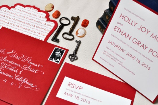
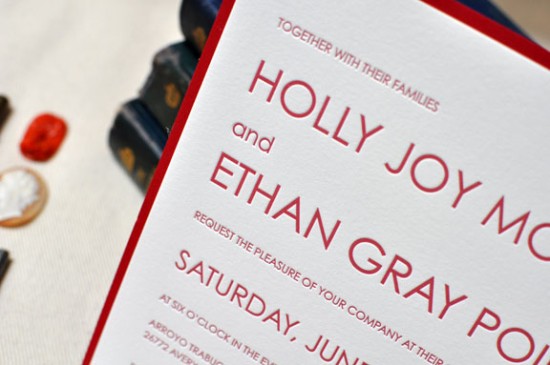
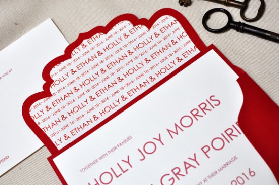
Theresa from b.t. elements sent over these beautiful red and white invitations from her brand new letterpress collection.  Theresa chose a minimalist and crisp design for the main invitation while bringing in a unique die cut outer envelope and bold white calligraphy.  Theresa even did the beautiful calligraphy herself – so pretty!

From Theresa: I love the beauty of the letterpress printing process and wanted to design an invitation that was clean and simple, working with just the relationship of small and large type.  The crisp design of this invitation was really inspired by the printing method itself.  I’m always inspired by strong bold colors that stand well on their own – red is one of those colors.  It’s bold, striking, and just a timeless color.

At b.t. elements we’re known for our custom pockets and folders, so I added in a very simple back pocket – you always need a place to tuck in those extra enclosures.  And we never overlook the envelope.  Our fancy cut envelopes are new this year and a big hit.  It’s so wonderful to see that envelope come in the mail.

The handwriting on the envelope is my own; I’ve been trying to teach myself calligraphy so I’ll take any practice I can get.  I love the contrast of the white on red.

Lovely!  Thanks Theresa!

Photo Credits: b.t. elements

Julianne + Philip’s Whimsical Letterpress Wedding Invitations

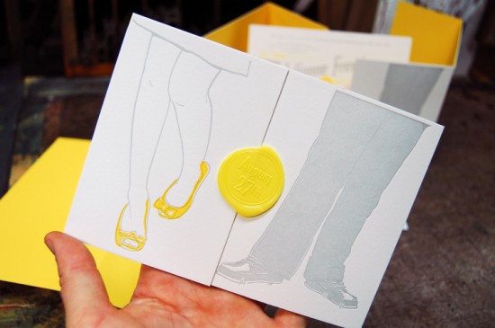
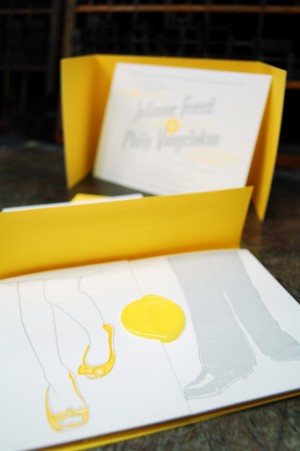
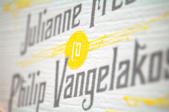
The folks down at Mama’s Sauce are really on a roll lately!  First they create some seriously cool business cards, and now these awesome wedding invitations.  Nick from Mama’s Sauce came up with the concept of basing the invitation design around an illustration of the couples’ shoes by Itchy Illustration, then incorporated the design into a horizontal tri-fold layout with a sunny yellow wax seal.  Love it!

From Nick: The couple wanted their printed materials to be a balance of playful & classic.  When it came time to design the wedding invitations months after our first consultation, Julianne’s love affair with her shoes was still stuck in my mind.  I quickly sketched a scene of the couple standing side by side with a bright popping yellow, highlighting Jewel’s shoes.  Not your typical wedding invitation, but typical isn’t what the couple wanted.

I am especially in love with the tri-fold wrap.  110# Pearl White Lettra Duplexed to French Paper Lemon Drop, we experimented with a type of die cut that allowed the wrap to fold and expose the yellow paper underneath creating a tri-colored edge.  A subtle detail that the most aesthetically sensitive recipients will surely appreciate.  Add a wax seal and the wrap is complete.
A collaboration with our friend & officemate, the talented Brian Boesch of Itchy Illustration, Julianne & Phil’s save the date and wedding suite are amongst our favorites that we’ve designed and printed this year.

Very cool – I love the layered effect with the yellow tri-fold die cut wrap, and of course that wax seal!  Thank you so much Nick!


Concept and Letterpress Printing: Mama’s Sauce
Illustration: Itchy Illustration


Photo Credits: Mama’s Sauce

{happy weekend!}

Happy Friday everyone!  I’m still trying to figure out how the week went by so quickly, but I’m glad to be back home in DC after spending a few days in New York and New Jersey.  Right now I’m looking forward to a night out with friends this evening followed by a lazy weekend.  But in the meantime…

…a few links for your weekend!

This week on Oh So Beautiful Paper:

And a big thanks to Jan from Poppytalk for asking me to stop by today with a recap from the Gift Fair!  That does it for me this week – I hope you all have a wonderful weekend, and I’ll see you back here on Monday! xoxo

Photo Credit: Beth Retro via Design is Mine

NYIGF August 2011, Part 3

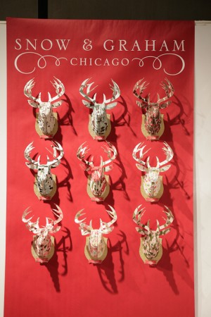
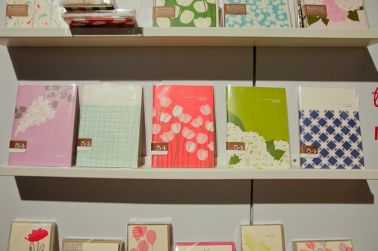
I’m back with more from NYIGF!  This time we’re focusing on all of the awesome stationery exhibitors at the Gift Fair, starting with some pretty notebooks, holiday cards, calendars, and gift wrap from Snow & Graham.

Snow & Graham

I’m loving the Valentine’s Day cards and gift wrap from Smudge Ink:

Smudge Ink

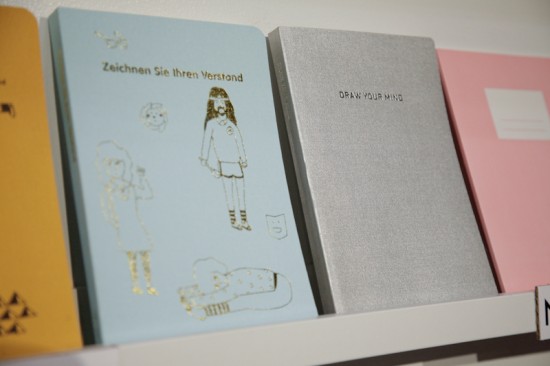
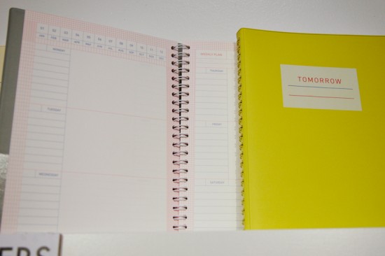
I had so much fun checking out the whimsical notebooks, planners, and cards at the Poketo booth:

Poketo

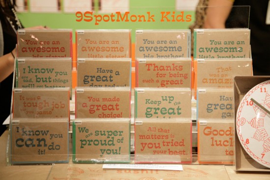
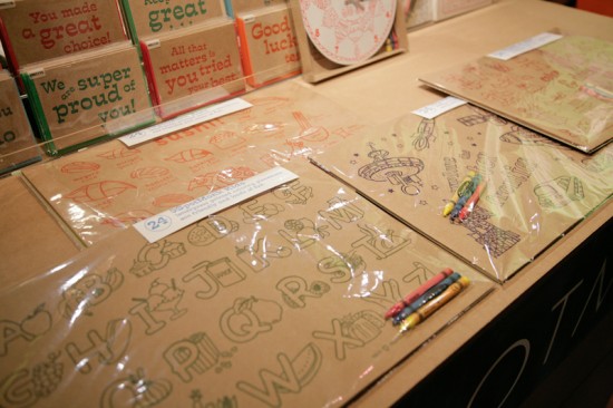
I always love the kid-friendly stationery and letterpress cards from the ladies of 9SpotMonk:

9SpotMonk

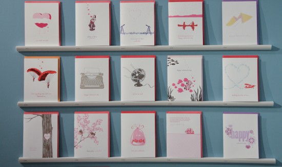
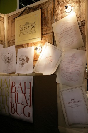
Such a pretty booth and funny letterpress cards from Oblation Papers and Press:

I thought this card was so funny!

Oblation Papers + Press

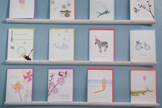
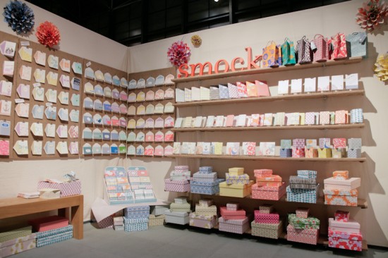
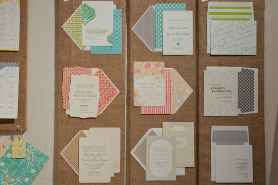
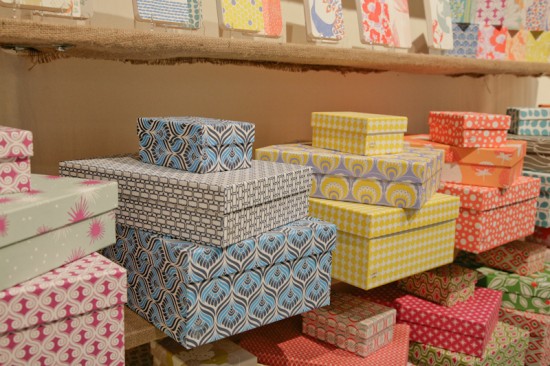
Lots of brightly colored letterpress greeting cards, gift wrap and boxes, and wedding invitations from Smock:
Smock

The ladies from Albertine Press, May Day Studio, and Carta, Inc. were back at NYIGF with a shared booth displaying their lovely cards, ribbons, and paper ephemera.

May Day Studio

Cute holiday cards from Albertine Press

Carta, Inc.

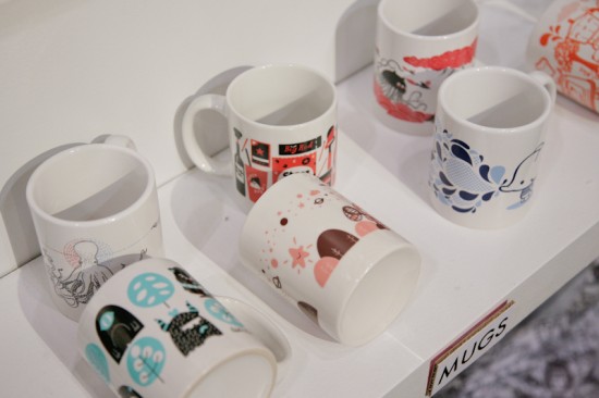
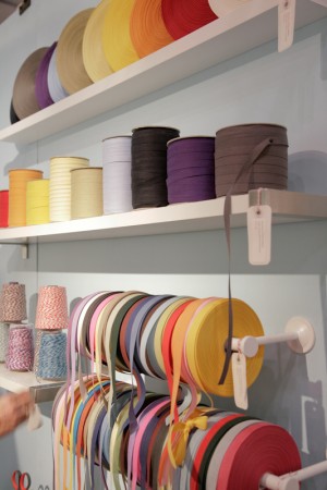
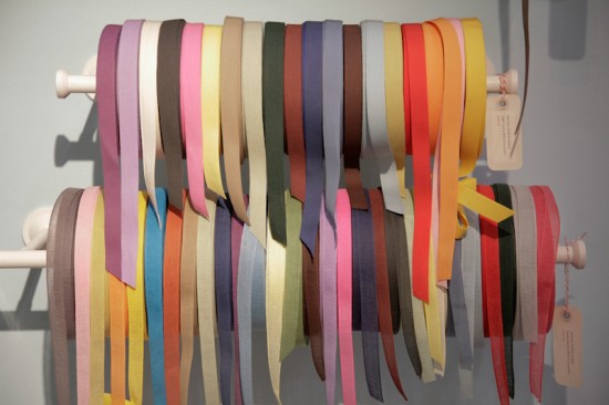
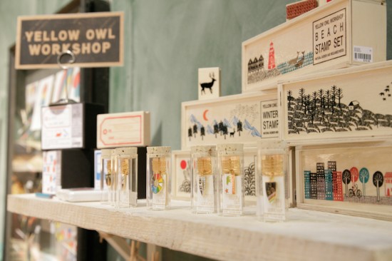
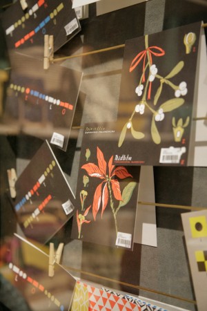
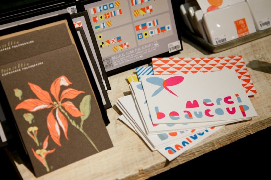
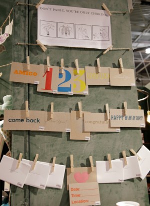
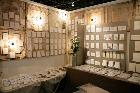
And finally for today, the Aesthetic Movement booth, which was full of pretty paper from Yellow Owl Workshop, Beau Ideal, and many others (along with lots of other pretty things!).

Yellow Owl Workshop

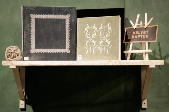
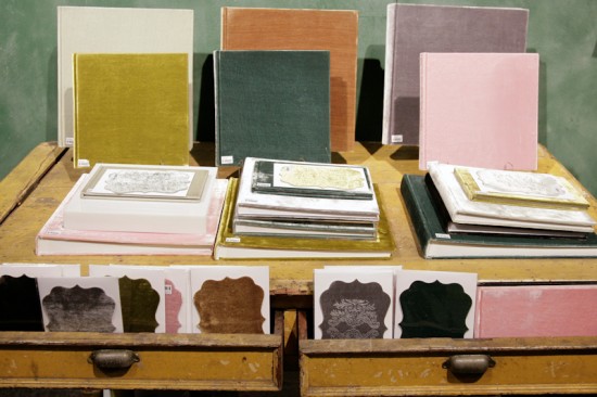
Gorgeous embossed velvet wedding albums, guest books, and die cut cards from Velvet Raptor

Beau Ideal

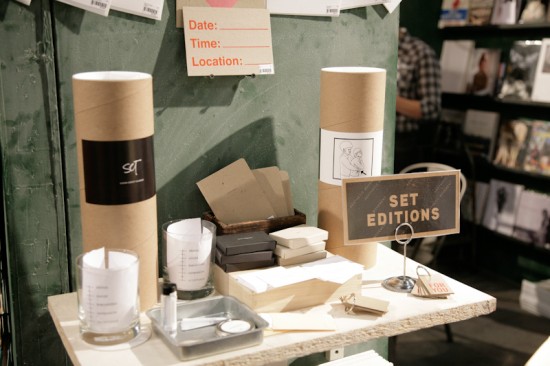
Austin Press (you can check out more from the Stationery Show right here) and Set Editions

Aesthetic Movement

I’ll be back with more from NYIGF tomor­row!  You can check out past year cov­er­age from NYIGF right here.

Photo Cred­its: Stephen Michael Garey for Oh So Beau­ti­ful Paper

Katie + Mark’s Sophisticated Autumn Wheat Wedding Invitations

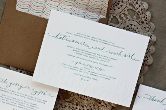
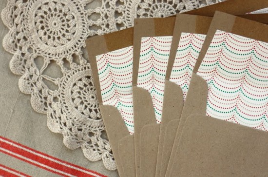
Before I jump back into my coverage from NYIGF, I just had to take a few minutes to gush over these beautiful wedding invitations from Bespoke Letterpress in Australia.  I love the combination of hand lettering and serif type, not to mention the stunning blind impression wheat border.  And that patterned envelope liner?  Such a fun surprise!


Check out more over on the Bespoke Letterpress blog!

Photo Credits: Bespoke Letterpress