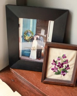
Jessica + Jake’s Modern Winter Wedding Invitations

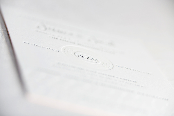
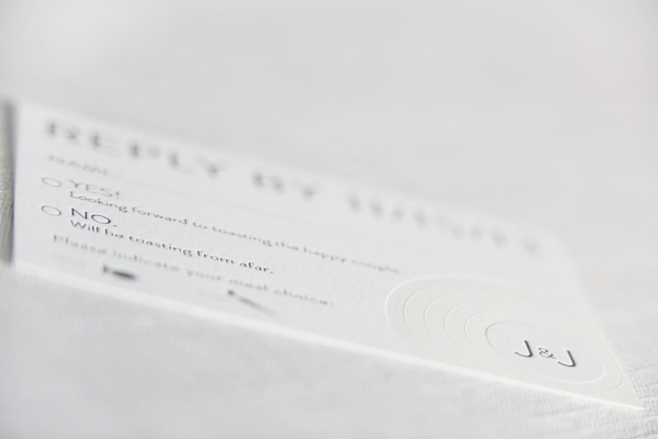
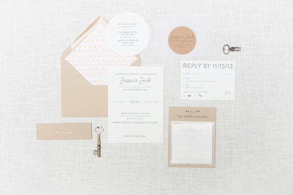
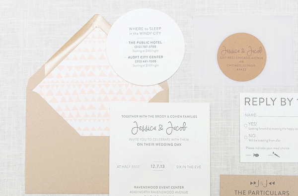
These soft and ethereal wedding invitations come to us from Megan at Ruby the Fox. Megan created these modern invitations for her cousin’s winter wedding in Chicago. A classic black and white color palette paired with kraft paper, soft peach details, and a few whimsical design elements complemented the industrial wedding venue while allowing the bride and groom’s personalities to shine through.

Modern-Letterpress-Wedding-Invitations-Ruby-the-Fox

From Megan: When Jessica, who happens to be my beautiful cousin, came to me to design a custom suite for her December 2013 wedding, I was incredibly flattered and beyond excited! Both she and her now husband, Jake, have fabulous eclectic taste and really wanted their personalities to come through in their paper goods. Planning a winter wedding in Chicago, they kept things soft, fresh and modern to play off their industrial venue.

Modern-Letterpress-Wedding-Invitations-Ruby-the-Fox2

Modern-Letterpress-Wedding-Invitations-Ruby-the-Fox3

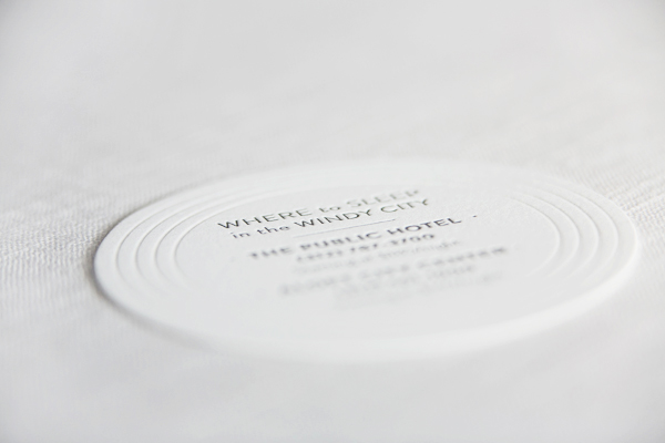
The suite featured a blind debossed pattern on thick 220lb stock with painted edges as well as multiple elements incorporating kraft paper, hand-stamped belly bands, and a whimsical accommodations insert! We also included Jessy and Jake’s love for old records, and carried a circular record image throughout from response cards to cocktail napkins!

Modern-Letterpress-Wedding-Invitations-Ruby-the-Fox5

Modern-Letterpress-Wedding-Invitations-Ruby-the-Fox4

Thanks Megan!

Design: Ruby the Fox

Letterpress Printing: Steracle Press

Ruby the Fox is a member of the Designer Rolodex – you can see more of their beautiful work right here or visit the real invi­ta­tions gallery for more wedding invitation ideas!

Photo Credits: Mary Kate McKenna Photography

Adelina + Blake’s Citrus and Olive Wedding Invitations

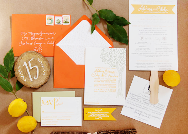
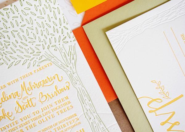
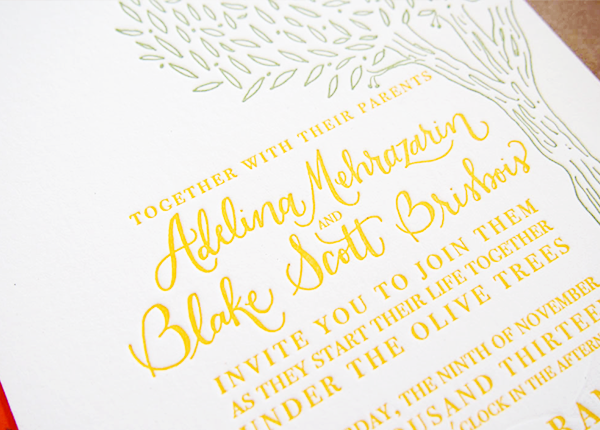
Happy Monday! After weeks of holiday-related posts, I’m so excited to get back to my first stationery love: wedding invitations! First up for the week are these whimsical invitations from Kim at Bright Room Studio – the bright color palette is inspired by citrus and olive trees! The invitation suite was letterpress printed in lemon yellow and olive green, with blind impression elements for added texture. Such a sunny wedding invitation for a cold and dreary winter day!

Citrus-Letterpress-Wedding-Invitations-Bright-Room-Studio2

From Kim: Adelina and Blake came to me with a million amazing ideas! They wanted to incorporate their vibrant citrus palette, a rustic yet classic vibe and some fun and unique touches. They got married under a large olive tree and the ceremony site was very special to them, so we used that location as the inspiration for the suite.

Citrus-Letterpress-Wedding-Invitations-Bright-Room-Studio6

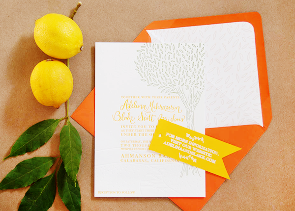
The invitation featured a custom illustration of the actual ceremony spot, including the path and hills, which were blind letterpress printed and the big, beautiful tree that framed the text of the invitation, which was letterpress printed in olive green. We then carried the tree texture onto the RSVP card, which was also blind letterpress printed. The subtle textures were accented with a vibrant lemon color ink for the most important information.

Citrus-Letterpress-Wedding-Invitations-Bright-Room-Studio10

For a little added texture, we hand-stamped the couple’s website onto a tag that was tied around the suite with twine. It was then topped off with a custom envelope liner that featured the leaf pattern from the olive tree.

Citrus-Letterpress-Wedding-Invitations-Bright-Room-Studio7

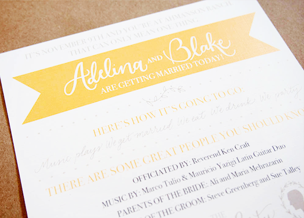
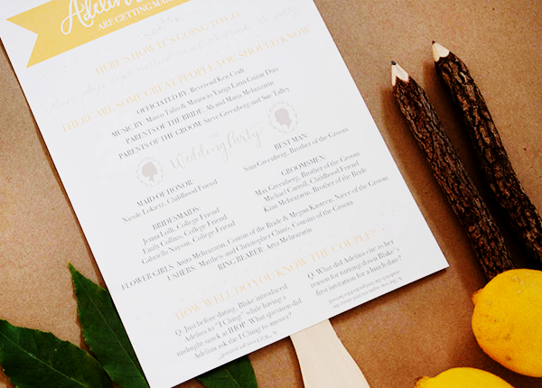
For their big day, we also created a program fan that featured some fun facts about the couple and hand-painted the table numbers on to wood slabs.

Citrus-Letterpress-Wedding-Invitations-Bright-Room-Studio3

Citrus-Letterpress-Wedding-Invitations-Bright-Room-Studio4

Citrus-Letterpress-Wedding-Invitations-Bright-Room-Studio5

Thanks Kim!

Design: Bright Room Studio

Printing: Mercurio Brothers

Bright Room Studio is a member of the Designer Rolodex  – you can see more of Kim’s beautiful work right here or visit the real invi­ta­tions gallery for more wedding invitation ideas!

Photo Credits: Bright Room Studio

Friday Happy Hour: The Danish Mary

Here’s a confession: I’m not the biggest fan of the Bloody Mary for two big reasons. First, all that tomato juice: I’m not crazy about savory drinks. Second, all that vodka: there’s no room in my bar for a neutral spirit that basically exists to liquor up a drink without adding any flavor. So for those of you desperately searching for a post-New Year hangover cure looking for a delicious brunch cocktail, here’s a slight variation that’s even better than the Bloody Mary: the Akvavit-based Danish Mary. – Andrew

OSBP-Signature-Cocktail-Recipe-Danish-Mary-50

OSBP-Signature-Cocktail-Recipe-Card-Danish-Mary-Shauna-Lynn-Illustration

Illustration by Shauna Lynn for Oh So Beautiful Paper

Danish Mary

2 oz Akvavit
4 oz Tomato Juice
1/2 oz Lemon Juice
2 Dashes Worcestershire Sauce
2 Dashes Tabasco Sauce
A Pinch of Salt + Pepper

Combine everything in a glass filled with ice, the pour back and forth between two glasses to roll the ingredients together. (Tomato juice foams a lot when shaken; this is a much gentler method of mixing.) Strain into a new glass filled with fresh ice. Garnish with lemon and/or celery and enjoy!

OSBP-Signature-Cocktail-Recipe-Danish-Mary-33

The Danish Mary is rich and savory, with a touch of spicy heat, just like a Bloody Mary, but even more complex, thanks to the herbaceous spiciness of the Akvavit. Akvavit (also Akevitt or Aquavit) is, as we’ve mentioned before, is a Scandinavian liquor flavored with spices and herbs, primarily flavors like caraway and dill, but also lemon, mint, ginger, cardamom, allspice and the like. It imparts a depth of flavor to the Danish Mary that vodka can’t match.

OSBP-Signature-Cocktail-Recipe-Danish-Mary-40 OSBP-Signature-Cocktail-Recipe-Danish-Mary-1

The easiest way to make a Danish (or Bloody) Mary is with bottled tomato juice. No one will judge you if you use this. But fresh juice really does make a difference, in this drink and every other. I muddled three medium tomatoes on the vine to get about 5 oz of juice; just make sure to filter the juice through a fine sieve or cheesecloth, or your Danish Mary will be pulpy. If you’re feeling extra fancy, try heirloom tomatoes. Modern tomatoes are bred for their color, firmness, and smoothness, but definitely not for taste, so heirloom tomatoes will give your drink a much richer tomato flavor. If that’s your thing.

OSBP-Signature-Cocktail-Recipe-Danish-Mary-8 OSBP-Signature-Cocktail-Recipe-Danish-Mary-13

The origins of the Bloody Mary are a little murky, but may have been invented at the New York Bar in Paris – the same bar at which the French 75 was invented – in the early 20th century. It makes sense that no one really remembers who first mixed one up, since it was invented as a hangover cure. Everyone around was probably too drunk, or too hungover, to write down or remember the details.

Just make sure to finish your Danish Mary before brunch ends. I’m pretty sure it’s against the law to drink one of these at any other time of day.

Photo Credits: Nole Garey for Oh So Beautiful Paper

OSBP At Home: Our New House + How We Got Here

And now, a little introduction to our not-so-new house! Aside from Sophie, my marriage, and my business, the house consumes more of my time and energy than anything else, some of it good and some of it really stressful. I’ve already talked a little bit about our plans for the front and back gardens and my office, but I thought it might be best if I shared the layout of our house, a few photos, and the story of how this became our house before delving into the subject any further.
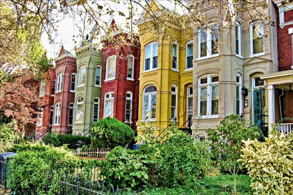
Capitol-Hill-DC-Rowhouses

Not our house, but our neighborhood / Photo via The WIHN

Before we bought our home, we were in our third year of happily renting the second floor 2 BR/ 1 BA apartment of a rowhouse in Capitol Hill. It wasn’t a huge apartment and Sophie’s nursery was only slightly bigger than a closet, but the layout worked for us, the rent was affordable, and we really really loved our neighborhood. We figured we could make it work for a little while longer. But in early December 2012, our landlords asked us to move out so they could ostensibly renovate the building. I didn’t want to rent again, so we got in touch with a realtor.
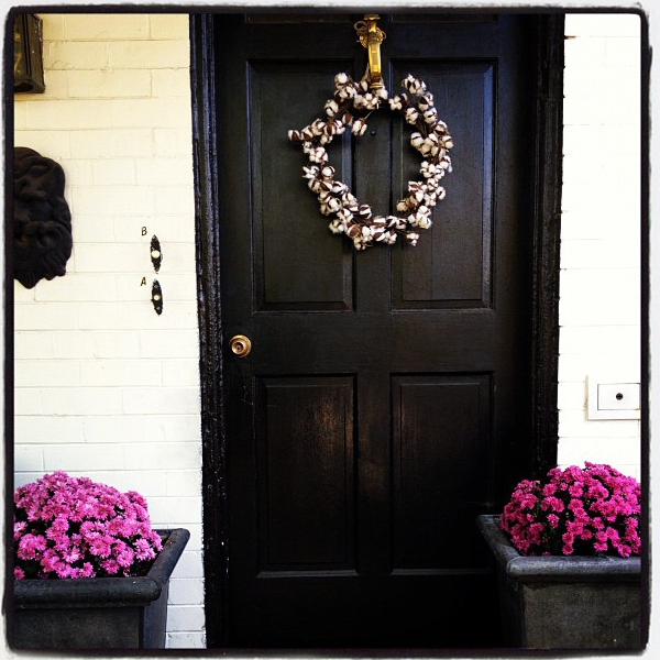
OSBP-At-Home-Front-Door

Our old front door / Photo by me via Instagram

What followed was two incredibly draining and discouraging months of house hunting. Capitol Hill is one of DC’s most competitive housing markets, so we knew that we weren’t going to find our dream house in our price range, but we barely found anything at all. Houses beyond our budget came on the market only to go under contract two days later, and houses within our budget required extensive renovations that in reality pushed them out of our budget. We put in two offers on houses that we didn’t really love, neither of which were successful. We started to look at other neighborhoods, but nothing jumped out at us as worth leaving the Hill.
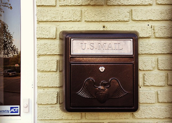
OSBP-At-Home-Mailbox

Our new mailbox / Photo by me via Instagram

When we visited our house for the first time, we didn’t love it right away but we didn’t hate it either. It had the bare minimum of what we were looking for (two bedrooms, close to a metro station) and it was in our price range, but it also needs lots of updates and was missing two things that I really wanted in a house: a finished basement and central air conditioning. We figured this was probably the best that we were going to be able to afford in Capitol Hill, so we put in an offer anyway and it was accepted a few days later. Here’s the layout of the house, just so you don’t get lost on the tour:
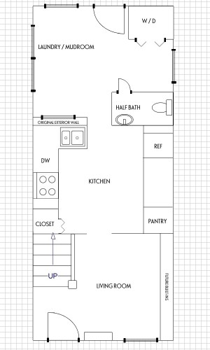
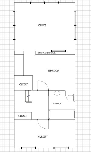
OSBP-At-Home-Downstairs-Floor-PlanOSBP-At-Home-Upstairs-Floor-Plan

Downstairs // Upstairs

Totally not to scale (click to enlarge)

Our home is a typical long and narrow DC rowhouse. It was built in 1923, with an addition that we think was added to the back of the house in the 1950s. Our house is not a grand Victorian like the homes in the top photo, but is probably closest to a basic Federal style rowhouse. The house is fairly small at 1200 square feet. It has two bedrooms (one of which I’m using as my office), a den that we’re currently using as our bedroom, and one and a half bathrooms. Please note, all the photos of our house below are from the MRIS listing of our house and feature the arrangements of a staging company. Apologies in advance for all the small images!
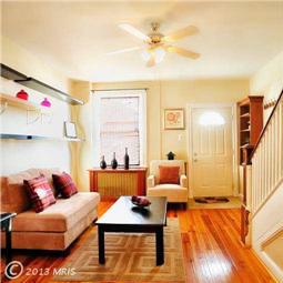
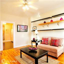
OSBP-at-Home-MRIS-Living-Room2 OSBP-at-Home-MRIS-Living-Room

When you enter the house, you step straight into the living room. The living room is narrow and much smaller than the living room in our previous apartment (sigh). We’re still trying to figure out the best layout and seating arrangement, particularly for entertaining. We’re planning to do built-ins along the wall with the shelves, and if we stay in the house long term we’d love to remove the wall between the living room and kitchen to add an eat-in peninsula and open the space up even more.
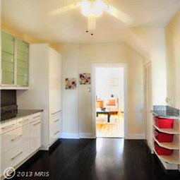
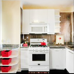
OSBP-at-Home-MRIS-Kitchen3 OSBP-at-Home-MRIS-Kitchen2

OSBP-at-Home-MRIS-Kitchen1 OSBP-at-Home-MRIS-Kitchen4

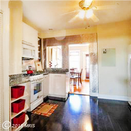
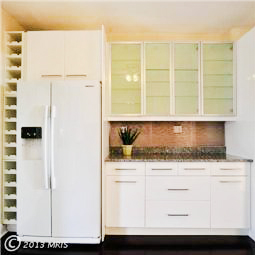
The kitchen! This room frustrates me probably more than any other room in the house. We knew right away that it definitely wasn’t our taste, but after living here for a while we’ve also learned that the layout is very awkward and there is a lot of wasted space despite the large room size. The sink and stove are practically adjacent to each other, which means we don’t have much counter space for food preparation. The floor needs to be leveled (it slopes down towards the middle of the room) and the laminate flooring shows every speck of dust and cat hair. Oh, and see the gray backsplash? Yeah, that would be corrugated cardboard made to look like tin tiles glued directly to the brick walls and running behind all of the upper cabinets and appliances. Awesome. Any talented kitchen designers out there looking for a challenge?? I don’t even know where to start with this room.
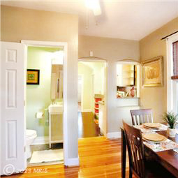
OSBP-at-Home-MRIS-Dining-Room2 OSBP-at-Home-MRIS-Dining-Room

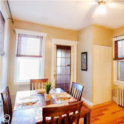
Moving on! The staging company made the room behind the kitchen look like a dining room, but we were able to fit our little four-person dining table in the kitchen. Since this room also contains our washer and dryer (hidden in the closet on the right) we use it mostly as a laundry/storage/cat room. There is also a half bath in the corner opposite the laundry machines (left).
OSBP-at-Home-MRIS-Exterior-Rear OSBP-at-Home-MRIS-Garage

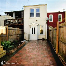
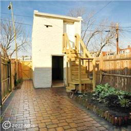
Outside! After 10 years of living in apartments without any real outdoor space, our little backyard is one of my favorite features of the whole house. I love that there are areas for both entertaining and gardening. We’d eventually like to tear down the weird and unfinished little rear entrance (left) and build a pergola over the back entrance. And hey, a garage! That was a nice surprise, as these are pretty rare on the Hill. There is a small unfinished storage/workplace above the garage. And I’d eventually like to replace the makeshift wood stairs (right, and so not up to code) with an iron spiral staircase.
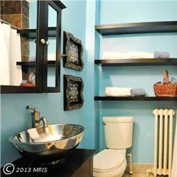
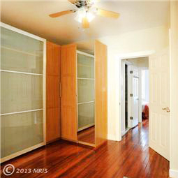
OSBP-at-Home-MRIS-Upstairs-Hallway OSBP-at-Home-MRIS-Bathroom

Bathroom1 Bathroom2

Bathroom5 Bathroom3

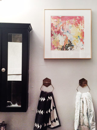
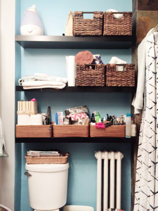
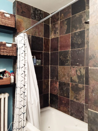
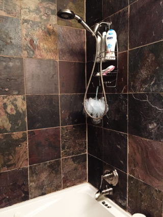
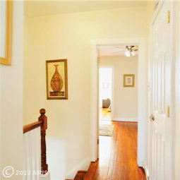
Heading upstairs (from the living room), there is a small landing and the only full bathroom in the house. We’re planning to completely gut the bathroom and start from scratch. The shower is tiled with some sort of slate floor tile (maybe this?), which I’m pretty sure isn’t meant for bathrooms because it’s starting to crumble each time we take a shower and there is water leaking into the walls. We’re hoping to tackle the bathroom in the very near future!
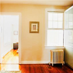
OSBP-at-Home-MRIS-Den3 OSBP-at-Home-MRIS-Den

This is the den on the second floor. The previous owners filled the room with wall-to-wall Ikea Pax closet units and essentially used it as a dressing room. We removed most of the Pax units and currently use it as our bedroom. It’s a small room, but it works for now. Above you can see the original exterior wall of the house (right) with a funny little window into the back room.
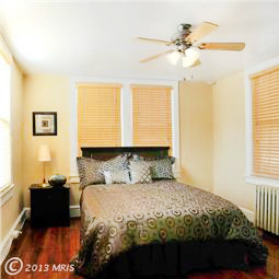
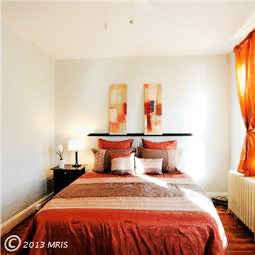
OSBP-at-Home-MRIS-Bedroom OSBP-at-Home-MRIS-Guest-Bedroom2

The two official bedrooms. On the left is the back room that I’m currently using as my office. The room on the right is located at the front of the house and is now Sophie’s nursery. Both have come a long way since we moved in and probably feel the most “finished” of all the rooms in the house.

So that’s our tiny little house! As I said in my new year goal post, it’s good enough but not exactly what we were looking for in a home. Most days I feel really overwhelmed by everything that we both need and want to do to this house. But I’m trying to be more chill about things and I’m hopeful that I’ll feel better once we get a few small projects out of the way. I think our biggest regret is purchasing a house without a finished basement. We really need a separate area for the cats outside of our living space, much less right next to the kitchen, and I would do almost anything for a dedicated laundry room. We have an unfinished half basement under the rear part of the house that contains our furnace and water heater, and if we decide to stay here long term we could theoretically dig out and finish the basement. But that’s a huge project that would involve a second mortgage-like loan, so there are several giant question marks next to that idea.

In the meantime, there are plenty of things to keep us busy around the house, from cosmetic improvements and electrical and plumbing updates inside to painting the exterior and working on the garden outside. Considering it took me nine months just to share the MRIS photos from our house, I am obviously not a home blogger, but I’ll do my best to share updates along the way!

I’ll be back to regular content next week – and we have a cocktail recipe coming up later this afternoon! Have a wonderful weekend, and I’ll see you back here on Monday! xoxo
OSBP at Home: Our Old Apartment (Tour!)

I’m still easing my way back into a normal schedule after the holidays, and after two mid-week holidays I don’t have a regular Friday round up post to share today. So instead I’m doing something a bit different and sharing a little glimpse into my home(s), with a quick tour of our old apartment and a little introduction to our “new” house. First up, our old apartment! Considering it has been more than nine months since we moved out, this is way way way overdue – but better late than never, right? Also, I ran around taking photos of the apartment as we packed it up the last couple of weeks before the move, so these aren’t styled photos. You’ll see cords, remotes, and some ugly appliances – but hey, that’s life, right?

OSBP-Apartment-Tour-112

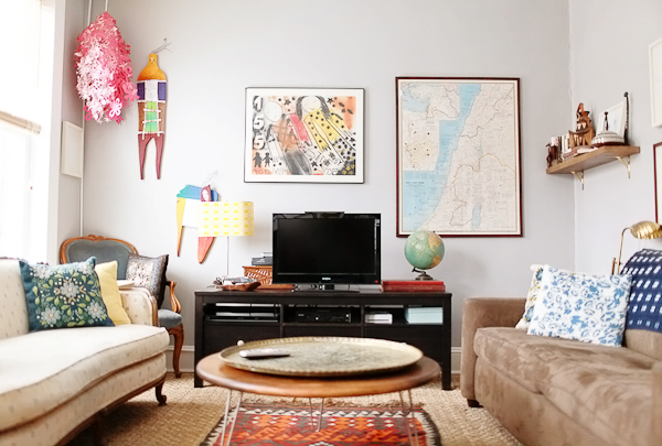
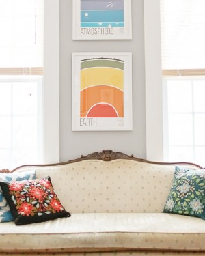
Starting in the front of the house with our living room. We spent most of our time in this room, and it’s probably the room that I miss the most now. It had three large southern-facing windows that let in the most beautiful morning and afternoon light, and it was just the right size for having friends and family over. Sigh. The furniture is a mix of flea market finds (like the brass tray and tribal rug), heirlooms that I inherited from my grandmother (the couch and chair on the left, both of which I’d eventually like to restore and recover), and modern items. If you have any specific questions about where we found something, please leave them in the comments and I’ll do my best to answer!

OSBP-Apartment-Tour-114OSBP-Apartment-Tour-116

OSBP-Apartment-Tour-113

OSBP-Apartment-Tour-118

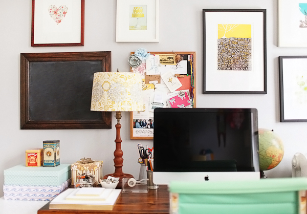
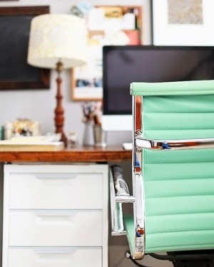
After Sophie arrived, we converted the second small bedroom into a nursery and I moved my office into a corner of the living room. It wasn’t a huge amount of space, but it worked at the time!

OSBP-Apartment-Tour-127OSBP-Apartment-Tour-125

OSBP-Apartment-Tour-124OSBP-Apartment-Tour-122

OSBP-Apartment-Tour-27

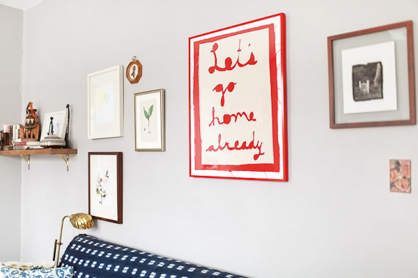
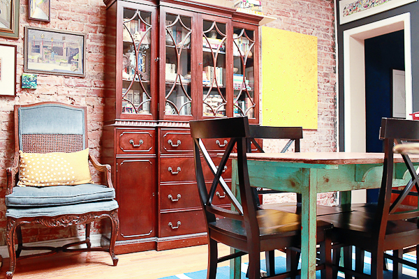
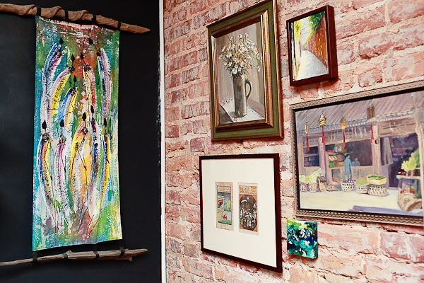
Moving towards the back of the house, we have our dining room. This room had a giant skylight, which avoided the typical dark middle room of DC rowhouses and made us feel so incredibly lucky to have a second floor apartment. The landlords exposed the brick wall years ago, and I painted the rest of the walls in black chalkboard paint to showcase our art collection. The large china cabinet and ornate chair are more heirlooms inherited from my grandmother, which she inherited from her mother. I love carrying pieces of them with me into my own home.

OSBP-Apartment-Tour-1

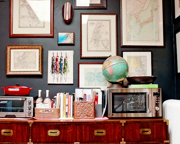
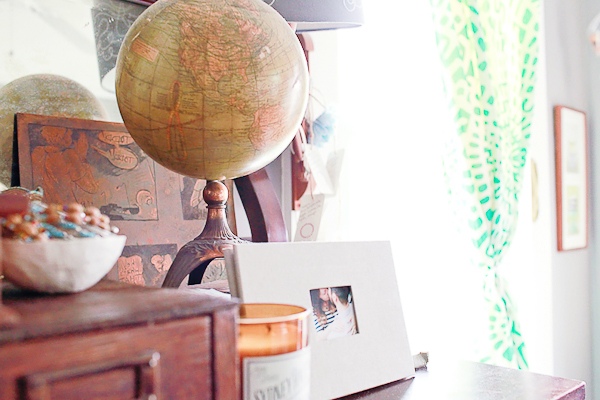
I didn’t manage to get any good photos of our kitchen, which lies directly to the right of this photo. The kitchen was pretty basic and small, so we moved the microwave and toaster oven out into the dining room to avoid taking up precious countertop space. The campaign dresser is one of my all time favorite flea market finds! Oh, and you might notice that we have a bit of a thing for antique maps and globes. It comes with the territory when two people with international backgrounds decide to get married.

OSBP-Apartment-Tour-23

OSBP-Apartment-Tour-9OSBP-Apartment-Tour-13

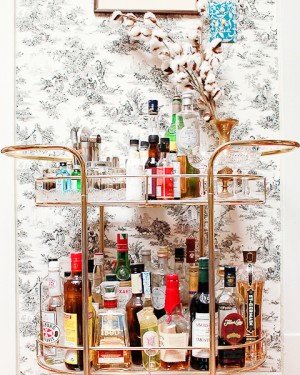
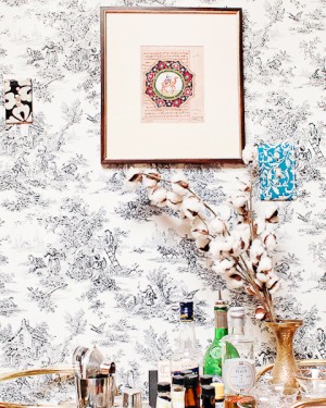
Our bar cart! I found this vintage brass beauty on craigslist: it was missing the original glass so we had pieces of acrylic cut down to fit the shelves instead. I used a combination of double-sided tape and painters tape to hang toile wallpaper (in a renter-friendly removable way) on this short little wall that connected our dining room and kitchen. This was another favorite nook of our old apartment.

OSBP-Apartment-Tour-108

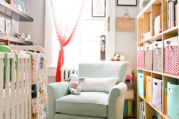
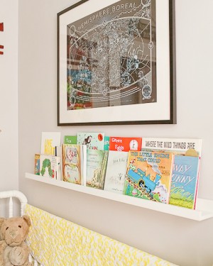
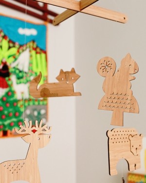
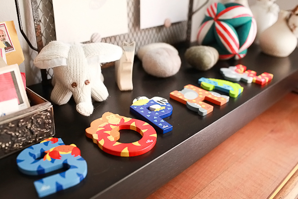
Next up, Sophie’s nursery! This room was so very tiny – we could barely fit the glider in next to the crib – so in retrospect I’m glad we didn’t have to use this room once Sophie was mobile. Hidden just to the right of the Expedit is a small vintage dresser that we used as our changing table.

OSBP-Apartment-Tour-87OSBP-Apartment-Tour-111

OSBP-Apartment-Tour-78OSBP-Apartment-Tour-75

OSBP-Apartment-Tour-79OSBP-Apartment-Tour-69

OSBP-Apartment-Tour-64OSBP-Apartment-Tour-62

OSBP-Apartment-Tour-73

OSBP-Apartment-Tour-31

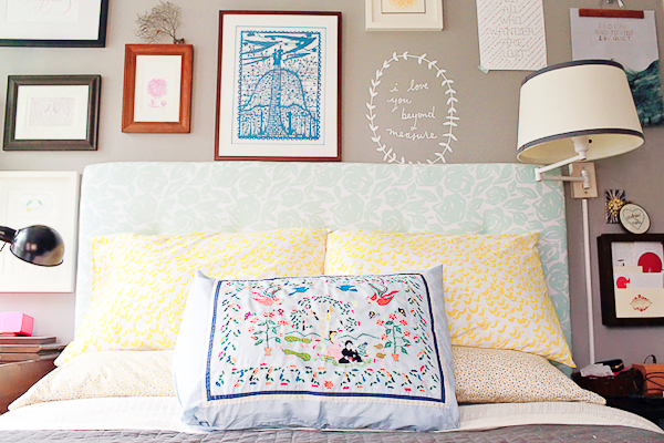
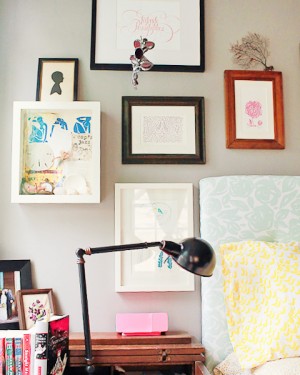
And finally, our bedroom! Also a small room and difficult to photograph without a wide angle lens (oops), but the room consisted of our bed, two nightstands, a dresser opposite the bed, and a closet with hanging storage and another dresser. This room had three north facing windows and also let in the most beautiful morning light. I do miss all those windows!

OSBP-Apartment-Tour-34OSBP-Apartment-Tour-55

OSBP-Apartment-Tour-46

And that’s it! Photos of our new house coming up next!

Photo Credits: Nole Garey for Oh So Beautiful Paper