Rainbow Rolls, Split Fountains, and Flats, Oh My!

Well, hello again! You may think that we here at Ladyfingers Letterpress love repetition – because well, we’re printmakers and we are in the business of making multiples, after all, but that doesn’t mean we don’t love a good challenge! We started our business because we love to make unique, one-of-a-kind things, so we continue to – pardon the pun – push the envelope and experiment with ways to make awesome things… AWESOMER. –Arley-Rose and Morgan of Ladyfingers Letterpress

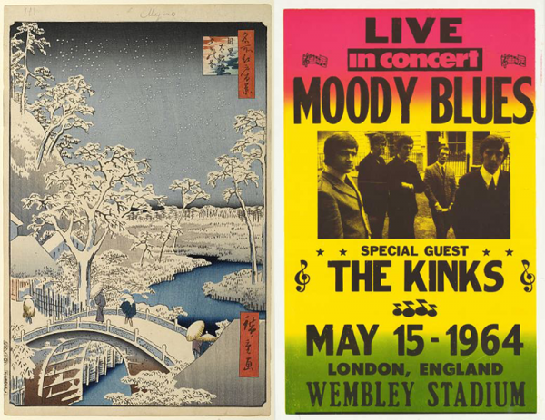
We’re huge fans of color and are always looking for ways to bring in more pop into our designs. We like to pull a good book off the shelf sometimes for technical ideas and design inspiration. One of the most historic printing techniques is called Bokashi, which was employed by Japanese woodblock printers and features large flats of more than one color, mixed by hand and applied by hand to woodblocks.

Bokashi and Rainbow Roll Examples
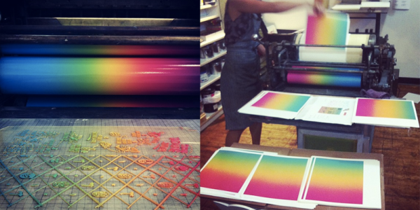
A resurgence of this idea can be seen in 1970s screenprinted and letterpressed rock posters, which feature a colorful technique that is known as a “Rainbow Roll” or “Split Fountain.” This method is achieved by inking the roller on a press with multiple colors and as the roller spins, the colors naturally blend together. Note that this can only be done on cylinder presses like a Vandercook or Heidelberg.

Split Fountain by Ladyfingers Letterpress

Below are some of our most recent forays into printing flats of Rainbow Rolls! Also, see yesterday’s post with Jeremy and Joe’s fabulous Mexican Broadside invitation!

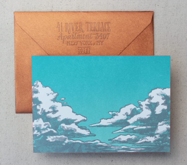
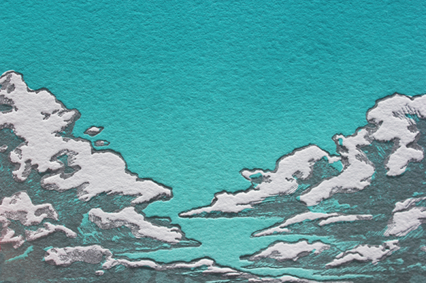
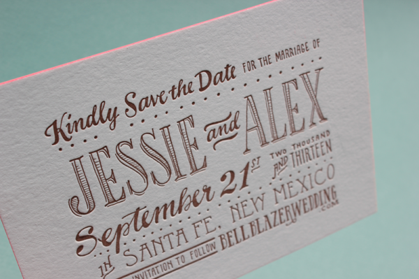
Jessie and Alex’s Southwest Cloudburst:

Jessie and Alex

Jessie and Alex

Jessie and Alex

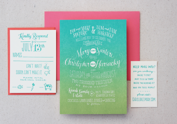
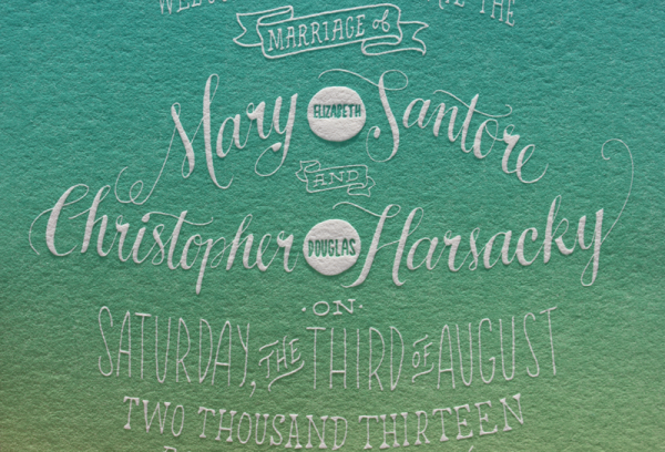
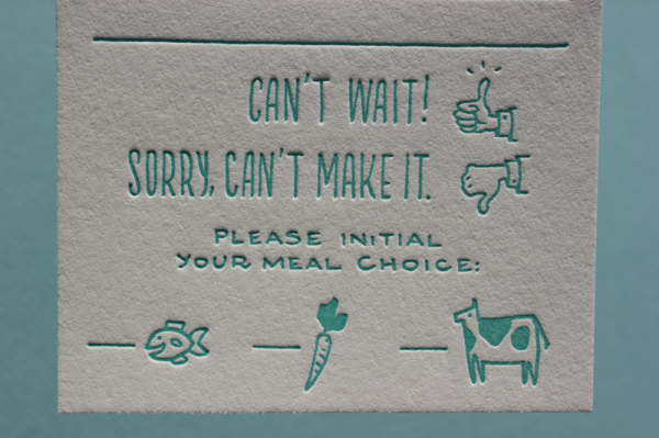
Mary and Chris’s Colorful Wine Country Invitation:

Mary and Chris

Mary and Chris

Mary and Chris

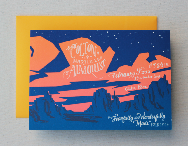
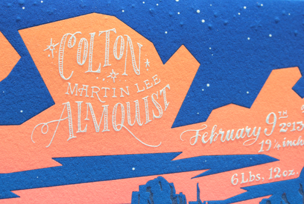
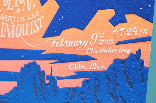
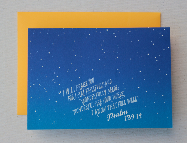
Colton Almquist’s Vibrant Sunscape Birth Announcement:

Colton Almquist

Colton Almquist

Colton Almquist

Colton Almquist

Ladyfingers Letterpress is a member of the Designer Rolodex – check out more of their beautiful work right here or visit the real invi­ta­tions gallery for more wedding invitation ideas!

Photo Credits: Ladyfingers Letterpress

9TH LETTER PRESS: Studio Tour

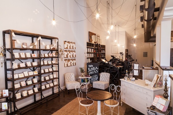
Hello, hello! Today, I thought I’d show you around the 9th Letter Press studio! We moved into our space about a year ago and have spent quite a bit of time getting it to look exactly like what was in my head. I have something of a very nostalgic nature so of course I wanted to decorate the studio to look like a turn of the century cafe. I’d like to think Edith Wharton could come in and feel right at home (nerd alert: I majored in English). Think old New York style during Prohibition meets the industrial revolution. In order to pull off that aesthetic, I used lots of dark wood (in my favorite stain: WALNUT), a variety of vintage furniture and pipes. –Isabel of 9th Letter Press

9th Letter Press store front

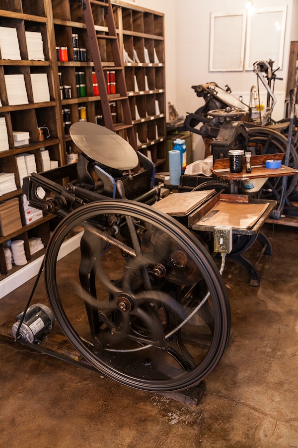
Meet our 119 year old printing press, St. Peter. He can be quite cantankerous but works so hard I inevitably forgive him at the end of each day.

letter press machine

We keep our  in house inks in mason jars which sure look cute but sure make a giant mess when accidentally dropped. Just ask me, I’ve dropped my fair share.

Shelves with ink for letter press

Counter register

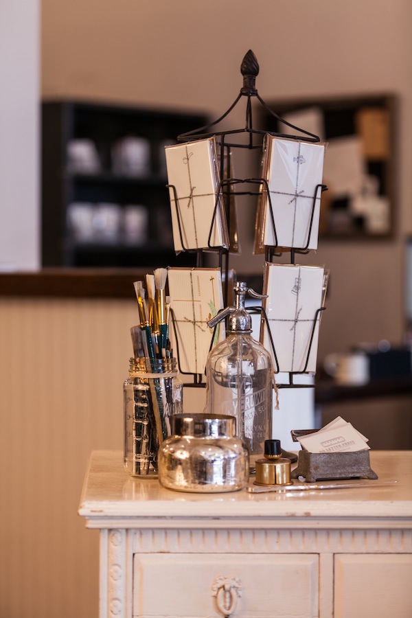
When it came to finding furniture for the studio, I enlisted lots of friends to keep a lookout for anything cute that might fit. Our register was just one of those finds which we bought for the grand total of $30! We gutted out the drawers and made shelving to accommodate our shopping bags and the like.

studio furniture

Photo Credits: Betsy Hansen

Happy and Gay Letterpress Wedding Invitations

We’re back! Ladyfingers Letterpress here, reporting today on a subject very near and dear to us. As some of you may already know, our company is owned and operated by two ladies, Arley-Rose and Morgan, who wed in Massachusetts in 2011. We have always taken marriage equality very seriously, making donations to equality efforts for every invitation suite ordered since we started our business in 2011. On June 26, the Supreme Court voted DOMA as unconstitutional and gave same-sex couples access to 1138 rights that were previously denied to them. We’ve always proudly worked with same-sex couples and are excited to share some of our favorite invitations with you today. –Arley-Rose and Morgan of Ladyfingers Letterpress

Jeremy and Joe’s Mexican Fiesta Wedding
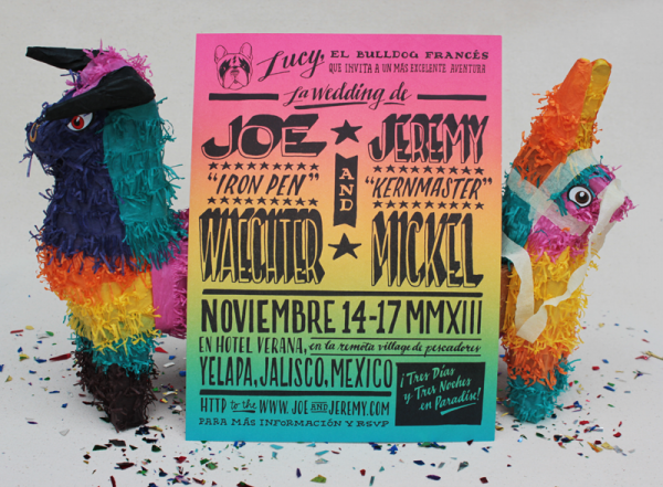
Jeremy and Joe's Mexican Fiesta Wedding

These guys are good friends of ours – Jeremy is a talented type designer (I designed a typeface thanks to him!) and Joe is an amazing playwright. They selected a hidden gem in Mexico to wed and wanted an invitation suite to reflect the culture and fun their guests are about to have. They sent us colorful and vibrant images of Mexican hand-lettering that appears on storefronts and signage, as well as old broadsides that advertise Mexican wrestling matches.
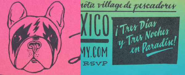
Jeremy and Joe's Mexican Fiesta Wedding

After some deliberation, they decided they wanted to create an invitation that resembled a wrestling match featuring Lucy, their “El Bulldog Francés” as the headliner. We letterpress printed a full bleed rainbow roll flat, with a black letterpress layer on top. The invitations were two sided, with a step-by-step story illustrating the exciting journey that lies ahead to their destination wedding.
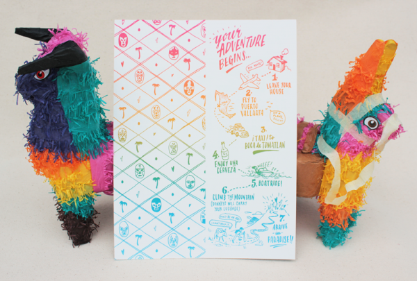
Jeremy and Joe's Mexican Fiesta Wedding

Jeremy and Joe's Mexican Fiesta Wedding

The invitations were then rolled and sealed with a red sleeve with the words “Vamos a Celebrar!” letterpress printed on it. What did we do with the invitations next? Well, hide them inside a piñata, of course! The “miñatas” were then placed in a box and shipped off to their small list of friends and family!

Lauren & LaQuet’s Interactive Invite
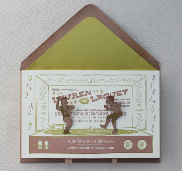
Lauren & LaQuet's Interactive Invite

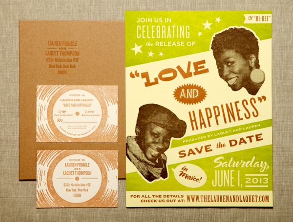
When we were first approached by these fabulous and outgoing ladies, we knew their invitations would be totally fun. LaQuet is a Broadway star and Lauren is a TV producer, so naturally their invitations would have to reflect some element of performance! Their wedding website was amazing, with videos of them speaking to the viewer on nearly every page. When they received their save the dates, they recorded their reactions and sent them to us. So adorable!
Lauren & LaQuet's Interactive Invite

Their save the dates were designed to resemble old Motown and ’60s Soul posters, featuring a three-color letterpress print on an oversize poster and shipped in a large kraft paper envelope.
Lauren & LaQuet's Interactive Invite

Lauren & LaQuet's Interactive Invite

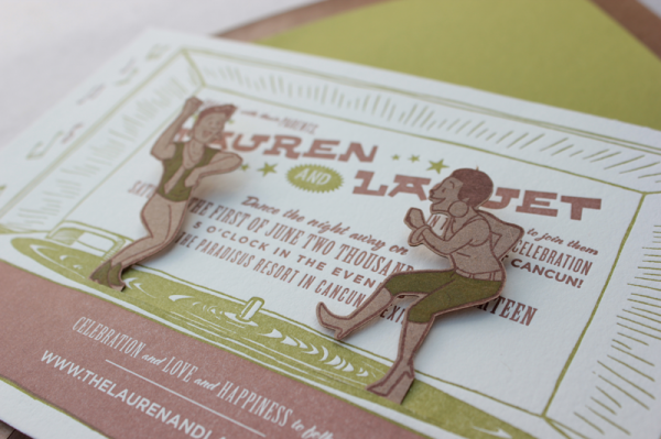
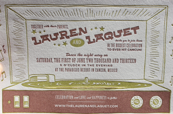
For their invitations, we created illustrations of the couple and letterpress printed them on kraft paper. The ladies were then laser cut and placed through a slit in the invite, which was designed to look like an old school record player. The result was an irresistible urge to make the ladies dance together, getting this party started early!

Liz & Janis’s Cuban Social Club Invitations

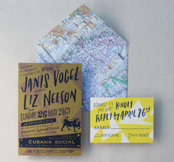
This was another friend couple of ours, so naturally we were psyched to help them out with a set of invitations! Their wedding took place at an amazing Cuban restaurant in Brooklyn, so we aimed to create a suite that reflected their artsy taste, their love of travel and the Cuban flair of their venue. We used a brush lettering for their script and paired the letterpress chip board invites with actual maps that were torn out of an atlas and individually die cut into an envelope shape.
Liz and Janis's Cuban Revolution

We created two sets of invites for them since their wedding had two rounds of guests: An earlier crowd who would enjoy the ceremony and dinner, and a rowdier bunch arriving later for dancing, revelry and drinks.
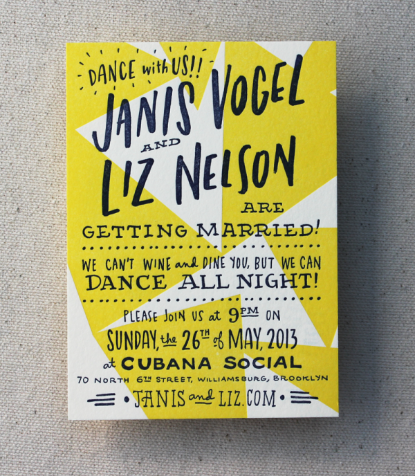
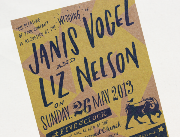
Liz and Janis's Cuban Revolution

Liz and Janis's Cuban Revolution

Ladyfingers Letterpress is a member of the Designer Rolodex – check out more of their beautiful work right here or visit the real invi­ta­tions gallery for more wedding invitation ideas!
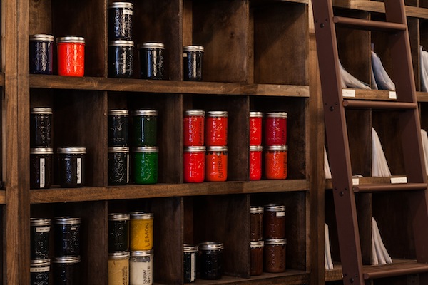
Photo Credits: Ladyfingers Letterpress
9TH LETTER PRESS: Jessie + Andrew’s Rustic Wedding Invitations

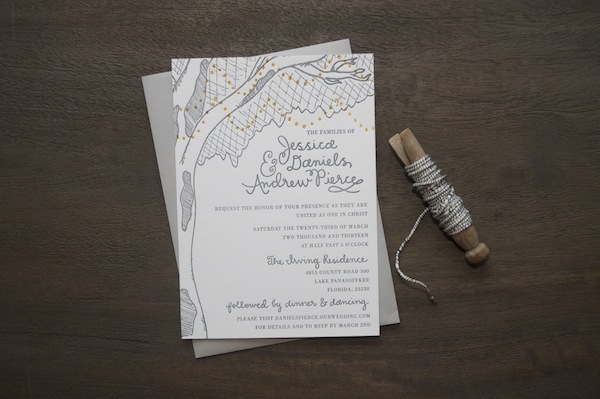
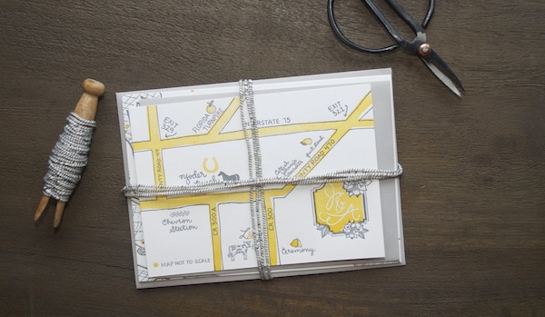
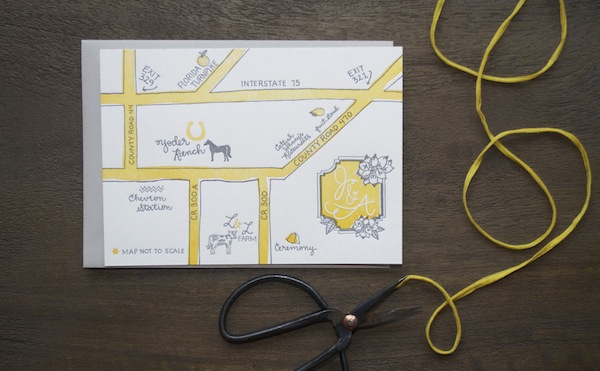
My sweet friend Jessie got hitched this past spring to the love of her life and she put me in charge of her wedding invitations! I was not only super honored to be a part of her big day but also excited to help her come up with a custom design for her paper goods. Jessie decided she wanted to get married outside, surrounded by trees and on a honey farm. For her wedding invitations, I drew her a large tree with little twinkling lights hanging from the branches. Jessie wanted a map too, and I probably had way too much fun drawing a cow and a peach stand than any person should, but there you have it. –Isabel of 9th Letter Press

letter press wedding invitation

letterpress wedding bundle

letter press wedding map

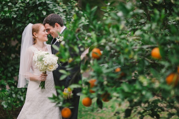
And here is the lovely couple in all of their married glory.

Wedding photo of Jessie and Andrew

p.s. 9th Letter Press is a member of the Designer Rolodex – you can see more of their beautiful wedding invitation work right here!

Photo Credits: 9th Letter Press Team & By The Robinsons

Todd + Sasha’s 1920s-Inspired Elegant Hand Lettered Wedding Invitations

Hi Again! Today we’d like to share with you a recent invite we did for an amazing couple who was having a sophisticated ’20s-era wedding. Although “Gatsby” was one of the words they used to convey the feeling they were going for, their suite was more about capturing the elegance and modernism of the era rather than trying to replicate the cues taken from the recent Baz Luhrmann movie. –Arley-Rose and Morgan of Ladyfingers Letterpress
1920's-inspired Elegant and Modern Letterpress Suite

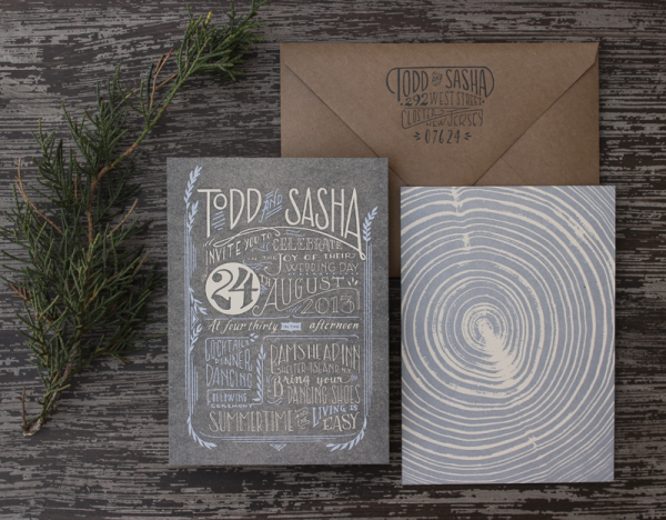
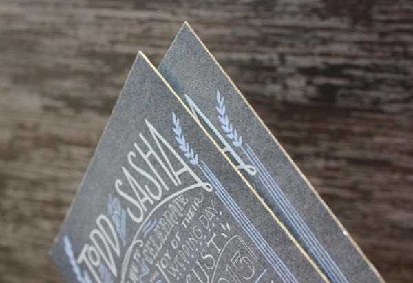
The suite features a two-sided, super thick invite that’s letterpress printed on both sides, with an application of silkscreen on the front, and edge painted in antique gold. If you’re familiar with letterpress printing at all, you may be aware that printing flats are a little more challenging than printing line work. We wanted to try a new approach where we attempted to letterpress a silver layer on top of the charcoal base flat layer, with the cream text knocked out of the charcoal layer. We had done a test in the studio before we pitched the idea to the client and it looked great. Somehow, by the time we were ready to print the silver layer, it didn’t look as legible as the tests and we had to come up with a new approach. We opted for silkscreen since it’s more viscous than letterpress ink. Another solution could have been hot foil stamping.

1920's-inspired Elegant and Modern Letterpress Suite

On the back of the invitation, we letterpress printed a cross section of a piece of wood, since the groom-to-be was an avid wood worker.

1920's-inspired Elegant and Modern Letterpress Suite

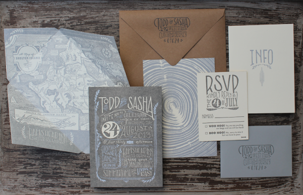
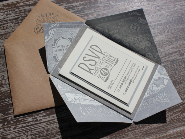
Their wedding was set to take place on Shelter Island, and features a letterpress print of a vintage map that acts as an inner envelope. These were then addressed in gold guache by our in-house calligrapher Tammy Ann Tan.

1920's-inspired Elegant and Modern Letterpress Suite

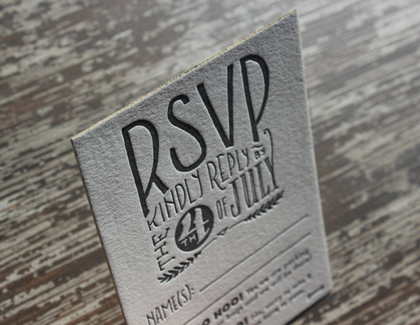
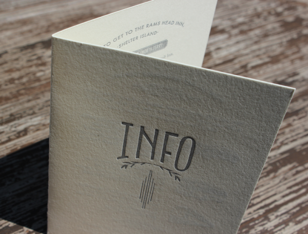
Their RSVP is also letterpress printed on thick cotton paper, edge painted and is double sided to accommodate menus, events and additional info. Their folded letterpress Info Card features directions, accommodations and vintage illustrations of Planes, Trains, and Automobiles.

1920's-inspired Elegant and Modern Letterpress Suite

1920's-inspired Elegant and Modern Letterpress Suite

1920's-inspired Elegant and Modern Letterpress Suite

p.s. Ladyfingers Letterpress is a member of the Designer Rolodex – check out more of their beautiful work right here or visit the real invi­ta­tions gallery for more wedding invitation ideas!
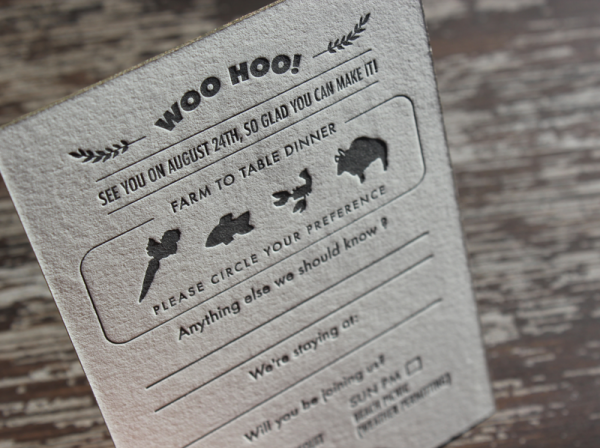
Photo Credits: Ladyfingers Letterpress