{happy weekend!}

Happy Friday everyone!  It’s finally starting to feel like fall here in DC; the leaves are changing colors everywhere and the skies have been mostly gray and rainy the last few days.  I think it’s all beautiful, and I love listening to the rain while I sit at my computer all day.  Right now I’m looking forward to a quick trip up to New York for a few days for Bridal Market – it’ll be nice to get out of DC for a couple of days!  But in the meantime…

Photo Credit: Nguyễn Hà

…a few links for your weekend!

This week on Oh So Beautiful Paper:

That’s it for me this week!  Don’t forget to enter the custom journal giveaway from Paper + Cup – the contest ends at midnight tonight!  I hope you all have a wonderful weekend, and I’ll see you all back here on Monday! xoxo

DIY Rubber Stamp Fabric Pocket Wedding Invitations

It’s the ladies of Anti­quaria, back with another fab­u­lous and cre­ative DIY project for you!  To celebrate the launch of their new custom wedding invitation design studio, this week they’re here with a tutorial for a full wedding invitation suite!

We are so excited for this DIY tutorial because this week, we’ve taken on an entire invitation suite!!!  When we are out and about shopping for vintage house-wares to stock our shop, we like to also pick up remnants of old curtains, sheets, and scarves when we can find them in patterns that we love.  We dug into our stash, using an old fitted sheet to create a lovely fabric pocket that holds all of our invitation suite components.  We love the idea of  using different patterns for each pocket!

Hand Stamped Wedding Invitation Suite

Steps1-3

Step One: Using pinking shears, cut pieces of fabric into 5″ x 9 3/4″ rectangles (for a finished pocket that fits into an A7 envelope).

Step Two: Fold each cut piece of fabric in half and stamp with a monogram stamp (we used our wreath monogram, size large).

Step Three: With the fabric folded, stitch up each side 1/8″ from the edge, creating a pocket that the invitation pieces will slide into.  We suggest that you make one to test the size before you cut all of the pockets.

Step 4

Step Four: For the invitations, cut chipboard to 4.5″ x 6.75″ to fit in the pouch.  Cut the RSVP card to a standard 4 bar size, 3.5″ x 5″.  Ink and print the invitation (we used our Calligraphy Accent Invitation Stamp) and RSVP (we used our Calligraphy Accent Reply Stamp) stamps using even pressure on a hard surface.

Step 5

Reply Envelopes

Step Five: Ink and print return address stamp (we used our Calligraphy Accent Return Address Stamp) on 4 bar envelopes to house your reply cards. Again, using even pressure on a hard surface.  Vintage stamps throughout help complete the overall look!


Materials:

Stamps – Calligraphy Accent Collection (invitation, reply card and return address), wreath monogram, large

Fabric – Either use “found” fabric like we did, or , if you would prefer to buy yardage, we love the prints from Purl Soho.

Pinking shears, sewing machine & thread

Chipboard or Kraft paper – If needed, enlist a framing shop to help you cut chipboard.  Their cutting tools should be able to do the job if you can’t at home.

Envelopes, A7 & 4 bar

Stamp Pad – we used a chestnut brown color

Vintage Postage Stamps

Anti­quaria is a mem­ber of the Designer Rolodex – you can see more of their beau­ti­ful work right here!

Photo Credits: Antiquaria

 p.s. Have you entered the custom journal giveaway from Paper + Cup?  The contest closes tomorrow!

Margie + Morgen’s Art Deco-Inspired Letterpress Wedding Invitations

Kathryn from Blackbird Letterpress created these gorgeous Art Deco-inspired invitations for her cousin’s wedding this summer, and I’ve been waiting (very patiently) to feature them ever since Kathryn sent over the corresponding save the dates back in May.  Inspired by the wedding venue, the Queen Mary, these invitations feature stunning calligraphy from Betsy Dunlap, Kathryn’s beautiful illustrations and patterns, and fun die cut elements – all in a sea green and coral invitation suite.

From Kathryn: Margie and Morgen are both amazingly talented.  Morgen has an interdisciplinary firm specializing in architecture and technology, while Margie is an architect and the co-creator of Larks & Japes.  Since the wedding was to be on the Queen Mary, we developed the style referencing the era of the 1930s, inspired by Art Deco architecture and jazz.  Margie loved the wave pattern from the save the dates, so I drew it again here to become a sea green ocean.  A small image of the ship in silhouette continue throughout the suite and other pieces.

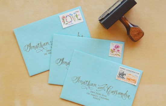
We commissioned Betsy Dunlap to letter the names and other calligraphy elements.  The typeface used for the main text is Verlag, which is very close to what was used on the Queen Mary’s original menu.

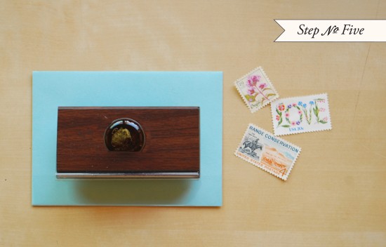
The die cut idea came up when we both wanted an small element of surprise.  Instead of using an enclosure folder or inner envelope, we agreed on a folded card with cut outs showing just a peek of the ship and invitation text.  Cruise ships of the time period are known for their telegraphic communication, but since this was to be mailed, Morgen suggested using “Postalgram.”  It gives reference to the old form of communication but with our own twist.

The rehearsal dinner was held at an old theater in Long Beach, California.  An old movie was shown along with a casual dinner.  Since the wedding was a destination wedding, the dinner invitation needed to be included with the invitation mailing.  Printed in coral, the stylized waves were brought back along with a bit of Betsy’s calligraphy.  Margie found these fantastic “crown” tickets that we incorporated into the design.  Thank you cards were designed by Betsy with her signature ribbon illustration.

I couldn’t get enough of the ship images and wave pattern, so for wedding favors, I formatted the illustrations to fit on round 4″ coasters, with two different designs.  The coasters were wrapped in sets of 6 (3 of each design) with orange and white baker’s twine and placed at each place setting at the reception.  My mom and aunt threw a bridal luncheon the day before the wedding and commissioned me to print a favor for that, so the ship and waves were again printed, here on Moleskines with squared/grid pages in honor of Margie and Morgen’s architecture background.

The escort card tags were letterpress printed and numbered on kraft paper tags with waves printed in coral at the bottom, a reinforced kraft circle around the hole, and tied with orange and white baker’s twine.  Morgen graciously volunteered to type everyone’s name and hometown with his vintage Underwood typewriter.

Thank you so much Kathryn!

Design and Printing: Blackbird Letterpress

Calligraphy: Betsy Dunlap

Blackbird Letterpress is a mem­ber of the Designer Rolodex – you can see more of their beau­ti­ful work right here or visit the real invi­ta­tions gallery for more wedding invitation ideas!

Photo Credits: Ben Christensen Photography

Olivia’s Country Carnival-Inspired Birthday Party Invitations

Sarah from The Happy Envelope sent over these adorable invitations that she created for a country carnival-inspired birthday party.  Such a fun theme for a fall birthday celebration!  The double-sided invitations were printed in pretty orange and green inks, then placed in mailing boxes and tied up with a ribbon and lollipop.  So cute!

From Sarah: These invitations were letterpress printed on ultra-thick, luxurious Crane 4-ply paper in a bright orange ink on the front and a mossy green on the back.  The invitations were placed into chartreuse mailing boxes from Paper Source filled with festive, colorful foam balls and then tied with a pumpkin lollipop and cheery ribbon.  An antique pumpkin illustration paired with vintage-style type and a woodgrain pattern all come together for a perfect country carnival mood!


Thanks Sarah!

Photo Credits: The Happy Envelope

New Giveaway! Custom Journals from Paper + Cup

I’m super excited about today’s giveaway – it comes from one of my favorite design studios, Paper + Cup!  I just love their amazing wedding invitations, stationery, and other paper goodies.  Paper + Cup’s artistic director recently moved to Paris and they’ve launched a new blog, Paper + Cup Sketchbook, to chronicle their inter-continental adventures in New York and Paris, and to keep track of inspiration sources and ideas.  To celebrate the new blog launch, Paper + Cup is offer­ing two lucky win­ners the chance to win three of their signature gold foil silhouette journals!

Paper-Cup-Journal-Giveaway

These gorgeous journals are available in assorted colors, individually hand bound with fine Italian paper.  The inside pages are blank, perfect for writing or drawing.  The covers can be customized with your choice of text and silhouette image.

To enter, just leave a comment below with something that has inspired you recently!  You’ll have until 11:59 p.m. EST on Fri­day, October 14 to enter – bonne chance!

Photo Credits: Paper + Cup