Priscilla + Daniel’s Rock n’ Roll Vintage-Inspired Wedding Invitations

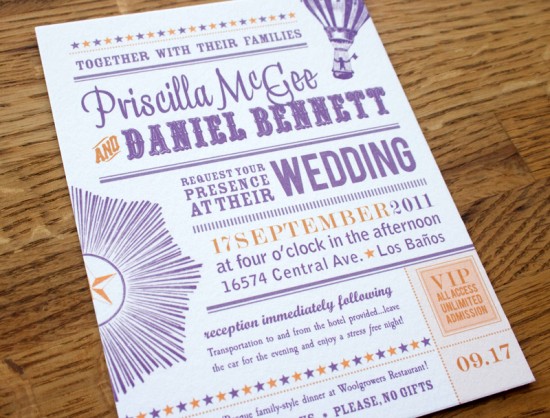
I’ve heard of some interesting sources of inspiration, but until today I don’t think I’ve ever heard of someone being inspired by a FedEx form for their wedding invitations!  Priscilla and Daniel worked with Elise from Sweet Penelope to create a vintage-inspired invitation suite with a slight rock n’ roll vibe, all based around a purple and orange color palette – and yes, inspired in part by a FedEx form!

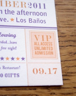
From Elise: Priscilla wanted something vintage, playful, and bold, while using her colors, purple and rusty orange.  She sent me a link to a FedEx invitation template to show me the direction she had in mind.  She also wanted to avoid anything frilly or cutesy, so I chose elements like the hissing lion’s head, sunburst, and hot air balloon, that were dynamic and strong.  Priscilla and Daniel volunteer together at rock concerts, so I tried to capture the spirit of a music festival (without being rock’n’roll specific, as requested by Priscilla) and incorporated the VIP/all access stub in the corner.


I designed each piece differently to avoid being matchy-matchy, but the palette and retro vibe are consistent throughout and help pull the suite together.  The invitations were digitally printed in my studio on 100% cotton 300 gsm paper.

Thanks Elise!

Check out the Designer Rolodex for more tal­ented wed­ding invi­ta­tion design­ers and the real invi­ta­tions gallery for more wedding invitation ideas!

Photo Credits: Sweet Penelope

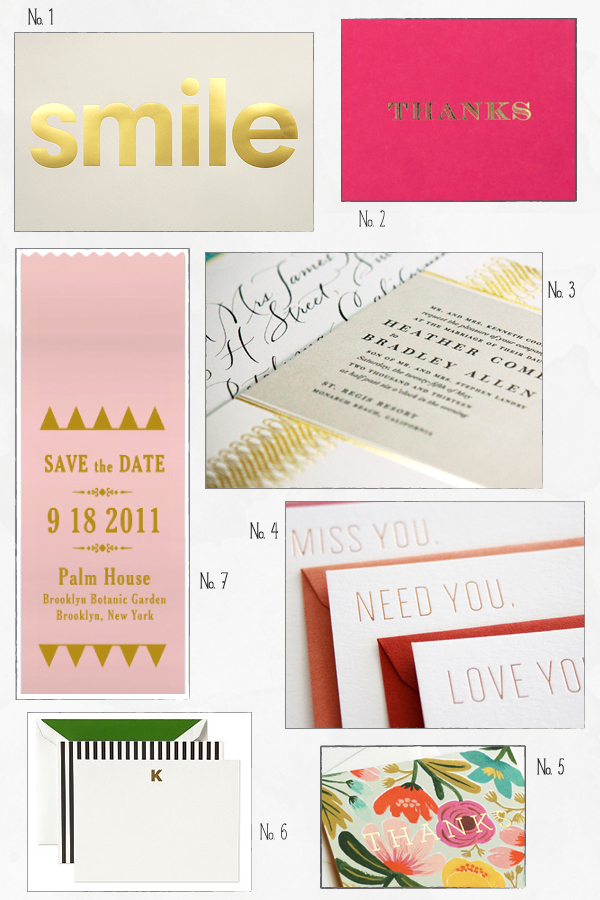
Inspired By: Gold Foil

The resurgence of gold foil is hands down one of my favorite design trends this year.  Foil comes in a myriad of colors (as you saw from Fig. 2 Design Studio on Monday), but gold foil will always have a special place in my heart.  Gold foil can be a big and bold statement or a subtle detail depending on the project and design, but it looks great on everything from wedding invitations to baby announcements to business cards and everything in between.  Gold foil also looks fantastic whether on its own, paired with a classic black and white design, or combined with lots of bright color!

No. 1 Hayley & Lucas via the Keep Calm Gallery; No. 2 Sugar Paper; No. 3 Dauphine Press; No. 4 SeeSaw; No. 5 Rifle Paper Co.; No. 6 Kate Spade; No. 7 Earmark Social Paper Goods

If you’re curious, you can learn more about the foil printing process right here!

Modern Open House Invitations by Studio Carta + Albertine Press

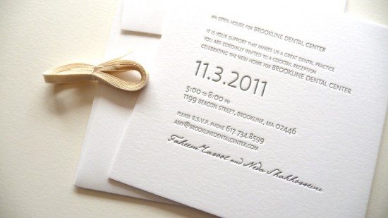
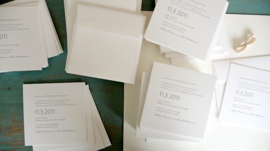
If only all office party invitations were this pretty!  Angela from Studio Carta created these beautiful letterpress invitations for a corporate cocktail reception – with only a week of turnaround time!  Angela partnered up with Shelley from Albertine Press for the letterpress printing, creating an elegant and modern design that suited the client without being overly formal.

From Angela: I was commissioned to design an Open House invitation for a new Dental Center, with only one week of time to complete the project!  When you factor in all the elements of letterpress printing, beyond the design, including ordering the polymer plates, shipping them to the printer, time for the actual printing, and then finally shipping everything back to my studio for the delivery – I was left with only one day to design receive final approval from my client!

The client was looking for elegant, modern invitations, and a dark gray color to match their logo.  I chose 100% cotton Lettra paper and square envelopes for its elegant and soft texture.  The 2-ply paper add a lovely tactile quality to the overall design, and the deep letterpress impression was very visible.  For the typography, I chose a contemporary sans-serif typeface designed by Dutch Lucas de Groot, paired with a calligraphic font that I used for the owners’ names to make the design a bit less formal.

Thanks Angela!

Design: Studio Carta

Letterpress Printing: Albertine Press

Photo Credits: Angela Liguori | Studio Carta

Giada + Davide’s Kraft Paper and Lace Wedding Invitations

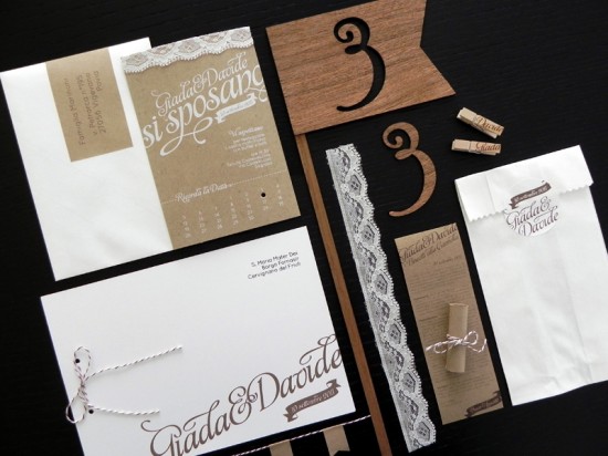
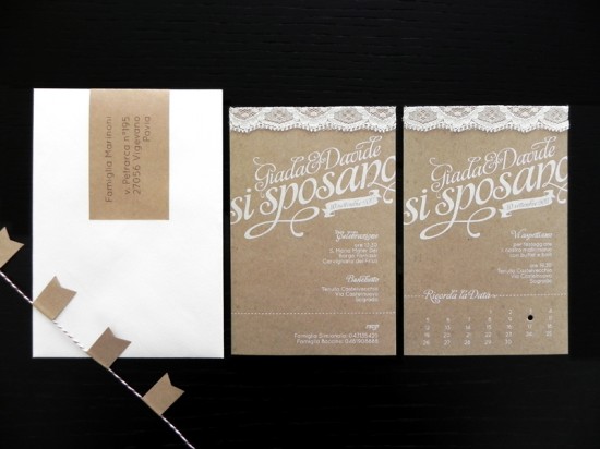
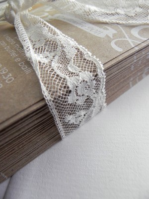
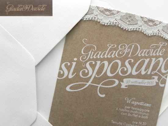
As much as I love bright pops of color, I’m just as easily blown away by a beautiful wedding invitation suite done all in soft and natural colors.  Valentina from Cut and Paste created these beautiful invitations for a recent wedding in Friuli, Italy, combining kraft paper, lace, and even lasercut wood into the wedding invitations and day-of stationery!

From Valentina:  Giada and Davide wanted a soft boho style wedding with lots of little flags and banners.  I created an invitation suite with a natural color palette, incorporating lace, kraft paper, and wood.  The kraft paper invitations were screen printed in white ink with a lace overlay at the top, then paired with white envelopes and kraft paper wrap-around address labels.

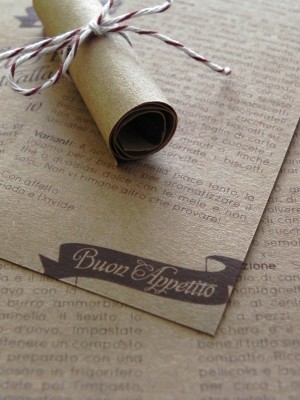
For favors, we printed copies of Giada and Davide’s favorite biscuit recipe on kraft paper and bound them to small jars of cinnamon.


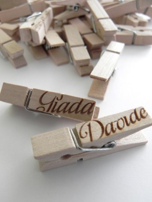
Lasercut wooden flags served as table numbers, while laser engraved clothespins functioned as place cards.


Thanks Valentina!

Check out the Designer Rolodex for more tal­ented wed­ding invi­ta­tion design­ers and the real invi­ta­tions gallery for more wedding invitation ideas!

Photo Credits: Valentina | Cut and Paste

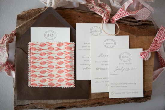
Lauren + Daniel’s Country Elegance Fabric Pocket Wedding Invitations

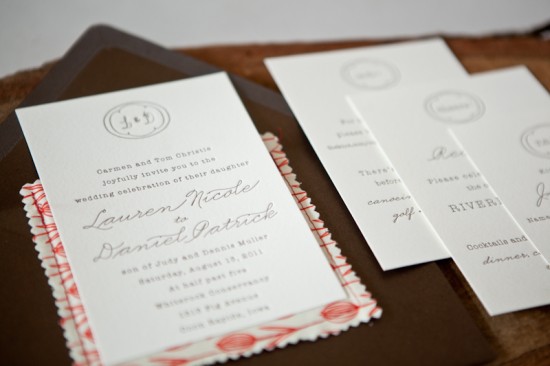
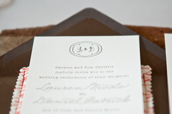
Happy Monday everyone!  We’re starting the week off with a beautiful suite of wedding invitations from recent bride Lauren – Lauren worked with Lesley from Inclosed Studio for both the design and letterpress printing of her wedding invitations.  I love the clean and simple invitation design paired with fabric pockets and a few bright pops of color!

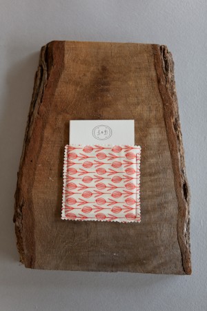
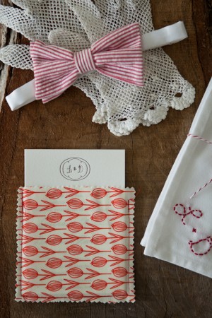
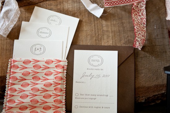
From Lauren: Our wedding took place in a barn in rural Iowa.  We were going for classic country elegance with lots of DIY details.  Lesley at Inclosed Studio blew us away with her creativity and attention to detail.  The invitations were composed of three detail cards and an RSVP postcard – all letterpress printed by Lesley.  A fabric pocket encased the cards perfectly.


We loved the combination of the elegance of the letterpress design paired with the rustic hand-sewn pocket.  Several fabric patters were chosen for the pocket in keeping with our wedding colors of red and tan.  The variety of fabrics and patterns made each invitation different and special.


The fabric was a huge inspiration for the rest of our decor decisions.  I took the extra pocket fabric mixed with other patterns to create banners for the eating area.  They looked so pretty blowing in the breeze!  The day was full of love and laughter and we are so thankful to Lesley for setting the tone for a perfect day with these beautiful invitations.

Thanks Lauren!

Design and Letterpress Printing: Inclosed Studio

Check out the Designer Rolodex for more tal­ented wed­ding invi­ta­tion design­ers and the real invi­ta­tions gallery for more wedding invitation ideas!

Photo Credits: dpmuller photography