Ed Note: I can’t imagine a better way to sign off for the holidays than with this beautiful post from Emily – with real cards carefully picked out by very real people. I’ll be back next week with my annual “best of” round up and a couple of New Year’s posts, and with brand new content on January 5! I hope you all have a wonderful holiday! xoxo – Nole
It’s Christmas Eve! I love this day almost more than Christmas itself, all of the anticipation of tomorrow just bursts today. But I’ll be honest, this shop owner is also very, very ready to settle down for a long winter’s nap. I’ve had a wonderfully full and exciting year, due in large part to many of you who egg me on and share the best conversations and questions. This will my fifth holiday owning Clementine. I know that holiday magic waits behind so many tiny moments: sneaky emails, hiding presents, surreptitious returns to purchase that little gift a loved one adored. I’m totally exhausted, but equally hooked on the bits of magic that flutter through this season, I hope wherever you are, a bit flutters to you. ~ Emily of Clementine.
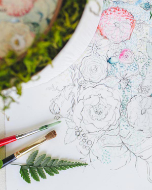
 Illustration by Emily McDowell for Oh So Beautiful Paper
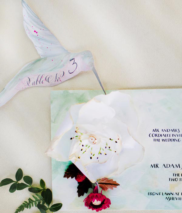
In the past, I have asked customers to hold their card up as they purchase it and tell me where the cards are headed. This year, we are all so rushed, I asked instead for a simple image of the card and story about it’s recipient.
From Nan: I used the box set of cards to send a little bit of Middlebury love to some of my best friends who go to other colleges who I haven’t seen in a while. It’s the perfect personalized note to let them know I’m thinking of them this Christmas season.
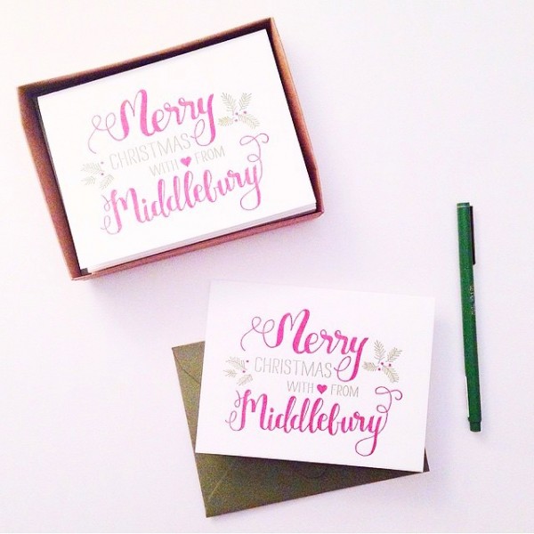
{Merry Christmas With Love from Middlebury ~ Custom Designed cards by Parrot Design Studio}
From Susan: I’m sending this to my Manhattan friend. We have sort of a tongue in cheek “city mouse/country mouse” joke so I love sending her cards that remind me of her hustle and bustle neighborhood. She, in return, sends me cards of farm animals and generally bucolic images…
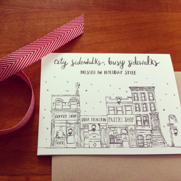
{Swiss Cottage Designs Christmas on Main Street}
From Chenoa: This card is going to one of our favorite people who cares for our daughter every day. We truly couldn’t live without her.
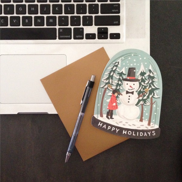
{Rifle Paper Co. Snow Globe}
From John: I’m putting together a collection of cards from your store for my wife. She’ll love them all, these are especially beautiful.
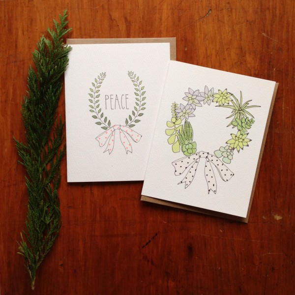
{Peace Wreath and Succulent Wreath by Hartland Brooklyn.}
From Sas: I sent this postcard to my dear friend in Brooklyn; she’s the only person I know who gets into the holidays the way I do! I love that the scene on the card feels like a snapshot of rural Vermont!
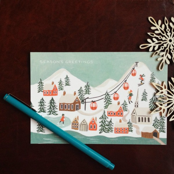
{Rifle Paper Co. Holiday Scene Post Card}
From Emily (that’s me!): I chose these diagramed snowmen for my son’s preschool teachers and friends because I love that they take the jolly holiday spirit of a snowman and break them down into their fun little bits. They remind me of all of the toddler activities his teachers so thoughtfully design – taking each craft piecemeal and creating something wonderful. 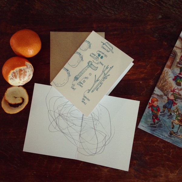
{Girls Can Tell Snowman}
From Meg: My husband and I don’t give each other gifts for the holidays. Instead, on Christmas Day we leave notes for each other and treat ourselves to a delicious homemade chili.
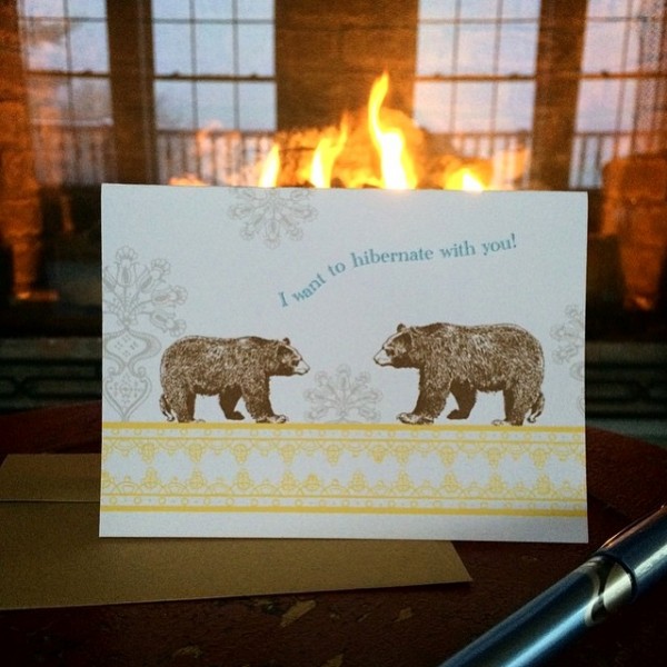
{Pearl & Marmalade’s I want to hibernate with you!}
Sarah purchased a little stack of cards for her employees, a mix of holiday and thank you cards. Like many of you, Sarah is running a small business and knows that the greatest holiday sentiment at this exhausted holiday moment is thanks! From Sarah: This card, among the others, is for the amazing hard work my employees did this year. We would have never gotten here without every one of them.
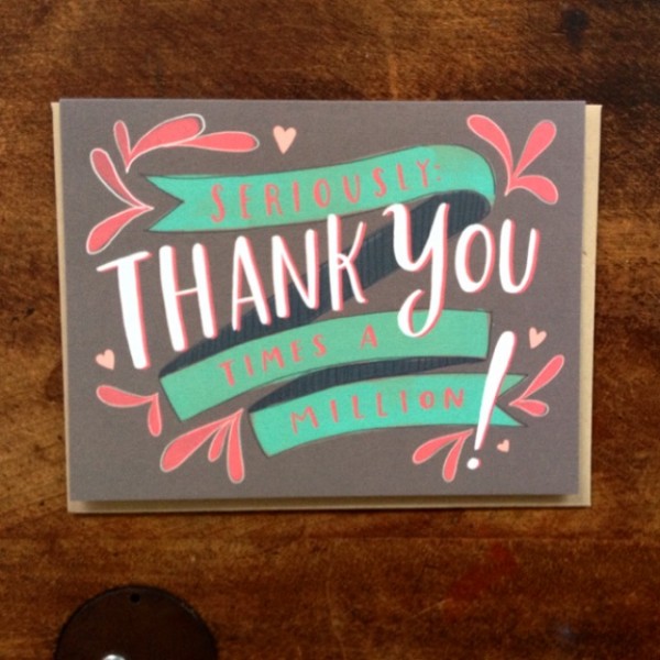
{Seriously Thank You Times a Million from Emily McDowell}
I’ll take a tiny breather here to say that this final story is a bit more tender. In other words, it makes me cry every time I read it. But in a good way, and I hope it hits you in a good way too. Stephanie and I have followed each others lives, without ever meeting, after becoming far-away friends on instagram almost three years ago. I tucked a card in to her order last year with no idea how it would follow their life story. This year has been momentous for Stephanie, I am lucky to be the tiniest snowflake in her story and to get to watch this family grow. From Stephanie: Last year I admired the Dear Santa stationary from afar. My husband and I didn’t have children, and at the time, weren’t planning to, but the idea of it was so sweet. I made an order from Emily’s shop and she slipped the Dear Santa card into my order. I squealed when I opened it. It was precious.
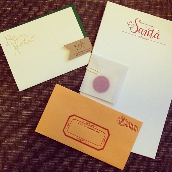
{Dear Santa by Printerette photographed here with another favorite, Parrot Design’s From the Desk of Santa}
When we unexpectedly found out in January that I was pregnant I pulled the Dear Santa Letter out of the Christmas stuff. I wanted to have it for our baby girl’s first Christmas. We named her Wright. At 18 weeks she was diagnosed with a chromosomal abnormality that was terminal. We spent the next 6 weeks waiting to go into labor though we knew she wouldn’t be born alive. For many reasons I never got around to putting the Dear Santa letter away. In late summer we had another unexpected event; a distant family member called, asking us to adopt her 2 year old son. We said yes.
On September 14th, C landed at JFK to the waiting arms of my husband. As we began Advent, I found the Dear Santa letter among Wright’s things, and with profound awareness of how complex and fantastic the year had been my husband, C, and I sat down to write our first letter to Santa as a family. Far more tearfully and joyfully than I expected – we mailed it from Macy’s on 34th Street – with our deep grief in our hearts and our overwhelming miracle in our arms.
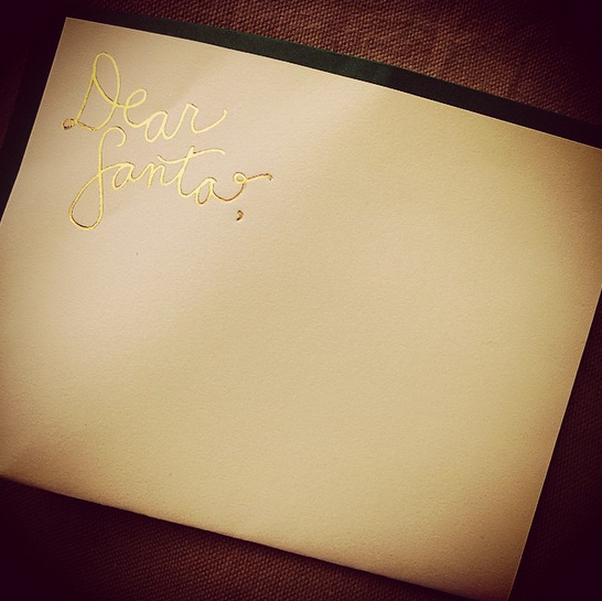
{Dear Santa, Printerette Press)
Wherever you are I hope your hearts are full and your holidays are bright. Even if you’re slogging through some of your days, I hope you catch a little bit of the magic too. May you hug, laugh and create as much as possible. Merriest of holidays to you all and a Happy New Year! xoxo, Emily


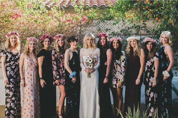
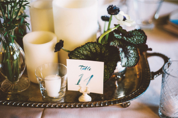
 Image by