Best of 2011: Neon Wedding Invitations

2011 was a good year for neon – from Fig. 2’s collection of neon greeting cards to business cards and calendars to wedding invitations.  Today I’m highlighting two favorite wedding invitations that incorporated bright pops of neon, although in very different ways.  First up, the wedding invitations of Arley-Rose and Morgan from Ladyfingers Letterpress.  I fell in love with these gorgeous large format wedding invitations from the first moment I saw them, from the beautiful hand lettering to the cute “Bits of Knowledge” information booklet.

Check out Arley-Rose and Morgan’s wedding invitations right here!

Next up, designer Kate Gabriel incorporated bright neon envelopes into Alecia + Jon’s graphic wedding invitations.  The colorful envelopes complemented the black and white invitation suite – perfect for a modern loft wedding!  In addition to the neon details, I love the fun word bubble details and the fact that these invitations could be folded into a triangle shape to sit on a desk or console.


Check out Alecia and Jon’s wedding invitations right here!

Check out the Designer Rolodex for more tal­ented wed­ding invi­ta­tion design­ers and the real invi­ta­tions gallery for more wedding invitation ideas!

Photo Credits: Ladyfingers Letterpress (Arley-Rose + Morgan); Kate Gabriel (Alecia + Jon)

Best of 2011: Christine + Ian’s Woodland Wedding Invitations

I’ll admit, it was realllly hard to come up with a list of favorite wedding invitations to highlight this year – there were so many amazing invitations!  But, as I was going through the posts from the last year, one clear frontrunner emerged – Christine and Ian’s amazing woodland wedding invitations.  After deciding on a wedding venue in the woods near Ian’s childhood home, Christine and Ian put an incredible amount of thought and creativity into their wedding invitations – from the amazing lasercut pop up details to the kraft paper enclosures (including a cool field guide with sketches of local wildlife).  Breathtaking!

See the rest of Christine and Ian’s wedding invitations right here!

Check out the Designer Rolodex for more tal­ented wed­ding invi­ta­tion design­ers and the real invi­ta­tions gallery for more wedding invitation ideas!

Photo Credits: Christine and Ian

{happy holidays!}

Okay folks!  I’m heading out to prepare for our loooong drive to upstate New York.  Next week I’ll be revisiting some of my favorite wedding invitations, save the dates, and other content from 2011 (leave a comment below if you want to nominate any favorites!) before returning with new content in 2012.  I hope you all have a wonderful holiday!  But in the meantime…

…a few links for your weekend:

This week on Oh So Beautiful Paper:

Photo Credit: Brunch at Saks

On the Road with Crow & Canary: Monograham, Broadway Paper and GREER

You might remember the awesome guest posts from Carina of Crow and Canary this past April – she’s a fabulous independent stationery rep who spends much of her time touring the country talking about beautiful stationery.  Well, today Carina is back with a profile of three wonderful stationery boutiques in the Midwest.  Welcome back Carina!

Hello there!  Carina from Crow and Canary here.  It’s my sincere pleasure to return to OSBP with a guest post profiling some of the finest stationery boutiques in the Midwest.  I think you’re going to love what you see – I was truly in paper heaven!

::MONOGRAHAM::

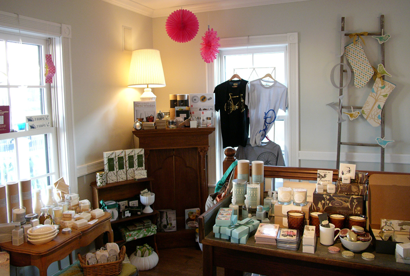
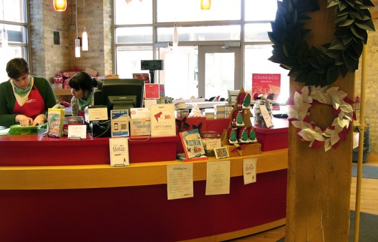
Let’s start off by taking a peek into Monograham Paper & Gifts in Delafield, Wisconsin.  This stunning boutique is run by Amy Graham Stigler, creative director and designer for Smock.  Every corner of Monograham held some lovely treasure.  It’s certainly the type of shop that you could plan to spend an afternoon shopping in.  I only wish that I could visit regularly!

A real treat to see the shop decked out for the holidays!


Left: Washi tape adorned bags were set up for an upcoming craft class that Monograham has recently begun offering.  Aren’t they adorable? Right: Some of the amazing wedding invitations available at Monograham.

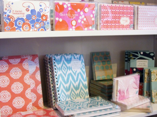
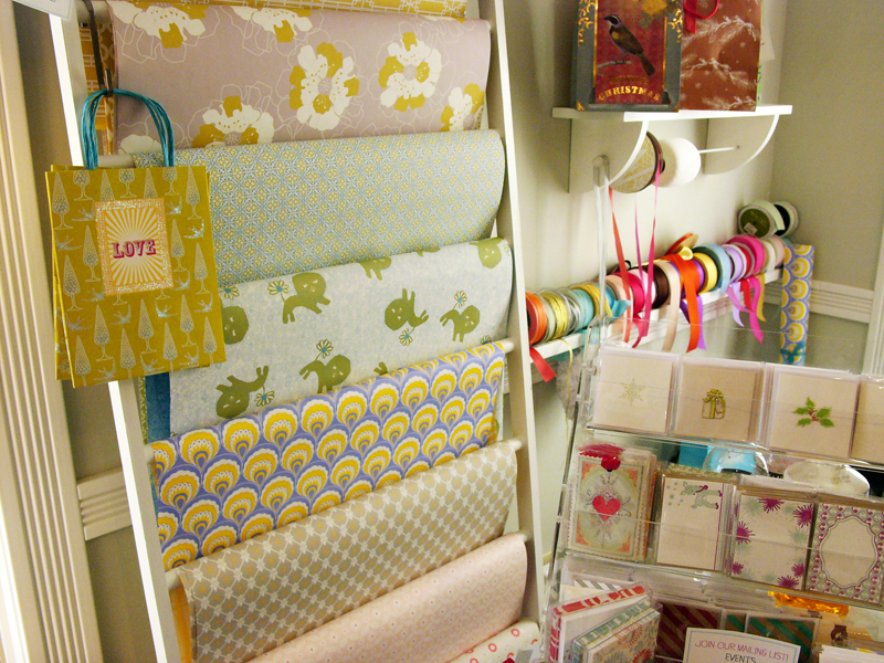
A bright and colorful assortment of paper goods, including: Smock, Susy Jack* & Paper Source.

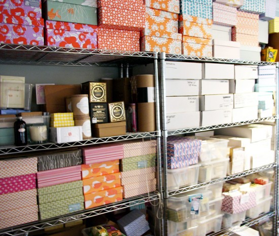
A peek into Amy’s adjacent studio space: Breathtaking wall of smock gift boxes, they make quite an impression.

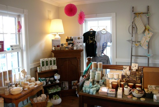
A bit of designer’s inspiration, such a cozy space.

::BROADWAY PAPER::

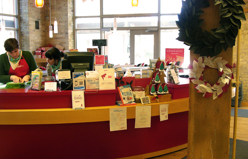
Broadway Paper has been on my radar for some time, I was so excited to finally have an opportunity to visit, as well as to enjoy a few precious minutes with Kate Strzok, Broadway Paper’s owner and fearless leader. Kate is always a delight! Broadway Paper is located in Milwaukee, Wisconsin’s Historic Third Ward and is surrounded by other great boutiques and cafes. I loved getting to ogle BP’s creative merchandising and handmade touches. I’m still obsessed with the paper log display below, so very clever.

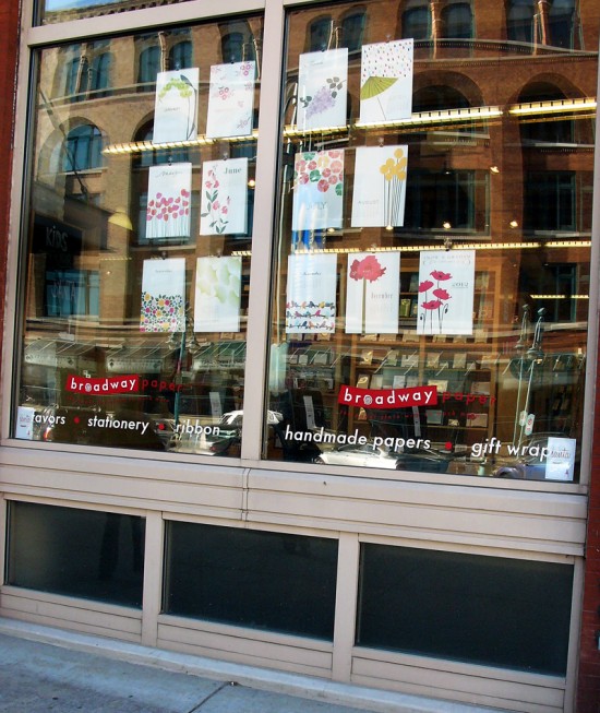
Near the entrance to Broadway Paper: Snow & Graham 2012 calendar window display.

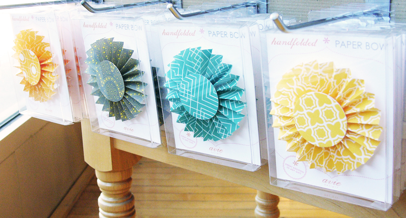
I couldn’t resist one of Avie Design’s sweet hand-folded bows; luckily it made it home unscathed.

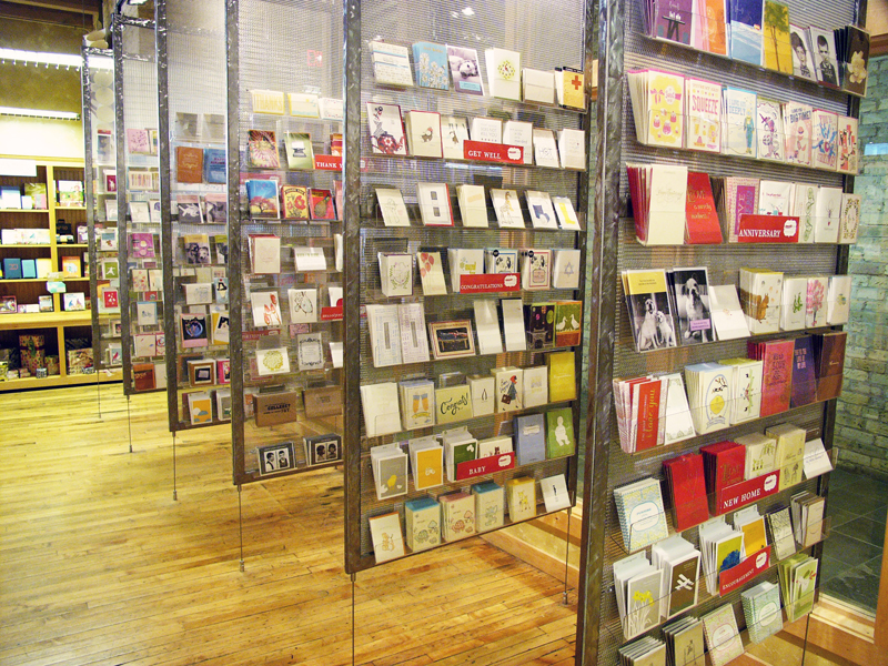
These modern card racks are a sight to behold, not to mention all the cute cards that fill them.

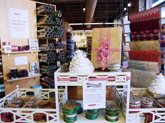
A display of Cream City Ribbon, an eco-friendly ribbon manufacturer and Milwaukee based company.

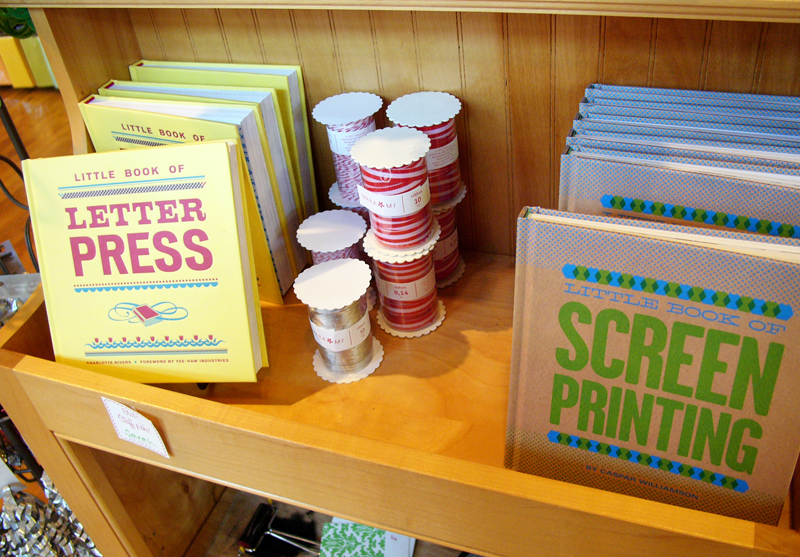
Little Book of Letterpress and Little Book of Screen Printing sandwiching Mara Mi ribbon.

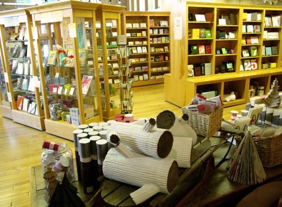
Very cute display, including the infamous handmade cardboard logs that I so admire.
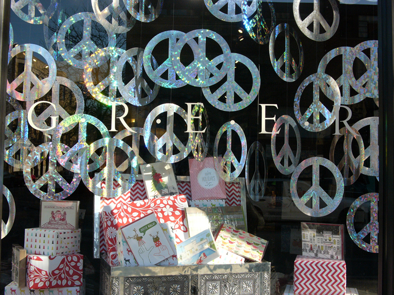
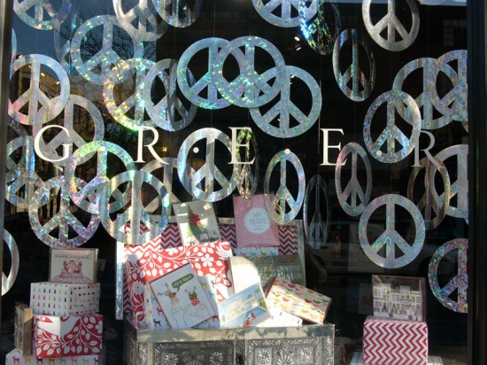
::GREER CHICAGO::

GREER Chicago and proprietress, Chandra Greer, are true legends in the stationery world. I’m fortunate to count Chandra as a friend and mentor and I know that her positive attitude and giving nature have been paramount for many emerging stationers over the years. GREER is beyond my wildest dreams fabulous. It’s very clear that Chandra hand picks the merchandise and works with an above average staff to maintain stunning presentation; you don’t have to take my word – have a look yourself…


Left: This Hammerpress calendar makes me think of pink lemonade, love! Right: I only wish I’d had time to look through every drawer, so many hidden treasures!


Left: Luscious ribbon in a vintage card catalog. Right: GREER’S Love Civilettes are perfect for “Spontaneous Adoration.”

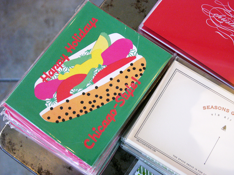
Perfect Chicago holiday greeting from La Familia Green.

A sincere thank you to Amy, Kate and Chandra for finding time to meet with me and allow me to come into their lovely spaces to take photographs, not always the easiest feat during a weekend in December! Their grace and generosity are much appreciated. And if you see something that you’re dying to get your hands on, both Broadway Paper and GREER Chicago offer comprehensive online shopping.

And last, but far from least, thanks to my traveling companion and partner in paper crime, Kimberley Yurkiewicz.

Photo Credits: Carina Murray

“On the road with Monograham, Broadway Paper and GREER” is a guest post by Carina Murray of Crow & Canary

Kendra + Robb’s Rustic Woodgrain Wedding Invitations

These gorgeous and woodsy wedding invitations come to us from Sally at La Happy, designed for an outdoor wedding in Washington state this past summer.  Sally kept the actual invitation simple and relaxed, bringing in hand stamped website cards and beautiful vintage stamps (not to mention stunning calligraphy) to pull the entire invitation suite together.

From Sally: I created this invitation for an outdoor rustic wedding in Winthrop, Washington, which is in the backwoods of Washington State.  The inspiration was the groom’s love of all things outdoors: camping, hiking, etc.  The bride and groom wanted a rustic wedding with a non-fussy, vintage feel, so we tried to incorporate that into the paper design.

The colors of the wedding were really earthy.  Mustard yellow was a key color, then we brought in the stone gray as a neutral color to complement the yellow.  I created the “deer logo” for the wedding and then made a custom stamp out of it and stamped all of the paper pieces.  The invitation was printed on faux bios (a faux wood grain) paper, to relay the feel of the woods and the outdoors.


I created custom stamps to look like an industrial time stamp to use for the date and time of the wedding.  The bride and groom wanted to make sure the invitations did not feel fussy, so we made sure everything had a more industrial, vintage feel.  The RSVP card is a postcard with vintage stamps.  We worked with the lovely (and SO helpful) Virginia Sauder of Verde Studios to find the perfect vintage postage to fit the set.

Thanks Sally!

Invitation design + calligraphy: La Happy

Vintage Stamps: Verde Studio

Check out the Designer Rolodex for more tal­ented wed­ding invi­ta­tion design­ers and the real invi­ta­tions gallery for more wedding invitation ideas!

Photo Credits: La Happy