Every morning this week, I’m running a series of guests posts about different printing methods – so if you’ve ever wondered why certain printing methods are best for certain kinds of designs (or cost more than others), this is for you! You can read the previous installments covering digital printing, engraving, screen printing, letterpress printing with antique type, and foil stamping all right here. Today Kim and Kyle from Baltimore Print Studios are here to walk us through modern letterpress printing!
Hello OSBP! We’re Kim and Kyle from Baltimore Print Studios, a public-access letterpress and screen printing studio where we also print commercially and for ourselves. We’re thrilled to share the process of letterpress printing with you and how things work in our shop.
What is Letterpress?
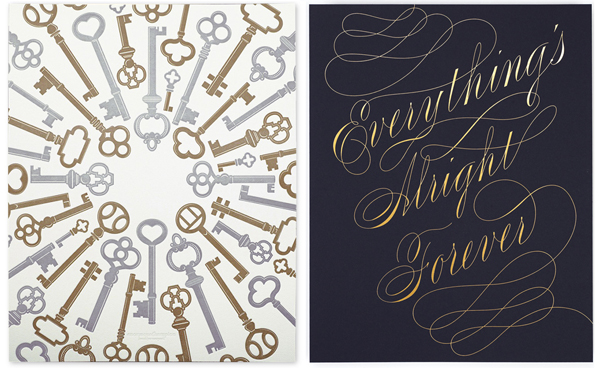
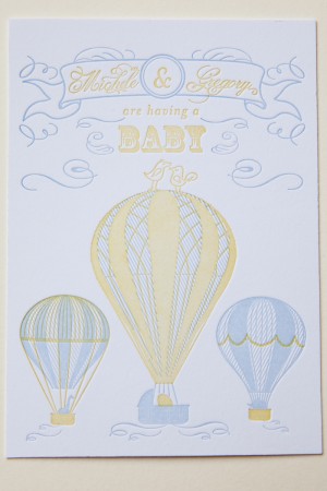
Letterpress printing has become the go-to printing technique for wedding invitations, greeting cards, and business cards for anyone hoping to make an impression (pun intended) on the recipient. Today’s cottage industry of letterpress printers has been built on the shoulders of 100 years of printing industry, starting around the late 1800s. It’s easy to forget that what we treasure today as an artisan product, made by a well-trained craftsperson, was once known simply as printing.
What began with hand-set wood and metal type (read more about this from Jen of Starshaped Press here) has become an industry centered around the photo polymer plate. Designing for letterpress today begins on a computer, and as such, new fonts, embellished ornaments, graphics, patterns, and complicated multi-color designs can be produced with relative ease. The printing part is still by hand, one at a time.
The Printing Process
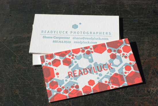
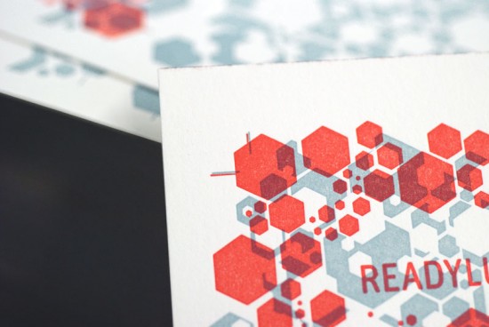
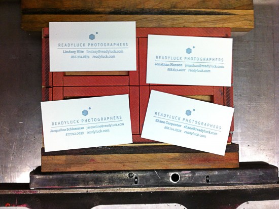
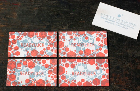
The images below walk you through the process of printing 2-color, double-sided business cards on a Vandercook SP-20 printing press. They were designed for a wedding photography company called Readyluck, by Baltimore designer Christopher Clark. These cards were printed on Crane Lettra 220 lb Pearl White cotton paper.
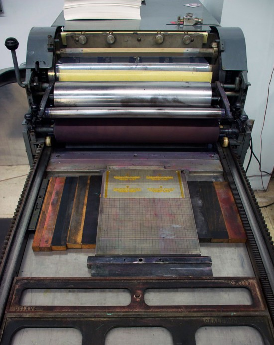
This is the Vandercook SP-20. In this press’s first life it probably pulled proofs of pages for a daily newspaper. Today, these presses are sought after for their quality and large printing size.
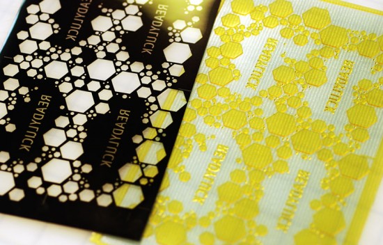
Polymer plates are produced using a photographic process. The digital design is output to a film as a negative (left), and then exposed to a polymer plate using UV light (right). The polymer plate is made of a light-sensitive, water-soluble plastic with a clear backing. The portions of the plate that are exposed through the clear parts of the film hardens, and what is not washes away. What remains is a raised surface in the shape of the design. A separate plate is produced for every color being printed, and the paper is run through the press at least once for each color in the design. We send our designs to Boxcar Press, where they transfer your digital design onto a polymer plate. These plates match a gridded Boxcar Base, a machined aluminum plate that raises the plate to type high.
The plate is affixed to a machined metal base which is in turn locked into the press.
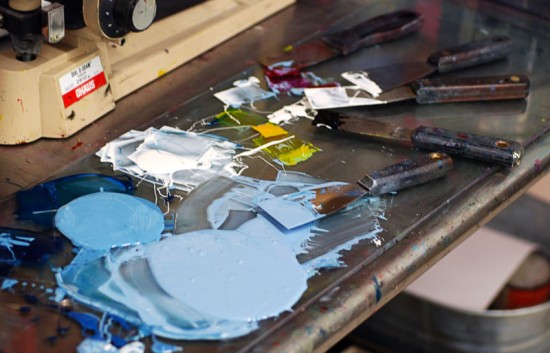
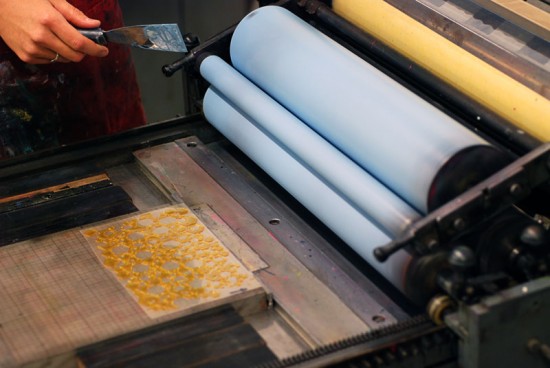
Ink is mixed by hand. When possible, ink can be weighed out to match a specific color recipe, but in our shop we mix everything by eye, often matching to a specific Pantone color. We use oil-based, lithography inks.
The press is inked. Even the inking process has to be done carefully. Too much ink will produce a sloppy print. Too little, and the color will not be solid.
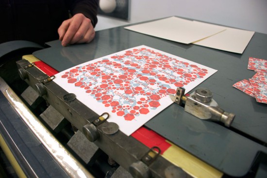
Printing begins. This plate prints an area half the size of the sheet. The sheet of paper is hand-fed through the press twice, once from each end of the paper. This produces 8 cards per sheet in a process called a work-and-turn. The 220 lb Crane Lettra paper, double than the standard 110 lb weight (and more than twice the cost), allows for a deeper impression on both sides, which was desired by the client.
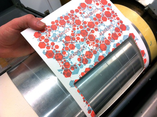
The ink is allowed to dry and the next day the press is inked up in red. Differences in pressure and the amount of ink can dramatically affect the printed color. Adjustments are made to produce the desired color, and the print run is checked periodically to be sure the color is consistent. For this particular run, the red ink ran out relatively quickly and frequent re-inkings were required.
All presses have a system of registration. Consistent placement of every print on every sheet is a must for quality printing. This design, like most we produce, has cross-hair trim marks made into the plate that serve not only as cutting guides, but printing guides as well. After this print run dried, a third printing run was made on the reverse of the pages.
Cutting! Printing is finished and the job is ready to cut. We usually die cut our business card jobs, even when the job doesn’t call for an unusual shape. Our business card die cuts four cards in a single pass. The press is outfitted with a metal die-jacket for protection, and the die itself is made up of metal cutting blades surrounded by protective foam pads. (Ed. Note: We’ll be covering die cutting in greater detail tomorrow!)
Each pass on the press cuts four cards. While this is an extremely inefficient press for die cutting, its accuracy far out-weighs speed for us.
The design for these cards utilized a random, non-repeating pattern and intentionally transparent colors. The four cards together create one overall design, but each business card is unique.
Tips and Advice
Letterpress printing takes some time. In our shop, each page is fed by hand, and each color of a print job can be several hours on press from start to clean-up. Add to that designs that need to be sent out to be made into plates. A two-week turn-around is common.
Letterpress excels at printing fine type and line work. Letterpress printing is not ideal for solid fields of color. Most large solid shapes result in the color printing ‘salty’, a term used to describe the texture and color of the paper showing through the ink. Your printer can tell you what is possible on their equipment.
While letterpress was never intended to be printed with a dramatic impression, or deboss, into the paper, it is often the most desired feature today. Printing like this will quickly damage wood and metal type, but polymer plates are more durable (and more easily replaced). Certain papers show off this impression better than others.
Thanks Kim and Kyle! You can learn more about Baltimore Print Studios right here.
Photo Credits: Baltimore Print Studios

