Mennat + Omar’s Bilingual English Arabic Wedding Invitations

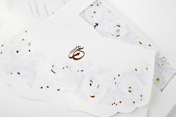
These romantic floral wedding invitations come to us all the way from Dubai! Mariam from Natoof Design created bilingual invitations with a sophisticated light blue and gold color palette, combining English text and Arabic calligraphy – and lots of gold foil. So pretty!
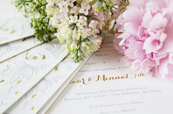
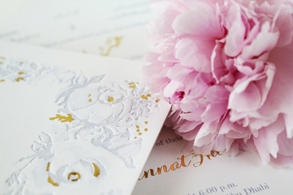
Bilingual-English-Arabic-Parisian-Chic-Wedding-Invitations-Natoof10

From Mariam: The bride and groom wanted a Parisian chic invitation with peonies and roses, and for the color palette to reflect seductive light blue hues with a light romantic touch.

Bilingual-English-Arabic-Parisian-Chic-Wedding-Invitations-Natoof2

Bilingual-English-Arabic-Parisian-Chic-Wedding-Invitations-Natoof6

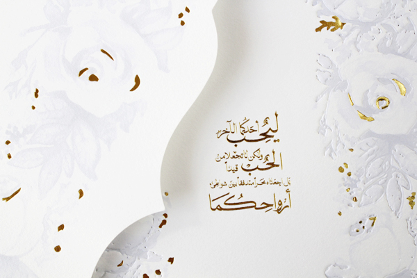
The invitation is bilingual with Arabic calligraphy and English typography, with an Arabic calligraphy monogram on the envelope flap. On the back of the invitation is a quote by Gibran Khalil Gibran which reads in English as following: “Love one another, but make not a bond of love. Let it rather be a moving sea between the shores of your souls.”

Bilingual-English-Arabic-Parisian-Chic-Wedding-Invitations-Natoof4

Bilingual-English-Arabic-Parisian-Chic-Wedding-Invitations-Natoof11

The bride expressed her love for the letterpress style; however, letterpress printing isn’t available in Dubai and generally in the Middle East region. So with the little time that we had before the wedding we worked with our local printer to mimic letterpress results with offset equipment.

Bilingual-English-Arabic-Parisian-Chic-Wedding-Invitations-Natoof5

Bilingual-English-Arabic-Parisian-Chic-Wedding-Invitations-Natoof7

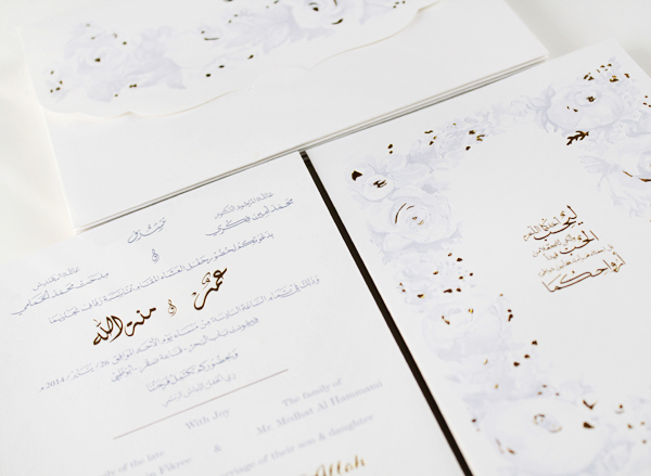
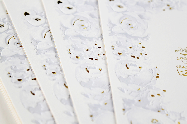
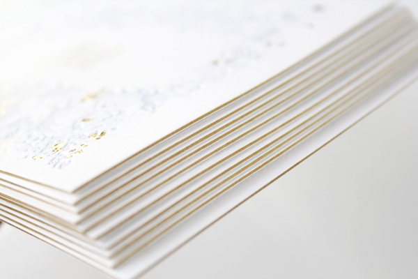
We duplexed the cotton paper with a layer of gold paper sandwiched between two layers of white cotton paper. The design incorporates gold foil, embossing, and debossing to achieve a dream wedding invitation suite.

Bilingual-English-Arabic-Parisian-Chic-Wedding-Invitations-Natoof9

Bilingual-English-Arabic-Parisian-Chic-Wedding-Invitations-Natoof12

Thanks Mariam!

Check out the Designer Rolodex for more tal­ented wed­ding invi­ta­tion design­ers and the real invi­ta­tions gallery for more wedding invitation ideas!

Photo Credits: Natoof

DIY Floral Cocktail Party Coasters

Spring is here, and after a far too long winter, I say bring on the flowers! This floral coaster project screams warm weather and delicious cocktails. While I used a little leftover wallpaper from a home decor project, grab any beautiful floral paper you can get your hands on (I used some Oh Joy! Petal Pusher wallpaper that I had left over from my office). Tackle this project, and then throw yourself a Spring cocktail party! – Mandy Pellegrin of Fabric Paper Glue

DIY Floral Cocktail Party Coasters / Oh So Beautiful Paper

DIY Floral Cocktail Party Coasters / Oh So Beautiful PaperDIY Floral Cocktail Party Coasters / Oh So Beautiful Paper

DIY Floral Cocktail Party Coasters / Oh So Beautiful Paper

Materials
floral wrapping paper or wallpaper
scissors
cork tile
decoupage glue
paint brushes
craft knife
craft glue

DIY Floral Cocktail Party Coasters / Oh So Beautiful Paper

Step One: Begin by cutting out several flowers from your floral paper.

DIY Floral Cocktail Party Coasters / Oh So Beautiful Paper

Step Two: Affix the paper flowers onto the cork tile using decoupage glue.

DIY Floral Cocktail Party Coasters / Oh So Beautiful Paper

Step Three: Use a craft knife to cut away excess cork.

DIY Floral Cocktail Party Coasters / Oh So Beautiful Paper

Step Four: Apply at least two more layers of  decoupage glue to seal the paper flowers. Allow to dry between each coat.

DIY Floral Cocktail Party Coasters / Oh So Beautiful Paper

Step Five: Carefully paint the edges of the coasters in bright colors.

DIY Floral Cocktail Party Coasters / Oh So Beautiful Paper

DIY Floral Cocktail Party Coasters / Oh So Beautiful PaperDIY Floral Cocktail Party Coasters / Oh So Beautiful Paper

DIY Floral Cocktail Party Coasters / Oh So Beautiful Paper

Photo Credits: Mandy Pellegrin for Oh So Beautiful Paper

Mother’s Day Brunch Inspiration

Nikki from Akula Kreative sent over this lovely brunch that she and her family put together to celebrate her mother’s 60th birthday. Nikki and her co-conspirators drew inspiration from her mom’s favorite activities – cooking and reading – to create this library-inspired brunch. And not only is it a beautiful birthday party, but with Mother’s Day coming up it also provides some fabulous Mother’s Day brunch inspiration!

Mothers-Day-Brunch-Ideas-Akula-Kreative

From NikkiAs far as hobbies go, my mom loves two things: cooking and reading. We (her kids) always joke about how “fancy” her book club is because the ladies spend WEEKS preparing to host. Each meeting is centered around a multi-course dinner in which the food, décor, and even music corresponds to that month’s book. So, when it came time to think of a surprise for her, I decided on a “brunch party” set on the library patio of a local inn. Over the fireplace, we hung tassel garland in gold and pink (the colors of the party). Under it, we placed a framed sign that read, “Welcome to the Li-brary :: food and drink required.” (Our family name is Li.) Flanking the frame we placed my mom’s initials: giant wood letters covered with pages of a vintage dictionary.

Mothers-Day-Brunch-Ideas-Akula-Kreative2

For the invitation, I made a mini book titled “The Book of Momisms.” On the inside cover, I defined “momism” as “a mother’s spoken phrase or word (real or invented) that provides endless entertainment to her children.” In other words…if my mom isn’t making up a new word, she’s making up a new definition for an existing word or saying something ridiculous. It’s endearing, frustrating, and funny all at the same time, and my brother and I record them on a regular basis.

Mothers-Day-Brunch-Ideas-Akula-Kreative4Mothers-Day-Brunch-Ideas-Akula-Kreative3

On subsequent pages of the invitation, I included brunch details, a map, and a few prime examples of momisms. One of my favorite details is the custom wax seal of a fork and spoon. We glued these to ribbons that guests could use as bookmarks for cookbooks.

Mothers-Day-Brunch-Ideas-Akula-Kreative12

On the tables, we used a kraft paper runner printed with giant silverware. On top, we placed small groupings of vintage books (borrowed from the library) next to the existing vases of flowers at the inn. Inside each vase was a stick-mounted sign that read “Shhh” on one side and “Less talking, more eating” on the other.

Mothers-Day-Brunch-Ideas-Akula-Kreative11Mothers-Day-Brunch-Ideas-Akula-Kreative10

Sprinkled throughout were votives (also mod-podged in vintage dictionary pages) and the fork-and-spoon motif cut from gold paper.
Table tent cards were designed to mimic library cards, each highlighting a classic momism. For favors, my aunts baked homemade biscotti. Attached to each bag was a mini tear-off bookmark that read “Eat, read, and be merry.” Last but not least, we splurged on tray-passed Mom-osas.

Mothers-Day-Brunch-Ideas-Akula-Kreative5Mothers-Day-Brunch-Ideas-Akula-Kreative8

Mothers-Day-Brunch-Ideas-Akula-Kreative9Mothers-Day-Brunch-Ideas-Akula-Kreative6

Thanks Nikki!

Photo Credits: Caroline Tran

Riley + Jimmy’s Bold Floral Wedding Announcements

When Riley and Jimmy decided to elope earlier this year, they knew they wanted to send fun and non-traditional wedding announcements to their friends and family. Riley also happens to be a lead designer at Papellerie, so she knew she didn’t want to sacrifice on her wedding stationery. The resulting announcements feature beautiful brush style calligraphy, a floral background pattern, and a bold hot pink and gold color palette. So lovely!

Floral-Pink-Gold-Wedding-Announcements-Papellerie2

From Riley: These are my own wedding announcements from earlier this year. Jimmy and I had started planning a wedding, and for me, the most important part of the whole thing (besides actually marrying him) were the flowers and paper goods. I had been gushing over my ideas with the other designers at Papellerie and had laid out plans for my save the dates with our in house calligrapher and illustrator, Alyssa. Then, kind of out of the blue, Jimmy and I decided to secretly elope and forgo the big wedding we were planning. I knew that I could still have my dream suite, even it if it was announcements instead of save the dates and invitations, and a floral background instead of actual flowers.

Floral-Pink-Gold-Wedding-Announcements-Papellerie5

Jimmy and I are both really non-traditional and like to have fun, so I knew right away I wanted hot pink and gold. I really had fallen in love with this style of brush script lettering and I wanted to make sure that was incorporated into the design. I worked with Alyssa on the calligraphy style and it’s exactly what I hoped for!

Floral-Pink-Gold-Wedding-Announcements-Papellerie3Floral-Pink-Gold-Wedding-Announcements-Papellerie4

The announcements were digitally printed on  pearl white Crane lettra cotton paper by Infovine here in Houston, and then hand mounted onto gold shimmer card stock. The envelopes pull in the hot pink of the floral background and feature a gold shimmer paper envelope liner.

Floral-Pink-Gold-Wedding-Announcements-Papellerie

Thanks ladies!

Design and Calligraphy: Papellerie

Printing: Infovine

Check out the Designer Rolodex for more tal­ented wed­ding invi­ta­tion design­ers and the real invi­ta­tions gallery for more wedding invitation ideas!

Photo Credits: Chelsea Davis Photography

Kate + Alex’s Elegant Rustic Wedding Invitations

Happy Monday everyone! After a beautiful spring weekend, I’m ready to start the week with these hand lettered wedding invitations from Arley-Rose and Morgan of Ladyfingers Letterpress! With a classic navy and gold color palette, these invitations combine elegant gold foil with rustic kraft paper and whimsical hand lettering. Gorgeous!

Rustic-Elegant-Letterpress-Gold-Foil-Wedding-Invitations-Ladyfingers-Letterpress2

From Arley-Rose and Morgan: Kate and Alex’s wedding will be held at the historic Presidio Chapel in San Francisco, and they wanted to capture the sophistication and elegance of their wedding while giving their guests something to hold onto and cherish forever. We had been working with Kate and Alex since their save the dates, which we letterpress printed onto kraft CD sleeves and then lovingly stuffed with CDs filled with their favorite jams!

Rustic-Elegant-Letterpress-Gold-Foil-Wedding-Invitations-Ladyfingers-Letterpress

For their gold and navy color scheme, we hot foil stamped gold foil onto a soft navy paper. The rest of their suite was letterpress printed in navy onto kraft paper, 110lb Crane Lettra paper, and shimmer gold paper. Their suite was wrapped in the kraft paper belly band and housed in a shimmer gold-lined kraft paper envelope.

Rustic-Elegant-Letterpress-Gold-Foil-Wedding-Invitations-Ladyfingers-Letterpress9

Rustic-Elegant-Letterpress-Gold-Foil-Wedding-Invitations-Ladyfingers-Letterpress4Rustic-Elegant-Letterpress-Gold-Foil-Wedding-Invitations-Ladyfingers-Letterpress5

The phrase, “True Love is the Greatest Adventure,” graces the top of their invitation, reminding their loved ones that the best is yet to come!

Rustic-Elegant-Letterpress-Gold-Foil-Wedding-Invitations-Ladyfingers-Letterpress7Rustic-Elegant-Letterpress-Gold-Foil-Wedding-Invitations-Ladyfingers-Letterpress8

Thank you so much ladies!

Ladyfingers Letterpress is a member of the Designer Rolodex – check out more of their beautiful work right here or visit the real invi­ta­tions gallery for more wedding invitation ideas!

Photo Credits: Ladyfingers Letterpress