Pascale + Maurice’s Colorful Cinco De Mayo Wedding Invitations

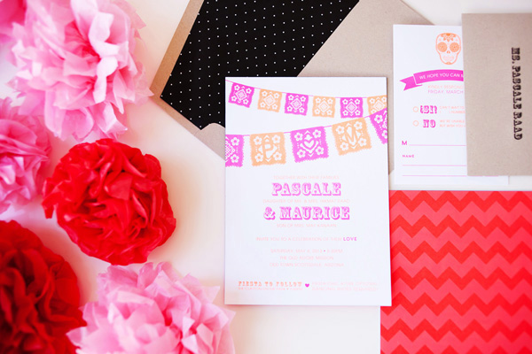
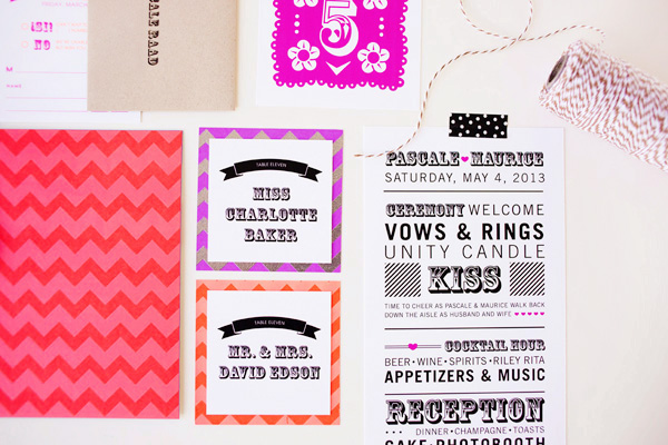
How about a little neon to brighten up your Wednesday? Heidi from idieh design sent over these vibrant invitations created for a Cinco de Mayo wedding, featuring neon fuchsia and neon orange paired with bright blue edge painting and kraft paper envelopes. So fun!

Cinco-De-Mayo-Wedding-Invitations-idieh-design

From Heidi: Pascale and Maurice wanted to merge tradition and trend in a fun and artistic way. Their wedding would take place on Cinco de Mayo weekend, so they chose to honor the Mexican holiday with a “fiesta-chic” theme. They wanted their invitation suite to incorporate a whimsical color scheme inspired by the very colorful Mexican culture.

Cinco-De-Mayo-Wedding-Invitations-idieh-design2

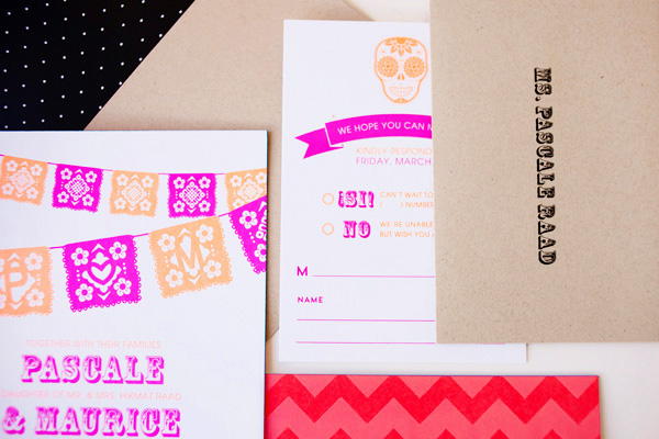
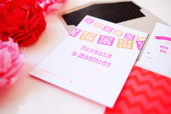
We decided on an extra-thick invitation with vibrant neon fuchsia and neon orange to let guests know it was going to be a fun, festive, and bold celebration. The graphic Mexican banner subtly enclosed the couple’s initials within the cuts of the design. The invitation was backed with a vibrant chevron pattern that utilized spot coating varnish for a glossy finish.

Cinco-De-Mayo-Wedding-Invitations-idieh-design3

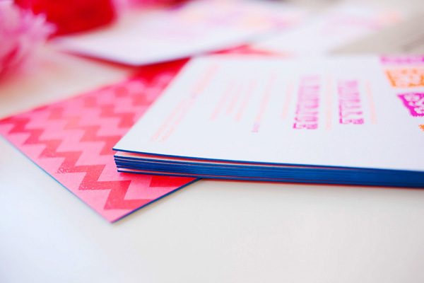
Bright blue edge painting on the main invitation provided a finishing touch. The entire suite, including the adorable response card, was packaged in a kraft envelope lined with a black and white polka dot patterned liner. 

Cinco-De-Mayo-Wedding-Invitations-idieh-design4

The bold graphics and colorful palette continued throughout the wedding day with the over-the-top playful ceremony programs, the whimsical table numbers, and the cheerful escort cards.

Cinco-De-Mayo-Wedding-Invitations-idieh-design8

Thanks Heidi!

Check out the Designer Rolodex for more tal­ented wed­ding invi­ta­tion design­ers and the real invi­ta­tions gallery for more wedding invitation ideas!

Photo Credits: Michelle Herrick Photography

April + Angelo’s Floral and Kraft Wedding Invitations

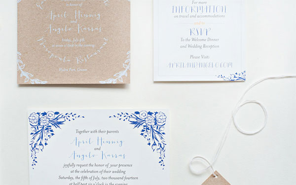
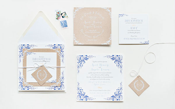
Becca from Suite Paperie sent over these beautiful invitations that she recently created for a destination wedding in Greece, inspired in part (naturally) by the groom’s Greek heritage. Becca paired blue floral details and text on white paper with kraft paper digitally printed in white ink. A stunning combination!

Blue-Floral-Kraft-Paper-Wedding-Invitations-Suite-Paperie

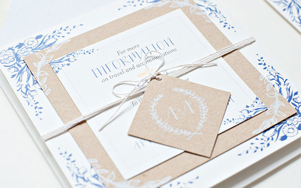
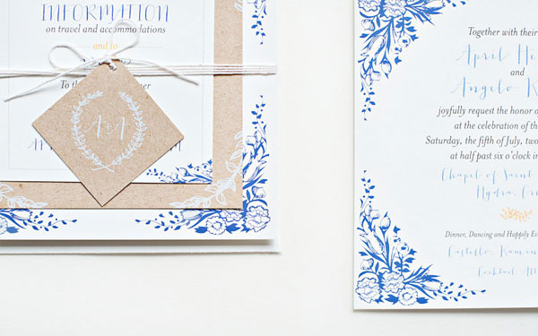
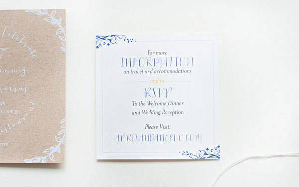
From Becca: Inspired by the groom’s Greek heritage, this blue, white, and kraft destination wedding suite is simply elegant. Floral details and a mix of whimsical typefaces are digitally printed on square double-mounted soft white card stock for the invitation and information cards.

Blue-Floral-Kraft-Paper-Wedding-Invitations-Suite-Paperie2

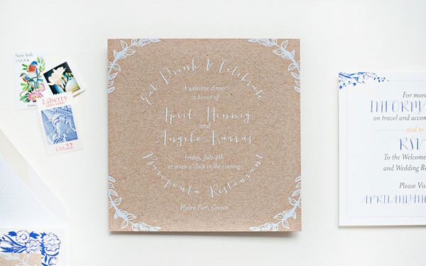
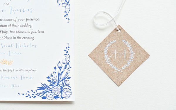
A rehearsal dinner insert and monogrammed tag are contrastingly printed in white ink on straw kraft stock, allowing the suite to stack beautifully. The pieces are tied together with cotton twine and tucked into a matching envelope that is lined with a subtle coordinating pattern.

Blue-Floral-Kraft-Paper-Wedding-Invitations-Suite-Paperie3

Blue-Floral-Kraft-Paper-Wedding-Invitations-Suite-Paperie5

Blue-Floral-Kraft-Paper-Wedding-Invitations-Suite-Paperie6

Blue-Floral-Kraft-Paper-Wedding-Invitations-Suite-Paperie7

Blue-Floral-Kraft-Paper-Wedding-Invitations-Suite-Paperie8

Thanks Becca!

Check out the Designer Rolodex for more tal­ented wed­ding invi­ta­tion design­ers and the real invi­ta­tions gallery for more wedding invitation ideas!

Photo Credits: Lindsay Nathanson

Quick Pick: Moglea Spring Collection

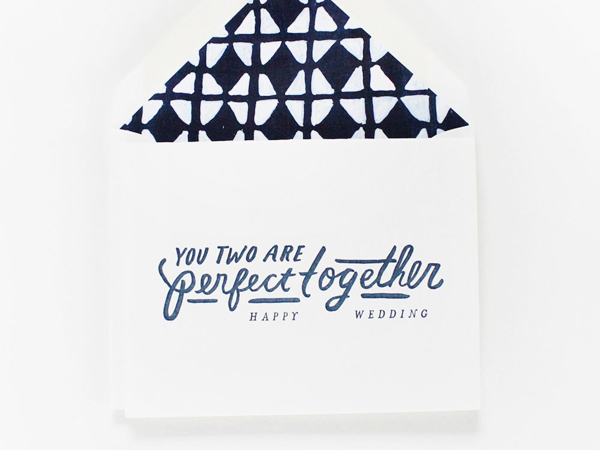
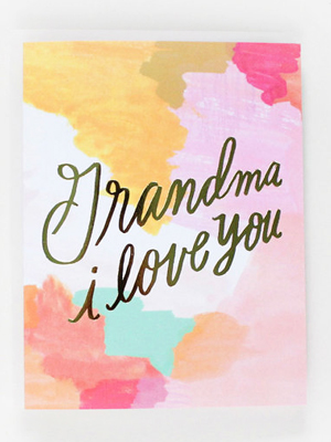
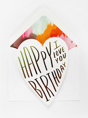
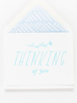
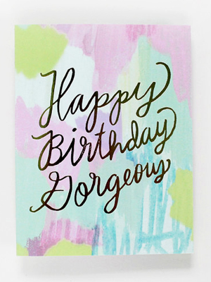
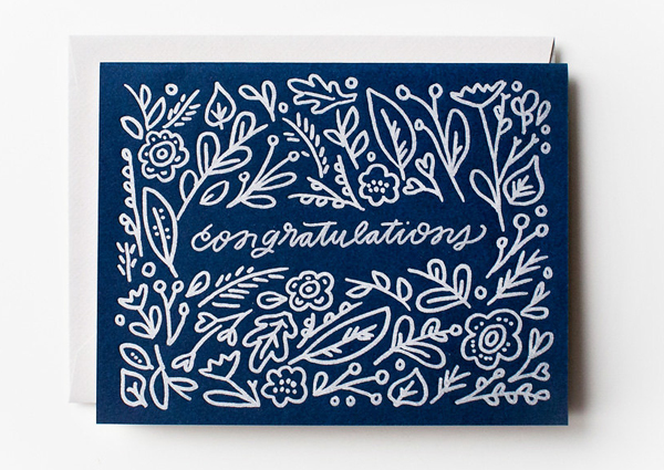
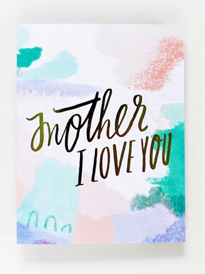
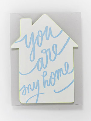
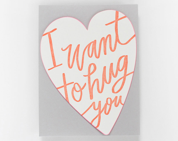
Now that it really feels like Spring, I just want to surround myself with color – I’m so happy to see green, yellow, pink, and purple returning to our neighborhood! I’m a huge fan of the painterly style and whimsical hand lettering of Meg from Moglea. Meg just released a bunch of new cards from her spring collection, and I’m loving all the gorgeous color – from hand painted patterns to bright edge painting (on die cut cards no less!). I can’t wait to see more at the National Stationery Show in just a few weeks!

Quick-Pick-Moglea-Spring-Collection4

Quick-Pick-Moglea-Spring-Collection6Quick-Pick-Moglea-Spring-Collection2

Quick-Pick-Moglea-Spring-Collection8Quick-Pick-Moglea-Spring-Collection7

Quick-Pick-Moglea-Spring-Collection3

Quick-Pick-Moglea-Spring-Collection5Quick-Pick-Moglea-Spring-Collection

Quick-Pick-Moglea-Spring-Collection9

Lots more in the Moglea etsy shop!

Photo Credits: Moglea

Lauren’s Ikat Baby Shower Invitations

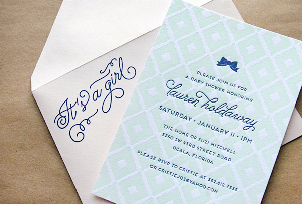
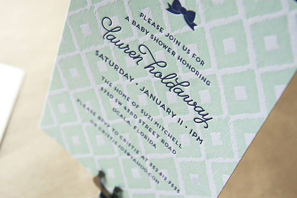
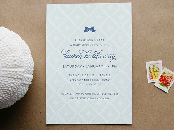
Happy Monday everyone! I thought I’d shake things up a bit and start the week with these adorable baby shower invitations from Alaina at Cheer Up Press. Created for a good friend, the invitations feature a sophisticated ikat pattern and a color palette inspired by the nursery. The invitations were letterpress printed in mint and navy blue, then paired with blush pink envelopes. So cute!

Ikat-Gender-Neutral-Baby-Shower-Invitations-Cheer-Up-Press4

From Alaina: I was commissioned by a good friend to design and print her baby shower invitation. I was inspired by the color palette she chose for her nursery: mint and blush with navy blue accents. Overall we didn’t want the style of the invitation to scream “baby” like so many baby shower invitations do, but rather put off a more sophisticated vibe that definitely reflects my Lauren’s tastes.

Ikat-Gender-Neutral-Baby-Shower-Invitations-Cheer-Up-Press3

We landed on a pretty simple design with an ikat background and added a trendy bow at the top. I pulled in the blush color on the envelope and digitally printed the words “It’s a girl”on the front in navy blue.

Ikat-Gender-Neutral-Baby-Shower-Invitations-Cheer-Up-Press2

Thanks Alaina!

Photo Credits: Cheer Up Press

The Sour

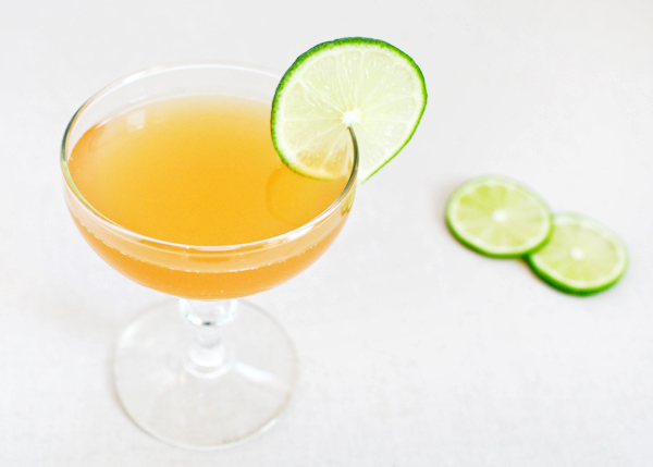
After a brief interruption, we’re returning to our back-to-basics series we started with The Cocktail and The Martini. This week’s drink is the Sour – possibly the biggest and most versatile family of cocktails out there. Every Sidecar, every White Lady, every Pisco Sour is a variation on the simple, delicious theme of spirits, sugar, citrus and ice. Figure out the right balance for just one, and you’re on your way to mastering them all.– Andrew
OSBP-Signature-Cocktail-Recipe-The-Sour-5

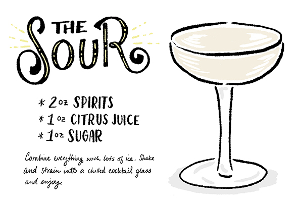
OSBP-Cocktail-Recipe-Card-The-Sour-Shauna-Lynn-Illustration

Illustration by Shauna Lynn for Oh So Beautiful Paper

The Sour

2 Parts Spirits
1 Part Citrus Juice
1 Part Sugar

Combine everything with lots of ice. Shake and strain into a chilled cocktail glass and enjoy.

This recipe is a suggestion, not a rule. Spirits, citrus, sweetener, and, most importantly, the ratios are all up for grabs. You can pick any spirit you like and match it with a citrus. Rum pairs so perfectly with lime and whiskey with lemon that you’d think those fruits were created for the special purpose of tarting up your liquor, but those are guidelines: think whiskey and grapefruit juice for a Brown Derby. Gin seems to love any citrus you can throw at it. The only real rule here is: the fresher the citrus juice, the better your cocktail will taste.
OSBP-Signature-Cocktail-Recipe-The-Sour-9OSBP-Signature-Cocktail-Recipe-The-Sour-24

Above, I listed sugar as the Sour’s sweetener, but that’s another suggestion. You can sweeten a Sour with actual sugar – preferably super-fine – or simple syrup, which blends more easily. Or a liqueur, as with the Sidecar or the Margarita or the Aviation or the unfortunately named Corpse Reviver #2. Or another syrup, like grenadine, as with the Jack Rose. You’ve got options.

Ok, so: you’ve got your spirits and your fresh citrus and your sweetener of choice. All that’s left is figuring out your preferred ratios. This is critical! Too much citrus and you could have a nearly undrinkable tart mess. Too much sweetener and you have a candy-saccharine disaster. There’s no magic solution, and the best ratio is the one that tastes best to you. My ratio above might be too sweet or too tart for you. David Embury’s mid-century classic The Fine Art of Mixing Drinks suggests a ratio of 2 parts spirits to just 1/2 part sour and 1/8 sweet – which means my grandparents were drinking Sours that were tarter than I could stand. But maybe you would love it. Experiment until you find what you love.
OSBP-Signature-Cocktail-Recipe-The-Sour-7

Your ratio will also depend in part on your sweetener. Agave syrup, perfect for tequila and mezcal sours, is enormously sweet and can be used sparingly. A liqueur like Cointreau will be drier, while grenadine will carry a bit of tartness of its own. Your ratio will also depend on your spirit. A sweeter spirit, like a brandy or a bourbon, might need a bit less sugar. Or maybe you have a particularly quality spirit – maybe a single malt whiskey you want to showcase – for which you’d lower both the citrus and sweetener to half an ounce each or less.
OSBP-Signature-Cocktail-Recipe-The-Sour-25OSBP-Signature-Cocktail-Recipe-The-Sour-13

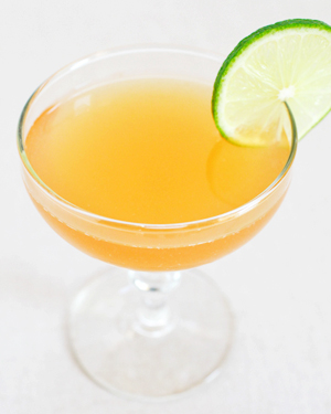
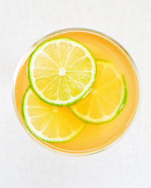
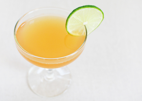
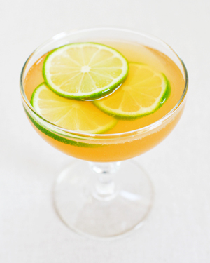
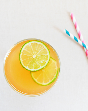
Ok, all that said, here’s my favorite (as seen in Nole’s beautiful photos): the Daiquiri. 2 oz rum (aged or clear) with 1 oz lime juice (freshly squeezed) and 1 oz simple syrup. Shaken with ice and strained. Simple. Perfection.

Don’t forget to let us know if you try any of our recipes. And if you do make one at home, you can use #osbphappyhour to share photos of these (or your own creations) on Instagram.

Photo Credits: Nole Garey for Oh So Beautiful Paper