Calligraphy Inspiration: Pink + Peach

Hey everyone! My 6-year-old daughter isn’t the only fan of pink in our house — I love pink. My fall coat is a coral pink hue, in fact. And when I stumbled on the work of Natalie Garrigan of Pink + Peach, I was tickled pink. I think you will be, too. Here’s a sweet dose of calligraphy inspiration. Enjoy! Jen

Calligraphy by Pink + Peach

Photo Credit: Tetiana Photography

Yes to everything in this photo. The modern organic style of the calligraphy, the choice of berries and blooms for the place cards, and of course, the pink sofa.

Pink + Peach Copper Place Cards

Calligraphy by Pink + Peach

Photo Credit: Sue Blue Events

Natalie is a self-taught calligrapher based out of Seattle. She just picked up calligraphy about 2 years ago (wow!). She went full-time with Pink + Peach about a year ago.

Calligraphy by Pink + Peach

How do you get this good at calligraphy in such a short time? Practice, of course. Natalie shares: “My lettering style is ever evolving, as I feel I am still trying to perfect my style. That’s my favorite aspect about my job — I’m always learning!”

Calligraphy by Pink + Peach

Natalie finds inspiration from fonts and she focuses on letter flow. She explains: “If I don’t like how my ‘h’ flows into an ‘r’ or ‘k’ into an ‘s’, I’ll rework the letters until I’ve found an aesthetic flow. In my mind, flow is queen.”

Calligraphy by Pink + Peach

Calligraphy by Pink + Peach

Photo Credits: Dawn Photography

Here’s a peek at table settings just perfect for fall. The calligraphy place cards add the special finishing touch. The place cards above feature Natalie’s lettering work on broken ceramic tiles.

Calligraphy by Pink + Peach

These pretty place cards show off her calligraphy on vellum with edges burned by hand.

Calligraphy by Pink + Peach

Black calligraphy on white envelopes is a timeless classic – but Natalie’s calligraphy style and use of vellum envelopes makes everything feel modern.

Calligraphy by Pink + Peach

Natalie loves to work her calligraphy magic on non-paper materials. Her favorites are leather and marble. Of leather, she shares: “It responds to ink beautifully and can be manipulated into whatever your vision is. Tiles are a close second because of their elegance.”

Calligraphy by Pink + Peach

Photo Credit: Jason Lucas Photography

And with that cozy fall imagery, I’ll leave you. Thanks so much to Natalie of Pink + Peach for sharing a peek into her work and process!

Blush and Gray Desert Wedding Invitations

Are you ready for some seriously dreamy wedding invitations? Alex of Goodheart Design combined a soft color palette, whimsical hand lettering, and sweet floral illustrations to create these blush and gray desert wedding invitations. You’ll definitely want to check out the ombré lettering on the save the date below. Absolute perfection!

Blush and Gray Desert Wedding Invitations by Goodheart Design

From Alex: Nicole and Justin got married in Ojai, California at the best time of year. The venue was open, airy and bright with a hint of desert vibes mixed in. We wanted to reflect that in the save the date and wedding invitation suite with soft colors, foliage, and classic calligraphy.

Blush and Gray Desert Wedding Invitations by Goodheart Design

We started with the save the date and made it a little more fun and outgoing. The save the date itself was a unique 4 x 9 inch size with ombré letterpress printing done by Czar Press, moving from blush to light grey. That piece was also accompanied by a fun photo booth reel with pictures of the two of them. I love when photos are included in a save the date in a unique way!

Blush and Gray Desert Wedding Invitations by Goodheart Design

As we moved to the invitation suite we wanted to keep the style, colors and look the same as the save the date but a little more classy and elegant. We started with creating a crest for the couple with their first name initials. That crest was used for the return address on the envelopes as well as other wedding ‘day of’ items.

Blush and Gray Desert Wedding Invitations by Goodheart Design

The crest then inspired the blind letterpress printed vines on the main and rsvp pieces. By having them blind letterpress printed into the page, we were able to add a little bit of the desert Ojai vibe while still keeping it light and airy. The blind letterpress makes them more of a texture rather than a heavy focus. In order to make the details piece stand out a little bit, since it had lot of important information on it, it was printed on blush paper. One side had a fun map of Ojai on it and the other had a link to their wedding website. While the suite had different colored papers from the main piece to the details to the envelopes, it all flowed together in such a beautiful way.

Blush and Gray Desert Wedding Invitations by Goodheart Design

Blush and Gray Desert Wedding Invitations by Goodheart Design

Blush and Gray Desert Wedding Invitations by Goodheart Design

Thanks Alex!

Design: Goodheart Design

Printing: Czar Press

Goodheart Design is a member of the Designer Rolodex – you can see more of Alex’s beautiful work right here or visit the real invi­ta­tions gallery for more wedding invitation ideas!

Photo Credits: Anna Delores Photography

Common Room Studio: Design Inspiration!

This post was sponsored, and paid for, by SunTrust. All opinions are my own. Thank you for supporting the sponsors that make Oh So Beautiful Paper possible!

Alright y’all, it’s time to talk about the design inspiration for Common Room Studio! You’ve already seen some of the before photos, and today I want to share our color palette and the overall vibe for the space. November is National Entrepreneurship Month, so it feels like the perfect time to talk about this new facet of my business. I’m partnering with SunTrust to share some tips from their Small Business Best Practices Guide, including a few tips that I wish I’d known when I first started Oh So Beautiful Paper! As entrepreneurs and small business owners, our businesses are always evolving, so it’s never too late to incorporate good advice and best practices into your business plan!

Common Room Studio Style Board and Color Palette

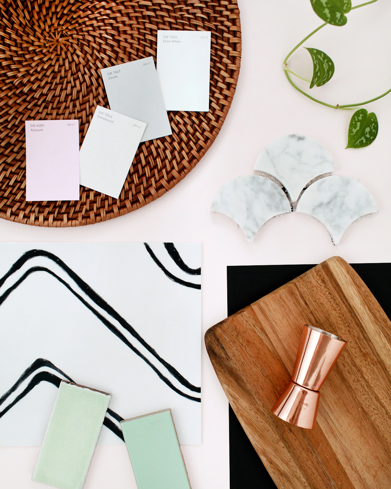
Some of the materials and colors for Common Room Studio: Sherwin-Williams paint in Alyssum, Snowbound, Zircon, Extra White // Scallop Marble Tile // Semihandmade Supermatte Black cabinet fronts // Butcher block kitchen countertop // Quadrostyle Harlow vinyl floor sticker (using these in the bathroom!) // Fireclay mint green tile samples

Because I started Oh So Beautiful Paper as a creative outlet, I spent the first couple of years treating the blog more like a hobby than a creative business. I didn’t even set up a business banking account until I had already quit my previous job to focus on Oh So Beautiful Paper full time. Oops! I wish I’d been able to read SunTrust’s Small Business Best Practices Guide when I first started my business; it definitely would have made things a lot easier in those early years. If I could go back and do things over, here are three things I would tell myself on day one based on what I know now:

  1. Establish good bookkeeping and banking practices from the very beginning. Keep all of your personal and business accounts totally separate, and invest in bookkeeping software that connects to your various financial institutions to keep track of expenses and spending habits. It can be a lot of work to set everything up at the very beginning, but it will save you so much time and energy down the road!
  2. As your business grows, focus your time and energy on the things that you enjoy the most and truly do best, then outsource the things that you either aren’t good at or really don’t enjoy. For most small businesses, bookkeeping is one of the first things that gets hired out. But you could also consider investing in a part time assistant to help manage your social media, or handle all shipping and mailing responsibilities.
  3. Review your pricing strategy on a regular basis to make sure your pricing reflects the full value of your products or services. If you’re a service-based business, remember that it’s totally okay to raise your prices as your business grows and evolves. Just because you start out offering a product or service for one price doesn’t mean that you’re stuck at that price forever!

Anything's possible if you've got enough nerve - JK Rowling

The SunTrust Small Business Best Practices Guide covers six important financial management topics to help small business owners navigate their entrepreneurial journey. With the addition of Common Room Studio, I’m in a growth and expansion stage of my business – so I found the section on Growing Your Small Business to be really helpful. I was particularly interested in the points on evaluating options for accessing funds to finance business growth, because hello build-out expenses! There is lots of seriously good financial advice for entrepreneurs and small business owners at every stage in their business. You can check out the full guide here!

Start Somewhere

Start Somewhere

Now that the big construction phase is behind us at Common Room Studio, our current challenge is to finish decorating the space! I’ve decorated plenty of apartments and my current home, but I’ve never decorated a commercial space before. Turns out, the process for decorating a commercial space is quite different from decorating a house! I want Common Room Studio to be a bright and open space that can serve lots of different purposes, but I also want it to be an inspiring place that creates a warm and inviting impression the minute you walk inside. I started by thinking about the colors, materials, and textures that I wanted to bring into the space, along with how I wanted the space to function as a whole.

I always create moodboards to help define my vibe and guide future design decisions, but I also roped in my friend and interior stylist Michelle Solobay to help me finish the space. I’ve been collecting inspiration on this board since I first started hunting for studio spaces, and then continued adding to it with this particular space in mind once I had signed the lease. Here’s what we’ve got so far!

Common Room Studio Moodboard

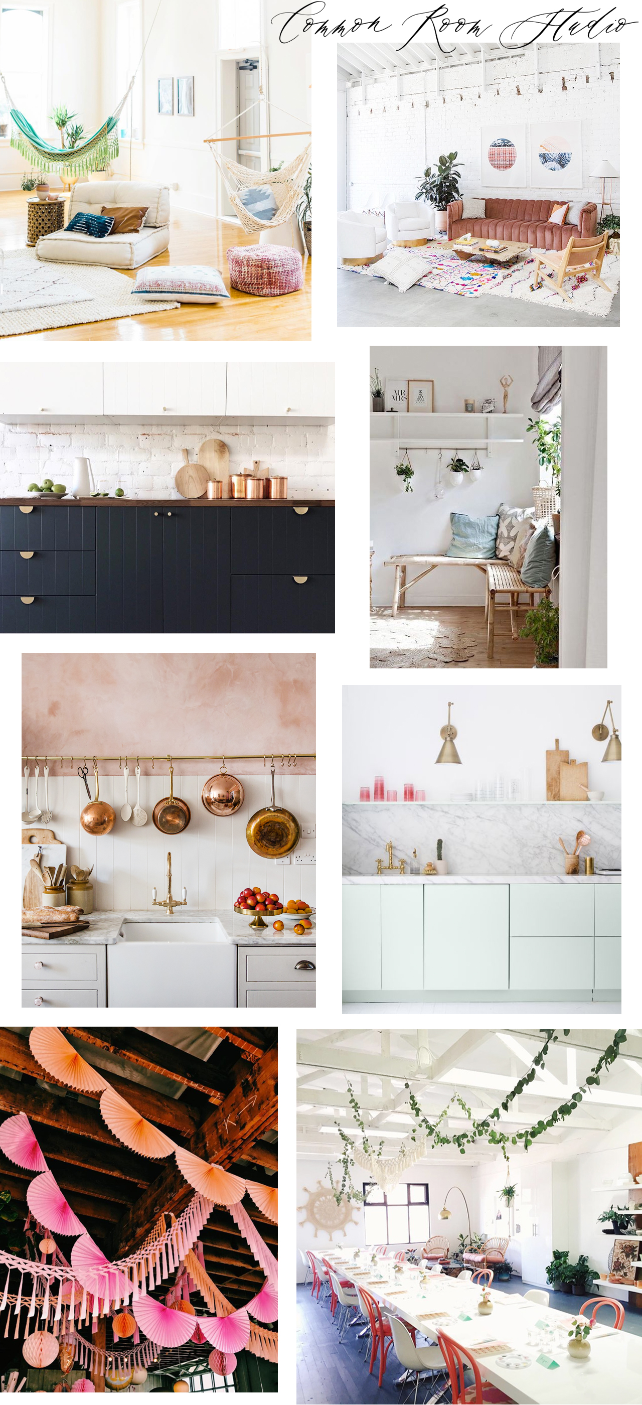
Sources (clockwise from top left): Jenna Kutcher; Light Lab; My Scandinavian Home; Pigment‘s workshop space via Mon Voir; garlands in the Pigment retail space; pink plaster kitchen by Jersey Ice Cream Co.; Sarah Sherman Samuel

Here are my goals for the space:

– Create a bright and open space that can serve as a blank box for photo shoots, workshops, and other events. Furniture in the workshop space must be able to serve multiple purposes and be easily moved and/or easily taken apart and stored to suit the needs of different events. 

– Because the space needs to be visually neutral, our color palette is pretty limited: bright white walls and floors to bounce natural light around, with accents of pink, green, navy blue, and black. Copper, brass, and matte black for metal and hardware.

– Incorporate natural materials, textures, and plants to soften the industrial vibe of the space. Butcher block countertops for the kitchenette, wood chairs, woven baskets and pendants, and house plants in varying sizes scattered throughout the space.

– Hang garlands from the ceiling and woven wall hangings to bring in bright pops of color and add additional texture/visual interest.

– Create a cozy seating area in the front room to welcome guests and provide a space where people can sit and socialize during events.

So there you have it: Common Room Studio, coming very very soon! I am BEYOND excited to bring it to life and share the whole process here!! If you have any decorating or layout advice, lay it on me in the comments. I’m all ears!

Photo Credits: Nole Garey for Oh So Beautiful Paper

This post was sponsored, and paid for, by SunTrust. All opinions are my own. Check out the SunTrust Small Business Best Practices Guide right here!

Well Said Type | 179

Well Said Type: Rare Bird Specimen II

RARE BIRD SPECIMEN II

Created by Karla Lim of Written Word Calligraphy (and seriously the most gorgeous calligraphy font I’ve seen in a long time)

p.s. Have you heard about Fontacular happening over at MyFonts?? It’s a legendary font event with amazing deals on dozens of fonts, including some of my personal favorites that I use all the time here on OSBP. The event only runs through midnight tomorrow (Friday), so get in on all the deals while you can! You can find the full list of participating fonts and foundries right here!

Black and White Wedding Stationery Inspiration

A black and white affair is always in style! Today we’re sharing some black and white wedding stationery inspiration, from crystal place cards to welcome signs and menus. See how you can incorporate this classic palette into any wedding! – Annie

Wedding Stationery Inspiration: Black & White Wedding / Oh So Beautiful Paper

Don’t be afraid to mix typography styles. | via The Knot

Wedding Stationery Inspiration: Black & White Wedding / Oh So Beautiful Paper

How amazing are these crystal place cards?! | Photography: Ashley Kelemen, Calligraphy: Betlem Calligraphy via Style Me Pretty

Wedding Stationery Inspiration: Black & White Wedding / Oh So Beautiful Paper

A graphic sign stands out, especially outdoors. | Photography: Jose Villa Photography, Event Planning: Cole Drake Events via Style Me Pretty

Wedding Stationery Inspiration: Black & White Wedding / Oh So Beautiful Paper

Minimalist table numbers won’t distract from the rest of your table. | Photography: Julien Bonjour Photographe, Wedding Stationery: Save the Date via Ruffled

Wedding Stationery Inspiration: Black & White Wedding / Oh So Beautiful Paper

Black watercolor adds bohemian flair. | Photography: Cattura Weddings, Event Design: Heidi Chankin, Paper Goods & Calligraphy: Emily Rose Ink via Green Wedding Shoes

Wedding Stationery Inspiration: Black & White Wedding / Oh So Beautiful Paper

White escort cards really pop against a black wall. | Photography: Abby Jiu Photography, Event Planning & Coordination: Karson Butler Events, Escort Card Display: Backup Backdrops, Day of Paper: The Romance Between via Style Me Pretty

Wedding Stationery Inspiration: Black & White Wedding / Oh So Beautiful Paper

Love the combination of calligraphy and a geometric border. | Photography: EE Photography, Paper: Yuling Designs via Grey Likes Weddings

Wedding Stationery Inspiration: Black & White Wedding / Oh So Beautiful Paper

These balloons would be fun for a photo booth! | Photography: Alex Lasota Photography, Event Design & Planning: Alex Lasota, Paper Goods: Grace Niu, Calligraphy: L Maria Calligraphy via Green Wedding Shoes

Wedding Stationery Inspiration: Black & White Wedding / Oh So Beautiful Paper

Gold frames double as favors. | Photography: Ashley Caroline Photography, Event Planning: Polka Dot Events via Style Me Pretty

Wedding Stationery Inspiration: Black & White Wedding / Oh So Beautiful Paper

Love the palm illustration at the top! | Photography: Eileen Meny Photography, Event Planning: Lindsey M Events, Paper Goods: Bonomo Paper Company, Calligraphy: Han Writing via Green Wedding Shoes

Anyone planning a classic black and white wedding? Let us know in the comments!