Courtney + Nate’s Wisconsin Lake Wedding Invitations

Created for a summer wedding along a lake in Madison, Wisconsin, these wedding invitations from Sugar River Stationers feature a beautiful line illustration of Madison and wave-inspired laser cut details. But my favorite detail? The wood box mailer, a fun nod to the groom’s profession as a distiller!
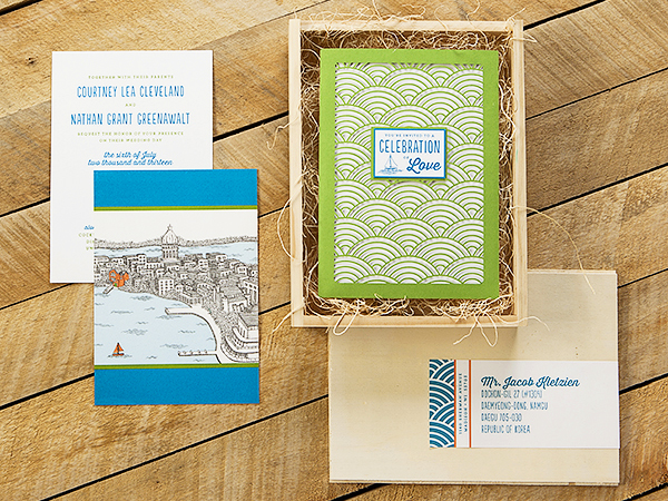
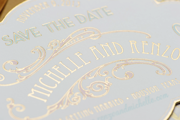
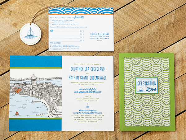
Wisconsin-Lake-Wedding-Invitations-Sugar-River-Stationers2

From Heather: We designed these wedding invitations for a July 2013 wedding in Madison, Wisconsin. I would categorize Courtney and Nathan’s stationery as “quirky” with lots of character. Courtney is an elementary school teacher and Nathan owns a distillery in Madison. The suite features an original line art illustration of Madison, as well as supplemental illustrations used in the custom stamps and various “day of” items. The couple live along one of Madison’s largest lakes and spend a great deal of time together boating.

Wisconsin-Lake-Wedding-Invitations-Sugar-River-Stationers

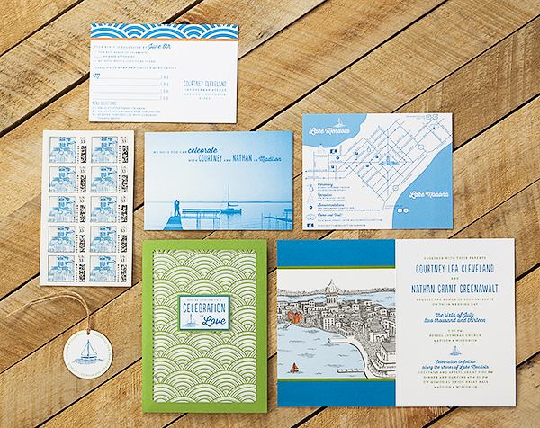
The invitation suite was mailed in a slide top wood box. Given that Nathan owns a distillery, the wood box and excelsior packaging appealed to him. Inside, the presentation layer features a laser-cut pocket with tag detail on the front.

Wisconsin-Lake-Wedding-Invitations-Sugar-River-Stationers4

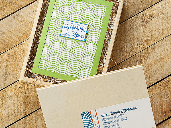
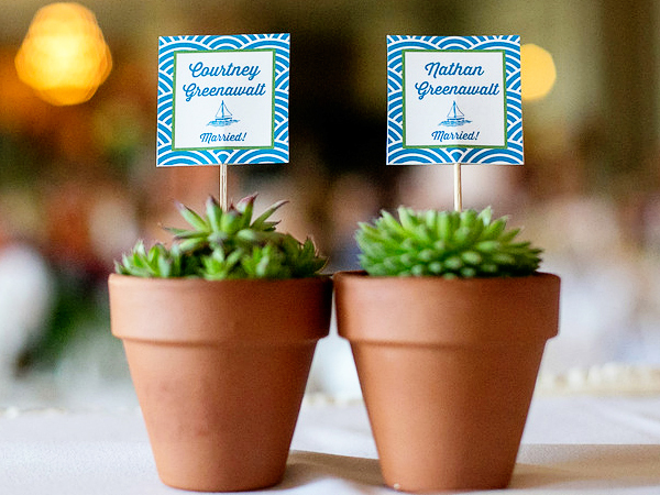
The invitation is booklet format, with illustration and additional items such as the RSVP, map and accommodations card were housed inside the laser cut pocket. The RSVP features an original photograph of Courtney and Nate changed to vector art. We created custom stamps with another original illustration of Courtney and Nate sitting on a pier in front of the house and used the boat illustration for a circle cut tag that was placed around succulents used as favors.

Wisconsin-Lake-Wedding-Invitations-Sugar-River-Stationers3

Wisconsin-Lake-Wedding-Invitations-Sugar-River-Stationers5

Thanks Heather!

Design: Sugar River Stationers

Illustration: Steph Davies

Check out the Designer Rolodex for more tal­ented wed­ding invi­ta­tion design­ers and the real invi­ta­tions gallery for more wedding invitation ideas!

Photo Credits: Harper Fritsch Studios and Maureen Cassidy Photography

Urbanic Faves | A day at the Bay

Ed Note: You guys! I’m so excited to introduce this brand new column from the incredible Audrey of Urbanic Paper Boutique! I’ve long admired Audrey’s amazing eye for stationery, particularly her ability to pull together themed collections in her beautiful store. I’m so lucky to be able to call Audrey a friend, but even luckier that she has agreed to stop by OSBP each month to share some of the things inspiring her each month. Welcome Audrey!! –Nole

Hello OSBP readers! I’m delighted to be here today and launching our new column on Oh So Beautiful Paper. My name is Audrey Woollen and I have a shop in Los Angeles called Urbanic Paper Boutique.  I’ve known Nole for many years (adore her) and love that we share a mutual passion for all things paper. I’ll be here once a month posting a ‘how about’ series, sharing our latest inspiration with you. We’ll be highlighting some of our favorite things from around the shop and beyond. Today we’re kicking off the column with inspiration from a recent family trip to San Francisco.  With adventures in the Ferry Building, Bi-Rite Creamery, Tartine, the Golden Gate Bridge and of course the cable cars – we had a wonderful time exploring and tasting our way through the Bay City! –Audrey

OSBP_SanFran_Coral

1. Mapnote; 2. Paper Parasol Press Postcard; 3. Hello! Lucky Skyline Note; 4. Lark Press Heart in SF note; 5. Birite Creamery Book; 6. SF City Guide; 7. Tartine Cookbooks; 8. Cavallini Rubber Stamps; 9. Jim Datz print; 10. Ilee Papergoods city cards; 11. Dandelion Chocolate; 12. Albert + Marie SF Poster; 13. Maptote Pouch; 14. Cavallini Eraser

{images via their respective sources}

Chelsea + John’s Colorful Passport Wedding Invitations

Brittany from Two if By Sea Studios is primarily a pattern surface designer (her designs have been used on products at Jo-Ann Fabrics and Target!), but Brittany was thrilled to take on a fun stationery project when her little sister got engaged! Brittany created these passport-style invitations for her younger sister’s destination wedding in Jamaica. I love the vibrant color palette of aqua, turquoise, and red for a tropical beach wedding!

Red-Aqua-Passport-Destination-Wedding-Invitations-Two-if-by-Sea-Studios

From Brittany: Chelsea and John chose a vibrant palette of aqua, turquoise, and lipstick red for their destination wedding in Jamaica. They wanted to inspire their friends and family to make the trek from all over the country, while also evoking the party atmosphere that they were envisioning for their casual beach wedding. A twist on the idea of the passport and airline ticket wedding suite, the modern typography, and a simple color scheme make this grouping of designed elements personal to the bride and groom.

Red-Aqua-Passport-Destination-Wedding-Invitations-Two-if-by-Sea-Studios2

Red-Aqua-Passport-Destination-Wedding-Invitations-Two-if-by-Sea-Studios3

Red-Aqua-Passport-Destination-Wedding-Invitations-Two-if-by-Sea-Studios7

A custom return address stamp was used for both the save the dates and invitations, while a tiny shark logo with their names acts as a playful closing mark on the back of the passport. These small designed details are the elements that the couple hoped would reflect their sometimes silly and beach-oriented lifestyle. On a tight budget for printing and extras, we let the pieces stand alone, simply bright and cheerful.

Red-Aqua-Passport-Destination-Wedding-Invitations-Two-if-by-Sea-Studios4

Red-Aqua-Passport-Destination-Wedding-Invitations-Two-if-by-Sea-Studios5

Red-Aqua-Passport-Destination-Wedding-Invitations-Two-if-by-Sea-Studios8

Thanks Brittany!

Design: Two if by Sea Studios

Custom Rubber Stamp: Stamptitude

Check out the Designer Rolodex for more tal­ented wed­ding invi­ta­tion design­ers and the real invi­ta­tions gallery for more wedding invitation ideas!

Photo Credits: Two if by Sea Studios

Michelle + Renzo’s Elegant Gold Foil Save the Dates

Do you like gold? Good! Then you’ll love these save the dates! Created by the talented ladies at Papellerie feature lots of gold foil, an elegant die cut shape, and hand tied gold ribbons with a handy magnet for displaying on the fridge. I can’t wait to see the invitations!

Ornate-Marie-Antoinette-Gold-Foil-Save-the-Dates-Papellerie4

From Papellerie: We designed Michelle and Renzo’s save the dates with inspiration from Marie Antoinette. We wanted to really touch on this very decadent, lavish feel for all of their items. They came to us right from the start and we got to design all of their pieces, from save the dates to shower invitations, their wedding invitation, and all of their day-of items.

Ornate-Marie-Antoinette-Gold-Foil-Save-the-Dates-Papellerie7

Their save the date features a custom die cut shape with a gold foil pattern on the back and two color letterpress and gold foil on the front. It was mailed to guests with hand tied ribbons and a magnet for hanging on the fridge! The envelope had an antique gold paper liner and gold foil on the flap.

Ornate-Marie-Antoinette-Gold-Foil-Save-the-Dates-Papellerie3Ornate-Marie-Antoinette-Gold-Foil-Save-the-Dates-Papellerie

Ornate-Marie-Antoinette-Gold-Foil-Save-the-Dates-Papellerie5

Ornate-Marie-Antoinette-Gold-Foil-Save-the-Dates-Papellerie6

Thanks ladies!

Design: Papellerie

Calligraphy: Abany Bauer of Brown Linen Design

Check out the Designer Rolodex for more tal­ented wed­ding invi­ta­tion design­ers and the real invi­ta­tions gallery for more wedding invitation ideas!

Photo Credits: Adam Nyholt

Ashley + James’s Chambray and Citrus Wedding Invitations

As you’ve heard me say countless times before, I love love love it when couples incorporate their unique personalities into their wedding invitations! For these two mechanical engineers, that meant incorporating gear illustrations into the invitation design for their Texas ranch wedding. Ashley and James worked with Liz at The Nouveau Romantics to bring their invitation vision to life. The result is the perfect quirky mix of modern design and rustic texture!

Chambray-Citrus-Texas-Ranch-Wedding-Invitations-The-Nouveau-Romantics2

From Liz at The Nouveau Romantics: Ashley and James are two mechanical engineers with a penchant for modern design. They were married on a rustic ranch here in Austin, Texas. They were both actively involved in the design process, and wanted their invitation to reflect a masculine and feminine sensibility, while also incorporating gears, if at all possible.

Chambray-Citrus-Texas-Ranch-Wedding-Invitations-The-Nouveau-Romantics4

We opted for an unusual shape in the long and narrow, as well as an off-centered assembly. As guests opened the kraft envelopes, they were greeted with a blind printed main invitation texture and the front of the RSVP postcard that had the couple’s separate “venn diagrams” with appropriate descriptions of each of their personalities. As you unwrapped the chambray band and wax seal, you revealed the shared qualities of the couple as the “overlap” in their diagram.

Chambray-Citrus-Texas-Ranch-Wedding-Invitations-The-Nouveau-Romantics3

I loved the texture in the color fields of the venn diagram via the two color letterpress as it’s perfectly imperfect and gives a really big graphic impact. Underneath the venn diagram postcard was their info card and finally the double-sided invitation. The back of the invitation was a flood of color in a medium blue, with a darker blue outline for a technical sketch of a complex gear-oriented machine. Pretty perfect! The front of the invitation was a mix of blind printing and grey ink for the invitation wording, while the machine drawing was blind printed to the left hand side.

Chambray-Citrus-Texas-Ranch-Wedding-Invitations-The-Nouveau-Romantics5

Chambray-Citrus-Texas-Ranch-Wedding-Invitations-The-Nouveau-Romantics6

For their save the date, we went the postcard route. Something simple and quirky with two vintage Austin postcards and a welcome note on the front, and Ashley’s handwriting scanned in as the back. I love the 5″ x 7″ size; while it’s more postage, it definitely has an impact!

Chambray-Citrus-Texas-Ranch-Wedding-Invitations-The-Nouveau-Romantics7

The rest of the day-of paper goods incorporated the same quality of modern fonts in a range of grays, blues, and chambray to create the perfect mix of modern and mechanical for these two!

Chambray-Citrus-Texas-Ranch-Wedding-Invitations-The-Nouveau-Romantics8

Chambray-Citrus-Texas-Ranch-Wedding-Invitations-The-Nouveau-Romantics9

Thanks Liz!

Design: The Nouveau Romantics

Letterpress Printing: Thomas Printers

Check out the Designer Rolodex for more tal­ented wed­ding invi­ta­tion design­ers and the real invi­ta­tions gallery for more wedding invitation ideas!

Photo Credits: Heather Curiel Photography