Calligraphy Inspiration: Mon Voir

With spring just around the corner, I really wanted to showcase the work of some fresh talent. Something playful and charming; something that feels like a breath of fresh air. I found just what I was looking for in self-taught calligrapher and illustrator Jenna Rainey of Mon Voir. Her illustration work really comes through in her style, as it has smooth painterly quality. I’m quite smitten with Jenna’s calligraphy and I’m sure you will be, too!  – Julie

monvoir_1

monvoir2

Jenna’s lively style floats and dances its way across the surface. Elements of her writing have an air of romance, much like that of an old love letter.

monvoir3

monvoir4

monvoir6

Youthful and lighthearted, I love that even a single word can bring the ordinary to life. Jenna’s calligraphy is all the embellishment you need!

monvoir5

monvoir_7

For more of Jenna’s work check out her blog and Instagram which is filled with beautiful peeks at projects.

Photo credits: No. 1, 2; 3 left, +4 Jenna Rainey; No. 3 right, 5 +  7 left Megan.Jeanne ; No.6 Kristen Rae Photography; No. 7 right Erich McVey 

DIY Tutorial: Hand Tinted Letterpress Save the Dates

Hand tinting was historically used to color black and white photographs before color photography was invented. It was also used on prints made by etching as a means to color them. For this tutorial, we’ll show you how to use this technique to bring a unique, vintage look to your letterpress save the dates or wedding invitations. Not only is it beautiful, it’s also super easy (as in two steps)! – Bailey and Emma of Antiquaria

Hand-tint-Save the Date-Final-1

Hand-tinted-Save the Date-Step1

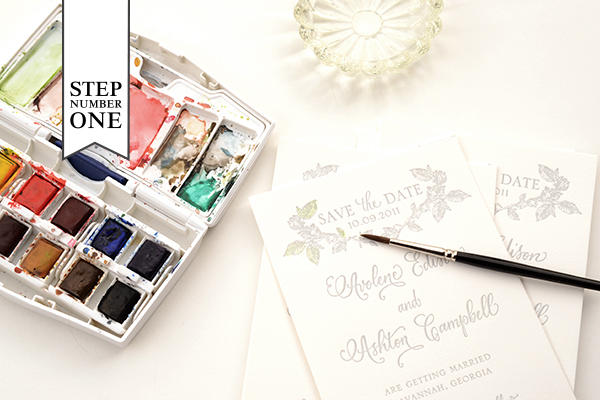
Step One: We chose two colors for this design: green and pink. When deciding what to do with your letterpress design, consider historical references for colors (searching hand tinted etching or photographs yields nice results).

First, we mixed our green color. We wanted it to be a little yellow tinged so we added some yellow to the green in our palette (see the upper left mixing area). The color needs to be very diluted to have it tint and not paint too heavily cover your letterpress print. Make sure to test your colors on an extra piece to make sure you have the technique down before starting the project.

Another key factor is how dry the brush is when it’s tinting the paper. You do not want it to be wet. Brushing it first against a paper towel helps keep the tint from being to watery. Again, it helps to work through this in testing.

Paint your first color in the desired area (in our case, green on the leaves) and set it aside to dry. Repeat on all cards.

Hand-tinted-Save the Date-Step2

Step Two: Next, you’ll be adding in your second color to the flowers on the design. Mix up your desired color and test it on your spare piece until the color and dilution is right. Brush on the color (in our case, pink) in the desired areas. Set aside to dry and repeat on the rest of your cards.

Hand-tinted-Save the Date-Final-5

Letterpress printing works exceptionally well with hand tinting because it created an indented texture when the print is made. This helps keep your tint in place and prevents coloring outside the lines or blotchiness. If you do end up with too much water on the print, it’s easy to quickly dab it with a clean paper towel and absorb any excess. No harm done!

Hand-tint-Save the Date-FInal-2

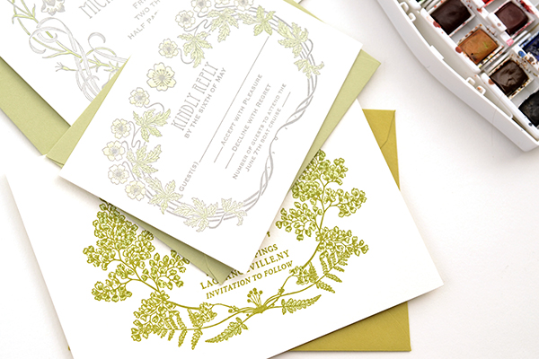
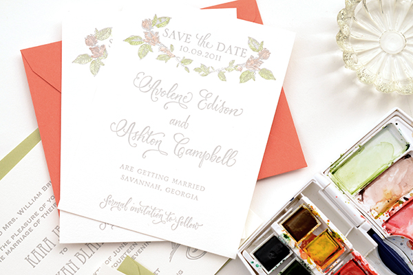
We found that the tinting technique worked most beautifully and effectively on our botanical collection of letterpress cards. The softness and vintage appeal lends to the charm of the designs. Of course, the possibilities are as endless as your imagination!

Materials

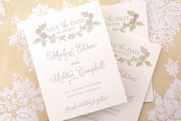
Savannah Letterpress Save the Date Card. We recommend ordering extra pieces (10% overage) for testing.

Watercolors

Paint brush. We recommend a very nice, small brush so that you have control and precision.

Water cup

Anti­quaria is a mem­ber of the Designer Rolodex – you can see more of their beau­ti­ful work right here or visit the real save the dates gallery for more save the date ideas!

Photo Credits: Antiquaria for Oh So Beautiful Paper

Rose + Mike’s Woodland Wedding Invitations

Created by designer Frances Close for a cabin wedding in Michigan, these invitations feature woodland elements inspired by the wedding’s natural setting. Frances also incorporated a vintage feel to the illustrations to evoke the idea of a field guide that guests might find at the cabin!

Woodland-Wedding-Invitations-Frances-Close

From Frances: Rose and Mike decided to get married at a family cabin in the Manistee National Forest in Michigan. The wedding took place outside, and the invitations picked up on the natural surroundings by incorporating wilderness elements. The vintage feel to the images was intentional, as they were meant to look like something you might find in an old book that would be sitting at the cabin. Along with the spot illustrations on the main invitations and a woodland scene in the background of the map, we also lined the envelopes with a vintage butterfly pattern.

Woodland-Wedding-Invitations-Frances-Close3

Woodland-Wedding-Invitations-Frances-Close5

Woodland-Wedding-Invitations-Frances-Close2

Woodland-Wedding-Invitations-Frances-Close4

Thanks Frances!

Check out the Designer Rolodex for more tal­ented wed­ding invi­ta­tion design­ers and the real invi­ta­tions gallery for more wedding invitation ideas!

Photo Credits: Frances Close

Gracie’s Colorful Bridal Luncheon Invitations

These adorable bridal luncheon invitations from Rafftruck Designs had me at the envelope liners: a swatch of vibrant Liberty of London fabric that the bride planned to use in her backyard wedding. Starting with the fabric as inspiration, Dara from Rafftruck Designs chose a bright summer color palette and sweet script font for the invitation design. Lovely!

Colorful-Floral-Bridal-Luncheon-Invitations-Rafftruck-Designs

From Dara: Rather than a traditional bridal shower, Gracie held a bridal luncheon the morning of her vintage chic backyard wedding. A beautiful floral Liberty of London fabric set the tone for the day’s festivities so I knew I should incorporate the vibrant pattern into the invitations.

Colorful-Floral-Bridal-Luncheon-Invitations-Rafftruck-Designs2

I started with bright, bold summer colors and selected a script font with lots of personality. The invitations were letterpress printed on 100% ecru cotton paper, which added the perfect amount of rustic romanticism to this bridal luncheon invitation. A kraft paper envelope lined with the amazing Liberty of London fabric completed the look.

Colorful-Floral-Bridal-Luncheon-Invitations-Rafftruck-Designs4Colorful-Floral-Bridal-Luncheon-Invitations-Rafftruck-Designs3

Colorful-Floral-Bridal-Luncheon-Invitations-Rafftruck-Designs6

Thanks Dara!

Design + Letterpress Printing: Rafftruck Designs

Photo Credits: Rafftruck Designs