Hello Brick & Mortar: Order Up!

If you’re in the mood for a simple nuts & bolts post, here it is: Ordering. Namely, how to get your retailers to do more of it. Assuming you like that sort of thing. ~ Emily of Clementine.

OSBP-Hello-Brick-and-Mortar-Clementine-by-Emily-McDowell-Illustration

Illustration by Emily McDowell for Oh So Beautiful Paper

Let’s get gushy for a second: I love ordering. I devour your catalogs and squirrel them away. I take you to the beach and pull you out in front of the fire. At my shop, I’ll gladly fawn over issuu when I have 18 other things to do. Ordering is the dinner & dancing of our relationship. It’s where I commit and you send me a beautifully wrapped box. It’s the most fun.

Yet there are enough trips and starts in the ordering process that some orders are never started and others go unfinished. Let’s break it down and see how to get those orders coming in.

When and why do I make orders?

  • I make an opening order when: I fall for your cards & I think they will sell. Often, this is because you reached out personally (and maybe because you kept in touch).
  • I make a re-order when:
    • I run out of a several things that have sold well.
    • A customer requests something that has sold out.
    • A holiday is coming up (maybe).
    • You find a way to entice me.
    • You check in.
    • Your line fits and offers something new to customers.

ClementineBirthdayCards

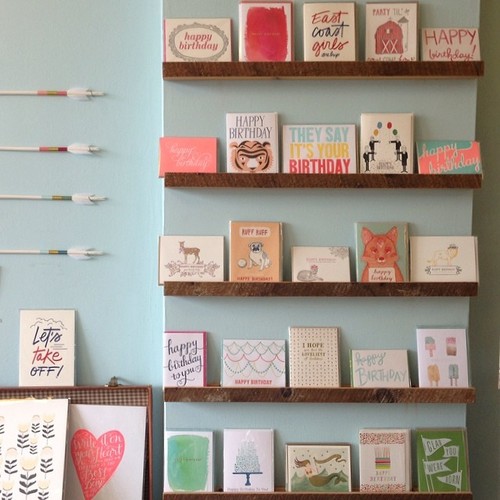
A display of Birthday cards at Clementine. Color, size, variety. I often order based on how your line would complement my existing lines.


Your Catalog. Your Calling Card: 

The best catalogs (paper or online) have nice, bright photos and clear terms. Retailers are different, so ideally you have a paper and online option. Here are some pros and cons of each option:

  • Paper Catalog:
    • Pros: Well, we all love paper, so there’s that. Flipping, circling, dog-earring. I like them best when they’re mailed to my shop. I like them least when I’m lugging them through Penn Station.
    • Cons: I have to have it with me to order and I still have to write the order down and send it to you. Also, it seems to be standard for catalogs to have terms and prices in the front or back. This means I have to flip back and forth frequently (especially if you have cards, card sets, gift tags, prints….) This takes a while and is the #1 reason it takes forever to fill out an order.

NSS catalogs

Some of the catalogs that traveled home with me from NSS 2013. Pretty, but pretty doesn’t carry itself.

  • Issuu: Most of you use issuu, so I’m assuming most are familiar. I like it. I dont’ love it, but I like it.
    • Pros: It’s online so I can pull it up anytime. Your updates are instant. I don’t have to dig in my files. I can send you a quick order. You can link to it easily in emails to me.
    • Cons: I still have to write/email out my order and it’s harder to “flip” through if the prices/quantity requirements are at the back. Also, sometimes the format gets wonky, especially on an ipad.
  • Online: If you have good photos and an easy website, this is pretty much just a pro except that many (myself included) do love a tangible catalog. That aside, let’s look at several online options:
    • A wholesale site just for retailers. Shopping online is my ideal form and results in my most frequent orders, because it’s quick. Especially, if you have a large line.
    • Etsy Wholesale. Did you know Etsy has a wholesale site? I’m pretty smitten because it’s a one stop shop for me. You have to apply, but I think it’s a great option if you’re not ready to build your own online shop. Also, if you already have an Etsy site, I believe transferring products is pretty easy. (Don’t quote me on that, but I think the fabulous ladies of Etsy will be checking in on this post today, so feel free to ask questions!)
    • Your existing retail site with a wholesale code. If you sell online and haven’t built a wholesale shop, a great in-between step is to simply send your retailers a wholesale code for 50% off. You may still have to work out shipping, that’s ok.

Stop the presses! What haven’t you heard from me?

  • I have to fax something in. (Wait, I’m genuinely curious, do any of you receive orders by fax?) Requiring forms that I have to fill out and send is going to delay my order. Find a way to be flexible in gathering credit card and tax IDs so that all I have to do is hit ‘submit’ or wait for your call.
  • I like you too much. Counterintuitive, I know, but  I have several lines that I liked so much it took forever to complete the order because I was trying to whittle it down. This is why it’s so important to be in contact. Silence does not always mean I’m not interested. Personal contact or an incentive can put you at the top of the stack.
  • Your line is very large. Similarly, if you have 25 pages of product, deciding what to get can take a while.
  • Your photos aren’t great/Your terms aren’t clear. Look at your own website and have a friend critique it too. A tiny, dark or fuzzy photo wont sell itself even if the card is great in person. Similarly, if I can’t find terms or contact info clearly, I may delay.
  • Your order minimums are too high and/or are inflexible. I generally order in 6s (singles) and 3s (packs/prints) even when you don’t require, because your colleagues have conditioned me to do so. Ask around, see what’s standard. But also make sure minimums and terms make sense for your business. If you are ok with orders of any size, say so.
  • I never hear from you. When should you reach out? I covered that topic at length here. In short: ask each retailer what they prefer, and always be in contact a few times a year. If you are always too busy to reach out to your retailers, it might be time to hire a rep.

What makes me order (more frequently)?

  • Flexibility. If you accept orders via web, email and/or over the phone, I’m more likely order. I mean, I’m probably never going to call in an order, but making it clear that you’re flexible sends a message and I’m more likely to email you a quick order because I know you’re open to it.
  • You’re responsive and open to dialogue. This isn’t for everyone, but if you’re open to the idea of turning a card into a print, or altering your existing products, it could lead to a dialogue between us that strengthens our relationship and gives me a new stake in your products. Obviously not all ideas are good ones and retailers should never direct your creativity, but they can offer insights into what might sell that could help your brand grow.

LLwoodlandset

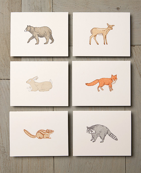
Letter & Lark’s Woodland animals were singles. Colleen responded immediately to retailers’ desire to have them as a set. 

SHCOantlers

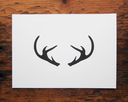
Scout’s Honor Co’s Antlers, was originally a card. I requested it as a print and Annemarie didn’t miss a beat saying yes. Also, take a page from this lady when you’re sending notes to retailers. 

  • Online, online, online. Look, I’m in the process of moving my shop, so I understand the feeling of being (incredibly) overwhelmed. If you don’t have an online wholesale shop, don’t fret. But I do make online orders far more frequently. I like to see the cards together and be able to adjust quantities in a cart. That’s something a paper linesheet can’t do (plus, the math).
  • Good photographs. I understand the ease of drawing your cards, but sketches are often very different from a letterpress card. Whenever possible, take a (nice, well lit) photo and upload at a visible size.
  • Social Media. I’ve been on the fence about how much social media affects my buying, but over the last few months I can say, without a doubt, that I’ve made orders based on sneak peeks or incentives I’ve seen (primarily on instagram, a bit on facebook).

MaconYorkInstagram

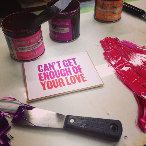
Macon York’s Can’t Get Enough of Your Love Card which I saw on Instagram, had to have, and essentially started the order there.

  • I think you’re fantastic. I know, this is somewhat intangible, but my favorite lesson of the last few years is that I want to have business relationships based on kindness, humor, generosity and a bit of bravery. If you like a retailer’s aesthetic, be in touch. Don’t be turned off if they don’t reply to your intro packet, if they make a first order and then don’t re-order. I’ve built great relationships with people even when their line isn’t right for my shop, I love those conversations and I am always happy to talk about how a line may become right for my shop, or someone else’s. Stay in touch. We’re all busy. If you believe in your product, keep going.

Have another question about orders? Post it below! Also, are you getting excited for the Stationery Show? I am! But if you’re not going, I have a post for that too. Next time…

xo! Emily

Claire + David’s Romantic Floral Wedding Invitations

UK-based designer Belinda Love Lee sent over these soft and romantic wedding invitations that she designed for a recent wedding. Belinda paired classic script and serif typefaces with beautiful floral illustrations for a soft and romantic feel. I love the matching ceremony programs incorporating the floral illustrations from the invitation!

Romantic-Floral-Wedding-Invitations-Belinda-Love-Lee2

From Belinda: I designed and hand illustrated Claire and David’s wedding invitations and ceremony programs. When designing this wedding invitation suite, I aimed to keep it classy and elegant with a modern touch. The invitation is design soft and delicate yet leaves a lasting impression. 

Romantic-Floral-Wedding-Invitations-Belinda-Love-Lee4

Romantic-Floral-Wedding-Invitations-Belinda-Love-Lee5

Romantic-Floral-Wedding-Invitations-Belinda-Love-Lee6

Romantic-Floral-Wedding-Invitations-Belinda-Love-Lee7

Romantic-Floral-Wedding-Invitations-Belinda-Love-Lee8

Thanks Belinda!

Check out the Designer Rolodex for more tal­ented wed­ding invi­ta­tion design­ers and the real invi­ta­tions gallery for more wedding invitation ideas!

Photo Credits: Belinda Love Lee

Stefanie + Martin’s Whimsical Illustrated Wedding Invitations

Designer Paulina Ortega sent over these lovely wedding invitations all the way from the Philippines! This whimsical invitation suite was hand lettered and illustrated by Paulina in a classic black and white color palette. So pretty!

Whimsical-Black-White-Illustrated-Wedding-Invitations-Paulina-Ortega6

From Paulina: I created these Alice in Wonderland and Great Gatsby inspired invitations for the magical garden wedding of Stefanie and Martin. A lot of the imagery in the main invitation sheet hints towards the couple’s story: boy and girl meet in New York, watch the Cure on their first date, and finally, everything comes together in their family’s garden estate in the Philippines. Everything was hand-lettered and hand-drawn in pencil by me.

Whimsical-Black-White-Illustrated-Wedding-Invitations-Paulina-Ortega2Whimsical-Black-White-Illustrated-Wedding-Invitations-Paulina-Ortega3

Whimsical-Black-White-Illustrated-Wedding-Invitations-Paulina-Ortega

Whimsical-Black-White-Illustrated-Wedding-Invitations-Paulina-Ortega4

Whimsical-Black-White-Illustrated-Wedding-Invitations-Paulina-Ortega8

Whimsical-Black-White-Illustrated-Wedding-Invitations-Paulina-Ortega7

Thanks Paulina!

Check out the Designer Rolodex for more tal­ented wed­ding invi­ta­tion design­ers and the real invi­ta­tions gallery for more wedding invitation ideas!

Photo Credits: Paulina Ortega

Jaymie + Miles’s Calligraphy Gold Foil Wedding Invitations

This beautiful invitation suite from Melissa at Atheneum Creative combines so many of my favorite things: a love of travel, gorgeous calligraphy (in collaboration with the talented Anne Robin), and elegant gold foil! Inspired by the idea of a luggage tag, Melissa designed a keepsake leather tag tied to the invitation suite with twine. Love that idea!

Calligraphy-Gold-Foil-Wedding-Invitations-Atheneum-Creative9

From Melissa: Jaymie and Miles love to travel and it was important to them to keep their shared travel history a focal point of the design in an elegant way. Jaymie also wanted to attach a luggage tag to her wedding invitations without being too clunky. Knowing we wanted to incorporate leather into the invitation suite, we decided to create a leather tag inspired by a traditional luggage tag that could be attached to the invitation with twine. We tested tons of leather stain options to see which one engraved best and printed the invitations and envelopes with gold foil for an overall elegant look.

Calligraphy-Gold-Foil-Wedding-Invitations-Atheneum-Creative3Calligraphy-Gold-Foil-Wedding-Invitations-Atheneum-Creative4

Calligraphy-Gold-Foil-Wedding-Invitations-Atheneum-Creative

Calligraphy-Gold-Foil-Wedding-Invitations-Atheneum-Creative8

Calligraphy-Gold-Foil-Wedding-Invitations-Atheneum-Creative10

Calligraphy-Gold-Foil-Wedding-Invitations-Atheneum-Creative6Calligraphy-Gold-Foil-Wedding-Invitations-Atheneum-Creative7

Calligraphy-Gold-Foil-Wedding-Invitations-Atheneum-Creative11

Thanks Melissa!

Design: Atheneum Creative

Calligraphy: Anne Robin

Printing: Crayton Heritage Letterpress

Atheneum Creative is a member of the Designer Rolodex – you can see more of their beautiful work right here or visit the real invitations gallery for more wedding invitation ideas!

Photo Credits: Chelsea Davis Photography

The Martini

Today we’re continuing our mini back-to-basics cocktail series with perhaps the most classic of cocktails. So what makes a Martini a Martini? When it has gin and vermouth and some dashes of bitters, and is very very cold and very very delicious. Pretty simple, right? Right. – Andrew

OSBP-Signature-Cocktail-Recipe-The-Martini-3

OSBP-Signature-Cocktail-Recipe-Card-The-Martini-Shauna-Lynn-Illustration

Illustration by Shauna Lynn for Oh So Beautiful Paper

The Martini

1 1/2 oz Gin
1 1/2 oz Dry Vermouth
2 Dashes Citrus Bitters

Combine with ice.  Stir languidly.  Strain into a chilled cocktail glass and enjoy.

OSBP-Signature-Cocktail-Recipe-The-Martini-7

That’s about it. Gin, vermouth, bitters, ice. It’s so simple, and so perfect.

It’s also a guide, not a law. Dry gin and dry vermouth will get you, not surprisingly, a Dry Martini: sharply herbaceous and clean. Or maybe you want something with less bite: try Ransom Aged Old Tom Gin and substitute a bit of blanc vermouth for the dry, as we did in Nole’s beautiful photographs. The result is much smoother, a bit sweeter, and a lot maltier – a lot more like the Martinez, but still recognizable as a Martini. (p.s. Lately I’m a big fan of Hella Bitters’ Citrus Bitters for any version of my Martini.)

OSBP-Signature-Cocktail-Recipe-The-Martini-21OSBP-Signature-Cocktail-Recipe-The-Martini-26

And yet lots of people feel the need to mess with this formula in unnatural. Vodka Martinis? Sour Apple Martinis? S’moretinis? The list of monstrosities goes on. None of these deserve the title “Martini.”

So: a Martini is a Martini when it has gin and vermouth and bitters, nothing more and nothing less. Throw in something else – vodka in place of the gin – or take something out, like the vermouth – and you have another drink entirely. Drink and enjoy it if you like, but it’s not really a Martini.

OSBP-Signature-Cocktail-Recipe-The-Martini-20

That’s one of the best and worst things about cocktails: the names. It’s a convention and conceit among bartenders and mixologists that every unique combination of spirits and mixers deserves its own name. A little self important and a little fun, in even measures. So even though the Sidecar and the White Lady and the Margarita and the Daiquiri are all simple variations on a theme, the Sour, they’re all unique drinks and they all get their own names. Since there’s an infinity of possible recipe combinations, a new drink with a new name is always within your reach, even if it’s just a dash of this and a splash of that away from someone else’s recipe.

(At least, I don’t think every single possible drink combination has already been tried by someone. But I suppose it’s possible that it’s all been done before. People really like their booze.)

And in that world of infinite combinations, and infinite possible names, a relative handful of named drinks have stood the test of time. The Manhattan. The Sazerac. The French 75. And the Martini. They survived when so many other recipes and their fleeting names were forgotten because they’re good. They have standard(ish) recipes and enduring names because they’ve earned them.

OSBP-Signature-Cocktail-Recipe-The-Martini-8OSBP-Signature-Cocktail-Recipe-The-Martini-13

I said the names were one of the best parts of cocktails, but they’re also among the worst. With those names, and the handy guidelines that roughly define them, come the scolds and the pedants and the rule enforcers. Virtually any discussion of drinks and cocktails will eventually attract some of these folks who will leap at the chance to tell you how you’re doing it all wrong and you must Follow The Rules and make your drink exactly this way Or Else.

If our Friday Happy Hour posts have a thesis, it’s this: there’s a better way in between the Appletini and the scold. That we can move beyond the immaturity of modern American drinking by learning from the great recipes of the past, without turning into nitpickers who obsess over the rules. Drink well, the way you like.

Oh, and something something moderation.

Photo Credits: Nole Garey for Oh So Beautiful Paper