Swiss Cottage Designs: Hello from Brooklyn!

image 1.1

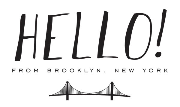
Hello from Brooklyn! I’m Courtney from Swiss Cottage Designs and I’m stoked to be guest blogging this week on our most favorite paper blog, Oh So Beautiful Paper! I’ve been a huge fan of Nole’s blog since the early days so it’s really fun to be able to contribute back to such an inspiring blog. Thanks for having us!

I thought it would be fun to start our week of guest blogging with a peek into our life here in Brooklyn. I founded Swiss Cottage Designs in 2009 after working in the design industry for 4 years. While those years were filled with amazing professional experiences, I always knew I wanted to work for myself. Thus, SCD was born! We specialize in illustration, invitations and custom branding. In the last 5 years we’ve had the pleasure of working with brands such as Warby Parker, Crown Publishing, and Paperless Post as well as many, many wonderful couples and planners. I feel so lucky to be in such an amazing and inspiring industry!

image 1.2 - Studio Desk

image 1.3 Studio Books

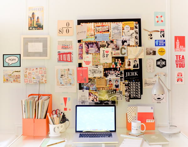
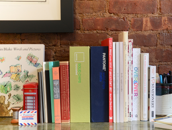
We’re located in Carroll Gardens, a Brooklyn neighborhood of tree lined streets, historic brownstones and about a million places to grab tasty treats (it’s kind of a problem, really.) We have a home studio which means the neighborhood becomes sort of like a co-worker. Lucky for us, he’s not that annoying guy who breathes too heavy in the next cube over.

image 1.5*

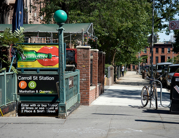
Photo courtesy bigriffith

image 1.4

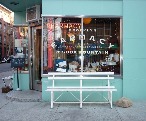
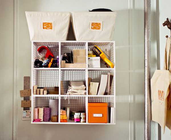
 Photo courtesy of Shiny Bright

A day typical day (if there is such a thing) around the studio consists of lots and lots of emails, drawing, scanning, painting, designing, packaging, eagerly awaiting shipments from the printer, opening said shipments with bated breath, more emails, drawing, packaging and of course illicit amounts of coffee and tea. Running a business is the most incredible experience yet can be just as equally frustrating! There are days when the printer jams all your envelopes, a FedEx package goes missing and a press run comes back wrong and you just want to phone it in. Then you have days that are better than anything you could have imagined. I wouldn’t trade it for anything.

image 1.7 Swiss Cottage Colors

image 1.6 Studio Storage

image 1.8 Swiss Cottage Stationary

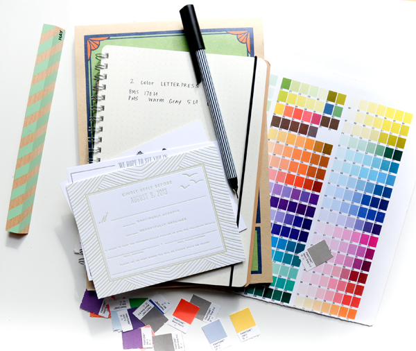
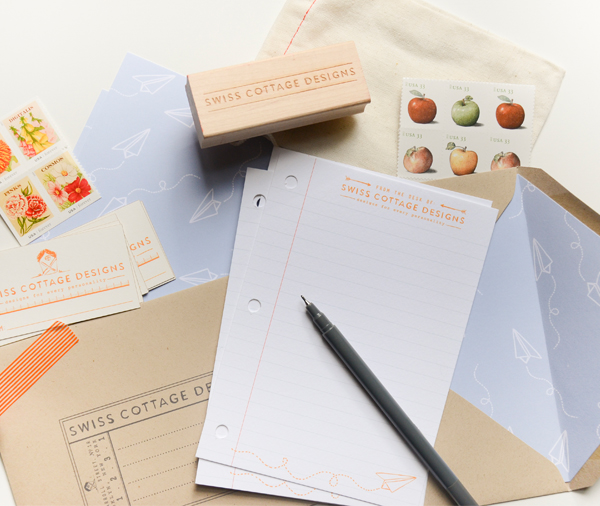
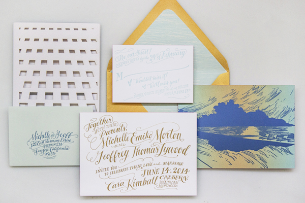
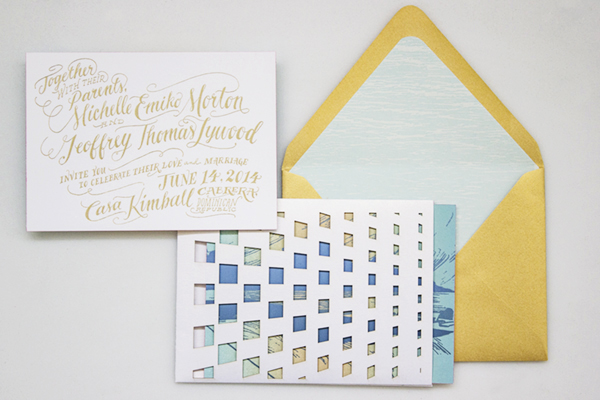
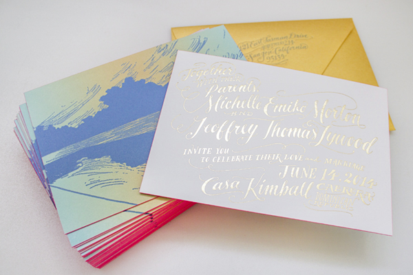
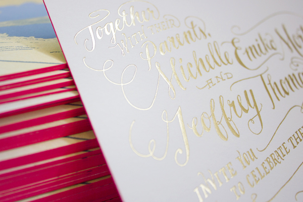
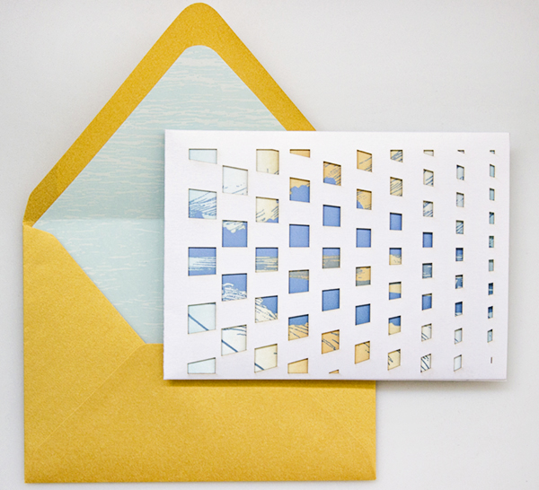
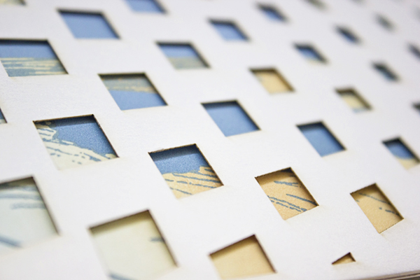
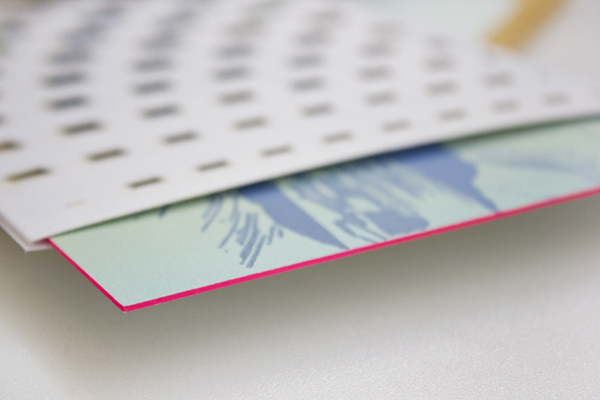
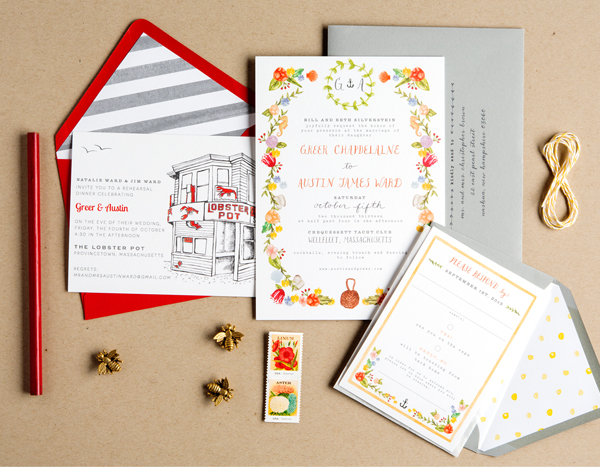
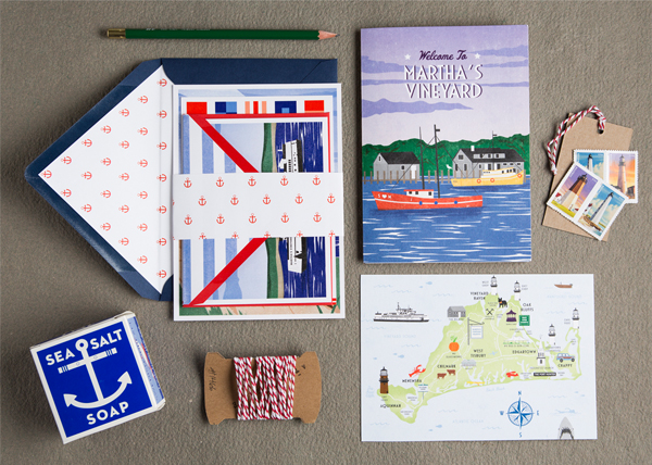
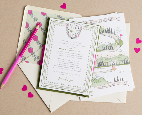
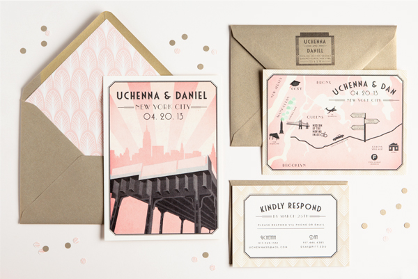
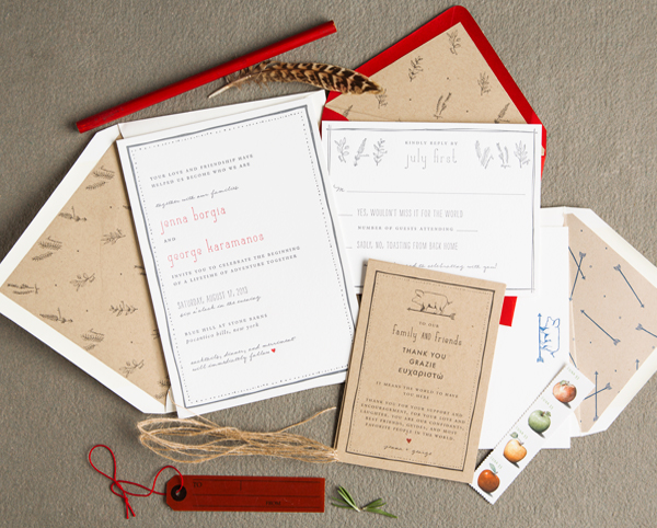
Our clients are constantly inspiring us! Because all of our projects are custom, we’re constantly exploring different methods of art and design. We love that no two jobs are alike. Here are a few recent projects we’ve worked on:

image 1.13

image 1.12

image 1.11

image 1.10

image 1.9

We can’t wait to share more with you! Stay tuned to Oh So Beautiful Paper this week and in the mean time, say hi to us on Twitter and Instagram. Looking forward to meeting you all!

Photo Credits: Swiss Cottage Designs, except where noted

Gold Foil Hand Lettered Wedding Invitations

Happy Monday everyone! Before I head off for a few days in the sun, I just had to share these gorgeous wedding invitations from Arley-Rose and Morgan of Ladyfingers Letterpress! Created for a wedding in the Dominican Republic, these invitations feature Arley-Rose’s signature hand lettering in stunning metallic gold foil, a beautiful rainbow roll sunset, architectural laser cut details, and a pop of bright neon edge painting. Love, love, love!

Neon-Gold-Foil-Hand-Lettered-Wedding-Invitations-Ladyfingers-Letterpress6

From Arley-Rose and Morgan: It didn’t take long for Michelle and Geoff to knock us off our feet and inspire us to make some of our most favorite invitations we’ve ever made! Influenced by their correspondence through adorable hand-written cards, genuinely sweet emails, and giddy phone calls filled with excitement and pure joy, we put our heads together to come up with some invitations fit for some of the sweetest clients we’ve ever had!

Neon-Gold-Foil-Hand-Lettered-Wedding-Invitations-Ladyfingers-Letterpress5

Since their wedding is going to be held in the Dominican Republic, they wanted an invitation suite that reflected the excitement and love they have for each other, while relaying the modern simplicity of their beautiful ocean-side venue. 

Neon-Gold-Foil-Hand-Lettered-Wedding-Invitations-Ladyfingers-Letterpress

Their hand-lettered invitations were hot foil stamped in bright gold foil onto thick, 220lb cotton Crane Lettra paper. On the backside of the invitation, a drawing of the sunset from the Casa Kimball infinity pool was rendered as a dual-split letterpress rainbow roll. Hot pink edge painting was applied to the edge of each piece, giving just the perfect amount of pop for each invitation!

Neon-Gold-Foil-Hand-Lettered-Wedding-Invitations-Ladyfingers-Letterpress4

Neon-Gold-Foil-Hand-Lettered-Wedding-Invitations-Ladyfingers-Letterpress9

The design for their enclosure mimics a pattern found in one of the architectural features at the venue. The pattern was then laser cut out of a Shimmer Ice paper and assembled with a pocket in the back to hold the RSVP card and envelope.

Neon-Gold-Foil-Hand-Lettered-Wedding-Invitations-Ladyfingers-Letterpress10

Neon-Gold-Foil-Hand-Lettered-Wedding-Invitations-Ladyfingers-Letterpress2

Their bright gold outer envelope is lined with a soft blue paper that was letterpress printed with a serene ocean design, and a letterpress return address. In the end, we were sad to see these invitations leave our studio, but happy to know that they were going to a good home. Sure enough, every time we come across the extras that we made here in the studio, we think of Michelle and Geoff and are reminded how fortunate we are to be able to make beautiful things for wonderful people!

Neon-Gold-Foil-Hand-Lettered-Wedding-Invitations-Ladyfingers-Letterpress7

Thank you so much ladies!

Ladyfingers Letterpress is a member of the Designer Rolodex – check out more of their beautiful work right here or visit the real invi­ta­tions gallery for more wedding invitation ideas!

Photo Credits: Ladyfingers Letterpress

Happy Weekend!

So… you may remember that I booked my family a little beach vacation a couple of weeks ago. Well, we’re off to warmer weather next week! We’ll be visiting Puerto Rico for the very first time and we’re all very excited. Luckily, the wonderful Courtney from Swiss Cottage Designs has agreed to help hold down the fort here next week, along with a few regularly scheduled posts – so you’ll be in great hands! But in the meantime…

OSBP-St-Lucia

Photo by me (via Instagram) from a trip to St. Lucia two years ago

…a few links for your weekend!

This week on Oh So Beautiful Paper:

That’s it for me this week! I hope you all have a wonderful weekend, and don’t forget to check back next week for some fantastic guest posts from Courtney! xoxo

DIY Tutorial: Spring Watercolor Wedding Invitation Suite

Spring is finally here and we couldn’t be more excited! When we stumbled across this gorgeous double sided watercolor paper by Rifle Paper Co., we just knew that it would be making a starring appearance in a future DIY tutorial. To kick off the season, we’ve designed a gorgeous, pastel invitation suite that would be perfect for any spring or summer event. The decorative watercolor paper trifold is just icing on the cake! We absolutely love it  this season as an alternative to the envelope liner! – Bailey and Emma of Antiquaria

DIY Tutorial: Watercolor Trifold Wedding Invitation by Antiquaria for Oh So Beautiful Paper

DIY Tutorial: Watercolor Trifold Wedding Invitation by Antiquaria for Oh So Beautiful Paper

Step One: Gather and cut the decorative paper that is destined to be your trifold wrap around your invitation. To fit an A7 (5″ x 7″) card cut the paper into rectangles measuring 7″ tall by 11″ long. This will allow for an inch of overlap around your invitation card. The decorative paper that you choose doesn’t have to be double sided like ours is but we would recommend selecting a paper with a pretty back, either clean white or a color or pattern. Remember that the back will be seen when your guests view the invitation!

DIY Tutorial: Watercolor Trifold Wedding Invitation by Antiquaria for Oh So Beautiful Paper

Step Two: For ease of folding and to make sure the line was straight, we scored one side of our decorative paper at the 2.5″ mark. Fold along the line and set the paper aside.

DIY Tutorial: Watercolor Trifold Wedding Invitation by Antiquaria for Oh So Beautiful Paper

Step Three: Next we stamped our invitation piece on an A7 card. For this design we used our Mod Invitation Stamp and an antique pewter stamp pad. For a step-by-step video tutorial about this printing process go here.

DIY Tutorial: Watercolor Trifold Wedding Invitation by Antiquaria for Oh So Beautiful Paper

Step Four: Next, we folded the other side of our decorative paper trifold around the A7 card, making sure it was a snug fit. We used a bone folder to make a crisp, folded edge.

DIY Tutorial: Watercolor Trifold Wedding Invitation by Antiquaria for Oh So Beautiful Paper

Step Five: Insert the A7 invitation card into the trifold decorative paper with double sided tape or stick glue. Put the tape on all four corners of the back of your card. Carefully place it over the center of the trifold and press it down to adhere it to the decorative paper.

DIY Tutorial: Watercolor Trifold Wedding Invitation by Antiquaria for Oh So Beautiful Paper

Step Six: For the reply card, we wanted to add some pattern and color to tie together the coral and turquoise sides of our decorative paper. For the reply card itself, we cut 4bar cards (3 1/2″ x 4 7/8″) out of our Paloma Patterned Coral Cover Paper and stamped our Mod  Reply Card Stamp on the blank, non-patterned side. We used a turquoise colored 4bar envelope stamped with our Mod Banner Return Address Stamp to coordinate. You will get four 4bar cards out of one sheet of card stock.

DIY Tutorial: Watercolor Trifold Wedding Invitation by Antiquaria for Oh So Beautiful Paper

Step Seven: The last step puts all of the gorgeous finishing touches on the suite. We used the Paloma Coral Paper again, except in text weight, to make the belly bands wrapped around the suite. We cut them into strips of 2″ x 11″ – meaning you will get four belly bands per sheet of paper. After taping the belly band, we tied a piece of ribbon around the band to soften the look and add a bit of texture to the design.

We stamped the same return address (Mod Banner Return Address Stamp) on the back flap of a blush envelope before addressing them and sending them on their merry way! We promise that each guest will be truly delighted to receive such a present in their mailbox!

Materials

Mod  Invitation Stamp

Mod  Reply Card Stamp

Mod Banner Return Address Stamp

Stamp Pad in Antique Pewter

Decorative Paper (we used these ombré gift wrap sheets from Rifle Paper Co.) cut to 7″ x 11″

A7 Cards in Superfine White

A7 Envelopes in Luxe Blush

Paloma Coral Patterned Paper in Cover and Text weight

4bar Envelopes in Pool

Double sided tape or stick glue

Scoring Board

Ribbon

Anti­quaria is a mem­ber of the Designer Rolodex – you can see more of their beau­ti­ful work right here or visit the real wedding invitations gallery for more wedding invitation ideas!

Photo Credits: Antiquaria for Oh So Beautiful Paper