Friday Happy Hour: The Tom Collins

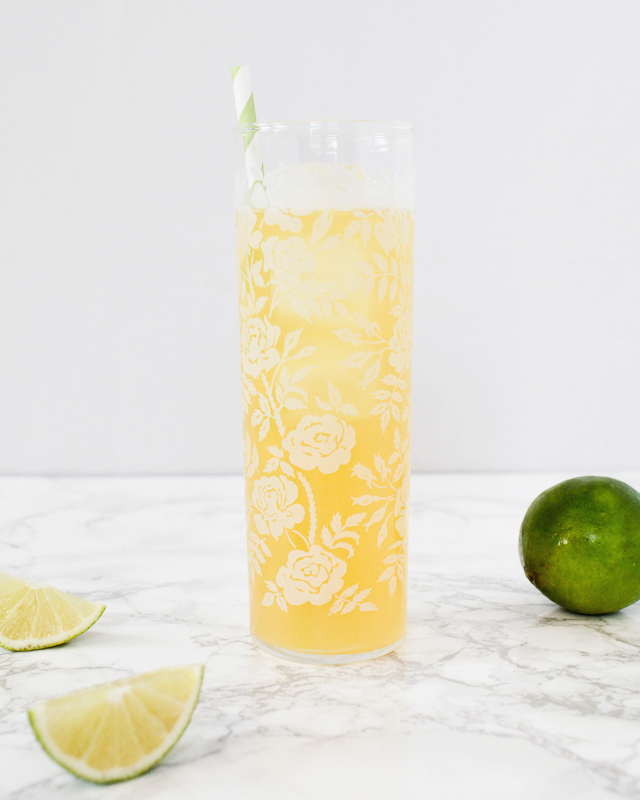
It’s finally, finally, finally Spring. So we can finally break out some Spring cocktails! Here’s another entry in our back-to-basics series, this time one of the best and easiest drinks out there: the Tom Collins. – Andrew

Tom Collins Cocktail Recipe / Liquorary for Oh So Beautiful Paper

Signature-Cocktail-Recipe-Card-The-Tom-Collins-Shauna-Lynn-Illustration-OSBP

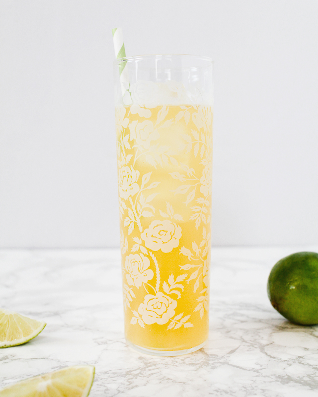
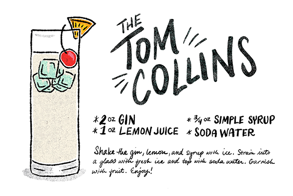
Illustration by Shauna Lynn for Oh So Beautiful Paper

The Tom Collins

2 oz Gin
1 oz Lemon Juice
3/4 oz Simple Syrup
Soda Water

Shake the spirits, lemon, and syrup with ice. Strain into a glass filled with fresh ice and top with soda water. Garnish with fruit. Enjoy!

There’s nothing too complicated here: spirits, citrus, sugar, and soda water. Sound familiar? This is basically a sparkling Gin Sour. Sweet and tart, crisp and floral from the gin, sparkling and refreshing – perfect for this time of year.

Tom Collins Cocktail Recipe / Liquorary for Oh So Beautiful Paper

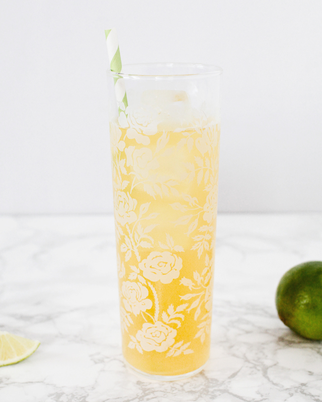
Almost any Tom Collins these days will be made with dry gin, which is just fine. But it’s even better with Old Tom gin – a sweeter, maltier cousin of dry gin – or Genever, the ancestor of modern gin that’s a bit like a botanical-laden whiskey. Or, really, you could use pretty much any spirit you’d like. (I really love Ransom’s aged Old Tom.) You can, and should, also adjust the tartness and sweetness to suit your tastes. That recipe above is a suggestion, not a rule. It’s hard to mess up a Tom Collins.

Tom Collins Cocktail Recipe / Liquorary for Oh So Beautiful Paper

The Tom Collins is so obvious a recipe that it appears in the record not long after the first cocktails, in the 1830s in England, evolving out of Gin Punch. Back then, it was called the John Collins, probably named for the first person to make the drink, or at least claim to be the first to make it. (You can still order a John Collins, but you’ll get a whiskey version of this drink.) It probably took on its current name a few decades later, when someone figured out this drink is particularly amazing with Old Tom gin. It kept the name even though we forgot all about Old Tom gin, though thankfully distillers are starting to produce it again based on old recipes.

Don’t forget to let us know if you try any of our recipes. And if you do make one at home, you can use #osbphappyhour to share photos of these (or your own creations) on Instagram.

Photo Credits: Nole Garey for Oh So Beautiful Paper

Happy Weekend!

Oh man you guys, this was a rough week. As I mentioned last week, Sophie came down with a bug, which a few days later morphed into a double ear infection and lower chest infection. We have one sad little toddler on our hands, which has resulted in several sleepless nights and two exhausted parents. I struggle during weeks like this: days that feel like a slog behind the scenes while trying to push forward and share pretty things for all of you to enjoy. I want to share the good and the bad here, but when things get tough (and especially when I’m feeling wiped out) it often feels easier to be quiet and wait for the storm to pass. I’m also way overdue for a Sophie update and a general life update, but that will have to wait for next week when I hopefully have a bit more energy. But in the meantime…

Paper-Party-Flowers-OSBP-Instagram

Photo by me via Instagram / Playing around with some paper flowers for my upcoming annual Paper Party!

…a few links for your weekend!

This week on Oh So Beautiful Paper:

Check back soon for this week’s cocktail! I hope you all have a wonderful weekend, and I’ll see you back here next week! xoxo

Ashley + Jeff’s Modern Chic Neon Pink Wedding Invitations

These weddings invitations are the result of a fantastic collaboration – designed by the bride (and featuring her own calligraphy!) and letterpress printed by Alia and Jason of Darling Press. Ashley wanted her wedding invitations to reflect both her love of paper (yay!) and her modern chic wedding style. The design features a blind impression pattern inspired by the texture on Ashley’s wedding dress and pops of neon pink. Love!

Neon-Pink-Modern-Calligraphy-Wedding-Invitations

From Ashley: I wanted our invitations to be really unique and really us. I love paper, typography, letterpress, and everything that goes along with it. I wanted to set a tone through the paper that we could carry throughout the rest of the wedding plans: sophisticated, chic, modern, and clean. Our wedding will take place in an art gallery in DC, and our tables will be Pantone colors instead of numbers – hence my interest in getting very specific ink colors.

Neon-Pink-Modern-Calligraphy-Wedding-Invitations2

The blind impression pattern is inspired by the embellishment on my wedding dress. I was using a font for the calligraphy at first, but then I took a calligraphy class from Michele Fritz of Meant to be Calligraphy here in DC, and she convinced me to replace that font with my own writing.

Neon-Pink-Modern-Calligraphy-Wedding-Invitations3

When it came time to print the invitation suite, Alia and Jason of Darling Press to letterpress printed the design on 236# Savoy Bright white paper with neon pink edge painting.

Neon-Pink-Modern-Calligraphy-Wedding-Invitations4

Neon-Pink-Modern-Calligraphy-Wedding-Invitations5

Thanks Alia and Jason!

Design: Ashley Frazier

Letterpress Printing: Darling Press

Check out the Designer Rolodex for more tal­ented wed­ding invi­ta­tion design­ers and the real invi­ta­tions gallery for more wedding invitation ideas!

Photo Credits: Darling Press

Pascale + Maurice’s Colorful Cinco De Mayo Wedding Invitations

How about a little neon to brighten up your Wednesday? Heidi from idieh design sent over these vibrant invitations created for a Cinco de Mayo wedding, featuring neon fuchsia and neon orange paired with bright blue edge painting and kraft paper envelopes. So fun!

Cinco-De-Mayo-Wedding-Invitations-idieh-design

From Heidi: Pascale and Maurice wanted to merge tradition and trend in a fun and artistic way. Their wedding would take place on Cinco de Mayo weekend, so they chose to honor the Mexican holiday with a “fiesta-chic” theme. They wanted their invitation suite to incorporate a whimsical color scheme inspired by the very colorful Mexican culture.

Cinco-De-Mayo-Wedding-Invitations-idieh-design2

We decided on an extra-thick invitation with vibrant neon fuchsia and neon orange to let guests know it was going to be a fun, festive, and bold celebration. The graphic Mexican banner subtly enclosed the couple’s initials within the cuts of the design. The invitation was backed with a vibrant chevron pattern that utilized spot coating varnish for a glossy finish.

Cinco-De-Mayo-Wedding-Invitations-idieh-design3

Bright blue edge painting on the main invitation provided a finishing touch. The entire suite, including the adorable response card, was packaged in a kraft envelope lined with a black and white polka dot patterned liner. 

Cinco-De-Mayo-Wedding-Invitations-idieh-design4

The bold graphics and colorful palette continued throughout the wedding day with the over-the-top playful ceremony programs, the whimsical table numbers, and the cheerful escort cards.

Cinco-De-Mayo-Wedding-Invitations-idieh-design8

Thanks Heidi!

Check out the Designer Rolodex for more tal­ented wed­ding invi­ta­tion design­ers and the real invi­ta­tions gallery for more wedding invitation ideas!

Photo Credits: Michelle Herrick Photography