Todd + Sasha’s 1920s-Inspired Elegant Hand Lettered Wedding Invitations

Hi Again! Today we’d like to share with you a recent invite we did for an amazing couple who was having a sophisticated ’20s-era wedding. Although “Gatsby” was one of the words they used to convey the feeling they were going for, their suite was more about capturing the elegance and modernism of the era rather than trying to replicate the cues taken from the recent Baz Luhrmann movie. –Arley-Rose and Morgan of Ladyfingers Letterpress

1920's-inspired Elegant and Modern Letterpress Suite

The suite features a two-sided, super thick invite that’s letterpress printed on both sides, with an application of silkscreen on the front, and edge painted in antique gold. If you’re familiar with letterpress printing at all, you may be aware that printing flats are a little more challenging than printing line work. We wanted to try a new approach where we attempted to letterpress a silver layer on top of the charcoal base flat layer, with the cream text knocked out of the charcoal layer. We had done a test in the studio before we pitched the idea to the client and it looked great. Somehow, by the time we were ready to print the silver layer, it didn’t look as legible as the tests and we had to come up with a new approach. We opted for silkscreen since it’s more viscous than letterpress ink. Another solution could have been hot foil stamping.

1920's-inspired Elegant and Modern Letterpress Suite

On the back of the invitation, we letterpress printed a cross section of a piece of wood, since the groom-to-be was an avid wood worker.

1920's-inspired Elegant and Modern Letterpress Suite

Their wedding was set to take place on Shelter Island, and features a letterpress print of a vintage map that acts as an inner envelope. These were then addressed in gold guache by our in-house calligrapher Tammy Ann Tan.

1920's-inspired Elegant and Modern Letterpress Suite

Their RSVP is also letterpress printed on thick cotton paper, edge painted and is double sided to accommodate menus, events and additional info. Their folded letterpress Info Card features directions, accommodations and vintage illustrations of Planes, Trains, and Automobiles.

1920's-inspired Elegant and Modern Letterpress Suite

1920's-inspired Elegant and Modern Letterpress Suite

1920's-inspired Elegant and Modern Letterpress Suite

p.s. Ladyfingers Letterpress is a member of the Designer Rolodex – check out more of their beautiful work right here or visit the real invi­ta­tions gallery for more wedding invitation ideas!

Photo Credits: Ladyfingers Letterpress

Hand-Lettering with Ladyfingers Letterpress

Greetings! It is an honor and a pleasure to be guest blogging on our most favoritest blog in the world for the next few days! We were thrilled when we were asked to create Sophie’s birth announcements, and are psyched to share with you more unique and curious work from the minds and hands of Ladyfingers Letterpress! â€“Arley-Rose and Morgan of Ladyfingers Letterpress

Ladyfingers Letterpress via Oh So Beautiful Paper

If you are familiar with our work, you know that we are all about blurring the lines between stationery and “whoaa!?”. We’re a bit crazy about coming up with new and exciting ways in which your guests receive your big announcement. When the right clients come along who are as excited about doing something different as we are, get ready for the unexpected. Piñatas stuffed with an invitation? Sure! Little cutouts of the couple who can dance and move on top of a record player? Why not! Full letterpress rainbow roll knocked-out flats? It can be done! There is no task to large nor too complex for our inquisitive brains. Challenges keep us going. Conformity kills our spirit. And ice cream is always on our minds.

Ladyfingers Letterpress via Oh So Beautiful Paper

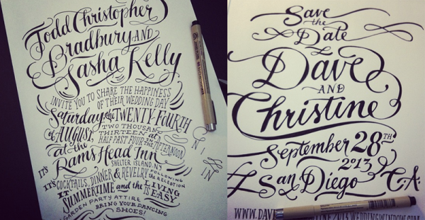
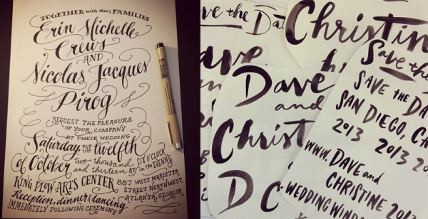
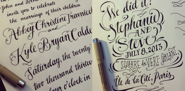
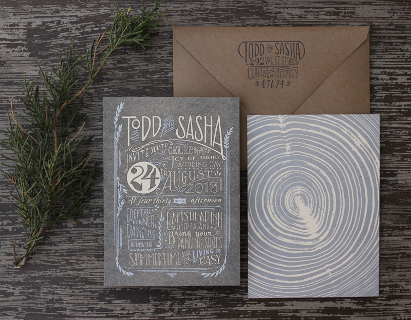
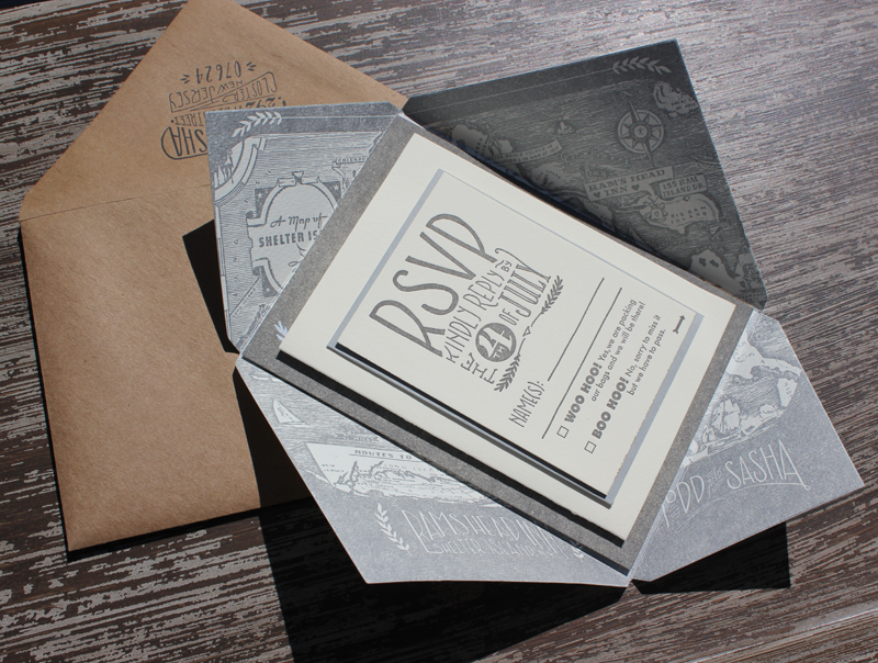
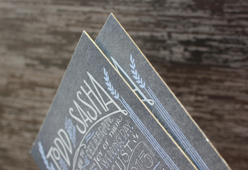
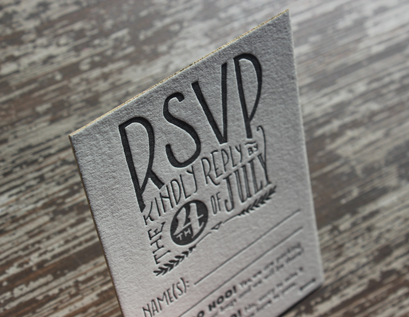
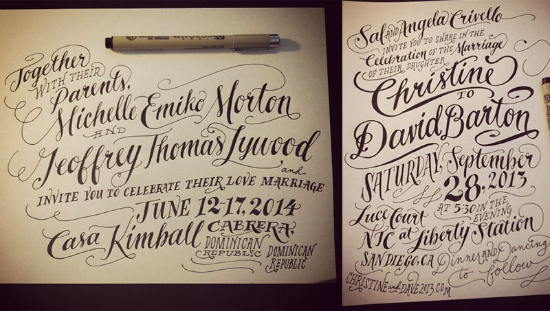
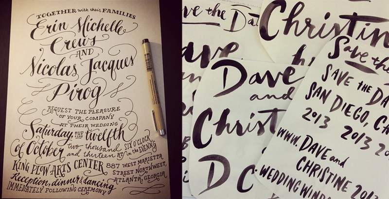
Another thing you may recognize about our work is the abundance of hand-lettering. Our obsession began back in the early 2000s when Arley-Rose was using it to rebel against the rigidity of the type world that was prevalent during her time studying at Parsons. Now, its easier and faster for her to draw letters than use design programs to create a layout, and her trademark handiwork has become one of the most identifying features about our work.

Ladyfingers Letterpress via Oh So Beautiful Paper

In our first post as guest bloggers, we’d like to introduce ourselves in this short clip where we give you a short and informal tour of our studio, and take you along as we hand-letter a real life invitation! (Pardon the absence of Morgan, the other mastermind behind Ladyfingers. She was out running errands when we recorded this!)

Interested in getting started with hand-lettering? Here are some tips to create your own illustrative voice using the most valuable design software ever: your hands, your brain, and a pen & paper:

• Materials: I like using Micron .08 or .05 pens and standard sketchbook paper. I don’t usually do a pencil sketch first, since I find that I lose the initial gesture of the design if I am tracing over existing line work. (If you feel more comfortable creating a layout in pencil and tracing in ink, be sure to draw lightly or your ink lines may become compromised when you’re erasing your pencil lines. Feel free to also use a lightbox to trace!)

Hand Lettering Ladyfingers Letterpress

• How does your message sound? Before you start, consider the tone or the voice of your piece. Is it formal? Fun and exciting? Remember that when people read text, they put it in a voice. (Or maybe that’s just me?) Do you want your lettering to sound like its being spoken by Vincent Price or a little kid on a trampoline? Or maybe just you, being really excited, and happy to share your joyful message with your most favorite people in the world? Don’t be ashamed to show how psyched you are! Your excitement will translate into a beautiful piece.

Ladyfingers Letterpress Hand Lettering

• Put some music on! I find that music and lettering have a lot in common. Not only do they both share a rhythm that can inspire people to keep reading/listening, but in the same way that you don’t have to listen to a song very long to know if its a somber song or a happy song, a nice piece of hand lettering should hit you with an expression as soon as you see it. You don’t wait till the last note to understand the essence of a song, so why should you have to wait til the last word to understand the message of a design?

Ladyfingers Letterpress Hand Lettering

• Practice, practice, practice! There is no app for this. There is no photoshop filter that will make your lettering look better. If you want to truly get better at hand-lettering, do it every day and don’t be afraid to make mistakes. Your hand and arm muscles will get used to drawing letters and it will become easier. Start with mastering one lettering style, whether its Roman, Script or Sans Serif. Need inspiration? Check out the different type styles on MyFonts.com. Once you have your favorite lettering style down pat, introduce a contrasting style. For example, I love combining script with a serif face.

Ladyfingers Letterpress Hand Lettering

• Draw other things, too! We wouldn’t be where we are today if it weren’t for a lifetime of drawing. To be a good letterer, you need to be comfortable with your pen enough to be free with it. Gotta know the rules before you can break ’em! Controlled chaos, that’s really what lettering is!

Ladyfingers Letterpress Hand Lettering

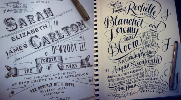
Once my drawings are finished, I scan them into the computer at high resolution. Sometimes I’ll clean up little errors in Photoshop and then drop them into Illustrator. I have a specific profile set up under Live Trace  so that my drawings come out crisp and un-live-tracey. Once they’ve been vectorized, I can move letters around and play with the design a little. Sometimes if I am drawing and I don’t like a letter or word that I just drew, I’ll draw another off to the side and move it in when I’m in Illustrator. The key is to have fun! Cuz if it ain’t fun, why do it?

Photo Credits: Ladyfingers Letterpress

{happy weekend!}

Happy Friday everyone! And surprise – I’m on vacation! We took our first cross country flight with Sophie yesterday for some much needed rest in Big Bear with my side of the family. We’re hanging out here for a few days, then spending a couple more days in LA before heading back to DC. Next week I have a couple of fantastic guest bloggers holding down the fort – and I’m so excited about what they have planned for you! You won’t want to miss it! But in the meantime…

…a few links for your weekend!

This week on Oh So Beautiful Paper:

I hope you all have a wonderful weekend – don’t forget to check back for this week’s cocktail recipe and then again next week for some amazing guest posts! I’ll see you back here in a couple of weeks! xoxo

Raymond + Marc’s Modern Poster Birthday Party Invitations

Rebecca from Crafty Pie Press sent over these modern invitations designed for her nephews’ joint birthday party – the blue and green color palette is so perfect for teenage boys! Rebecca’s challenge was to create something cheerful without being overly childish. The resulting invitation features a poster-inspired layout and fun chevron stripe pattern. Super cute!

Modern Poster-Style Birthday Party Invitations by Crafty Pie via Oh So Beautiful Paper (1)

From Rebecca: My sister asked me to design the invitations for my nephews’ 14th and 16th birthday party and Raymond’s 8th grade graduation. This was the first time I’ve designed invitations for teenage boys – it was a little bit challenging since I’m the complete opposite of a teenage boy!

Modern Poster-Style Birthday Party Invitations by Crafty Pie via Oh So Beautiful Paper (3)

They’re not kids anymore (even though I still think of them as kids!) so I couldn’t put together something childish. I decided on a modern poster style invitation in their favorite colors, green and blue. It’s still fun without feeling childish. I also designed a green chevron stripe pattern that was printed on the back of the invitation. I paired the invitation with a kraft envelope and an envelope liner with the green chevron pattern.

Modern Poster-Style Birthday Party Invitations by Crafty Pie via Oh So Beautiful Paper (5)

Modern Poster-Style Birthday Party Invitations by Crafty Pie via Oh So Beautiful Paper (4)

Thanks Rebecca!

Photo Credits: Crafty Pie Press

Alexia + Marco’s Colorful Miami Art Deco Wedding Invitations

Happy Monday everyone! I hope you all had a wonderful holiday and weekend! I always have trouble getting back into a groove after a long weekend, so I thought these bright and colorful wedding invitations from Nicole at Umama were the perfect way to start the week. Bride Alexia wanted Art Deco-inspired design mixed with vibrant Miami colors – such a fun combination! I love the tiny flamingo motif incorporated throughout the design, from the invitation to the envelope liner. So cute!

Colorful Miami Art Deco Wedding Invitations by Umama via Oh So Beautiful Paper (9)

From Nicole: Alexia and Marco’s wedding has an Art Deco theme, but will take place in Miami. Alexia said she envisioned Art Deco style with slightly more flair, brighter colors, and gold foil. She sent along some inspiration from the Art Deco era and we worked from her vibrant color palette. The combination of clean lines, bold colors, and gold foil made this one of my favorites!

Colorful Miami Art Deco Wedding Invitations by Umama via Oh So Beautiful Paper (1)

Colorful Miami Art Deco Wedding Invitations by Umama via Oh So Beautiful Paper (3)

Colorful Miami Art Deco Wedding Invitations by Umama via Oh So Beautiful Paper (8)

Thanks Nicole!

Check out the Designer Rolodex for more tal­ented wed­ding invi­ta­tion design­ers and the real invi­ta­tions gallery for more wedding invitation ideas!

Photo Credits: Umama