Sybil + Oliver’s Floral Poster Wedding Invitations

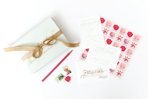
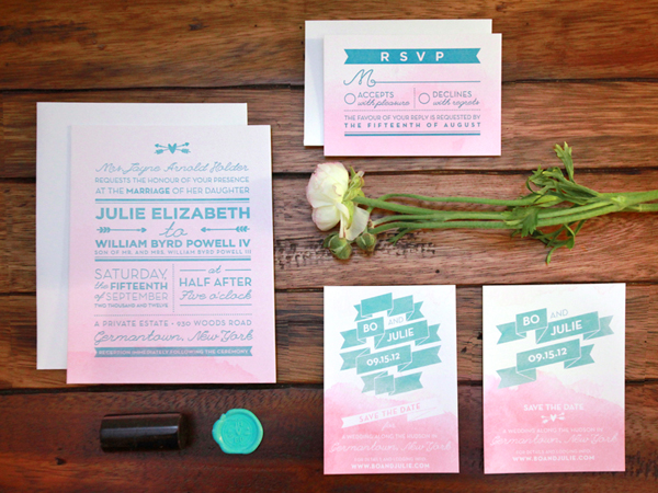
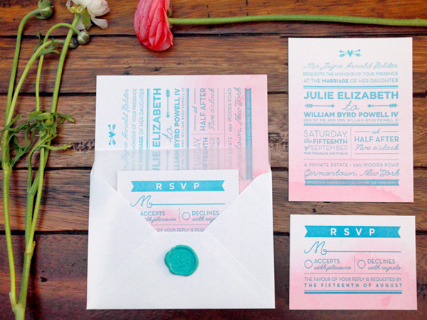
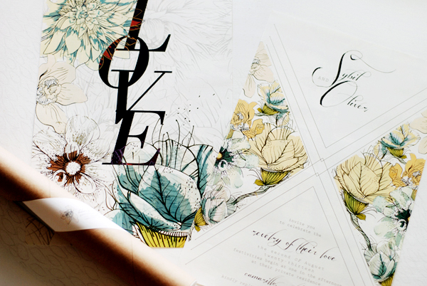
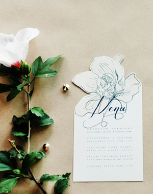
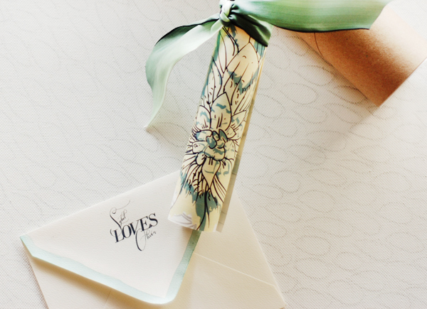
Nicole from Umama decided to go big with these wedding invitations – like poster big! Nicole incorporated a watercolor-inspired floral pattern and made sure that the reverse side of the invitation could stand alone as keepsake artwork. Beautiful!
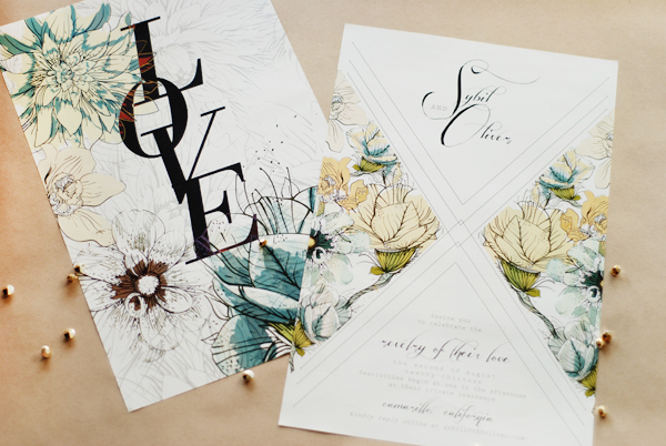
Floral-Poster-Wedding-Invitation-Umama4

From Nicole: For Sybil and Oliver’s invitation, we wanted to go big! But in being big, we also wanted to make it beautiful and purposeful. The artwork on the back was designed to be a keepsake: to hang on a wall, add to an inspiration board, or pass to a friend.

Floral-Poster-Wedding-Invitation-Umama2

Floral-Poster-Wedding-Invitation-Umama3

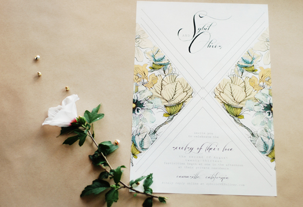
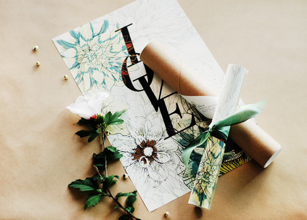
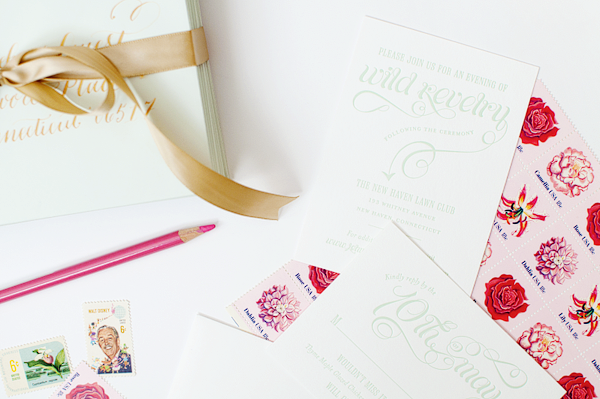
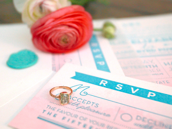
Delicate watercolor-esque flowers adorn the invitation, which was then wrapped with an ombre jade ribbon and sealed within a mailer tube. A little LOVE goes a long way!

Floral-Poster-Wedding-Invitation-Umama

Floral-Poster-Wedding-Invitation-Umama11Floral-Poster-Wedding-Invitation-Umama10

Floral-Poster-Wedding-Invitation-Umama7

Thanks Nicole!

Check out the Designer Rolodex for more tal­ented wed­ding invi­ta­tion design­ers and the real invi­ta­tions gallery for more wedding invitation ideas!

Photo Credits: Umama

Jessie + Spencer’s Storybook-Inspired Baby Shower Invitations

These adorable baby shower invitations come to us from Jessie and Jen of Shipwright & Co. – and they’re for Jessie’s own baby shower! The shower doubled as a co-ed pool party and barbeque, so Jessie and Jen wanted to avoid anything traditionally “baby” for the design. They drew inspiration from antique storybooks, incorporating whimsical illustrations and hand lettering. Beautiful!

Woodland-Letterpress-Baby-Shower-Invitations-Shipwright-Co2

From Jessie (and Jen): These invitations were created for a co-ed baby shower doubling as a pool party and barbecue for an expecting mom (me!) who wanted something a little different for her shower. We set out to create an invitation that would be child-like without being overly cutesy. Our inspiration came from storybooks from the 1930s and ’40s, whose beautiful and whimsical illustrations conveyed the sense of childhood that we sought.

Woodland-Letterpress-Baby-Shower-Invitations-Shipwright-Co5 Woodland-Letterpress-Baby-Shower-Invitations-Shipwright-Co8

 We printed the moon and animals in a light gray, set against irregular bubbles of overlapping color, to play around with the lovely way in which the translucent inks interact with each other on the lush cotton paper. The details of the party sit within each bubble in hand-drawn text. We loved the way the text pops against the background color and how the pressure of the press raises it up slightly, giving the whole piece that lovely tactile quality you get from letterpress.

Woodland-Letterpress-Baby-Shower-Invitations-Shipwright-Co3

Woodland-Letterpress-Baby-Shower-Invitations-Shipwright-Co

Lastly, we printed the envelopes in the same light green color as the invitations with more hand-drawn text and a different illustration of woodland creatures — this time a happy pair of dancing frogs. This project was hand printed on our 1911 Chandler & Price letterpress on Crane’s Lettra pearl white paper.

Woodland-Letterpress-Baby-Shower-Invitations-Shipwright-Co4

Thanks Jessie & Jen!

Photo Credits: Shipwright & Co.

Kelly + John’s Pink, Mint, and Gold Wedding Invitations

Pink, mint, and gold – can you imagine a sweeter color palette? Nichole from Coral Pheasant incorporated all three colors through both the save the dates and wedding invitations. Nichole started with a fold-out save the date (along with some confetti!), followed by beautiful letterpress printed invitations! The final finishing touches? Calligraphy by Molly Jacques and the perfect pink and mint vintage stamps!

Pink-Mint-Wedding-Invitations-Coral-Pheasant

From Nichole: Kelly and John’s vision for their wedding was for it to be fun and full of surprises with simple pops of color. I love bring­ing an ele­ment of dis­cov­ery to cus­tom sta­tionery and was excited to get started on this project!

Pink-Mint-Wedding-Invitations-Coral-Pheasant7

Pink-Mint-Wedding-Invitations-Coral-Pheasant8

With their deli­cious color palette of mint, pink, and gold, we started with an accor­dion style save the date. The card featured the details on the front and a chevron-inspired pattern on the back. On the last panel, a mini glas­sine enve­lope was attached that con­tained tis­sue paper con­fetti and a small card with their wed­ding web­site. Who doesn’t get excited by confetti?!

Pink-Mint-Wedding-Invitations-Coral-Pheasant5

Pink-Mint-Wedding-Invitations-Coral-Pheasant6

The design car­ried over to their letterpress printed invi­ta­tion suite where cel­e­bra­tory word­ing mar­ried playful typography, and the pattern from the save the date was used on the envelope liners. The finishing touch: lovely calligraphy by Molly Jacques.

Pink-Mint-Wedding-Invitations-Coral-Pheasant3

Pink-Mint-Wedding-Invitations-Coral-Pheasant2

Thanks Nichole!

Design: Coral Pheasant

Calligraphy: Molly Jacques

Check out the Designer Rolodex for more tal­ented wed­ding invi­ta­tion design­ers and the real invi­ta­tions gallery for more wedding invitation ideas!

Photo Credits: Coral Pheasant

Chris + Yelena’s Gilded Parisian Wedding Invitations

I’m always so excited when Margot from Atelier Isabey sends over one of her custom wedding invitation designs because I know it’s going to be super creative and unique. Case and point: these romantic invitations for a wedding in Paris! The invitation suite combines gold foil and black letterpress printed text along with a booklet full of important info for guests. Stunning!

Gold-Foil-Paris-Wedding-Invitations-Atelier-Isabey6

From Margot: Weddings don’t get any more romantic and glamorous than in Paris so we wanted to set the tone with an invitation that captured a truly classic Parisian feel in a fresh, updated way. We tried to stay away from anything too kitschy or cliché and focused on making the suite feel French and Parisian with understated references to the city of lights and with elegant photography and graphics.

Gold-Foil-Paris-Wedding-Invitations-Atelier-Isabey3

Gold-Foil-Paris-Wedding-Invitations-Atelier-Isabey7

Yelena, the bride, was originally from Russia and loved all things luxurious and ornate, Chris on the other hand had a more modern and minimalist, Philippe Starck aesthetic. We merged their individual styles right in the middle and accentuated the design with a multitude of luxe print methods, details and finishings.

Gold-Foil-Paris-Wedding-Invitations-Atelier-Isabey2

The invitation card is printed in gold foil and black letterpress on ultra thick stock with gilded edges. It is paired with a booklet (also with gilded edges) which outlines the itinerary, information and details all designed in a contemporary editorial style with bold typography and crisp photography.

Gold-Foil-Paris-Wedding-Invitations-Atelier-Isabey4

Gold-Foil-Paris-Wedding-Invitations-Atelier-Isabey

Both of these pieces slide into a stark white sleeve accented with a sculpture embossed coat of arms designed specially for them. To finish the entire look we designed a custom gusseted envelope with a thick spine and contoured flap to house the contents within.

Gold-Foil-Paris-Wedding-Invitations-Atelier-Isabey5

Thanks Margot!

Check out the Designer Rolodex for more tal­ented wed­ding invi­ta­tion design­ers and the real invi­ta­tions gallery for more wedding invitation ideas!

Photo Credits: Atelier Isabey

Julie + Bo’s Hand Painted Wedding Invitations

Happy Monday everyone! We’re starting the week with some beautiful wedding invitations from Meghan of And Here We Are! Inspired by the bride’s love of all things ombré, Meghan combined watercolor (hand painted on more than 200 sheets of paper!) and letterpress printing into a seriously gorgeous wedding invitation.

Pink-Aqua-Ombre-Wedding-Invitations-And-Here-We-Are2

From Meghan: Julie and Bo’s upstate New York wedding had a bohemian, outdoorsy, and slightly vintage vibe with a color scheme of peach and robin’s egg blue. It was really important that their invitations felt unique and hand made, so when Julie showed me her Pinterest board full of ombrés, I knew I just had to try a hand-painted watercolor ombre paper with blue letterpress printed elements.

Pink-Aqua-Ombre-Wedding-Invitations-And-Here-We-Are

I painted over 200 individual pages of extra-thick cotton paper, then letterpress printed and trimmed them to size. The invitation was inspired by a mix of vintage and modern design, with some hand drawn components. Elements like the ribbon motif, the crossed-arrow heart, and 1920s-inspired double lines and angles, along with a mix of script and sans-serif typefaces came together to form the final design.

Pink-Aqua-Ombre-Wedding-Invitations-And-Here-We-Are4

I also created a Julie and Bo ‘logomark,’ which we used on the save the dates, programs and wedding website, and also translated into a rubber stamp and wax seal. That artwork was later used on matchbooks, favors and cups at the wedding.

Pink-Aqua-Ombre-Wedding-Invitations-And-Here-We-Are3

Pink-Aqua-Ombre-Wedding-Invitations-And-Here-We-Are6

Thanks Meghan!

Check out the Designer Rolodex for more tal­ented wed­ding invi­ta­tion design­ers and the real invi­ta­tions gallery for more wedding invitation ideas!

Photo Credits: Julie Holder