Brick + Mortar Q + A: Will anyone find me at NSS?

I love writing this Brick + Mortar column. Your responses are a highlight each month. Often the best conversations emerge in the comments section or via email after a post. Though I love talking through your questions one-on-on, I dreamed up this spin-off Q + A column because many of you had similar questions and I thought it would be fun and helpful to answer them in this format. (For those of you who have more extensive questions about your own line, I’ve also devoted a bit of time each month to one-on-one consulting.) Please submit any questions you have to me at [email protected]. Thank you so much for trusting me to be a part of your businesses. I can’t wait to hear from you and I hope you love this column as it evolves! –Emily of Clementine
Hello Brick + Mortar by Emily McDowell Illustration for Oh So Beautiful Paper

Illustration by Emily McDowell for Oh So Beautiful Paper

Hi Emily!

I finally took the bullet and applied for National Stationery Show. But when I got my booth number, I freaked out that it was really far back and that no one would go to that section. I was curious if you could let me know if you walked that far back (near the supply side), or perhaps I could try to apply for the ‘fresh’ section? 

I attached the NSS floor plan with my booth circled in pink so you can see my spot. Thank you SO MUCH for your help!

I hope you have a gloriously lovely day!

– Jenipher 

***

Dear Glorious Jenipher,

Congratulations! Applying to NSS is a huge, exciting step for a new line.

The great thing about trade shows is that there are literally endless things to freak out about. I truly wouldn’t worry about your location, especially for your first show. Location does matter, but most spots have pros and cons. NSS is a manageable size for retailers to walk. So rather than get into the potential pros/cons of your spotwhich I think is pretty decent, by the way – it’s in the 2200s and not too far out (Ed Note: You do have the option of requesting a new booth number from your NSS rep if you’re really really concerned, but yeah, the 2200 aisle is a great location. You’ll be in great company. –Nole), let’s focus on what you can do to make it a great spot for you.

  1. Target your retailers in advance. Make yourself a destination for them at NSS. Make a list of your existing and ideal retailers. Make sure you personalize your mailers to them and consider a show special or incentive to encourage them to visit. This is also a great year to create a memorable mailer – a little buzz can go a long way to get retailers to visit (more on that in a later post!)
  2. Design an eye-catching booth. Dream big, sketch, brainstorm, look through old OSBP posts about NSS. Do it now! As you get closer, you’ll be knee deep in the nitty-gritty work of actually building your booth. If you don’t plan your design in advance, you may be too tired to give it the energy and it needs. I walk up and down almost all of the rows, but sometimes it’s just a quick sweep (an internal no, no, no, yes!) waiting for a booth to pull me in. So you could be right in the heart of the action, but if you don’t stand out, retailers will pass you by.
  3. Build your social media community. Start focusing on other stationery makers and retailers now. Check in with the NSS2015 hashtag to see how others are preparing. Give sneak peeks. Talk to retailers and your colleagues. Find them on Instagram now and start conversations. One of the best parts of NSS is the community you build that carries you through from one show to another. I think it will help ease some of the fears to go in feeling like you’re part of it.

A note about the Fresh section. I do think it’s a great thing to apply for in your first show, because:

  1. There are retailers who will check out that section just because they are interested; and
  2. You meet your peers, many of whom are sharing many of the same experiences. It’s exciting to grow together and maintain those friendships.

However, wherever you are, especially in your first year, your job is to draw retailers in and look fabulous when they get to you. You can focus on that no matter your location. See you in three months!

x + o! Emily

NYNOW Winter 2015, Part 1

A couple of weeks ago, I ventured up to New York for the winter NYNOW market – a large trade show with exhibitors showcasing everything from handmade ceramics and jewelry to furniture and home decor. I shared quite a bit of the show on Instagram, but wanted to highlight some favorites from each section of the show that I walked (including some photos that I took with my big camera when my phone battery died!). So to kick it all off a few favorites from the Handmade section of NYNOW!

NYNOW Winter 2015 Round Up: Handmade from Oh So Beautiful Paper

1. So many gorgeous ceramic pieces in a rainbow of beautiful colors from Wilcoxson Ceramics (available at LEIF and Abode New York)

2. I love love love the new bright coral leather bracelets from Laurel Denise!

3. Ceramic coasters in graphic patterns from Xenia Taler

4. The most beautiful countertop compost bin I’ve EVER seen from Ironwood

5. Beautiful new art prints and colorful cards from Thimblepress

6. The cutest keychains and citrus reamers from Sucre Shop

7. Adorable new wood cake toppers and ceramic salt and pepper shakers from Belle & Union in her signature Southern style!

For more from NYNOW – just search #OSBPatNYNOW on Instagram!

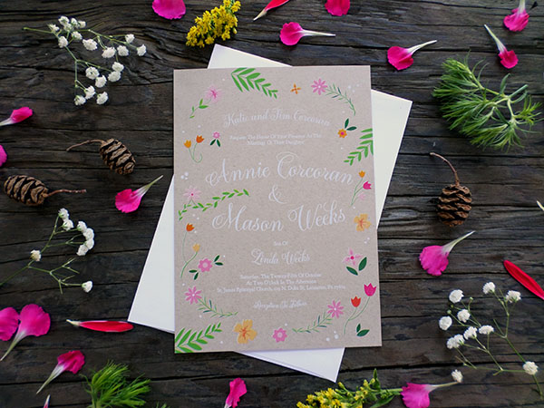
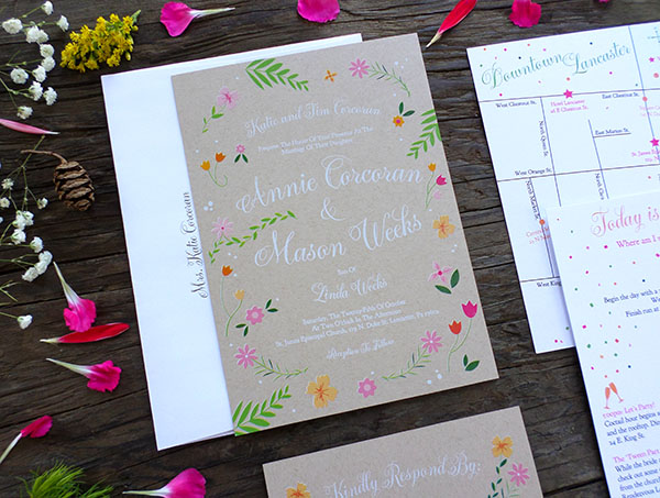
Annie + Mason’s Floral and Kraft Wedding Invitations

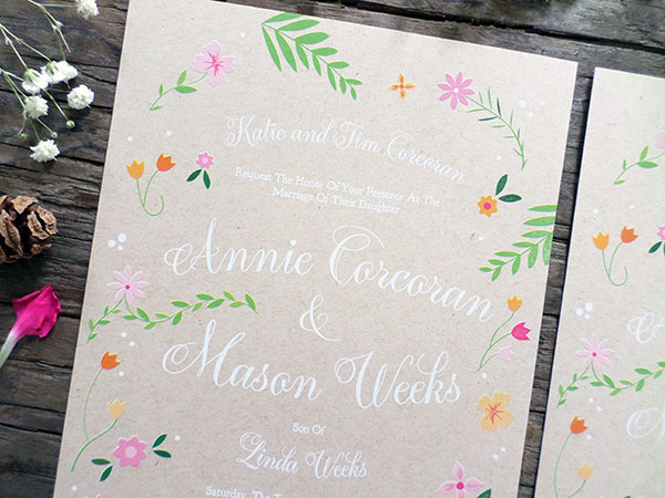
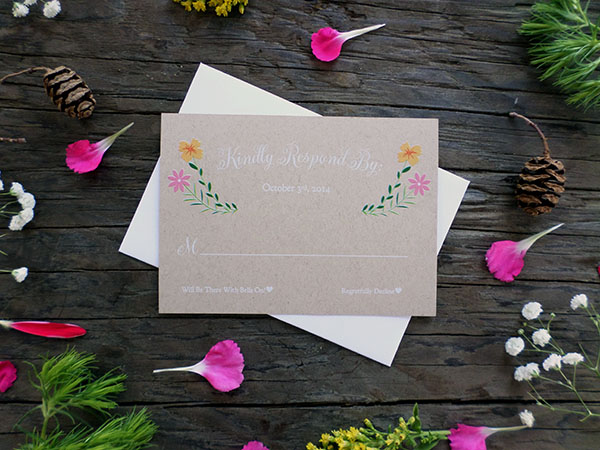
These fun and modern wedding invitations from Carolyn at BON Graphic Design & Illustration combine flowers with kraft paper – not to mention the recent technology of digital printing with white ink! I love all the bright pops of color – so unexpected with the kraft paper!

Floral and Kraft Wedding Invitations by BON Design via Oh So Beautiful Paper

From Carolyn: Whenever I design custom wedding invitations, my main goals are to capture the feel of the wedding and reflect the personalities of the couple in the design. Annie and Mason are such a fun and easy going couple and I knew they would be a blast to work with. They had two things in mind: kraft paper and flowers.

Floral and Kraft Wedding Invitations by BON Design via Oh So Beautiful Paper

Floral and Kraft Wedding Invitations by BON Design via Oh So Beautiful Paper

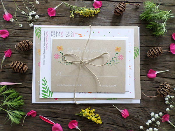
I decided to take a playful approach while having fun designing and illustrating some bright floral designs.The invitation suite was digitally printed through StationeryHQ on 100# Kraft paper 110# and Uncoated Cover stock. It can be tricky to print color on kraft paper, but luckily StationeryHQ went above and beyond all expectations to nail the printing and get the color to pop the way I wanted.

Floral and Kraft Wedding Invitations by BON Design via Oh So Beautiful Paper

Floral and Kraft Wedding Invitations by BON Design via Oh So Beautiful Paper

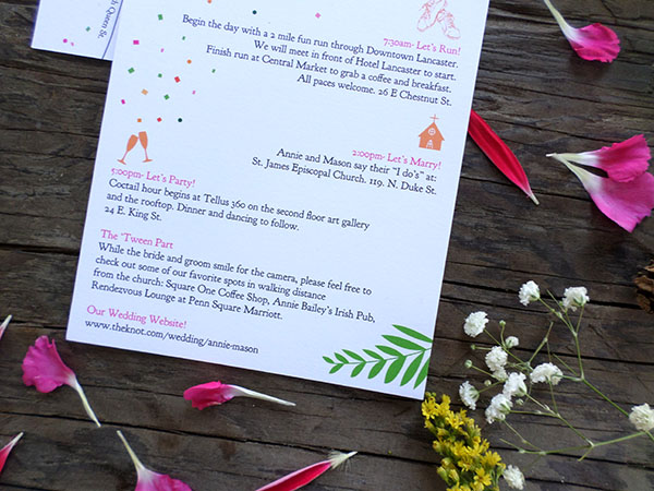
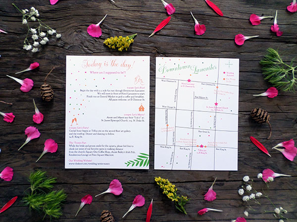
We decided to print the map and information card double sided on a white uncoated cover stock to help it stand out from the rest of the invitation suite. A lot of the guests were traveling from out of town, so Annie and Mason wanted something quick and easy for them to grab while navigating around Lancaster City, PA for their wedding weekend.

Floral and Kraft Wedding Invitations by BON Design via Oh So Beautiful Paper

Floral and Kraft Wedding Invitations by BON Design via Oh So Beautiful Paper

Thanks Carolyn!

Design: BON Graphic Design & Illustration

Printing: StationeryHQ

Check out the Designer Rolodex for more tal­ented wed­ding invi­ta­tion design­ers and the real invi­ta­tions gallery for more wedding invitation ideas!

Photo Credits: BON Graphic Design & Illustration

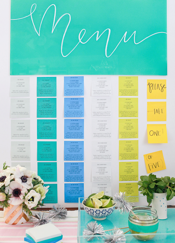
Post-it Brand A World of Color Collections Cocktail Party Menu

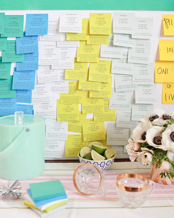
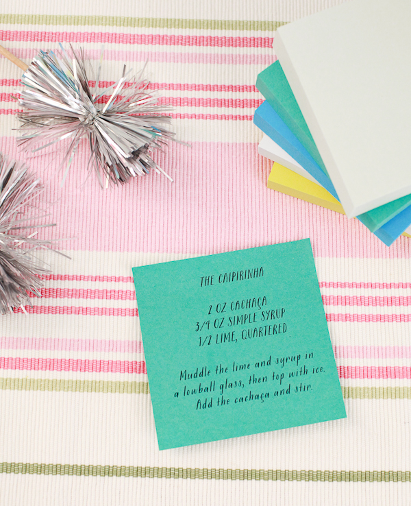
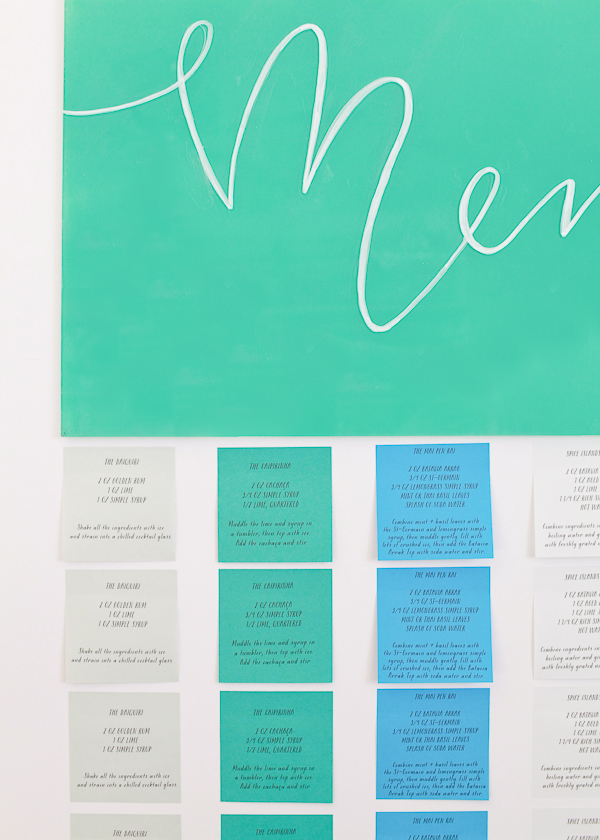
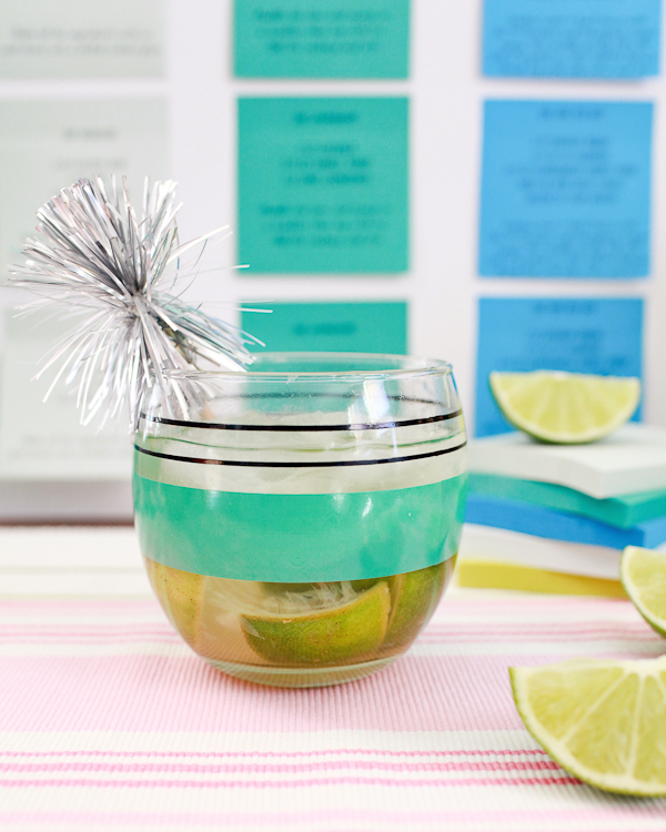
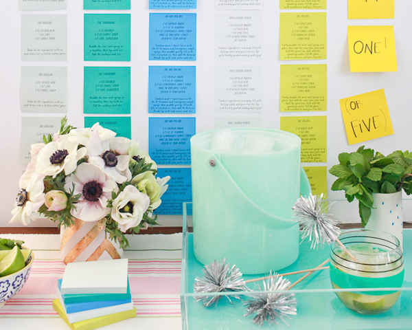
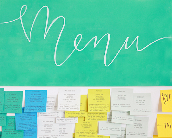
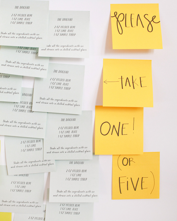
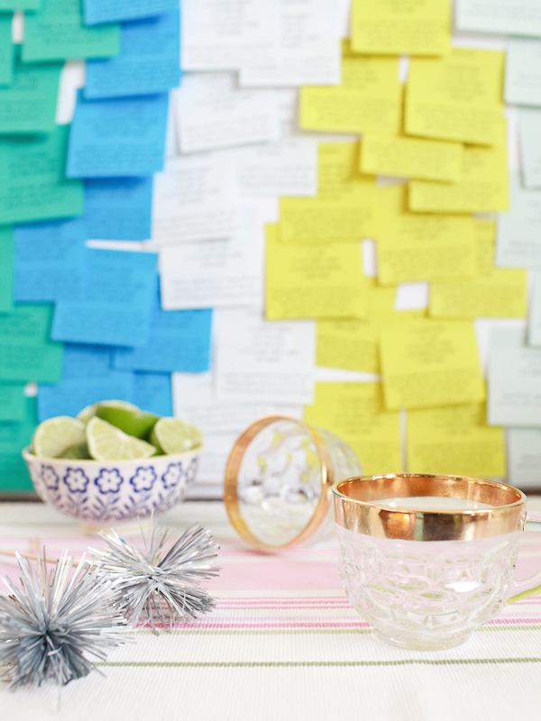
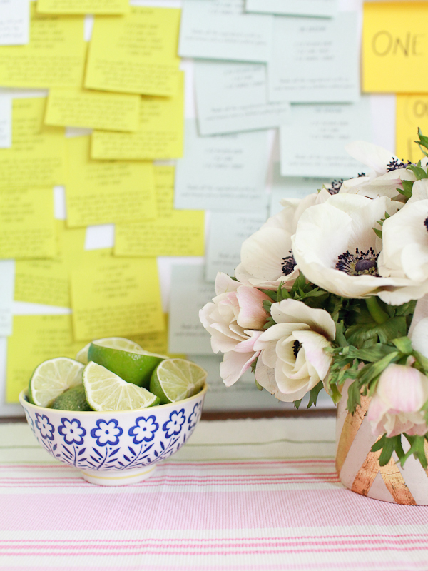
I was thrilled when Post-it Brand reached out to me regarding their new collections of notes – Post-it Brand A World of Color collections – featuring an array of beautiful colors inspired by nine cities around the world. The new collections combine two of my favorite things: world travel and lots of color! I’m convinced that bright colors make me happier, especially during these dark winter months. I wanted to do something that reflected the global vibe of the new collections, so I created a fun cocktail party menu out of Post-it® Notes – featuring five cocktail recipes with rum and lime juice from around the world!

Post-it-Cocktail-Party-Menu-OSBP-15

I was immediately drawn to the blues and greens of the A World of Color Bora Bora collection, with their promise of sandy beaches and warm tropical weather. Our menu includes five tropical rum sours from around the world – from Brazil to Southeast Asia – with each color note representing a different recipe! And this menu is incredibly versatile: create streamlined rows for a smaller, intimate gathering, or layer dozens of notes for an explosion of color. But the best part is that your guests can take their favorite recipe with them at the end of the evening to recreate their favorite recipe (or recipes) at home!

Post-it-Brand-Cocktail-Party-Menu-OSBP-186

Post-it-Cocktail-Party-Menu-OSBP-123

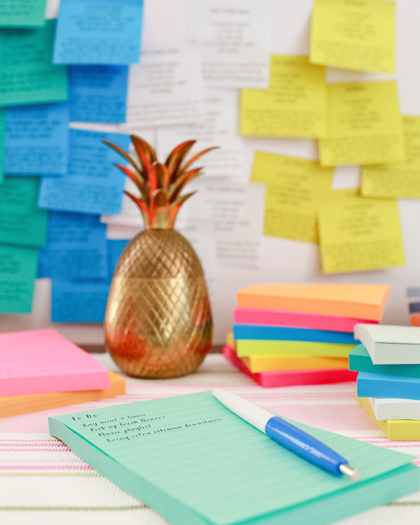
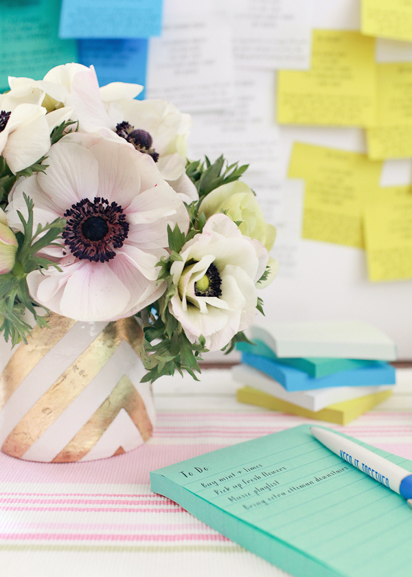
Other cities in the Post-it Brand A World of Color collections include Marrakesh, Rio de Janeiro, Jaipur, Cape Town, Bali, Marseille, Helsinki, and New York. The notes come in the 3″ x 3″ size that I used to create this menu, along with lined and unlined Notes in the 4” x 4” and 4” x 6” sizes. I love the colors of the Cape Town 4″ x 6″ Notes – especially that wonderful light minty blue above – for making to do lists!

Post-it-Cocktail-Party-Menu-OSBP-167

Post-it-Cocktail-Party-Menu-OSBP-82

Post-it-Cocktail-Party-Menu-OSBP-37

Post-it-Cocktail-Party-Menu-OSBP-67

Post-it-Brand-Cocktail-Party-Menu-OSBP-169

Post-it-Brand-Cocktail-Party-Menu-OSBP-197

Post-it-Brand-Cocktail-Party-Menu-OSBP-199

Post-it-Brand-Cocktail-Party-Menu-OSBP-193

Post-it-Brand-Cocktail-Party-Menu-OSBP-191

What is your favorite collection from the Post-it Brand A World of Color collections?

Check back next week for the full instructions for this project!

Photo Credits: Nole Garey for Oh So Beautiful Paper

This post is sponsored by Post-it Brand. Thank you for supporting the sponsors that help make Oh So Beautiful Paper possible!

Behind the Stationery: Sycamore Street Press

Happy Tuesday everyone! Today I’m so excited to introduce a brand new column (and something that I’ve wanted to do for a long, long time): Behind the Stationery! Every month we’ll be giving you a peek behind the scenes of some familiar faces – the stories behind how they came to be stationers, a little bit about how they manage work and life, and of course a peek into their creative processes. Today we’re kicking everything off with a company with a long history here on OSBP (they were featured in my very first week of posting in 2008!) – Sycamore Street Press! –Nole

As a stationery obsessed girl in digital world, there are so many companies I follow and admire wondering how they do it all. How did they start their business? What’s their design process like? To me, the behind-the-scenes is the heartbeat of small business so I’m extremely excited to bring you this new column on Oh So Beautiful Paper highlighting the stories of different stationers, starting with Sycamore Street Press. Take it away, Eva! â€“ Megan

Behind the Stationery: Sycamore Street Press via Oh So Beautiful Paper Photo by Jessica Peterson

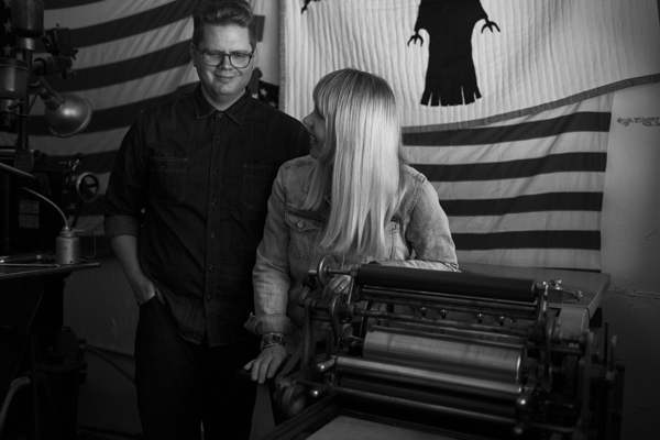
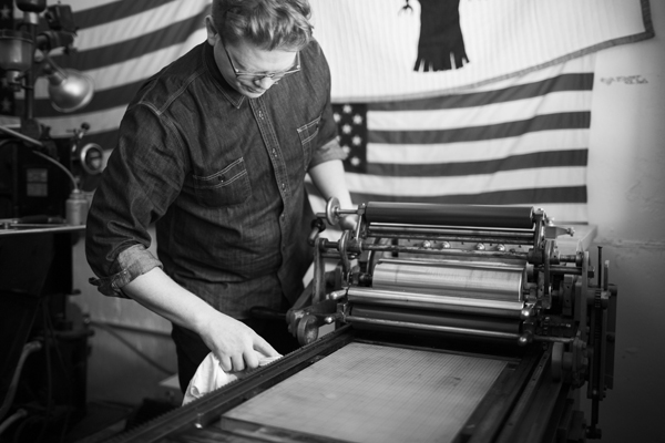
Hello. I’m Eva Jorgensen, founder and creative director at Sycamore Street Press. Back in 2007, I moved a hand cranked Vandercook letterpress into our dining room and launched the company. By 2009, my husband Kirk joined me full-time, and it’s been the family business ever since. Our goal is to somehow, in our small way, help people to live a simple, beautiful, quality life through the goods we create.

Our stationery is sold in Anthropologie, West Elm, Paper Source, hundreds of independent boutiques around the world, and on sycamorestreetpress.com. I also teach an online class called Stationery Business 100: Starting Strong.

Behind the Stationery: Sycamore Street Press via Oh So Beautiful PaperPhoto by Jessica Peterson

We’re up in the mountains of Utah in a small town called Heber City. We love it up here away from pollution and crime with beautiful scenery and wild animals at our doorstep. We’re only about an hour away from Salt Lake City, so we still have access to just about anything we might need.

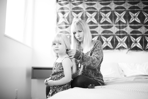
We used to have a separate studio space, but when our first child was born we decided to move the business back home to make it easier to juggle the business and the baby. Four years later (and a second child along the way) we’re still here and it’s working well for us. To give us the best of both worlds, we will soon be joining a shared studio space called Hinterland to use for photo shoots, workshops, events, etc.

Behind the Stationery: Sycamore Street Press via Oh So Beautiful Paper

Photo by Jessica Peterson

I went to school for a BFA and MFA in art with an emphasis in printmaking, so it wasn’t much of a leap to start designing and printing letterpress cards. The business side of things, however, was a big leap! I wish I had taken some business classes in school. That said, my dad is an entrepreneur and gave me a lot of great advice about going that route. As for Kirk, he got his master’s degree in Slavic linguistics. While he was working on that, he was helping me at shows on weekends. Although he loved speaking and teaching Russian, he was really drawn to the idea of doing something more hands on and building a family business.

Kirk and I love working together. When we were a young couple, we took a backpacking trip around Europe. One of the highlights was working on an organic family-run farm in Denmark. We loved how the couple worked together to take care of the kids and household and provide a living. Kirk and I decided then and there that that’s what we wanted for ourselves. We’re fortunate that Sycamore Street Press has allowed us to do that.

Behind the Stationery: Sycamore Street Press via Oh So Beautiful PaperPhoto courtesy of Eva Jorgensen

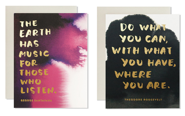
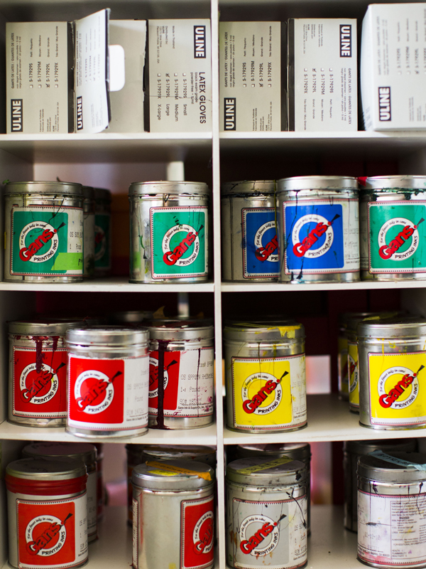
For the first 5 years of our business, we printed every single Sycamore Street Press product on our hand-cranked letterpress, but we got to a point where we couldn’t keep up with orders. At the same time, I wanted to try and branch out creatively. I love letterpress, but using it exclusively came with limitations, such as only printing in 1 or 2 colors per item. We decided to start partnering with a few other local print shops; they’ve been able to help us handle the workload and fulfill bigger orders while also opening up the possibilities in terms of medium. Now I can go where my inspiration leads me to choose whichever printing method seems best to execute my idea – from a simple letterpress print in one color with a beautiful impression to a 4 color process offset print to capture the nuances of my ink washes, overlaid with foil stamped typography. For an upcoming project, we’re looking into screen printing. Each process has unique strengths that can be used to our advantage depending on the design. This doesn’t have to be the way for everyone, but it’s working well for us.

Behind the Stationery: Sycamore Street Press via Oh So Beautiful PaperPhotos courtesy of Sycamore Street Press

I am constantly looking for inspiration — travel, film, fashion, art, decor, folk art, and vintage books are all things I look to. I actually make a point to go outside the world of paper and stationery for inspiration because I think it helps me have a fresh approach. Recently, I’ve been intrigued by the idea of the West – the character and history of this region where I live. I’m reading Angle of Repose by Wallace Stegner and plan on going back and reading all the Willa Cather books I loved in high school and college. And really, I only have to look around the high mountain valley where we live to feel inspired.

Behind the Stationery: Sycamore Street Press via Oh So Beautiful PaperPhoto by Jessica Peterson

It’s true that it can be difficult to balance running your own business with having a family (or just a life in general!), but we find it really rewarding. It’s been so important for us to learn when to say no, especially since the kids came along. Sometimes you have to cut a lot of good things out of your life in order to make room for the best things. And of course it can be difficult not knowing exactly how much money will be coming in each month, but somehow it always works out one way or another. Our faith and trust in God has always brought us together and guided us through hard times where we wondered if we should throw in the towel.

Behind the Stationery: Sycamore Street Press via Oh So Beautiful Paper

Photo by Jessica Peterson

For the most part, we have our separate duties. Kirk is over wholesale accounts, retail sales, and operations. I’m over design and marketing. We work together on big picture stuff. It took us a year or two after Kirk joined me full-time to really get that sorted out, but now we’ve got it under control for the most part. (Neither of us likes finances! We have a bookkeeper and an accountant to help with that.).

Behind the Stationery: Sycamore Street Press via Oh So Beautiful Paper

Behind the Stationery: Sycamore Street Press via Oh So Beautiful Paper

Photos by Jessica Peterson

A lesson we’ve learned in working with loved ones is to make sure that you are hiring or going into business with someone because they are well-suited for the job, not just because they are family. Kirk is a natural at operations and working with accounts. His brother Karl does our shipping and has a really organized kind of brain that a shipping manager needs. A bookkeeper needs to be level-headed and completely trustworthy, and our sister-in-law Kate is both of those things. Our design assistant, Natalie Fielding, isn’t a family member, but she has the skills necessary and works well with the team. And she’s a part of the Sycamore family now! â€“ Eva Jorgensen

Behind the Stationery: Sycamore Street Press via Oh So Beautiful PaperPhoto courtesy of Sycamore Street Press

Interested in participating in the Behind the Stationery? Please email [email protected].