I know, I know, I said the mega round-ups were over, and they are! But see, there are a few more that just came out or *somehow* weren't included in earlier round-ups but really need to be — so I figured a quick mini round-up is the easiest way to share them with you. And trust me, these are some really great calendars…
First up, I am completely head over heels in love with this seasonal letterpress calendar from Becca Heuer:
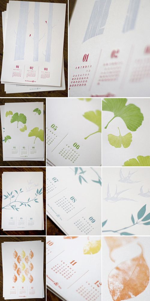 {becca heuer}
If you're looking for a more modern design, check out this gorgeous eco-friendly calendar with two months printed to each page from Good on Paper:
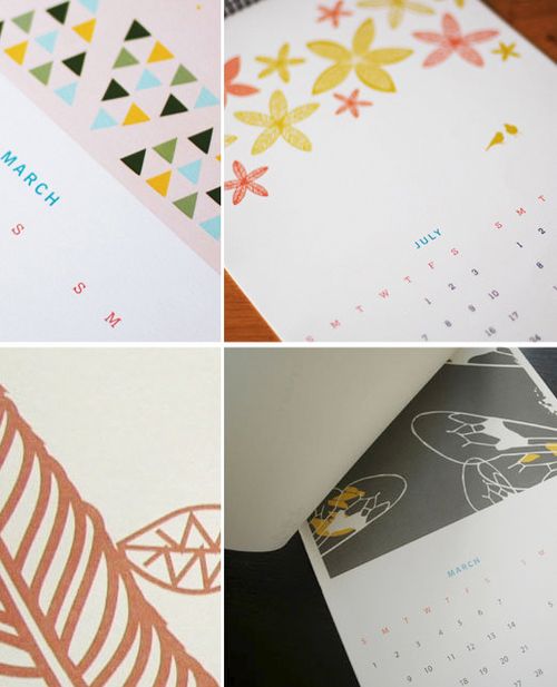 {good on paper}
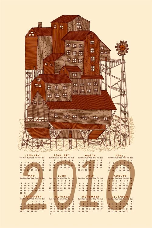
For those of you looking for calendars that can also function as artwork, this beautiful screen printed calendar by Nate Duval might be for you:
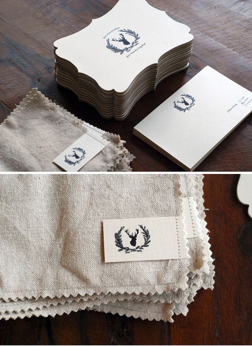
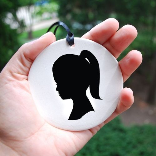
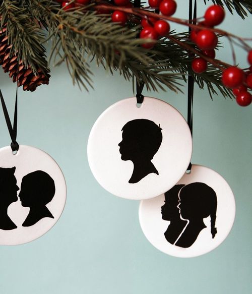
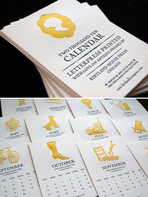
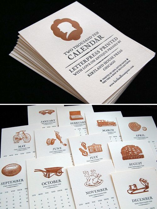
Kirtland House has released two different 2010 letterpress calendars — one named for girls and the another named for boys — each featuring unique imagery each month and a beautiful silhouette on the cover:
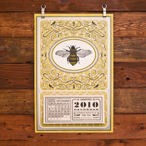
And for those of you who really don't want to wait until 2010 to start using your new calendar, Hammerpress offers a 13-month (December 2009 – December 2010) honeybee tear-away calendar letterpress printed on newsprint and chipboard:
 {hammerpress}
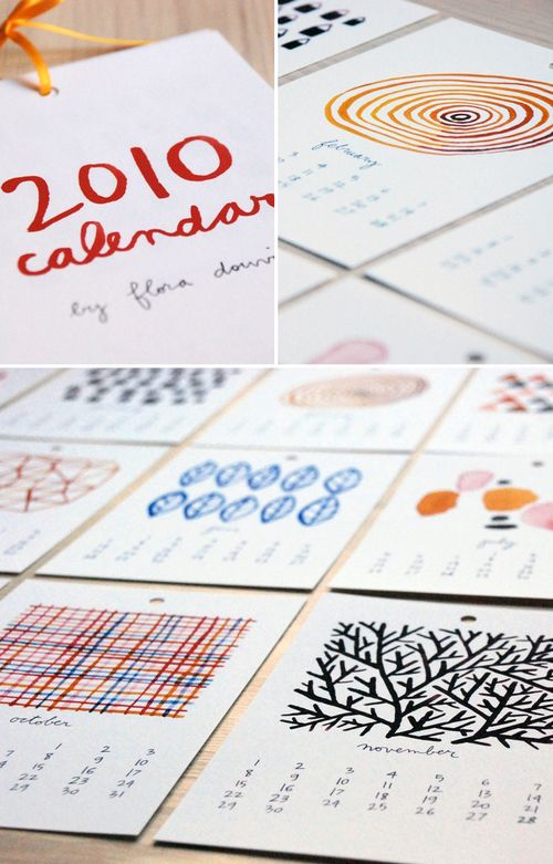
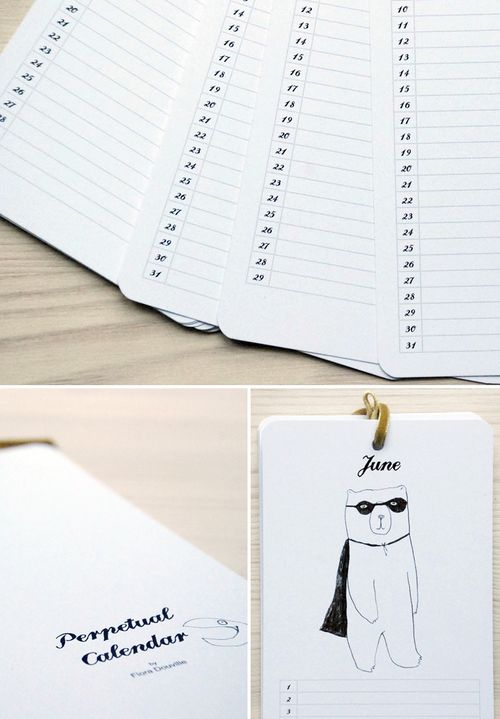
I came across this beautiful calendar (available in French and English) by Flora Douville via Chelsea, and love all the beautiful illustrated details in both the wall calendar and perpetual calendar:
 {flora douville}
That's it (for now)!
{images from their respective sources}