Sarah + Anthony’s Preppy Chic Wedding Invitations

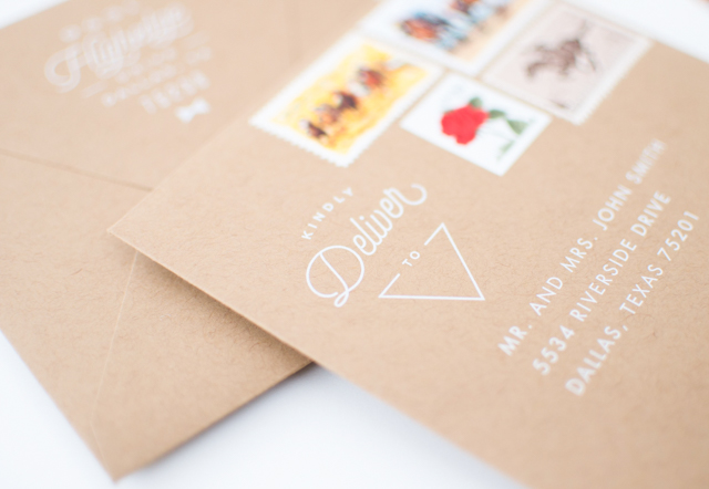
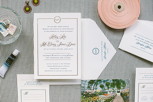
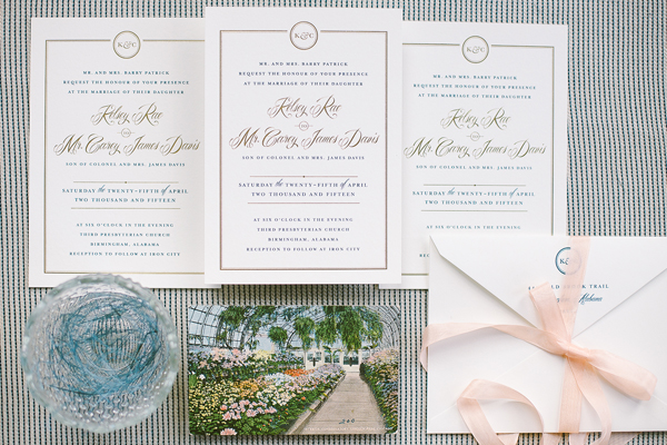
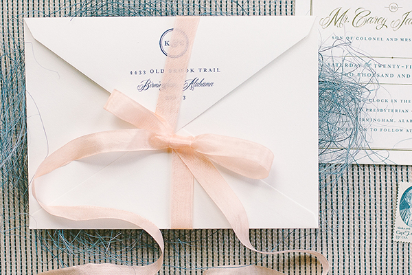
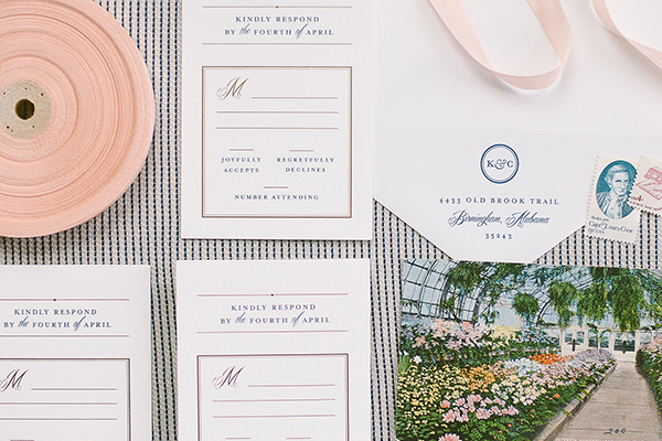
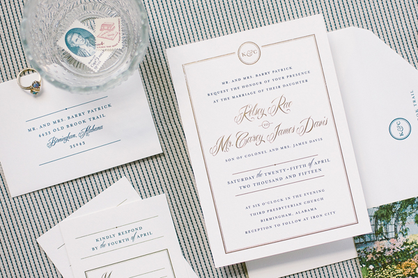
Happy Monday everyone! I thought we’d start the week with these preppy navy, gold, and white wedding invitations from designer Kaydi Bishop. The chic design combines stripes and polka dots with geometric shapes – so fun!

Preppy-Chic-Navy-White-Wedding-Invitations-Kaydi-Bishop-OSBP9

From Kaydi: I had a blast working with Sarah and Anthony to create their perfect wedding invitation suite. Since Sarah is a lover of fashion, we narrowed the direction to a fun and sophisticated mix that was best described as Kate Spade meets J. Crew. I coined their theme “Preppy Chic” and ran with it!

Preppy-Chic-Navy-White-Wedding-Invitations-Kaydi-Bishop-OSBP3

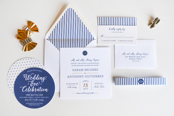
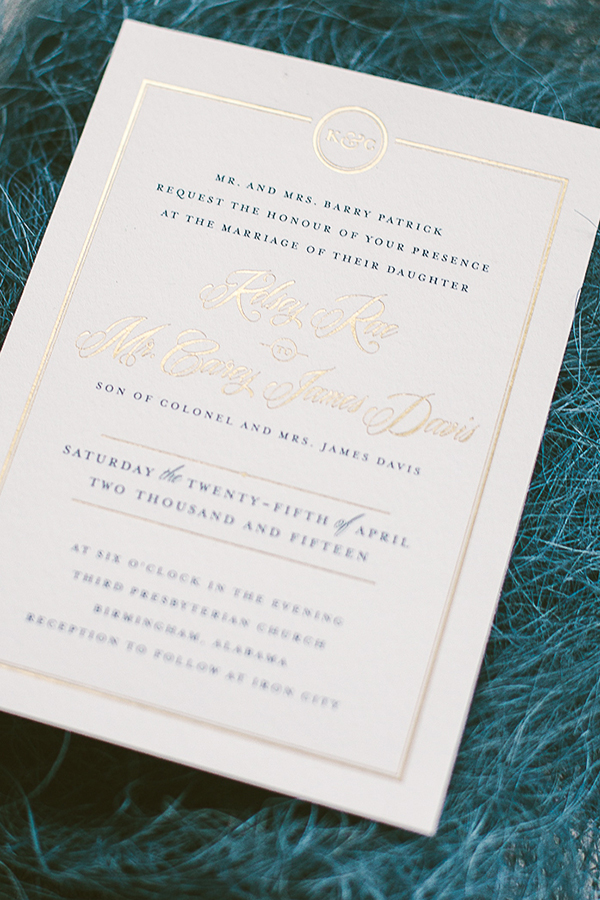
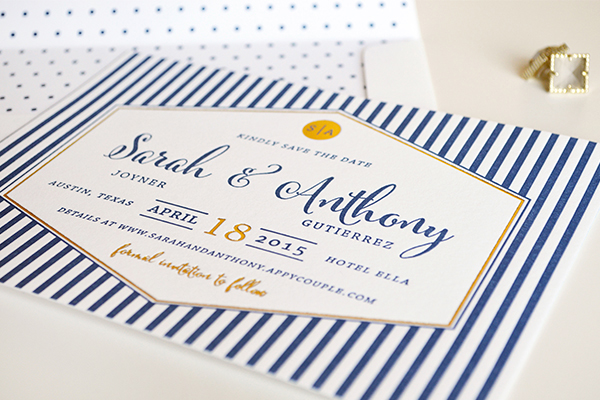
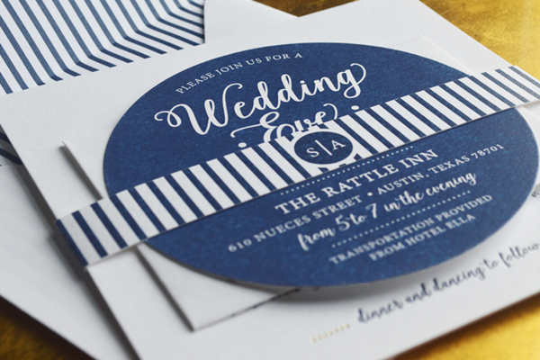
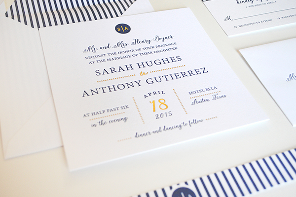
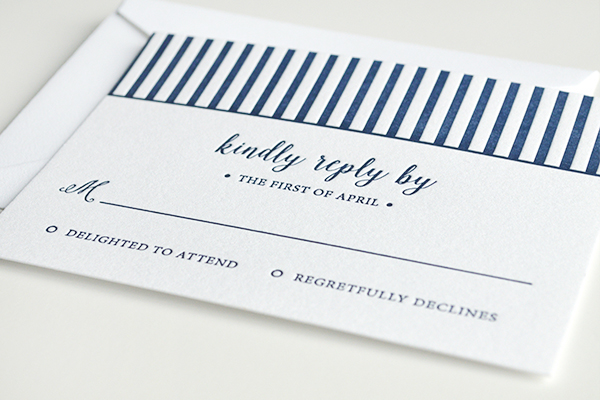
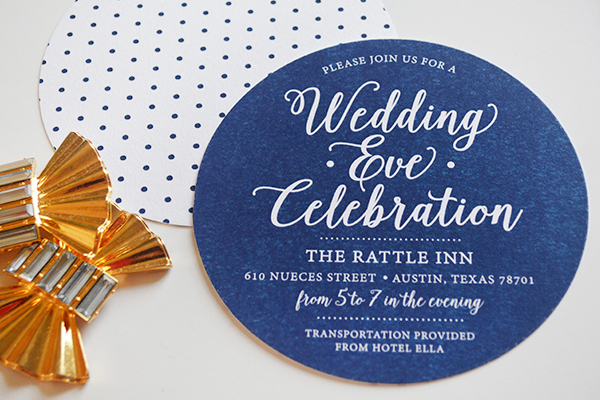
I loved using their classic navy and gold color palette on unexpected square, hexagon, and circle shaped elements, giving a chic flair to a seemingly traditional design. Preppy patterns of stripes and polka dots added just the right amount of contrast to the clean and sophisticated layouts. A fun “Wedding Eve Celebration” invitation was flat printed on luxe cotton paper to achieve a solid bold navy color that popped against the other pieces while carrying the circle theme from their personal monogram emblem. The main components in the suite were letterpress printed on luxe cotton paper in navy ink and gold foil by Czar Press.

Preppy-Chic-Navy-White-Wedding-Invitations-Kaydi-Bishop-OSBP8

Preppy-Chic-Navy-White-Wedding-Invitations-Kaydi-Bishop-OSBP4

Preppy-Chic-Navy-White-Wedding-Invitations-Kaydi-Bishop-OSBP6

Preppy-Chic-Navy-White-Wedding-Invitations-Kaydi-Bishop-OSBP7

Thanks Kaydi!

Design: Kaydi Bishop

Letterpress Printing: Czar Press

Check out the Designer Rolodex for more tal­ented wed­ding invi­ta­tion design­ers and the real invi­ta­tions gallery for more wedding invitation ideas!

Photo Credits: Kaydi Bishop

Happy Weekend!

Happy Friday everyone! Well, it’s officially NSS mailer season – best time of the year! Also, the Kentucky Derby is this weekend! If you’re looking for a Mint Julep recipe for any Derby Day festivities you can find a Basil Mint Julep here and a classic Mint Julep recipe here. But in the meantime…

Katie-Stoops-Photography-Palm-Fronds-Instagram

Photo by Katie Stoops via Instagram

…a few links for your weekend!

This week on Oh So Beautiful Paper:

Check back this afternoon for this week’s cocktail recipe! Have a wonderful weekend, and I’ll see you back here on Monday! xoxo

Lauren’s 2nd Annual Derby Day Party Invitations

You might remember these super fun Kentucky Derby Day party invitations from Lauren Chism last year – I loved the preppy navy and green color palette and stripes! Well, Lauren and her husband decided to make their Derby Day party an annual tradition, and I’m thrilled to share this year’s invitations today!

Derby-Day-Party-Invitations-Lauren-Chism-Fine-Papers4

From Lauren: When it was time to design invitations for our annual Derby Day party, I felt the pressure to design another fun invitation (self-imposed of course). I loved how last year’s invitations turned out, so I wanted these to be equally as special, without overlapping in style since we were inviting a lot of the same people. I kept the color scheme the same-ish with cobalt blue and kelly green, but that’s where the similarities ended.

Derby-Day-Party-Invitations-Lauren-Chism-Fine-Papers1

Derby-Day-Party-Invitations-Lauren-Chism-Fine-Papers10

I wanted to wow guests right out of the mailbox, so I planned the envelopes as much as the invitations. I used white digital ink for the addresses, which just popped on the kraft paper and each envelope had a mix of vintage postage that I curated from various Etsy shops. From the horses to the roses, I don’t think I could have found more perfect postage for a derby party.

Derby-Day-Party-Invitations-Lauren-Chism-Fine-Papers5

Derby-Day-Party-Invitations-Lauren-Chism-Fine-Papers6

Wait, it gets better on the inside… the invitations were square gate fold format, but I had the back facing up, so that when guests open the envelope, the first thing they see is “2nd Annual Derby Day.” When they flip it over, the cards were sealed with a little bow-tie sticker. The green stickers popped on the background of patterns, inspired by jockey silks.

Derby-Day-Party-Invitations-Lauren-Chism-Fine-Papers7

Derby-Day-Party-Invitations-Lauren-Chism-Fine-Papers8

Derby-Day-Party-Invitations-Lauren-Chism-Fine-Papers9

On the inside, I utilized the unique format to layout the party details. From the mint juleps and southern snacks to requesting guest wear ‘derby attire’, I made sure I all the information was there but love how the layout was simple and fresh. We had fun with the puns too: calling our house ‘Chism Downs’ and asking guests to RSVP with yay or ‘neigh’. Now, we just need to make sure our party is as much fun as the invitations!

Derby-Day-Party-Invitations-Lauren-Chism-Fine-Papers2

Thanks Lauren!

Lauren Chism Fine Papers is a member of the Designer Rolodex – you can check out more of Lauren’s work right here!

Photo Credits: Lauren Chism Fine Papers

Ashley + David’s Gold Foil Confetti Save the Dates

How fun is this gold foil confetti pattern from Amanda at Wide Eyes Paper Co. for wedding save the dates? Love!

Gold-Foil-Confetti-Save-the-Dates-Wide-Eyes-Paper-Co-OSBP

From Amanda: These save the dates were a particular labor of love as they were created for my cousin, Ashley. When creating this save the date design, Ashley wanted something simple and modern with a touch of glitz and glam. She ​was not locked into a theme and didn’t want an overly feminine design.

Gold-Foil-Confetti-Save-the-Dates-Wide-Eyes-Paper-Co-OSBP2

The gold foil printed polka dots are one of my favorite accents of the save the dates. They are just the right amount of whimsical she wanted without compromising the modern style of the save the dates. The save the dates were printed on 110 1b bright white Crane’s Lettra cotton paper and features classic black ink mixed in with gold foil accents. We finished the look with gold envelopes printed with their return address on the back flap.

Gold-Foil-Confetti-Save-the-Dates-Wide-Eyes-Paper-Co-OSBP5

Gold-Foil-Confetti-Save-the-Dates-Wide-Eyes-Paper-Co-OSBP6

Thanks Amanda!

Design: Wide Eyes Paper Co.

Letterpress Printing: Czar Press

Wide Eyes Paper Co. is a member of the Designer Rolodex – you can see more of Amanda’s work right here or visit the real invitations gallery for more wedding invitation ideas!

Photo Credits: Let’s Frolic Together

Kelsey + Carey’s Timeless Navy and Gold Foil Wedding Invitations

Classic navy paired with shiny gold foil. Classic serif text paired with a modern calligraphy script. A modern wedding logo in lieu of a monogram. I’m loving all the modern touches in these timeless wedding invitations from Sam and Kelly of Deliver!

Classic-Navy-Gold-Foil-Wedding-Invitations-Deliver-OSBP

From Sam and Kelly: Our bride, Kelsey, had a love for clean details, classic typography, and elegant design. Their wedding revolved around a navy and gold palette – we immediately knew to go with navy flat printing and touches of gold foil stamping to give her the sense of elegance she desired.

Classic-Navy-Gold-Foil-Wedding-Invitations-Deliver-OSBP2

We created a simple custom logo (a modernized version of a monogram) to incorporate at the top of her wedding invitation and on her return address to give her invitations a sense of identity. We used simple lines and shapes throughout to establish hierarchy and add interest. The entire suite was printed on the soft, lush cotton of Crane’s Lettra in Pearl White.

Classic-Navy-Gold-Foil-Wedding-Invitations-Deliver-OSBP3

Classic-Navy-Gold-Foil-Wedding-Invitations-Deliver-OSBP4

Classic-Navy-Gold-Foil-Wedding-Invitations-Deliver-OSBP5

Classic-Navy-Gold-Foil-Wedding-Invitations-Deliver-OSBP7

Thanks Sam and Kelly!

Check out the Designer Rolodex for more tal­ented wed­ding invi­ta­tion design­ers and the real invi­ta­tions gallery for more wedding invitation ideas!

Photo Credits: Deliver