Greetings! It is an honor and a pleasure to be guest blogging on our most favoritest blog in the world for the next few days! We were thrilled when we were asked to create Sophie’s birth announcements, and are psyched to share with you more unique and curious work from the minds and hands of Ladyfingers Letterpress! –Arley-Rose and Morgan of Ladyfingers Letterpress
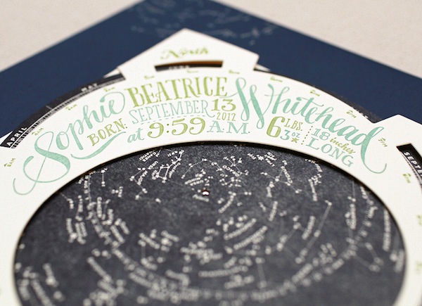
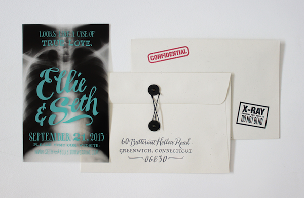
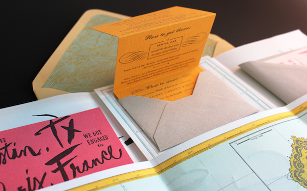
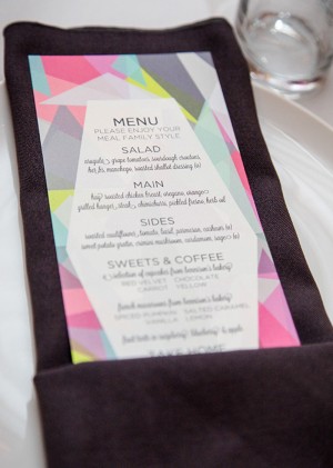
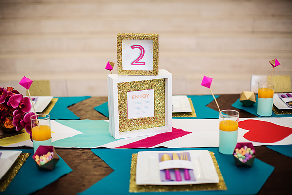
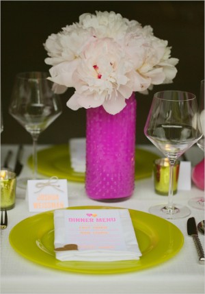
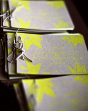
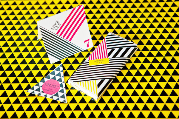
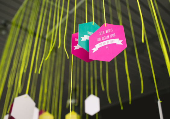
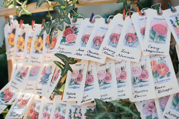
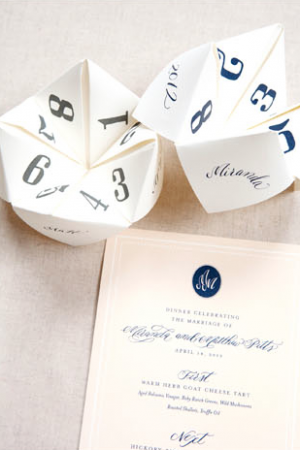
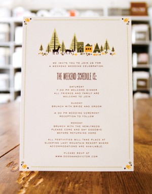
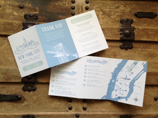
If you are familiar with our work, you know that we are all about blurring the lines between stationery and “whoaa!?â€. We’re a bit crazy about coming up with new and exciting ways in which your guests receive your big announcement. When the right clients come along who are as excited about doing something different as we are, get ready for the unexpected. Piñatas stuffed with an invitation? Sure! Little cutouts of the couple who can dance and move on top of a record player? Why not! Full letterpress rainbow roll knocked-out flats? It can be done! There is no task to large nor too complex for our inquisitive brains. Challenges keep us going. Conformity kills our spirit. And ice cream is always on our minds.
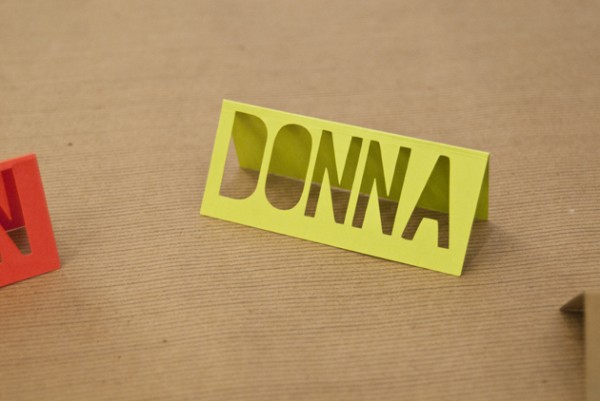
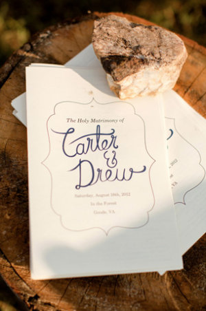
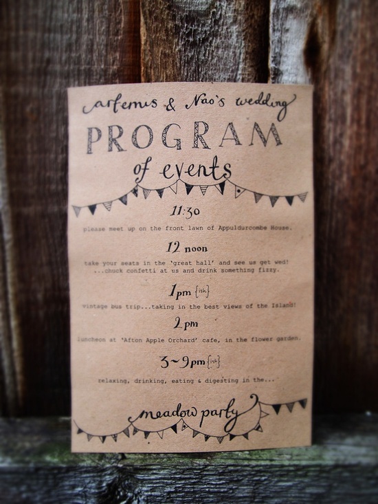
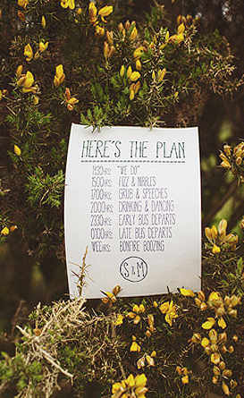
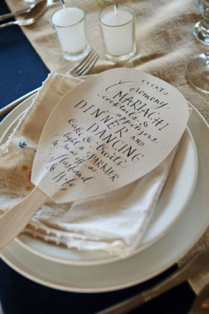
Another thing you may recognize about our work is the abundance of hand-lettering. Our obsession began back in the early 2000s when Arley-Rose was using it to rebel against the rigidity of the type world that was prevalent during her time studying at Parsons. Now, its easier and faster for her to draw letters than use design programs to create a layout, and her trademark handiwork has become one of the most identifying features about our work.
In our first post as guest bloggers, we’d like to introduce ourselves in this short clip where we give you a short and informal tour of our studio, and take you along as we hand-letter a real life invitation! (Pardon the absence of Morgan, the other mastermind behind Ladyfingers. She was out running errands when we recorded this!)
Interested in getting started with hand-lettering? Here are some tips to create your own illustrative voice using the most valuable design software ever: your hands, your brain, and a pen & paper:
• Materials: I like using Micron .08 or .05 pens and standard sketchbook paper. I don’t usually do a pencil sketch first, since I find that I lose the initial gesture of the design if I am tracing over existing line work. (If you feel more comfortable creating a layout in pencil and tracing in ink, be sure to draw lightly or your ink lines may become compromised when you’re erasing your pencil lines. Feel free to also use a lightbox to trace!)
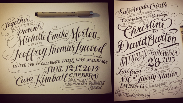
• How does your message sound? Before you start, consider the tone or the voice of your piece. Is it formal? Fun and exciting? Remember that when people read text, they put it in a voice. (Or maybe that’s just me?) Do you want your lettering to sound like its being spoken by Vincent Price or a little kid on a trampoline? Or maybe just you, being really excited, and happy to share your joyful message with your most favorite people in the world? Don’t be ashamed to show how psyched you are! Your excitement will translate into a beautiful piece.
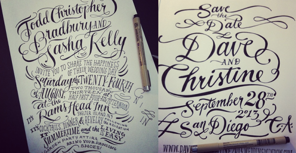
• Put some music on! I find that music and lettering have a lot in common. Not only do they both share a rhythm that can inspire people to keep reading/listening, but in the same way that you don’t have to listen to a song very long to know if its a somber song or a happy song, a nice piece of hand lettering should hit you with an expression as soon as you see it. You don’t wait till the last note to understand the essence of a song, so why should you have to wait til the last word to understand the message of a design?
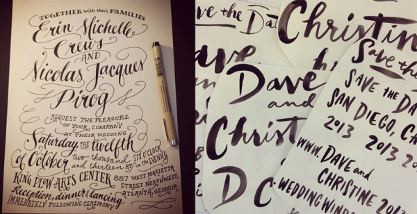
• Practice, practice, practice! There is no app for this. There is no photoshop filter that will make your lettering look better. If you want to truly get better at hand-lettering, do it every day and don’t be afraid to make mistakes. Your hand and arm muscles will get used to drawing letters and it will become easier. Start with mastering one lettering style, whether its Roman, Script or Sans Serif. Need inspiration? Check out the different type styles on MyFonts.com. Once you have your favorite lettering style down pat, introduce a contrasting style. For example, I love combining script with a serif face.
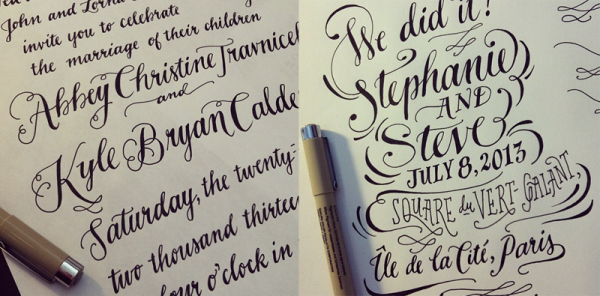
• Draw other things, too! We wouldn’t be where we are today if it weren’t for a lifetime of drawing. To be a good letterer, you need to be comfortable with your pen enough to be free with it. Gotta know the rules before you can break ’em! Controlled chaos, that’s really what lettering is!
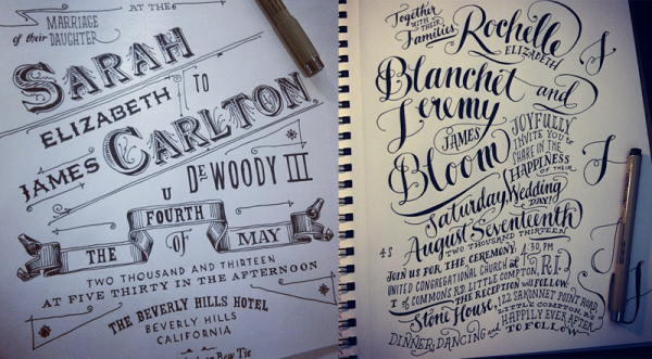
Once my drawings are finished, I scan them into the computer at high resolution. Sometimes I’ll clean up little errors in Photoshop and then drop them into Illustrator. I have a specific profile set up under Live Trace so that my drawings come out crisp and un-live-tracey. Once they’ve been vectorized, I can move letters around and play with the design a little. Sometimes if I am drawing and I don’t like a letter or word that I just drew, I’ll draw another off to the side and move it in when I’m in Illustrator. The key is to have fun! Cuz if it ain’t fun, why do it?
Photo Credits: Ladyfingers Letterpress

 Â

 Â
 Â
 Â





 Â
 
 Â
 