Colleen + Paul’s Illustrated Cartography-Inspired Wedding Invitations

I couldn’t end the week without featuring these beautiful cartography-inspired wedding invitations, designed by the bride and groom and printed by the lovely Colleen Ellse.  You might remember Paul and Colleen’s silhouette save the dates from a few months back, and the wedding invitations continued the illustrated feel along with the gray and green color palette.  I’m loving the cartography border on the information card and the anchor illustration on the hand drawn map.  The bride also did the calligraphy – isn’t it so pretty??

Modern-Cartography-Letterpress-Wedding-Invitations

Modern-Cartography-Letterpress-Wedding-Invitations-White-Calligraphy

Modern-Cartography-Letterpress-Wedding-Invitations-Detail

Get the full details over on Colleen‘s blog, Craft Lovely.

Photo Credits: Colleen Ellse | Craft Lovely

*Colleen Ellse is one of my fab­u­lous spon­sors, but she had no idea I was going to write this post today; for more on my edi­to­r­ial poli­cies please click here.

Wedding Details: Escort Cards and Place Cards

You already know how much I love wedding invitations, but I also love day-of wedding stationery – place cards, ceremony programs, menus, and all sorts of other fun papery goodness.  Today we’re rounding up some of the prettiest and most creative ideas as inspiration for all of you, starting with escort card and place card ideas!  There are so many ways to get creative with escort and place cards for your wedding that everyone can find something that fits in with their style or theme.

You can’t go wrong with a silhouette escort card for a classic wedding (left), and this “seating cards in a bottle” idea is so creative!  Both from Martha Stewart Weddings

Beautiful calligraphy and neutral cards by Neither Snow

I want to go to a wedding that features these adorable button escort cards! (left)  Equally adorable is using a typewriter to type each person’s name and then attaching a vintage typewriter key (right).  Both via Martha Stewart Weddings.

Another button idea, perfect for a rustic wedding. Photo by Max Wanger via Elizabeth Anne Designs.

This escort booklet idea is so versatile – featured in Martha Stewart Weddings (left).  Photo of cupcake escort card by Jill Thomas, card by Posh Paperie via 100 Layer Cake (right).

How cute are these pinwheels for a whimsical, outdoor wedding? Photo by Jessica Stout via Style Me Pretty.

Love the color and types used in these cards.  Ruby and Willow via Oh So Beautiful Paper.

Great color and visual impact in this example; perfect for a casual wedding.  Photo by Studio Nouveau, escort cards by Strong Studio via Ruffled.

These fabric escort cards (left) were DIY’d by the bride and groom – so creative!  Photo by Brett Buchanan via  Style Me Pretty.  I also love the idea of beautiful calligraphy on green apples for a fall wedding (right).  Photo by Meg Perotti, calligraphy by Calligraphy Katrina via Style Me Pretty.

These wrapped succulents are perfect for weddings, showers, Sunday brunches…  Photo by Mary Swenson via Somewhere Splendid.

Skeleton keys and satin ribbon – so romantic!  Photo by Kate Headley via United With Love.

Stay tuned for more beautiful escort and place cards!

p.s. Do you know the difference between place cards and escort cards?  Simply put, escort cards guide your guest to their designated table, while place cards help guests find their assigned seat.  Escort cards are typically placed at a central location at the entrance to the reception.  Guests will find their card, then locate their table based on the number indicated on the card.  Place cards, which are only necessary if you have assigned seating at your reception, sit at each individual place setting – hence the name!

{images via their respective sources}

National Stationery Show 2011 – Part 7

Happy Friday everyone!  We’re about halfway through the coverage from this year’s National Stationery Show, and after looking back through all of the photos from the show I can’t believe what we managed to pack into just a few short days.  So much beautiful stationery!  First up today, a new-to-me exhibitor from the Pacific Northwest, Bison Bookbinding and Letterpress.  I’m absolutely smitten with Bison’s collection of hand lettered note cards and brightly colored geometric letterpress notebooks.

Bison Bookbinding and Letterpress

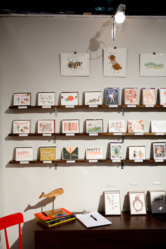
After somehow missing them last year, I was absolutely determined to visit the Gold Teeth Brooklyn booth this time around.  This simple-yet-vibrant collection of screen printed note cards and art prints is incredibly refreshing, and was accompanied by a sweet and simple booth design that really let the cards shine.

Gold Teeth Brooklyn

Another new exhibitor that made a big impression – Lucky Bird, who came to New York all the way over from the United Kingdom.  Lucky Bird’s collection includes some seriously adorable foil blocked illustrated note cards and gift tags.

Lucky Bird

I’m seriously loving all the new patterns and colorways in the SusyJack* collection this year.  The blue and yellow ikat patterns?  Love it!  And the flower pattern for the 2012 calendars is so lovely…

SusyJack*

From Ink + Wit this year, some new rubber stamp sets, wood veneer notebooks, and gift wrap – and of course lovely notecards all featuring Tara’s signature modern nature-inspired illustrations and patterns.

Ink + Wit

It was such a pleasure to finally meet Rebekah from Wild Ink Press after admiring her work from afar for so long!  Rebecca had one of the prettiest booth displays at the show, with gold logo signs on top of gray chalkboard paint along with a hand drawn chalk border and illustrations – a perfect complement to her beautiful letterpress cards.

Wild Ink Press

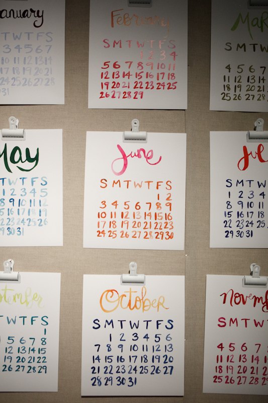
Another big Stationery Show debut this year – OneCanoeTwo!  This booth was packed full of awesome letterpress goodies, from greeting cards to a monthly calendar to art prints.  And don’t let the black and white walls fool you; this booth was absolutely packed full of color!

OneCanoeTwo

I was also seriously loving The Great Lakes booth this year – from the sweet and funny cards to the most adorable mobiles featuring wood acorns and dip dyed feathers.

Love these acorn and dipped feather mobiles!

The Great Lakes

Last (for now) but definitely not least, Sesame Letterpress.  Those crosshatch pattern silhouette greeting cards and silhouette note cards are totally calling my name…

Sesame Letterpress

Photo Credits: Bison Bookbinding, The Great Lakes, One Canoe Two, and Sesame Letterpress by me, all others by Brian Tropiano Photography for Oh So Beautiful Paper; please ask permission before reposting.

*Wild Ink Press is a spon­sor of Oh So Beau­ti­ful Paper; for more on my edito­r­ial poli­cies please click here.

National Stationery Show 2011 – Part 3

It’s hard to believe that today is the final day of the Stationery Show in New York – but don’t worry, I have so much more to share with you from this year’s show!  Yesterday I was lucky enough to have photographer Brian Tropiano join me to help out on photo duty at the show, which made me a very happy blogger!  First up today, Figs and Ginger, who put together one of my favorite booth displays for this year’s show, hands down.  You saw a sneak peek of the new wood collection at the last Gift Fair, but the full collection of wedding and party goods made its big debut at the Stationery Show with amazing silhouette cake toppers, banners, wood signs, and dress hangers for wedding party members.  Just stunning!

Figs + Ginger

Right across the aisle, Laurel Denise was exhibiting at the show with her totally awesome calendar/planner.  You’ll get a sneak peek at the 2012 version below, which is totally adorable with some fun patterns and multiple cover color options.  See that large scale version that Laurel made just for her booth display?  I’m trying to convince her to figure out how to actually make that for people to use in their own offices.  How awesome would that be?  I know I could use one!

Laurel Denise

After making her big debut at last year’s show, Anna from Rifle Paper Co. was back this year with even more gorgeous stationery – including gold foil note cards, multiple calendars, note pads, coasters, and prints.  So much pretty!

I looooove those watercolor cards!

Rifle Paper Co.

I always love the Linda & Harriett booth at the Stationery Show, and this year was no exception.  This year Liz is exhibiting two calendar formats, including a hanging letterpress calendar and a totally gorgeous and larger scale watercolor calendar, along with new versions of a Linda + Harriett classic – note pads!

Linda + Harriett

Check back in a bit for more from the Stationery Show!

Photo Credits: Brian Tropiano for Oh So Beautiful Paper, please do not repost without permission


Rebecca + Nick’s Rocky Mountain Colorado Wedding Invitations

Happy Monday everyone!  We’re starting the week off with a fabulous set of Colorado mountain wedding invitations from Samantha and Whitney at Gus & Ruby Letterpress in Portsmouth, New Hampshire.  Sam and Whit created this invitation suite for a wedding that took place last year on Pikes Peak in the Rocky Mountains.  When it came to the design, Sam and Whit were inspired by the wedding’s rustic lodge venue and the beauty of the Colorado mountain landscape.

Colorado-Rocky-Mountains-Blue-Yellow-Wedding-Invitations-Suite

From Sam and Whit: The suite was designed for a lovely couple getting married on Pikes Peak in Colorado Springs, Colorado. The couple adored the beautiful rustic lodge where they were getting married and really wanted to play up the venue in their stationery.  From the save the date to the thank you notes, we focused on the beauty of Pikes Peak, the Colorado landscape and details from the gorgeous hotel where they were to be wed.

Antler-Letterpress-Save-the-Dates-Gus-and-Ruby

We started with the beautiful blind impression save the dates.  There were big antlers hung all over the venue, so the blind impression antlers were a little nod to the lodge decor and hinted at the mountain top theme.

Colorado-Rocky-Mountains-Blue-Yellow-Wedding-Invitations-Suite

Colorado-Rocky-Mountains-Blue-Yellow-Wedding-Invitation-Detail

The invitation itself is a die-cut silhouette of Pikes Peak mountain that we then adhered to a navy backing paper (as we did on the save-the-date).  We loved the depth and interesting shape that the die-cut gave the invitation and that the silhouette was actually the real silhouette of the mountain where the couple would be married.  On the reply card, we featured illustration of an aspen tree – the type of tree most prominent on the mountain.

Colorado-Rocky-Mountains-Blue-Yellow-Wedding-Invitation

Colorado-Rocky-Mountains-Blue-Yellow-Wedding-Invitations-Reception-Card

For the suite, we found inspiration for the color palate and envelope liner pattern in the rug design and pattern found inside the lodge.  The envelope liner pattern is a direct imitation of the rug on site at the lodge!

Colorado-Rocky-Mountains-Blue-Yellow-Wedding-Invitations-RSVP

Colorado-Rocky-Mountains-Blue-Yellow-Wedding-Invitations-Reception

Colors and fonts tied everything together and we really loved the mix of pattern, shape and illustration – it gave the whole suite a funky, mountain-y feeling without being too theme-y.  Of course, all the pieces were lovingly letterpress printed by hand on our antique press on beautiful 100% cotton paper.

Colorado-Rocky-Mountains-Blue-Yellow-Wedding-Invitations-Envelope

Absolutely stunning work, as always.  A big thanks to Samantha and Whitney for sharing these invitations – and you can check out more of their custom design work over on their blog!

Photo Credits: Brea McDonald Photography