Envelope Address Hand Lettering Tutorial from Ladyfingers Letterpress

Hi Everyone! The ladies of Ladyfingers Letterpress were kind enough to fill in during my summer vacation last year, and this post on Arley-Rose’s signature hand lettering was one of my favorite posts that week! So I jumped at the chance when Arley-Rose volunteered to stop by with some tips and tricks for adorning your envelopes with beautiful and whimsical hand lettered addresses. Take it away ladies! –Nole

With the majority of correspondence these days taking place in the digital realm, it’s always such a treat to get something real and tangible in the mail. Heck, even before e-mail dominated our lines of communication, you knew something was really special when it arrived through your mail slot all decked out with big, beautiful lettering that you knew someone took time to carefully create. Hopefully by the end of this post you will want to sit yourself down and experiment with some of the styles shown below to make your own beautifully styled envelope addresses. –Arley-Rose of Ladyfingers Letterpress
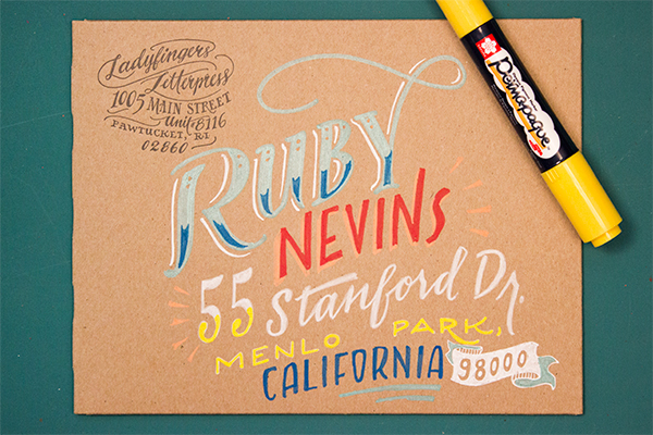
Envelope Address Hand Lettering Tutorial by Ladyfingers Letterpress / Oh So Beautiful Paper

I like to think of hand-lettering as more of an “illustration using letters” more than a “trained handwriting” kinda thing, so I choose pens that give me the most control as possible. People are doing beautiful things with pointed pens and modern calligraphy these days, and I encourage you to experiment with pointed pens if you like, but for now I am going to stick the tools that I know and love.

We’ll begin our journey into the world of lettering with familiarizing ourselves with a few different lettering styles that will act as our foundation and give us some variation in style that we can draw upon throughout our lettering endeavors! Personally, I like to combine different lettering styles, fluctuating between scripts, roman, and sans-serif characters to give the piece a lot of motion and personality. Not sure what a roman character is? Read on! Have questions about the etiquette and formality of addressing your envelopes? Martha Stewart has a terrific go-to tutorial about that!

Hand Lettering Envelope Address Tutorial by Ladyfingers Letterpress / Oh So Beautiful Paper

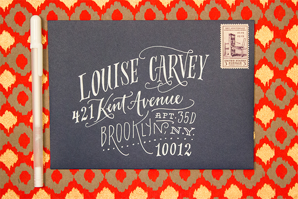
Roman lettering, which can also be called a “Serif,” has some of the earliest origins dating back to, well, the Romans! The word “Serif” is latin for “foot”, which makes sense when you look at the letters. See? They all have feet (except o’s)! Serifed typefaces such as Garamond or Baskerville look great as all caps and spaced out (which us type nerds refer to as “tracking”), or spelled out in both caps and lowercase with normal tracking. I sometimes like to make tall condensed roman letters if the address is really long and I need to make the most of my space. On capital As, Rs, Ns, Ys, Ks, Hs, and sometimes Gs, I like to add a little flourish, as you’ll notice on some of the envelope samples below.
Hand Lettering Envelope Address Tutorial by Ladyfingers Letterpress / Oh So Beautiful Paper

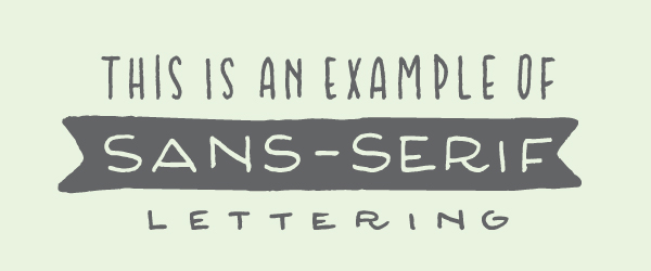
Now that you know that the word “Serif” means “foot”, naturally “Sans Serif” means “Without Feet!” Sans Serif letters were popularized in the mid twentieth century with the arrival of Helvetica, Gill Sans and Futura. I think they look great as all caps, tall and condensed! I also find that they’re easy to draw because they most closely resemble a clean, handwritten print style.
Hand Lettering Envelope Address Tutorial by Ladyfingers Letterpress / Oh So Beautiful Paper

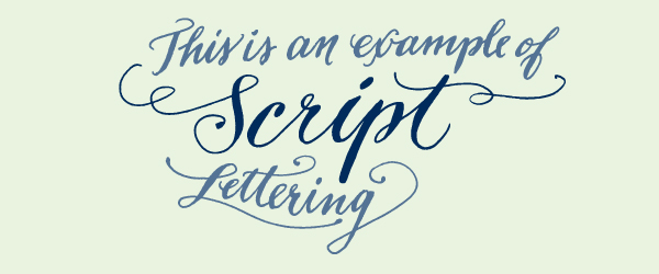
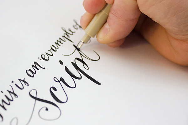
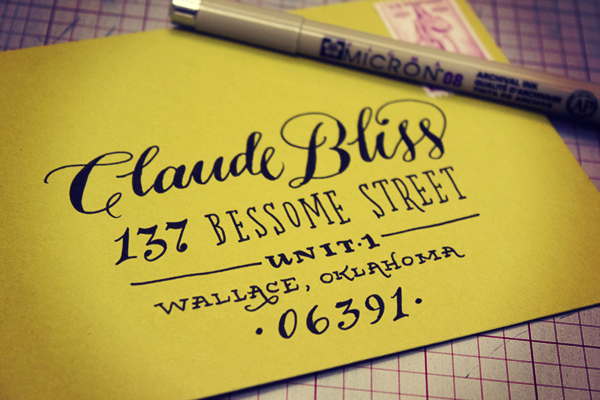
Now the fun part begins! Getting the hang of lettering a script might take some time to get the hang of, but here’s a secret! Write in cursive as you normally would, and then darken the strokes that should have accents. Feel free to refer to other scripts with a quick google image search to see where those accents should be. Have some fun with your script: it’s not necessary to keep a straight baseline, in fact I tend to like scripts that dance around a little bit on the page. They have more character! Ha! Get it! Character? Typography? Joke? Uhhh….. Nevermind.
Hand Lettering Envelope Address Tutorial by Ladyfingers Letterpress / Oh So Beautiful Paper

Hand Lettering Envelope Address Tutorial by Ladyfingers Letterpress / Oh So Beautiful Paper

My favorite go-to pen is the Pigma Micron from Sakura of America. I’ve been drawing with Micron pens since I was a wee young artist, and they continue to be my favorite pen for all types of uses, especially drawing on light-colored envelopes. My size of choice is an 08 but there was a time when all I used was the smaller 03s to get a really nice fine line.
Hand Lettering Envelope Address Tutorial by Ladyfingers Letterpress / Oh So Beautiful Paper

Hand Lettering Envelope Address Tutorial by Ladyfingers Letterpress / Oh So Beautiful Paper

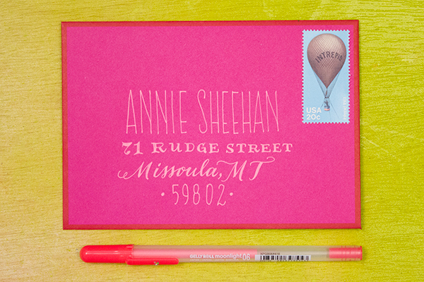
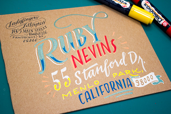
Keep it classy! Sometimes a white pen is all you need to do the trick, especially on dark or brightly colored envelopes. My go-to is the White Gelly Roll 08, which gives me a nice smooth line without any breaks or clogs. I’ve found that the Metallic Silver Gelly Roll pen is also super awesome! It’s not really too sparkly, but is super opaque which is exactly what I want. I also like the Moonlight pens for an extra burst of color.
Envelope Address Hand Lettering Tutorial by Ladyfingers Letterpress / Oh So Beautiful Paper

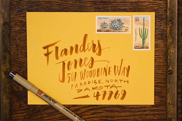
Sometimes I like the swift expression that can only be found with a brush pen. When I don’t have time to whip out the gouache and brushes, the Pigma Brush pens really do the trick. They also come in  a variety of colors, so if you’re not feeling like black ink is your thing that day, you can also choose from a variety of other colors that look great on white or light colored envelopes.
Envelope Address Hand Lettering Tutorial by Ladyfingers Letterpress / Oh So Beautiful Paper
The Do Not Open Lettering Project  by Erik Marinovich was recently brought to my attention by my amazing typographer friend Jeremy Mickel, and it blew my mind. It still does blow my mind. Every time I look at it. I thought I would refer to it here because it shows how creative you can be with large oversize envelopes. Besides, envelopes: they’re really just a canvas for beautiful lettering, right? Anyway, the Permapaque markers are incredible for this task. They’re nice and opaque like a paint marker without the nasty smell, and you get a huge variety of colors!

Now that you’ve seen some samples, I’d love to see what you come up with! Don’t forget to tag your work on Instagram with @beautifulpaper, @ladyfingersletterpress and @sakuraofamerica. Thanks and happy lettering!

Pens provided by Sakura of America, with awesome stamps provided by Pack & Post!

Photo Credits: Ladyfingers Letterpress
Urbanic Faves | Farmer’s Market Fresh

Happy Spring everyone!

I hope you’re enjoying the change of weather lately and getting a chance to spend some time outside.  A recent trip to our local outdoor market inspired this post ( … and the vegetable herb garden I’m about to kill plant).  Here’s to vine ripened tomatoes and rosemary mint lemonade!  Below are some fresh picks from around Urbanic and beyond.

xo – Audrey

farmers_market_

1. Rifle Paper Co. vegetables card; 2. Apolis market bag; 3. Rifle Paper Co. notepads; 4. Sugar Paper market list pad; 5.+ 6. Rifle Paper Co. cards; 7,8,9 One Canoe Two cards; 10. Girl of All Work page tabs; 11. Paddywax relish candle; 12.Claudia Pearson calendar; 13.Freckle Paper tomato print; 14. Jayde Fish flower bundle print; 15. Eat Pretty book; 16.Galison kitchen sticky notes


{images via their respective sources}

Urbanic Faves | A High Five

Hey everyone! So glad to be back. I can’t believe it’s been a month already since our last post! Around here at Urbanic Paper Boutique we all work pretty hard each day (as I’m sure the majority of you do). Let’s face it, we all need a high five every now and then to keep the momentum up on projects and our spirits high in the midst of a busy work day. Nothing says team camaraderie like an arms up, solid hand slap. We use them for small things …. Look! I just found the earring that a customer lost in the shop last week – HIGH FIVE!  and for bigger deals … I just entered, received, and tagged 500 rolls of washi tape in 10 minutes – HIGH FIVE! 

Today I’m rounding up some of my favorite things from around the shop and beyond in recognition of this celebratory hand gesture. How many people can you think of right now that could use a dose of encouragement? xo – Audrey

A High Five | Urbanic Paper Boutique

1. Candyspotting laser cut card; 2. Meri Meri gold foil tattoos; 3. Sapling Press card; 4. Quiet Whimsy card; 5. Dude and Chic card ; 6. Smock letterpress card; 7. Knock Knock sticky notes; 8. Emily McDowell card; 9. Smarty Pants Paper Co. card; 10. Maid Servant Of wall print; 11.Paul Hess print; 12. Knock Knock notepad, 13. Iron Curtain Press card

 {images via their respective sources}

DIY Tutorial: Hand Tinted Letterpress Save the Dates

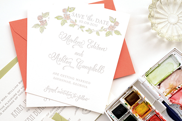
Hand tinting was historically used to color black and white photographs before color photography was invented. It was also used on prints made by etching as a means to color them. For this tutorial, we’ll show you how to use this technique to bring a unique, vintage look to your letterpress save the dates or wedding invitations. Not only is it beautiful, it’s also super easy (as in two steps)! – Bailey and Emma of Antiquaria

Hand-tint-Save the Date-Final-1

Hand-tinted-Save the Date-Step1

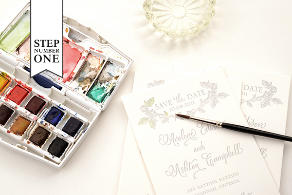
Step One: We chose two colors for this design: green and pink. When deciding what to do with your letterpress design, consider historical references for colors (searching hand tinted etching or photographs yields nice results).

First, we mixed our green color. We wanted it to be a little yellow tinged so we added some yellow to the green in our palette (see the upper left mixing area). The color needs to be very diluted to have it tint and not paint too heavily cover your letterpress print. Make sure to test your colors on an extra piece to make sure you have the technique down before starting the project.

Another key factor is how dry the brush is when it’s tinting the paper. You do not want it to be wet. Brushing it first against a paper towel helps keep the tint from being to watery. Again, it helps to work through this in testing.

Paint your first color in the desired area (in our case, green on the leaves) and set it aside to dry. Repeat on all cards.

Hand-tinted-Save the Date-Step2

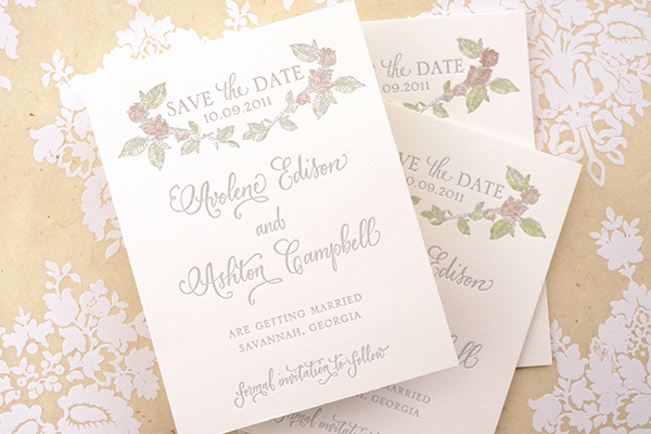
Step Two: Next, you’ll be adding in your second color to the flowers on the design. Mix up your desired color and test it on your spare piece until the color and dilution is right. Brush on the color (in our case, pink) in the desired areas. Set aside to dry and repeat on the rest of your cards.

Hand-tinted-Save the Date-Final-5

Letterpress printing works exceptionally well with hand tinting because it created an indented texture when the print is made. This helps keep your tint in place and prevents coloring outside the lines or blotchiness. If you do end up with too much water on the print, it’s easy to quickly dab it with a clean paper towel and absorb any excess. No harm done!

Hand-tint-Save the Date-FInal-2

We found that the tinting technique worked most beautifully and effectively on our botanical collection of letterpress cards. The softness and vintage appeal lends to the charm of the designs. Of course, the possibilities are as endless as your imagination!

Materials

Savannah Letterpress Save the Date Card. We recommend ordering extra pieces (10% overage) for testing.

Watercolors

Paint brush. We recommend a very nice, small brush so that you have control and precision.

Water cup

Anti­quaria is a mem­ber of the Designer Rolodex – you can see more of their beau­ti­ful work right here or visit the real save the dates gallery for more save the date ideas!

Photo Credits: Antiquaria for Oh So Beautiful Paper

DC Guide: The National Postal Museum

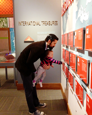
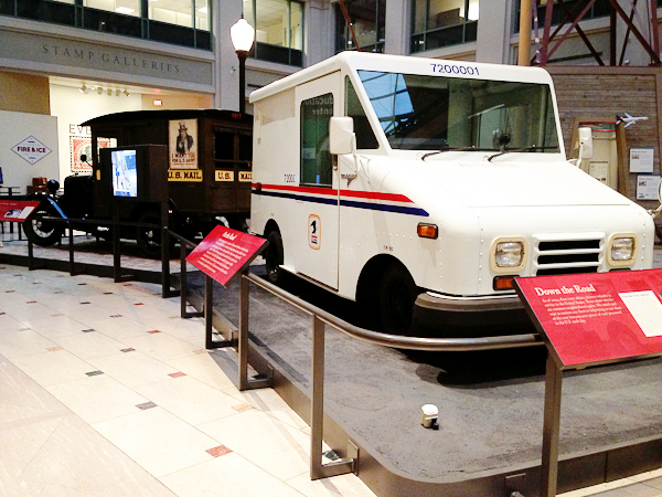
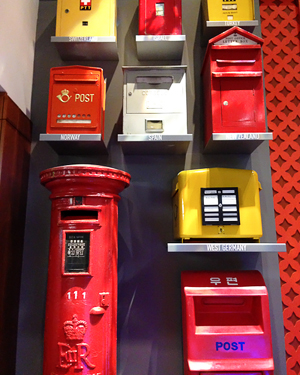
We made an impromptu trip to the Smithsonian National Postal Museum on a rainy Saturday a couple of weeks ago. It was actually my first time at this museum, but I’m so glad we went – it’s now on my must-visit list for DC! The stamp collection alone is worth a visit, but there are also exhibits on the evolution of the postal service, from the original private letter carriers to the Pony Express to the modern U.S. Post Service, and a display of mail delivery vehicles and airplanes. Sophie even had fun at the museum pulling out the displays in the stamp gallery and pretending to drive a mail delivery truck!

OSBP-DC-Guide-National-Postal-Museum-5

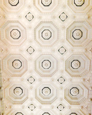
The National Postal Museum is located in Northeast DC next to Union Station, and is housed on the lower level of the historic City Post Office Building, which was constructed in 1914 and served as the DC post office from 1914 to 1986. I love these old buildings – the architectural details are amazing! The Museum also houses a 6,000-square-foot research library, a stamp store, and of course a museum shop.

OSBP-DC-Guide-National-Postal-Museum-2OSBP-DC-Guide-National-Postal-Museum-6

OSBP-DC-Guide-National-Postal-Museum-10OSBP-DC-Guide-National-Postal-Museum-9

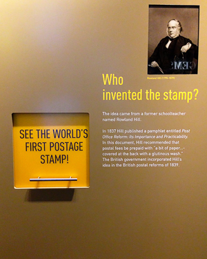
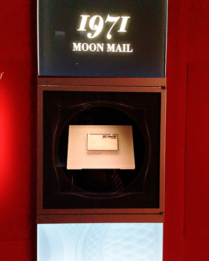
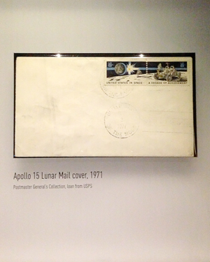
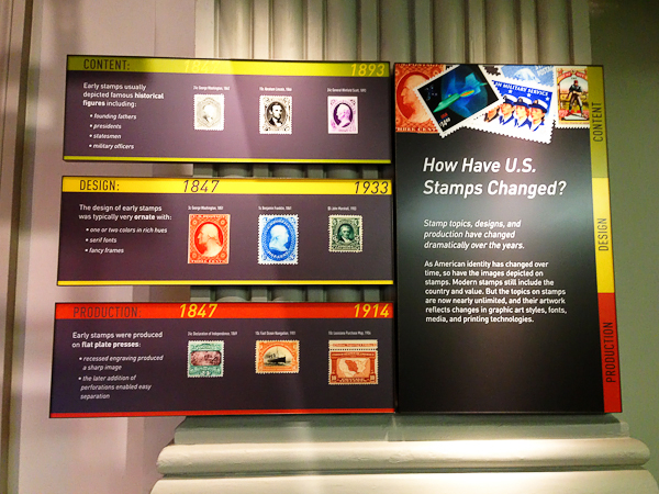
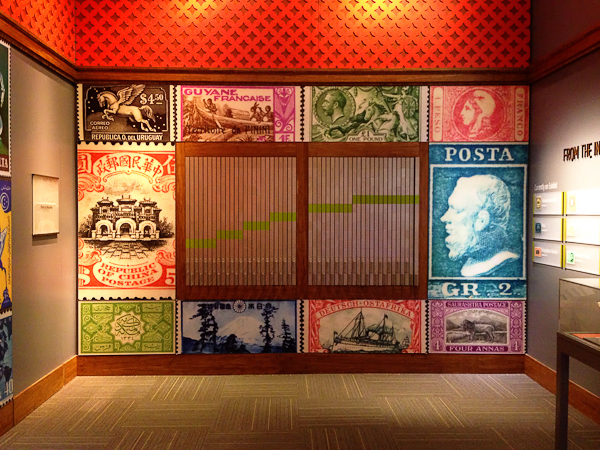
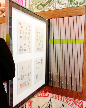
The stamp collection is amazing – not that you’d expect anything else! Everything from the first postage stamp to mail sent from the Moon, examples of engraving dies used to make antique stamps, and tons of international stamps.

OSBP-DC-Guide-National-Postal-Museum-16

OSBP-DC-Guide-National-Postal-Museum-14

OSBP-DC-Guide-National-Postal-Museum-28OSBP-DC-Guide-National-Postal-Museum-12

OSBP-DC-Guide-National-Postal-Museum-36

OSBP-DC-Guide-National-Postal-Museum-21OSBP-DC-Guide-National-Postal-Museum-23

OSBP-DC-Guide-National-Postal-Museum-40

OSBP-DC-Guide-National-Postal-Museum-50OSBP-DC-Guide-National-Postal-Museum-44

OSBP-DC-Guide-National-Postal-Museum-41

OSBP-DC-Guide-National-Postal-Museum-47

As you can probably tell, the National Postal Museum is very kid friendly (which I love!). We’re looking forward to going back!

More fun things to do in DC right here!

Photo Credits: Nole Garey for Oh So Beautiful Paper