Today I Love: Wedding Inspiration from Urban Wed

…all the gorgeous details from the Urban Wed event earlier this week:

Urban-wed-chalkboard-seating-global-stamps
Urban-wed-moss-silhouettes
Urban-wed-cameras-calligraphy
Urban-wed-photograph-table-runner
Urban-wed-rubber-stamp-books
Urban-wed-table-centerpiece
Urban-wed-paper-cup-pins{photos above by jen huang photography}

 Urban-wed-paper-cup-invitations
Urban-wed-paper-cup-invitations2{photos by jenny ebert photography}

From the invitations (Paper + Cup) to the calligraphy (Paperfinger) to the amazing vintage photograph table runner and centerpieces (by Hatch Creative Studio), Vané pulled together an amazing group of vendors for a beautiful show.  I wish I could have been there in person!  I’m sure Vané will be doing a more extensive review of the show on Brooklyn Bride and the Urban Wed blog, but in the meantime you can read about the experience on Ruffled, Papertastebuds, and Paper + Cup.

{image credits: top photos by jen huang photography, bottom two photos by jenny ebert photography via paper + cup}

Business Card Ideas and Inspiration #2

I'm overdue for new business cards, so I've been looking around for layout ideas.  Last year, I went with a one-sided horizontal layout, but this year I'm thinking I'd like to mix things up a bit.  I really love the vertical layout of these business cards from Second World Design Collaborative and Papered Together:

Vertical-letterpress-business-cards{via FPO}

Vertical-letterpress-business-card{via vandelay design}

I also really like the idea of double-sided business cards, like these from Ink + Wit (printed by Boxcar Press) and Thinktopia (printed by Studio on Fire):

Ink-wit-double-sided-letterpress-business-cards{via ink + wit}

Double-sided-letterpress-business-cards{via beast pieces}

I've got a few more business card photos over on my tumblr page.  I'm thinking about a combination of vertical and horizontal layouts on double-sided cards.  I'll be sure to share photos a bit later on!

UPDATE: So I just saw that Sarah from Parrott Design Studio also recently printed new letterpress business cards for herself, using her new calligraphy logo by Grace Edmands – and I'm in love.  Such a gorgeous card, from the vertical layout, to the calligraphy, to the floral border at the top:

Calligraphy-business-collateral

Calligraphy-vertical-business-cards


{images from their respective sources}

Kristy + Adam’s Unique Watercolor Vow Renewal Invitations

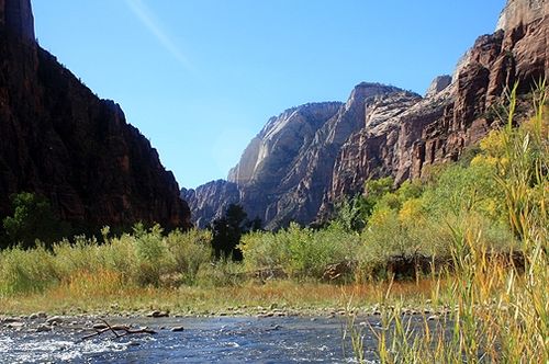
Last year, I featured the stunningly gorgeous hand-painted letterpress Save the Dates for the 10-year vow renewal of Kristy Rice from Momental Designs.  Today, I’m thrilled that Kristy is back with her equally beautiful watercolor wedding invitations — with a design inspired by the majesty of Zion National Park, where Kristy’s vow renewal will take place:

Momental-zion-invitation-suite

From Kristy: The save the date design was meant to introduce our guests to the beauty of Zion National Park in Utah but the invitations were meant to immerse them!

Momental-zion-watercolor-invitations
Momental-watercolor-invitation-text

Momental-zion-invitation-rsvp

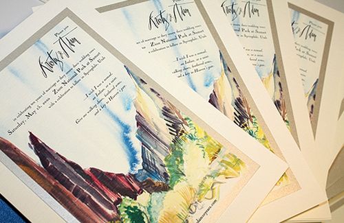
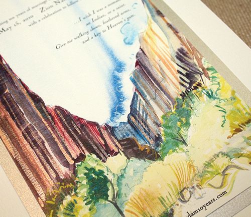
After many, many trips to Zion I have developed a serious collection of watercolor sketches and paintings.  A full color watercolor painting worked into the actual invitation layout seemed the perfect option.

Momental-zion-invitations-process1

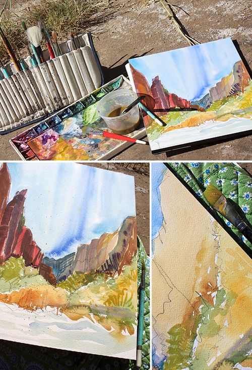
The particular painting chosen for the invitation was created on one very sunny October day at a quiet spot near the crystal waters of the Virgin River.

Zion-national-park

I sat on the cool rocks near the water and proceeded to paint for nearly 3 hours, leaving with a detailed and expressive painting and also a bit of a sunburn!

Momental-zion-watercolor-detail2

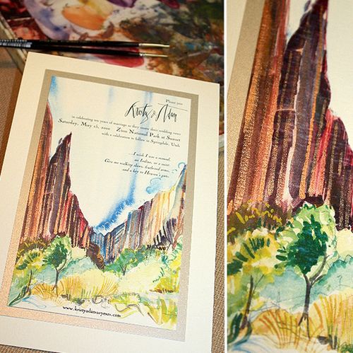
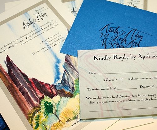
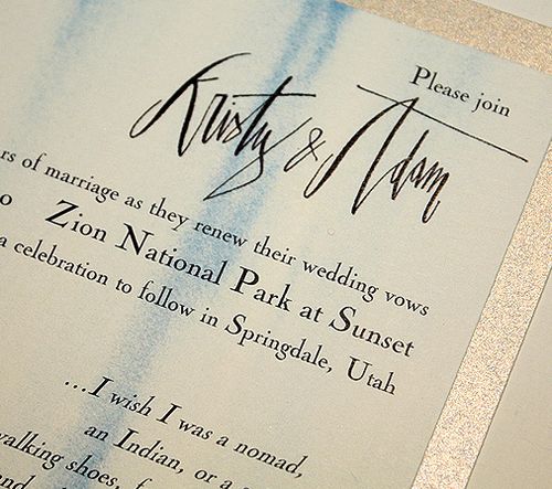
After each invitation was reproduced, shimmering copper and cobalt blue hand painted strokes of color were added to each individual card.  I wanted to give our guests a sense of how the water reflects light on the towering rocks and dances shadows in every direction.

Momental-zion-envelopes-calligraphy
Momental-zion-invitations-calligraphy

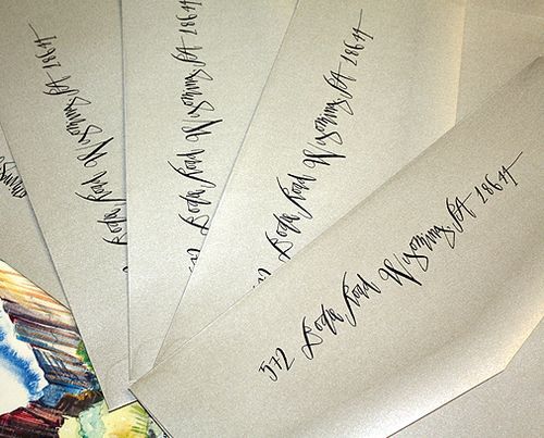
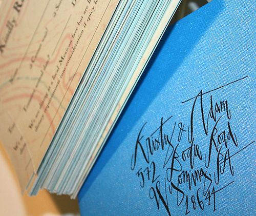
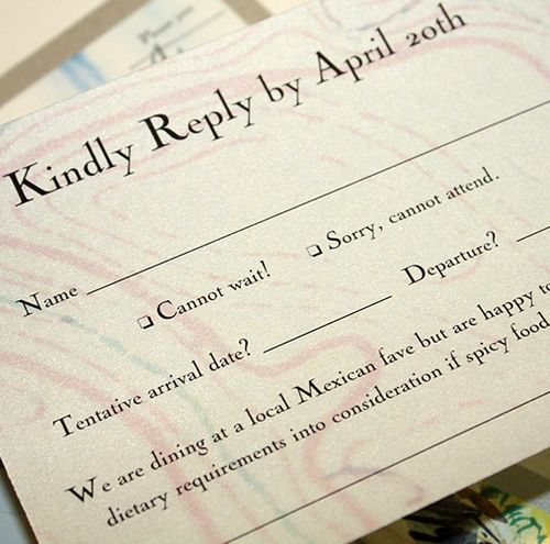
The calligraphy for the names and addresses on the outer envelopes, as well as our names on the main invitation, was done by the talented Betsy Dunlap.  I used the print ready image that Betsy created for our save the dates everywhere I could, from the invitation to the rsvp response and outer envelope backflap.

Momental-zion-watercolor-invitation-detail

Size and scale were important in this design since the redrock landscape of Zion is so towering and massive.  The finished invite measured nearly 6.5 x 9.5 inches!

You can check out Kristy’s letterpress save the dates right here, and you can see lots more of her beautiful work over on Momental Designs.  Thank you so much Kristy!

{image credits: kristy rice}

Chris + Emma’s Vintage Texas Cactus Wedding Invitations

Brace yourselves, because today’s real wedding invitations are truly spectacular.  Combining three of my favorite things — gorgeous calligraphy, letterpress printing, and vintage stamps — Emma + Chris’s southwestern cactus-inspired wedding invitations are a true representation of their upcoming Texas wedding.  So let’s get right to it!

Emma-chris-texas-cactus-wedding-invitations-suite

From Emma: I am a designer living in Austin, Texas. I started designing wedding invitations about a year ago, when I took a job at a local invitation shop.  I draw my inspiration from nature, art, and all things vintage. (Update: Emma has since formed her own design studio called Antiquaria in partnership with calligrapher Bailey Amon)

Emma-chris-texas-cactus-wedding-invitations

Our wedding will be out doors in the hill country of Austin and I wanted an invitation that reflected the southwest without being overtly western.  I had the invitations letterpress printed at our awesome vendor Stationery Works using a warm gray ink.

Emma-chris-texas-cactus-wedding-invitations-gray-letterpress

Emma-chris-texas-cactus-wedding-invitations-rsvp

Keeping all the letterpress printed pieces one color helped keep the overall cost down and I was able to add in pops of color with the bright yellow envelope liner and a reproduction vintage postcard (which I printed myself). All the pieces were then tied together in little bundles with yellow bakers twine from Whisker Graphics.

Emma-chris-texas-cactus-wedding-invitations-stamps
Emma-chris-texas-cactus-wedding-invitations-calligraphy

The outer envelopes brought it all together with calligraphy by Bailey Amon and vintage cactus postage that I found on ebay.

Thanks so much Emma!  You can find more of Emma’s design inspiration and influences, as well as more tidbits about her wedding, on her blog, Love of Folly, and more of her beautiful designs at Antiquaria.

Image Credits: Emma | Antiquaria

{happy weekend!}

Happy Friday everyone!  Whether your neighborhood is filled with snow or sunshine, I hope you have a lovely weekend.  I'm still dreaming about spring (please get here soon!) and am hoping to sketch out my garden plan this weekend.  But in the meantime…

Climbing-roses

…a few links for your weekend:

That's it for me – thank you so much for stopping by this week.  I'll see you all here again on Monday!

{image credits: from me to you}