Hazel’s Fall Harvest First Birthday Party Invitations
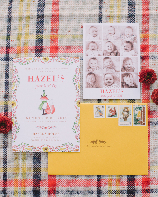
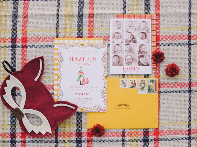
For her daughter Hazel’s first birthday, my friend Maggie worked with Courtney from Swiss Cottage Designs to create the most fun and whimsical Fall Harvest-inspired invitations. And I’m so excited to share them here on OSBP today, along with photos of some of the party details from the talented ladies at Sweet Root Village! The invitations feature watercolor illustrations by Courtney paired with plaid patterns, a cute insert featuring Hazel’s monthly baby photos, and the most adorable (and completely perfect) vintage stamps. The whole thing came together so beautifully!
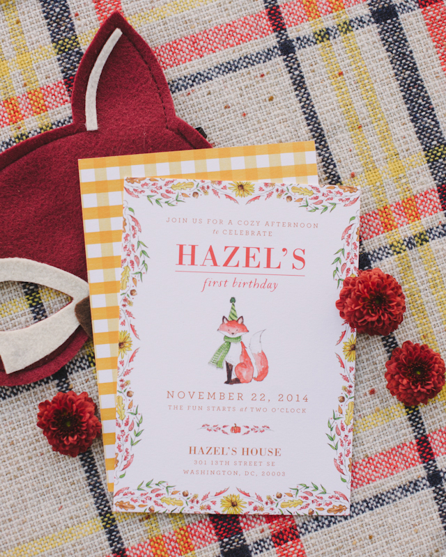
From Courtney: Hazel’s invitations were inspired by colors found during autumn and that cozy feeling you get during this time of year. We wanted the invitations to be fun and cute but nothing that was too overtly baby. I created a watercolor border made up of different autumnal elements and complemented that with a fun little fox friend (complete with party hat!) We contrasted the hand illustrations with the bold envelope and graphic plaid liner.
Love those beautiful plaid patterns!

From Maggie: We loved how the invitations perfectly embodied the party’s look and feel with the gorgeous plaids and whimsical animals.

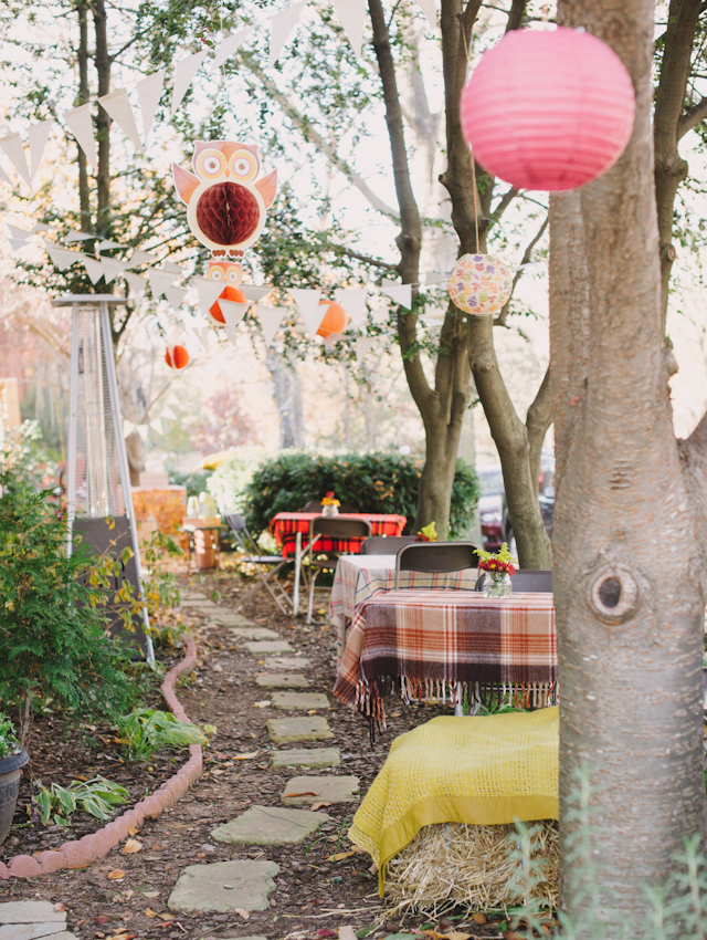
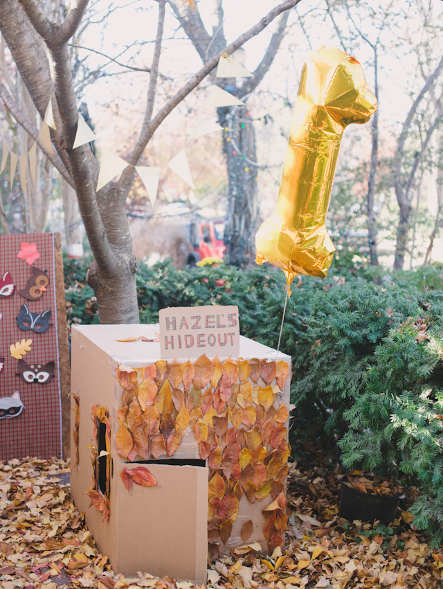
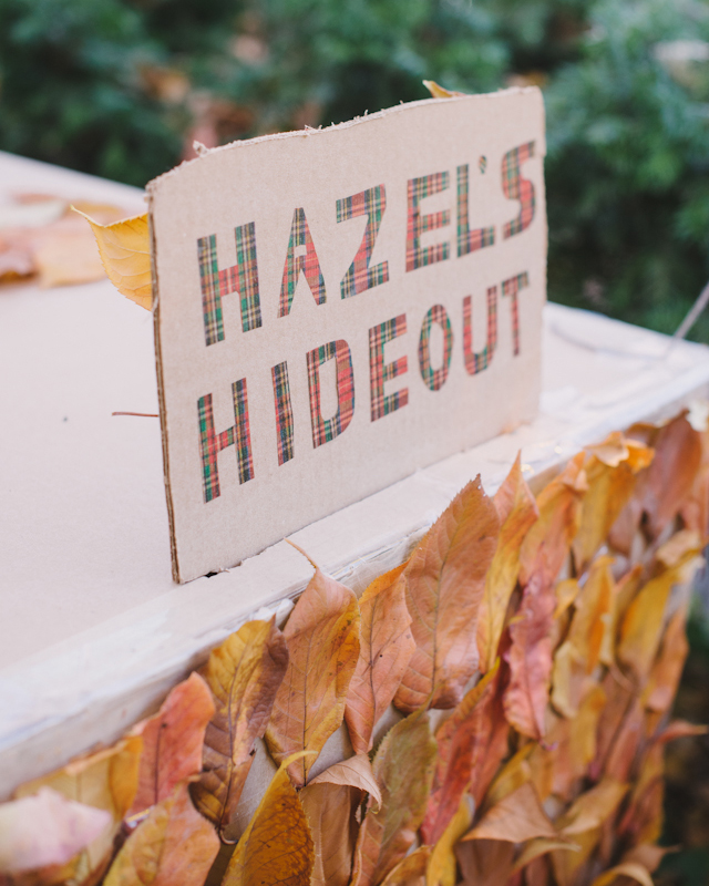
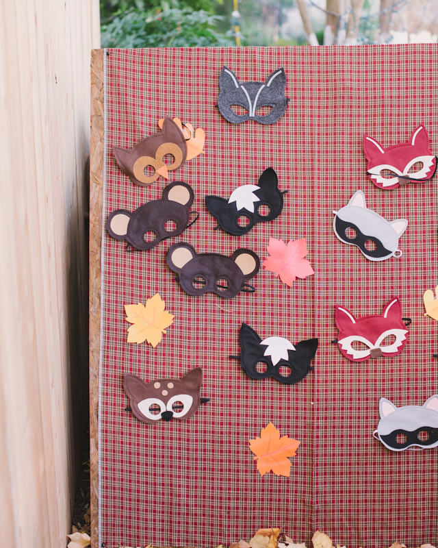
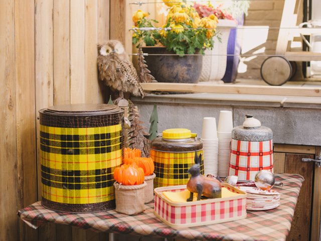
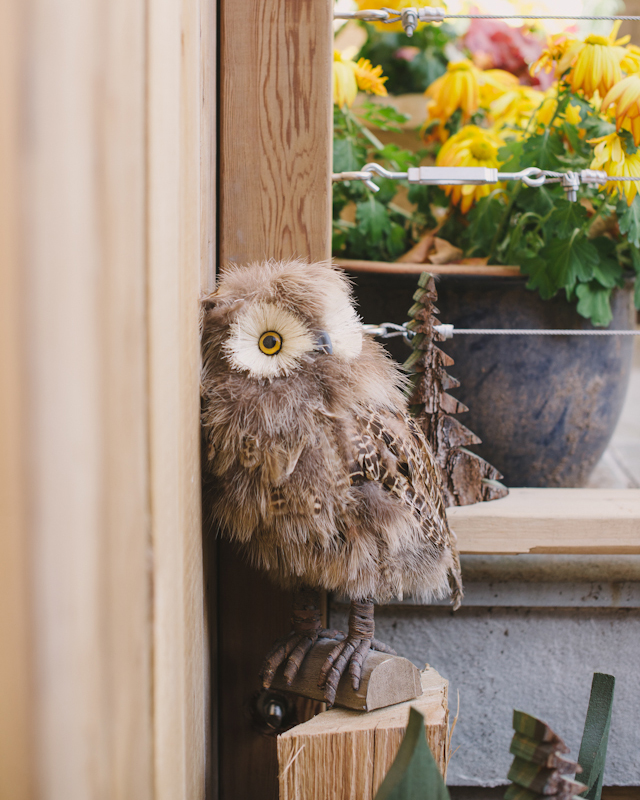
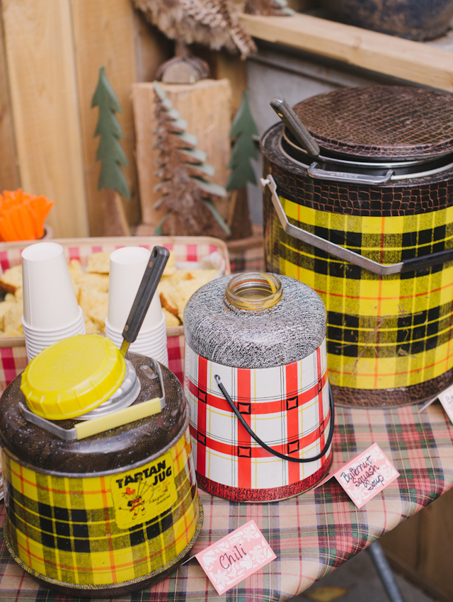
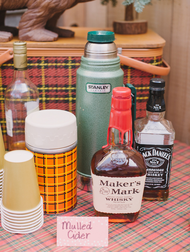
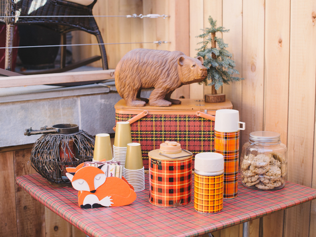
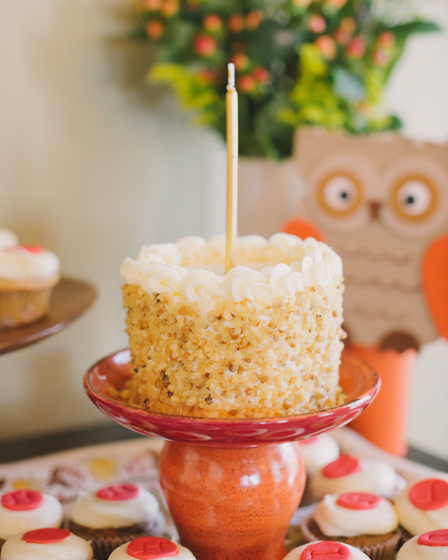
And here are some of the amazing party details by Maggie!
Thanks Maggie and Courtney!
Invitation Design: Swiss Cottage Designs
Swiss Cottage Designs is a member of the Designer Rolodex – you can see more of Courtney’s amazing work right here or visit the real inviÂtaÂtions gallery for more wedding invitation ideas!
Photo Credits: Sweet Root Village
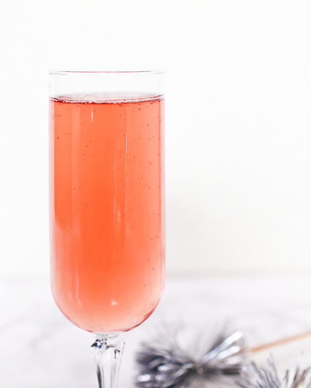
Rosé 75
Ah, champagne cocktails. They’re both delicious and versatile. Enjoy them over brunch, during a New Year’s Eve celebration, at weddings, or even during a quietly romantic dinner at home. Champagne cocktails also tend to involve just a few key ingredients, making them super easy to put together on short notice. This recipe is a spin on the classic French 75 cocktail recipe – but with delicious sparkling Rosé instead of classic champagne and a bit of raspberry syrup for some extra flavor. It’s sweet, sparkling, smooth, and the most lovely shade of pale pink. I call it the Rosé 75! You can find the full recipe below – and check out the shopping guide on eBay right here!
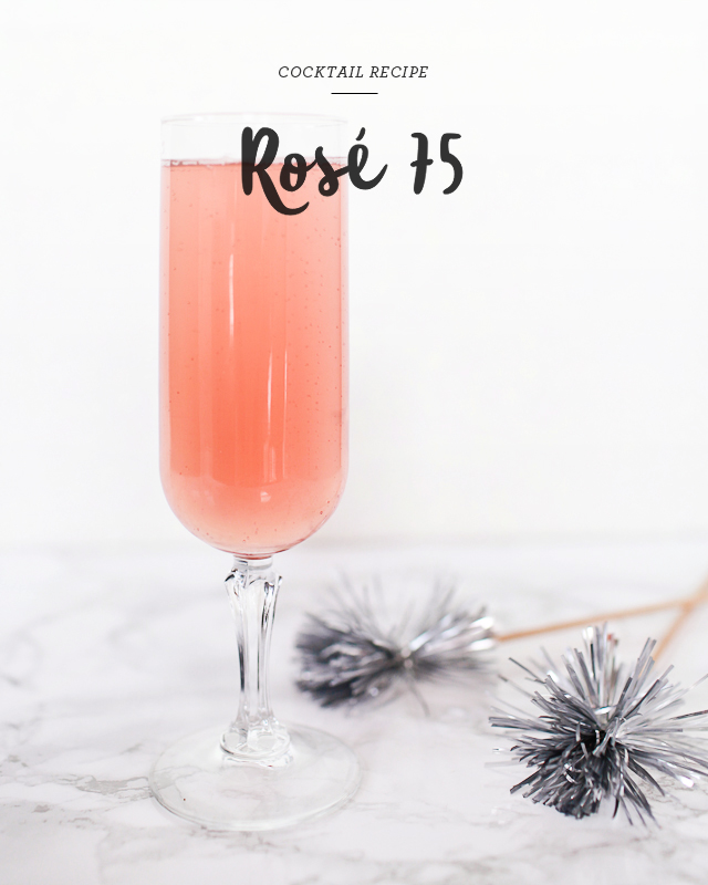
Rosé 75
1 oz Dry Gin
1/2 oz Lemon Juice
1/2 oz Raspberry Syrup
3 oz Rosé Sparkling Wine
Add all the ingredients except the sparkling wine to a cocktail shaker and fill with ice. Shake well and strain into a Champagne flute. Top with the Rosé sparkling wine and enjoy!
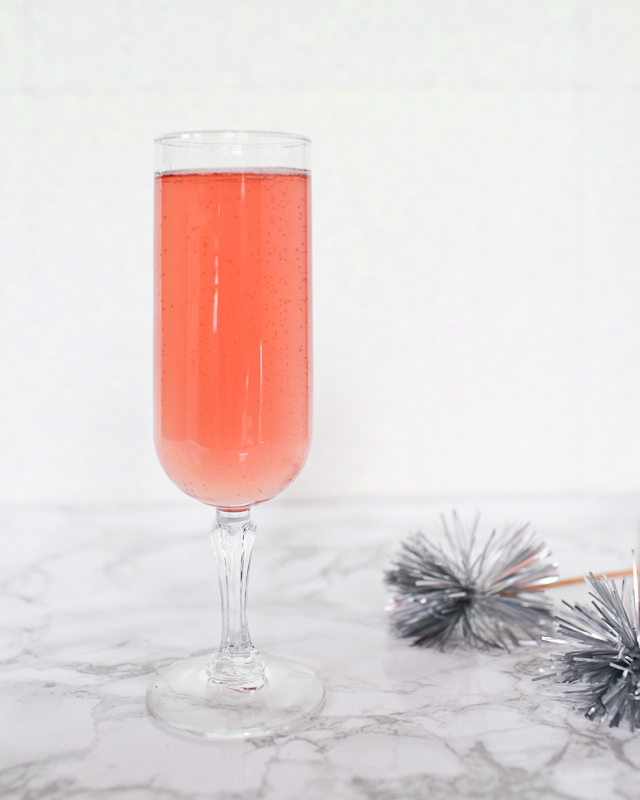
Simple syrup is an essential ingredient in many cocktails, but especially in champagne and sparkling wine cocktail recipes. In this Rosé 75, the raspberry simple syrup help balances the dryness of the gin and sparkling wine.
Simple syrup is easy to make at home by melting 1 cup of sugar in 1 cup of water, but I like to add a bit of extra flavor into my recipes with flavored syrups. Raspberry syrup was a popular ingredient in pre-Prohibition cocktail recipes – and is a fantastic addition to a Rosé 75!
Just a few ingredients – and so easy to make! Make a bunch for a Girls Night In, or for brunch with friends. Enjoy these lovely pink drinks any time of year!
This post was created in partnership with eBay. All content and opinions are my own. Thank you for supporting the sponsors that make Oh So Beautiful Paper possible!
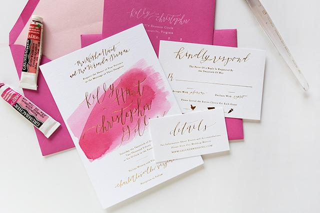
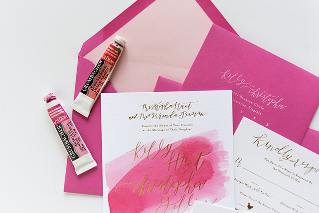
Fuchsia Watercolor and Gold Foil Wedding Invitations
If you love pink you’ll absolutely LOVE these wedding invitations from Alex of Goodheart Design! Alex hand painted a vibrant watercolor wash using gouache in two different layers, making each invitation completely unique. And who could possibly resist that shiny gold foil?
From Alex: I had so much fun working with my client Kelly Gellner on her wedding invitation suite! Kelly had already been dreaming up ideas for this suite so it didn’t take long for us to come up with this super fun idea.
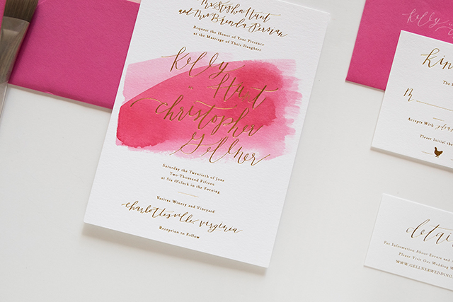
The inspiration behind this suite was simple: fuchsia, white, and gold! Kelly wanted something simple and clean that highlighted their names in a unique way. She also for sure wanted a pink watercolor wash incorporated somewhere in the suite. She had brought up the idea of each invitation being individually watercolored (my kind of girl!) and I totally took that idea and ran with it. This was the first invitation suite I had made that incorporated watercolor and foil so I was a little nervous but super happy with the results!
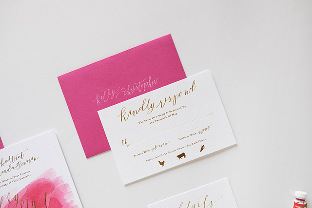
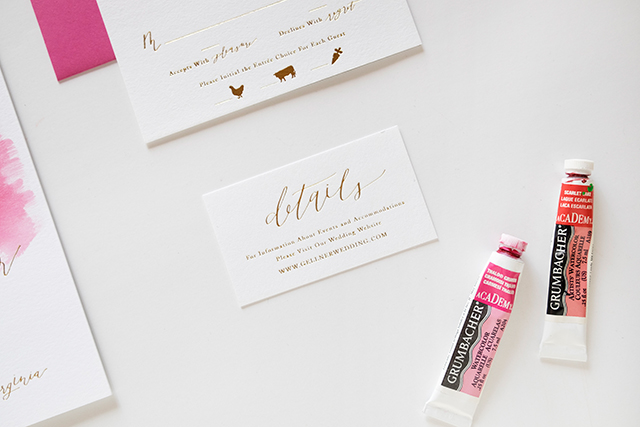
Each piece featured delicate hand lettered details and were all printed in shiny gold foil. The main invitation was printed on slightly thicker paper than the other two pieces, 220# Lettra, so that when the watercolor was applied after printing the paper was thick enough to stay flat and not warp. The other two pieces were printed on 110# Lettra paper. Each invitation was individually hand watercolored, which made each and every one completely unique.
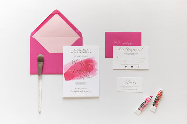
I kept my method of watercoloring consistent throughout the process, but each invitation still had a slightly different watercolor wash – which ends up being the beauty (and the benefit) to hand painting each one versus digitally printing a watercolor background. The watercolor was applied in 2 layers (one light and one dark) right on top of the the foil. Luckily the watercolor falls right off of the foil, so the foil is able to shine beautifully through. You can see a video of the watercolor being applied over the foil here!
Thanks Alex!
Design + Lettering: Goodheart Design
Foil Printing: Czar Press
Client: Kelly Hunt of Eat Yourself Skinny
Goodheart Design is a member of the Designer Rolodex – you can see more of Alex’s beautiful work right here!
Photo Credits: Goodheart Design
Behind the Stationery: Bench Pressed
The husband and wife team of Bench Pressed are no rookies to the stationery world – even though they launched their business just a couple years ago. Jane and Andy are here to share their creative process, from brainstorming and sketching to hitting the letterpress! I love this story on how they discovered the voice to Bench Pressed – read on about one of their favorite cards and how it shaped the brand. Take it away, guys! –Megan

Hi there! Welcome to Bench Pressed! We are Jane and Andy Shannon, a husband and wife team, running a letterpress and design company in the Twin Cities and faking it until we make it.
Before we started Bench Pressed, Andy was working as a freelance illustrator and I was a stationery buyer at a small boutique in Minneapolis. After a few years, we decided to take our two passions and merge them. We launched Bench Pressed at the National Stationery Show in 2013, and we’ve been working on it ever since. Both of us still have side-jobs one day a week to help support ourselves and our dogs, but we are now working on creating greeting cards full-time.

Our shop is located in the old Hamm’s brewery in East St. Paul, Minnesota. This side of the neighborhood is slowly being revitalized after sitting vacant for a long time. Now our neighbors are small start-ups, like a craft brewery, small distillery, chocolatier and an urban hydroponic farm, all drawn to the neighborhood by the historic building and the cheap rent. Also, we are close to the best taco truck in all of the Twin Cities (priorities).

Bench Pressed is a letterpress shop. We specialize in hand-drawn and hand-printed cards, which means that all of our designs begin with pen on paper. We like to say that our cards are “tongue-in-cheek, with a little sweet.”

Coming up with card ideas is the best part. Andy keeps multiple Moleskine journals around and is drawing constantly. We both use the Notes app on our phones to write down things that make us laugh, which might end up as a card. Most of the time we’re working on cards we need in advance of a certain season (Valentine’s, Christmas, etc.), but not all of our cards are contrived.
For example, one of our most popular cards was just a random doodle that I found inside of Andy’s sketchbook, a little house with the words “Hope Your Neighbors Aren’t Creepy” (which I’m assuming was inspired by our neighbor who has many, many cats).


Once an idea and an illustration is made, he redraws the images from his sketchbook with tracing paper. The images are scanned into Photoshop where we add color, resize if needed, and prep all the cards into large files to be sent out to Boxcar Press for our photopolymer plates.

Our cards are all printed by us in our shop. We have three presses, a small table top press, a Chandler and Price, and our newest member of the family, the Heidelberg. We are using the windmill the most these days, but still use the C&P on some of the cards.


A typical day at Bench Pressed means that I’m at the computer answering emails and keeping on track of our orders, both retail and wholesale. Andy is usually working on our ever-growing print-list or on new products.

As for a team, right now it’s just the two of us. We plan on eventually adding more people to the mix – more hands for printing, folding, and packing up orders – but for now, it’s just us and the dogs at the shop.
Our struggles right now are getting ahead of our print-list to create more time for new products. I also think that keeping business separate from regular life can be tough, especially when you work with your partner. We have to remind ourselves take the weekend off or to take a step back when we need to.

One of our favorite cards is the “Oh Shit” pregnancy test card. It was one of our first designs and it really opened up the door for us to get a little more snarky with our line. At first, we didn’t want to push the envelope too much and didn’t want to upset people, but when we released this card there was such an overwhelming response to it that we were able to keep creating cards that we would want to give. And I guess that’s the exciting thing about making greeting cards for a living; we get to be a (tiny) part of people’s everyday joys.

We find inspiration from a lot of places. First of all, the stationery and paper industry is the most supportive industry that I know. We have learned so much from other stationers from printing techniques and troubleshooting to the best places to buy cello sleeves, envelopes, etc. Going to the National Stationery Show is one of our favorite things every year because we get to meet new and see old friends and catch up with them. It could be so easy for us to all see other stationers as competition, especially since we use the same medium, but instead it seems like we all boost each other up. Which is really refreshing and energizing.

In more basic terms of inspiration, we are constantly blown away by other artists and makers on various social media accounts, mostly Instagram. There is so much to see, from furniture makers and jewelers to installation artists, photographers, and chefs – strangers and friends alike – literally hours could vanish and not a damn thing would be done around the shop. Sometimes it is overwhelming, but there is an endless amount of talent out in the world and it’s kind of a paralyzing beauty.
All product photos by Bench Pressed, all other photos by 2nd Truth Photography.
Interested in participating in this column? Reach out to Megan at megan(at)ohsobeautifulpaper.com for more details about Behind the Stationery.