Modern Copper Foil and Gray Wedding Invitations

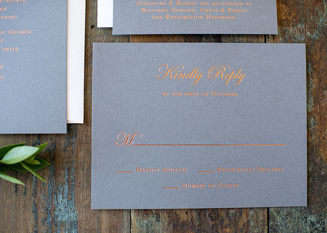
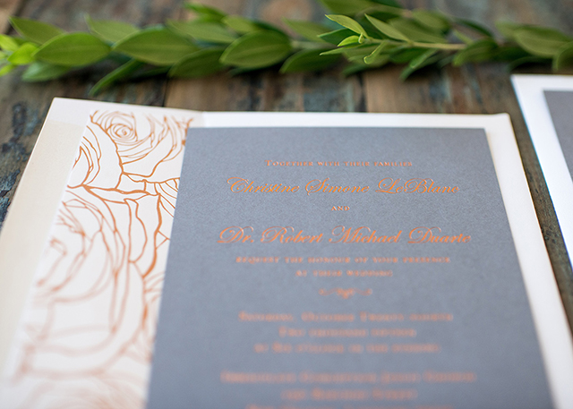
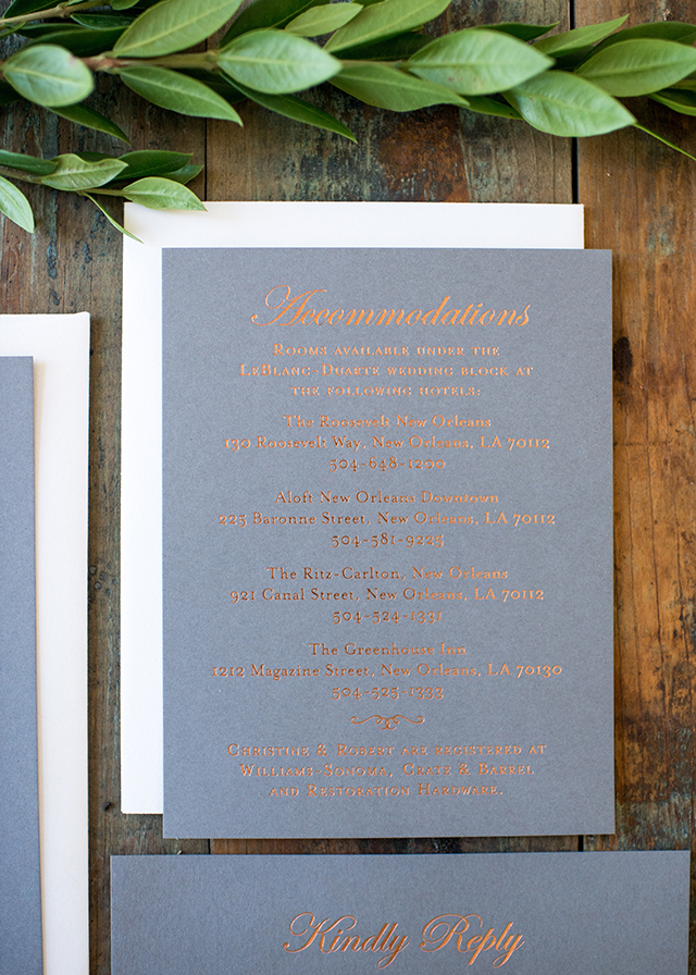
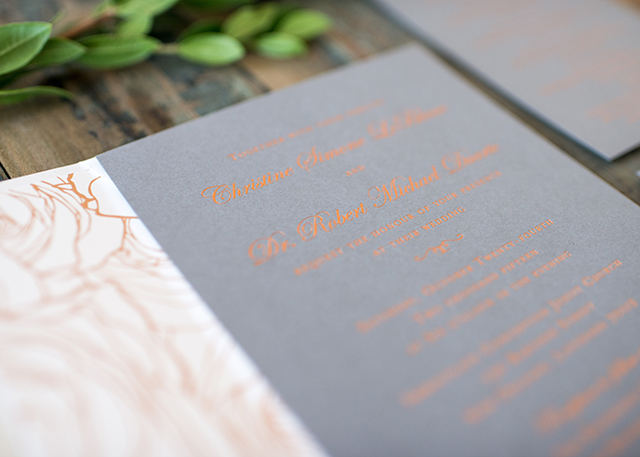
There’s just something about copper foil paired with dark paper, don’t you think? These modern copper foil and gray wedding invitations from Brynne at Harken Press blend traditional text and a classic layout with a modern color palette. And that envelope liner!

Modern Copper Foil and Gray Wedding Invitations by Harken Press / Oh So Beautiful Paper

From Brynne: After hearing about Christine’s vision for their formal New Orleans wedding, I knew right away that I wanted to blend traditional design with modern colors and non-traditional materials. Foil printing was the perfect choice to compliment their chic wedding décor with mixed metals and all white flowers. Copper metallic foil on pewter gray paper added the hint of romance the couple was looking for, and helped set the tone for their evening wedding ceremony. The envelope liner brings a modern touch with a graphic peonies pattern. The end result was a romantic and eye catching invitation suite that Christine and Robert were so excited to mail to their wedding guests.

Modern Copper Foil and Gray Wedding Invitations by Harken Press / Oh So Beautiful Paper

Modern Copper Foil and Gray Wedding Invitations by Harken Press / Oh So Beautiful Paper

Modern Copper Foil and Gray Wedding Invitations by Harken Press / Oh So Beautiful Paper

Modern Copper Foil and Gray Wedding Invitations by Harken Press / Oh So Beautiful Paper

Thanks Brynne!

Design: Harken Press

Foil Printing: Quality Letterpress

Check out the Designer Rolodex for more tal­ented wed­ding invi­ta­tion design­ers and the real invi­ta­tions gallery for more wedding invitation ideas!

Photo Credit: Meagan Floris

Leap Day Birthday Party Invitations

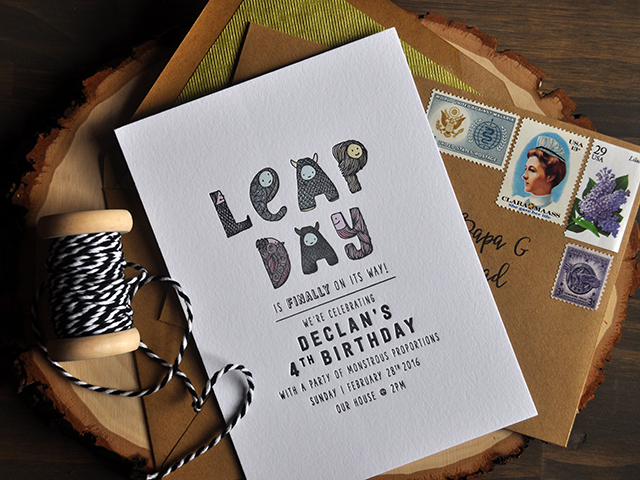
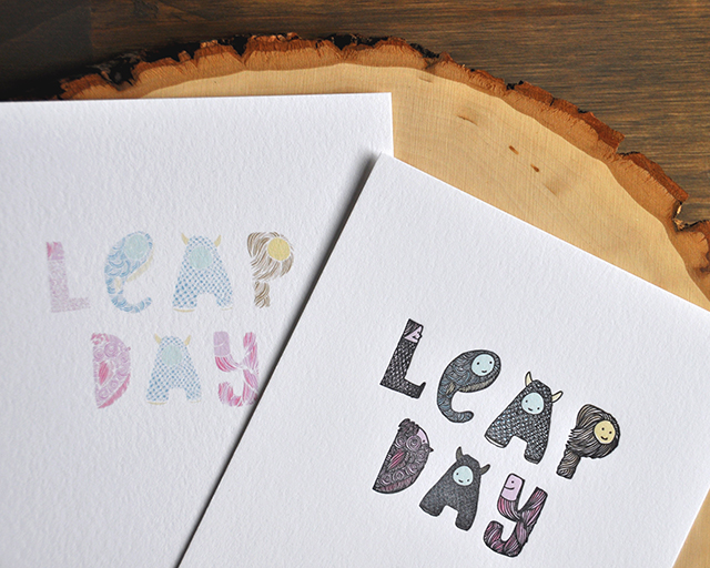
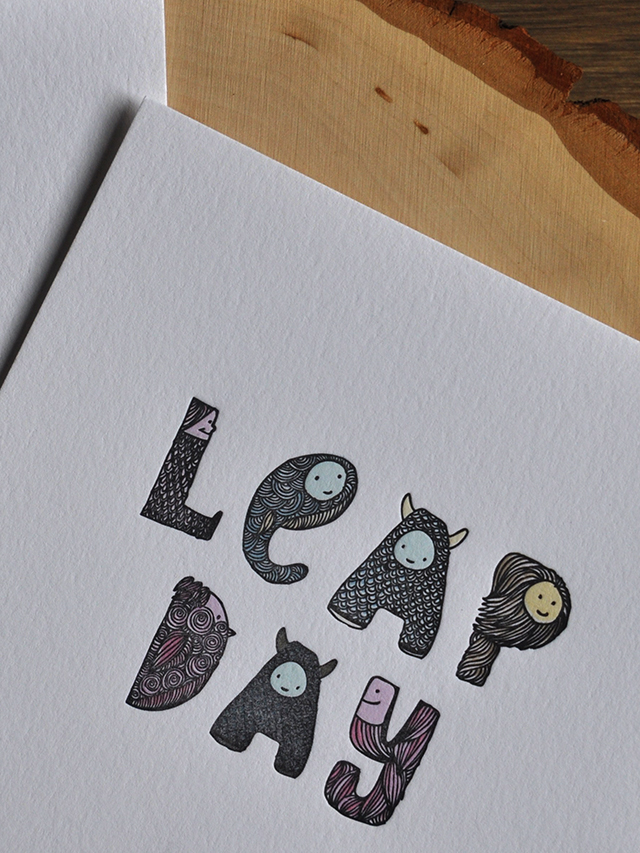
Any leap day babies out there? Or anyone WITH leap day babies of their own? Well, this one is for you! Lauren at Darling + Pearl just happens to have a leap day baby, and they’re super excited to celebrate this year! Lauren put together these really cute monster-themed leap day birthday party invitations, and because she’s a letterpress printer she just had to give herself a little extra challenge in the printing department. So cute!

Leap Day Birthday Party Invitations by Darling & Pearl / Oh So Beautiful Paper

From Lauren: Here’s a project that is SO close to my heart. Not too many people care about, much less celebrate, leap day, BUT it’s my son’s birthday! And we’ve waited so impatiently for FOUR YEARS to see it on the calendar!

Leap Day Birthday Party Invitations by Darling & Pearl / Oh So Beautiful Paper

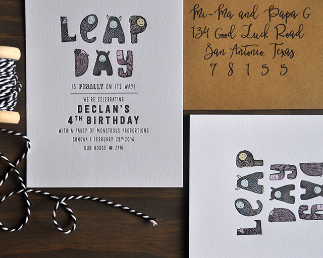
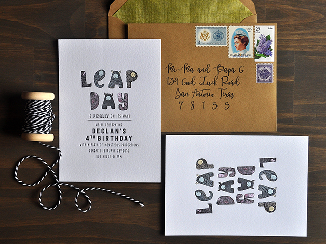
These invitations were mixed media- one color letterpress printed in black and flat printed full color details on 110lb fluorescent white cotton stock. I wasn’t exactly sure what I was signing on for with registration this tight, but the best times to push the envelope is on personal projects and I can’t stop staring at them!

Leap Day Birthday Party Invitations by Darling & Pearl / Oh So Beautiful Paper

Declan is kind of obsessed with his stuffed animal entourage at the moment – some of them being dinosaurs (his 3rd birthday theme) and monsters – so when it came time to decide on a birthday theme, like 2 weeks ago, (hah! things are more and more lax at the years go on, and children multiply – am I right?) monsters for a monstrous leap day celebration seemed to fit the ticket.

Leap Day Birthday Party Invitations by Darling & Pearl / Oh So Beautiful Paper

Leap Day Birthday Party Invitations by Darling & Pearl / Oh So Beautiful Paper

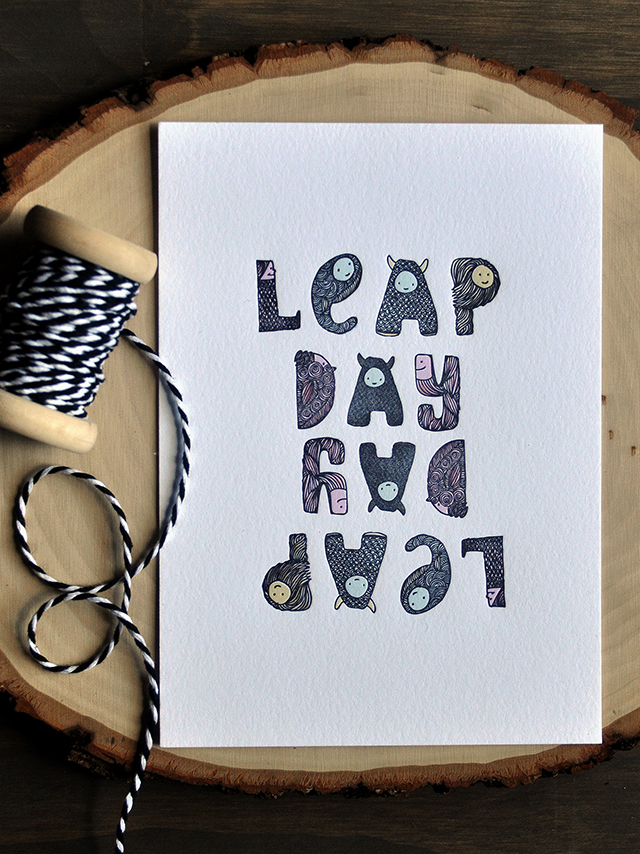
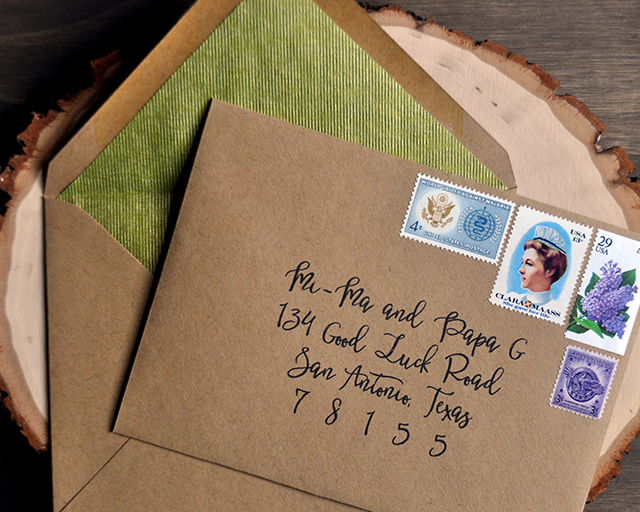
I used kraft envelopes, since I generally like to keep it neutral, and ribbed metallic green fine paper envelope liners. AND vintage stamps! In the meantime I also created a little art print that we can hang in his room, one to share with his leap day buddy, Charlotte, and obviously one to hang in my print studio.

Leap Day Birthday Party Invitations by Darling & Pearl / Oh So Beautiful Paper

Leap Day Birthday Party Invitations by Darling & Pearl / Oh So Beautiful Paper

Thanks Lauren!

Darling + Pearl is a member of the Designer Rolodex – you can see more of Lauren’s beautiful work right here!

Photo Credits: Darling + Pearl

Illustrated European-Inspired Watercolor Save The Dates

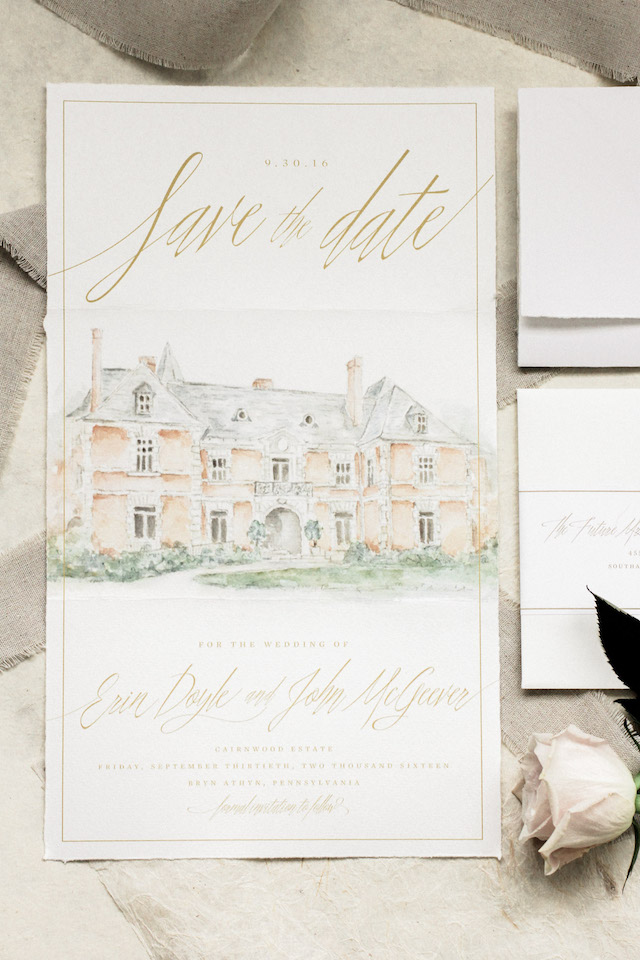
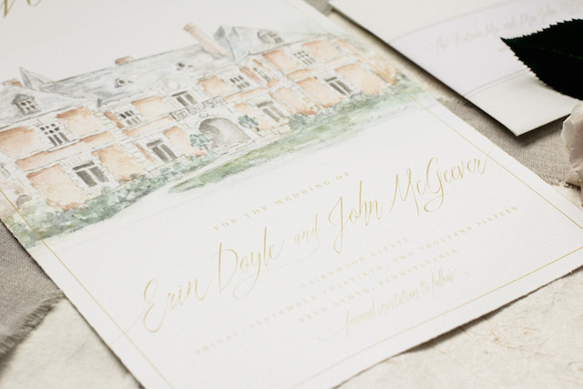
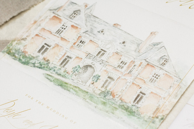
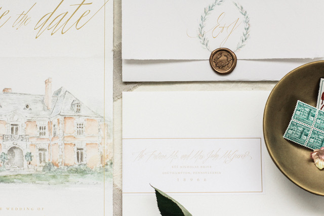
Well, these save the dates are quite romantic! Created for her own upcoming wedding by Erin of Grace + Ardor Co., these illustrated European-inspired watercolor save the dates feature a gorgeous custom watercolor illustration of the reception venue, hand-torn deckle edges, and a gorgeous wax seal. And I love that Erin chose to go with a large scale format for her save the dates – all the better to show off that beautiful illustration!

Illustrated European-Inspired Watercolor Save the Dates by Grace + Ardor / Oh So Beautiful Paper

From Erin: My fiancé, John, and I are getting married this September, and planning and designing a wedding has been something I’ve dreamed of doing since I was a little girl. I spent the first few months of our engagement really researching and refining my aesthetic. Once I had that in place, I decided to collaborate with a fellow designer (and one of my bridesmaids), Tracey, to create my Save the Dates.

Illustrated European-Inspired Watercolor Save the Dates by Grace + Ardor / Oh So Beautiful Paper

Illustrated European-Inspired Watercolor Save the Dates by Grace + Ardor / Oh So Beautiful Paper

Our wedding is going to be very soft, romantic, and European-inspired. Blush pinks and neutrals, lots of foliage, some deep merlot tones, and mixed metals are in the palette. The ceremony will be held at Bryn Athyn Cathedral in Pennsylvania: a gorgeous Early Gothic style structure set amongst beautiful gardens. Located next to that is the stunning Cairnwood Estate, in which our reception will take place.

Illustrated European-Inspired Watercolor Save the Dates by Grace + Ardor / Oh So Beautiful Paper

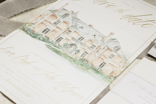
I also collaborated with an illustrator, Cheryl Geiger Sheeler, for the beautiful watercolor painting of Cairnwood Estate. This was scanned in to the computer and printed on Epson Watercolor Paper. We tore the edges of the paper by hand to give it a deckled edge, and the illustration bled off the edge to add to the natural, handmade feel.

Illustrated European-Inspired Watercolor Save the Dates by Grace + Ardor / Oh So Beautiful Paper

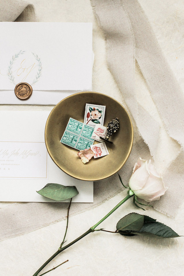
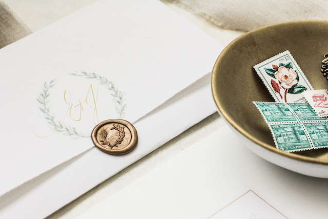
For impact, the scale was larger than a traditional Save the Date at 8.75 x 15 inches, folding down into a Crane Lettra A9 envelope. The fold was secured with an antique gold olive branch wax seal. I wanted to save the beautiful impression that calligraphy gives for our main wedding stationery, so I decided to create address labels that wrapped around the side of the envelope as an elegant alternative. Everything came together so wonderfully, and I especially love the handcrafted details. I cannot wait until our big day in September to celebrate our love for each other!

Illustrated European-Inspired Watercolor Save the Dates by Grace + Ardor / Oh So Beautiful Paper

Illustrated European-Inspired Watercolor Save the Dates by Grace + Ardor / Oh So Beautiful Paper

Thanks Erin!

Design: Grace + Ardor Co.

Watercolor Illustration: Cheryl Geiger Sheeler

Check out the Designer Rolodex for more tal­ented wed­ding invi­ta­tion design­ers and the real invi­ta­tions gallery for more wedding invitation ideas!

Photo Credits: Erin Doyle, Grace + Ardor Co.

Behind the Stationery: Hammerpress

It’s a true honor to feature printmaker, designer, entrepreneur, business owner, and true craftsman Brady Vest of Hammerpress in our latest installment of Behind the Stationery. Today Brady takes us behind the scenes, talking about his staff, daily business, and how he started the company before the internet took over. –Megan
Behind the Stationery: Hammerpress / Oh So Beautiful Paper

I started Hammerpress in 1994 while studying printmaking at the Kansas City Art Institute. The school had two letterpresses and some type that no one really used. I started working with friends on collaborative projects – mostly posters for local bands, record covers, etc. Once I graduated, I had no letterpress equipment to continue the work, so I began looking for presses and type. This was pre-internet and sources like Briar Press were non-existent. You would basically just walk into print shops and ask if they had any old equipment to sell. I lucked out when I was visiting my hometown of Oklahoma City and wound up scoring a bunch of type and other equipment. Then I got a studio space, and it was basically a word of mouth business. Again, pre-internet and pre-website for your business.
Behind the Stationery: Hammerpress / Oh So Beautiful PaperBehind the Stationery: Hammerpress / Oh So Beautiful Paper

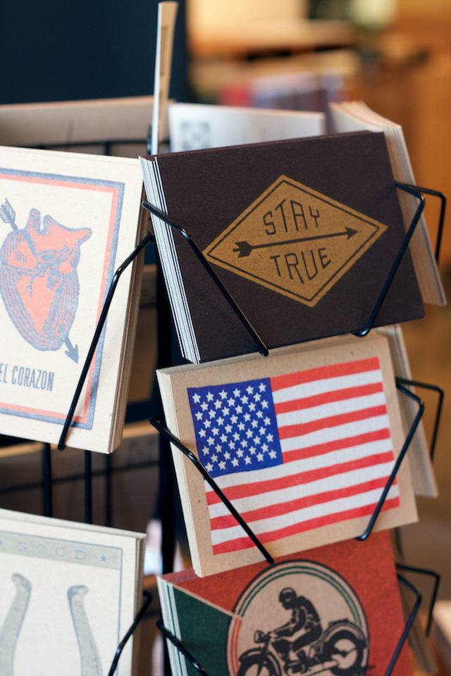
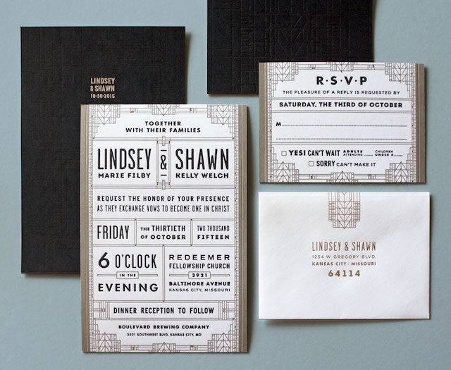
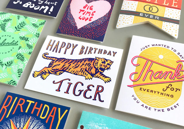
In those first years we printed job work for designers around town, making custom wedding invitations & business cards. From there it just kind of slowly grew and morphed into what it is today. The big jump happened in about 2004 or so, with the help of a couple of good people, we decided to go to the National Stationery Show in New York. I think once we entered that world, Hammerpress really started to develop into more of a business. We now have over 300 products in our wholesale line, mostly greeting cards, but also prints, notebooks, postcards, gift tags & calendars. We have an amazing network of reps selling our product on the road, in their showrooms, and at trade shows, and we couldn’t do it without them.
Behind the Stationery: Hammerpress / Oh So Beautiful Paper

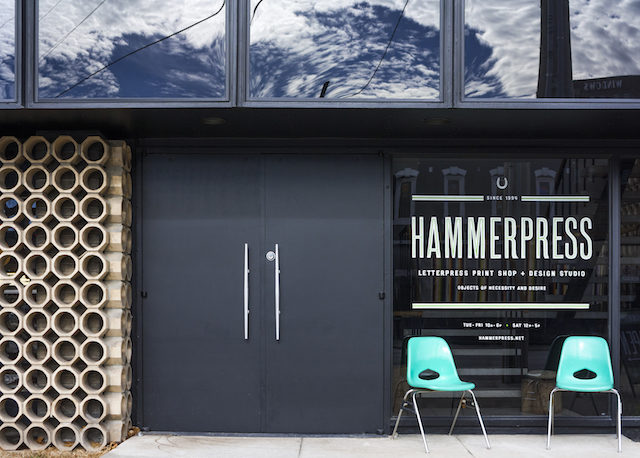
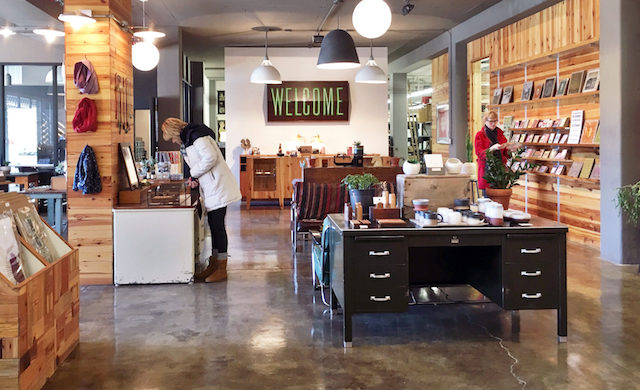
We still continue to design and print work aside from the stationery line. Our custom work includes wedding invitations, business cards, restaurant menus, coasters, posters, and logo design. And we have our storefront, which is an important part of our local identity in Kansas City.
Behind the Stationery: Hammerpress / Oh So Beautiful PaperBehind the Stationery: Hammerpress / Oh So Beautiful Paper

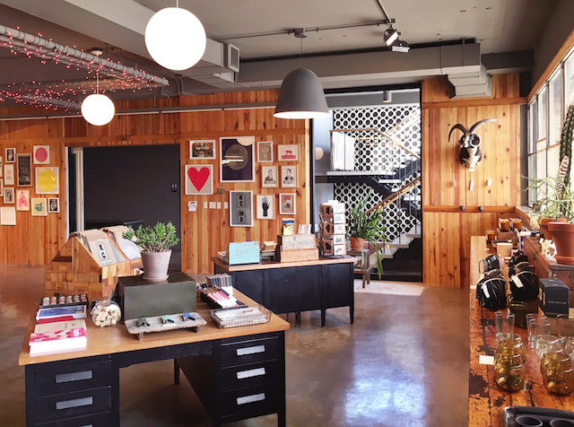
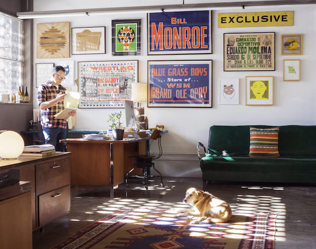
The Hammerpress print shop, design studio & retail space exists in a 1950s building in the Crossroads Arts District in Kansas City, Missouri. We moved to this space in January 2015 after 7 years in our previous location. But Hammerpress has operated out of the Crossroads district since ’95 when it wasn’t more than auto shops and a few art galleries. The Crossroads now hosts a great mix of restaurants, lofts, galleries, bars, retail shops, alongside the glorious Kauffman Center for the Performing Arts.
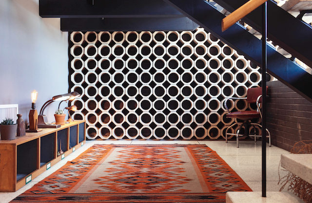
Behind the Stationery: Hammerpress / Oh So Beautiful Paper / PHOTO BY LANCE FLORES

Photo by Lance FloresBehind the Stationery: Hammerpress / Oh So Beautiful PaperOur work - postcards in the shop

Our new building was vacant before – basically a giant open space with no walls and in need of a lot of attention when we moved in. With the help of some very talented friends and a lot of staring into space in an empty building, we turned it into a really wonderful studio space. The building’s architecture is characterized by a mix of mid-century modern and industrial manufacturing.
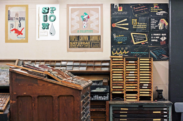
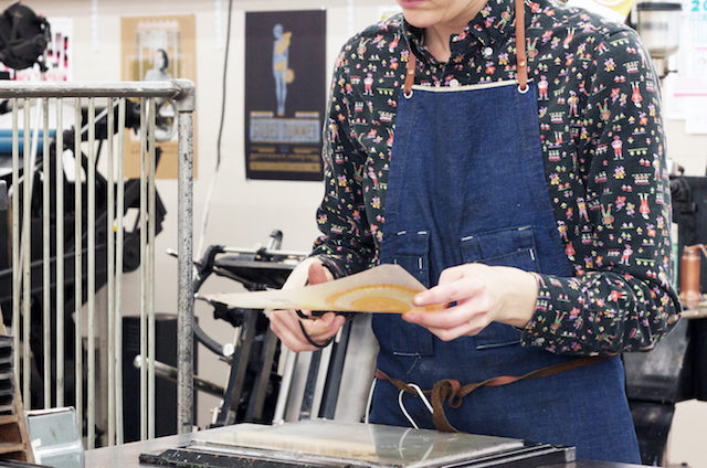
Behind the Stationery: Hammerpress / Oh So Beautiful PaperPressroom - preparing photo polymer plate for You Are My Sunshine card

On a typical day, a few people start work at 9 am, and few at 10 am. We like to keep a flexible schedule that accommodates different people’s needs. The press room is usually buzzing by time our storefront opens. You can see through to the shop from the storefront and get a glimpse behind the scenes. Our inventory and fulfillment department is located just behind the front counter. And the office is just beyond that. Currently the designers here at the shop are myself and Jenn Rogers. Britta Rice handles all of our wholesale business, working directly with our retailers, reps, and distributors. Ben Jones and Kate Morgan make up our production team. Debbie Swan and Olivia Tedford take care of order fulfillment and donation requests, and Elise Sanders manages our storefront.
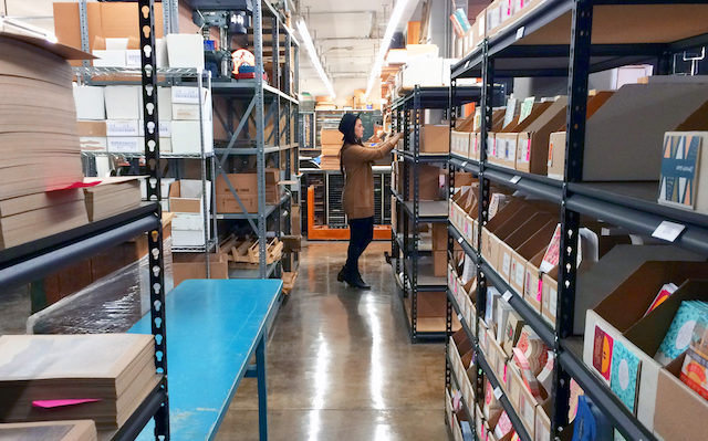
Behind the Stationery: Hammerpress / Oh So Beautiful Paper

Everything we make here is letterpress printed on recycled-content paper. The majority of our projects are printed on our three Heidelberg windmills. For more particular jobs, we utilize the automated Kluge press, or the two hand-fed Chandler & Price platen presses. And all art prints and posters are produced on our two Vandercook Universal I cylinder presses.
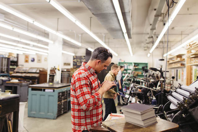
Behind the Stationery: Hammerpress / Oh So Beautiful Paper / PHOTO BY LANCE FLORESPhoto by Lance Flores

With letterpress printing, you’re making a connection with all of the people who designed those machines, all of the people who built them, and all the people who made their living printing on them. And it’s a lovely reminder that there will always be a need for tangible things made by people.
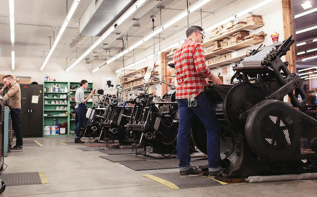
Behind the Stationery: Hammerpress / Oh So Beautiful Paper / PHOTO BY LANCE FLORESPhoto by Lance Flores

Our goal is to continue to make quality letterpress work that has a connection to the roots of letterpress printing, as well as the roots of Hammerpress. I began the company on my own and, whether by accident or by design, established a look and feel that is recognized as Hammerpress work. We strive to keep that connection to both histories while continuing to change and develop fresh ideas and new directions offered by others within the Hammerpress team.
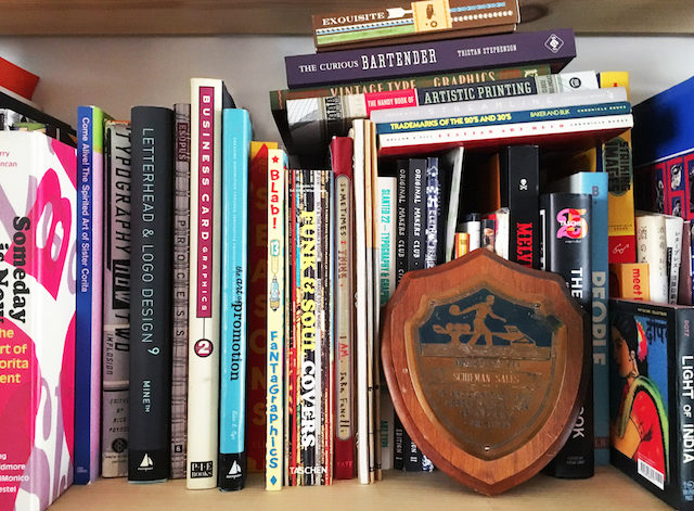
Behind the Stationery: Hammerpress / Oh So Beautiful Paper

We draw inspiration from so many sources that it’s hard to be specific. Each of us look at many different things – old sign painting, postage stamps, matchbooks, textiles, Russian posters, Cuban posters, Vaughn Oliver, Peter Seville, Bruce Licher, folk art, old science books, record covers, fashion, ceramics, etc.
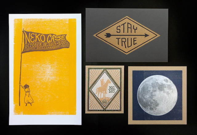
Behind the Stationery: Hammerpress / Oh So Beautiful Paper

Each product usually starts out as sketches or doodles with some loose ideas regarding color, etc. The design process can really vary depending on the type of project. There are some projects that I work on completely solo, without a lot of interaction or involvement from others. But for our stationery products, it’s a few of us collaborating throughout the design process. When we’re developing product for a new release, we meet twice a week for product planning and group critique.
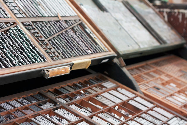
Behind the Stationery: Hammerpress / Oh So Beautiful Paper

After all of these years, I think the most important thing about letterpress printing is the connection to the machine and your hands. As the business has changed over the past 20 years, the connection to the machine always seems to stay the same. We are choosing to take an old and obsolete form of printing and strive to make a living doing it. By this, we are paying an homage to an era of the past.

All photos courtesy of Hammerpress, except where noted.

If you’re interested in participating in the Behind the Stationery column, contact Megan at megan[at]ohsobeautifulpaper.com!
Romantic Gold Foil Wedding Invitations

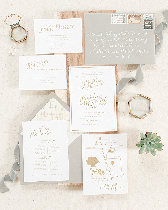
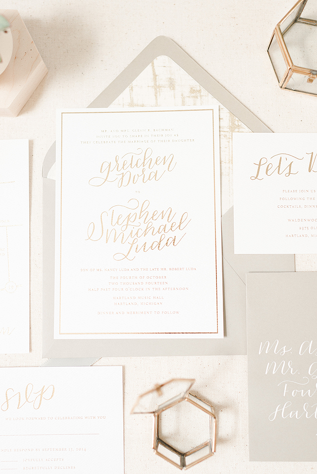
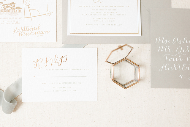
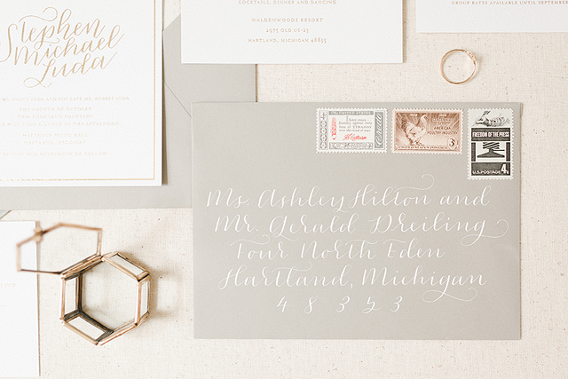
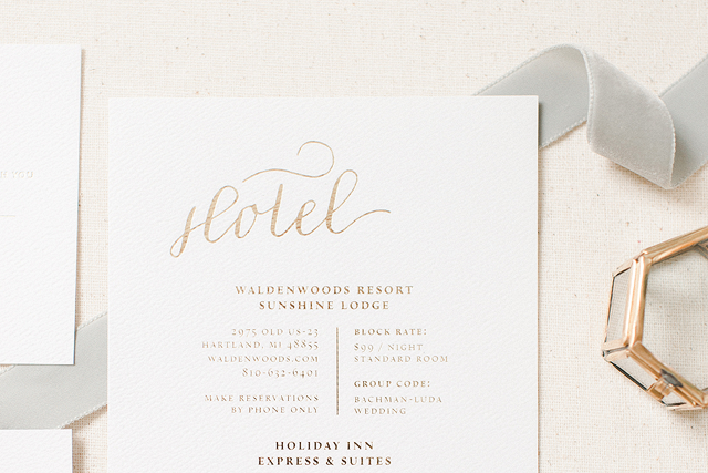
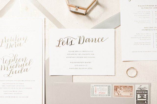
Gold foil is everywhere these days, but let’s face it: metallics are timeless. I’m always happy to see a beautiful gold wedding invitation suite, regardless of the printing method, or envelopes calligraphed in sparkly gold ink. (And while gold and other metallic foils may be all the rage these days, foil stamping is a printing method that dates back to the 1930s and earlier!) These romantic gold foil wedding invitations from Laura of Paper & Honey definitely fall on the classic end of the metallic spectrum, with gorgeous calligraphy woven throughout the invitation suite and an overall neutral color palette that includes white address calligraphy on gray envelopes. Just a beautiful combination.

Romantic Gold Foil Wedding Invitations by Paper & Honey / Photo Credit: Andrea Pesce / Oh So Beautiful Paper

From Laura: Gretchen, along with her fiancé Stephen, had dreams of their wedding reflecting togetherness, family, and love. Their number one priority was a stunning custom invitation suite to kick it all off! Held in Hartland, Michigan, the wedding itself was equal parts classic and a tiny bit vintage. While Gretchen is an event planner, it took a little bit of time to transition from the aesthetic she had originally envisioned — bold vintage graphics, heavy and differentiating typography, an autumn color palette — to her elegant and elevated final suite. The evolution was night and day, and her suite is delicate and just the right amount of whimsical.

Romantic Gold Foil Wedding Invitations by Paper & Honey / Photo Credit: Andrea Pesce / Oh So Beautiful Paper

Calligraphy, a hand illustrated map, and gold foil stamping is a recipe after my own heart. As the design itself is fairly sweet and simple, we brought in texture through the use of felt paper and a gold brush liner to imitate the tablecloths spread out at the reception. Gretchen and Stephen wanted their wedding day to be warm and welcoming, so we kept the calligraphy fun and modern rather than sticking to more traditional Copperplate styles.

Romantic Gold Foil Wedding Invitations by Paper & Honey / Photo Credit: Andrea Pesce / Oh So Beautiful Paper

Gold foil stamping can be pretty trendy nowadays as far as stationery goes, but a neutral color palette keeps the suite romantic and timeless. For her soft grey envelopes accented by delicate white calligraphy, Gretchen worked one on one with Flowers by LJP to curate Michigan-themed vintage stamps. The perfect finishing touch!

Romantic Gold Foil Wedding Invitations by Paper & Honey / Photo Credit: Andrea Pesce / Oh So Beautiful Paper

The map card might be my favorite aspect to the suite. Gretchen and Stephen married at the historic Hartland Music Hall and held their reception at Waldenwoods, and both were a joy to illustrate! This area of Michigan is beautiful, with lots of rolling countryside and spring-fed lakes. Waldenwoods claims to have a fairy-tale setting — I hope this suite did them justice!

Romantic Gold Foil Wedding Invitations by Paper & Honey / Photo Credit: Andrea Pesce / Oh So Beautiful Paper

Romantic Gold Foil Wedding Invitations by Paper & Honey / Photo Credit: Andrea Pesce / Oh So Beautiful Paper

Thanks Laura!

Design: Paper & Honey

Check out the Designer Rolodex for more tal­ented wed­ding invi­ta­tion design­ers and the real invi­ta­tions gallery for more wedding invitation ideas!

Photo Credits: Andrea Pesce