Quick Pick: Hester & Cook Sorbet Collection

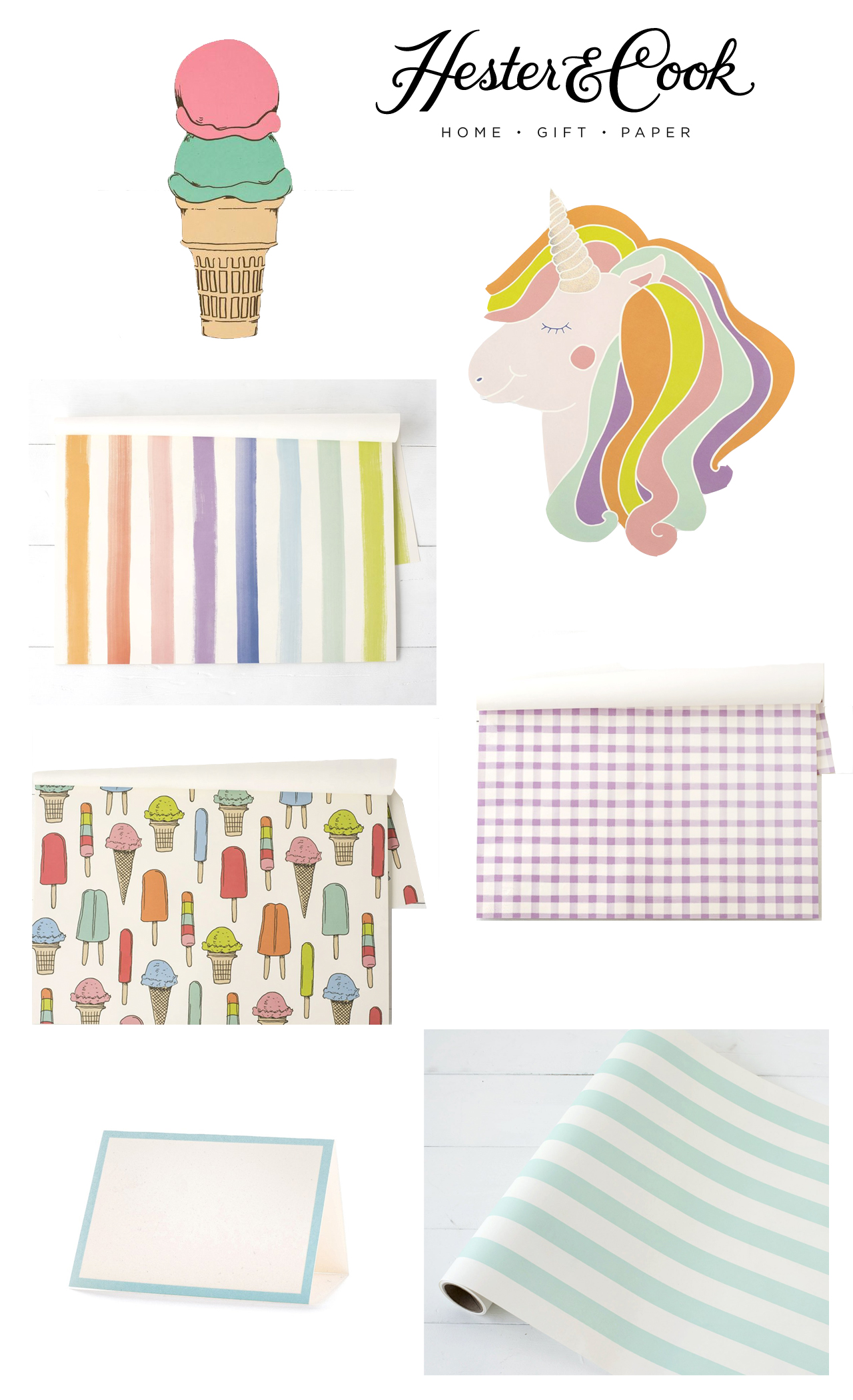
I’m such a big fan of the fun and festive paper party décor from Hester & Cook – we’ve used their beautiful pieces at the Paper Party going back to 2014! They released one of my favorite collections EVER earlier this year, called the Sorbet Collection, and it’s just perfect for everything from birthday parties to summer picnics. I’m sure there are plenty of mamas out there looking for unicorn and rainbow party decor for upcoming birthday parties, and this is definitely right up that alley. The die-cut unicorn placemats even come with a HOLOGRAM FOIL horn – it’s seriously the most perfect detail. I also love the painted rainbow stripe placemats, the die cut ice cream table accent that works for everything from place cards to table signs, and the classic stripe table runner. So good!

Quick Pick: Hester & Cook Sorbet Collection Rainbow and Unicorn Party Decor

Ice Cream Table Accent

Unicorn Placemat

Sorbet Painted Stripe Placemat (also available as a table runner)

Lilac Painted Check Placemat

Ice Cream Social Placemat

Seafoam Frame Place Card

Classic Stripe Paper Table Runner


Check out more from Hester & Cook right here!

Vibrant Floral Summer Wedding Invitations

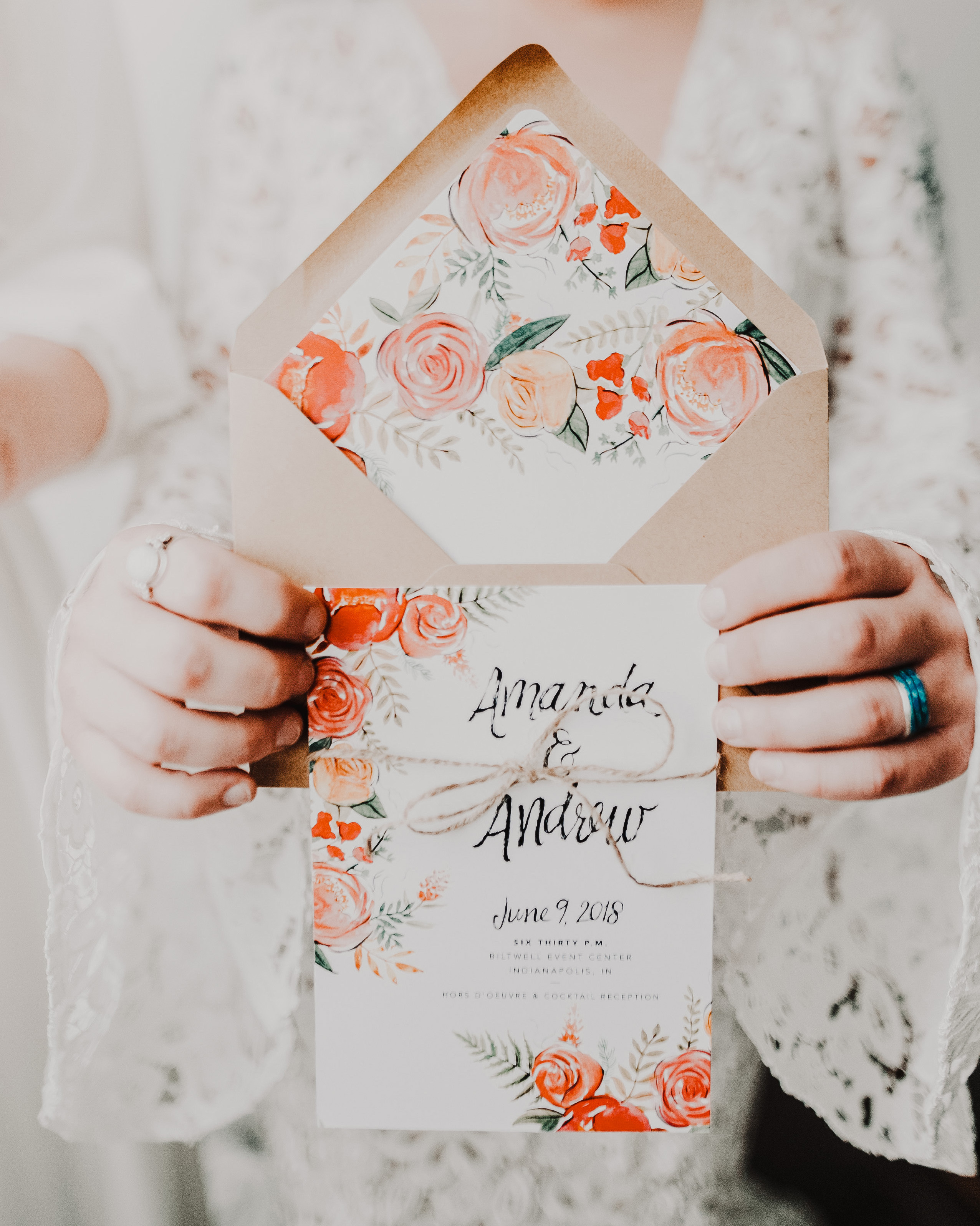
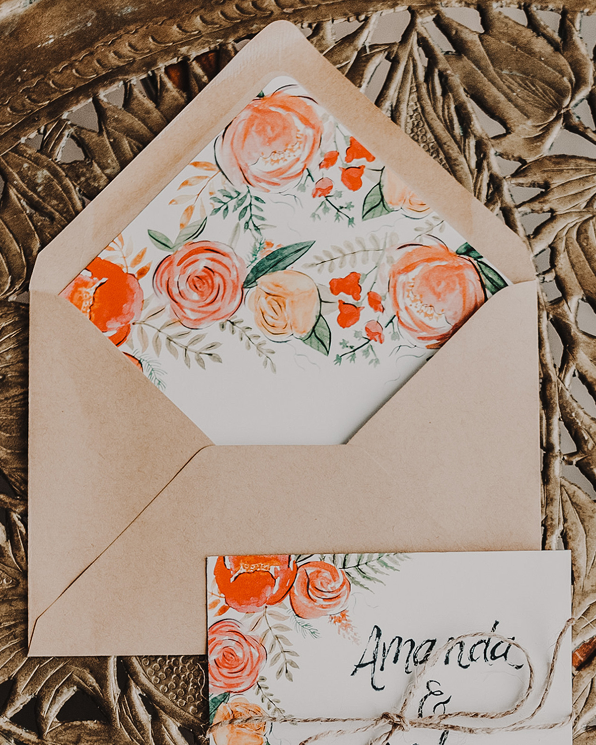
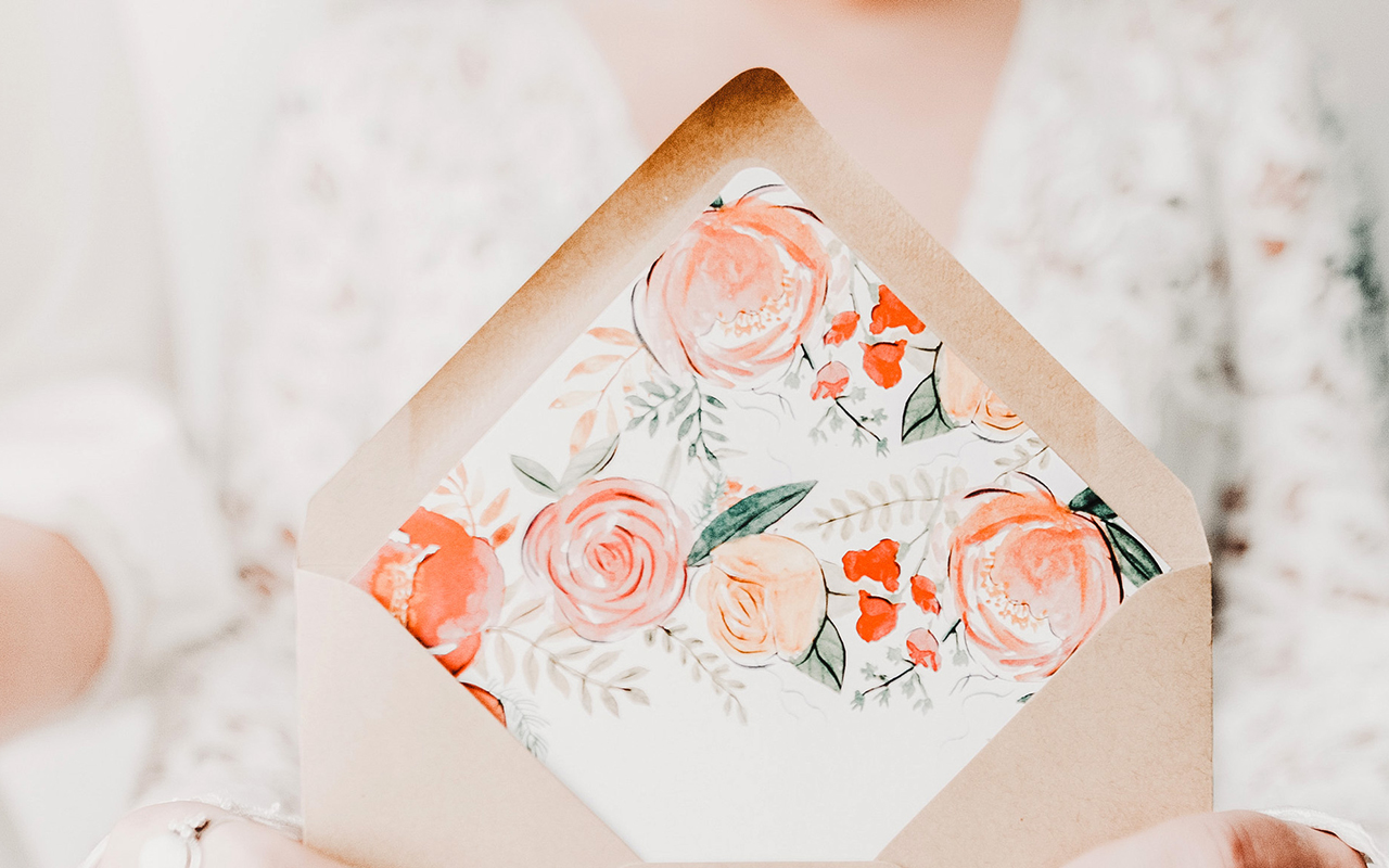
I’m always in favor of vibrant floral wedding invitation designs, but especially in the summer! These gorgeous and vibrant floral summer wedding invitations from Designer Rolodex member Amanda of Wide Eyes Paper Co. combine beautiful floral illustrations with whimsical hand lettering for a bright and cheerful midwestern wedding. And seriously, how gorgeous is that envelope liner??

Vibrant Floral Summer Wedding Invitations by Wide Eyes Paper Co.

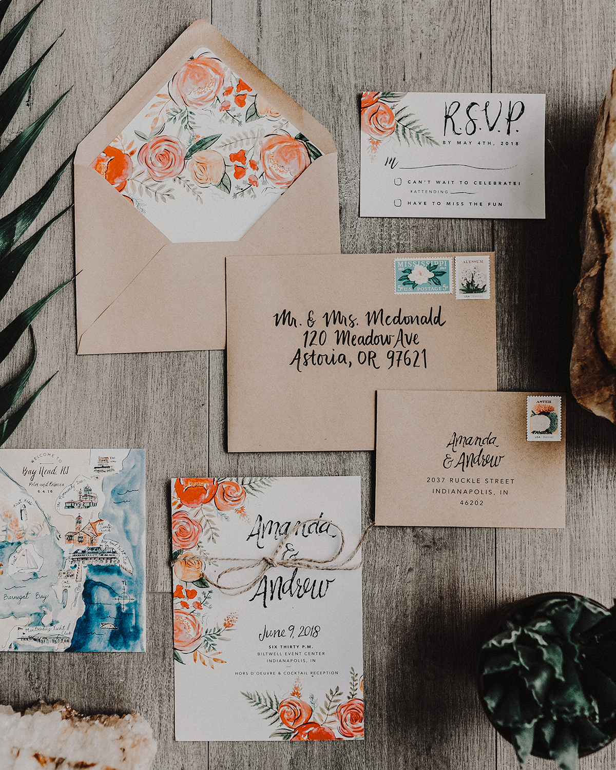
From Amanda: Less is definitely more in this vibrant floral summer wedding invitation suite. Andrew and Amanda had a vision of bright, cheerful, and whimsical with a minimal inspired flare. We utilized a striking color palette of pinks, oranges and reds which is perfect for the summer wedding in Indianapolis. The bride wanted to tie in her floral arrangement with the paper goods so we created a custom watercolor floral design that adds a pop of whimsy but still keeping the aesthetic fresh.

Vibrant Floral Summer Wedding Invitations by Wide Eyes Paper Co.

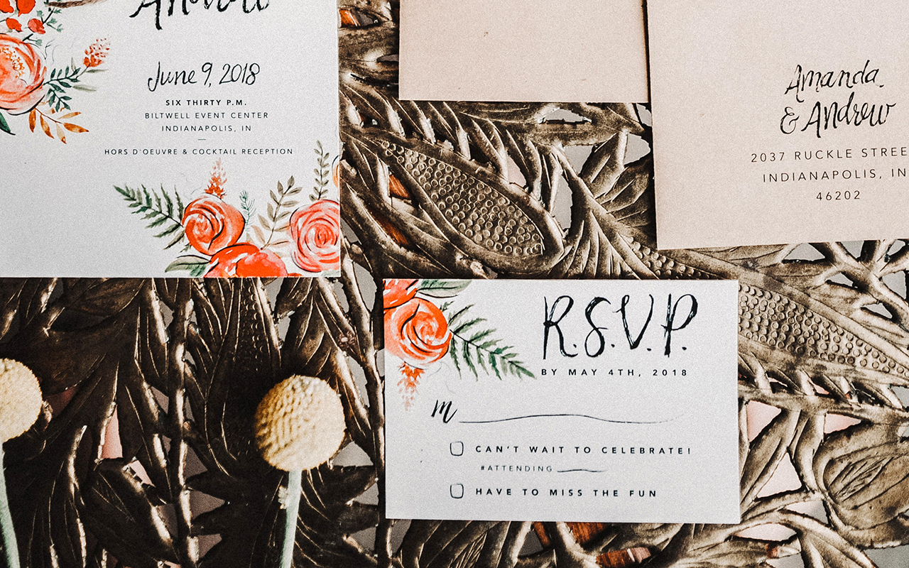
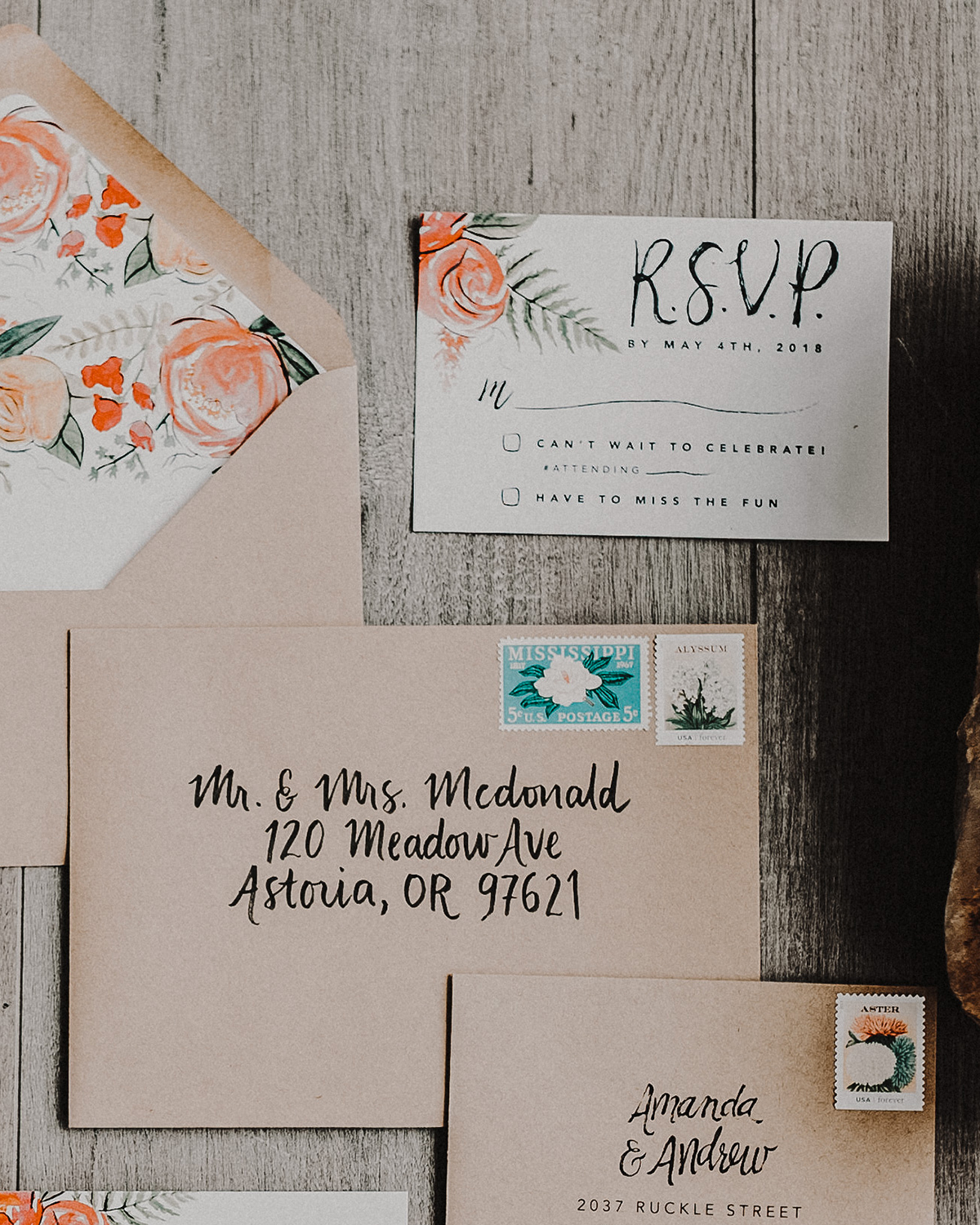
The simple wording of this invitation showcases a whimsical hand lettered font for the couples’s names and a simple sans serif font for the remaining important details. The hand-painted design carries over to the RSVP card. We love putting the invitation and RSVP card next to each other as the floral elegance is carried between the two.

Vibrant Floral Summer Wedding Invitations by Wide Eyes Paper Co.

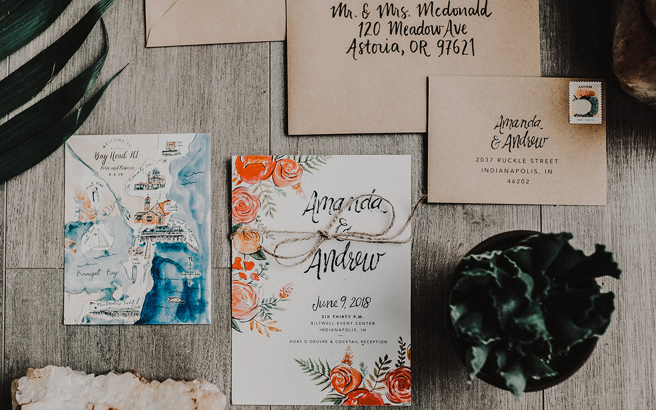
The tiny details are what make each set an individual work of art. Customizing each invitation set to perfectly align with the couples unique love story is what makes our job so special. One of our favorite parts of the design process is the custom map card we get to paint, highlighting all of the special spots near and dear to the lovebirds’ hearts.

Vibrant Floral Summer Wedding Invitations by Wide Eyes Paper Co.

For the envelope liners, we carried over the custom florals used throughout the set to add even more whimsical charm. Yes, they match the invitation and bring the whole set up a notch, the real cherry on top. We ALWAYS recommend liners to do just that. Finally, each envelope features hand lettered calligraphy which also ties in the unique hand crafted nature of the invitation suite.

Vibrant Floral Summer Wedding Invitations by Wide Eyes Paper Co.

Vibrant Floral Summer Wedding Invitations by Wide Eyes Paper Co.

Wide Eyes Paper Co. is a member of the Designer Rolodex – you can see more of their beautiful work right hereor visit the real invi­ta­tions gallery for more wedding invitation ideas!

Photo Credits: Swiss Dot Photography

Derby de Mayo Party Invitations

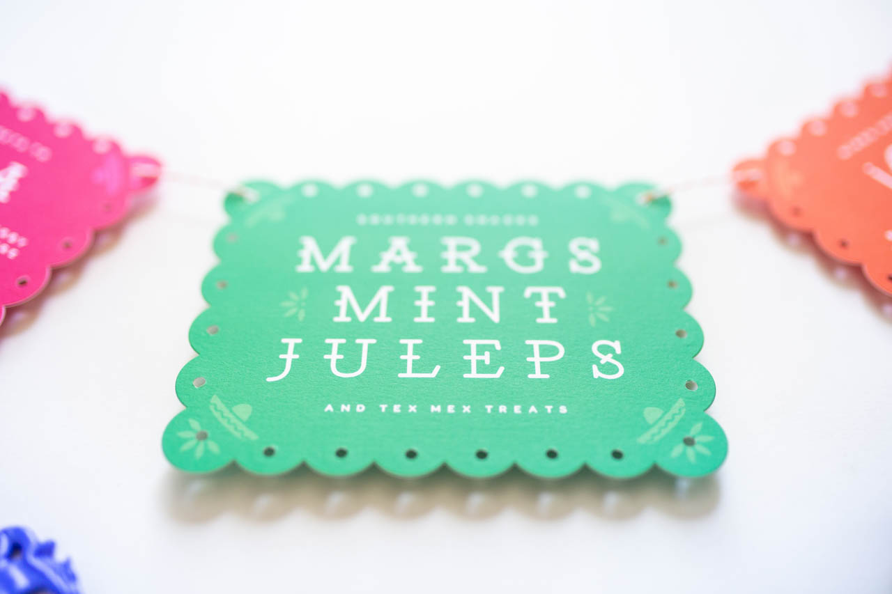
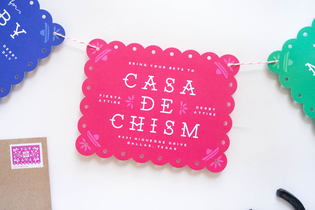
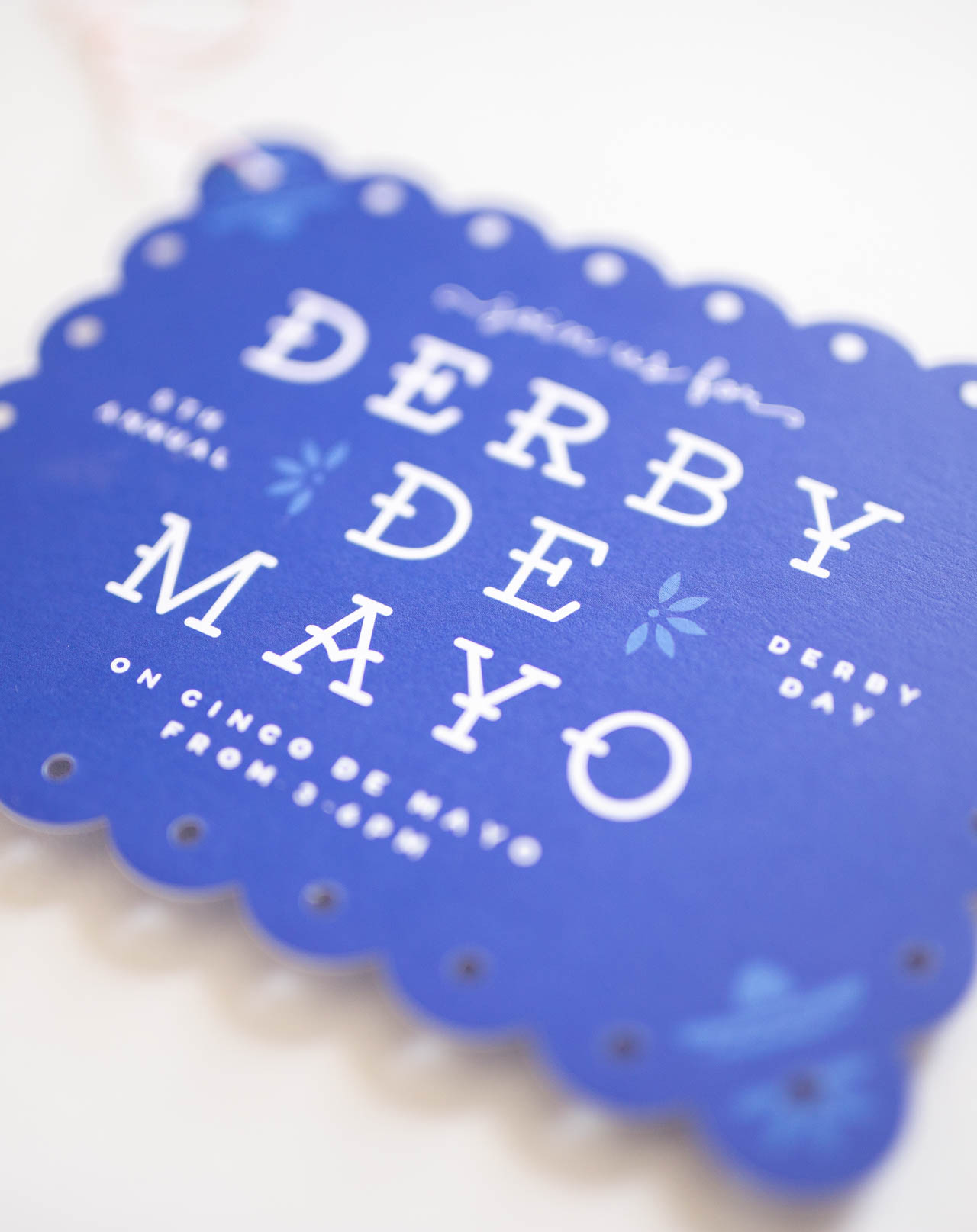
For those of you who celebrate Cinco de Mayo or the Kentucky Derby, you’re going to want to go ahead and save/pin/bookmark these adorable Derby de Mayo party invitations from Lauren Chism Fine Papers for future inspiration! Lauren and her husband host an annual Kentucky Derby party (you can see some past examples here), and she faced a wee bit of a design challenge when the Kentucky Derby fell on Cinco de Mayo earlier this year. The resulting papel picado-inspired invitations are super cute – take a look!
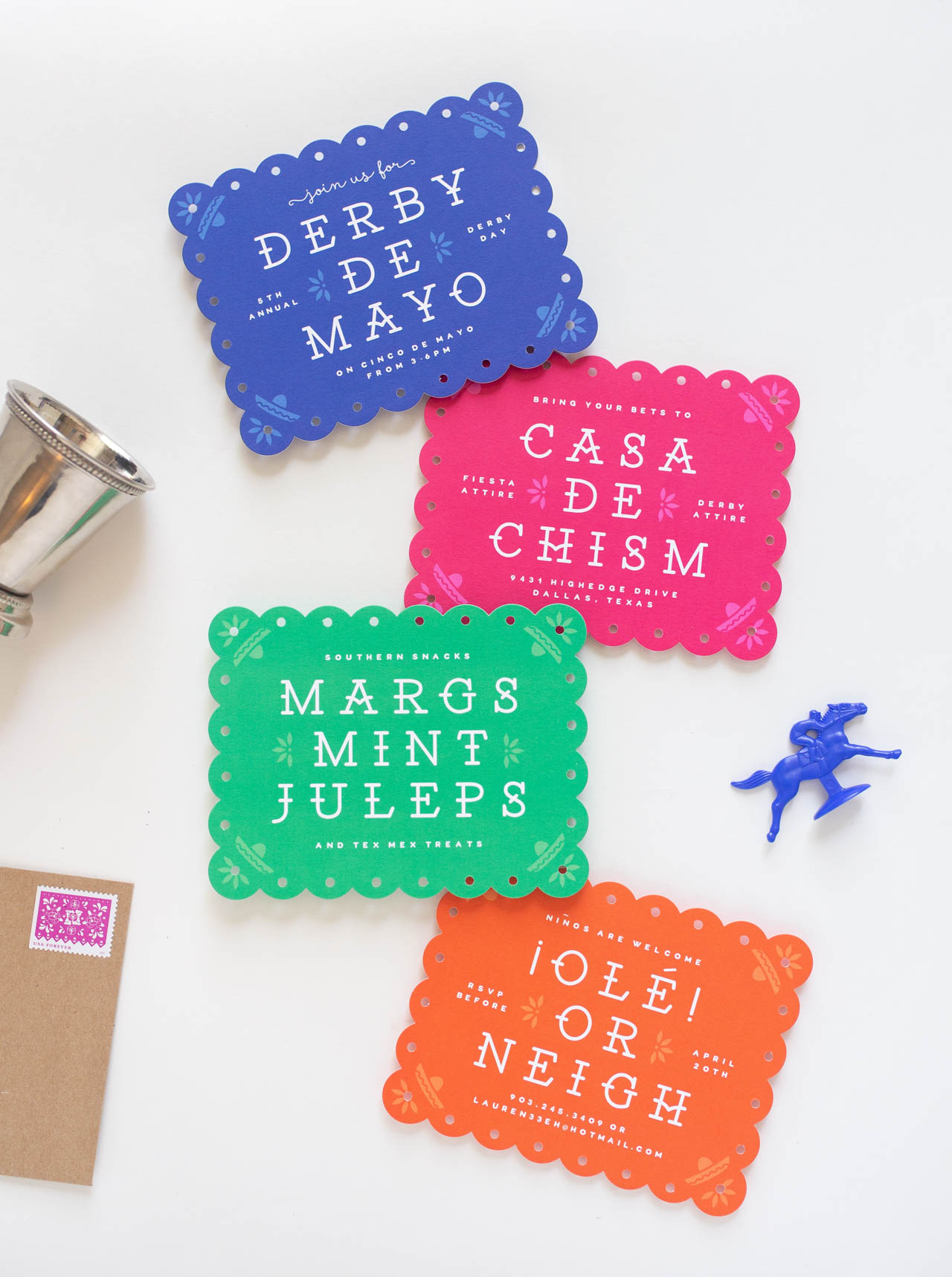
Derby de Mayo Party Invitations by Lauren Chism

From LaurenAs our annual derby party comes around each year, the (self-imposed) pressure mounts – how do I keep designing something new for the same party, year after year? It’s always a challenge, but this year, the universe threw me a bone and the Kentucky Derby fell another celebratory day, Cinco De Mayo! The excitement mounted… Fascinators and Sombreros? Mint Juleps and Margaritas? Southern Snacks and Tex Mex Treats? Yes please! So just like that, Derby De Mayo was born!*
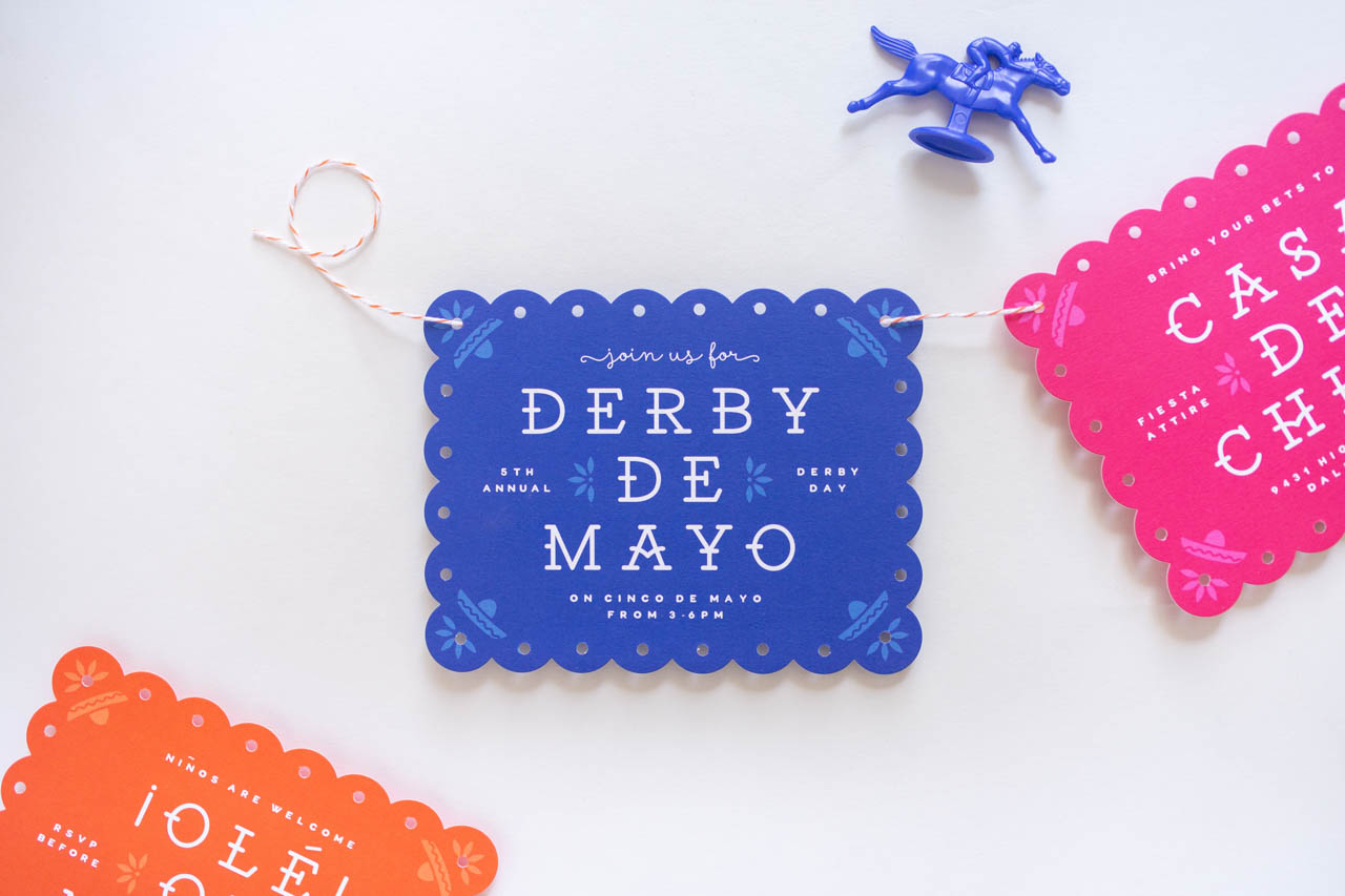
Derby de Mayo Party Invitations by Lauren Chism

*(Side note: I then googled it, and being that the derby is the first weekend in May, this turned out to not be the most unique idea in the world, but whatever, it was a new original theme for us!)
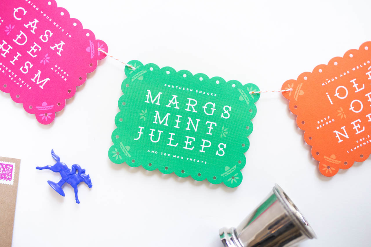
Derby de Mayo Party Invitations by Lauren Chism

Apparently, all I need is a good theme to kick-start my creativity, because from there, the ideas were flowing. I really wanted to do some kind of papel picado inspired design, but I wanted to make it reasonably affordable (I can get carried away sometimes), so I found a way!
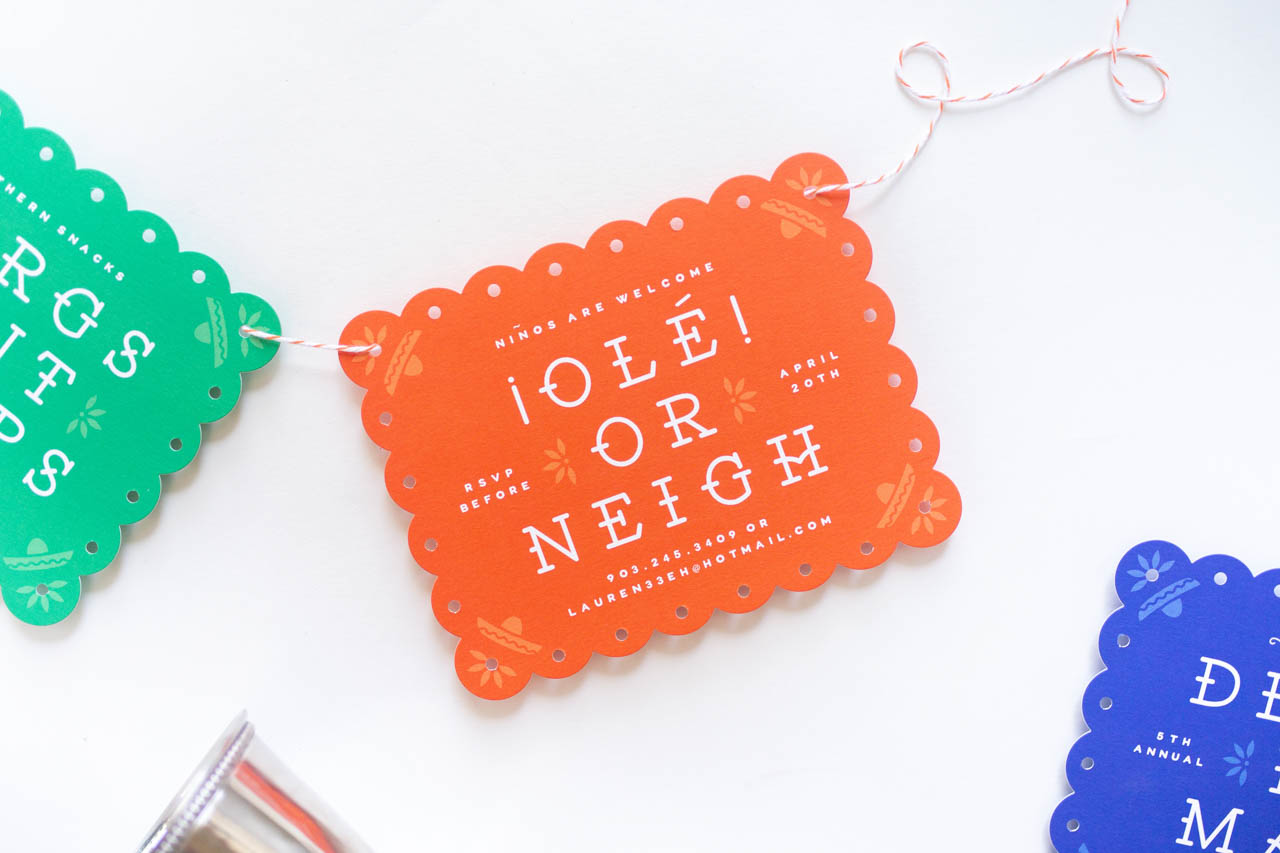
Derby de Mayo Party Invitations by Lauren Chism

The ‘flags’ are just A2 cards, digitally printed and die-cut with the scallop shape that my printer offers. To make them more realistic, I went through and punched holes in every scallop… one. by. one. My toddler even got in on the action ‘pretending to help me’, so it was a family affair. It actually wasn’t that bad and made it more affordable than ordering a custom die.
Derby de Mayo Party Invitations by Lauren Chism

Derby de Mayo Party Invitations by Lauren Chism

I don’t typically design with a lot of color, but with the Derby Day invitations, I tend to get some practice and this was the ultimate color exercise. Over the years, we’ve made some reusable derby items, like napkins and koozies, so I picked our ‘signature’ green and blue and paired them with pink and orange. They are bright, fun and festive. I love how they turned out and our guests seem to love them, too!
Derby de Mayo Party Invitations by Lauren Chism

Thanks Lauren!

Photo Credits: Lauren Chism Fine Papers
Hand Lettering and Calligraphy at Common Room Studio!

Before we jump into the week, I wanted to share a couple of upcoming hand lettering and calligraphy workshops at my new studio space – Common Room Studio! If you’re in the DC area, we’d absolutely love for you to join us. Come hand out with fellow lettering aficionados in the area, and learn a new skill while you’re at it. It’ll be so fun – come hang with us!

August Workshops at Common Room Studio

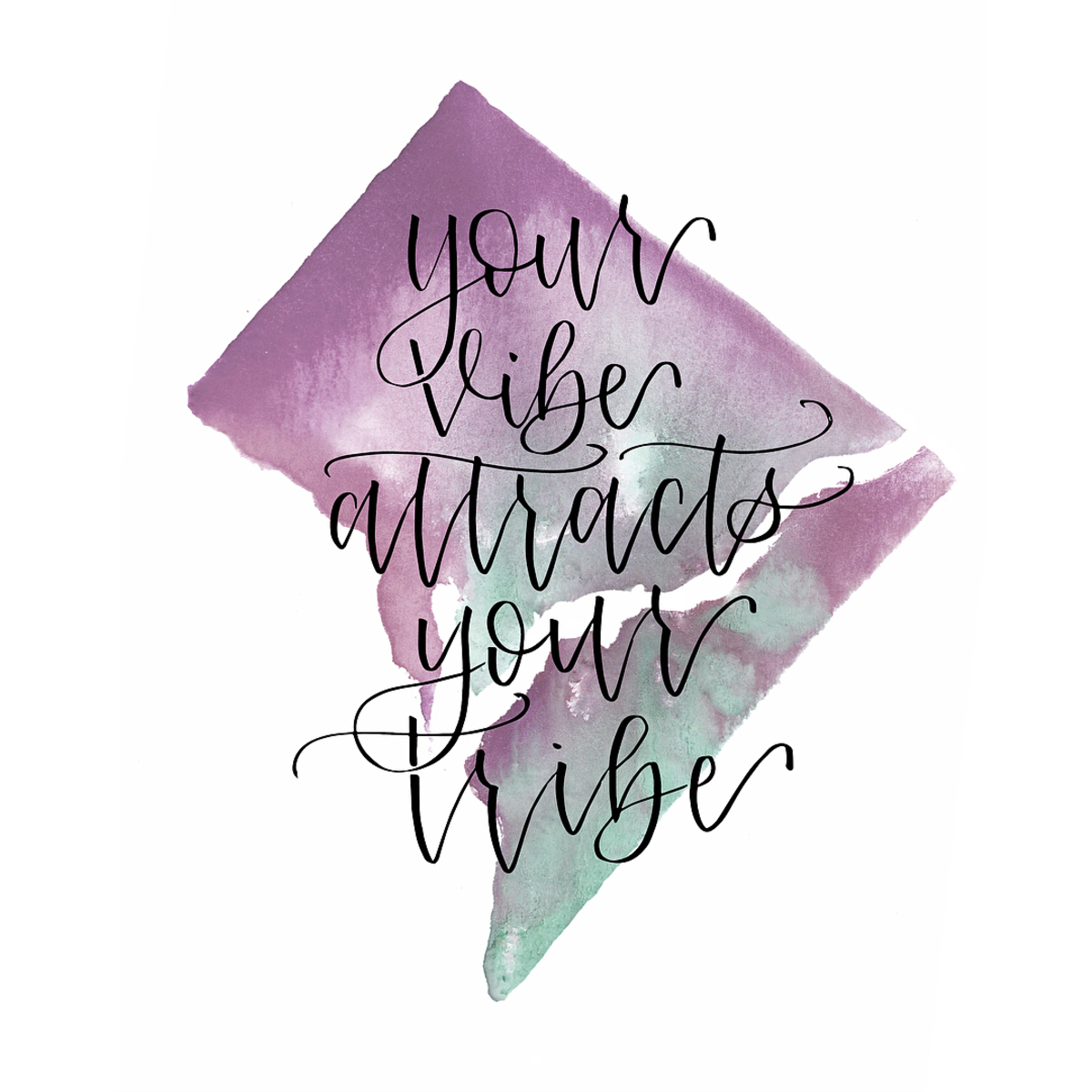
Painted Palettes / Your Vibe Attracts Your Tribe

First up, a hand lettering and watercolor workshop on Saturday, August 11 from 11 am – 1 pm! Join Samantha Testa of Painted Palettes for a workshop of lettering and good vibes! You’ll learn the basics of hand lettering using four unique pens and four different styles, along with how to create a beautiful watercolor background. And you’ll get to take home your very own 5×7 art print at the end of the workshop! Light sips and snacks will be served. Sign up right here!

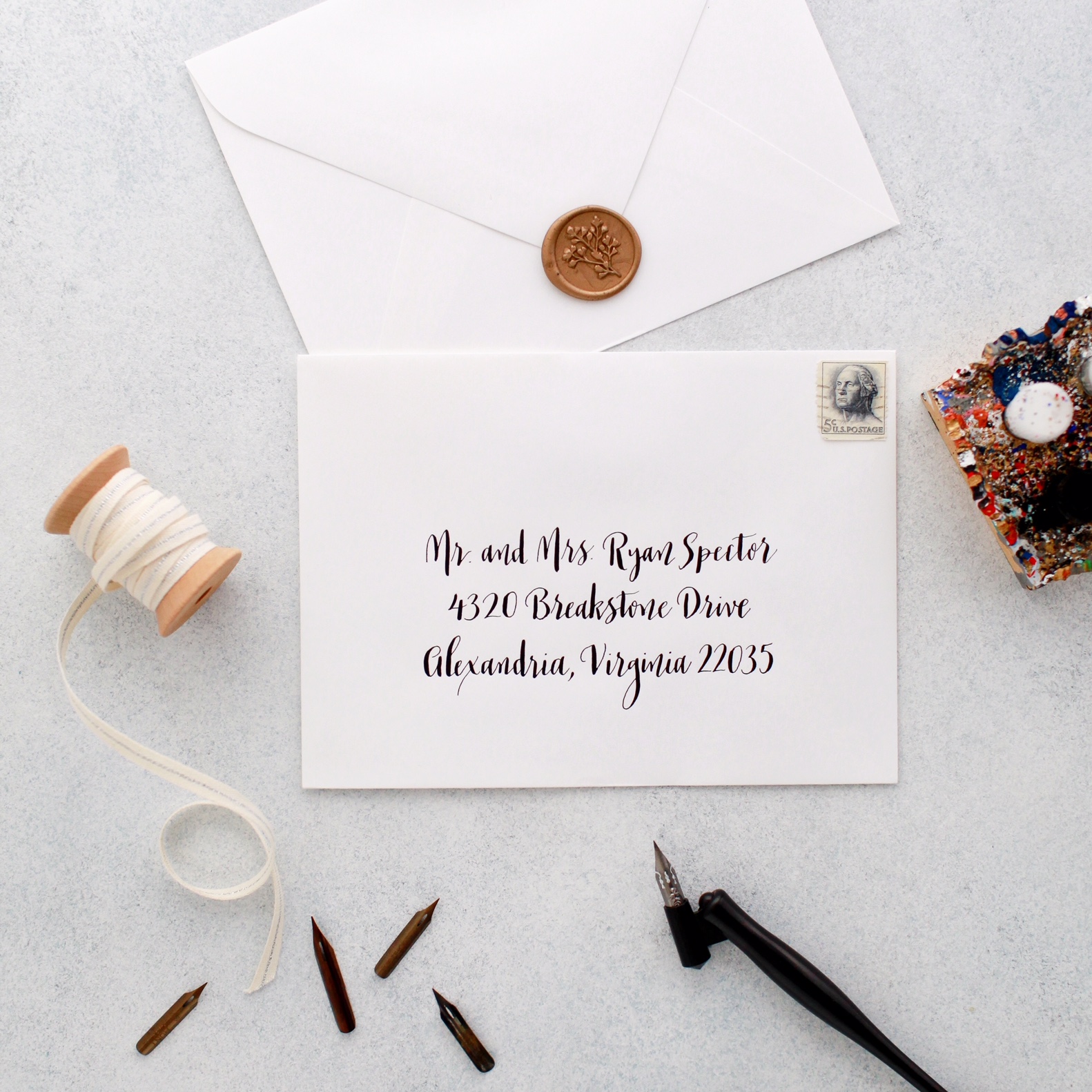
Introduction to Modern Pointed Pen Calligraphy by Meant to Be Calligraphy

If you’re interested in learning the art of pointed pen calligraphy, join Michele of Meant to Be Calligraphy for her popular Introduction to Modern Pointed Pen Calligraphy workshop on August 12! Michelle will teach you how to use traditional materials (pointed pen calligraphy nibs, an oblique pen holder and real ink) to create gorgeous hand-lettering with a modern twist. You’ll learn how to create the nuanced thick and thin lines that set pointed pen lettering apart from regular handwriting. Plus, you’ll go home with all the materials you’ll need to continue practicing and showing off your new lettering skills. Sign up right here!

Hope to see you there!

If you’d like to learn about more upcoming workshops and events at Common Room Studio, sign up for our newsletter right here!

August 2018 Wallpapers!

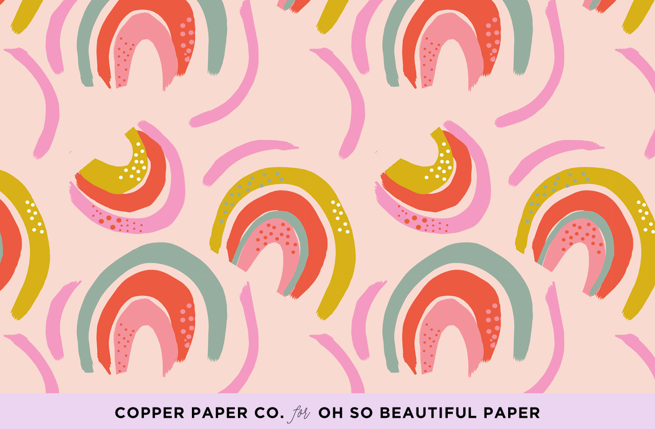
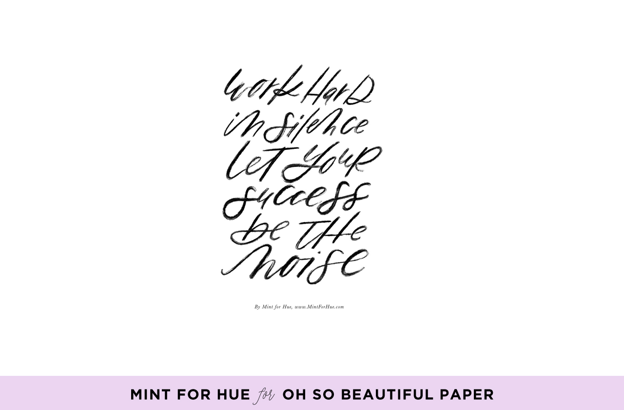
Ah, August. The month that everyone should be on mandatory vacation, don’t you think? My family just got back from a couple days at the beach and it felt SO good to get away for even just a couple of days. Are you heading off on vacation soon? Did you already take your summer vacation? Spill the details! Are you going to the beach? Or do you prefer adventure vacations? While we’re all dreaming of summer vacations and adventures, let’s enjoy these brand new illustrated and calligraphy wallpapers from Mint for Hue and Copper Paper Co. for your phone and desktop!

Illustrated Wallpaper by Copper Paper Co. for Oh So Beautiful Paper

iPhone | Desktop

Calligraphy Wallpaper by Mint for Hue for Oh So Beautiful Paper

iPhone | Desktop

For personal use only. All illustrations by Mint for Hue and Copper Paper Co. for Oh So Beautiful Paper

p.s. If you’re interested in walking down memory lane a bit, here are the wallpaper designs from August 2017, August 2016, and August 2015!

If you’re a designer or illustrator interested in contributing your own designs to this column, please email your design to hello(at)ohsobeautifulpaper.com with the subject line “desktop downloads” and image files in both desktop and iPhone retina screen sizes. If it’s a good fit I’ll add it to the post for the following month!