Romantic Blush and Gray Letterpress Calligraphy Wedding Invitations

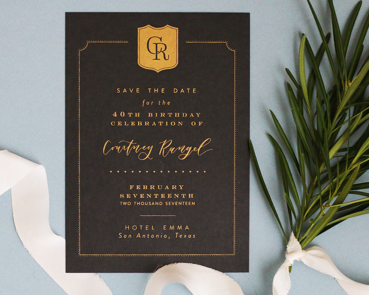
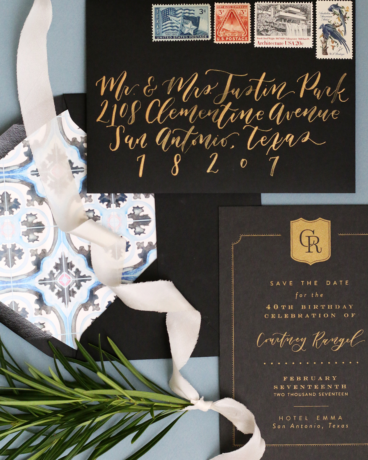
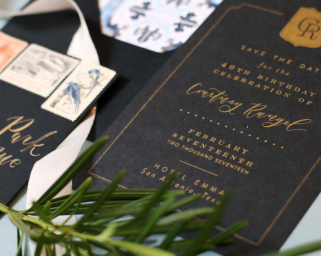
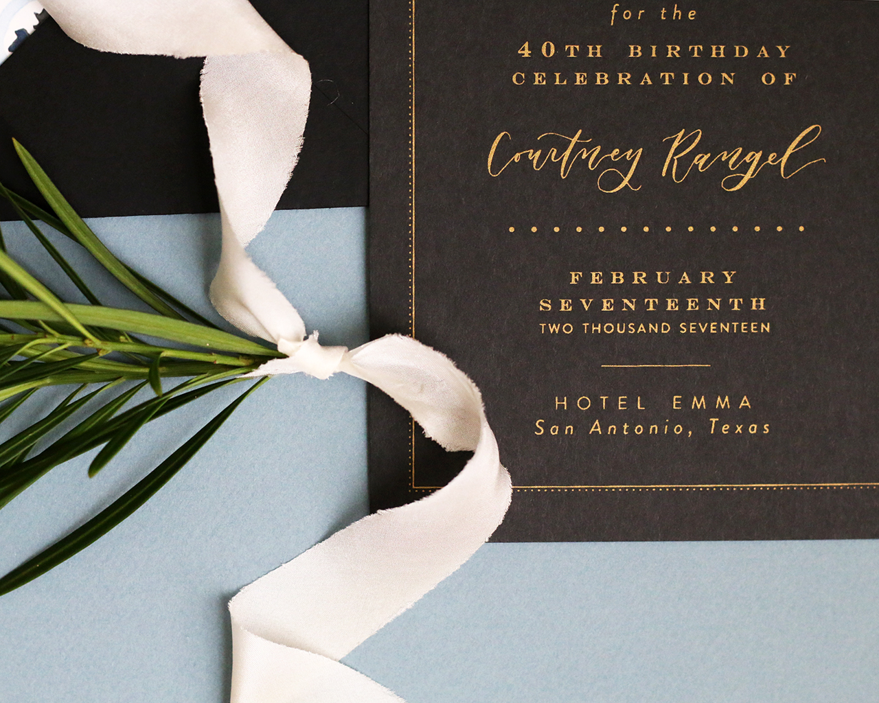
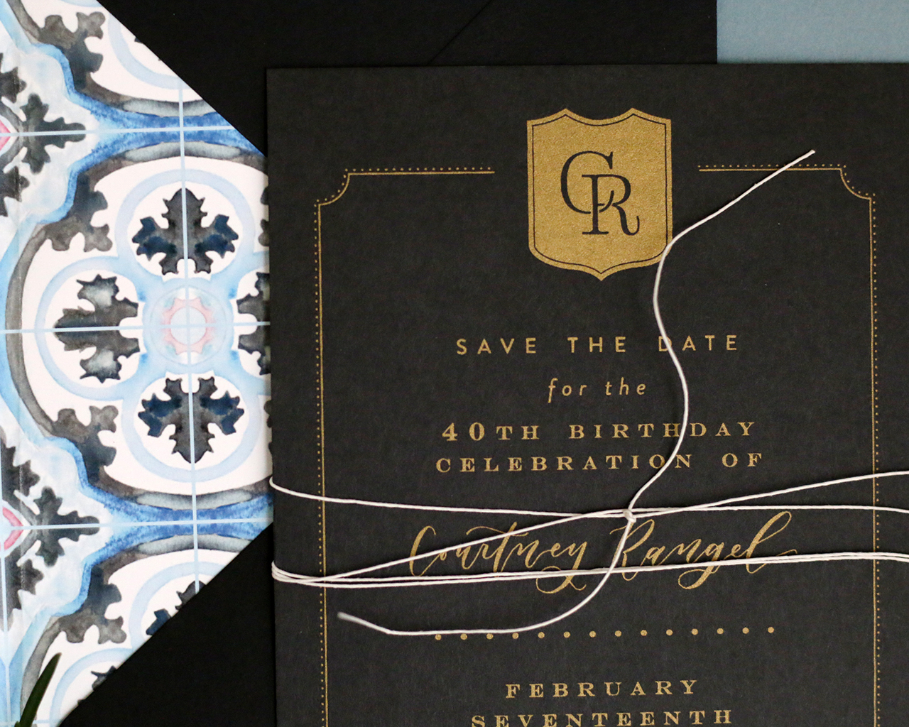
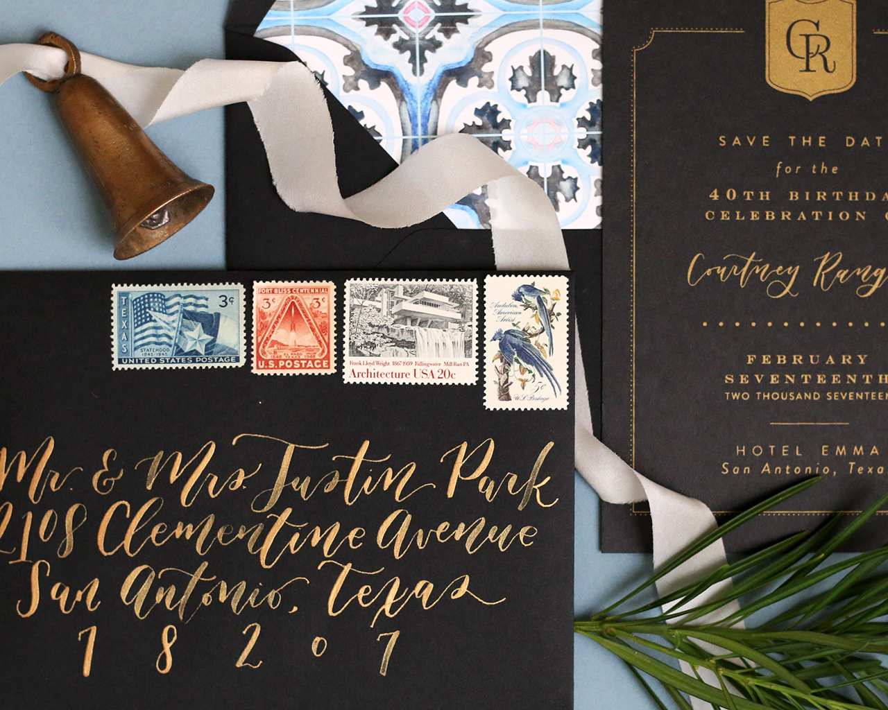
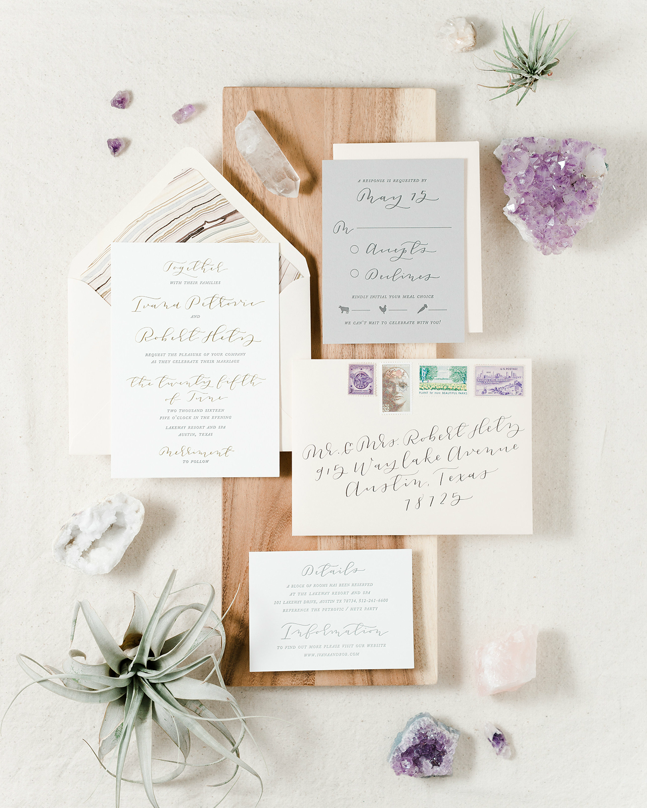
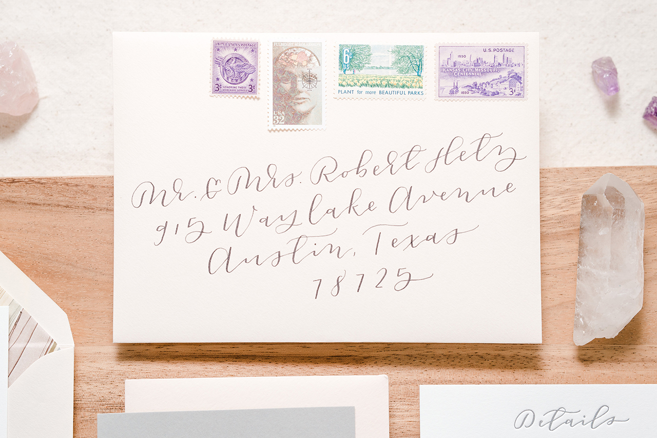
These romantic blush and gray letterpress calligraphy wedding invitations from Laura of Paper & Honey were inspired by the natural elegance of Austin, Texas and the quintessential charm and simplicity of the wedding’s resort venue. The subtle blush and gray color palette is complemented by the gorgeous gold foil and gray letterpress printed text, vintage postage stamps, and timeless calligraphy details! We always love a fun envelope liner and these marbled envelope liners made from handmade paper have us swooning!

Romantic Blush and Gray Letterpress Calligraphy Wedding Invitations by Paper & Honey

From Laura: Working on Ivana and Bob’s invitation suite was a total dream! These two lived on opposite coasts for three years of their relationship to pursue their professional dreams — his of being a surgeon, hers of working for Google — and over the course of their long distance they learned to “love each other to the moon and back.” What an honor it was to help them craft an invitation suite worthy of helping them celebrate finally starting their lives together!

Romantic Blush and Gray Letterpress Calligraphy Wedding Invitations by Paper & Honey

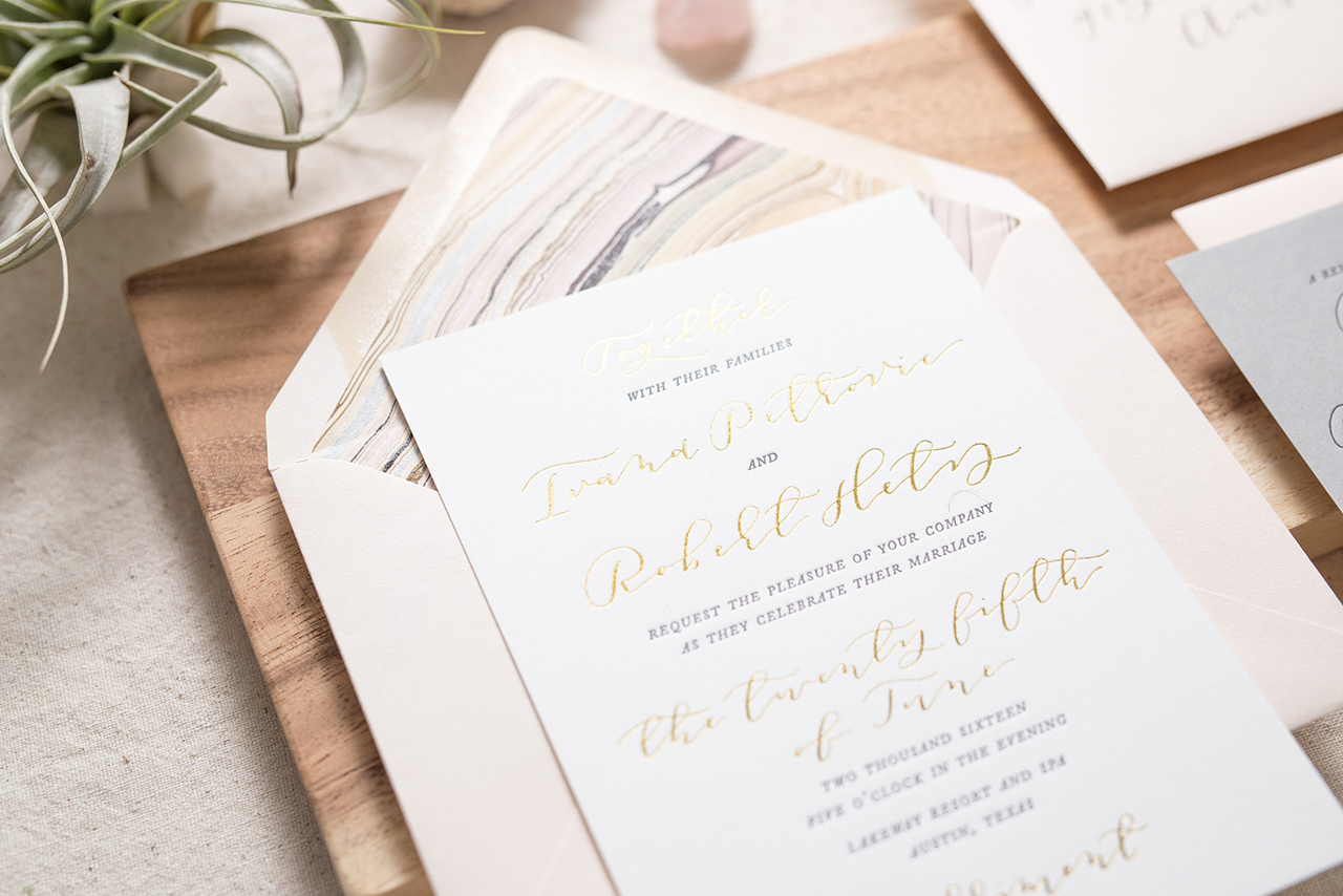
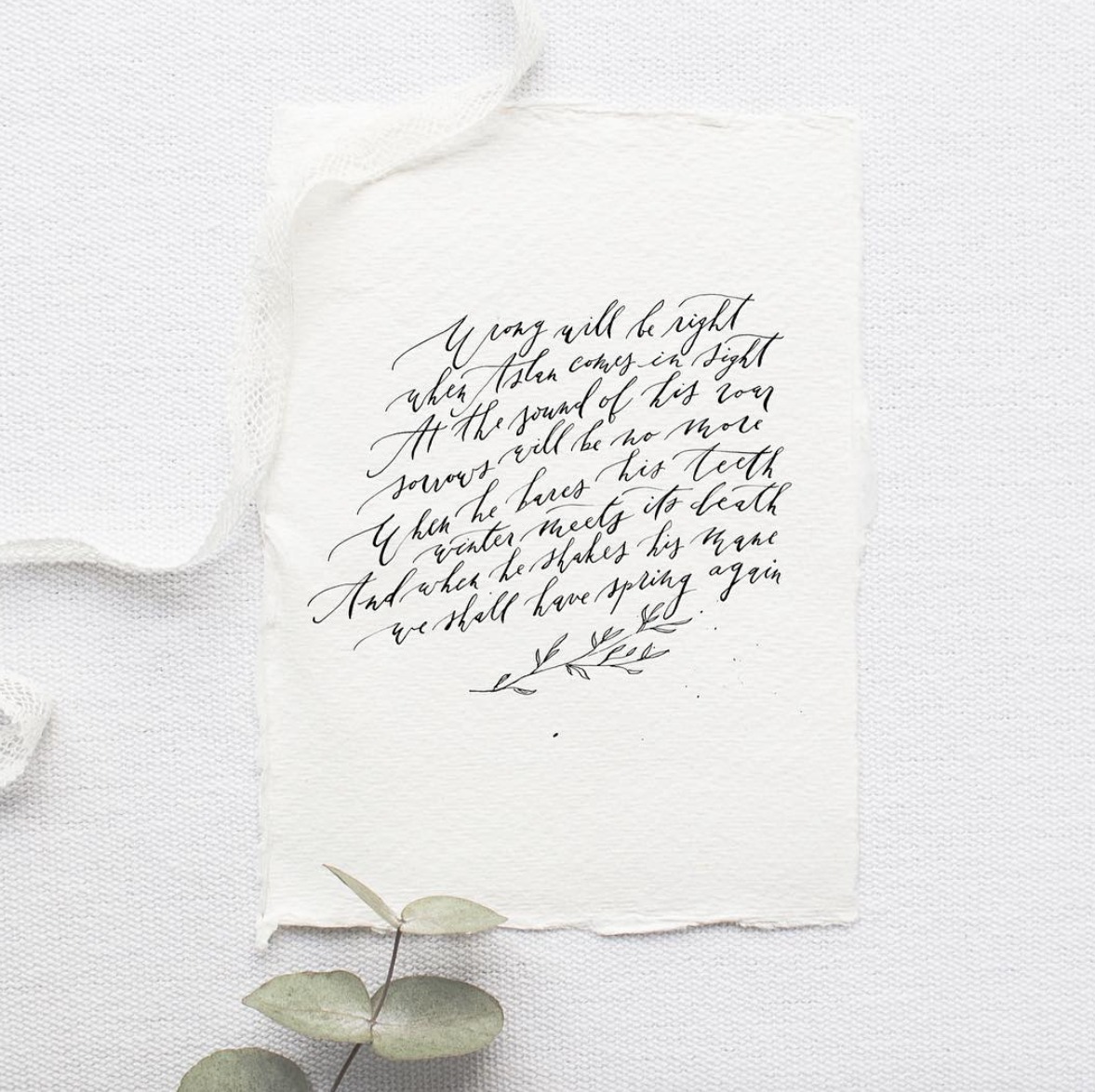
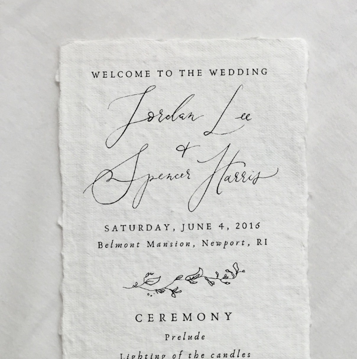
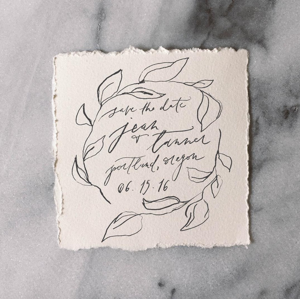
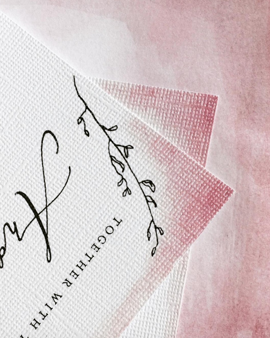
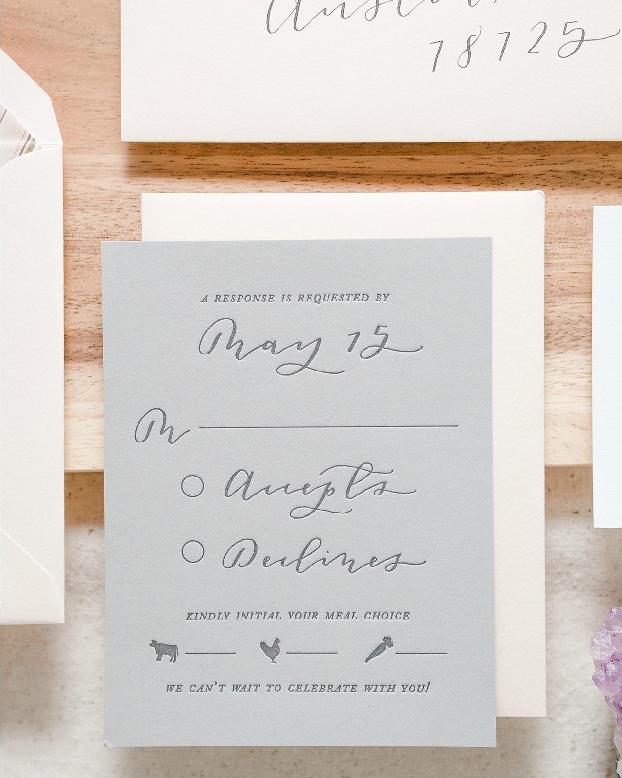
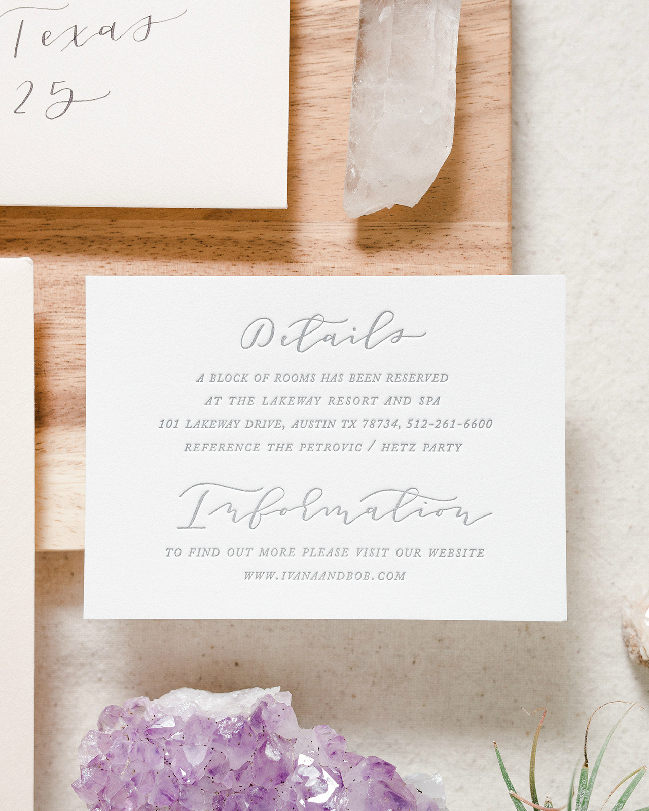
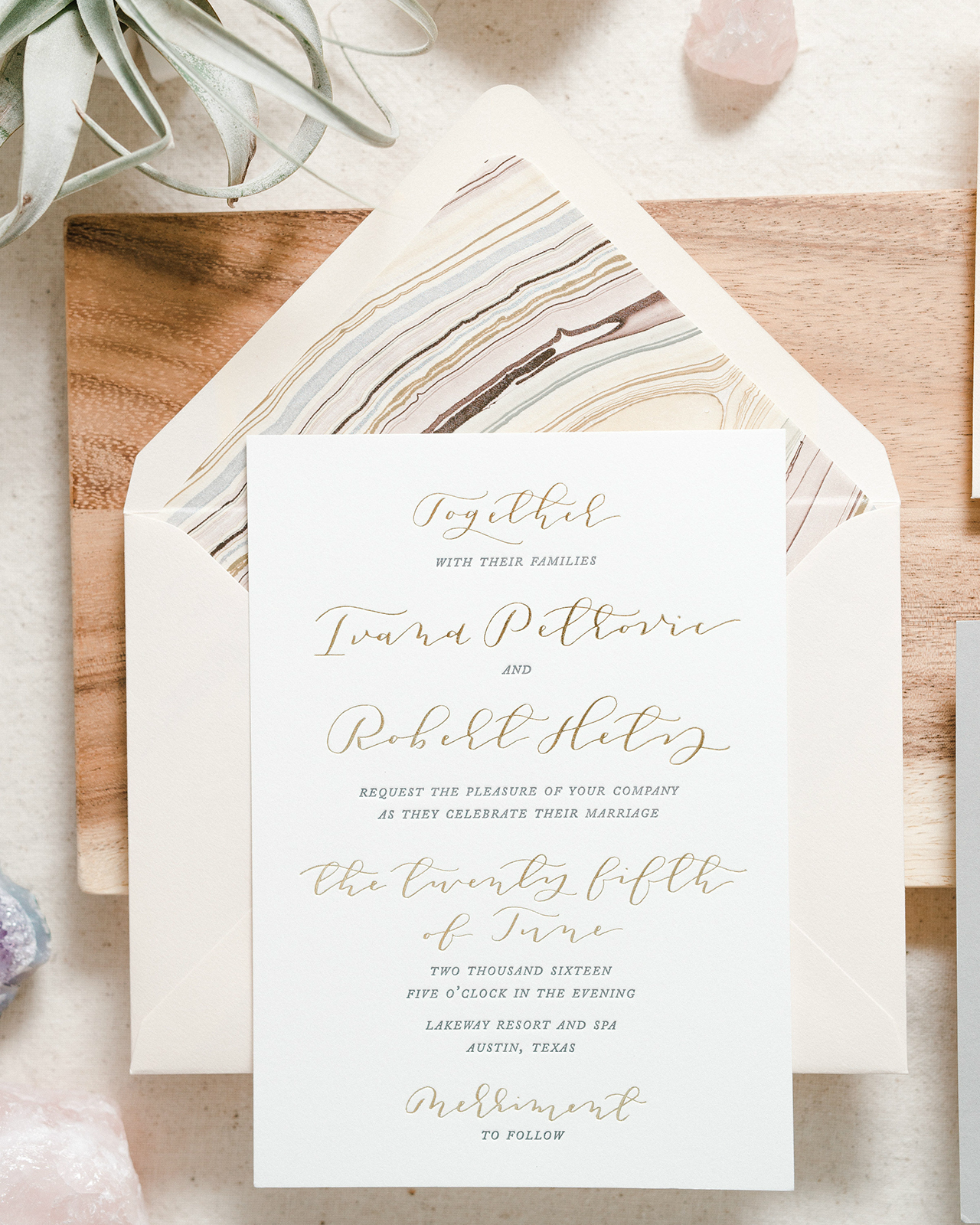
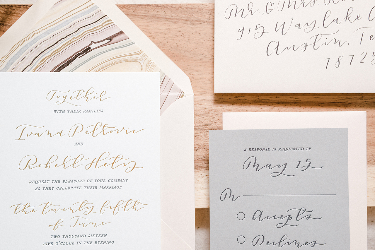
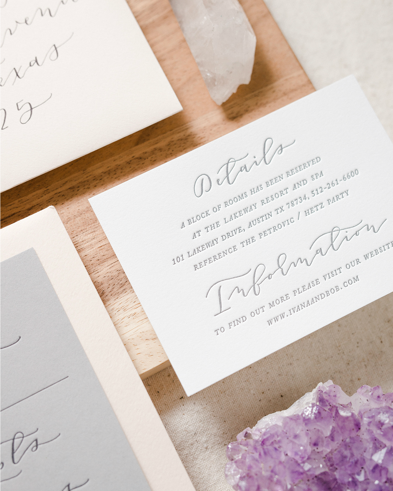
Ivana and Bob married at the Lakeway Resort and Spa. With a wedding held in the rolling hills of Austin, Texas, just overlooking Lake Travis, we knew the paper had to convey the beauty and simplicity of the area. Elongated, sweeping calligraphy paired with a simple serif kept the design timeless and classic with a hint of whimsy. Everything was letterpress printed on delicious cotton paper, and metallic gold foil stamping elevates the invitation and provides a hint of sparkle. Gold foil always says romance to me! The RSVP card is one of my favorite parts — I love the contrast of the light gray paper, and the tiny food icons are too cute.

Romantic Blush and Gray Letterpress Calligraphy Wedding Invitations by Paper & Honey

Romantic Blush and Gray Letterpress Calligraphy Wedding Invitations by Paper & Honey

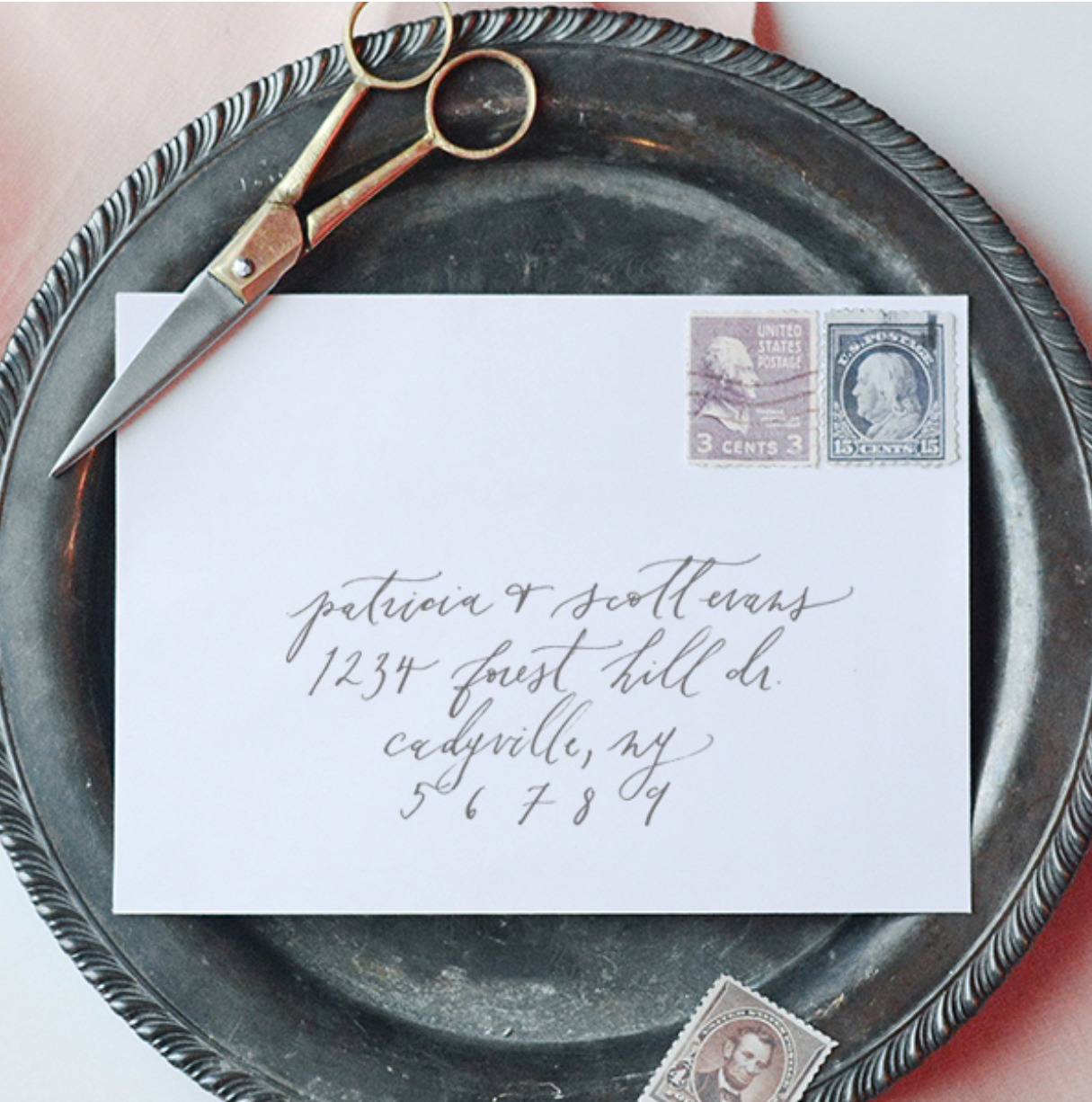
To wrap everything up, we added a pop of blush (one of Ivana’s wedding colors) through the euro flap envelopes, and an envelope liner made from handmade marbled paper. Handmade paper is the best; each piece is so unique and prettier than the last. Outer envelopes were addressed to guests with romantic calligraphy cohesive with the rest of the suite, and how else could we get them to friends and loved ones but with perfect vintage stamps.

Romantic Blush and Gray Letterpress Calligraphy Wedding Invitations by Paper & Honey

Romantic Blush and Gray Letterpress Calligraphy Wedding Invitations by Paper & Honey

Romantic Blush and Gray Letterpress Calligraphy Wedding Invitations by Paper & Honey

This wedding suite, perfectly simple, romantic, and organic with a hint of playful movement, was such a joy to create! With Ivana’s ideas and the location in mind, it came together easily. I hope it did Lake Travis a bit of justice!

Romantic Blush and Gray Letterpress Calligraphy Wedding Invitations by Paper & Honey

Thanks Laura!

Design: Paper & Honey

Printing: Czar Press

Vintage Postage Stamps: Verde Studio

Check out the Designer Rolodex for more tal­ented wed­ding invi­ta­tion design­ers and the real invi­ta­tions gallery for more wedding invitation ideas!

Photo Credits: Andrea Pesce Photography

Calligraphy Inspiration: Ettie Kim Calligraphy and Design

Hello everyone! I’m excited to share some pretty calligraphy inspiration from that captures a fluid and organic calligraphy style. Nowadays, it’s easy to find fonts and digital graphics that incorporate fanciful lettering, and I’m all for calligraphy taking over the world. But when you see an artist doing calligraphy in a way that looks so uncalibrated, so imperfectly perfect, with brushstrokes that you simply can’t create with the click of a mouse, that makes me appreciate this art form that much more. So take a peek through the work of Ettie Kim Calligraphy and Design!

Calligraphy Inspiration: Ettie Kim Calligraphy and Design

Ettie, an East Coast native, shared on her Instagram that she took the leap into a full-time creative career after a detour through law school. It’s clear Ettie has a love for handmade papers, and the delicate raw edges feel like the perfect canvas for her delicate calligraphy. I also love all the botanical patterns she mixes in with her work. Ettie Kim’s website includes a just-launched shop where you can hire her for projects from semi-custom invitations to address labels, and she shares her inspiration: “My lettering work is inspired by the asymmetrical, irregular forms found in nature, and I aim for unique design that is organic yet refined.”

organic-calligraphy-program-wedding-ettiekim-osbp

Calligraphy Inspiration: Ettie Kim Calligraphy and Design

organic-calligraphy-savethedate-ettiekim-osbp

Simplicity rules, as you can see in this sweet save-the-date by Ettie.

Calligraphy Inspiration: Ettie Kim Calligraphy and Design

These invitations were designed with a dusty rose ombré to match the bridesmaid dresses.

Calligraphy Inspiration: Ettie Kim Calligraphy and Design

A vintage crate adorned with sweet calligraphy is just about the perfect spot for cards and gifts for a rustic modern wedding.

Calligraphy Inspiration: Ettie Kim Calligraphy and Design

Honey jar wedding favors with custom calligraphy tags. | Photo credit: Nikki Kauzlarich

Calligraphy Inspiration: Ettie Kim Calligraphy and Design

On Ettie’s site, she notes you can contact her “for other bespoke inquiries” (which I love) including non-paper projects like designing a calligraphy tattoo. Let me just say, I have no tattoos and I was not the teenager who was ever pining for a tattoo. But recently (late thirties crisis?!), I’ve had this newfound desire to get inked in part because of all the amazing calligraphy tattoos I’m seeing popping up on inspiration boards. I’m still not sure I’ll ever take that big permanent leap, but if I were to get a tattoo, Ettie would be one of the first artists I’d look to for the design.

Photo Credits: Ettie Kim Design, except where noted

Thanks for following along and be back soon with more calligraphy love!

Vibrant Blue and Red Watercolor Wedding Invitations

What do elephants, lemons, and stained glass windows have in common?? They’re all sources of inspiration for these vibrant blue and red watercolor wedding invitations by Caroline of Lovely Paper Things. The couple drew inspiration from various components of their relationship for their invitations, including odes to where they were engaged, where they went on dates, and what they received as an engagement present! We absolutely love how Caroline artfully crafted all these elements into a cohesive and festive design for their wedding guests to enjoy!

Vibrant Blue and Red Watercolor Wedding Invitations by Lovely Paper Things

From Caroline: Elephants, lemons, and stained glass windows, oh my!! Over the years I’ve had the delight of working with some pretty amazing couples, and after getting to know each of them I’ve had the joy of finding at least one special element that was important to their relationship, which we have woven into their suite in one way or another. From colors and symbols, to subtle shapes, textures, and florals, these elements can take many forms. However, it’s not every day that I receive a request for a wedding suite to incorporate art, elephants, lemons, Korean and Chinese details, swords, rocks, and flowers! So, when Maria and Paul’s sweet email came through wanting to incorporate these goodies from their love story, I knew this was going to be one special couple and one amazing wedding suite! Oh my goodness it was a blast!

Vibrant Blue and Red Watercolor Wedding Invitations by Lovely Paper Things

Vibrant Blue and Red Watercolor Wedding Invitations by Lovely Paper Things

We started by creating their circle die cut, stained glass window save the date, which was inspired by the National Cathedral in Washington D.C. where Paul proposed. And we wove lemons and flowers into the watercolor painted window as a teaser to the rest of the the fun to come in the other pieces of their suite!

Vibrant Blue and Red Watercolor Wedding Invitations by Lovely Paper Things

Vibrant Blue and Red Watercolor Wedding Invitations by Lovely Paper Things

Then we created a custom crest which brought in Maria’s romantic and whimsical side, and Paul’s love for classic details. It included a dancing elephant (representing both their love song and one of their favorite dates at the zoo) wearing a Korean Hambock, a Chinese quail (to represent Paul’s military service and travel around Asia), lemon branches galore (his father gave his mother a lemon tree as a symbol of good luck and years later they gave Maria and Paul a basket of lemons from the tree as an engagement present!), flowers, and all sorts of goodies the couple collects! Even their bold color palette represented their love for Washington D.C. in the fall!

Vibrant Blue and Red Watercolor Wedding Invitations by Lovely Paper Things

Each piece of the suite incorporated at least one of their special love story details, making them super vibrant, personal, and oh so inviting! This is one of my all time favorite suites because Maria and Paul were such sweethearts and it was so fun to create something so personal for them!

Vibrant Blue and Red Watercolor Wedding Invitations by Lovely Paper Things

Thanks Caroline!

Design and Lettering: Lovely Paper Things

Styling: To La Lune

Printer: Czar Press

Check out the Designer Rolodex for more tal­ented wed­ding invi­ta­tion design­ers and the real invi­ta­tions gallery for more wedding invitation ideas!

Photo Credits: Jen Wojcik Photography

Traditional Black and Gold Screen Printed Invitations

Kids often have all the fun when it comes to celebrating birthdays. I’m always so happy to see adults celebrate some of their own milestone birthdays, especially when the invitations are this pretty! Clara of Goldie Design Co. created these traditional black and gold screen printed invitations for a 40th birthday party at an historic hotel full of southern flair. Clara brought the elegant feel of the venue into the invitation design with the moody black and gold color palette and a crest inspired by the hotel logo, along with custom watercolor envelope liners inspired by the hotel’s tile floors. Beautiful!

Traditional Black and Gold Screen Printed Invitations by Goldie Design Co.

From Clara: This design was for the invitations for Courtney’s 40th birthday celebration to be held at the Hotel Emma in San Antonio, Texas. This hotel is Courtney’s all time favorite, and she wanted the simplicity and elegance of this hotel to shine through in the paper pieces. The Hotel Emma is a historical building that used to be a brewhouse, but now houses the 146 rooms of this riverfront hotel. The elegant and traditional, yet modern and warm southern feel was exactly the look we were going for with the birthday party invitation suite.

Traditional Black and Gold Screen Printed Invitations by Goldie Design Co.

Courtney wanted to incorporate her initials into a crest similar to the hotel’s logo, which she planned to use throughout her stationery for the event. This crest sits centered at the top of the invitation card, with a simple double lined border around the text to give it a traditional feel.

Traditional Black and Gold Screen Printed Invitations by Goldie Design Co.

The invitation card was screen printed in metallic gold ink on a smooth black paper. The typefaces used in the invitation were kept fairly simple, except for her name done in a flowing modern calligraphy, that would tie together with the hand addressed calligraphy envelopes.

Traditional Black and Gold Screen Printed Invitations by Goldie Design Co.

The black and gold color palette brought in that moody southern feel of the hotel, but we wanted to incorporate a pop of color. Courtney mentioned that she loves the beautiful tile floors seen throughout the hotel. After researching these gorgeous floors, I decided that a soft watercolor painting of the tile pattern would provide the perfect pop of color for the invitation suite. So each envelope was adorned with a custom envelope liner featuring a hand-painted watercolor of the floor pattern. It really tied the suite together and gave it that last bit of southern flair.

Traditional Black and Gold Screen Printed Invitations by Goldie Design Co.

The outer envelopes were addressed with calligraphy in metallic gold ink and dressed up with some hand picked vintage stamps to go along with both the theme and color scheme. My favorite stamp used is the Texas statehood one that not only is perfect for the venue of the the party, but also brings out the blues of the watercolor envelope liner. The back flap of the envelope is blind embossed with a simple return address. The invitation was wrapped in a very thin white twine.

Traditional Black and Gold Screen Printed Invitations by Goldie Design Co.

Thanks Clara!

Design, Calligraphy, and Styling:Goldie Design Co.

Screenprinting: Atmosphere Printing Company

Envelopes: Cards & Pockets

Photo Credits: Clara Odgen

Happy Weekend!

Happy Friday everyone! It’s November! How is it November??? Daylight Savings Time comes to an end this weekend (ugh), so we’ll fall back an hour on Saturday night. Have you grabbed your new phone or desktop wallpaper yet? You can find them right here! But in the meantime…

Sugar Paper: Start Each Day with a Grateful Heart

Image by Sugar Paper via Instagram

…a few links for your weekend!

This week on Oh So Beautiful Paper:

That’s it for us this week! Check back a bit later for a cocktail recipe (yay!) and I’ll see you back here next week! xoxo