Printable Valentine’s Day Envelope Liners

Valentine’s Day is just around the corner – and today I’m sharing a fun printable project to add an extra dose of love (and color) to your Valentine’s Day cards: printable Valentine’s Day envelope liners! I’ve teamed up with Courtney of Swiss Cottage Designs to offer two beautiful envelope liner patterns for you to enjoy. And the best part is that these liners are totally versatile, so you can use them with envelopes of all shapes and sizes!

Printable Valentine's Day Envelope Liners

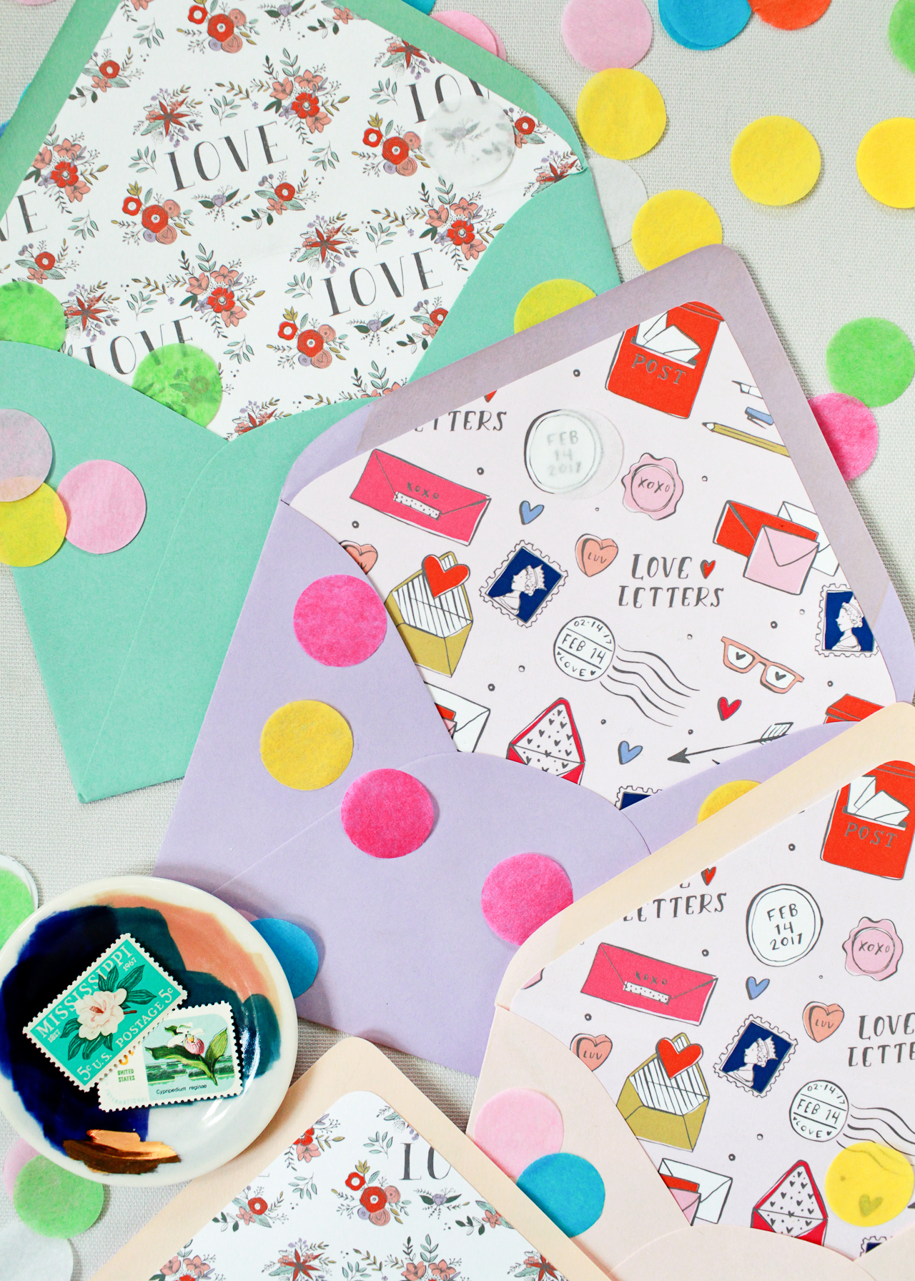
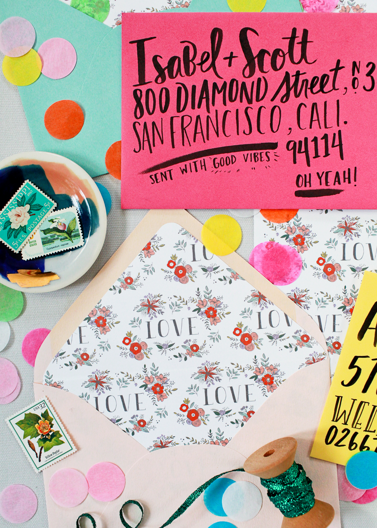
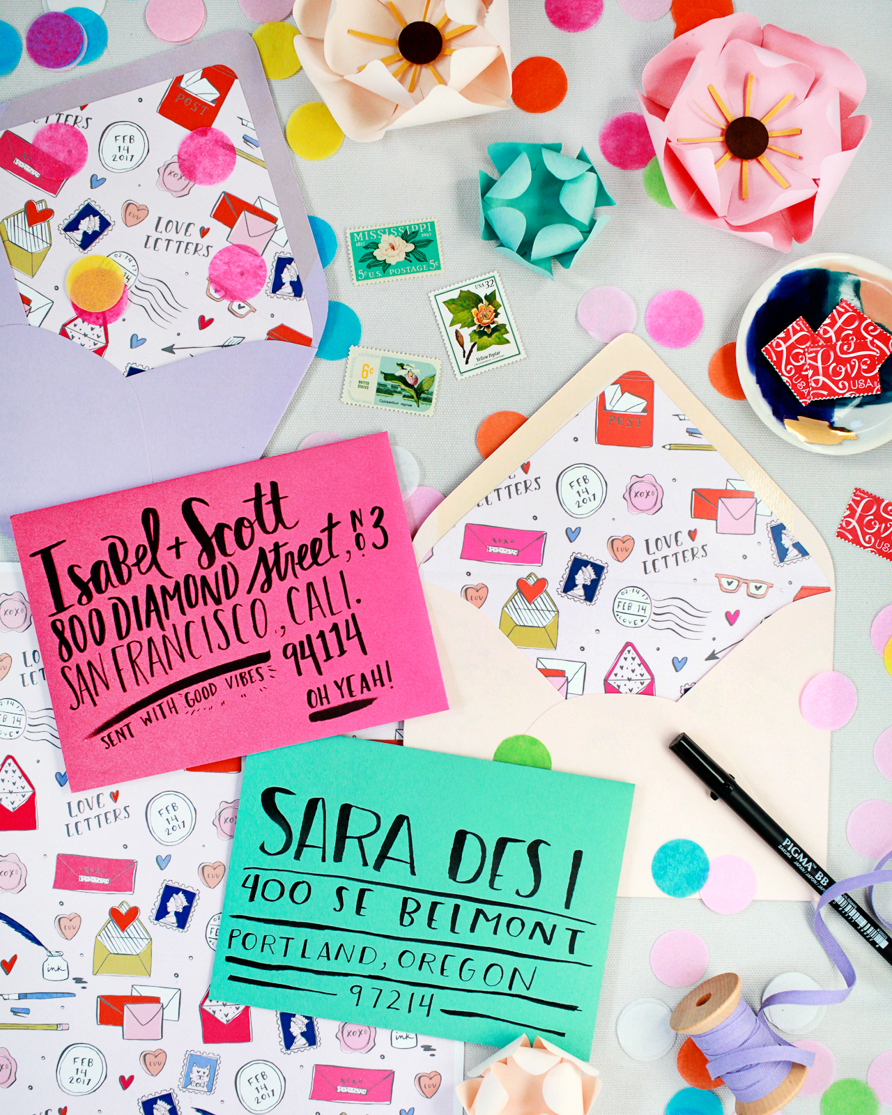
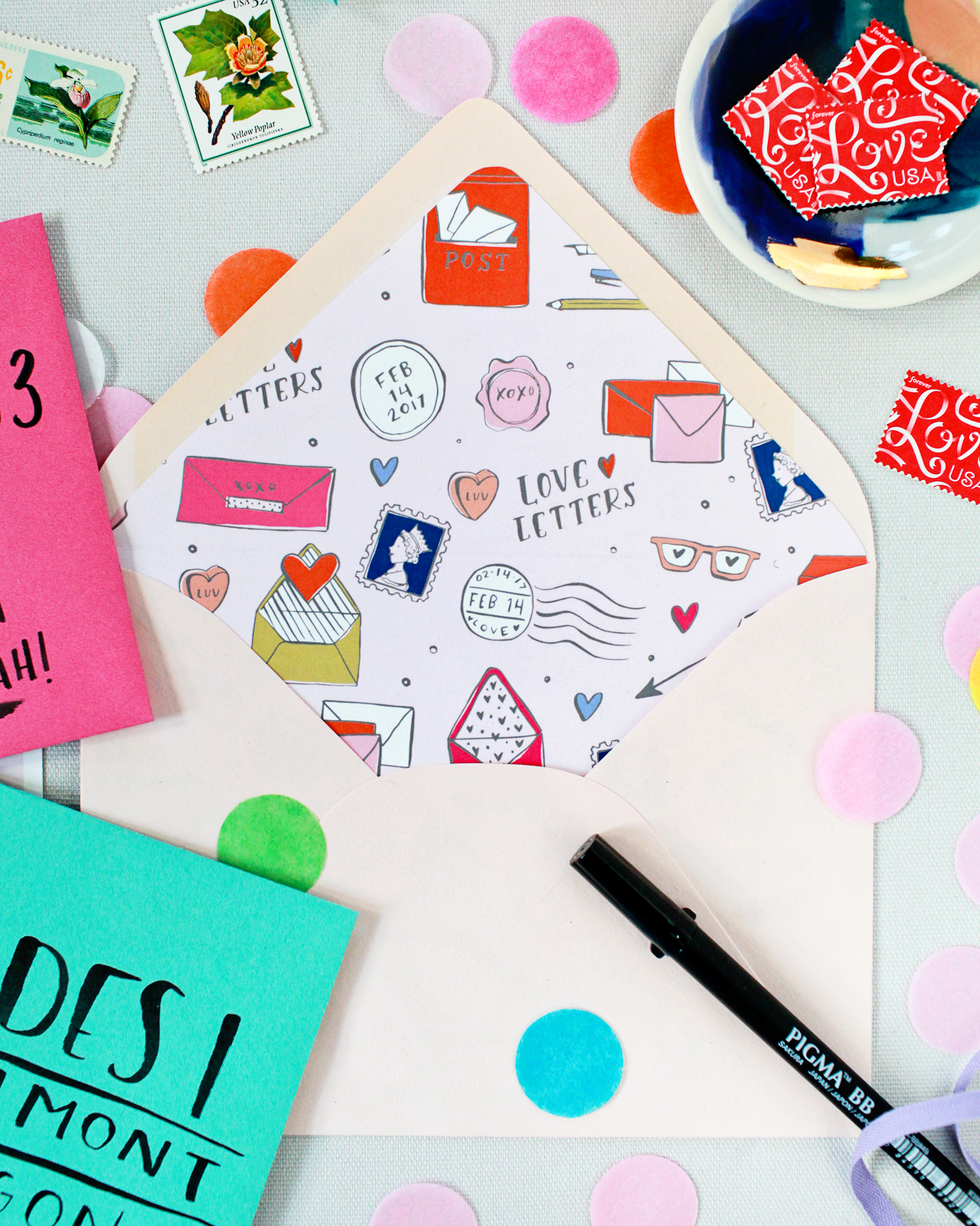
Courtney created two absolutely gorgeous illustrated liner patterns celebrating two of our favorite things: love letters and flowers! The little bouquets in the floral liners are my favorite thing ever – and can be used any time of year to send some love! And seriously, how cute are all those little illustrated postage stamps, airmail stamps, and wax seals?? Add ’em in to an envelope with a favorite greeting card, or use them with any colorful envelope to send a special hand written message. Bonus points if you add a bit of colorful confetti to your envelope. The more love the better these days!

Printable Valentine's Day Envelope Liners

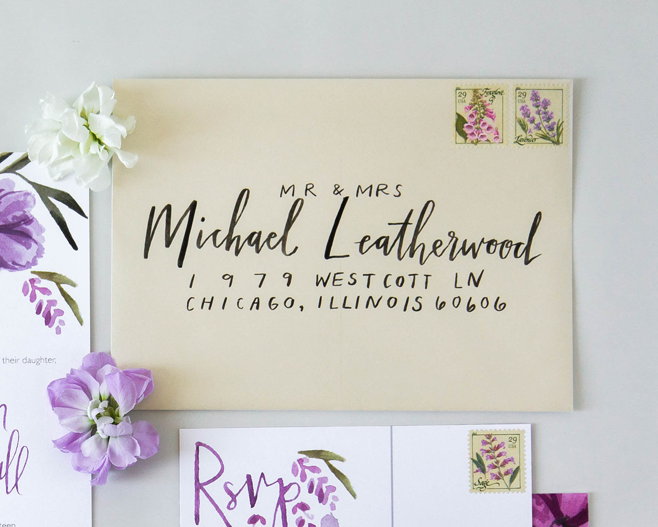
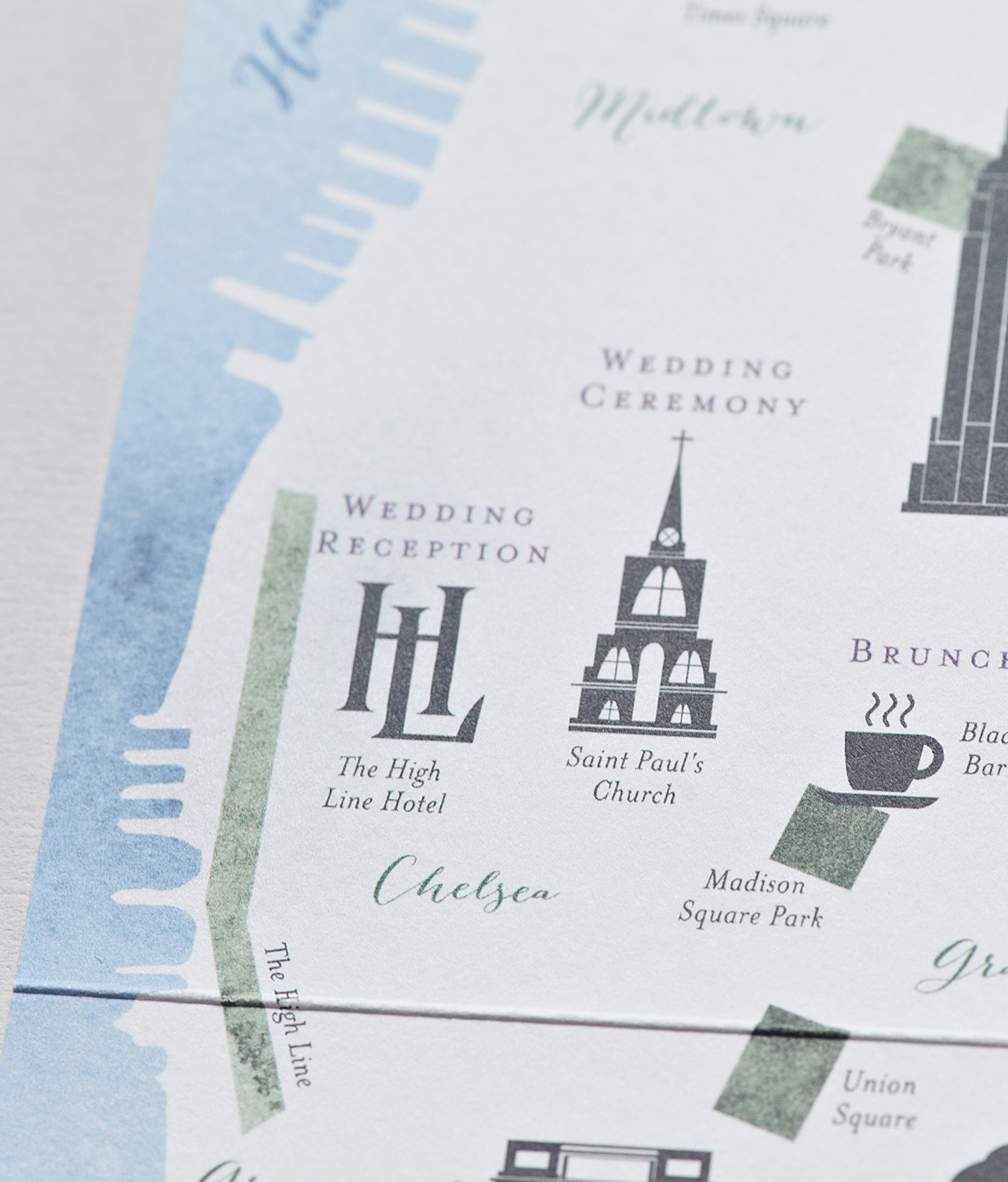
These would even be fun for weddings and bridal shower invitations, no?

Printable Valentine's Day Envelope Liners

ribbon + scissors| ceramic dish | tissue paper confetti

We’ll need a few basic supplies before we get started:

Printable Valentine's Day Envelope Liners

To make the envelope liners:

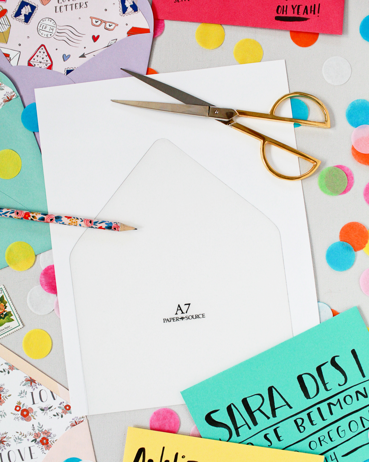
Step 1. Print your liner pattern of choice onto a letter sized sheet of text weight paper. If you don’t have a home printer, you can easily print these at your local copy and print shop – my printer isn’t that great at printing pink tones, so I had mine printed at my local Staples.

Step 2. On the back of the liner, lightly trace your liner template with pencil. For pointed flap envelopes, I like to use these liner templates from Paper Source. If you’re using square flap envelopes or prefer to DIY your own template, just trace the outline of the back of your envelope onto a sheet of thick card stock. Cut the template from the card stock, being careful to cut on the inside of the lines, and trim an additional 1/16″ off the left and right side and 3/4″ off the bottom of the template. Trace the liner template on the back of each printed liner until you have enough liners for all your envelopes, then carefully cut out each liner with scissors.

Step 3. Place the liner in the envelope. Use a glue stick or double sided tape on the back of the liner (along the top triangle and just above the crease) to adhere the liner to the envelope. Don’t worry about placing any adhesive on the lower part of the liner, since it’s tucked into the envelope it should stay put. Place a ruler along the crease of the envelope flap, then use your bone folder to score the envelope liner. This will help you maintain a clean line when you close your envelopes!

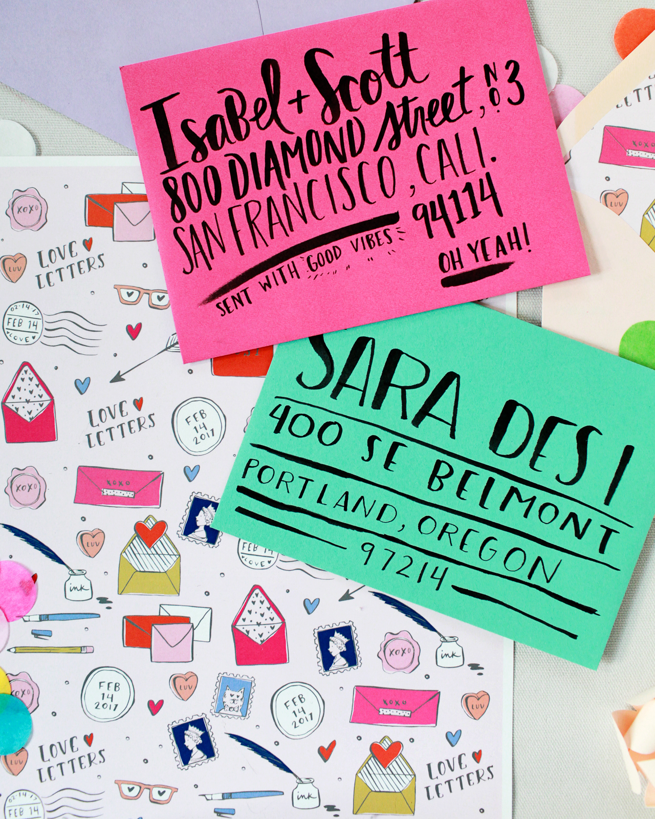
Step 4. Add a fun hand written note or greeting card, and close the envelope. Address the envelope in a playful hand lettering style using a brush marker or writing tool of your choice, and voila! You’ve got yourself a snazzy envelope that is guaranteed to bring a smile to someone’s face!

Printable Valentine's Day Envelope Liners

Since the liner patterns are a full letter-size sheet of paper, you can make them work for any size envelopes, including larger square envelopes, rectangular #10 envelopes, and all standard size greeting card envelopes. No matter what size envelope you’re using, we’ve got you covered!

Printable Valentine's Day Envelope Liners

Printable Valentine's Day Envelope Liners

Are you as obsessed with these liners as I am? When you print them out and use them, don’t forget to share your photos on Instagram and tag #madewithosbp so I can see them! I can’t wait!!

Printable Valentine's Day Envelope Liners

Download the envelope liner patterns from Swiss Cottage Designs right here: Love Letters and Floral Love!


All artwork © 2017 Swiss Cottage Designs created exclusively for Oh So Beautiful Paper. All artwork is made available for personal use only. By downloading the patterns you agree to the terms of use.

Photos by Nole Garey for Oh So Beautiful Paper


Rustic Illustrated Carrot Coaster Save The Dates

Eat your veggies, folks! With carrots this adorable, I will happily eat twice my portion. Amanda of Wide Eyes Paper Co. created these rustic illustrated carrot coaster save the dates for a wedding on a farm in New York’s Hudson Valley. The dainty cuddling carrot illustration is paired with a classic serif typeface with a sweet and simple save the date message. So perfect for a farm wedding!

Rustic Illustrated Carrot Coaster Save The Dates by Wide Eyes Paper Co.

From Amanda: As designers, we are always on the lookout for new avenues for creativity within the wedding stationery industry. We derive inspiration from tackling new projects like these rustic, farm-inspired, save the date coasters. This custom letterpress design was a downright fun project and a chance to offer a new product to future clients.

Rustic Illustrated Carrot Coaster Save The Dates by Wide Eyes Paper Co.

Lucy’s custom order brought our team into new territory and gave us a chance for innovation, but what was really great about it was that it was such a fruitful collaboration of different skills. As she was actually living on the breathtaking Stonegate Farm that was to be her wedding venue, Lucy was truly a well of agrarian inspiration. She had done her own illustration of what she wanted – two carrots growing together in a sweet, twisting embrace. It was great to get that running start on the creative vision and then head to work within our individual expertise.

Rustic Illustrated Carrot Coaster Save The Dates by Wide Eyes Paper Co.

First, we hand-illustrated the cuddling carrots in a style inspired by woodblock printing. Then, we paired the intricate line drawing with some graphic design magic. Creating organic-inspired pieces is often a balancing act; to counter the playful whimsy of the embracing carrots, we chose a serif font with a more stately feel to ground the design as a whole. The beauty of these coasters is really born from this delicate interplay of styles. The whole is definitely greater than the sum of its parts, in this case! Once we found a harmony between text and line, we fired it off to our letterpress printer.

Rustic Illustrated Carrot Coaster Save The Dates by Wide Eyes Paper Co.

For letterpress printed designs with multiple colors like these coasters, each color requires a separate plate. The metal plates are fabricated, coated in ink, and then run through the letterpress printing machine one by one. These hearty coasters were printed on 220 lb 2-ply Pearl White Crane’s Electra Cotton Letterpress stock; basically, the finest, ultra-thick letterpress stock available.

Rustic Illustrated Carrot Coaster Save The Dates by Wide Eyes Paper Co.

Thanks Amanda!

Design: Wide Eyes Paper Co.

Letterpress Printing: Clove St. Press

Wide Eyes Paper Co. is a member of the Designer Rolodex – you can see more of Amanda’s work right here or visit the real invitations gallery for more wedding invitation ideas!

Photo Credits: Kelly Wilde

Vibrant Purple Floral Watercolor Wedding Invitations

These invitations are so vibrant and fun! Kyle Sommer of Sommer Letter Co. created these vibrant purple floral watercolor wedding invitations for an elegant-meets-casual summer farm wedding for two high school sweethearts in Indiana. The floral illustrations and watercolor hand lettering are the perfect match for a summer barn wedding!

Vibrant Purple Floral Watercolor Wedding Invitations by Sommer Letter Co.

From Kyle: Taylor and Jalen, high school sweethearts, came to me looking for a beautiful way to capture the vibes of their dreamy summer wedding in Indiana. They had chosen an amazing variety of purples for their wedding colors: a mix of lavender, violet, amethyst, and lilac. The couple chose to get married at Joseph Decuis Farm, an event space that describes itself as “a farm dressed in a tuxedo.” It truly carries a formal vibe in an unexpectedly casual environment. Throughout the design process, we tried to walk that line between formal and friendly. Taylor told me she wanted to keep things elegant, but also reflect the casual barn wedding atmosphere. She really emphasized that she didn’t want the event to feel stiff – she wanted her guests to feel at home.

Vibrant Purple Floral Watercolor Wedding Invitations by Sommer Letter Co.

I really wanted to carry that breezy, summery, barn wedding feel into the wedding invitation suite. We decided a hand painted floral bouquet would be the perfect fit. It would capture the beauty and elegance of florals, but we gave it a bit of an “undone” look by imagining a bouquet with a few loose leaves poking about, and a handful of lavender stems drooping downward. We chose to feature their names and titles with a bit of large, scribbly, watercolor hand lettering.

Vibrant Purple Floral Watercolor Wedding Invitations by Sommer Letter Co.

To top it off, Taylor chose a shimmery champagne envelope and vintage floral postage stamps. We kept the outside of the envelope fairly traditional. I chose to write names and addresses in a simple brush pen lettering style. Guests would receive formal, traditional looking envelopes, but open them to discover rich purple hues and the couple’s welcoming vibes.

Vibrant Purple Floral Watercolor Wedding Invitations by Sommer Letter Co.

Thanks Kyle!

Design, Styling, & Lettering: Sommer Letter Co.

Check out the Designer Rolodex for more tal­ented wed­ding invi­ta­tion design­ers and the real invi­ta­tions gallery for more wedding invitation ideas!

Photo Credits: Natalie Kunkel Photography

New York City Inspired Floral Watercolor Wedding Invitations

Is there anything more beautiful than New York City in the fall? Central Park practically explodes with gorgeous fall foliage, and all the brownstones decorate their stoops with pumpkins and colorful autumn blooms. Becca of Suite Paperie created these whimsical New York City inspired floral watercolor invitations for a bride and groom tying the knot in the city. The invitations feature a color palette of rich autumn hues like purple and deep green, along with an illustrated map of Manhattan and soft watercolor florals.

New York City Inspired Floral Watercolor Wedding Invitations by Suite Paperie

From Becca: Kelly and Bennett wanted to set the perfect early Autumn New York City tone for their mostly out of town guests, and we set out to do just that! Oversized fall blooms were watercolor painted in rich purples, dusty roses, blushes, and deep greens, and paired perfectly with their wine and gray whimsical script and serif lettering on the main piece of their invitation suite. Digitally printed on duplexed soft white cover stock, the invitation was both colorful and luxuriously thick.

New York City Inspired Floral Watercolor Wedding Invitations by Suite Paperie

We created a custom map of Manhattan showcasing the neighborhoods and venues for the events throughout the wedding weekend. We also made sure to highlight important landmarks and neighborhoods that had special meaning to the couple, like their favorite place to sit and people watch, Washington Square Park, and where Bennett proposed to Kelly, Greenwich Village.

New York City Inspired Floral Watercolor Wedding Invitations by Suite Paperie

The back of the folded map listed a detailed schedule of the weekend, including welcome drinks and a post-wedding recovery brunch, a NYC must-have! The couple also wanted to include little fun facts and tips about New York City, like leaving plenty of time to get to their ceremony on a Friday afternoon, during rush hour, and encouraging guests to walk from the church to the reception at The High Line Hotel because, well, it’s New York City after all!

New York City Inspired Floral Watercolor Wedding Invitations by Suite Paperie

We carried the watercolor look onto the RSVP card and the front of the map insert. On the response card, we created mini watercolor animal silhouettes that served as meal option indicators. Additionally, on the front of the map insert, an oversized wash of minty green watercolor gives the suite a fresh, cheery punch.

New York City Inspired Floral Watercolor Wedding Invitations by Suite Paperie

My absolute favorite part of the suite is the envelope liner. We enlarged and layered the watercolor flowers to create a beautiful pattern and then digitally printed them on vellum for a subtle, but cohesive look to the suite. Finally, we wrapped the pieces in a berry colored double-thick cotton twine bringing out the rich colors in the suite.

New York City Inspired Floral Watercolor Wedding Invitations by Suite Paperie

Thanks Becca!

Design: Suite Paperie

Check out the Designer Rolodex for more tal­ented wed­ding invi­ta­tion design­ers and the real invi­ta­tions gallery for more wedding invitation ideas!

Photo Credits: Lindsay Nathanson

Refined Modern Neutral Letterpress Wedding Invitations

Aaaaaahhhh…. if invitations could be a soothing breath of fresh air, these refined modern neutral letterpress wedding invitations from Alana of Bourne Paper Co. would definitely be it. A clean, minimalist design with classic serif and sans-serif text, luxurious neutrals, and a delicate textured envelope liner? So good. And the silk thread wrap and white wax seal finish are simply sublime!

Refined Modern Neutral Letterpress Wedding Invitations by Bourne Paper Co.

From Alana: This invitation suite was designed to focus on modern typography and a warm, neutral color palette. We wanted the suite to have a very clean and crisp feel paired with unique textures that would stand out even when executed in whites and taupes.

Refined Modern Neutral Letterpress Wedding Invitations by Bourne Paper Co.

The first design decision made was to forego script fonts in favor of clean serif and sans-serif fonts. Italicized accents were added to the type to give the suite a more formal and elegant feel. We also created a modern monogram that was subtly featured throughout the invitation suite.

Refined Modern Neutral Letterpress Wedding Invitations by Bourne Paper Co.

The invitation suite was letterpress printed in a warm, metallic gold ink which reflected with the perfect, subtle shine when held at an angle. For paper, we used Somerset Velvet 300g card stock in Radiant White for a bright look and a soft cotton-like texture. The card stock also allowed us to apply stronger pressure during the printing process, which gave the letterpress text the crisp, clean feel we were going for and ensured the typography maintained its sharp edges and angles.

Refined Modern Neutral Letterpress Wedding Invitations by Bourne Paper Co.

To complete the suite, we finished the invitation with a silk thread wrap and white wax seal which used the couple’s monogram. We selected a warm taupe envelope for both the invitation and response card, something to add a hint of color without straying too far from the neutral theme. The taupe envelopes paired perfectly with the metallic gold ink, which was used to print the couple’s address and monogram onto the response envelope.

Refined Modern Neutral Letterpress Wedding Invitations by Bourne Paper Co.

We finished the invitation with an envelope liner featuring blind embossed cherry blossoms and other delicate florals. We loved the dramatic texture the liner provided and the bright white paper was the perfect compliment to the warm, taupe envelope – it also added just the right touch of florals to maintain the suite’s modern but elegant look.

Refined Modern Neutral Letterpress Wedding Invitations by Bourne Paper Co.

Thanks Alana!

Design: Bourne Paper Co.

Check out the Designer Rolodex for more tal­ented wed­ding invi­ta­tion design­ers and the real invi­ta­tions gallery for more wedding invitation ideas!

Photo Credits: Alana Cutler