Calligraphy Inspiration: Primele

Some like to think that talent runs in the family.  In the case of Primele, the design studio of sisters Patricia and Rachel Mumau, it’s most certainly true.  Ever since I stumbled upon their Etsy shop, I’ve been looking for glimpses of projects on Patricia’s blog, and ogling their portfolio of work.  The sisters are also the creatives behind Fawnsberg, a stationery line that carries over Primele’s signature style, adding it to cards, papers, and stamps.  Their work has been featured in Martha Stewart Weddings, Lucky Magazine, and Real Simple.  You’ll see why!  – Julie 

Primele Calligraphy via Oh So Beautiful Paper

Primele Calligraphy via Oh So Beautiful Paper

Primele Calligraphy via Oh So Beautiful Paper

Patricia’s calligraphy gives off a playful and welcoming air.  You don’t have to worry about blending into the crowd with addressed envelopes like these. (Especially with such great, bright inks!)

Primele Calligraphy via Oh So Beautiful Paper

Primele Calligraphy via Oh So Beautiful Paper

Primele Calligraphy via Oh So Beautiful Paper

Calligraphy and illustration find a home in the line of Fawnsberg stationery.  Ever so whimsical, their art and address stamps, writing sheets and notecards are some of the most charming I’ve seen.

Primele Calligraphy via Oh So Beautiful Paper

With the sneak peeks I’ve seen of the Fawnsberg booth at the National Stationery Show, you’ll definitely want to keep an eye on these ladies.  I can’t wait to see what goodies they’ll have in store for us next!

Photo Credits: Primele and Fawnsberg

DIY Tutorial: Rubber Stamp Fireworks Invitation

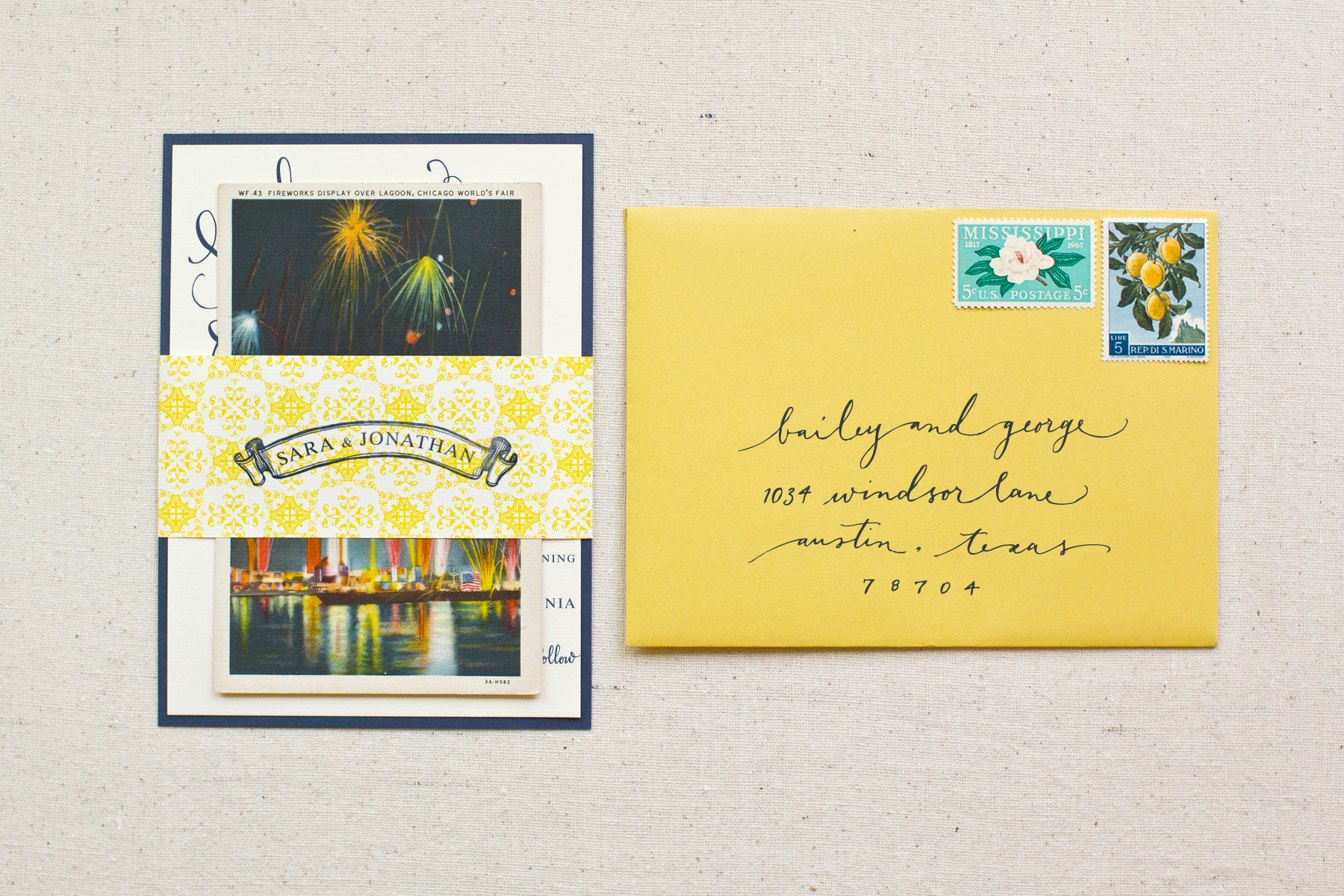
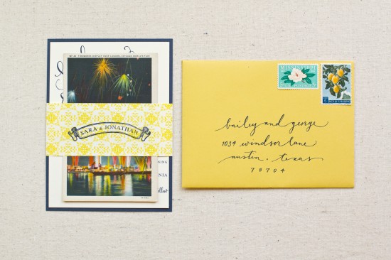
We love the challenge of creating an invitation suite based off of a unique theme, venue or color palette.  For this DIY tutorial, we were inspired by a fabulous vintage firework postcard (that we found while hunting at a local thrift shop)!  This combo would be so perfect for New Years Eve or July 4th nuptials – or even a Fourth of July party!  The mixture of colors and patterns is sure to make a statement to all of your guests. – Bailey and Emma of Antiquaria

DIY Tutorial: Rubber Stamp Fireworks Invitation by Antiquaria

DIY Tutorial: Rubber Stamp Fireworks Invitation by Antiquaria

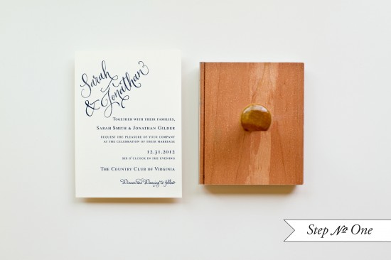
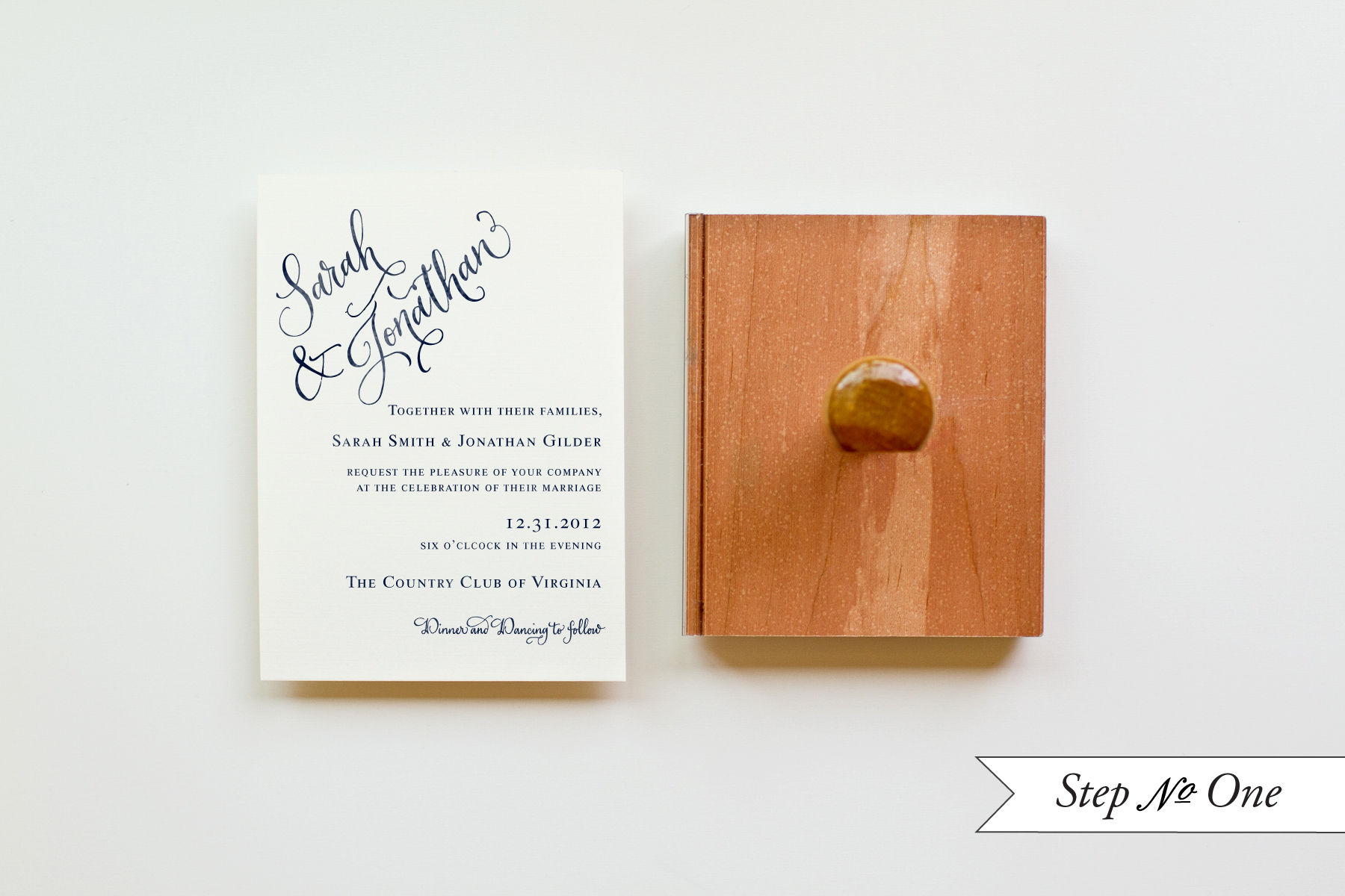
Step One: Lay a 4.25 x 6″ card (preferably a heavyweight card stock) on a stable and hard surface.  Ink your invitation stamp (we used our Calligraphy Accent Invitation Stamp) and center it over card.  Press down firmly with moderate pressure, using the handle as the anchor point.  Lift off the stamp and set card aside to dry.

DIY Tutorial: Rubber Stamp Fireworks Invitation by Antiquaria

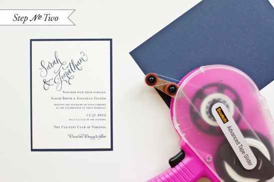
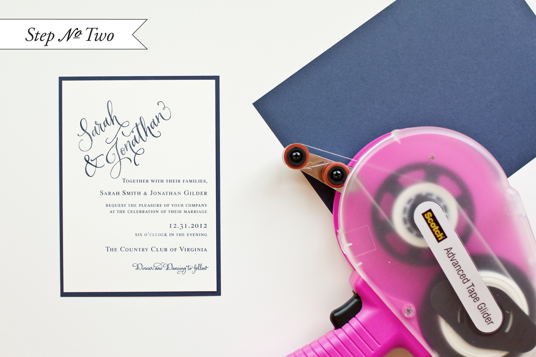
Step Two: Cut a navy sheet of paper into a 4.5 x 6.25″ rectangle.  Once the printed invitation piece is dry, flip over and adhere double stick tape to each edge.  Center over the navy card and stick it down pressing the edges to make sure that the two pieces are stuck together properly.

DIY Tutorial: Rubber Stamp Fireworks Invitation by Antiquaria

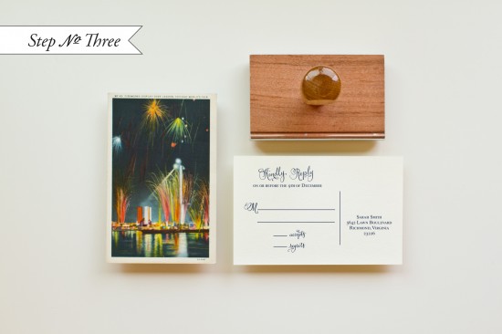
Step Three: In order to use our found postcard for all of our guests, we scanned the front image into the computer and printed out enough cards to suit our quantity.  (The cards ended up being 3.5 x 5.5″ rectangles).  We stamped the back of each card using our Calligraphy Accent Reply Postcard Stamp.  Of course, let the cards dry after inking.

DIY Tutorial: Rubber Stamp Fireworks Invitation by Antiquaria

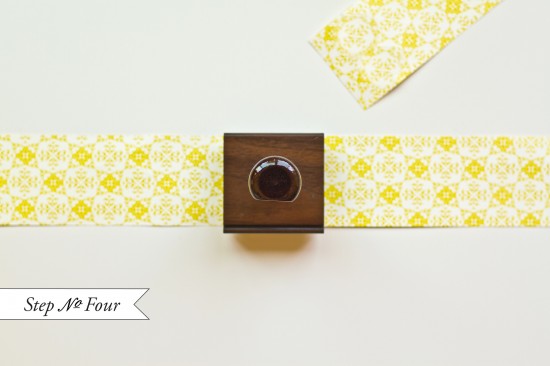
Step Four: To make the belly band, cut a fun, patterned paper into 2 x 11″ or 2 x 12″ (depending on the length of your paper) strips.  Stamp a monogram (we used our Banner Name Monogram Stamp) in the middle and wrap the band around your invitation suite, securing it in the back with double sided or decorative washi tape.  Now all of your pieces will stay together and look cute at the same time!

DIY Tutorial: Rubber Stamp Fireworks Invitation by Antiquaria

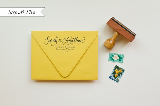
Step Five: Stamp an A6 envelope with your return address (we used our Calligraphy Ampersand Return Address stamp), address the front, pick out your postage and send them on their way!

Materials:

Calligraphy Accent Invitation Stamp

Calligraphy Accent Reply Card Stamp

Calligraphy Ampersand Return Address Stamp

Banner Name Stamp

Stamp Pad (we used Midnight)

Cream Cardstock cut to 4.25 x 6 inches

Vintage Postcard measuring 3.5 x 5.5 inches, found locally

Navy Blue Cardstock cut to 4.5 x 6.25 inches

Patterned Paper (ours was custom designed and printed by Antiquaria)

A6 Envelope (we used Curry)

Double sided tape

Washi Tape

Tape Gun (optional but definitely helpful in taping on the navy backers)

Photo Credits: Jamie of Intertwyned

2012 Paper Party

The booth recaps from the National Stationery Show may be over, but I have one final NSS post to share with you!  Every year for the last few years, I’ve had the pleasure of co-hosting a little stationery meetup with Erika from Delphine one evening during the show.  This year, we invited the stationery and design industry’s finest to come hang out for a few hours outside of the Javits Center – and an awesome turnout of exhibitors, retailers, and fellow stationery enthusiasts showed up to get their paper party on!


This year’s meetup took place at a fun little venue just a few blocks north of the Javits Center called Little Town NYC on Restaurant Row â€“ we loved the rustic vibe and brick interiors!  Our fabulous and talented friends Janice from Bellwether Events and Cyd from The Sweetest Occasion helped us pull all of the party details together.  We were thrilled to work with some really amazing sponsors who made the party possible, including Crane & Co., Stationery HQ, Tradeshow Bootcamp, Ladies of Letterpress, and Mohawk/Felt + Wire.


The super cute paper party details were provided by For Your Party, and DC Rentals helped us out with some gorgeous linens!


Of course, a paper party wouldn’t be complete without a fabulous goodie bag!  This year’s goodie bag was pretty hefty and full of amazing paper from Crane & Co., Dingbat PressLinnea’s LightsFig. 2 Design StudioRussell + HazelFigs + Ginger, TattlyKelp DesignsKate & BirdieCartolinaPaper + CupCrow & CanaryCzar Press, Knock Knock, Legion Paper, and Anthology Magazine.


Oh, and I can’t forget the invitations themselves!  Erika created the gorgeous design and the invitations were printed in mint green and gold foil by Stationery HQ.  The wonderful Michele from Meant to Be Calligraphy provided her beautiful hand lettering (in her Edwards style) for the invitations that we mailed out a bit further in advance.

We had so much fun at this year’s meetup!

Once again, a huge thanks and much love to our amazing sponsors: Crane & Co., Stationery HQ, Mohawk/Felt + Wire, Tradeshow Bootcamp, and Ladies of Letterpress, not to mention Little Town NYC for having us – and a million thanks to Janice and Cyd for all their help.  I can’t wait for next year!

There was no way I could fit all of the photos from this year’s meetup into a single post, but you can find the full gallery from the party right here!

Photo Credits: Tory Williams Photography

{happy weekend!}

Whew!  What a week… but I hope you’re all enjoying the coverage from the 2012 National Stationery Show so far!  I’m looking forward to a relaxing weekend at home, and hopefully giving a little care and attention to our poor neglected apartment and garden.  But in the meantime…

Constellation Print by Sycamore Street Press

…a few links for your weekend:

This week on Oh So Beautiful Paper:

That’s it for me this week!  Cocktail Fridays will be back this afternoon – and we have a special cocktail just in time for Memorial Day weekend, so check back a bit later for the recipe!  I hope you all have a wonderful weekend, and I’ll see you back here on Monday!  xoxo

Calligraphy Inspiration: Nancy Hopkins Handlettering

Ed Note: Hi Everyone! I’m taking a quick break from National Stationery Show coverage today to get more photos and posts ready to share with you.  I’ll be back with more from the show tomorrow! – Nole

The thing I love most about calligraphy is its emotive qualities.  Sometimes, it seems we have enough trouble trying to put thoughts and feelings into words.  But to then have those words illustrate these things, simply through line and form, is pretty amazing; it’s quite the challenge.  Nancy of Nancy Hopkins Handlettering seems to enjoy the challenge by the looks of her portfolio.  With 15 years of experience specializing in commercial and event calligraphy, and clients like Saks Fifth Avenue, Bank of America, and Martha Stewart Magazine, she has certainly made a name for herself transforming the written word. – Julie

 Nancy Hopkins invitation suite

Nancy Hopkins blue addressed envelopes

A mix of calligraphy and hand lettering along with a great use of space adds charm to addressed envelopes.

Nancy Hopkins warm invitation suite

Nancy Hopkins detail

The perfectly imperfect line quality of some of her styles are swoon-worthy.  The words are given such personality and texture, don’t you think?

Nancy Hopkins addressed and illustrated envelopes

Nancy Hopkins kraft envelopes

Nancy Hopkins grey lettered envelope and place cards

Don’t forget to visit Nancy’s website for more of her work.  She recently updated the website – and with many fantastic examples and with 26 lettering styles available, it’s almost guaranteed that she has a style perfectly suited for your needs.

Letterpress printing: Olivia San Mateo

Photo Credits: Sabine Elser