Modern Neon Pink and Yellow Save the Dates

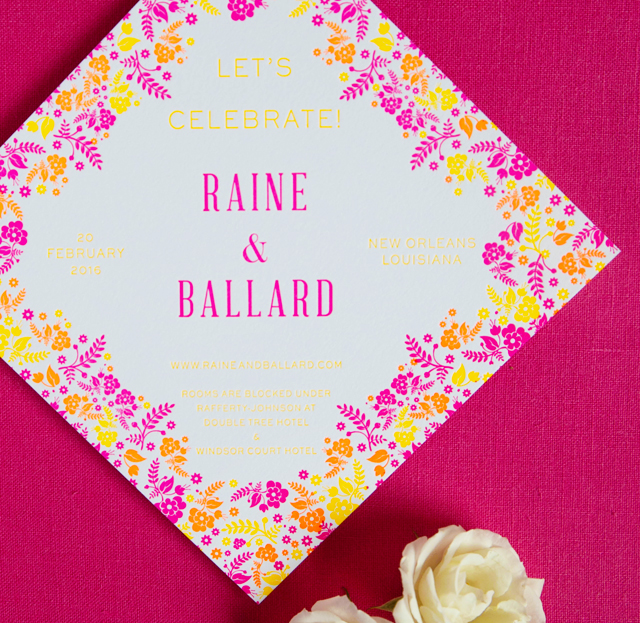
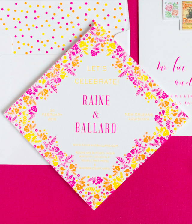
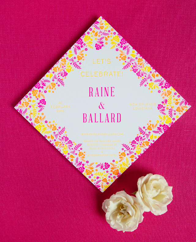
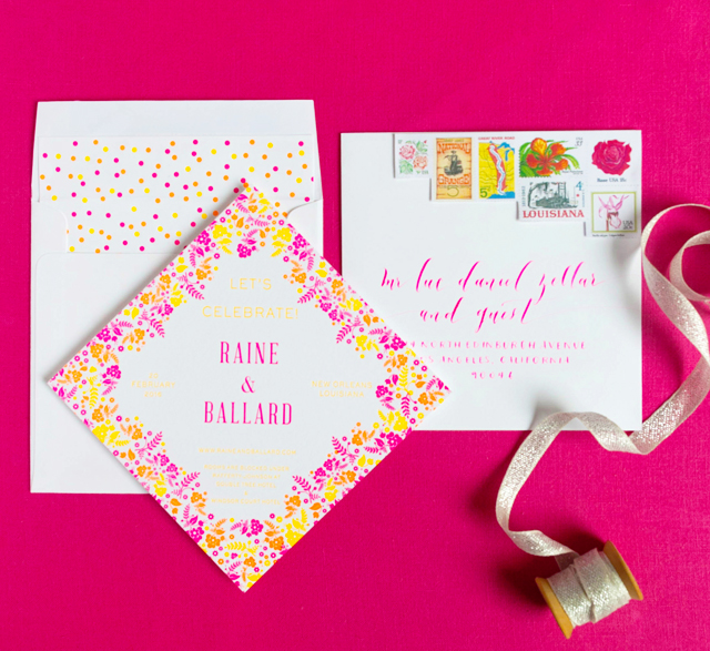
There are so many things to love about these modern neon pink and yellow save the dates from Lily of Lavender & Mint! All that bright color, modern floral patterns inspired by the Otomi dresses that the bridesmaids will wear to the rehearsal dinner, and absolutely gorgeous envelopes with vintage stamps and calligraphy from Blue Eye, Brown Eye! I also love that Lily printed the save the dates to have a diamond shape appearance instead of the traditional horizontal or square shape – such a fun twist!

Modern Neon Pink and Yellow Save the Dates by Lavender and Mint / Oh So Beautiful Paper

From Lily: It doesn’t get much better than a big New Orleans wedding and this wedding is sure to be a PARTY! While the wedding will be a traditional evening black tie event, the bride and her mother wanted a save the date that was far from traditional.

Modern Neon Pink and Yellow Save the Dates by Lavender and Mint / Oh So Beautiful Paper

The wedding is a winter affair, so we decided to bring color to the occasion to let guests know that even though it isn’t quite time for Mardi Gras, the wedding will still be a vibrant New Orleans celebration. The bridesmaids will be wearing colorful Mexican Floral Otomi dresses for the rehearsal dinner so we used those patterns as inspiration for the save the date design. We chose pink, orange and yellow as our colors and used neon ink for the letterpress printing.

Modern Neon Pink and Yellow Save the Dates by Lavender and Mint / Oh So Beautiful Paper

The save the date is printed in a diamond shape to skew even further from tradition. We used 3-ply stock so that the impression from the letterpress could be deep. My favorite is the confetti inspired 3-color letterpress envelope liner that shouts PARTY! when the recipients open their mail. The bride & groom are both from Louisiana but currently live in Texas and wanted an extra personal touch to the save the date. We accomplished that with a series of vintage stamps with colors that fit the suite wonderfully. The envelopes are oversized 7.5” square envelopes with incredible neon pink calligraphy from Blue Eye Brown Eye.

Modern Neon Pink and Yellow Save the Dates by Lavender and Mint / Oh So Beautiful Paper

Thanks Lily!

Design: Lavender & Mint
Envelope Calligraphy: Lauren Essl of Blue Eye Brown Eye Calligraphy
Printing: Littleford Letterpress

Lavender & Mint is a member of the Designer Rolodex – you can check out more of Lily’s beautiful work right here or visit the real invi­ta­tions gallery for more wedding invitation ideas!

Photo Credits: Lucy Cuneo Photography

Behind the Stationery: The Social Type

I’m beyond thrilled to bring y’all our next stationer, Allison from The Social Type! Allison and Jess have created some of my favorite foil pieces and matchboxes and they are a hoot to be around. The Social Type is a creative manifestation of their friendship and they have been at it since working separate day jobs and being long distance business partners. From working together on designs to adjusting to being a parent, Allison is here to take us through their stationery business story! –Megan

Behind the Stationery: The Social Type / Oh So Beautiful Paper

Hello from sunny Los Angeles! I’m Allison Brennan, co-founder of The Social Type. Jessica Tree and I are thrilled to be featured on Oh So Beautiful Paper, our go-to for all things paper related! Jessica and I founded The Social Type in 2009. We were already good friends and decided we wanted to do something creative together. Both eager to be our own bosses and business partners, we were excited by the idea of creating cards and products that we loved and wanted to buy. I had previously worked as a buyer for Jonathan Wright and Company and Minted.com. I was immersed in the stationery and gift industry, and there was no place I’d rather be. I had a desire to launch a wholesale line and Jessica was on board.
Behind the Stationery: The Social Type / Oh So Beautiful Paper

We really kicked things off in 2010 when we launched our mini-collection of letterpress and foil greeting cards at the Renegade Craft Fair in LA. Urbanic, in Venice, CA was our very first store. We dropped off some samples for Audrey right after Renegade and I think she purchased the entire line for her boutique. We were thrilled; that gave us the boost of confidence to keep going and grow our line further. Over the next year, we figured out how to fund a collection that was big enough to show at the National Stationery Show. Our first show in 2012 was a great success and this May 2016 will mark our fifth NSS. We are always excited to travel to New York City to be part of such an amazing show.
Behind the Stationery: The Social Type / Oh So Beautiful Paper

The Social Type is a paper goods and gift company; we sell wholesale to boutiques and stores across the United States, Canada, and beyond. We also have a retail site where customers can purchase directly. We outsource all of our printing and most of our manufacturing primarily in the United States, and we ship all of our products from Los Angeles.

We are really crazy about foil printing. When we were conceptualizing our first collection, foil wasn’t a prominent printing method in the stationery industry. We love letterpress but knew we wanted our cards to have a little more sparkle, and foil was the perfect detail. It was a bit of a risk because the trend hadn’t taken off yet, but we were confident that it would catch on. Everything we print today, from cards to matchboxes, all involve some sort of foil printing. We haven’t met a foil we didn’t like. Right now we are mad for hologram; we really can’t get enough of it.
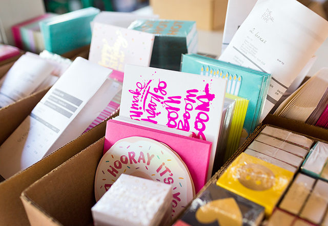
Behind the Stationery: The Social Type / Oh So Beautiful Paper

Our studio is in Echo Park, Los Angeles, which is just a short jaunt from hip Silver Lake and booming Downtown. Jessica and I love LA, and it suits us both quite well. We are two midwestern transplants that can’t get enough sunny skies. Some days we head to the Echo Park Boathouse for lunch meetings to enjoy the lake or we’ll have a happy hour brainstorming session at L&E Oyster Bar in Silver Lake. Our surrounding neighborhoods serve as constant inspiration as they are home to many artists, entrepreneurs, and creatives like us. Los Angeles is such an exciting place to grow our company; we have lots of good friends that have their own companies here, too. We are lucky to have such a great support group.

Behind the Stationery: The Social Type / Oh So Beautiful Paper

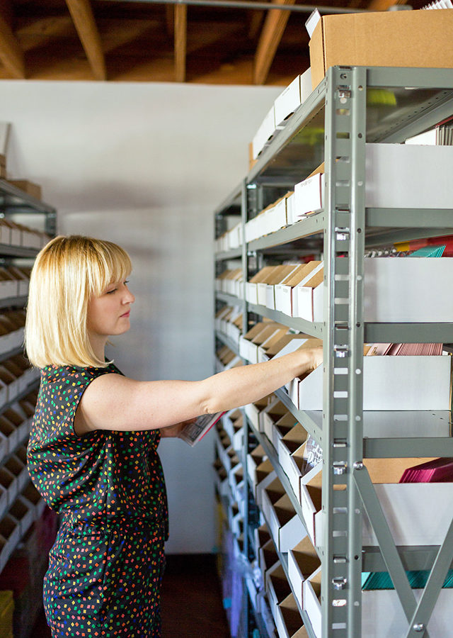
Our studio has a lot of natural light and great outdoor space, and we take our meetings in the courtyard whenever possible. About a quarter of the studio is dedicated to our own offices and the rest of the studio is comprised of fulfillment space and inventory, though the inventory is really taking over. We moved to the studio in August 2014 and are already outgrowing it. We are currently looking for space in the area where we might one day be able to have a retail shop, which is a dream of mine, as well as our warehouse and design studio.
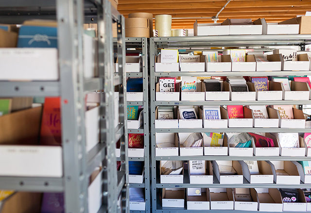
Behind the Stationery: The Social Type / Oh So Beautiful Paper

Our work day typically starts around 9-9:30 for the team. I usually sneak in at about 10 so I can spend a few morning hours with my daughter (and I’m grateful to have a partner who allows me to do so). Monday mornings we have a team meeting to discuss projects and schedules for the week ahead. Jess and I usually meet on our own and split up tasks for the week. Jess often focuses on design, deliverables for our licensing partners, and answering inquiries we receive through our website. I focus on some design, sourcing, and general operations. Our awesome fulfillment team handles everything else from order processing and packing to rep correspondence, processing payments, and shipping wholesale and web orders. From time to time, we bring in extra fulfillment help during busier seasons and for large key account orders.
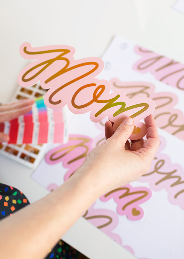
Behind the Stationery: The Social Type / Oh So Beautiful Paper

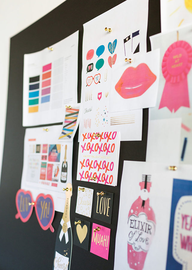
Jess and I concept and design together. When I get stuck on an initial idea or design, I pass it off to Jess and she figures out what to do with it, and vice versa. We have worked that way since the very beginning, even when we were in different cities. Occasionally we license art from other artists too, and we really appreciate those partnerships.
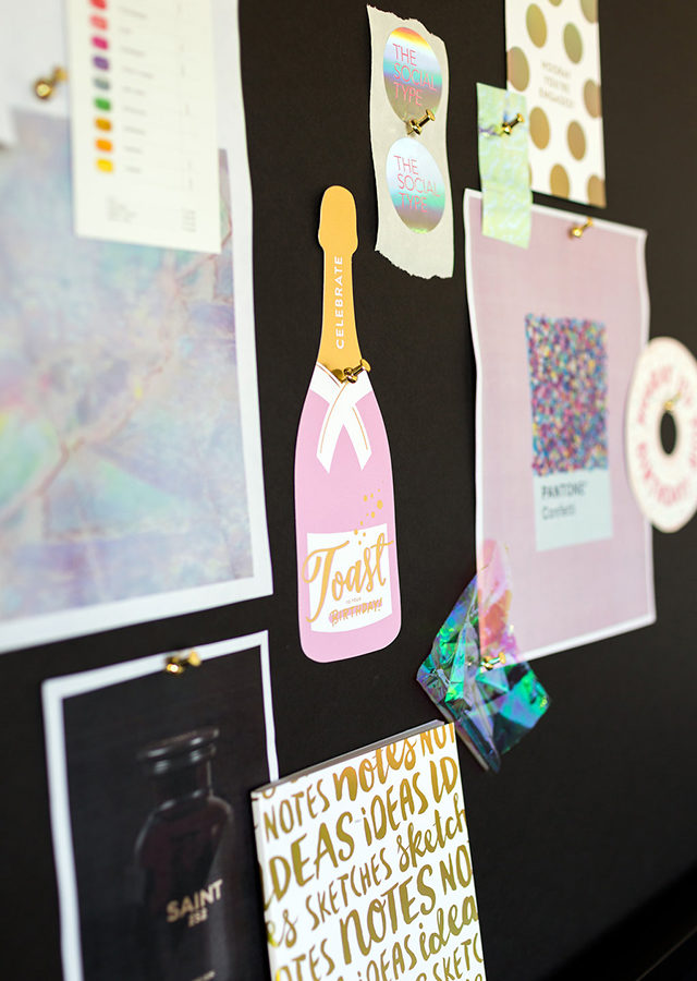
Behind the Stationery: The Social Type / Oh So Beautiful Paper

Once a design is ready to be manufactured, I usually prep the design files to send to our printer and Jess will create or update our catalog and sell sheets for our reps and stores. Our products often go through several rounds of proofing before we sign off on them. Once we receive inventory at our studio, our accounts coordinator and fulfillment team handle the rest. They stock product, sleeve and label cards, pull and pack orders, and ship samples to our reps. Our team is small but growing, and that means we all wear a lot of hats – it’s a group effort. We work hard, but like to have a good time. It’s not unusual to find us blasting music, dancing about the studio, or cracking jokes.
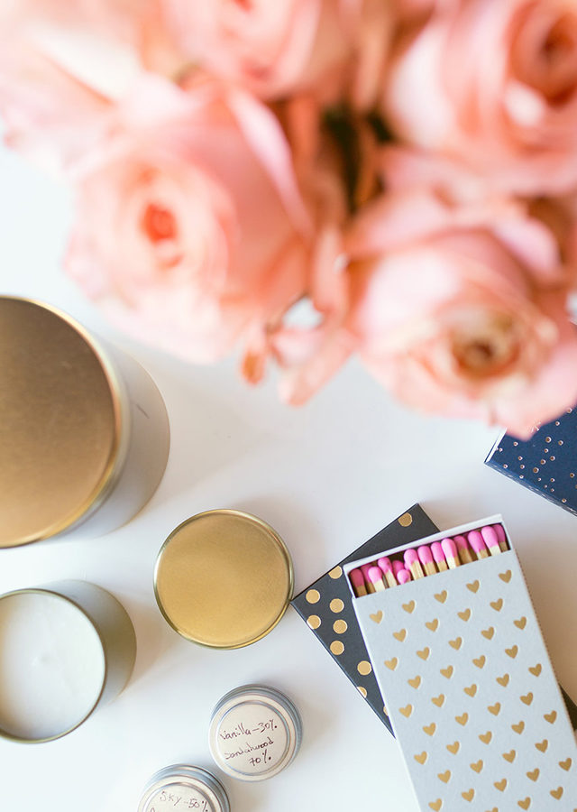
Behind the Stationery: The Social Type / Oh So Beautiful Paper

About a year and a half ago we started designing die cut cards and they’ve been really successful. We have fun designing them, too. Expect to see more die cuts, lots of hologram foil, and new matchboxes in May at NSS. We have some other goodies planned for 2016, including a line of candles and other party and gift items. Our biggest release comes in May of each year when we show off new product at NSS. We have two other smaller releases in early Fall and mid-Winter, though this year we will have a more sizable release in August since we will have our first solo booth at NY NOW. We love owning and operating our own business, but it’s not always cut and dry. As we grow, we occasionally run into obstacles but try to learn from our mistakes, which makes our partnerships and business stronger.
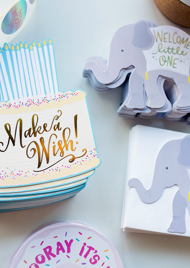
Behind the Stationery: The Social Type / Oh So Beautiful Paper

Thanks to Nole and Megan for letting us share a little glimpse of our company with you. We love what we do and are very fortunate to be part of an amazing network of talented businesses and individuals. We look forward to expanding our business this year and sharing new products with you. Don’t be a stranger, please keep in touch!

Photos by Stephanie Todaro

Interested in participating in the Behind the Stationery column? Reach out to me at Megan [at] ohsobeautifulpaper [dot] com.
Seven Pretty Ring Dishes

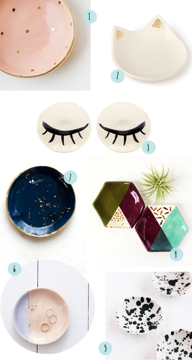
I’m absolutely obsessed with pretty ring dishes. I can’t stop myself from buying one whenever I see a new beautiful dish! Of course, I don’t just use ring dishes to hold jewelry. Some help organize paperclips and vintage stamps on my desk, one holds loose change by the front door, while others frequently hold small components of a DIY project on the kitchen table. I just love seeing these little ceramic dishes around the house – and here are a few of my favorites!

Seven Pretty Ring Dishes / Oh So Beautiful Paper

1. Love the sweet gold polka dots against a peach background from Up In the Air Somewhere

2. A cat ring dish! From Catbird, naturally

3. I’m completely obsessed with these bold black and white eyelash ring dishes by BDB NY (available for purchase here)

4. Unique colorblocked hexagon ring dishes from Quiet Clementine

5. A fun black and white splatter pattern from Paper and Clay

6. Two of my favorite colors: lavender and peach, with the most delicate gold line down the middle, from Redraven

7. I would happily buy just about anything from Suite One Studios, but I’m completely powerless when it comes to her ring dishes! Dark navy with gold splatters? Iridescent glaze? A deep emerald green or rose pink with gold rims? Yes, yes, yes, and yes.

Dusty Blue Letterpress and Copper Foil Wedding Invitations

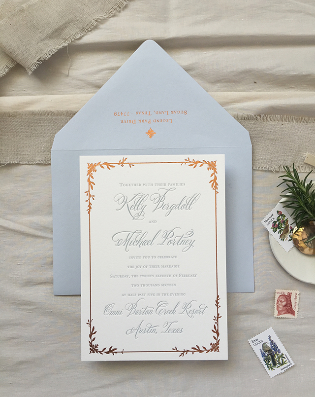
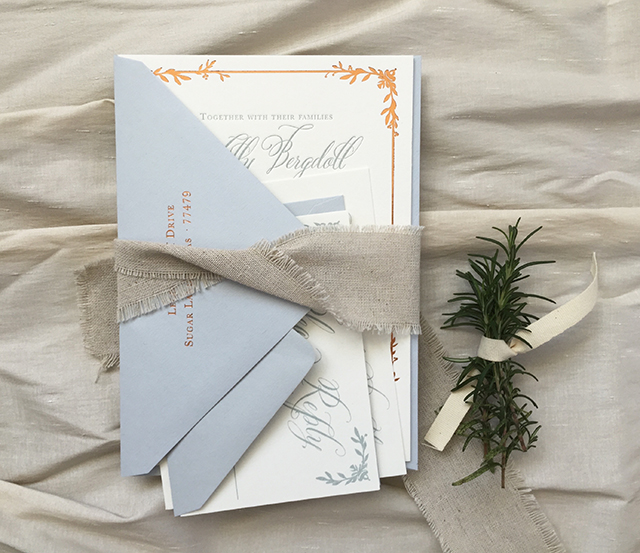
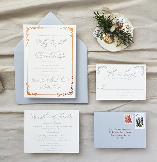
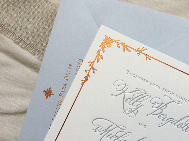
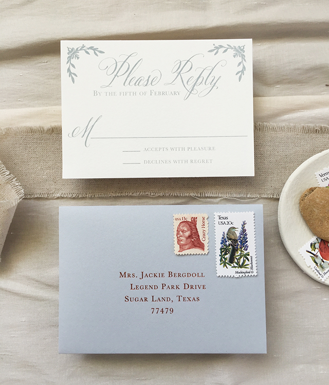
I love unexpected color combinations! We’ve seen some gorgeous navy blue and copper wedding invitations, but this is the first time I’ve seen copper foil paired with a medium blue gray! Lauren from Charm & Fig designed these dusty blue letterpress and copper foil wedding invitations for a romantic and rustic wedding in Austin, Texas. The dusty blue feels like the perfect fit for a Texas wedding – it reminds me of bluebonnets! – and looks great against the warm and shiny copper foil in both the invitation border and return address. So pretty!

Dusty Blue Letterpress and Copper Foil Wedding Invitations by Charm and Fig / Oh So Beautiful Paper

From Lauren: As Kelly and Michael were planning their wedding, they knew they wanted a romantic Texas Hill Country affair with the slightest rustic touch.

Dusty Blue Letterpress and Copper Foil Wedding Invitations by Charm and Fig / Oh So Beautiful Paper

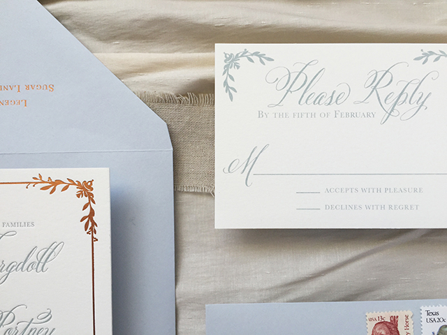
The invitation text was letterpress printed in a dusty blue gray inspired by the muted tones of desert succulents. The rich copper foil balanced out the lightness of the blue and was a subtle wink to the famous burnt orange of bride’s alma mater… hook ’em horns! For the invitation, we selected Crane’s 100% cotton Lettra paper as the base for the letterpress printing and foil stamping called for in our design. The RSVP and accommodations cards were offset printed in the same dusty blue gray as the invitation text.

Dusty Blue Letterpress and Copper Foil Wedding Invitations by Charm and Fig / Oh So Beautiful Paper

For the graphics, we used a gorgeous, sweeping calligraphy typeface for the names and key text, surrounded by a structured border with vines sprouting in and around the corners. We wanted the vines to bring an organic element to the invitation design, with no two corners alike.

Dusty Blue Letterpress and Copper Foil Wedding Invitations by Charm and Fig / Oh So Beautiful Paper

Dusty Blue Letterpress and Copper Foil Wedding Invitations by Charm and Fig / Oh So Beautiful Paper

Dusty Blue Letterpress and Copper Foil Wedding Invitations by Charm and Fig / Oh So Beautiful Paper

Thanks Lauren!

Design: Charm & Fig Paper Goods

Letterpress: Quality Printing Company

Foil Stamping: Gold Leaf Embossing

Check out the Designer Rolodex for more tal­ented wed­ding invi­ta­tion design­ers and the real invi­ta­tions gallery for more wedding invitation ideas!

Photo and Styling Credits: Lauren Covington | Charm & Fig

Quick Pick: Hartland Brooklyn

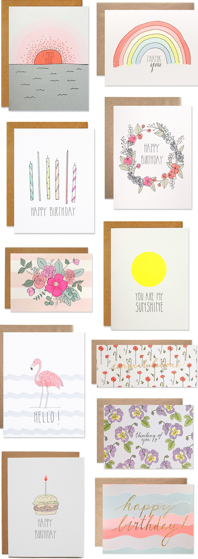
Happy Spring everyone! Spring is hands down my favorite season of the year. The days are getting warmer and longer, the sun is shining, and the world around me is bursting into bloom. I pretty much live for Spring flowers, especially lilacs, peonies, sweet peas, and cherry blossoms. These bright and happy cards from Hartland Brooklyn are just perfect for the new season. So many colors! Shiny gold foil! Floral illustrations! Yes, yes, and yes.

Quick Pick: Hartland Brooklyn / Oh So Beautiful Paper

More gorgeous cards from Hartland Brooklyn right here – along with art prints, notepads, temporary tattoos, and nail tattoos!