Bright and Colorful Superhero Birthday Party Invitations

Happy Monday everyone! As a mom, I love seeing how other moms translate popular birthday party themes into modern birthday party invitation designs. Case and point: these bright and colorful superhero birthday party invitations from Cari Marie Designs! Sporting vibrant lightening bolts and funky comic book-style graphics, Cari made her son’s dream of being a superhero a reality with this bright and colorful superhero themed birthday party!

Bright and Colorful Superhero Birthday Party Invitations by Cari Marie Designs

Bright and Colorful Superhero Birthday Party Invitations by Cari Marie Designs

From Cari: WHAM BAM ZWEE! To celebrate my son, Cohen, turning three, I put together a fun, modern, and laid back party for the savvy superhero, decked out in his “super fast” tracksuit complete with lightning bolts, and of course, a superhero mask & cape! Sealed in a bright yellow envelope, the invitations set the tone for the party with superhero sayings and lightning bolts replicated from the party plates! I had fun playing off superhero words like “kapow” and using “hero headquarters” for the party destination spot!

Bright and Colorful Superhero Birthday Party Invitations by Cari Marie Designs

When our tiny guests arrived, they had the chance to stop by the wall of capes and masks and pick out their favorite color! (Numerous wardrobe changes occurred during the party, might I add!) There were even some adults who took part in the dress-up fun!

Bright and Colorful Superhero Birthday Party Invitations by Cari Marie Designs

Bright and Colorful Superhero Birthday Party Invitations by Cari Marie Designs

The party room was filled with custom superhero coloring pages, kapow! Cupcakes topped with pop rocks, boom blast bam mix, super pebble pops and not one, but two birthday cakes – Nutella and chocolate with a chocolate ganache and a gingerbread cake with cream cheese frosting by two birds baking.

Bright and Colorful Superhero Birthday Party Invitations by Cari Marie Designs

After the heroes, excuse me, guests helped save the city, they flew back home with their cape and mask, superhero tattoos, glow sticks, pop rocks, hero finger flingers, and loads of boom blast bam mix! They also got to take home their masterpiece coloring sheets!

Bright and Colorful Superhero Birthday Party Invitations by Cari Marie Designs

Bright and Colorful Superhero Birthday Party Invitations by Cari Marie Designs

His party was a blast to design and I loved incorporating a new perspective on the superhero theme! It was fun to put a modern spin on this theme without using one specific superhero!

Bright and Colorful Superhero Birthday Party Invitations by Cari Marie Designs

Thanks Cari!

Design: Cari Marie Designs
Cakes: two birds baking 

Photo Credits: Cari Holmes

Understated Blush and Teal Wedding Invitations

The serif typography in these understated blush and teal wedding invitations is such a wonderful reminder that a well-curated serif typeface can make a stunning and modern statement. Designer Jaclyn Lee Bergmann, of her namesake Designed by Jaclyn, designed these beautiful invitations for her own special wedding celebration, with a gorgeous blush and teal color palette that is totally having a moment right now, rose gold and matte white foil, and dreamy vellum envelopes!

Understated Teal and Blush Wedding Invitations by Design by Jaclyn

From Jaclyn: As a visual designer, it was important to me that our wedding stationery reflect our personalities, relationship, and the laid-back elegance of our wedding day that we hoped to convey. Plus, it was such a personal (and indulgent!) experience to design for our very own wedding and our invitation suite now serves as the perfect reminder of that magical day.

Understated Teal and Blush Wedding Invitations by Design by Jaclyn

Understated Teal and Blush Wedding Invitations by Design by Jaclyn

While we were inspired by our redwood grove venue with its organic feel, we opted for something a bit more modern that both blended with and balanced out the rustic space. To do so, we paired clean lines, modern typefaces, and a hint of floral detail with a modern color palette of blush tones, rose gold, and rich dark teal to create our take on a fresh, modern elegant wedding invitation suite.

Understated Teal and Blush Wedding Invitations by Design by Jaclyn

A clean design for our main invitation let the gorgeous blush paper and rose gold foil shine, while the addition of our floral wedding logo added a lighthearted touch. Along with the main invitation we included a details card that featured a nature-inspired image from our engagement shoot and a screen-printed RSVP card in a rich dark teal hue. Together, the three pieces resulted in a playful range of texture and color.

Understated Teal and Blush Wedding Invitations by Design by Jaclyn

Understated Teal and Blush Wedding Invitations by Design by Jaclyn

To complete the suite, a printed vellum enclosure featuring our wedding logo held the three pieces together and added an elegant texture to the invitation. The printed vellum was folded to create a layered geometric look and allowed the recipient to see the layered stationery pieces upon receiving the invite. Lastly, each vellum enclosure was then sealed with a simple, yet bold rose gold sticker and slipped into an envelope.

Understated Teal and Blush Wedding Invitations by Design by Jaclyn

Understated Teal and Blush Wedding Invitations by Design by Jaclyn

We carried the layered approach of our invitation suite to our day-of wedding stationery as well, including our wedding programs and guest place cards. Our wedding programs featured three pieces of varying sizes and color paired with a simple rose gold paperclip, which when layered together created a clean, geometric look. While for the place cards, we layered blush and dark teal shapes to create a unique name tag for each guest.

Understated Teal and Blush Wedding Invitations by Design by Jaclyn

Our wedding stationery perfectly emoted the laid-back, modern elegant spirit we had envisioned for our wedding day and we love how it came together!

Understated Teal and Blush Wedding Invitations by Design by Jaclyn

Thanks Jaclyn!

Design: Design by Jaclyn
Printing: Czar Press

Check out the Designer Rolodex for more tal­ented wed­ding invi­ta­tion design­ers and the real invi­ta­tions gallery for more wedding invitation ideas!

Photo Credits: Jaclyn Lee Bergmann 

Romantic Watercolor Floral Wedding Invitations

If you’re a fan of watercolor florals, you’re going to love today’s wedding invitations! These romantic watercolor floral wedding invitations from Jen of Blush Paper Co. feature soft, cascading flowers, flowing calligraphy, deckled edge envelopes, and a copper wax seal. The entire suite feels timeless and romantic!

Romantic Watercolor Floral Wedding Invitations by Blush Paper Co.

From JenMy heart truly soars when we get to work with watercolors and florals! We created this invitation suite to reflect the couple’s love of all things nature, thanks to a color palette of pink, green, and gray, flowing script, and botanical elements. The twine and hand-torn paper reinforced the nature-inspired theme, while the wax seal brings in a vintage touch. Romantic Watercolor Floral Wedding Invitations by Blush Paper Co.

Romantic Watercolor Floral Wedding Invitations by Blush Paper Co.

Romantic Watercolor Floral Wedding Invitations by Blush Paper Co.

While this invitation suite primarily uses a soft color palette, I wanted to create a floral design that would remain timeless and could be applied to any season. The pinks and greens are wonderful for spring and summer, the orange undertones nod toward fall, and the eucalyptus and blue florals help transition this suite into winter.

Romantic Watercolor Floral Wedding Invitations by Blush Paper Co.

Soft, cascading florals frame the main invitation and enclosure cards, but my favorite piece throughout the entire suite is the watercolor wash on the reply card. I incorporated watercolor florals throughout the invitation and the enclosure cards, but gave the reply card a subtle watercolor wash for a pop of color and to make the suite stand out. White deckled edge envelopes and a copper wax seal pull the entire look together.

Romantic Watercolor Floral Wedding Invitations by Blush Paper Co.

The invitations are printed on a lovely textured cotton paper. This particular paper is one of the best for digitally printing watercolor, and almost looks like the elements were hand painted directly onto the card instead of being printed. The cotton paper really brings everything to life!

Romantic Watercolor Floral Wedding Invitations by Blush Paper Co.

Thanks Jen!

Design: Blush Paper Co.

Check out the Designer Rolodex for more tal­ented wed­ding invi­ta­tion design­ers and the real invi­ta­tions gallery for more wedding invitation ideas!

Photo Credits: Margot Grey

Chinoiserie-Inspired Blue and White Wedding Invitations

There’s something so charming about the ornate blue and white chinoiserie patterns on classic southern ginger jars. Megan from Honeybee Paper Co. designed these chinoiserie-inspired blue and white wedding invitations with gold foil accents for an elegant, outdoor picnic-inspired wedding. The playful pin stripes on the back of the invitations are the perfect complement to the floral illustrations. Royal blue envelopes with floral envelope liners and calligraphed addresses bring everything together to create a truly memorable wedding invitation suite!

Chinoiserie-Inspired Blue and White Wedding Invitations by Honeybee Paper Co.

From Megan: When Jamie, the bride, came to me for custom wedding invitations and said that I had free reign creatively, I couldn’t even contain my excitement! The bride and groom were planning an elegant outdoor barbeque picnic inspired wedding that took place at an arboretum with beautiful botanicals and a regal manor home on the grounds.

Chinoiserie-Inspired Blue and White Wedding Invitations by Honeybee Paper Co.

Chinoiserie-Inspired Blue and White Wedding Invitations by Honeybee Paper Co.

The bride wanted the invitations to be elegant and still convey the more casual laid-back feel of their nuptials so I let the theme and venue drive the inspiration behind the design. They chose royal blue and yellow as the color palette, so the gold foil was the perfect fit for this invitation suite — and let’s be honest, I love foil!

Chinoiserie-Inspired Blue and White Wedding Invitations by Honeybee Paper Co.

The florals on the invitation were so lovely that we carried them over to the rsvp and enclosure cards, and even the envelope liner, using them in slightly different ways to add some variation to the suite. The cards were all printed on a white cotton stock, adding another layer of texture. The response envelopes even got their own complementary liners that matched the reverse side of the invitation card. I for one LOVE envelope liners, so to be able to include them in the response envelopes as well was a real treat for me.

Chinoiserie-Inspired Blue and White Wedding Invitations by Honeybee Paper Co.

Chinoiserie-Inspired Blue and White Wedding Invitations by Honeybee Paper Co.

The couple’s names and “please reply” on the response card were spot calligraphed and printed in gold foil. The darker blue of the design really allowed the gold foil to shine — literally and figuratively! To complete the suite, we chose a metallic blue envelope which contrasted nicely with the white space of the overall design. Of course, the envelopes were addressed with a lustrous gold ink in the same calligraphy style that was used on in the suite. The simplicity of this suite makes it so stunning, and I was truly delighted to have the opportunity to design it.

Chinoiserie-Inspired Blue and White Wedding Invitations by Honeybee Paper Co.

Chinoiserie-Inspired Blue and White Wedding Invitations by Honeybee Paper Co.

Thanks Megan!

Design: Honeybee Paper Co.
Printing: StationeryHQ

Check out the Designer Rolodex for more tal­ented wed­ding invi­ta­tion design­ers and the real invi­ta­tions gallery for more wedding invitation ideas!

Photo Credits: Megan Veliz

Behind the Stationery: Dahlia Press

Our next installment of Behind the Stationery bring us to Seattle, Washington to chat with Stephanie Clarke of Dahlia Press. Stephanie shares about how she transitioned from moonlighting as an entrepreneur to investing full-time in Dahlia Press, how sketching on an iPad has expedited her overall process, and how her custom client workflow differs from designing a wholesale line. Here’s Stephanie! —Megan Soh

Behind the Stationery: Stephanie Clarke of Dahlia Press

From Stephanie: I first fell in love with letterpress in a typography class. My instructor was a printer and would make all of the students letterpress flashcards of the typefaces we should all know by heart. Fast forward a couple years and by day I was a Graphic Designer for a retail branding firm designing everything from logos and interior environments to websites and packaging, and by night I was printing on a 1912 Golding Pearl platen press in my basement.

Behind the Stationery: Stephanie Clarke of Dahlia Press

Behind the Stationery: Stephanie Clarke of Dahlia Press

For 6 years, Dahlia Press was a side hustle. Named after the flowers in my front yard, I spent my evenings printing wedding invitations and custom stationery. To say that I started with a formal business plan and a vision for what Dahlia Press would eventually become wouldn’t be entirely correct. I knew that the entrepreneur in me wanted my own business, but I also knew that it was best for me to grow slowly and carefully, trying not to grow too fast to where I couldn’t sustain my full-time job (which I loved), and not too slow that the business wasn’t gaining momentum.

Behind the Stationery: Stephanie Clarke of Dahlia Press

Eventually with hard work and late nights, Dahlia Press grew to a size where I could no longer sustain both jobs. Knowing Dahlia Press needed my full attention, I left my day job to focus on it entirely. It was at this time that we expanded our offerings to include a line of letterpress greeting cards for the retail and wholesale market.

Behind the Stationery: Stephanie Clarke of Dahlia Press

Shortly after we started our wholesale line and prepared to debut at the National Stationery Show, we outgrew the basement area. We were lucky enough to find an amazing brick and mortar space in Seattle’s Portage Bay neighborhood, where we have worked for the past 3 years. Our bright, sun-filled studio houses our three letterpress printing presses, a small retail area with a meeting counter for consultations with custom clients, work desks and a stock/shipping room in the back.

Behind the Stationery: Stephanie Clarke of Dahlia Press

Behind the Stationery: Stephanie Clarke of Dahlia Press

A typical work day starts with coffee and packing up the shop-dog Chloe to head to the studio. Once I arrive, normally around 9:30am, a second cup of coffee is poured and I check in with George (our press operator who also happens to be my older brother) to see what’s on our print list for the day. Emails are answered and I work with our team to fill orders in the back. I try to reserve the afternoon for tackling custom projects or writing quotes and sending invoices.

Behind the Stationery: Stephanie Clarke of Dahlia Press

Behind the Stationery: Stephanie Clarke of Dahlia Press

There’s always an ongoing list of items to do that normally consists of social media photos, mocking up new designs, editing art files, ordering supplies or packaging products. Around 6pm, I close up shop and pack up the dog to head home. Evenings are typically spent tackling whatever administrative tasks didn’t get done throughout the day, but occasionally I’ll use that time to sketch new concepts and ideas. It’s a labor of love, to say the least.

Behind the Stationery: Stephanie Clarke of Dahlia Press

Behind the Stationery: Stephanie Clarke of Dahlia Press

Depending on what I’m working on, the design and production process really varies. The process of designing our greeting card line always starts in a notebook. I’m an avid list maker, so I always have an ongoing list of phrases, ideas, sayings, and concepts jotted down. As much as I try to draw every day, there isn’t always time. If I have an initial idea, I’ll create a quick doodle or sketch in my notebook so I can come back to it later. For years, all of my lettering and illustrations were done on stacks and stacks of tracing paper using my favorite Micron or Tombow brush pens. Once the design was fine-tuned, I would scan it into Illustrator and prepare it for platemaking.

Behind the Stationery: Stephanie Clarke of Dahlia Press

Behind the Stationery: Stephanie Clarke of Dahlia Press

This past year my process changed slightly as I started experimenting with drawing software on my iPad Pro. Today I rarely use pens (although for finer details, it’s still preferred), and the majority of my drawings are done directly on the iPad. I then AirDrop the file to my computer and prep the file for the plate-making process. This change has shaved off hours of time, not to mention ink and paper! Once the plates arrive from the platemakers, we mix ink by hand and prep Ruby (our 1926 Chandler and Price press) for printing. My favorite moment is when that first print comes off the press. It’s so satisfying to see a design come to life and to feel that one of a kind impression.

Behind the Stationery: Stephanie Clarke of Dahlia Press

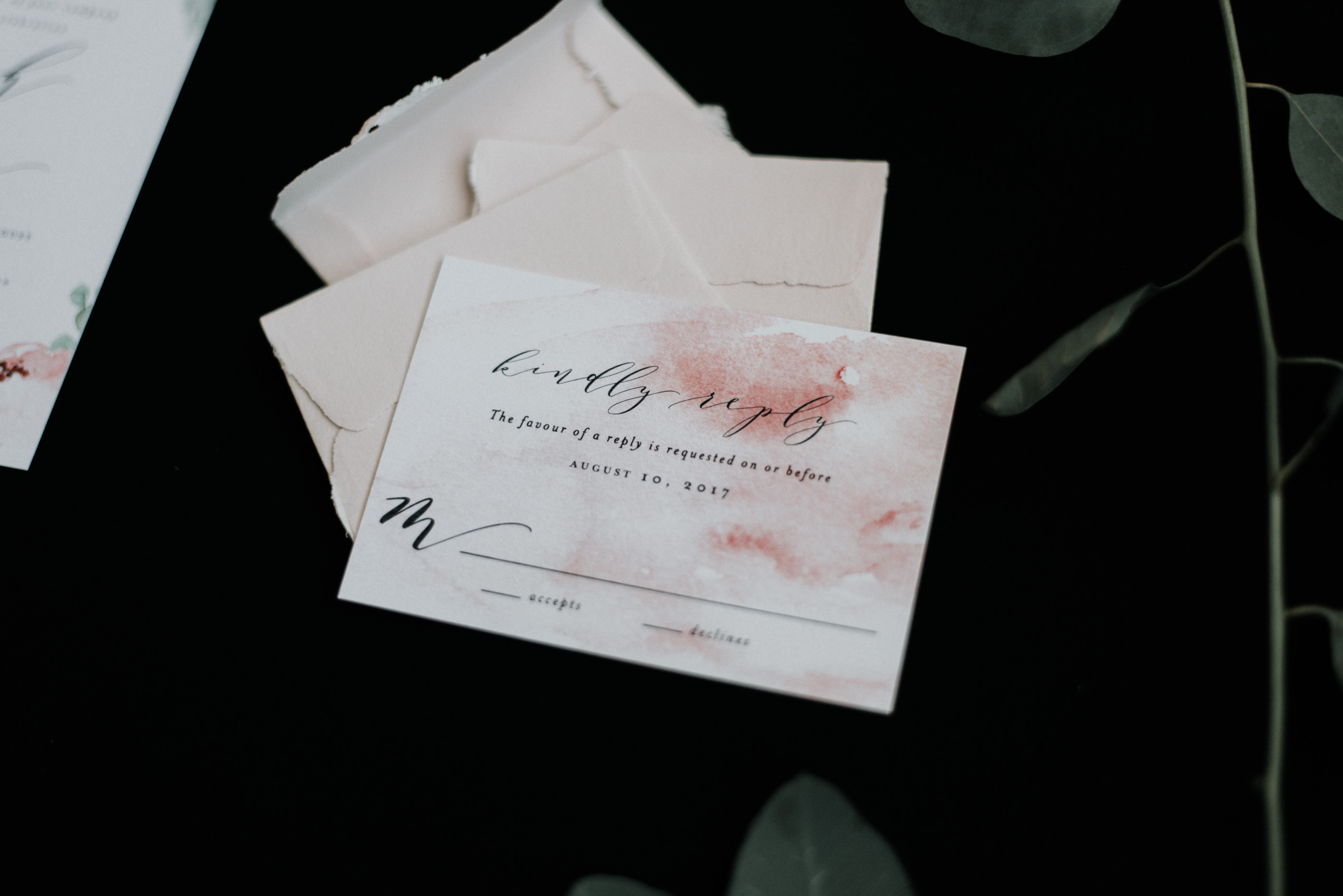
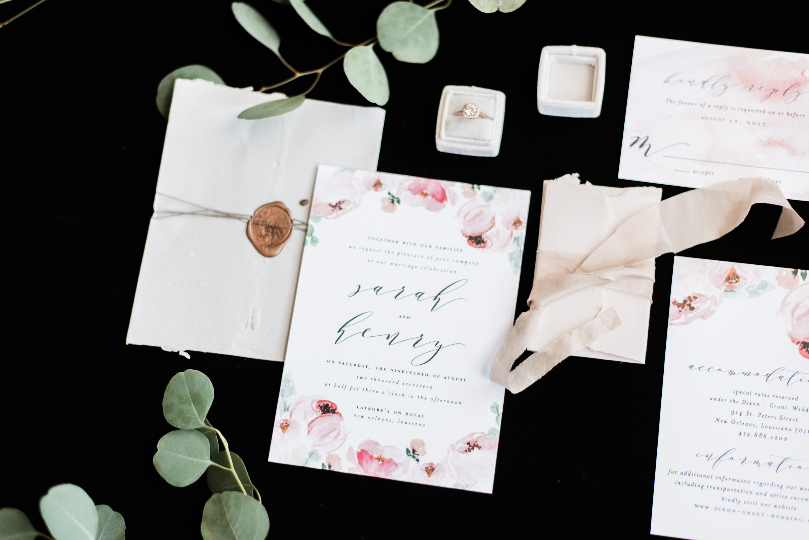
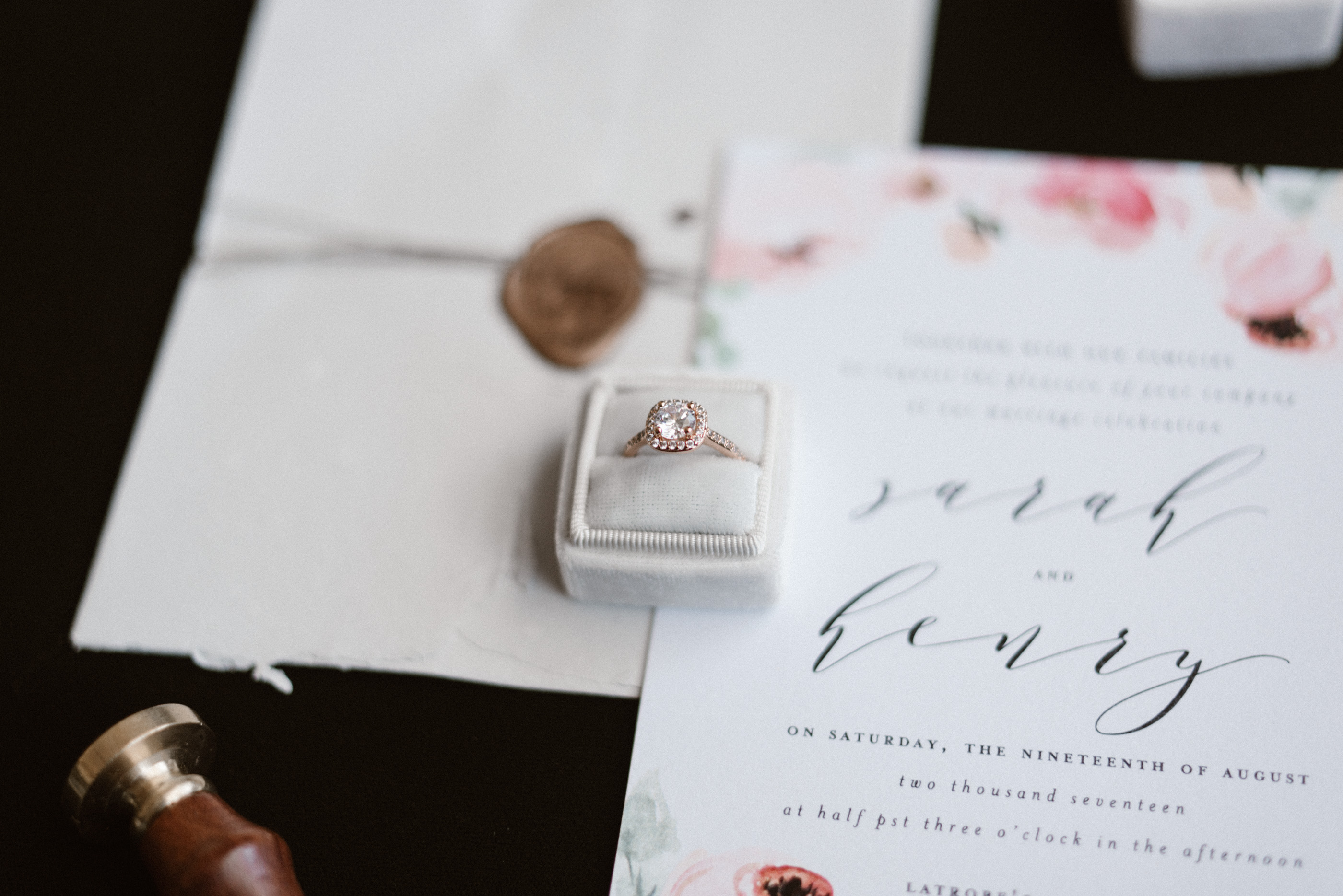
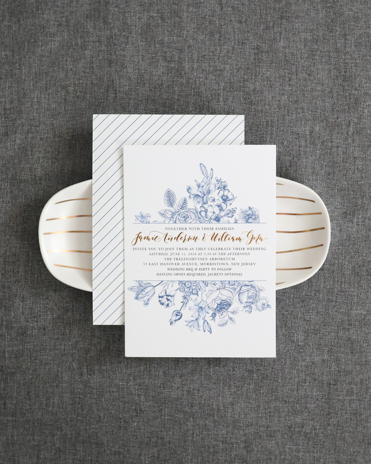
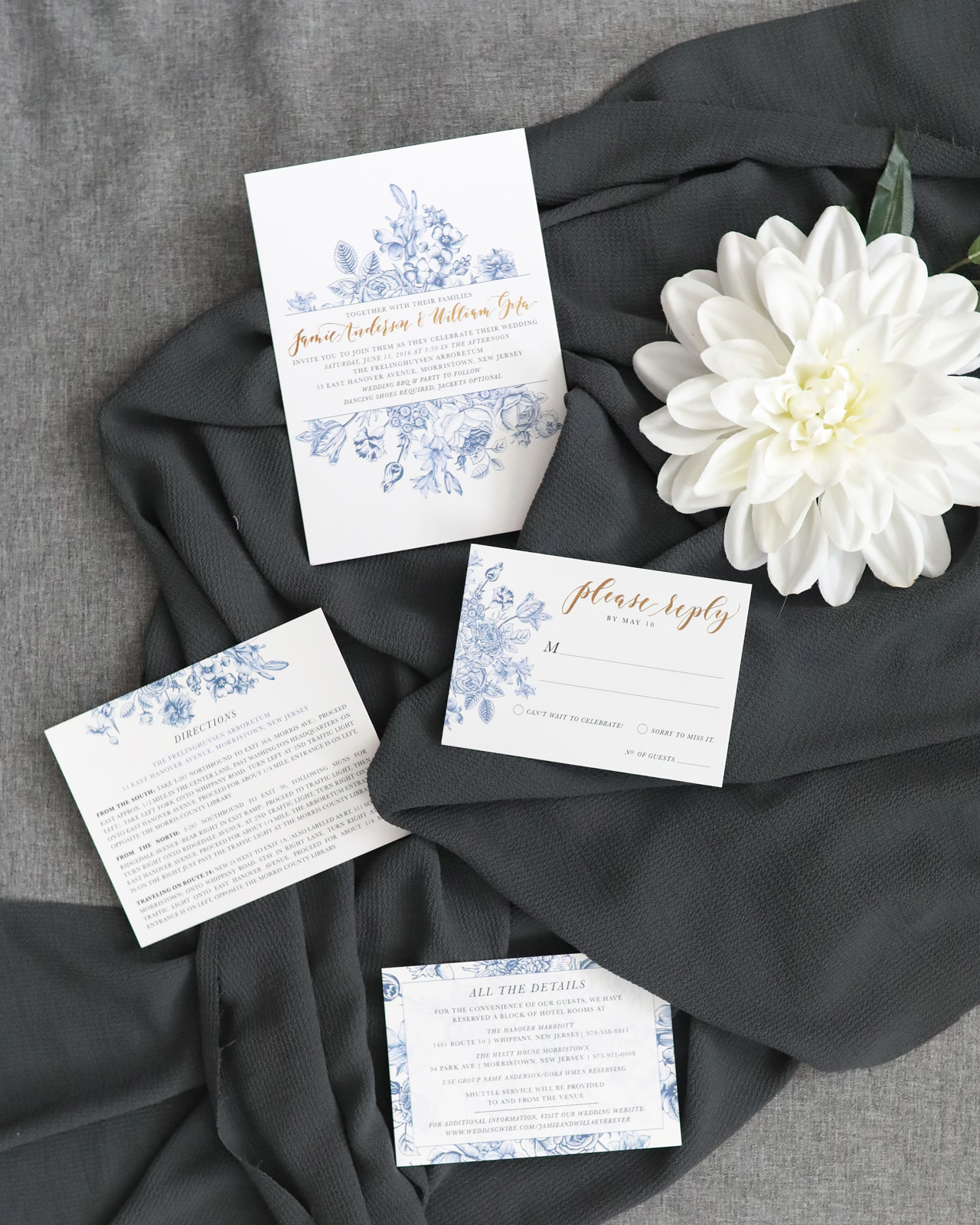
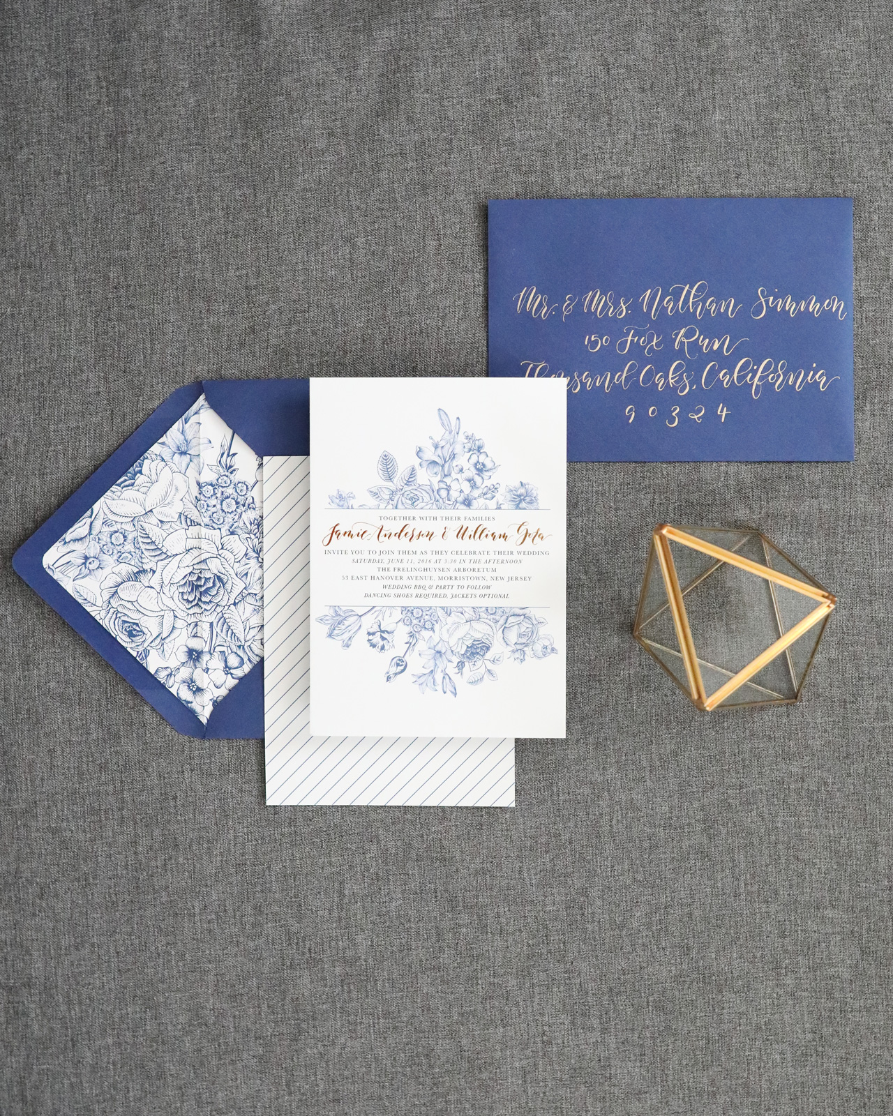
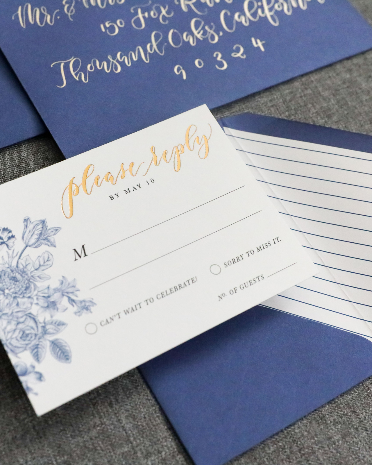
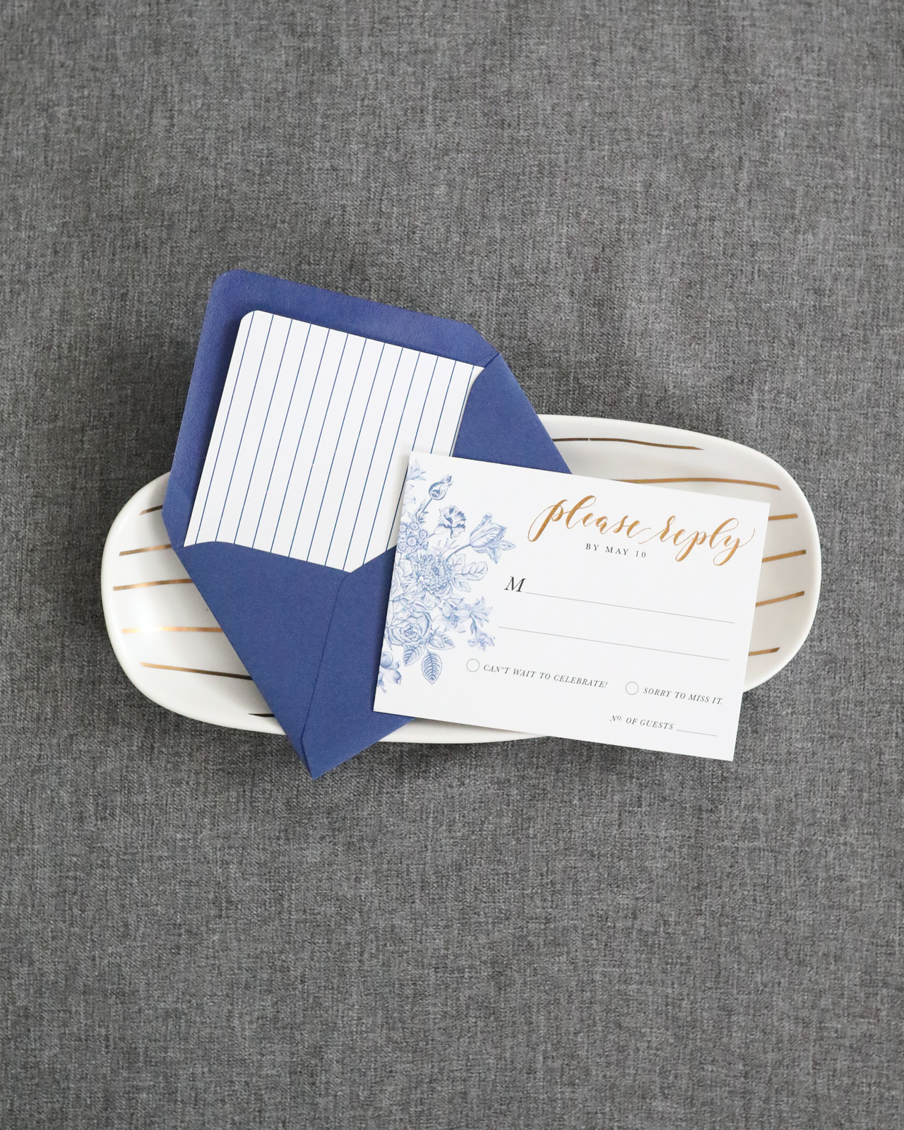
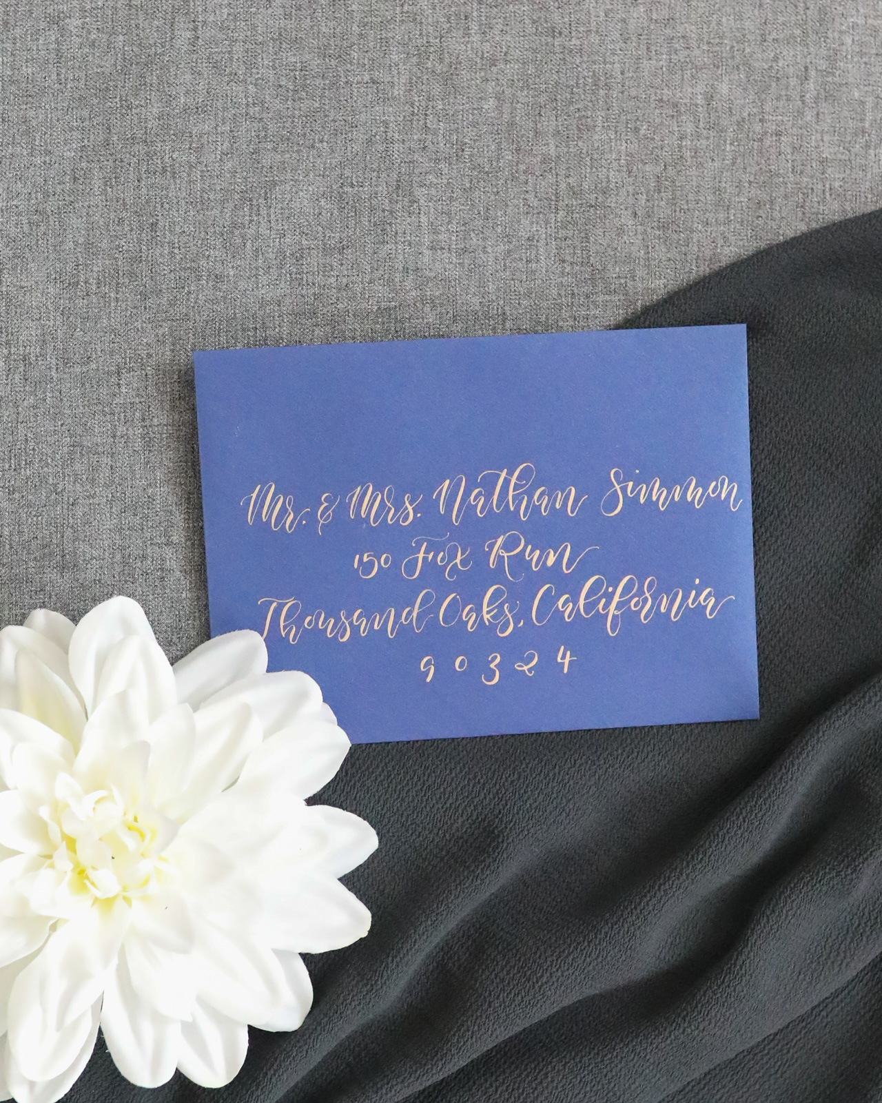
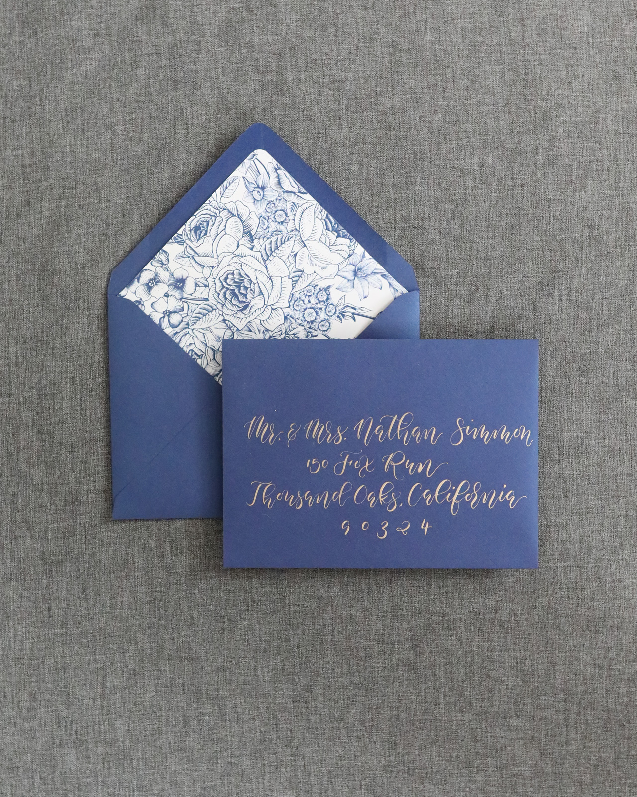
The process of working with our custom clients is a little more extensive. It always starts with a consultation (hopefully in person, but often over the phone too) where I get the all the details of their event and their overall vision. After the administrative details are worked out (quotes and contracts), we pull samples and swatches and start initial sketches of the design concept. Those sketches turn into a digitally mocked-up design, which we send to the client for review. We’ll go through a series of revisions and once the final design is approved, we finalize the art files and prep them for printing.

Behind the Stationery: Stephanie Clarke of Dahlia Press

As we print all of our greetings in house, we’ve relied on a list of trusted vendors to help us when it comes to printing our custom projects. They offer additional services such as foil stamping and die cutting, which allows us to expand our list of offerings and frees up our schedule to work on more projects.

Behind the Stationery: Stephanie Clarke of Dahlia Press

Studio images are by Krista Welch Creative. All other photos are by Dahlia Press.

Want to be featured in the Behind the Stationery column? Reach out to Megan at megan [at] ohsobeautifulpaper [dot] com for more details.