Wedding Invitations — Belamour Design

Victoria from Belamour Design recently sent over a few designs from her portfolio.  Victoria likes to focus on the details (or the “elements of style” as she calls them), often resulting in an invitation design inspired by the style of the event itself.  Since your wedding invitations are usually the first indication your guests will receive of your wedding style (black-tie ballroom, informal backyard, semi-formal garden wedding, etc.), I thought I’d include two designs for two very different weddings. First up, a blue and white ocean-inspired invitation design for a laid-back seaside wedding:

Seaside-Blue-White-Wedding-Invitation

The second design comes from the opposite end of the design spectrum, with beautiful calligraphy details perfect for a more formal, black tie ballroom wedding:

Calligraphy-Black-White-Wedding-Invitations

Thanks Victoria!  So tell me - how are you incorporating your wedding style into your invitations?

{image credits: Belamour Design}

Kristy + Adam’s Hand-Painted Letterpress Save the Dates

Before we jump back into holiday cards, I just have to share these amazing hand-painted watercolor letterpress Save the Dates created by Kristy at Momental Designs for her upcoming 10-year vow renewal ceremony.  The pop of watercolor detail works so well with the letterpress impressions on thick cotton paper – and Kristy was kind enough to send over the background behind her design.

Letterpress-watercolor-invitations

From Kristy: Hand-painted details and original artwork are my passion.  While planning my own renewal celebration I knew letterpress had to be included but of course wanted to incorporate my signature hand-painted look.  Thus, hand-painted letterpress was born!  I simply love the very visceral, textured nature of letterpress.  When combined with juicy, romantic watercolor brushstrokes, letterpress, in my opinion is transformed to a whole new level.  The intimate touch of the pressed image first makes an impression but then the washy, romantic quality of the watercolor gives the perfect finish.

Letterpress-watercolor-invitations2

Choice of materials were extremely important for this project.  I wanted to mimic the many natural occurring textures so obvious in Zion National Park, where are renewal ceremony is taking place.  From Crane’s roughly textured cotton stock to the champagne silk ribbon and cobalt blue envelopes, every detail needed to be reminiscent of the crystal clear river, intense blue skies and towering red rock landscape of Zion.  So many of our guests have never traveled to this magical place.  The goal was to translate the Zion experience on paper in hopes of creating great anticipation of the adventure to come!

Letterpress-watercolor-invitations8

Original illustration didn’t stop at the save the date cover!  Each page features one of my sketches with watercolor details added throughout.  At the center of the booklet is a hand-drawn map which is not only functional but seems to unify the look overall.  Envelope liners are reproductions of vintage topographical maps.  I just love the rich orange and blue colors — nothing needed to be altered!

Letterpress-watercolor-invitations6

Betsy Dunlap created a printable file with the calligraphy for my envelope backflap.  This was a great budget option I would add — it certainly doesn’t hurt to save when you can!  I am saving patiently to have Betsy pen all the invitation outer envelopes!  When I first contacted Betsy I proclaimed that this particular lettering style was simply perfect as it really mimicked the red rock landscape of Zion!  Thank you Betsy for your artistry!

Thanks so much Kristy!  You can read more about Kristy’s design process right here and see some of her other recent projects here.

{image credits: Momental Designs}

Jenya + André’s Illustrated Chandelier Wedding Invitations

As you may have noticed, I adore wedding invitations that incorporate hand-illustrated details – and today’s real invitations are no exception.  These letterpress invitations were inspired by the chandelier in a summer house on Cape Cod that the bride, Jenya, shares with freelance designer Nina Max Daly, who designed these beautiful invitations.  This design has such a wonderful and personal story behind it, I’ll turn things over to Nina…

From Nina:  My lifelong friend Jenya and her now husband André decided to get married this past summer on a small compound of cottages on Cape Cod that our families have been renting together for over 20 years. Jenya is also a graphic designer so I presumed she’d want to do her invitation herself, but she was way too overwhelmed with planning a huge wedding on her own to do it, and asked me. I was honored.

Chandelier-Wedding-Invitation

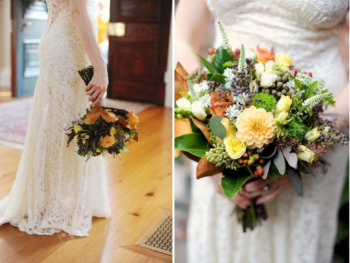
When I first spoke to Jenya about the invitation she had little idea of what she wanted.  She said the wedding would be ‘very casual and very elegant’ with lots of really good food.  She said that she wanted lots of re-purposing and collaboration.  All of the serving dishes would be from our houses, rather than use rental serveware.  The flowers would be what was growing on the property, hydrangeas,  the vases collected from various family members.  My mom would make the wedding cake.

Chandelier-Wedding-Invitation2

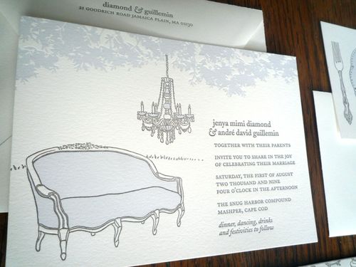
Over the dance floor, she planned to hang the chandelier that my mom found in someone’s trash and which now hung in the tiny sun room of the Cape house that Jenya, my sister Anna, and I share each summer (and now also with one kid and two husbands).  She thought we could bring couches out from the houses and put them around the dance floor so people would feel comfortable either lounging or dancing late into the night.

Chandelier-Wedding-Invitation3

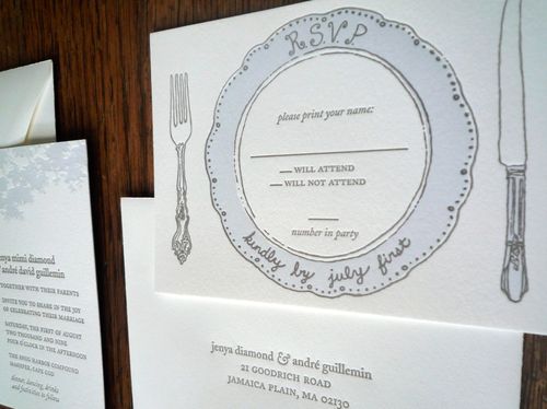
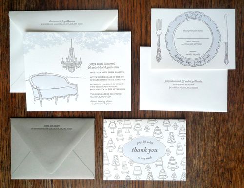
The chandelier image really resonated with me, as did the idea of the couches and re-purposed dishes. So I went with it.  I love to draw, so I started drawing, a couch like the one in our Cape house, a chandelier like ours, some of my favorite old dishes and silverware.  For color, I chose a lighter shade of hydrangea blue.

Chandelier-Save-the-Date

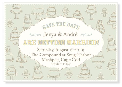
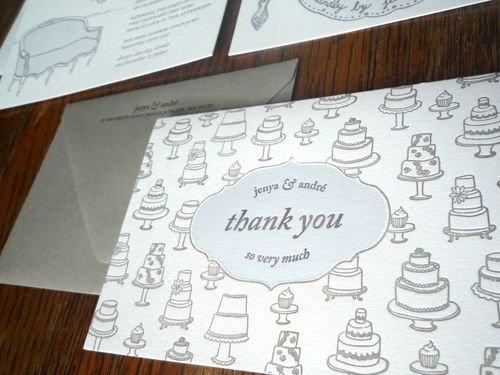
Jenya needed her save the date card in a hurry so she went with a cake repeat e-card design that I had already made. I re-used the cake design for the thank you card. When my mom saw the design for the thank you card, she was inspired to make several small cakes, like those on the card rather than one big wedding cake.

Chandelier-Wedding-Invitation4

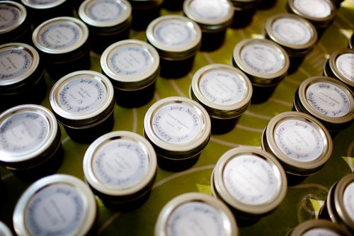
André’s good friend Deb is a letterpress printer and owns Smudge Ink.  Deb and Jenya printed the invitations together on a weekend. After the invitations had gone out, Jenya re-purposed several of the designs to use as signage, table cards and gift labels for the wedding favors, little jars of raspberry jam that Jenya’s mom mad with the raspberries we grew. The project came out beautifully and the entire wedding as well as the invitation was a true collaboration.

Wedding-Favor-Jar-Label

Seriously, how cool are these invitations?  I love the dinner plate RSVP card, not to mention all the other illustrated details from the mini wedding cakes to the couch and chandelier.  Such an incredibly sweet design, with a wonderful and personal meaning to match.  Thanks Nina!

{image credits: invitation photos by nina max daly, favor jar photos by channing johnson}

Afternoon at the Athenaeum

A few weeks ago, I had the opportunity to collaborate on a photo shoot with the ever-fabulous Kate Headley and a few of my other favorite DC-area wedding professionals — and since it offered me a chance to wear my wedding dress again (yay!), I convinced my husband to come along and get all dressed up for an afternoon at the Athenaeum in Old Town, Alexandria.

Athenaeum-Rustic-Elegance-Wedding-Floral-Arrangements

The style inspiration for the photo shoot was rustic elegance, with a color palette of soft peaches and creams, browns, and classic black and white.  My contribution (aside from being in the photos) was the stationery — I designed these square escort cards, which we hung from natural jute twine along a brick archway in the back garden patio of the venue:

Athenaeum-Script-Escort-Cards

Just for fun, I created this “Mr & Mrs” bunting — which you can download and use yourself (for personal use only, please) right here.  We hung the bunting from a small tree, but you could string up over the guestbook table or on the path to your reception location:

Athenaeum-Bunting

I also created these dinner menus, which Kelly from Design Cuisine and Maria from Ritzy Bee Events wrapped in a white cloth napkin along with a simple flower and more jute twine for each table place setting:

Athenaeum-Menus

In keeping with our rustic elegance theme for this shoot, my amazing stylist Abbey from Parlour Salon created a beautiful hairstyle with two braids leading back to a messy bun with a cute little button dahlia tucked in:

Nole-Wedding-Hair-Style-Braid

I was so happy to finally have the chance to work with Holly Chapple!  I had desperately wanted to work with Holly for my wedding last year, but sadly she was already booked on my date.  For this shoot, Holly created some truly beautiful floral arrangements, from boutonnieres to centerpieces and lush bouquets:

Athenaeum-Rustic-Elegance-Boutonnieres
Athenaeum-Rustic-Elegance-Bouquet
Athenaeum-Rustic-Elegance-Wedding-Centerpieces
Athenaeum-Rustic-Elegance-Wedding-Centerpieces2

My husband and I spent some time walking around Old Town near the Athenaeum with Kate — it was an absolutely beautiful autumn afternoon:

Nole-Andy
Nole-Andy2

Here’s a full list of everyone who participated in this photo shoot:

Location: The Athenaeum

Flowers: Holly Chapple Flowers

Hair: Abbey Castellano Parlour Salon

Stationery: Me!

Photography: Kate Headley

Styling: Maria at Ritzy Bee Events 

Styling: Kelly Seizert, Design Cuisine 

{all photographs by Kate Headley}

Business Card Ideas and Inspiration #1

I have a slight (ok, more like a major) fascination with business cards.  I love the way people infuse their personality into the design and layout of the card.  I’ve found myself drawn to a few particular design details in business card designs, so I thought I’d share a few favorites with you!

1. Cool use of pattern and negative space in the design:

Jessica-hische-pattern-business-cards{jessica hische via FPO}

Four-color-letterpress-business-card{amazing registration by SlowPrint Letterpress via card observer}

Watercolor-letterpress-business-card{watercolor letterpress business cards by dingbat press}

Negative-space-business-card{WallStreet via card observer}

2. Typography details and double-sided printing:

Vertical-typography-letterpress-business-card{shane cranford via card observer}

red letterpress photographer double-sided business card
{studio on fire}

3. Unique shapes — from circles and squares to ninja stars:

Gold-round-circle-business-card{gold lunchbox via FPO}

Ninja-star-business-card{studio on fire}

4. Laser-cut details and cards that transform into new shapes:

Laser-cut-business-card{laser-cut chipboard via jolie jolie}

Woodgrain-chair-business-card{woodgrain business card by emily berry via card observer}

Anyone else have business cards on the brain?  Or am I alone in this minor fascination?

{images from their respective sources}