Smock Everyday Stationery

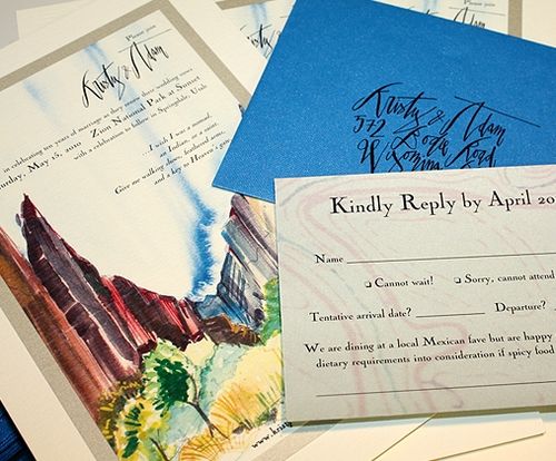
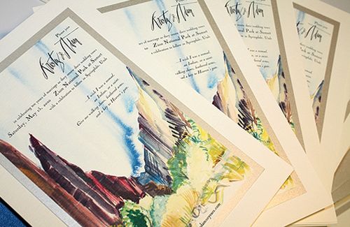
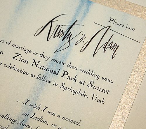
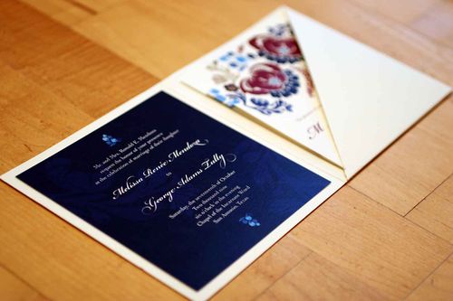
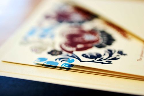
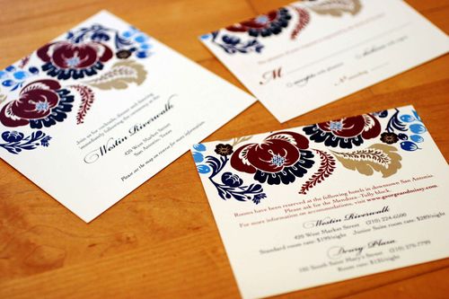
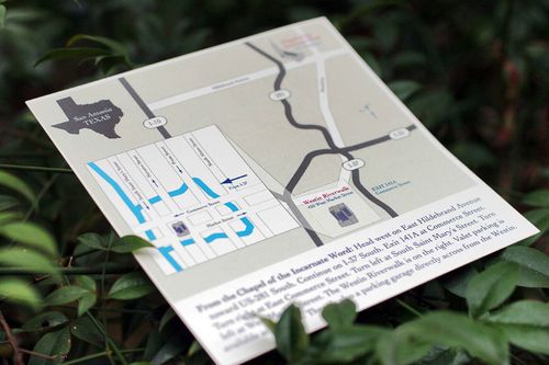
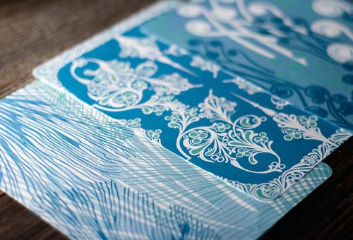
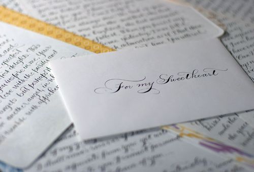
It's been a wedding-filled week over here, so I thought I'd help end the week with some gorgeous new stationery from Smock.  These town, country and isle lettersheets are blind deboss printed on the front with beautiful offset patterns on the back, all on Smock's environmentally-friendly bamboo paper:

Smock-everyday-stationery-blue
Smock-stationery-blue-closeup
Smock-everyday-stationery
Smock-everyday-stationery-ikat
Smock-everyday-stationery-pattern
Smock-everyday-stationery-yellow
Smock-stationery-yellow

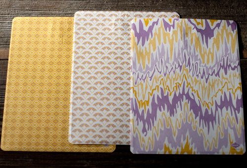
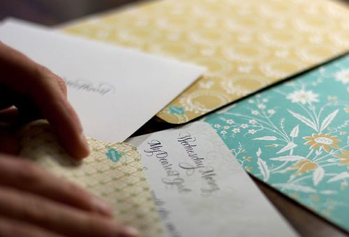
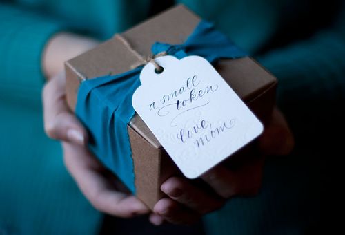
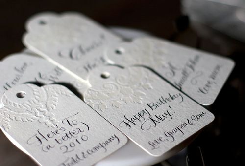
Smock also recently released a collection of equally beautiful gift tags, also with a blind deboss on the front and patterned back:

Smock-everyday-giftwrap
Smock-gift-tags
Smock-hangtag-blind-letterpress
Smock-hangtag-with-pattern
Smock-hangtag-calligraphy 

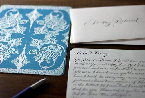
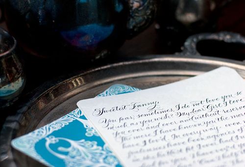
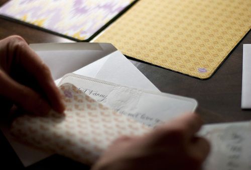
On a slightly different note — do you recognize the calligraphy text from the first set of photos?  The "Dearest Fanny" letter is from poet John Keats to Fanny Brawne, which some of you might remember from the movie Bright Star.  I finally saw the movie a few weeks ago and it was everything I had expected it to be — beautiful scenery and cinematography, amazing costumes, and utterly romantic in every sense of the word.  Even my husband, who usually teases me about my penchant for sappy period romances, loved Bright Star.  Definitely worth adding to your netflix queue if you haven't already seen it…

{image credits: Smock}

*Smock is a sponsor on Oh So Beautiful Paper, but this is not a sponsored post.  For more on my editorial policy, please click here.

Kristy + Adam’s Unique Watercolor Vow Renewal Invitations

Last year, I featured the stunningly gorgeous hand-painted letterpress Save the Dates for the 10-year vow renewal of Kristy Rice from Momental Designs.  Today, I’m thrilled that Kristy is back with her equally beautiful watercolor wedding invitations — with a design inspired by the majesty of Zion National Park, where Kristy’s vow renewal will take place:

Momental-zion-invitation-suite

From Kristy: The save the date design was meant to introduce our guests to the beauty of Zion National Park in Utah but the invitations were meant to immerse them!

Momental-zion-watercolor-invitations
Momental-watercolor-invitation-text

Momental-zion-invitation-rsvp

After many, many trips to Zion I have developed a serious collection of watercolor sketches and paintings.  A full color watercolor painting worked into the actual invitation layout seemed the perfect option.

Momental-zion-invitations-process1

The particular painting chosen for the invitation was created on one very sunny October day at a quiet spot near the crystal waters of the Virgin River.

Zion-national-park

I sat on the cool rocks near the water and proceeded to paint for nearly 3 hours, leaving with a detailed and expressive painting and also a bit of a sunburn!

Momental-zion-watercolor-detail2

After each invitation was reproduced, shimmering copper and cobalt blue hand painted strokes of color were added to each individual card.  I wanted to give our guests a sense of how the water reflects light on the towering rocks and dances shadows in every direction.

Momental-zion-envelopes-calligraphy
Momental-zion-invitations-calligraphy

The calligraphy for the names and addresses on the outer envelopes, as well as our names on the main invitation, was done by the talented Betsy Dunlap.  I used the print ready image that Betsy created for our save the dates everywhere I could, from the invitation to the rsvp response and outer envelope backflap.

Momental-zion-watercolor-invitation-detail

Size and scale were important in this design since the redrock landscape of Zion is so towering and massive.  The finished invite measured nearly 6.5 x 9.5 inches!

You can check out Kristy’s letterpress save the dates right here, and you can see lots more of her beautiful work over on Momental Designs.  Thank you so much Kristy!

{image credits: kristy rice}

More Graduation Announcements!

When the folks over at Envelopments heard that I was looking for graduation announcement ideas, they were kind enough to send over a few examples of recent designs — all in different color palettes and sizes. So let's get started!

Graduation-announcements-purple-charcoal{love this announcement for the high school graduation of a youngest child from high school — it probably represents both her feelings as well as those of her parents!}

Graduation-announcements-red-aqua
Graduation-announcement-charcoal-yellow
Graduation-announcements-green-floral-monarch
Graduation-announcement-psychology-degree{a cool idea for a student graduating with a psychology degree}

Graduation-announcements-blue-gold{a lovely script font for a more traditional design}

There's lots more over at Envelopments — check out their website here and blog here!

{image credits: envelopments}

Floral Japanese Paper Journals

Today is the first day that truly feels like Spring – I can walk outside without having to wear a coat (yay!), little buds are popping up all over the place, and things suddenly feel more green, not brown and gray.  And judging by these brightly colored japanese paper journals and photo albums in the new Spring collection from Campbell Raw Press, I'm not the only one with a major case of Spring fever:

Campbell-raw-press-coptic-journal-blue-floral
Campbell-raw-press-photo-album-yellow-floral
Campbell-raw-press-coptic-journal-green-floral
Campbell-raw-press-photo-album-yellow-japanese-floral
Campbell-raw-press-coptic-journal-red-floral
Check out more of these beautiful journals – and some gorgeous spring letterpress stationery – right here!

{image credits: campbell raw press}

Melissa + George’s Vibrant Folk Art Wedding Invitations

Melissa and George were married last October in San Antonio, Texas.  Melissa works as a graphic designer, so naturally she decided to take on the task of designing her own wedding invitations.  With her bold pattern selections and color palette, Melissa infused her invitations with a folk art-inspired feel, while still maintaining a traditional layout that suited her semi-formal wedding:

Folk-Art-Floral-Wedding-Invitations-Suite

From Melissa: I loved the idea of a square format invitation and a full-bleed (no white border) design, but knew I needed to include a lot of information and wanted a more formal look-and-feel, since our church wedding and reception was more on the traditional side.

Folk-Art-Floral-Wedding-Invitations
Folk-Art-Floral-Wedding-Invitations-Detail

I sourced vector artwork from Shutterstock and colored and rearranged the pattern until I found one I liked. Our wedding colors were navy, cranberry and cream with a hint of turquoise, which I think was fully reflected in the final design.

Folk-Art-Floral-Wedding-Invitations-Enclosures

Folk-Art-Floral-Wedding-Invitations-Directions

We had more than half of our guests traveling from out of town, so I needed to include hotel and transportation information and a map of the area, along with our web site url and RSVP postcard.  The three stacked cards were designed to look like one cohesive image, but staggered to fit all the necessary details.  The diagonal pocket folder and envelopes were from Paper Source.

Folk-Art-Floral-Wedding-Invitations-Assembly

The invitations were digitally printed by Ginny’s Printing in Austin, Texas on 100# Classic Crest natural cover.  My mom, sisters, grandmother and bridesmaids helped assemble more than 200 invitations by affixing glue dots to the back of the navy blue card and attaching the cranberry belly bands.

Folk-Art-Floral-Wedding-Invitations-RSVP
Folk-Art-Floral-Wedding-Invitations-Envelope
My mom hand-addressed each envelope — and she also calligraphed the guests’ names on small square cards attached to the belly band around the invitation.  She’s a champ!

Melissa is now offering her wedding invitation design and several other designs as printable invitations in her etsy shop — check out the full selection right here!

{image credits: invitation photos by Katie Shagman, assembly photos by Melissa}