Erin + Jeremy’s Literary Vintage-Inspired Wedding Invitations

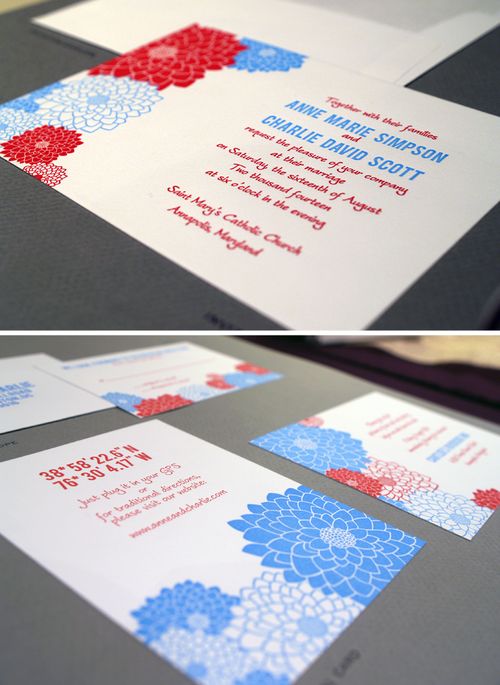
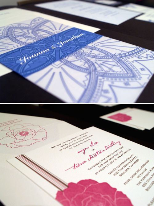
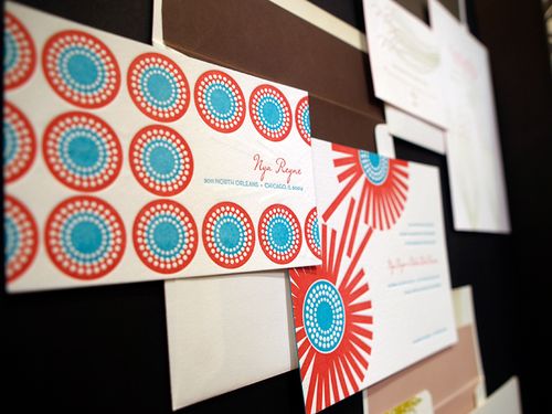
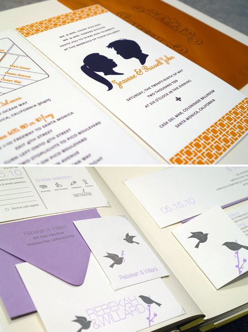
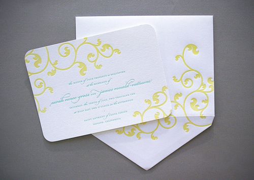
I love the concept behind this week’s real invitations a collection of individual pieces resembling vintage paper ephemera from the 1800s through the 1950s!  Hello!Lucky, the design team behind this custom wedding invitation suite, combined letterpress and digital printing to create a sense of romance and nostalgia:

Hello-Lucky-Vintage-Paper-Ephemera-Wedding-Invitation12

From the Hello!Lucky team: We designed these invitations for our dear friend Erin and her fiance Jeremy for their upcoming destination wedding in Calistoga, California.  The bride and groom are both academics Erin teaches law and Jeremy is an astrophysicist so they wanted their invitation to have a book-ish feel.

Hello-Lucky-Vintage-Paper-Ephemera-Wedding-Invitation7
Hello-Lucky-Vintage-Paper-Ephemera-Wedding-Invitation6

We decided to use the concept of a collection of found paper memorabilia including a book-page invitation, a snapshot of the bride and groom, map and shuttle bus enclosures, brunch ticket, and RSVP telegram giving the invitation suite a vintage, romantic and nostalgic feel.

Hello-Lucky-Vintage-Paper-Ephemera-Wedding-Invitation11
Hello-Lucky-Vintage-Paper-Ephemera-Wedding-Invitation2

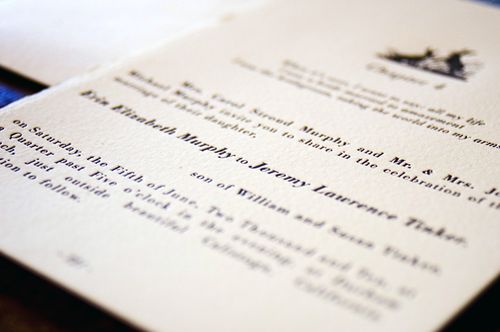
The wedding invitation is inspired by the opening chapter of a classic novel (think Jane Austen) and was letterpress printed on deckle-edged paper to emulate a page torn from an authentic book.  Wedding details are printed on a vintage-style postcard from Calistoga, the wedding’s location.


Hello-Lucky-Vintage-Paper-Ephemera-Wedding-Invitation10
Hello-Lucky-Vintage-Paper-Ephemera-Wedding-Invitation1
Hello-Lucky-Vintage-Paper-Ephemera-Wedding-Invitation3

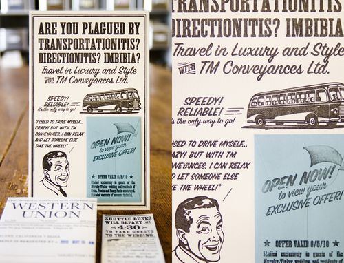
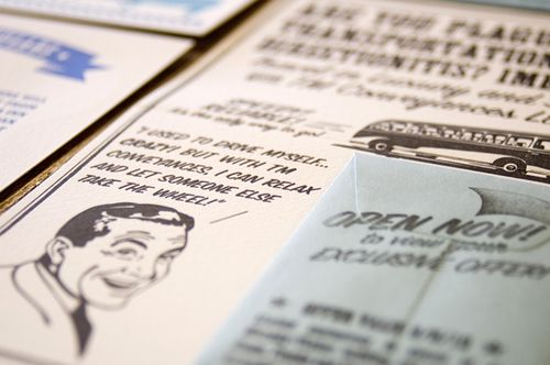
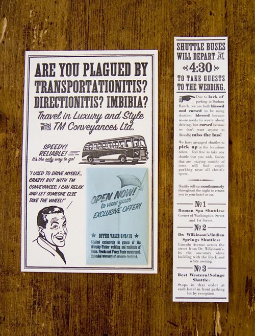
The RSVP card is a letterpress printed Western Union telegram and includes witty, mad-lib style blanks that guests can fill out.  We also designed a 1950’s-style “advertisement” for the free wedding shuttle, including a information card enclosed in a small coin envelope, as well as a vintage bus-ticket invitation to the farewell brunch.

Hello-Lucky-Vintage-Paper-Ephemera-Wedding-Invitation4
Hello-Lucky-Vintage-Paper-Ephemera-Wedding-Invitation13

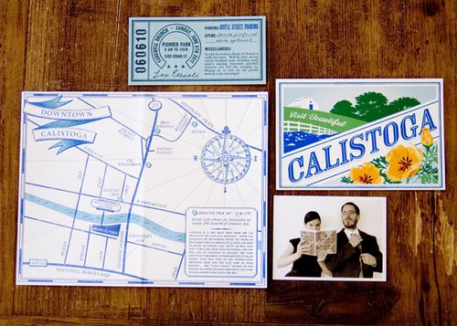
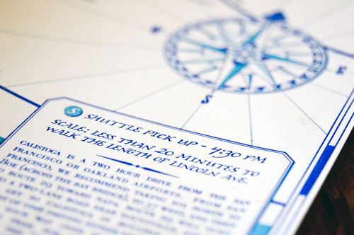
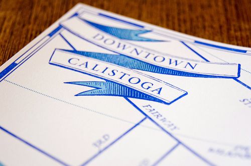
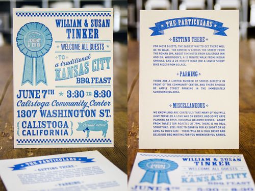
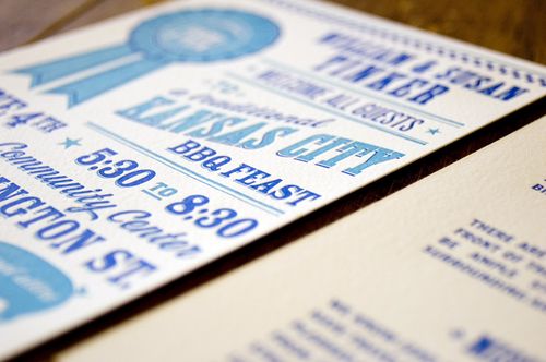
A old-fashioned map of downtown Calistoga guides guests to their hotels and local attractions.  We also designed a state fair-inspired rehearsal dinner invitation for a Kansas City style BBQ (the groom hails from Kansas City), featuring a picnic napkin checker pattern and a blue-ribbon pig.  Finally, we included a small black and white snapshot of the bride and groom posing in a bookish manner.

Sigh… I love the romanticism of the novel page invitation, while the accompanying enclosures bring an overall balance to the full suite.  So lovely!

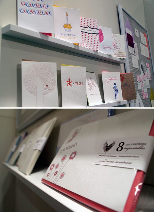
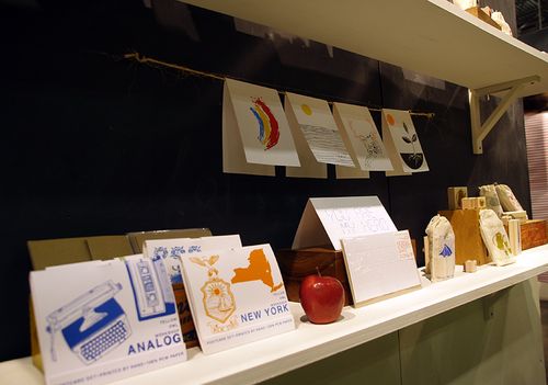
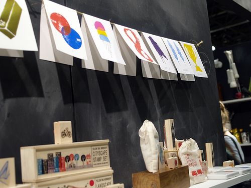
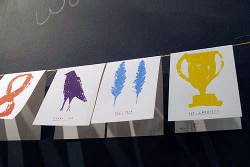
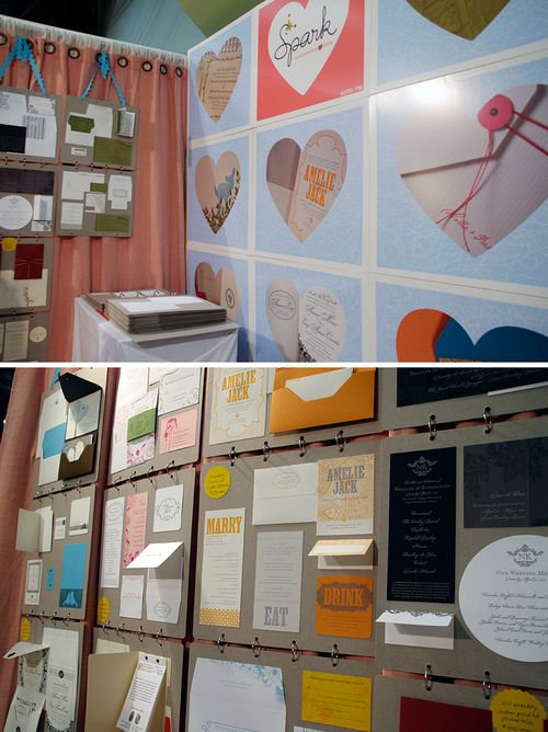
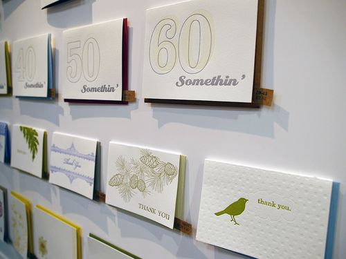
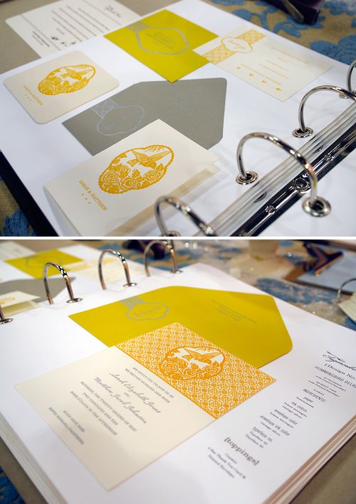
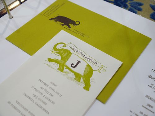
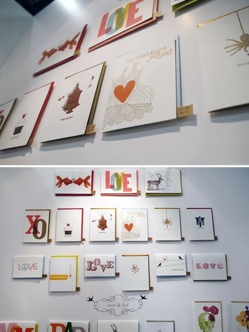
{image credits: Hello!Lucky}

*Hello!Lucky is one of my fantastic sponsors; for more on my editorial policy, please click here.

NSS 2010 – Part 10

Before I wrap up my coverage of this year’s National Stationery Show tomorrow, I’ve got a few more booths that I’d like to share with you.  First up, another perennial favorite – Fugu Fugu Press – with their incredibly sweet letterpress cards and new fill-in-the-blank letterpress dinner party invitations:

Fugu-Fugu-Press-NSS1
Fugu-Fugu-Press-NSS2
Fugu-Fugu-Press-NSS3
Fugu-Fugu-Press-NSS4{fugu fugu press}

I’m always impressed by the work from Maginating Letterpress – from the adorable characters to the near-perfect letterpress registration on each card, no detail is overlooked:

Maginating-NSS1
Maginating-NSS2{quite possibly the cutest card ever!}

Maginating-NSS3
Maginating-NSS4 {love the spot varnish on these two holiday cards}

Maginating-NSS5 {maginating letterpress}

I also stopped by the Pearl & Marmalade and The Great Lakes booth to check out their latest cards, prints, and get a sneak peek at their upcoming 2011 calendars:

Pearl-Marmalade-NSS1
Pearl-Marmalade-NSS2
Pearl-Marmalade-NSS3 {pearl & marmalade}

The-Great-Lakes-NSS1
The-Great-Lakes-NSS2
The-Great-Lakes-NSS3
The-Great-Lakes-NSS4{the great lakes}

I spent some time catching up with Carrie and Hal from Red Cap Cards and checking out their latest greeting cards (I always love Carrie’s illustrated Halloween cards), notebooks, and a new series of cards featuring a collaboration with illustrator Blanca Gomez:

Red-Cap-Cards-NSS1
Red-Cap-Cards-NSS2
Red-Cap-Cards-NSS3{Carrie’s illustrations look even more amazing when letterpress printed!}

Red-Cap-Cards-NSS4
Red-Cap-Cards-NSS5{red cap cards}

Over on the other side of the Javits Center, I probably could have spent an hour just in the Egg Press booth gawking at all of their new cards – not to mention the new wrapping paper!

Egg-Press-NSS1
Egg-Press-NSS2
Egg-Press-NSS-Calendar {a sneak peek at the 2011 desktop calendar}

Egg-Press-NSS3 {love the multi-dimensional elements of this die cut birthday card}

Egg-Press-NSS4
Egg-Press-NSS5
Egg-Press-NSS6{egg press}

Old School Stationers also had a bunch of new botanical prints for this year’s show – my favorites are the bees and mason jar prints below – as well as new installments in their series of animal prints and cards:

Old-School-Stationers-NSS-Calendar
Old-School-Stationers-NSS1
Old-School-Stationers-NSS2
Old-School-Stationers-NSS3
Old-School-Stationers-NSS4 {old school stationers}

I always love stopping by the Blue Barnhouse booth — Brandon’s letterpress cards are both impeccably printed and completely hilarious:

Blue-Barnhouse-NSS1
Blue-Barnhouse-NSS2
Blue-Barnhouse-NSS3{love this “build a community” letterpress print}

Blue-Barnhouse-NSS4{blue barnhouse}

I always love running into the ladies (and fellow DC residents!) of Haute Papier — their new wedding invitation book is stunning!

Haute-Papier-NSS1
Haute-Papier-NSS2
Haute-Papier-NSS3
Haute-Papier-NSS4{haute papier}

Of course, a trip to the Stationery Show wouldn’t be complete (at least for me) without a trip over to the Smock booth to check out their latest wedding invitations and everyday stationery designs:

Smock-NSS1
Smock-NSS2
Smock-NSS-Calligraphy
Smock-NSS3
Smock-NSS6
Smock-NSS4
Smock-NSS7{smock}

I’ve got a few final booths left for tomorrow, plus a big announcement coming up a bit later in the week!

{all photos by Oh So Beautiful Paper}

*Smock is one of my fantastic sponsors, for more on my editorial policy please click here.

NSS 2010 – Part 9

We’re definitely nearing the home stretch in this year’s Stationery Show coverage, but I have a few more booths from NSS 2010 to share with you!  First up, Sweet Letter Press out of Boulder, Colorado with an adorable collection of wedding invitations and letterpress stationery:

Sweet-Letterpress-NSS1
Sweet-Letterpress-NSS2
Sweet-Letterpress-NSS3
Sweet-Letterpress-NSS4

Sweet-Letterpress-NSS5{sweet letter press}

Yellow Owl Workshop exhibited this year as part of the Aesthetic Movement booth (along with Austin Press and a few others), where they showcased their latest rubber stamp sets, correspondence sets, and screen printed note cards:

Yellow-Owl-NSS1
Yellow-Owl-NSS2
Yellow-Owl-NSS3
Yellow-Owl-NSS4{yellow owl workshop}

You already know that I’m a huge fan of Spark Letterpress, and it was wonderful to finally see their work — from their gorgeous wedding invitations to holiday cards — in person at this year’s show!

Spark-NSS1
Spark-NSS2-Wedding
Spark-NSS-Holiday
Spark-NSS3-Wedding
Spark-NSS-Chipboard-Blue-Wedding-Invitation
Spark-NSS-Green-Brown-Wedding-Invitation
Spark-NSS-Map-Wedding-Invitation{spark letterpress}

Paper Loop is always one of my favorite stops at the Stationery Show — Sara and Rob create adorable illustrated greeting cards and I always look forward to seeing their latest creations!

Paper-Loop-NSS1
Paper-Loop-NSS2
Paper-Loop-NSS3
Paper-Loop-NSS4{paper loop}

After seeing the sneak peek from Avie Designs last week, I was super-excited to see the entire booth in person.  Avis pulled together a wonderful collection of cards, invitations, and gift wrap for this year’s show:

Avie-Designs-NSS1
Avie-Designs-NSS2
Avie-Designs-NSS3
Avie-Designs-NSS4
Avie-Designs-NSS5{avie designs}

I somehow missed Kamal’s booth at last year’s show, so I was thrilled to finally meet her this year!  Luckily, Kamal was in a corner booth this year, which gave her plenty of space to spread out and showcase her gorgeous stationery:

Kamal-NSS1
Kamal-NSS2
Kamal-NSS3
Kamal-NSS4{one of Kamal’s beautiful wedding invitations for Bella Figura}

Kamal-NSS5
Kamal-NSS6
Kamal-NSS7{kamal}

The ladies from Sugarcube Press were back at this year’s show with a ton of new cards, not to mention the adorable 6-week-old Sugarcube baby!  Unfortunately, I don’t have any photos of the baby, but I did manage to get a few of the booth:

Sugarcube-Press-NSS1
Sugarcube-Press-NSS2

{love the spot varnish and blind impressions on the cards above}

Sugarcube-Press-NSS3-Orange-Gray
Sugarcube-Press-NSS4-Baby
Sugarcube-Press-NSS5
Sugarcube-Press-NSS6{sugarcube press}

I loved the mix of sweet and saucy over at Tiselle — from the beautiful wedding invitations and fill-in party invitations to the baby mama and braille card series:

Tiselle-NSS1
Tiselle-NSS2
Tiselle-NSS3
Tiselle-NSS4
Tiselle-NSS5
Tiselle-NSS6
Tiselle-NSS7-Wedding{tiselle}

Some of you may have seen a preview of the L2 Design Collective booth on twitter — the “I saw it on” card series was one of my favorites from the show:

L2-Design-NSS1
L2-Design-NSS2
L2-Design-NSS3
L2-Design-NSS4{L2 Design Collective}

Check back tomorrow for a few more booths from NSS 2010!

{all photos by Oh So Beautiful Paper}

*Spark Letterpress is one of my fabulous sponsors, please click here for more on my editorial policy.

Modern Geometric Pattern Wedding Invitation

I thought I’d take a quick break from NSS previews this morning to share a gorgeous wedding invitation from Dauphine Press!  Created for a July wedding, this invitation suite features bold pops of color and beautiful pattern details inspired by quilts made by the bride’s grandmother!

Dauphine-Yellow-Blue-Modern-Wedding-Invitation

The design team at Dauphine Press set out to create a beautiful wedding invitation that balanced modern and feminine design elements, including a custom vine motif and crisp geometric pattern.  They also chose to orient the invitation card horizontally instead of vertically for a less traditional approach.

Dauphine-Yellow-Blue-Modern-Wedding-Invitation-Suite

The overall suite includes a mix of traditional and contemporary elements. Dauphine Press included inner and outer envelopes and center-aligned typography to represent the traditional church ceremony, while also adding pops of color and pattern details.  The unexpected little details and the color palette made the design a perfect reflection of the couples’ warm and sunny personalities.

Dauphine-Yellow-Blue-Modern-Wedding-Invitation2

The color palette for the invitation suite incorporated the groom’s favorite color, blue, with contrasting shades of yellow.  The combination of light turquoise and bright yellow reminded the bride of summers spent at the beach or by the pool — perfect for a July wedding!

Dauphine-Yellow-Blue-Modern-Wedding-Invitation-Envelope

The geometric circular pattern used on both the back of the Save the Dates as well as the invitation envelope liners was inspired by one of the bride’s grandmother’s patterned quilts!

Dauphine-Yellow-Blue-Modern-Wedding-Save-the-Date-Geometric-Pattern

From the bride, Sarah: One of my Grandmother’s wedding quilts influenced the design. Having so many of her quilts in my life, I felt an instant connection to the pattern.  I love how the clean geometric lines can also play into a stylized floral design, though while I love floral patterns, I wanted something that resonated with both James and me.

Dauphine-Yellow-Blue-Modern-Wedding-Save-the-Date

{image credits: dauphine press}

Bonnie’s Bun in the Oven Baby Shower Invitations

Bonnie from Tenn Hens Design sent over some photos from her recent baby shower, and the entire shower — from the red and blue color palette to the sweet hand-lettering to the mix of old and new stamps — is just so completely adorable that I broke out into a great big smile when I first opened up Bonnie's e-mail.  Let's start with the shower invitations.

Red-aqua-baby-shower-invitations-with-vintage-stamps

From Bonnie: The design inspiration and shower theme all stemmed from my childhood nickname — "Buns."  My friends today still call me that some 20 years later!  So we thought "bun in the oven" was an appropriate theme for my shower.  And since I'm not finding out the gender of our baby, we wanted to keep the colors relatively gender neutral and went with a color palette of red and shades of light blue. 

Red-aqua-baby-shower-invitations-with-vintage-stamps2

We illustrated the type and design and made it very loose and imperfect.  We then used a corner cutter and mounted it to a colored sheet of card stock left over from a recent project so that the invitations ranged in border color from light blue to teal.  We also lined the envelopes with paper stock from Michaels. 

Red-aqua-baby-shower-invitations-with-vintage-stamps3

Then we tied the bakers twine around the whole card for an extra little touch.  For the envelopes, we addressed them in the same style as the lettering on the invitation.  We also used old stamps I'd collected, mixed with some new ones (we especially love the new abstract art stamps since they're oversize) and created a little collage of stamps on each envelope.

Red-aqua-baby-shower-quiz

We also found ways to continue the design theme through to the party through custom napkin tags, food tags & a baby quiz — all of which were super easy to make and print in the office.

Red-aqua-baby-shower-napkin-tags
Red-aqua-baby-shower

Thanks so much Bonnie!  Bonnie has posted a bunch of additional photos from the shower on her personal blog, Carolina Postcard.  You can also check out more from Bonnie (and her business partner, Currier) over on the Tenn Hens Design website and blog.

{image credits: tenn hens design}