Elegant Rustic Coral Wedding Invitations
Beautiful modern calligraphy paired with a fantastic vintage coral velvet ribbon? Yes, please! These elegant rustic coral wedding invitations from Melissa of Atheneum Creative pair elegant letterpress printed calligraphy with a sophisticated gray, white, and coral color palette and rustic wood details throughout the invitation suite. Absolutely gorgeous!
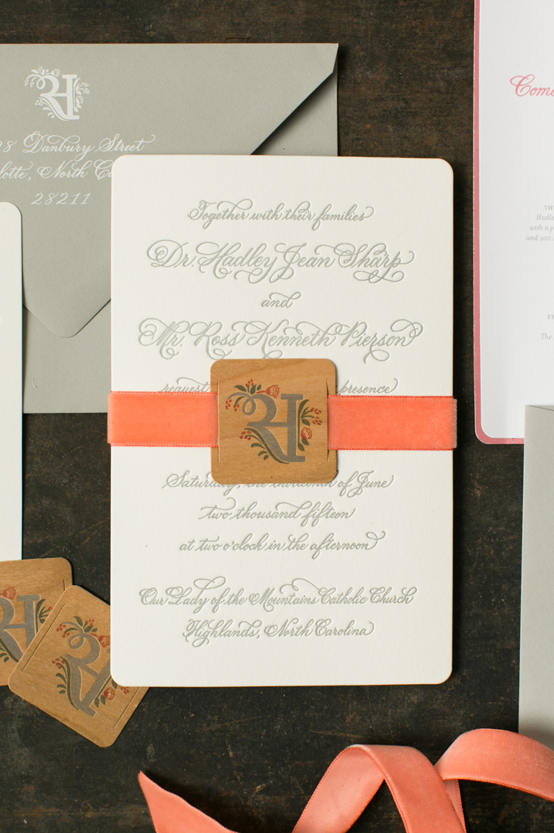
From Melissa: Hadley and Ross planned a rustic wedding in the mountains, but wanted their wedding to be sophisticated and elegant at the same time. We started working on their wedding monogram and their wedding stationery with that concept in mind: rustic, modern, and softly elegant.
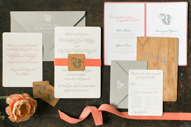
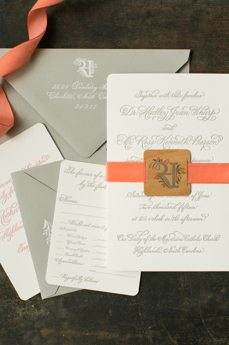
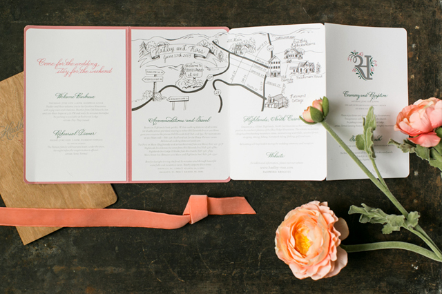
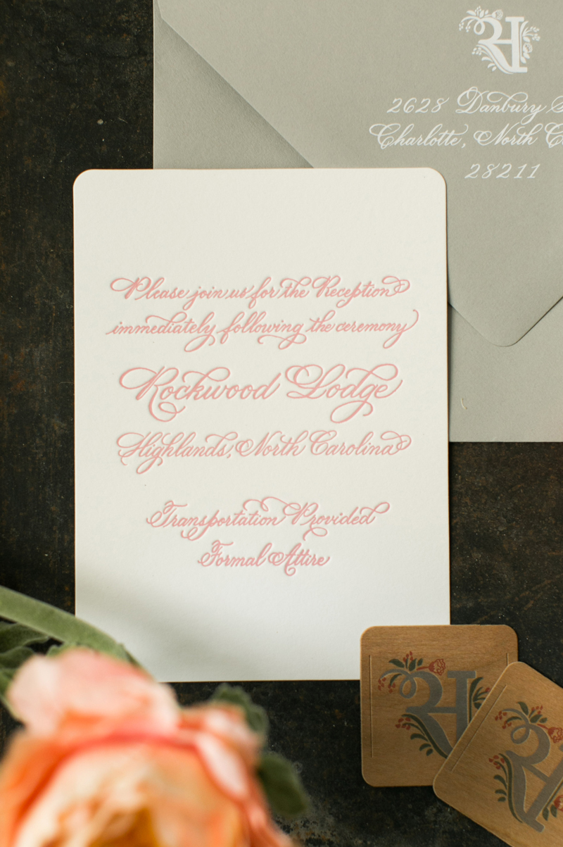
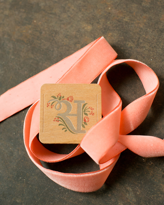
The wedding invitation was letterpress printed with gray calligraphy text on white paper, then bound with a vintage velvet coral ribbon and a custom wood tag featuring the wedding monogram. The coral ribbon is absolutely gorgeous when paired with the cherry wood tag! The wedding invitation suite also included an accordion-fold booklet with a wood front and back cover. The booklet listed all of the wedding events and contained a custom map. The wood booklet cover helped provide the rustic feel for the invitation suite. A letterpress printed reception card in coral calligraphy, a formal RSVP card in gray calligraphy, and gray envelopes completed the invitation suite.
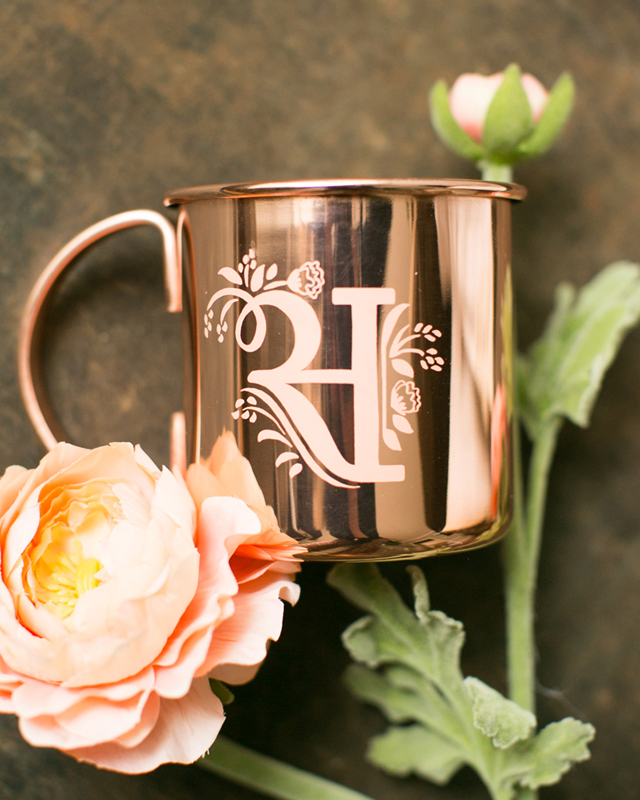
We also had lots of fun with their day-of wedding stationery. Napkins and stir sticks in matching colors, ceremony programs, and more! Our favorite detail of all has to be the custom copper cups that were sitting at everyone place setting. The copper just popped right off the table! We also made a custom coffee travel cup for guests to grab for brunch on the go the following morning.
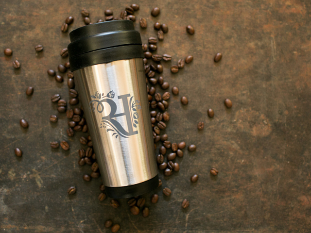
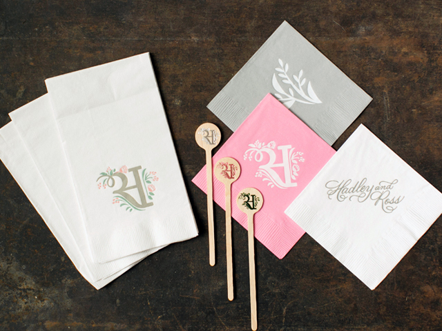
Thanks Melissa!
Design: Atheneum Creative
Atheneum Creative is a member of the Designer Rolodex – you can see more of their beautiful work right here!
Photo Credits:Â Chelsea Davis Photography
Navy and Silver Hand Painted Wedding Invitations
You guys. Every piece in this wedding invitation suite from Ilana of Sugar & Type was individually hand painted. Each and every one! These beautiful navy and silver hand painted wedding invitations were created for the wedding of Ilana’s sister Danielle, who just also happens to be an artist. Danielle viewed the creative process behind these invitations as a symbolic representation of a new marriage, and her description of the process below is just so beautiful I can barely stand it!
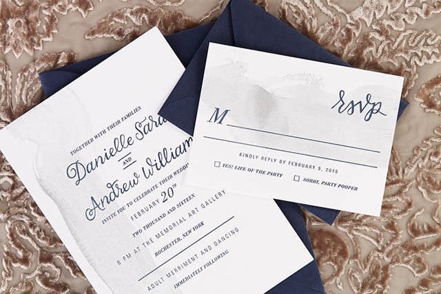
From Ilana: I’m so excited to share my sister Danielle’s wedding invitations! As an artist, my sister really wanted to have her hand in the creative process of the paper goods for her wedding day. My sister and I letterpress printed the invitations on a Vandercook letterpress (with the help of Amy at Green Girl Press), then Danielle individually hand painted each and every invitation, reply card, program, and info card. These invitations truly told a unique story.
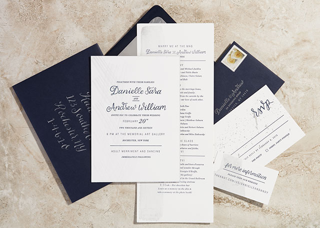
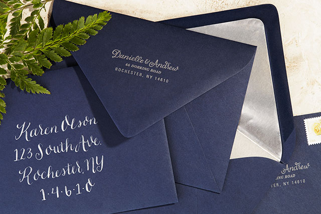
Danielle and Andrew’s winter wedding was held at an art gallery, where people were able to explore the space and really appreciate the art! The invitations were printed on 220lb paper with navy edge painting. Each envelope was hand addressed with silver ink to match the hand painted element on the suite. They carried out the metallic splatters throughout the details at their ceremony and reception, and it was truly a masterpiece.
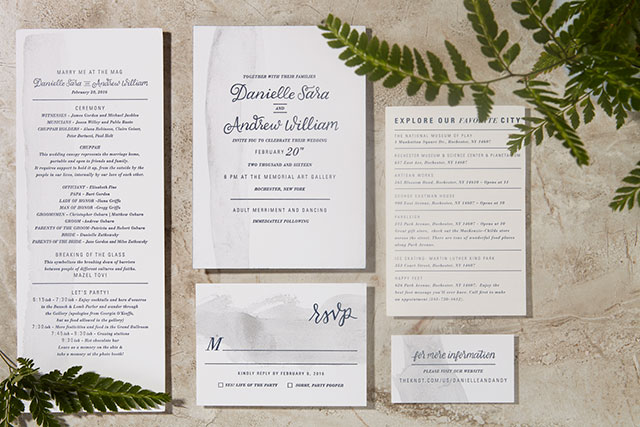
From Danielle – the bride and artist: For our wedding, it was important to us that the experience of art was gently portrayed in every element. From the hand painted brush strokes on each piece of every invitation, response card, information card, and program, to the calligraphy that was letterpress printed onto each sheet of paper.
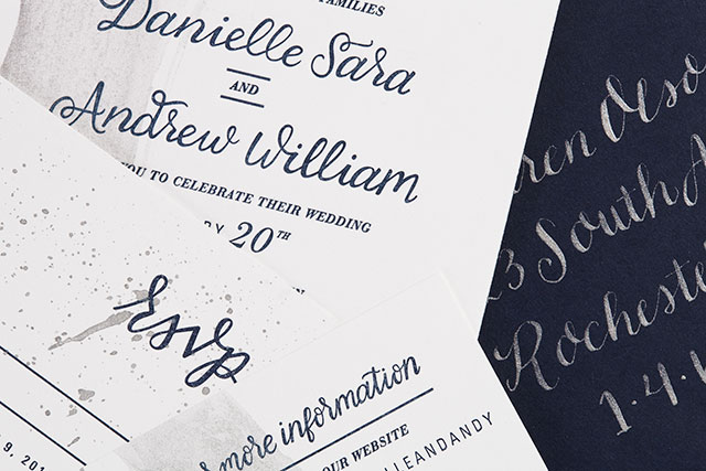
The brush strokes represented the evidence of process, the way that every motion in life leaves a mark, either large or small. These strokes were intentionally made to be perfectly imperfect and one of a kind, just like each individual marriage or relationship. Each mark was made specifically with intention and care, the way that everything you do in a marriage should be. Each component of the creation of the invitations reflected the ever changing atmosphere that exists in a marriage and fulfilled the symbolic process that felt necessary for us as we embarked on our next journey as a couple. We are thrilled with what the process yielded and the final product truly represents us as a couple. We are a team who tries to take time to consider the purpose and execution of our actions, and works to enjoy the journey to the final product.
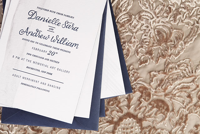
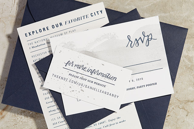
Design and Calligraphy: Sugar and Type
Letterpress Printing: Green Girl Press
Hand Painting: Danielle Sara
Check out the Designer Rolodex for more talÂented wedÂding inviÂtaÂtion designÂers or visit the real invitations gallery for more wedding invitation ideas!
Photo Credits: Audra Zaba Photo
Behind the Stationery: The Good Twin
Based in the colorful land of Los Angeles, California, Katie from The Good Twin is here to share with us the founding moments of her stationery company and take us through a day in her life. I love seeing her pins and stationery in local Brooklyn shops here in New York! So glad to have you here today, Katie. Take it away –Megan
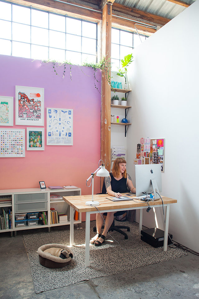
Hi there! I’m Katie, owner and operator of The Good Twin, based here in toasty Los Angeles. And yes, I am a twin, although my brother might argue with you about the “good†part, ha. I’m so excited to be chatting with you guys today – Oh So Beautiful Paper has been a source of inspiration for me for many years, and stationery is one of my favorite things to talk about, go figure.
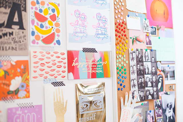
I’ve been working in stationery since my college days in Minneapolis, after a childhood in Portland spent creating greeting cards for family and friends for pretty much any occasion. While I was in art school, I interned for a corporate greeting card company, and then a small letterpress shop, both of which really helped me learn the ins and outs of the industry. I realized I was really excited about the big picture of a business — growing a full line and having creative control, rather than being a hired gun for an art director, and I set my sights on producing my own designs.
When I graduated, I worked a few jobs (barista, library assistant, and freelance illustrator) while my friend John and I started Dude and Chick, a tiny line of letterpress cards. After a few years of long hours and late nights, I moved to L.A., where I eventually decided to leave Dude and Chick and start my own line. The Good Twin was finally off and running in May of 2014.
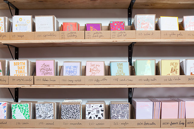
My studio is in Lincoln Heights, way on the east side of Los Angeles just northeast of downtown. It’s small, but it’s mine! I only recently moved into a space outside of my house, which has been a big change, but also very welcomed – my apartment feels like a real place again, rather than a storage locker filled to the brim with paper! All of my inventory lives in the studio, and I also carved out a designated area that feels a bit more officelike, with a big desk for drawing.
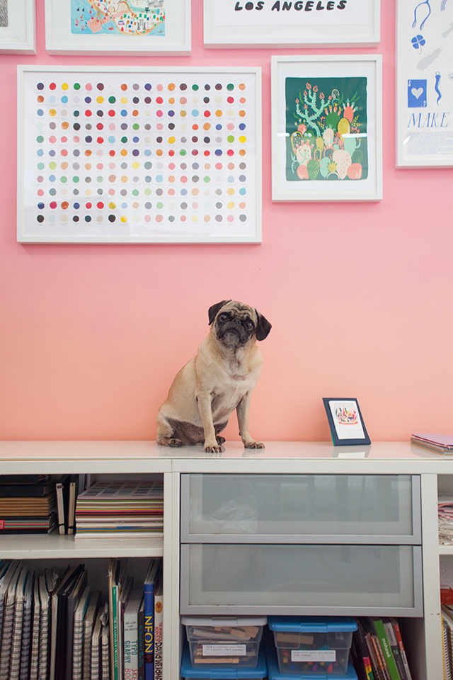
I usually bring my pug Peggy to work with me, and we’re joined a few times a week by my friend Bryan, who helps out with inventory management and order fulfillment. Having an employee has been my saving grace —before that, my nights and weekends (and sometimes afternoons) would be spent sleeving cards and pulling orders. I still do a lot of that, but now I have a lot more time to focus on illustrating and the business as a whole.
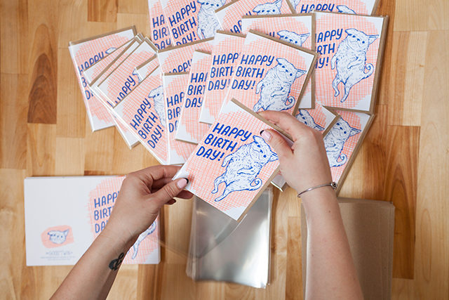
As The Good Twin has grown and expanded, I’ve learned to delegate a bit, but I still find myself packing my days with a million different things. I work best when I’m multitasking. My best trick for any problem is to step away for a few minutes and work on something else, then return with a fresh eye. I’ve always relied pretty heavily on a routine and regular work hours, since my brain responds really well to structure. There’s always something to do when you run the show, so I try to put in a full day even if I’m feeling uncreative or having one of those blocks where I feel like I’ll never be able to draw again.
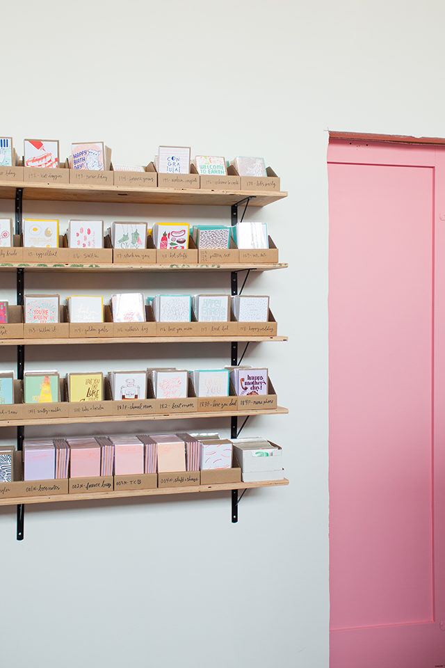
Days usually begin around 9am, after a morning run and breakfast at home with my boyfriend. Mornings are reserved for processing orders and managing my books (nothing like a little Quickbooks with a cup of coffee to wake me up!). I spend a lot of time writing and answering emails from buyers, sales reps, and printers, as well as entering expenses and planning budgets for reprints and new products in the works.
By the afternoon I’m ready for a little creativity. I do my best to draw a bit every day, even if it’s just a few minutes of calligraphy practice. I keep a folder on my phone with all my dumb (and occasionally awesome) ideas for new cards and products. About half the time, I start from a really concrete idea, but often I’ll just be browsing through my endless Pinterest boards for inspiration and just make a drawing or pattern I really like.
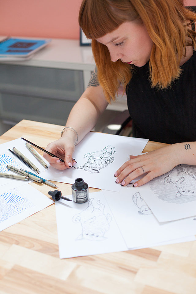
Every week I comb through my sketchbooks and pull anything I feel is worthwhile, and from there I ink those drawings (sometimes with a Micron pen, sometimes with a brush), scan them in, and start playing around with layout and color in Illustrator. Although I do hand draw everything, including type, I usually piece things together either in the computer or with a light box. For me, it’s easier to focus on each piece of a composition separately, and then assemble everything in post.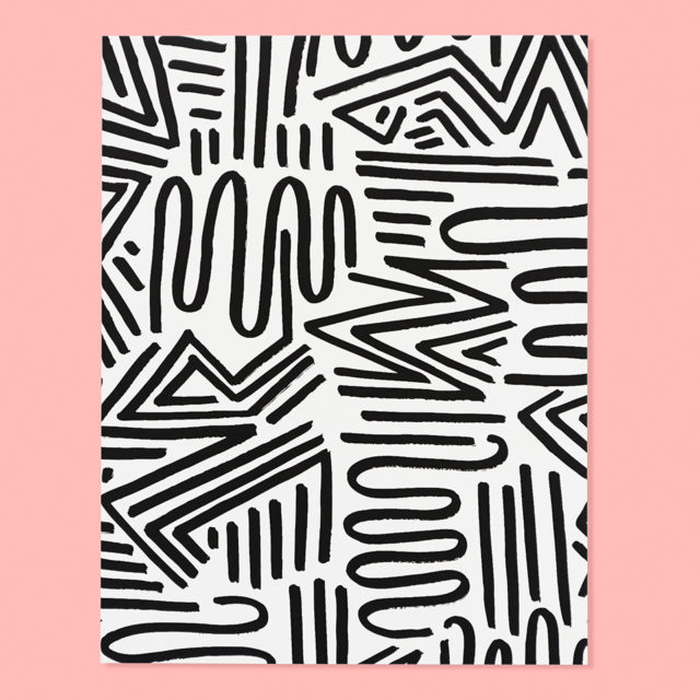
My biggest challenge has always been color, and sometimes I’ll go through ten different palettes before I find something I like. Each season’s release gets one huge file where I keep everything so I can be sure it all looks nice together. Once I have the general look down, each design gets a separate file for cleanup, color separations, and other finishing touches before they go off to print. While I’m working, I like to listen to music and podcasts and occasionally audio books.
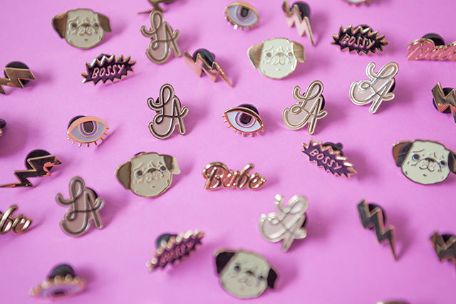
I head home for the day between 5-8pm depending on how busy things are and how much I’m getting done. I really love my job, and hands down my favorite aspect of running a small business is the variety. As much as I love designing, it’s important to me to understand things like profit margins, trend research, and sales patterns. I think it helps me better direct my own work and style. I’m constantly giving myself pep talks and figuring out things that I never dreamed I’d be wrestling with, but that’s how I like it.
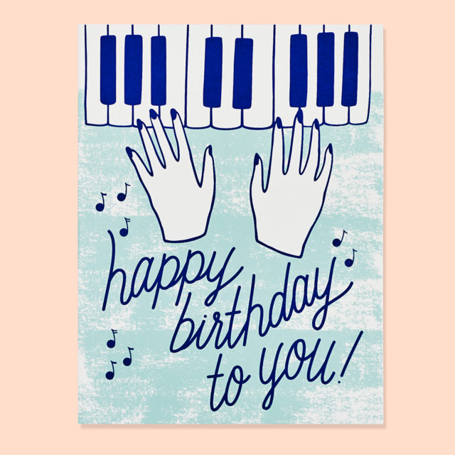
Stationery is really exciting industry, and I love seeing change in my own style as well as the different lines I admire. Hope you enjoyed the peek into my corner of the paper world! Thanks for having me, Megan and Nole!
Photos by Kate Miss
Want to be featured in Behind the Stationery? Email [email protected] for details.
The 2016 National Stationery Show, Part 8
One of my first recaps from the 2016 National Stationery Show featured veteran booths that are always on my can’t-miss-list at the show. Today I’m sharing another NSS 2016 recap featuring even more of my favorite veteran exhibitors from this year’s show! These should all be VERY familiar names here at Oh So Beautiful Paper, from Snow & Graham to Hammerpress to Smudge Ink. You’ll see beautiful envelope liners and wedding invitations from Bella Figura, eco-friendly greeting cards, art prints, keepsake boxes, and notebooks from Smock, the most beautiful cotton ribbons from Studio Carta, city postcards from Albertine Press, and social preparedness kits from Egg Press. Let’s dive right in!
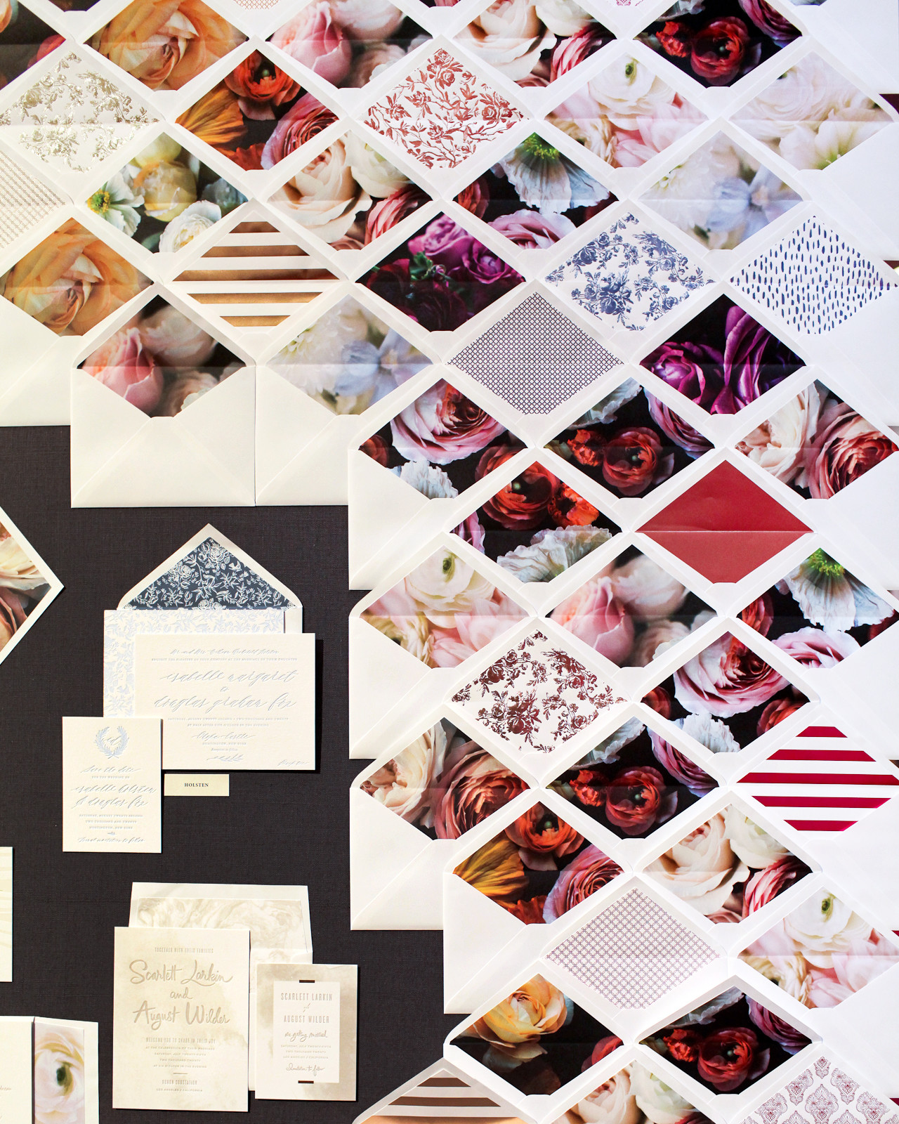
How stunning is this wall  featuring Bella Figura‘s new collection of flower photograph envelope liners?? And those copper foil envelope liners? Gorgeous!

