Happy Monday everyone! Today I’m hanging out at the New York International Gift Fair, and I can’t wait to share some of my favorite finds from the show later this week! But in the meantime, designer Kristen Smith sent over these classic invitations that she designed for a Southern wedding. I’m loving all the vibrant pops of red – such a great touch!
")
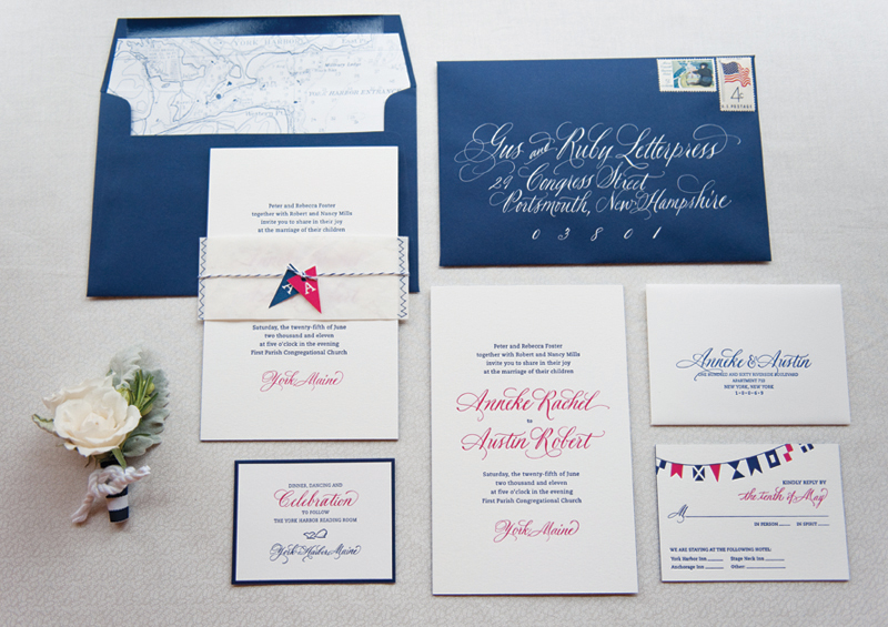
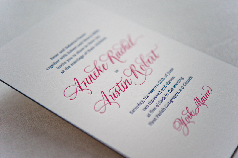
From Kristen:Â Katie is an art teacher and Matt is an industrial designer, and when it came to the invitations they wanted something elegant and classic with a few modern touches. We first set to work creating a custom monogram (since the bride and groom have last names that begin with the same initial), which could be used on everything from invitations to favor tags. The monogram was one of my favorite parts!
") Â
 ")
")
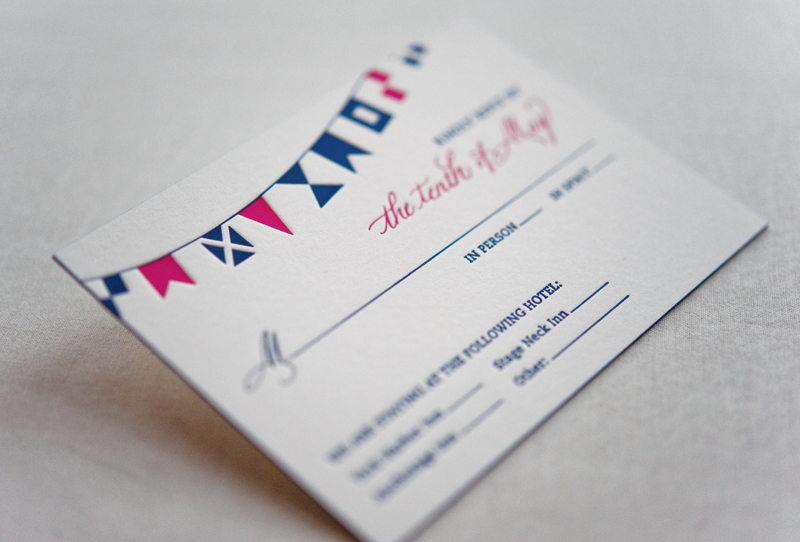
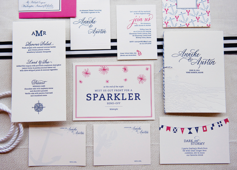
The RSVPs were done as postcards and pre-stamped so attendees could simply return them in the mail. On the front of the RSVP was a “Marriage Advice” madlib for guests to fill out and return as well. At the reception they were hung in a tree near the tent for everyone to see!
") Â
 ")
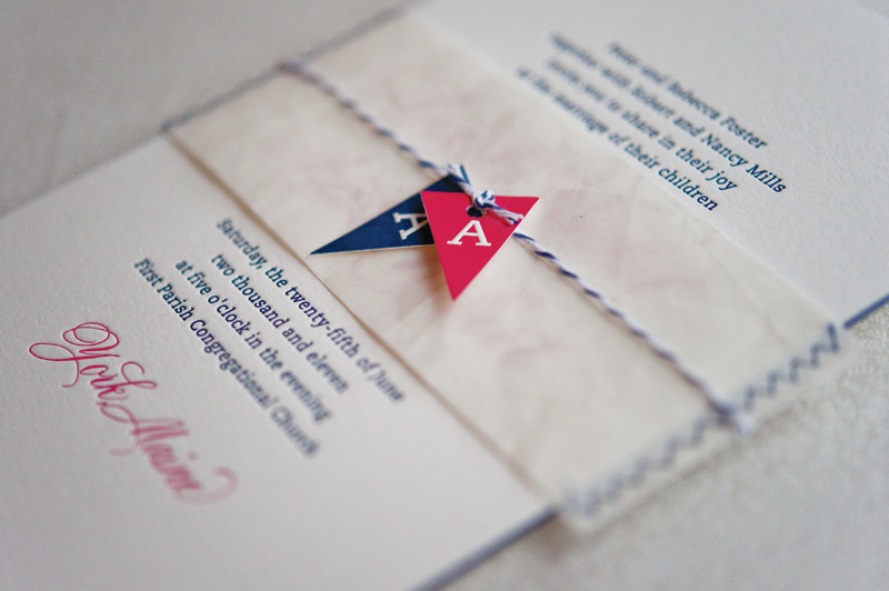
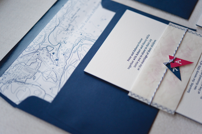
The invitations were letterpress printed while the other flat pieces were printed digitally. All three were then edge painted in a beautiful red to match the red liners chosen for the envelopes. The belly band that held everything together featured a gate on the front with wreaths containing their initials. On the wedding day, similar wreaths were hung with moss initials for both Katie and Matt.
")
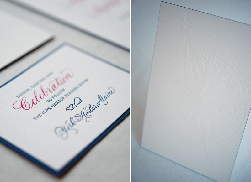
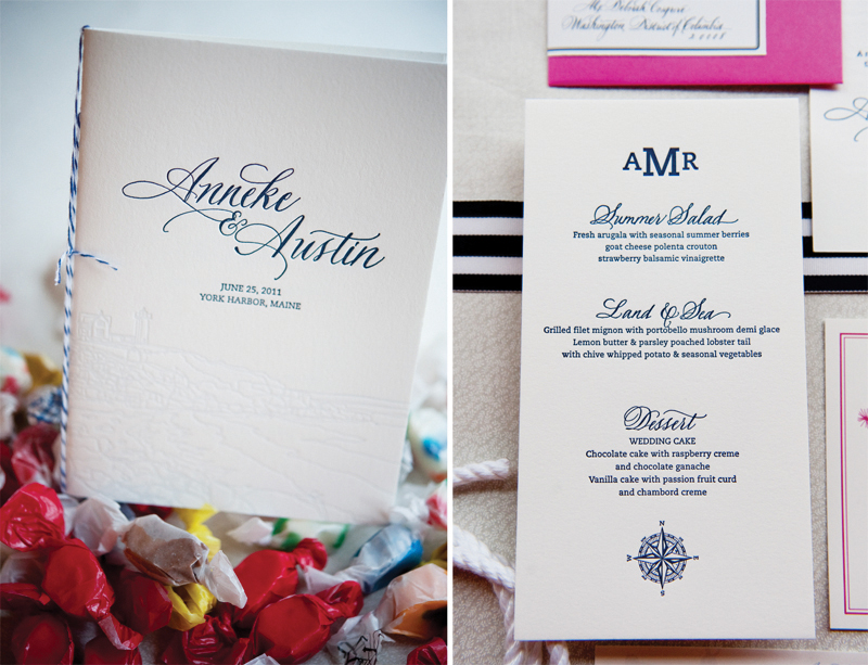
The programs were done to match the invitations with the monogram and names prominently featured on the front. On the inside we used the same red from the liners and edging to make the pages stand out a little more. The inside featured information and historical tidbits about the venue as well as the history for all of the important items incorporated during the wedding ceremony. The programs were punched and tied with bakers twine as well.

Thanks Kristen!
Design:Â Kristen Smith
Printing:Â Sase Ink in Charleston, SC
Edge Painting:Â Moglea
Calligraphy: Diane Rember of Calligraphy Expressions
Check out the Designer Rolodex for more talÂented wedÂding inviÂtaÂtion designÂers and the real inviÂtaÂtions gallery for more wedding invitation ideas!
Photo Credits: Kristen Smith
")
")
")
")
")
")
")
")
")
")
")
")
")
