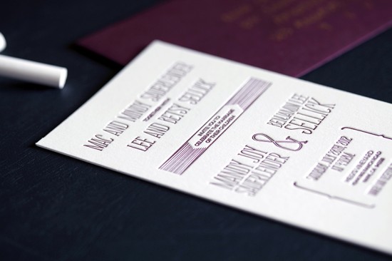
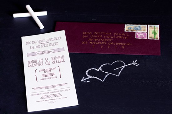
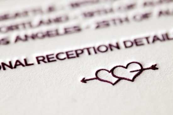
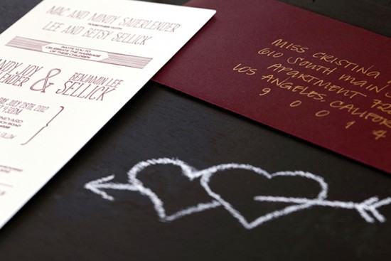
Happy Monday everyone! Â We’re starting the week off with some modern wine-inspired wedding invitations from designer Cristina Pandol. Â Cristina created these invitations for the wedding of a friend and colleague, drawing inspiration from wine labels to complement the vineyard wedding venue. Â So cute!
From Cristina:Â Ben is a colleague of mine, so this project was very personal for me. Â Ben and Mandy are a young couple who are fun, energetic, creative, very hands on, and most importantly crazy in love. Â They asked me to design something that represented them as a couple and was young and different, without being too unconventional. Â The only design inspiration I was given was to “think wine” to fit with the vineyard wedding venue.
After spending a lot of time in the wine aisle, I knew that I wanted to do an invitation for a #10 vertical envelope. Â The vertical layout made it a little younger and the long and skinny dimension would give the feeling of a wine label. Â This also made it possible to fit all of the information on one piece, which brought down the overall production cost.
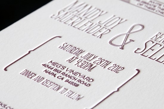
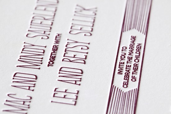
Since a wedding is all about two people coming together I wanted to mix two typefaces in an interesting way, but keep it looking clean by stacking it. Â I chose Soundtrack as the focus typeface because it’s clean, but looks handwritten and fits with their DIY style.
Thanks Cristina!
Design and Printing: Cristina Pandol, via Vandercook press rental at Lala Press
Envelope Calligraphy: Calligraphy by Katrina
Check out the Designer Rolodex for more talÂented wedÂding inviÂtaÂtion designÂers and the real inviÂtaÂtions gallery for more wedding invitation ideas!
Photo Credits: Damon Biviano

