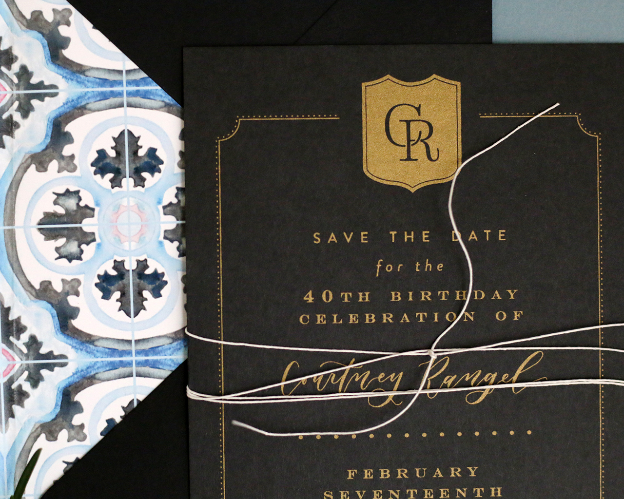
Kids often have all the fun when it comes to celebrating birthdays. I’m always so happy to see adults celebrate some of their own milestone birthdays, especially when the invitations are this pretty! Clara of Goldie Design Co. created these traditional black and gold screen printed invitations for a 40th birthday party at an historic hotel full of southern flair. Clara brought the elegant feel of the venue into the invitation design with the moody black and gold color palette and a crest inspired by the hotel logo, along with custom watercolor envelope liners inspired by the hotel’s tile floors. Beautiful!
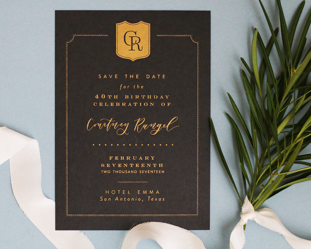
From Clara: This design was for the invitations for Courtney’s 40th birthday celebration to be held at the Hotel Emma in San Antonio, Texas. This hotel is Courtney’s all time favorite, and she wanted the simplicity and elegance of this hotel to shine through in the paper pieces. The Hotel Emma is a historical building that used to be a brewhouse, but now houses the 146 rooms of this riverfront hotel. The elegant and traditional, yet modern and warm southern feel was exactly the look we were going for with the birthday party invitation suite.
Courtney wanted to incorporate her initials into a crest similar to the hotel’s logo, which she planned to use throughout her stationery for the event. This crest sits centered at the top of the invitation card, with a simple double lined border around the text to give it a traditional feel.
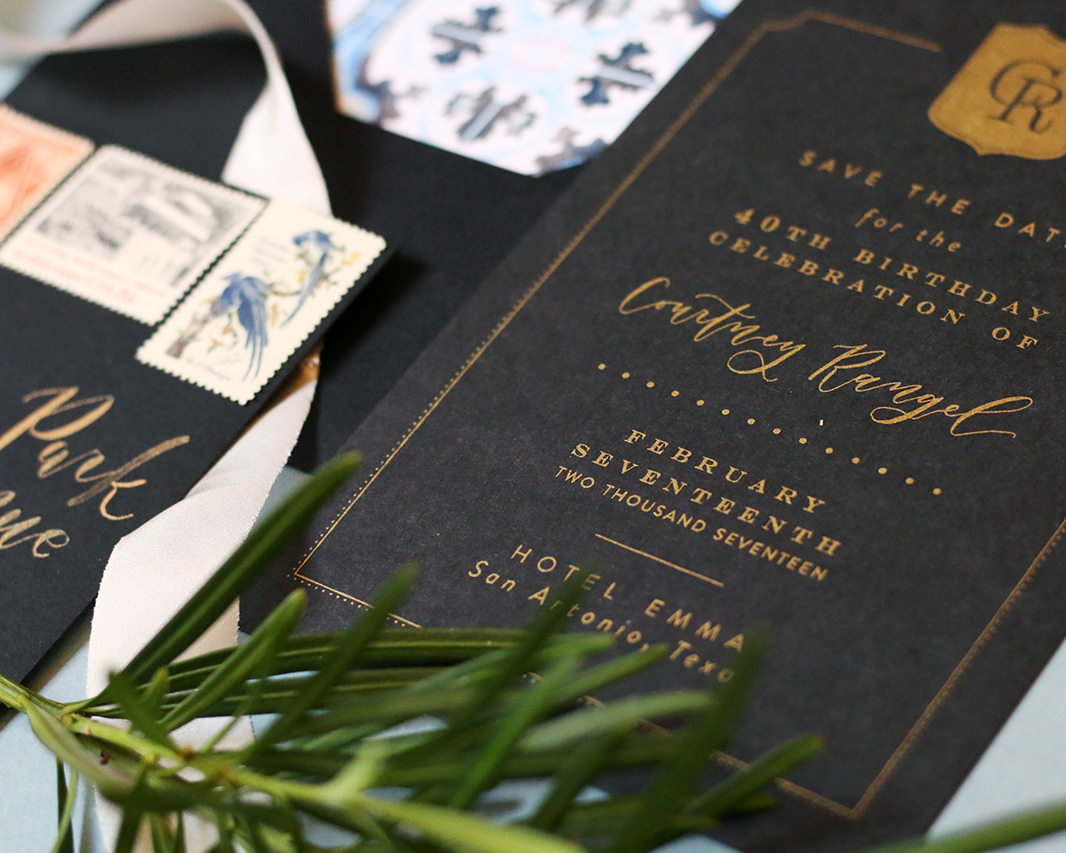
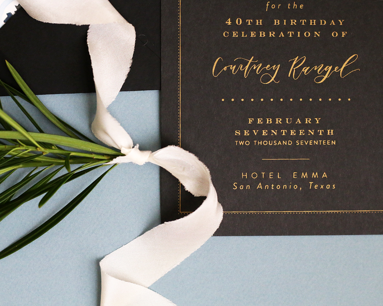
The invitation card was screen printed in metallic gold ink on a smooth black paper. The typefaces used in the invitation were kept fairly simple, except for her name done in a flowing modern calligraphy, that would tie together with the hand addressed calligraphy envelopes.
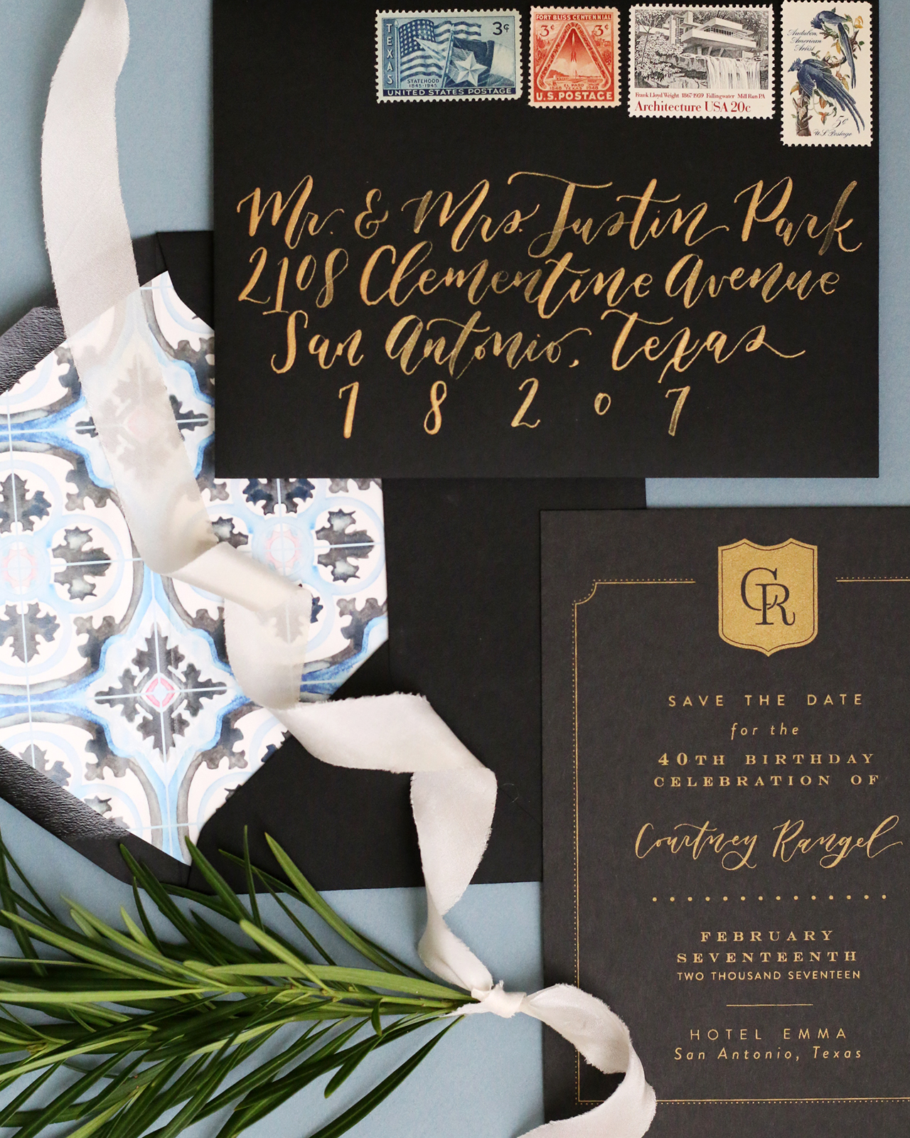
The black and gold color palette brought in that moody southern feel of the hotel, but we wanted to incorporate a pop of color. Courtney mentioned that she loves the beautiful tile floors seen throughout the hotel. After researching these gorgeous floors, I decided that a soft watercolor painting of the tile pattern would provide the perfect pop of color for the invitation suite. So each envelope was adorned with a custom envelope liner featuring a hand-painted watercolor of the floor pattern. It really tied the suite together and gave it that last bit of southern flair.
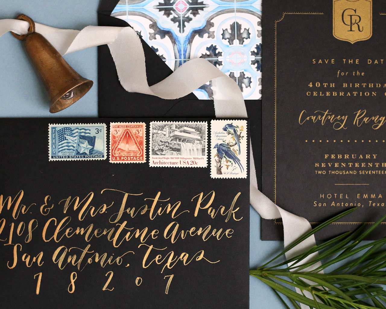
The outer envelopes were addressed with calligraphy in metallic gold ink and dressed up with some hand picked vintage stamps to go along with both the theme and color scheme. My favorite stamp used is the Texas statehood one that not only is perfect for the venue of the the party, but also brings out the blues of the watercolor envelope liner. The back flap of the envelope is blind embossed with a simple return address. The invitation was wrapped in a very thin white twine.
Thanks Clara!
Design, Calligraphy, and Styling:Goldie Design Co.
Screenprinting: Atmosphere Printing Company
Envelopes: Cards & Pockets
Photo Credits: Clara Odgen

