Behind the Stationery: Paper Wilderness

Jenna from Paper Wilderness joins us on this installment of Behind the Stationery from Long Beach, California. Her stationery collections bring together lively watercolor illustrations and puns galore, and she makes it work all right out of her living room apartment! She’s here to share how her artwork went from a side hustle to her full-time job and how she maintains that handmade feel in her line. —Megan Soh

Behind the Stationery: Paper Wilderness

From Jenna: I’ve been drawing and painting ever since I could pick up a pencil and always knew I’d be some kind of artist. In 2010, the question of what exactly I’d be doing was definitely on my mind as I was about to graduate from CSU Long Beach with a BFA in Illustration. I’ve always had a deep appreciation for actually putting a paintbrush to paper, traditional art methods where you really have to commit to every brushstroke, and for me that was watercolor painting specifically. Yet in an increasingly technological society, where a large portion of art is created digitally, I was uncertain if my work would have any place in today’s art world.

Behind the Stationery: Paper Wilderness

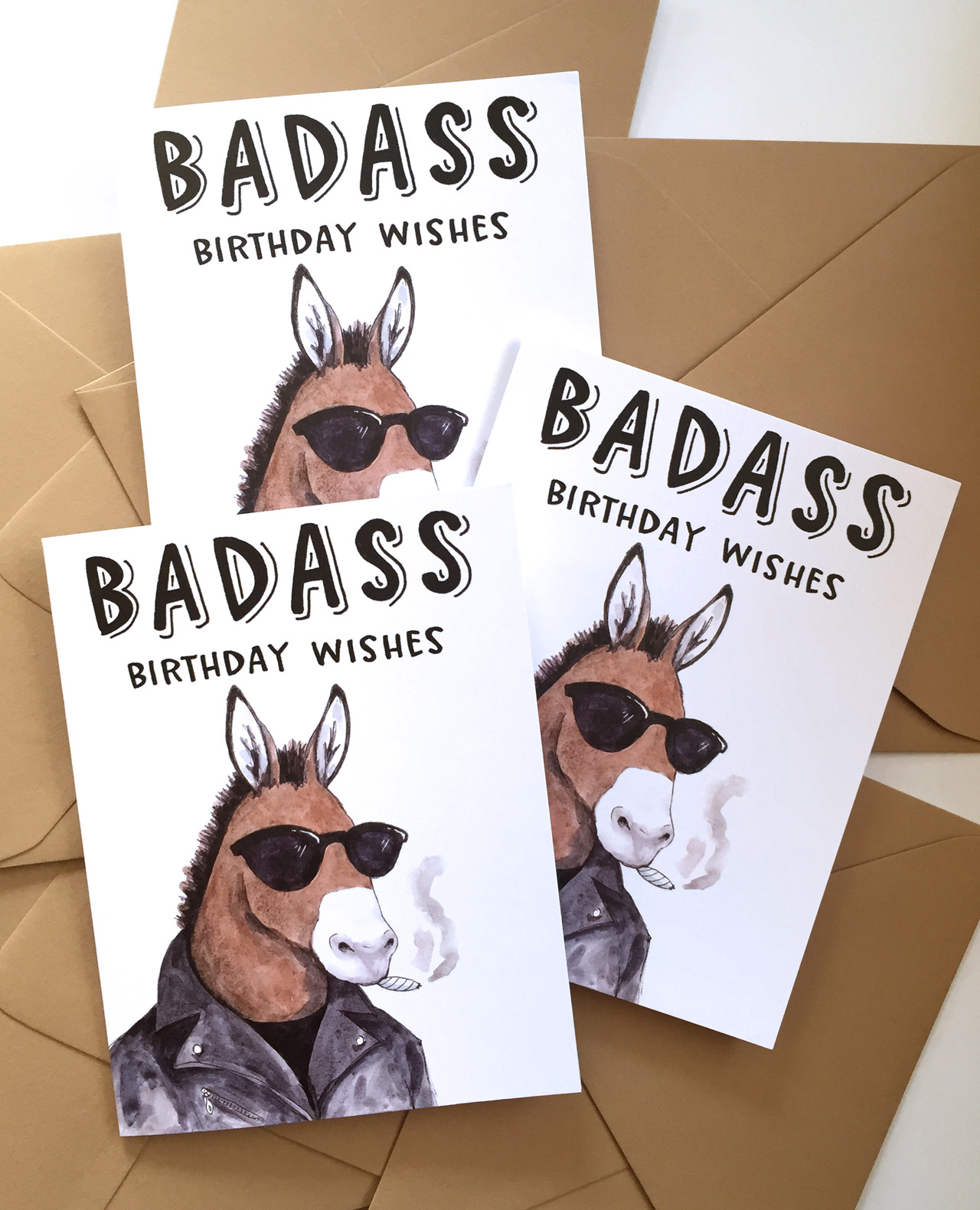
Meanwhile, I’d been hand painting greeting cards for friends and family for years, and usually customized them with their favorite animal and a punny phrase. Everyone loved the cards and I discovered that they’d often get framed. Shortly after I graduated college, I got the opportunity to have a table at a small local art walk. While brainstorming ideas of what to sell at my table, I realized that my greeting cards were always well received and would be the perfect, affordable piece of art to sell. So I drew ten animals wearing party hats, traced each drawing onto cards, and hand painted every one! The cards sold out and I was addicted to the feeling that people actually wanted to buy my art. (Fun fact: a few cards from this first Party Animals series are still in my line to this day!) This little hand-painted side hustle continued for a while where I sold framed paintings, brooches, cards, and anything I wanted to experiment with at the occasional art walk, just as an artist with a hobby and not a business.

Behind the Stationery: Paper Wilderness

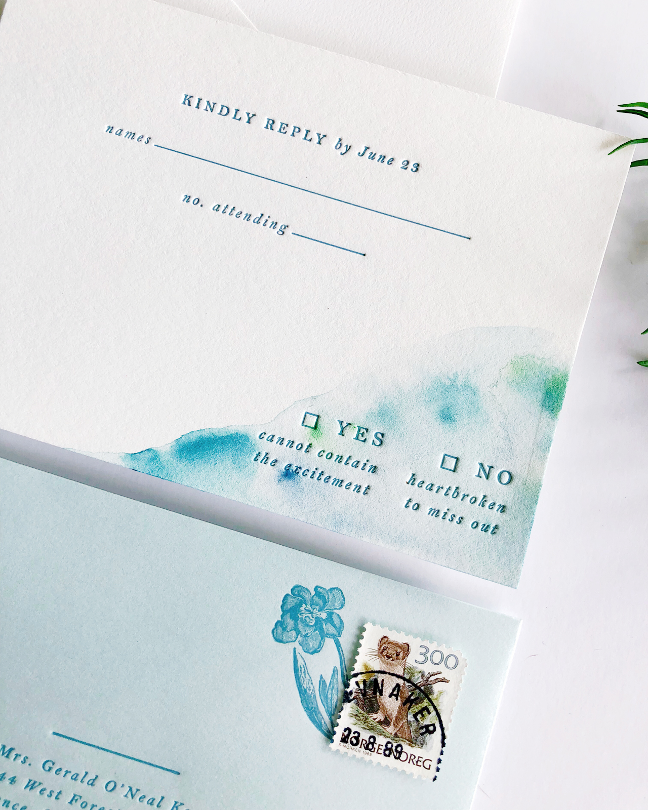
Eventually I realized that my unique watercolor greeting cards were the obvious draw and that I wanted to make an actual business out of it, and Paper Wilderness was born in 2014. Hand painting each card was not a sustainable option anymore (ha!) so after printing in-house for a few years I recently found a couple amazing printers who digitally print our goods now. Having inventory on hand to pull from has been amazing.

Behind the Stationery: Paper Wilderness

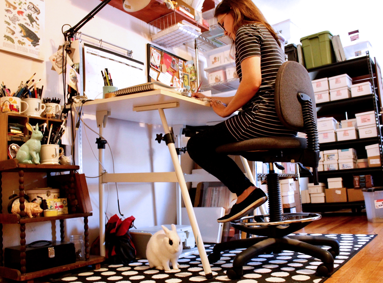
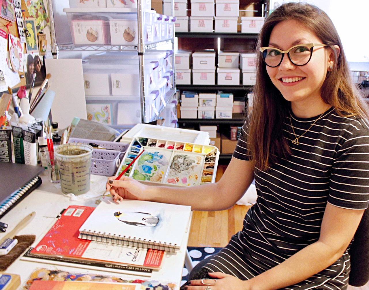
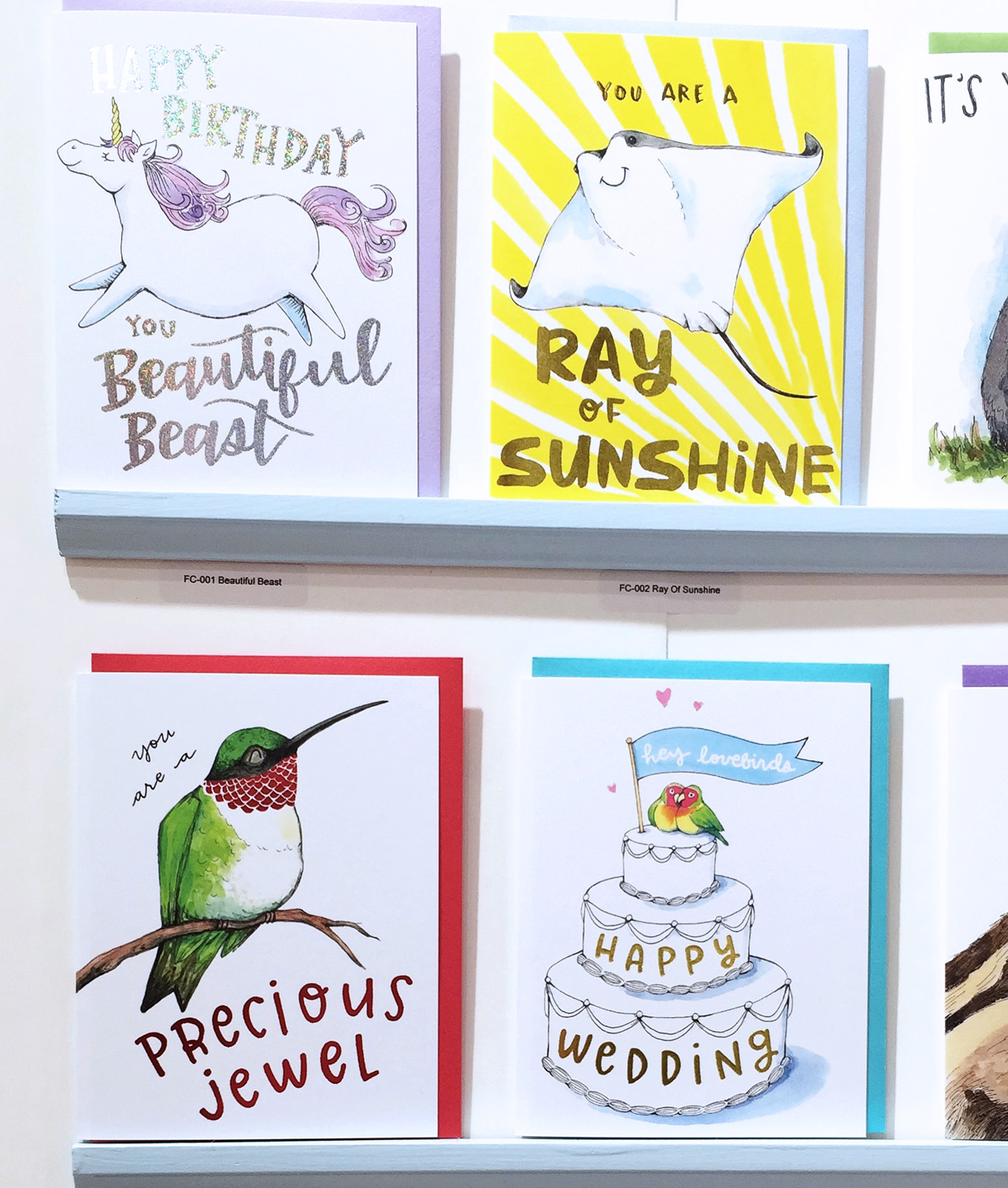
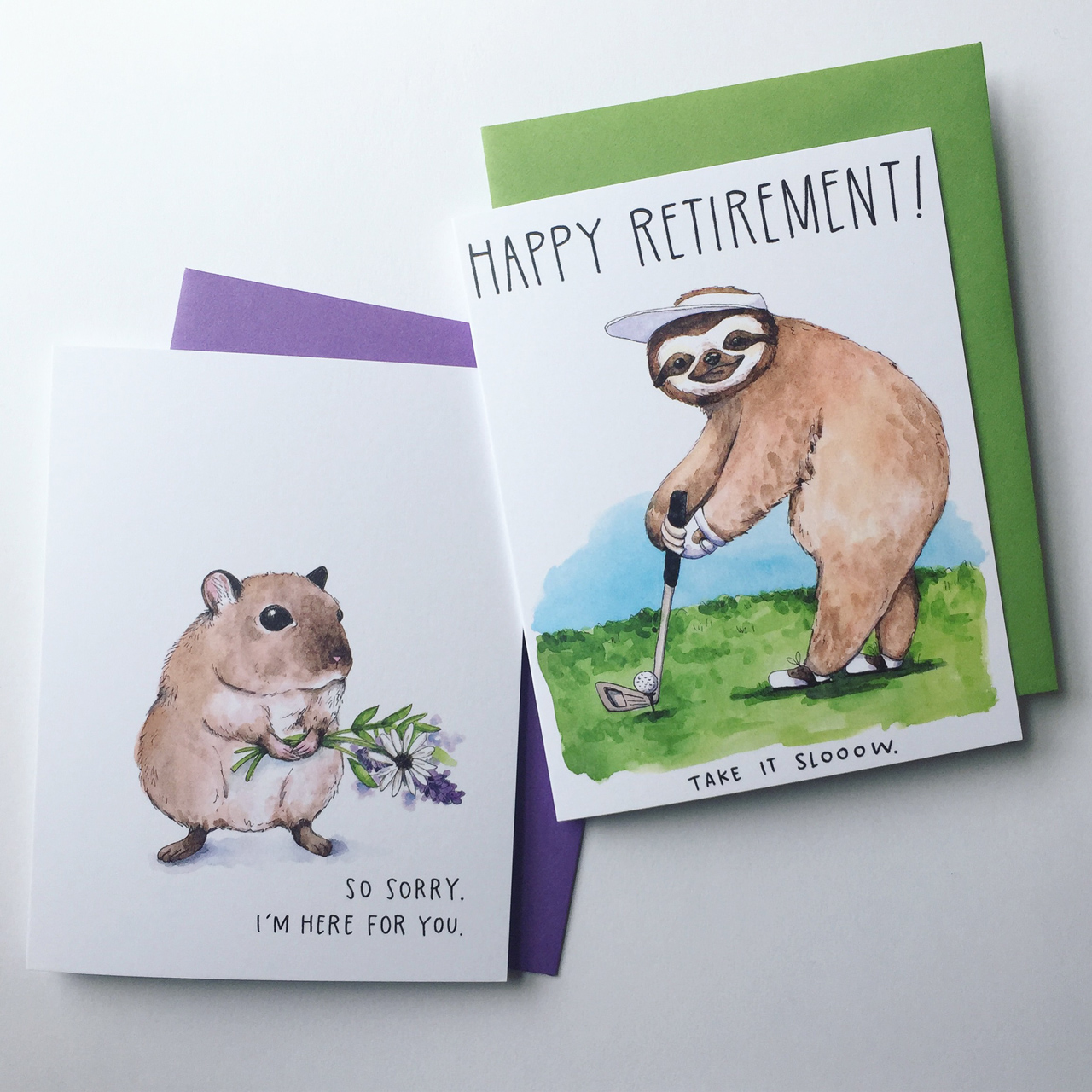
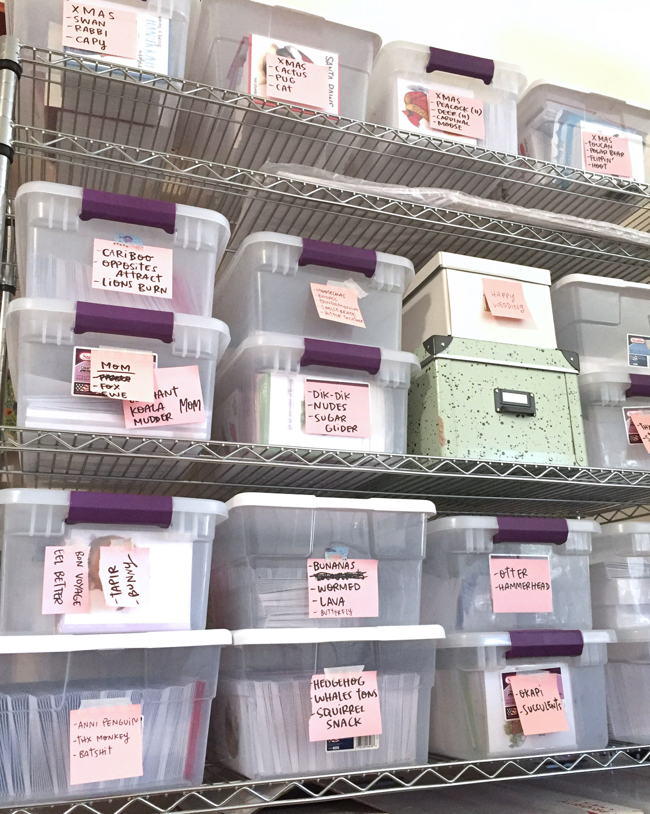
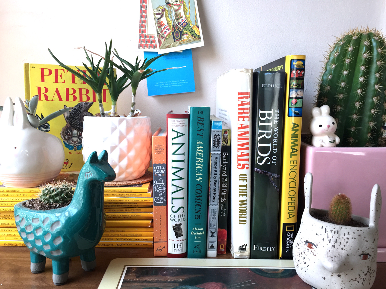
I run the business out of the dining room of my apartment in Long Beach, California and space is a little tight but I make it work. Paper Wilderness revolves around my lifelong love of animals, so every design is animal and nature based. I feel like animals and the natural world are a universal love language, symbols of purity that every human can appreciate and admire. That’s why they’re the perfect subjects for my work and goal of uniting people and encouraging communication and togetherness.

Behind the Stationery: Paper Wilderness

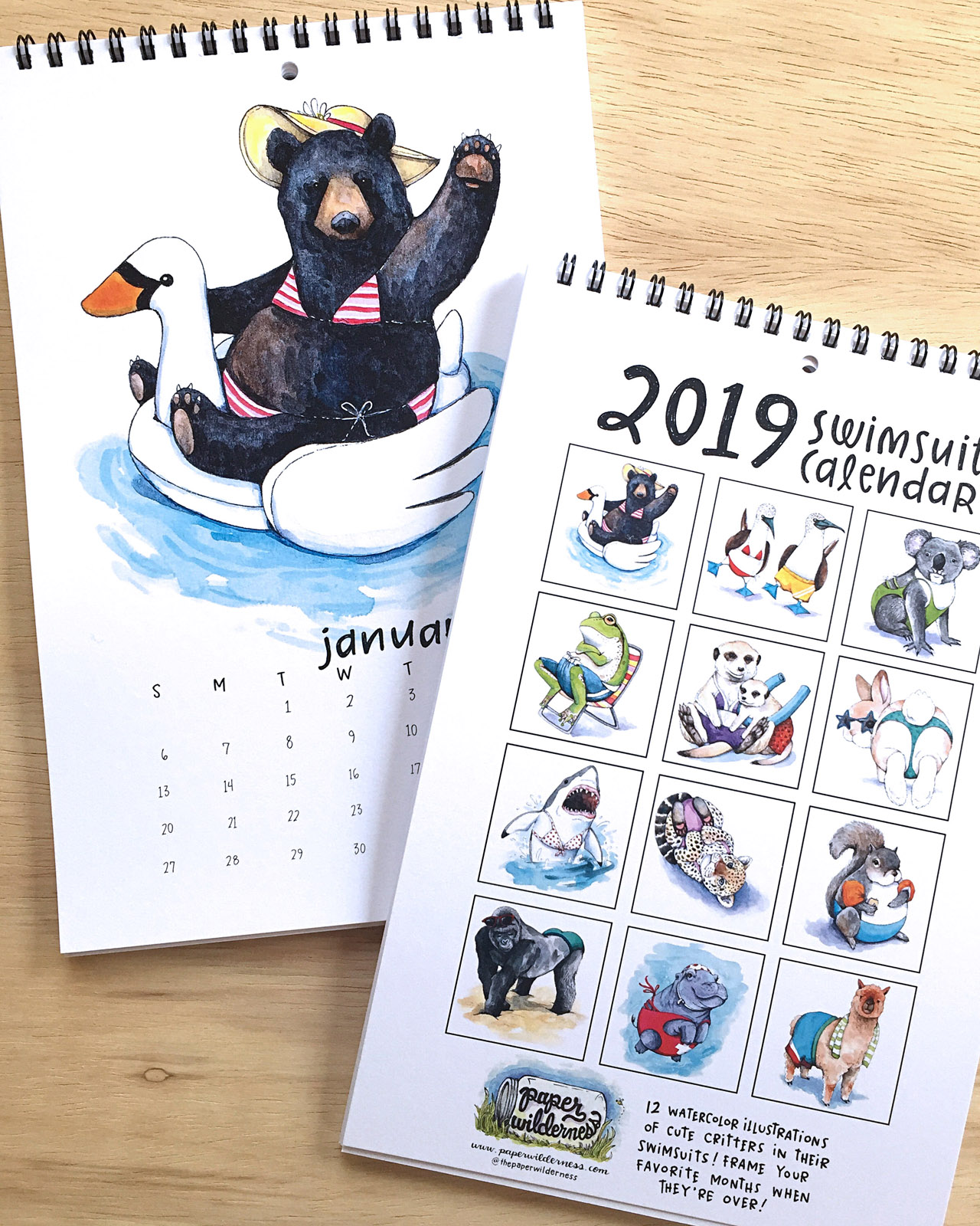
My cards usually involve some kind of pun too because I will always appreciate a good dad joke. Working from home while my bunny Lou Lou hops around is a constant source of cute inspiration so she’s got me covered on that front. The rest of the inspiration I get is from zoo trips, National Park visits, old illustrated textbooks, animal encyclopedias, and nature shows like Blue Planet. I love featuring obscure animals in my designs! The Notes app on my phone is full of snippets of funny conversations, cool animals to draw, and ideas for future cards.

Behind the Stationery: Paper Wilderness

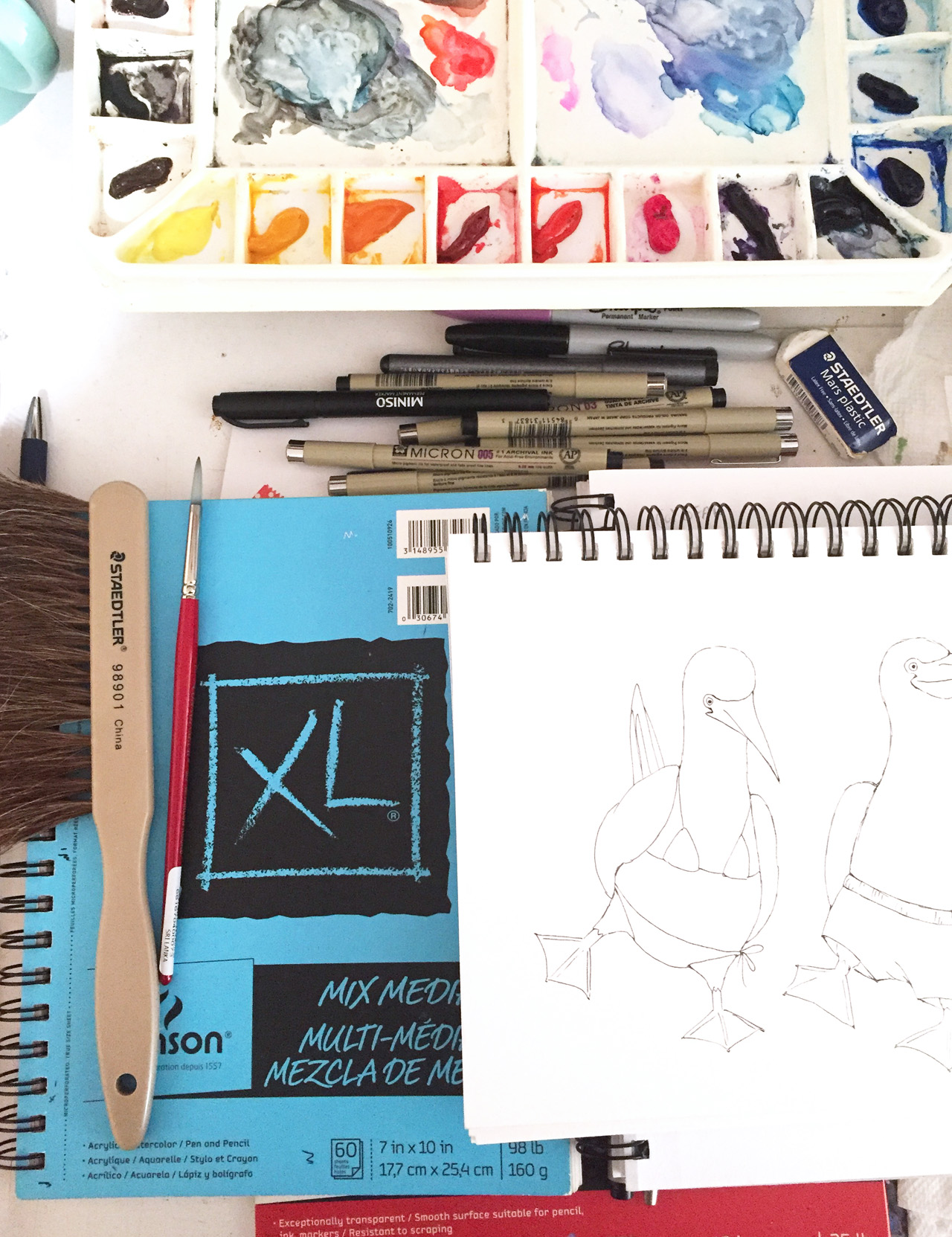
All my work begins as a pencil sketch in my favorite mixed media sketchbook. Once I’m happy with the sketch, I ink it with waterproof Micron pens and watercolor paint over that inked illustration. Next I’ll experiment with hand lettering until I find a style that feels right for the card or product I’m designing, and that gets lettered in my sketchbook or piece of tracing paper. Then I scan everything into Photoshop, clean them up a little, lay it out, and it’s ready for production!

Behind the Stationery: Paper Wilderness

Behind the Stationery: Paper Wilderness

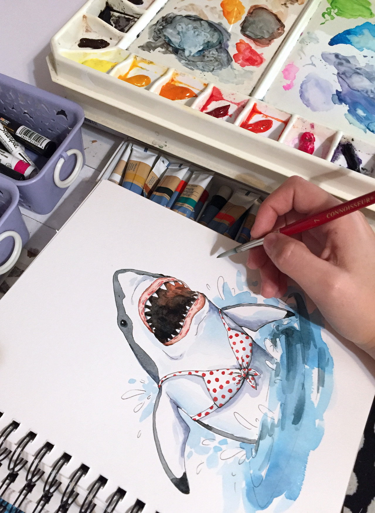
I just love how every single product exists on an actual piece of paper somewhere in my studio. I think this handmade process lends a certain intimate feeling or emotion to my work, which is definitely what I’m going for. I want my customers to feel like my own friends and family did when I first started, like I made this card just for them.

Behind the Stationery: Paper Wilderness

Paper Wilderness is a one-woman-show so every day is different. Whatever needs to happen gets tackled one task at a time, whether that’s packing up retail and wholesale orders, painting new illustrations, answering emails, checking inventory, bookkeeping, updating websites, or prepping for craft and trade shows. I just debuted my line at the National Stationery Show back in May and it was amazing! My business has slowly evolved into the hand painted, hand lettered watercolor paper goods studio it is today and I wouldn’t have it any other way.

Behind the Stationery: Paper Wilderness

All photos courtesy of Paper Wilderness.

Want to be featured in the Behind the Stationery column? Reach out to Megan at megan [at] ohsobeautifulpaper [dot] com for more details.

Inspiring Calligraphers: Li Ward Calligraphy

Hey everyone! It’s been a hot summer in many places so I thought it only fitting to pull some inspiring calligraphy work with a true summertime vibe. Here’s a look at the work of Li Ward Calligraphy. I love the mix of her lettering work and watercolor and illustration, and how each wedding suite looks so fitting for the destination. With that, let’s grab a lemonade and check out Li’s beautiful calligraphy! Jen

Inspiring Calligraphers: Li Ward Calligraphy

Photo Credit: Cambria Grace Photography

Inspiring Calligraphers: Li Ward Calligraphy

On how she got her start, Li shares:

I started calligraphy about 6 years ago, using traditional pens with nibs that you dip into ink. I started doing spot lettering for other stationery designers whose clients requested some hand lettering for their invitations. Two years ago when I began dabbling in watercolors, I decided to go “full service” with invitation design: I would take care of not just lettering, but full design which would include watercolor illustrations, hand lettering, envelope liner design, paper choice, and printing.

Inspiring Calligraphers: Li Ward Calligraphy

Inspiring Calligraphers: Li Ward Calligraphy

What inspires Li? She gets inspiration from Jane Austen, scratchy old-fashioned script, Edward Gorey’s irreverent sense of humor, Matisse’s bold color palettes, stained glass designs — just to name a few. “I’m still really new to this and constantly trying new things out,” says Li.

Inspiring Calligraphers: Li Ward Calligraphy

“One of my favorite suites is the Catskills wedding suite (Zoe and Sam), which included Save the Dates, folded maps, and illustrated menus,” says Li. “The couple had already commissioned Happy Menocal to design their crest. Happy just happens to be one of my favorite artists, so I was really thrilled when they asked me to design the rest of the suite that would complement Happy’s design. I took inspiration from Edward Gorey’s illustration style and Happy’s of course, threw in block font mixed with cursive, went with a more is better frame of mind. And it’s kind of been the basis of my style going forward. I’m definitely all about bold colors and shapes!”

Inspiring Calligraphers: Li Ward Calligraphy

Inspiring Calligraphers: Li Ward Calligraphy

As much as I love Li’s illustration work, I’m also a big fan of this kraft brown wedding suite she designed. The white lettering on kraft brown paper has a modern organic vibe that feels casual, yet cool.

Inspiring Calligraphers: Li Ward Calligraphy

Inspiring Calligraphers: Li Ward Calligraphy

Another favorite style? Li loves to do “seamless” designs. “If you were to put two cards side by side, the design from one card would match up with the design on another,” says Li.

Big thanks to Li Ward for sharing a a peek into her world of lettering!

All photos by Li Ward, except where noted

Want to be featured in our calligraphy column? Reach out to us at submissions [at] ohsobeautifulpaper [dot] com with the subject line “Calligraphy Feature” for more details!

Aquamarine Watercolor and Letterpress Wedding Invitations

Whenever I look at a wedding invitation, I always look for that one special detail that stands out from everything else. Sometimes it’s hand lettering or calligraphy. Sometimes it’s the carefully chosen vintage stamps. In the case of these gorgeous aquamarine watercolor and letterpress wedding invitations from Shana of Iris and Marie Letterpress, it’s the beautiful and ethereal hand painted details that Shana added to each invitation. So perfect for an oceanside wedding!

Aquamarine Watercolor and Letterpress Wedding Invitations by Iris and Marie Letterpress

From Shana: Abbey’s July wedding in Florence, South Carolina was hot, but these cool ocean blues and greens gave her guests a breath of fresh air before the big day. Each invitation and reply card was hand painted with acrylic paint using a special water technique. The design was letterpress printed on a 1920s Chandler & Price letterpress using Crane Lettra cotton paper for the invitation and Cards & Pockets Aquamarine envelopes for the reply envelopes. Three colors were used throughout the suite: medium dusty teal, dark dusty teal & grey-green.

Aquamarine Watercolor and Letterpress Wedding Invitations by Iris and Marie Letterpress

The reply card and envelope featured the darker teal of the suite, where as the invitation and outer envelope featured the medium dusty teal that Abbey picked out. The dusty teal used matched her bridesmaids’ dresses perfectly! To go along with her chill vibe, the grey-green was used on the text of the invitation to compliment the blues going on everywhere else.

Aquamarine Watercolor and Letterpress Wedding Invitations by Iris and Marie Letterpress

At the bottom of each invitation is the hazy water painting created uniquely for each invitation with subtle hints of a bright green. The grey-green ink really helped pull those bright greens out & made the invitation colors flow together. The really cool thing about hand painting each piece of paper is that each guest gets a different suite which in turn makes each invitation feel like its own art piece.

Aquamarine Watercolor and Letterpress Wedding Invitations by Iris and Marie Letterpress

Abbey definitely was excited to see each suite come together and see how every invitation was different than the next. She also wanted to add a floral element, but didn’t want them to overpower the hand painted details. So we printed floral illustrations on top of the painted piece to add extra texture.

Aquamarine Watercolor and Letterpress Wedding Invitations by Iris and Marie Letterpress

Can you spot the other little floral element peeking out from the stamp? Instead of having a plain corner of her reply envelope where a stamp would go, we opted to have a cute little flower coming out of the stamp for some extra personality. Flowers were also added to the outer envelopes by being printed to bleed off the envelope flap to give guests a little insight to what is inside.

Aquamarine Watercolor and Letterpress Wedding Invitations by Iris and Marie Letterpress

There are so many fun elements going on in this one suite that you might think that this wedding definitely does not have a “relaxed” vibe. Heck yes it does! Don’t the blue-greens make you want to sit by the ocean? If I were to give this wedding a new theme it would be: relaxed by the ocean with a flower in one hand and sea glass in the other.

Aquamarine Watercolor and Letterpress Wedding Invitations by Iris and Marie Letterpress

Thanks Shana!

Design and printing: Iris and Marie Letterpress

Envelopes: Cards & Pockets

Looking for more wedding invitation inspiration? Visit our wedding invitations archive for more custom wedding invitation ideas!

Mixbook Designer Collaborations

I love companies that create well-made products for everyday life. And when those companies team up with some of my very favorite designers? EVEN BETTER. If you don’t already know about Mixbook, they make beautiful custom products that are easy to create, completely customizable, and of course rooted in beautiful design! Need photo books and calendars? Wedding invitations and custom stationery? Home décor and photo prints? Yep, you can get all of those with Mixbook, customized with your photos, graphics, and text!

Mixbook Designer Collaborations

I first fell in love with Mixbook for their fabulous photo books, which make the absolute BEST holiday gifts for grandparents and far-away family members. I love that they offer cover designs for a range of purposes, including wedding photo bookstravel photo books, and year-in-review photo books. They also offer custom photo home décor, including canvas wrapped prints, acrylic prints, metal prints, and poster prints – we collaborated with Mixbook to create a gorgeous gallery wall at the Paper Party back in May!

Mixbook Designer Collaborations

Mixbook Designer Collaborations

Mixbook Designer Collaborations

Okay, so now let’s focus on the design. Mixbook has collaborated with some of the very best designers and illustrators – including 1canoe2, Hello!Lucky, Lily & Val, Amy Tangerine, and Black Lamb Studio – to offer on-trend handmade wedding and stationery designs, custom calendars, and photo book themes. You’ll find beautiful tropical foliage, colorful watercolor washes, vibrant colors and patterns, romantic floral illustrations, and whimsical hand lettering.

Mixbook Designer Collections / Molly Hatch Travel Book

Mixbook Designer Collections / Gold Foil Save the Date

Mixbook Designer Collections / 1canoe2 Memory Book 

Mixbook Designer Collections / Hello!Lucky

Mixbook Designer Collections / Black Lamb Studio

Here are a few favorites from the Mixbook designer collections – but you should totally check them out for yourself, I had so much trouble narrowing it down to just a few choices!

Mixbook Designer Collaborations


Fun Times Calendar by Black Lamb Studio

Go Get ‘Em Tiger Graduation Announcements by Hello!Lucky

Rainbow Stationery Address Labels by Black Lamb Studio

Winter Florals Wedding Save the Date by Hello!Lucky

Girl Power Cards by Hello!Lucky

Everyday Memories Photo Book by 1canoe2

Holiday Happy Happy Joy Joy Photo Cards by Amy Tangerine

Illustrated Frame Holiday Photo Cards by Lily & Val

Hand Drawn Wedding Florals Save the Date by Lily & Val

Love is Love Friendship Cards by Hello! Lucky


So cute, right? I love those rainbow address labels and I’m definitely bookmarking a few graduation announcements for the future! Check out more of the Mixbook Designer Collections right here!


This post was created in partnership with Mixbook. All content and opinions are my own. Thank you for supporting the sponsors that make Oh So Beautiful Paper possible!

Vibrant Floral Summer Wedding Invitations

I’m always in favor of vibrant floral wedding invitation designs, but especially in the summer! These gorgeous and vibrant floral summer wedding invitations from Designer Rolodex member Amanda of Wide Eyes Paper Co. combine beautiful floral illustrations with whimsical hand lettering for a bright and cheerful midwestern wedding. And seriously, how gorgeous is that envelope liner??

Vibrant Floral Summer Wedding Invitations by Wide Eyes Paper Co.

From Amanda: Less is definitely more in this vibrant floral summer wedding invitation suite. Andrew and Amanda had a vision of bright, cheerful, and whimsical with a minimal inspired flare. We utilized a striking color palette of pinks, oranges and reds which is perfect for the summer wedding in Indianapolis. The bride wanted to tie in her floral arrangement with the paper goods so we created a custom watercolor floral design that adds a pop of whimsy but still keeping the aesthetic fresh.

Vibrant Floral Summer Wedding Invitations by Wide Eyes Paper Co.

The simple wording of this invitation showcases a whimsical hand lettered font for the couples’s names and a simple sans serif font for the remaining important details. The hand-painted design carries over to the RSVP card. We love putting the invitation and RSVP card next to each other as the floral elegance is carried between the two.

Vibrant Floral Summer Wedding Invitations by Wide Eyes Paper Co.

The tiny details are what make each set an individual work of art. Customizing each invitation set to perfectly align with the couples unique love story is what makes our job so special. One of our favorite parts of the design process is the custom map card we get to paint, highlighting all of the special spots near and dear to the lovebirds’ hearts.

Vibrant Floral Summer Wedding Invitations by Wide Eyes Paper Co.

For the envelope liners, we carried over the custom florals used throughout the set to add even more whimsical charm. Yes, they match the invitation and bring the whole set up a notch, the real cherry on top. We ALWAYS recommend liners to do just that. Finally, each envelope features hand lettered calligraphy which also ties in the unique hand crafted nature of the invitation suite.

Vibrant Floral Summer Wedding Invitations by Wide Eyes Paper Co.

Vibrant Floral Summer Wedding Invitations by Wide Eyes Paper Co.

Wide Eyes Paper Co. is a member of the Designer Rolodex – you can see more of their beautiful work right hereor visit the real invi­ta­tions gallery for more wedding invitation ideas!

Photo Credits: Swiss Dot Photography