Megan + Kevin’s Illustrated Family Crest Wedding Invitations

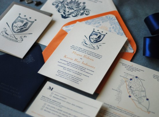
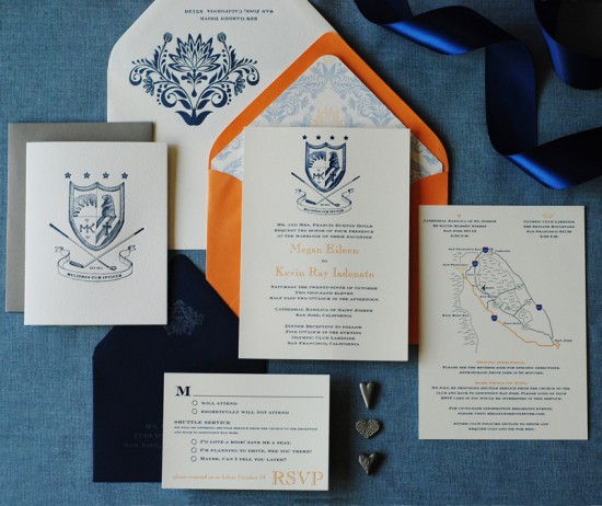
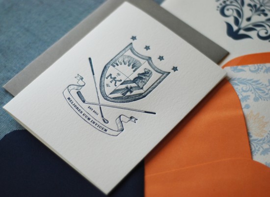
I love the idea of having a family crest – and there’s nothing to say that you can’t develop your own crest to pass down to future children and grandchildren.  That’s exactly what bride and groom Megan and Kevin decided to do for their wedding invitations!  They worked with Richele from Richie Designs to design the invitation suite, which includes a custom family crest created by illustrator Serena Chang.  So cool!

From Richele:  Megan and Kevin wanted to develop a custom family crest.  Each item in the illustration has special meaning for them, and the Latin term means “better together.”  We worked with illustrator Serena Chang to develop the family crest.  We chose to digitally print the invitation due to time constraints, while the thank you cards and envelopes were letterpress printed.

We brought Megan’s orange and blue color palette into play by using formal outer, inner, and rsvp envelopes.  The outer envelope was white with a letterpress printed fleur pattern, while the inner envelope was orange with a custom envelope liner.  Finally, the rsvp envelope was navy blue – a color used throughout the invitation suite – and was letterpress printed with silver ink.

Thanks Richele!

Design and Printing: Richie Designs

Illustration: Serena Chang

Richie Designs is a member of the Designer Rolodex – you can check out more of Richele’s work right here or visit the real invi­ta­tions gallery for more wedding invitation ideas!

Photo Credits: Richie Designs

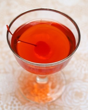
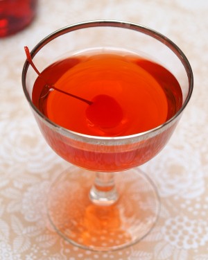
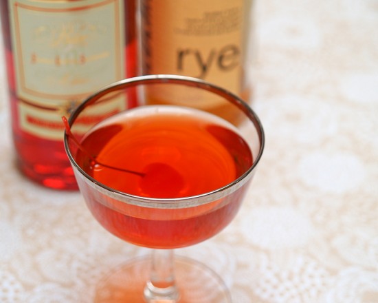
Friday Happy Hour: The Boulevardier (aka: The Bittersweet Manhattan)

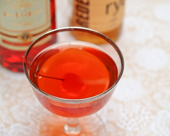
I am not the biggest fan of the Manhattan.  This is something of a terrible secret to confess in the world of cocktail aficionados.  The Manhattan is as classic a cocktail as they come; it’s a quintessentially masculine cocktail.  But it’s a little too rich for my taste.  So, I played around until I found a version I loved, which I dubbed the Bittersweet Manhattan.  Except it’s hard to invent anything truly new in the world of cocktails, and I found out that my recipe goes back at least to the 1920s as the Boulevardier.  Oh well.  It’s delicious no matter what you call it.

Read below for the full recipe!

The Boulevardier

2 oz Rye Whiskey
1/2 oz Sweet Vermouth
1/2 oz Campari
2 Dashes Bitters (optional)

Combine the ingredients and stir well with ice, then strain into a chilled cocktail glass or serve with an ample lump of ice.  Garnish with a lemon twist and enjoy.


A Manhattan, made with Rye, sweet vermouth, and bitters, is rich, spicy and oaky, sweet and sharp, icy cold and warming at the same time.  A Boulevardier is a Manhattan made with Campari – a very bitter Italian liqueur – in place of some of the vermouth, and is a little less sweet, a little more rounded, but just as sharp, aromatic, and complex.  With all that Campari, this version really doesn’t need any more bitters (though I found that Fee Brothers Cherry Bitters works well here).  I like a lemon twist for a garnish as the oils help balance the drink; you can go with a twist or the more common Manhattan garnish, a cherry.


Campari is one of the amari – Italian bitters – that also include Aperol, Punt e Mes, Cynar, and Zucca.  To be honest, its bitterness can be overwhelming.  I was ready to write it off until I read Jason Wilson’s fun and fascinating (and slightly self-impressed) spirits memoir Boozehound.  Wilson described happy hour in Milan as sipping amari and soda, munching on tramezzini and prosciutto and polenta covered in gorgonzola with coiffed men in red pants and brown belts or crisp blue suits, and lithe, tan, sunglassed women who drive Vespas in their high heels.  After that, I figured Campari was worth another try.  I may never love it, but I’m a fan when it’s mixed well in cocktails like the Boulevardier.

From whence the Boulevardier?  This drink belongs to Harry McElhone, proprietor of Harry’s New York Bar in Paris (and inventor of the French 75), and first appears in his 1927 cocktail guide.  It probably gets its name from a magazine published by Erskine Gwynne, an American expat who almost certainly patronized Harry’s.  Gwynne’s magazine, which featured the work of the likes of Hemingway, Lewis, Coward, and Joyce, was called – what else – The Boulevardier.

Photo Credits: Nole Garey for Oh So Beautiful Paper

Pretty Paper in the Office: Scissors

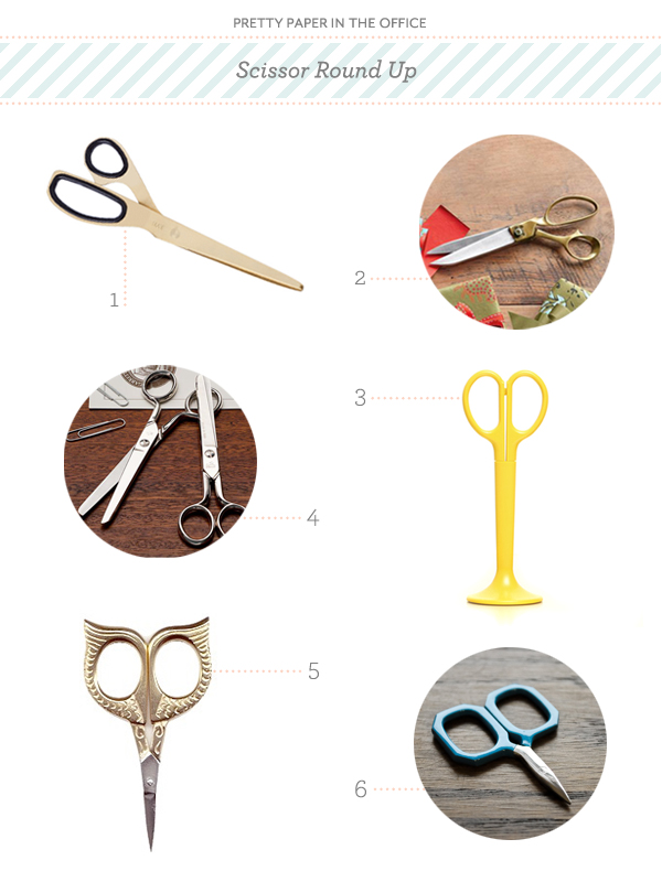
No matter what the office, or what kind of work you do, a good pair of scissors is pretty much a requirement.  I always find myself snipping something, be it for work, craft or a whirlwind wrapping day.  It’s only then that I realize that not just any pair will do; you need the right scissors for the task at hand.  From fabric to paper, and even a pair suitable for traveling, I’ve put together a round up of scissors big and small that will surely make the cut. – Julie

Scissor Round Up

No. 1 Brass scissors by Hay; No. 2 Tailor’s shears from Sundance; No. 3 Yellow scissors by ANYTHING; No. 4 Classic school scissors by Garrett Wade; No. 5 Owl embroidery scissors from Sublime Stitching; No. 6 Little gem blue scissors from The Workroom

{images via their respective sources}

Sarah + Jeff’s Modern Wedding Invitations and Save the Dates

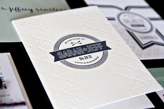
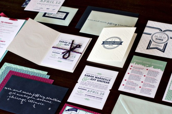
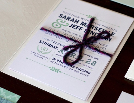
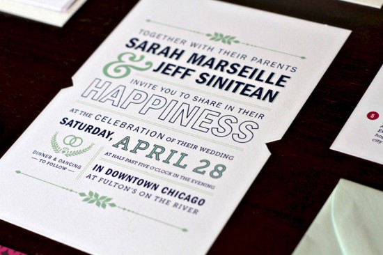
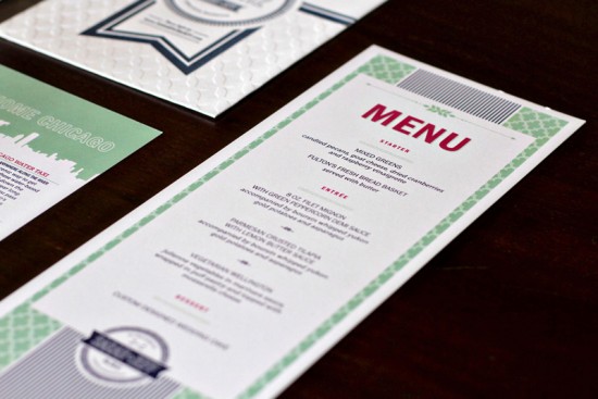
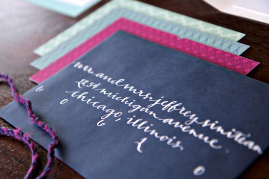
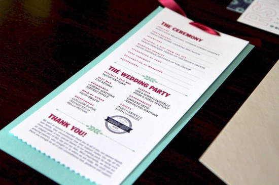
It’s always a great day when something from designer Kate Holgate shows up in my inbox!  Kate created these awesome wedding invitations last year, and today she’s back with another gorgeous suite.  Kate combined letterpress and digital printing, along with geometric patterns and lots of fun color, to create a modern and truly unique invitation suite for Sarah and Jeff’s Chicago wedding.

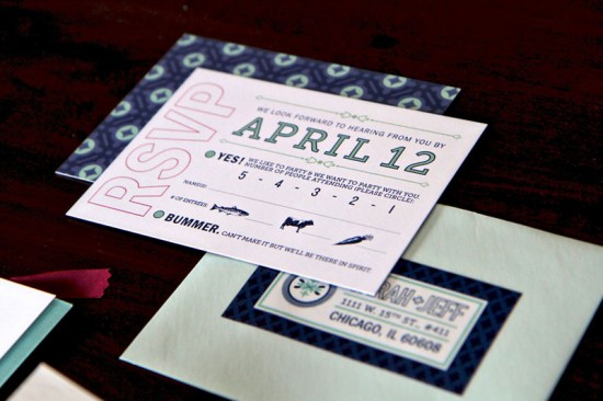
From Kate: Sarah and Jeff will be married in Chicago next month.  They wanted a unique design that combined lots of texture, geometric patterns and interesting typography.  Their gorgeous color pallet consisted of navy blue with accents of aqua and fuchsia.

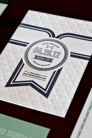
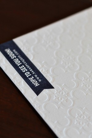
Sarah and Jeff were a dream to work with; they had impeccable taste and were very open to ideas.  Their production budget allowed for two of the pieces to be letterpress printed; we chose to letterpress print the save the date and invitation packet cover piece.  Both incorporated a blind impression and navy blue ink.


The rest of the suite was digitally printed.  We alternated patterns and colors on the backs of the individual pieces for a fun, colorful effect.  Sarah and Jeff love to kayak on the Chicago River together, so I subtly incorporated paddle icons to personalize the design.  Custom calligraphy gave a nice finishing touch.  Overall, I think that the invitation suite turned out elegant and fresh.

Thanks Kate!

Letterpress Printing for Save the Date: Paper Mill Designs
Letterpress Printing for Invitation Cover: Ladybug Press
Design: Kate Holgate
Calligraphy: Danica Cindell

Check out the Designer Rolodex for more tal­ented wed­ding invi­ta­tion design­ers and the real invi­ta­tions gallery for more wedding invitation ideas!

Photo Credits: Kate Holgate

Meg + Bryan’s Plant Marker and Plantable Save the Dates

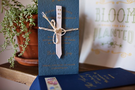
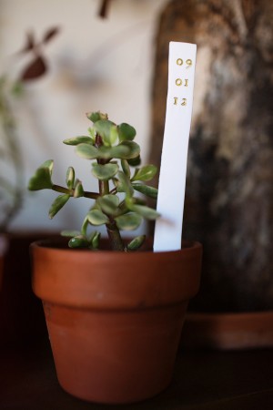
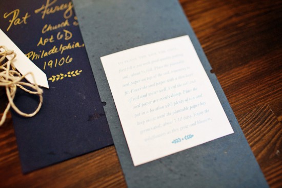
Happy Monday everyone!  We’re starting the week off with an unusual (and very cool) save the date from Meg at Belle + Union.  The bride and groom were inspired by the concept of putting down roots with their wedding, so they decided to incorporate handmade ceramic plant markers and letterpress printed text on plantable paper.  The bride also created a video of the printing and assembly process that you can watch below!

From the bride, Meg: Bryan and I had been dating for over six and half years when we got engaged.  Since we’ve been all over and done seemingly a thousand and one things in our six+ years together, the concept of “roots” and “growth” were really strong in our conversations, which paved the way for the entire aesthetic direction of our wedding.  We plan to incorporate a lot of natural elements and plants and herbs in lieu of cut flowers in the decor.


We really wanted the save the date to set the tone for the wedding.  I remembered something called seed paper, and Meg and I eventually decided on a rich french blue paper letterpress printed with gold ink, combined with handmade clay plant markers stamped with our date and tied to the paper with sparkly gold and white twine.  The idea was kind of perfect – you could actually plant the save the date and watch it grow roots.

After a weekend of printing and crafting,  I flew back home with a giant box of goodies and spent the next weekend cutting, tying, stuffing envelopes with my best friend and my fabulous mother.  All the while, I was documenting the process, which I edited into this video.  The video has become something really special for us – since we’re encouraging our friends and family to plant their save the dates and not keep them as mementos, we will all have this video and the flowers that grow from them instead.

Thanks Meg!  You can check out more from Belle + Union right here!

Design and Letterpress Printing: Belle + Union

Photo Credits: Pat Furey Photography