Wedding Details: Creative Menu Ideas

Today we have more wedding day stationery ideas to share – this time focusing on wedding menus.  Menus are one of my favorite details at a wedding, and I love seeing how the bride and groom choose to give their guests a sneak peek of the meal to come.  Whether you go with a menu at each place setting or as part of the centerpiece, I’ve gathered some of the best ideas to share with you!

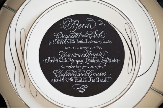
A classic round menu with beautiful calligraphy by Calligraphy Katrina. Photo by Krista Mason via Grey Likes Weddings.

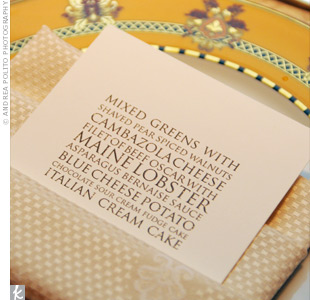
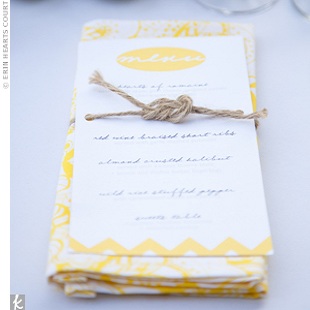
This modern type menu (left) would be so easy to DIY.  Photo by Andrea Polito Photography via The Knot.  I also love the idea of tying the menu to a coordinated napkin with a piece of twine (with a love knot, of course!) for more a casual wedding (right).  Photo by Erin Hearts Court via The Knot.

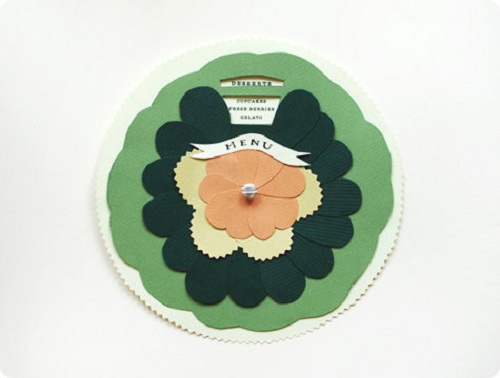
I think just about everyone around the blogosphere fell in love with Anna Bond’s DIY wedding menu wheel – and for good reason!  Details and instructions on Design Sponge.

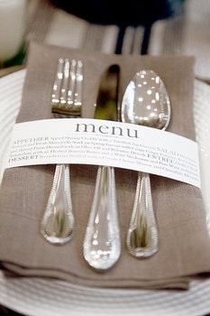
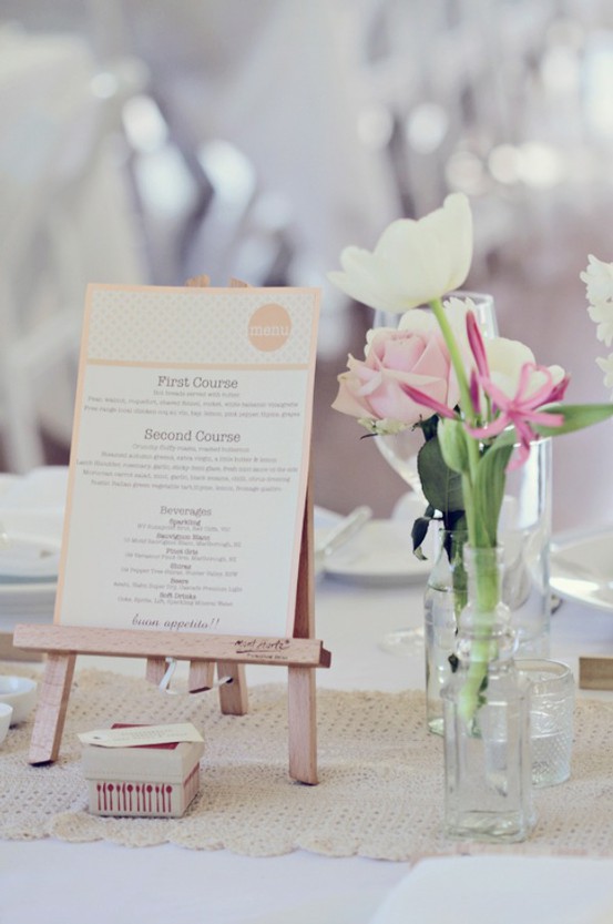
This napkin wrap menu (left) is so creative and modern! Design by Wiley Valentine, photo by Aaron Delesie via Gina DeDominici.  And these tiny art easels are perfect for making your menu part of table’s centerpiece (right). Photo by Poppy Lane via Style Me Pretty.

Having a western themed affair?  Carry it throughout all of your wedding stationery for a cohesive look.  Designed by Things Are Better with a Parrot.

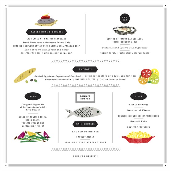
Hand-illustrated menus have become really popular and they I think they add a great personal touch.  Check out these examples:

Stationery by Christine Schmidt of Yellow Owl Workshop and photo by Aaron Delesie, via MS Weddings (Left).  Notebook sketch menu designed by the groom, Erik Marinovich, and photo by Thayer Photo, via MS Weddings (Right).

Artwork by Erin Jang via her blog, The Indigo Bunting.

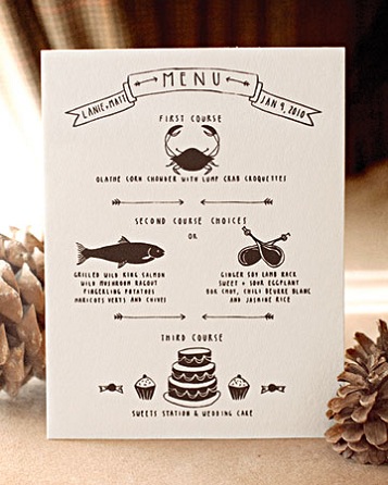
Another beautiful custom menu by Anna Bond of Rifle Paper Co.  Photo by Weddings by Two via Style Me Pretty.

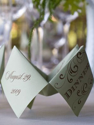
These two ideas are genius!  An “interactive” menu photographed by Jennifer Roper via The Knot (left); and a menu that doubles as a favor bag designed by Good On Paper Design, photographed by Janae Shields, via Snippet and Ink (right).

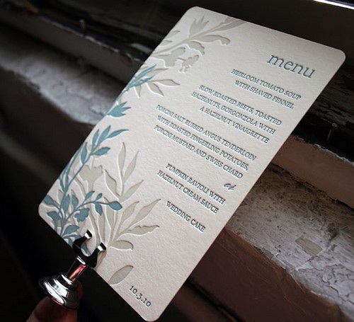
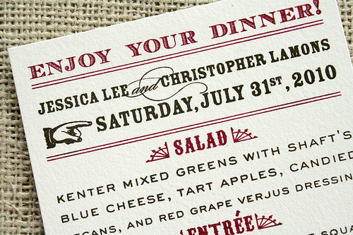
Smock has some beautiful letterpress printed menus; this is the Engadine design with one of my favorite color combinations.

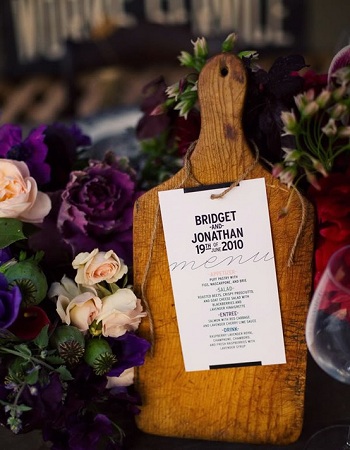
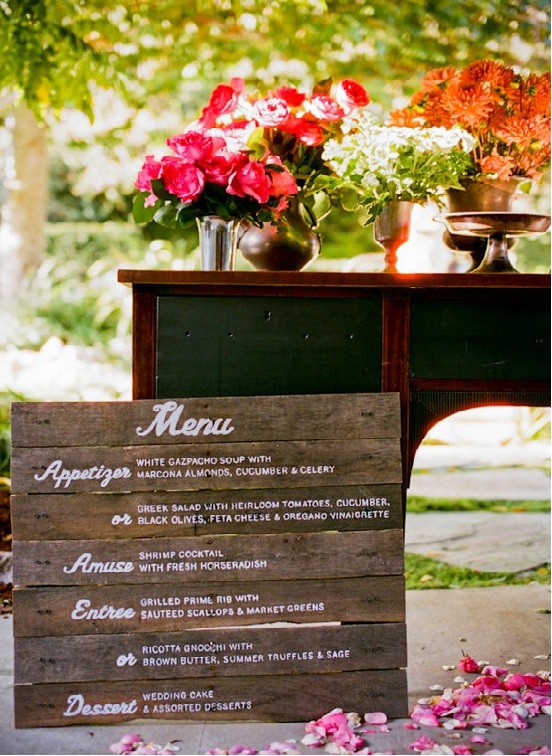
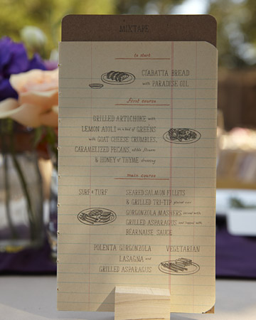
I’m in love with both of these rustic menu designs!  Cutting board centerpiece menu designed by Blue Pool Road and photographed by Bonnie Tsang via Snippet and Ink.  Wood menu created by Melangerie and photographed by Docuvitae via Style Me Pretty.


And while they’re not completely paper-related, how could I leave out chalkboard menus?  Here are two examples of how they can be done in a creative and stylish way.

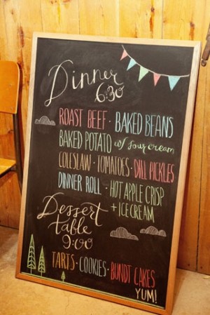
Colorful chalkboard menu (left)photographed by Kamp Photography via Green Wedding Shoes.  Sundae chalkboard menu (right) features calligraphy by Love, Jenna, photographed by Scott Clark via 100 Layer Cake.

Thanks so much for joining me today!  I hope you’ve enjoyed this round up of creative and stylish wedding menu designs, and if you missed our earlier round-ups of wedding escort and place card ideas you can find them here and here.  I hope this serves as some inspiration for you as your plan your big day!

{images via their respective sources}

*Smock is a spon­sor of Oh So Beau­ti­ful Paper.  For more on my edi­to­r­ial poli­cies, please click here.

Kathryn + Ryan’s Timeless Winter Wedding Invitations

You guys, if there’s anyone out there that loves paper as much as I do, it’s Kathryn from Snippet & Ink.  I’ve been poring over each and every detail from Kathryn and Ryan’s winter wedding (you can see the full series right here) and I’m honored that Kathryn decided to share the inspiration behind her gorgeous wedding invitations here today!  Kathryn partnered with Jill from PS Paper to create wedding invitations that truly represent her personal style – elegant, timeless, and totally stunning.

Classic-Elegant-Red-White-Gray-Letterpress-Wedding-Invitations Classic-Elegant-Red-White-Gray-Letterpress-Wedding-Invitations

From Kathryn: Our save the date design was a collaboration between me and Jill Sassa at PS Paper – I liked the idea of a vintage San Francisco postcard, so that was what we started with.  We used two vintage postcards for the save the dates, one of the Golden Gate Bridge for a note to our guests and one of a cable car for hotel and travel information.

San-Francisco-Post-Card-Save-the-Date

Jill added the tiniest bit of glitter to the postcards, tied them together with bakers twine, finished them off with a little tag, and then mailed them in a glassine envelope with a wrap-around address label.

Classic-Elegant-Red-White-Gray-Letterpress-Wedding-Invitations Classic-Elegant-Red-White-Gray-Letterpress-Wedding-Invitation

For the invitation suite, I wanted something that was both elegant and playful.  After collecting inspiration and discussing the design with Jill and Laurie Arons (my planner), I played around in Photoshop with different fonts, motifs, colors until I got very close to the look that I wanted.

Classic-Elegant-Red-White-Gray-Letterpress-Wedding-Invitations-Reply

The final design, brought to life by Jill and letterpress artist Alan Hillesheim, used gray and red ink on thick 100% cotton paper from Crane’s in pearl white.  In addition to the red and gray letterpress, we incorporated a blind press wreath in each piece of the suite.

Classic-Elegant-Red-White-Gray-Letterpress-Wedding-Invitations-Reception-Card Classic-Elegant-Red-White-Gray-Letterpress-Wedding-Invitations-Envelope

Red hand-painted edges on the invitations and envelope flaps were a simple touch that added a pop of color.  We wanted guests to receive something that they’d be excited to open, which I think we accomplished by using Betsy Dunlap‘s calligraphy and vintage stamps from The Paper Nickel.  Other playful details: on the invitations, our first names were the only thing printed in red; our reception cards were coasters, hinting at the supper club feel of our venue; and the RSVP cards gave guests room for personal responses (my favorite response was from my teenage cousin who wrote in gigantic capital letters: I WILL BE THERE. THAT’S A PROMISE.).

Classic-Elegant-Red-White-Gray-Letterpress-Wedding-Invitations-Envelope-Calligraphy

Can I just say how much I’m in love with this red, gray, and white color palette?  So perfect for a winter wedding – sophisticated and festive without being overly Christmas-y.  In addition to stunning wedding invitations and save the dates, Kathryn had some of the most adorable paper details at her wedding – from beautiful glittery menus to playful calligraphy button escort cards:

Winter-Wedding-Details-Silver-Wreath-Menu Winter-Wedding-Details-Menus-Napkins

Winter-Wedding-Details-Calligraphy-Button-Escort-Cards Winter-Wedding-Details-Red-Calligraphy-Button-Escort-Cards

Thank you Kathryn!  You can read more about Kathryn’s invitations (and the printing process) here and here, and see all of the amazing images and details from Kathryn’s wedding right here.

Invitations and Save the Dates: PS Paper

Wedding Invitation Calligraphy: Betsy Dunlap

Vintage Stamps: The Paper Nickel

Letterpress Printing: Alan Hillesheim

Escort Card Calligraphy: Maybelle Imasa-Stukuls

Photo Credits: Elizabeth Messina, with the exception of the save the date photo by PS Paper

p.s. If you haven’t seen Kathryn’s wedding video… it’s the most beautiful wedding video I’ve ever seen and I dare you not to tear up while you watch it.  Go. Now.

Save the Date Contest Finalists {Part 2}

As promised, I have more inspiration boards from the finalists of the Save the Date contest from Delphine!  Here are the next three finalists (again, in no particular order):


Kate S: Design: Meeting Street;  Ink Colors: Crimson and Freesia
My fiance and I had our entire wedding planned in my native New York City, but the economy has taken its toll and we have had to cancel our plans and move everything to my moms backyard in Westchester, NY. Its even more exciting now as we are planning a very communal wedding, asking friends and family to contribute towards the day in lieu of gifts. The style of the wedding is going to be very outdoorsy and whimsical, with a vintage feel. We are going to have a 1930's style band, elegant dresses, men in straw hats and floral prints – a sort of hippie meets glamour evening. Since I love color so much its hard to narrow them down for a theme, but red and yellow have always been my favorite combination, they shouldn't work together but they just do!
Save-the-Date-Contest-KateS
image sources, from left to right: hair piece via ban.do; Save the Date card via Delphine; cake via MS Weddings; backyard viaLittle Winter Bride; bouquet via New York Magazine; papel picado banner via Ay mujer; boutonniere via Something Old, Something New


Libby: Design: Savannah;  Ink Colors: Two-tone greens (like
key lime and palm)

My fiance, Lee, and I live in Providence, RI, but are getting married next May in Fairhope, Alabama (close to my family and friends). Lee and I are having to pay for the majority of the wedding, and because of extra costs such as traveling and hotels, our budget is tight. I feel that the Savannah style fits perfectly with my wedding. We are getting married at The Fairhope Inn. It is a small charming bed and breakfast and restaurant in Fairhope, AL. We will have both the ceremony and the reception in the garden courtyard. I want my wedding to be fun and springy and green and fresh. I love botanical anything, and I love, love the Savannah invitations and Save the Dates! They would fit so perfectly with the theme!

Save-the-Date-Contest-Libby
image sources, from left to right: Save the Date via Delphine; centerpiece via Style Me Pretty; bridesmaid dress via J Crew; shoes via Style Me pretty; sparklers via events wholesale; dress via Once Wed; bouquet via Style Me Pretty; centerpieces via MS Weddings

Lindsay: Design: The Robin Collection;  Ink Colors: Tangerine +
Chocolate. 

Lindsay and her fiancé are planning a wedding that reflects their memories of a trip to Napa Valley, California, where they were engaged:

We chose the Fairmont Copley as our venue because of its beautiful architecture, intricate gold detailing and cozy, warm ambiance. We picked the month of October for its rich autumn hues and seasonal food offerings. From there we began focusing on the little details: stacked corks to hold the seating cards, wooden wine crates to give depth and height to our antipasto display, olive oil favors to honor my fiancé's Greek heritage. We started thinking about the flowers; clustered vases with full garden roses, submerged orchids, dripping crystals and floating candles. We want our wedding to reflect the romance and beauty of the California vineyards. We see the candlelight as being reminiscent of the wine cellars with their antique candelabras and cool cement walls. The colors that we chose; gold, champagne, ivory, peach and cream play to the peaceful elegance of the area and the cascading crystals add that sexiness that permeates everything in Napa Valley.


Save-the-Date-Contest-Lindsay
image sources, from left to right: sunlight photo via flickr; invitation via Delphine; boutonniere via Style Me Pretty; Pumpkin
Soup
here; wine cellar via flickr; dress via Style Me Pretty; flowers via the knot; vineyard via National Geographic; flowers and escort cards via the knot; submerged flowers via Style Me Pretty; cake via Southern Weddings; bridesmaid dress by Jim Hjelm; Lindsay's venue, the Venetian Room.
I've got a few more finalist inspiration boards to post, so if you entered the contest, check back tomorrow morning!

Lindsay + Ryan’s Kraft Paper + Gold Wedding Invitations

I completely fell for these beautiful letterpress wedding invitations and Save the Date from SeeSaw Designs during Angela Hardison‘s guest posts on Black*Eiffel.  The invitations were designed and printed for and by one of SeeSaw’s own designers, Lindsay Tingstrom-Casey:

Seesaw_letterpress1

Luckily for me, Lindsay was kind enough to both send over a few additional photos of her invitations and share some of the inspiration behind the design.  Let’s start with the initial inspiration.

From Lindsay: We were married at the Phoenix Art Museum, a beautiful modern space.  The building itself focuses on a lot of natural, raw materials, and we wanted to continue that feeling with the invites themselves. Our colors included brown, cream, orange and yellow.

Pam_lcentral_sm

346

And now for the invitations!

The contrast between roughness of the natural kraft paper material and the clean crispness of the Lettra was really appealing to us. We knew we wanted the invite to have three pieces, so the chocolate enclosure was a perfect solution.

Invite3

The blind deboss on the enclosure’s belly band was totally a happy accident – I had no idea it would be legible without ink, but lo and behold, it worked!

Invite1

Invite2

Lindsay printed both the accommodation enclosure from her invitations and her ceremony programs on thick chipboard:

Invite4

Invite7

A couple detail shots of Lindsay’s Save the Dates:

Invite5

Invite6

Lindsay also carried the design elements from her invitation suite over to her escort cards and table numbers and printed them on similar material to the Save the Dates and accommodation card:

391

513

The letterpress that we used to print my invitations, a Kluge, was a recent addition to Seesaw’s studio.  We already had a C&P when the Kluge came to us, and this was actually the first job we printed on it.  Talk about pressure!  Our prior letterpress experience was limited, but it all worked out for the best.

I hope everyone has enjoyed Lindsay’s invitations as much as I have!  Thanks so much Lindsay, for sharing your beautiful wedding invitations and inspiration with us!

Check out the Designer Rolodex for more tal­ented wed­ding invi­ta­tion design­ers and the real invi­ta­tions gallery for more wedding invitation ideas!

{images via Lindsay Tingstrom-Casey and SeeSaw designs}

Weekly Link Round-Up

AlysonFox-DesignSponge
{my favorite image of the week – from Alyson Fox’s wedding via Design Sponge}

This has been a busy week in paper goods, so grab a cup of coffee or tea or chai and let’s get started!

Gig
  • Beautiful prints by Clare Rojas via Dear Ada
  • An inspired First Birthday in a Box set by City Bird Design via Inspired Goodness
  • Don’t forget to check out all the DIY projects this month over at EAD!
  • This week was all about Save the Date designs at Brooklyn Bride
  • A new letterpress invitation suite is available at Laura Hooper Calligraphy
  • VintageGlam tells us where to find free Art Deco fonts
  • {ritzy bee} loves escort cards
  • Wedding Paper Divas is offering a special discount on Blurb books – but only until November 30!
  • More lovely work by Bird & Banner over at OnceWed

That’s it for this week — I hope everyone has a wonderful weekend!