Modern Orange and Burgundy Acrylic Wedding Invitations

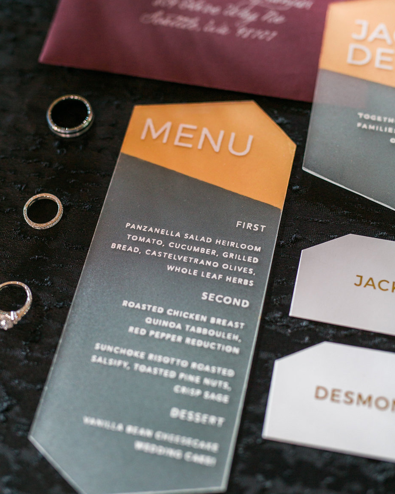
These modern orange and burgundy acrylic wedding invitations have ALL THE THINGS! Pops of die-cutie cut acrylic, vintage stamps, a crisp sans serif typeface, and a warm bold color palette! Katie of Ink and Sable drew inspiration from the industrial modern venue and brought in fun acrylic elements to make this modern suite one that really packs a punch! So fun!
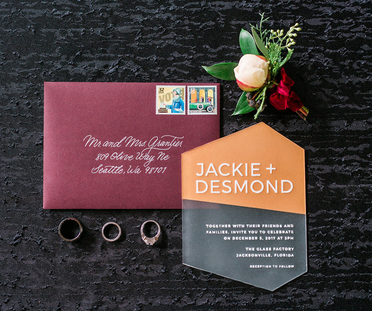
Modern Orange and Burgundy Acrylic Wedding Invitations by Ink and Sable

From KatieWhen Lauren Townsend from A Tale of Two Towns Wedding and Event Design came to with this modern speakeasy challenge I was, to be honest, a little nervous. One of the first questions I asked was “what’s the venue?” She told me The Glass Factory in Jacksonville FL. I Googled the venue and I knew from looking at the images exactly what I was going to make to bring accomplish Lauren’s desired look.

Modern Orange and Burgundy Acrylic Wedding Invitations by Ink and Sable

Modern Orange and Burgundy Acrylic Wedding Invitations by Ink and Sable

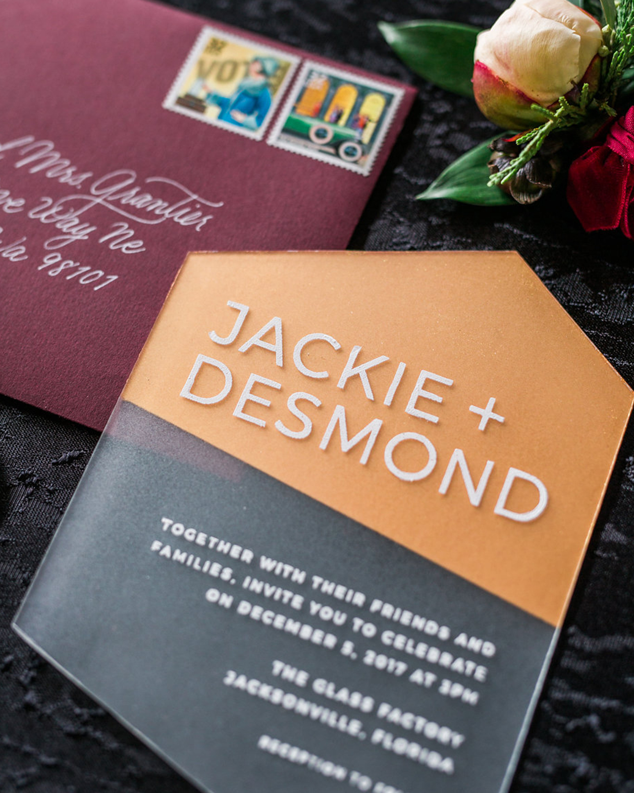
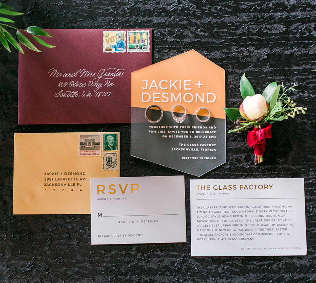
The aesthetic is all about gold, burgundy, and crisp accents to offset the historic industrial venue, which is an awesome combination! I really wanted to play up the name of the venue and hit it hard with the modern look versus the industrial look or even an organic calligraphy look. After seeing some acrylic invitations float around, I knew that was going to pack the biggest punch! Plus, it totally looks like frosted glass! See what I did there?

Modern Orange and Burgundy Acrylic Wedding Invitations by Ink and Sable

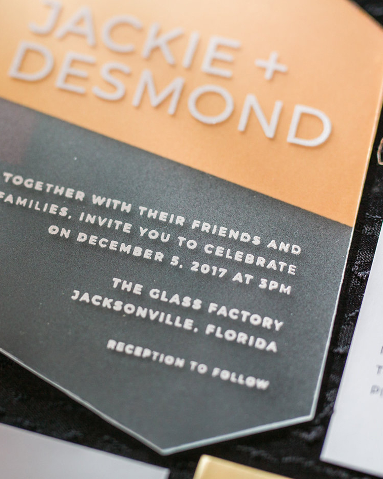
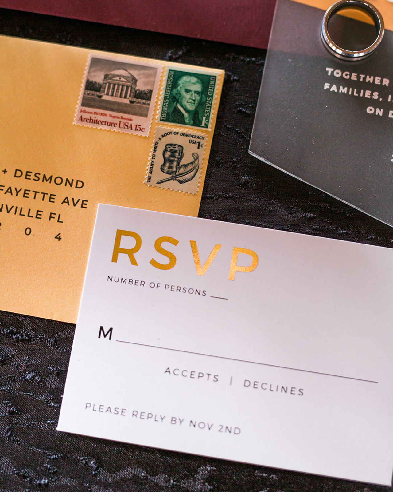
I really wanted to use a modern typeface, and as some stationers might know, writing perfectly on acrylic is quite a task! So what would get me the best results? Screen printing! While my invitation and menu were going to be the stars of the show, I didn’t want to do a disservice to the RSVP and Details card, so I embellished the typography with foil printing through CatPrint who does short-run foil press (YAY!). RSVP and Details paired with a shimmery gold return envelope really accented the gold.

Modern Orange and Burgundy Acrylic Wedding Invitations by Ink and Sable

Once I got the silkscreen, I had to test it on sheets of acrylic to make sure it was going to work. After testing and retesting I was ready to do the REAL one. I silkscreen printed the invitation first and let it dry over a period of a few days and put a heavy spray of varnish on top to make sure the ink would stay on the acrylic. I flipped it over to mark where my die cut would be and very carefully cut off the edges to make my invitation and menu asymmetrical. The final touch was to add the wash of gold to the back to add that extra punch of modern flair.

Modern Orange and Burgundy Acrylic Wedding Invitations by Ink and Sable

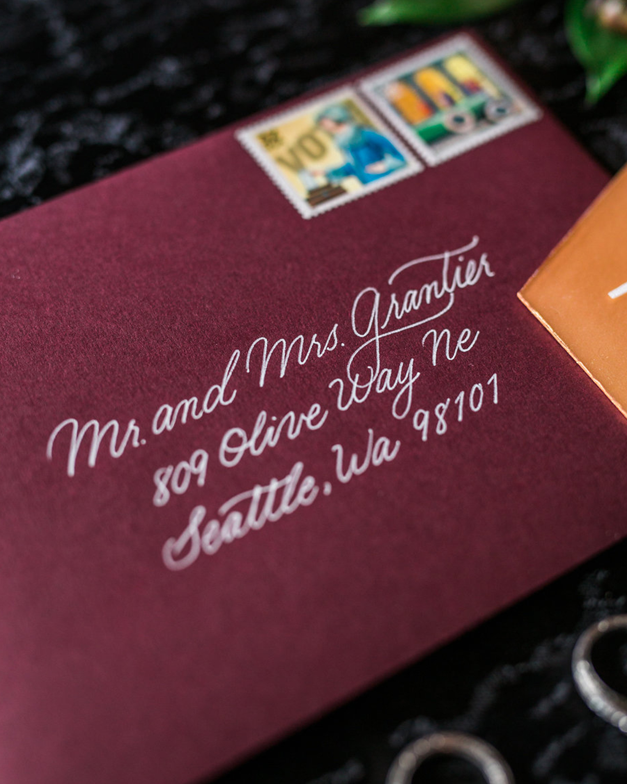
This suite paired with a burgundy envelope stamped with vintage 1920s speakeasy postal stamps was the perfect amount of jewel tone to really bring this look together. With the details laid flat on black velvet with hints of greenery and, of course, the rings, this suite was super sexy! Can you say that about a suite? Because I just did.

Modern Orange and Burgundy Acrylic Wedding Invitations by Ink and Sable

Thanks Katie!

Design: Ink and Sable
Foil Printing: Cat Print
Event Planning/Design: Laura Townsend of A Tale of Two Towns Wedding and Event Design
Venue: The Glass Factory 
Floral: Liz Stewart Floral Design
Jewelry: Chloe and Isabel, Styled by Markie 
Ring Box: The Mrs. Box
Linens: BBJ Linen

Check out the Designer Rolodex for more tal­ented wed­ding invi­ta­tion design­ers and the real invi­ta­tions gallery for more wedding invitation ideas!

Photo Credits: Arielle Johnson

Unicorn and Gemstone Inspired Birthday Party Invitations

These unicorn and gemstone inspired birthday party invitations are perfect if you’re in the mood for something magical, festive, and just plain fun! This bright pink invitation suite, complete with the most adorable gemstone envelope liner, was designed by Briana of Flyover Design Co. I imagine that quite a bit of giggling ensued while guests played pin the horn on the unicorn!

Unicorn and Gemstone Inspired Birthday Party Invitations by Flyover Design Co.

From Briana: We designed this unicorn-themed invitation suite for a lucky four-year-old girl’s upcoming birthday party. The client’s main request when contacting us to help with the party was to incorporate hand-drawn unicorns, watercolor washes, and geometric elements while staying in the desired pink color palette.

Unicorn and Gemstone Inspired Birthday Party Invitations by Flyover Design Co.

Our process began with the illustration of the unicorn—we hand-drew a few variations of unicorns for the client to choose from. Once the unicorn design was selected, we started on the main 5×7 invitation. The final invitation includes all of the party details with design elements including: watercolor, hand-lettering, and gold-foil printing. After completing the main invitation, we moved on to the envelope liners to accompany the suite. The liners incorporated the same geometric gemstones from the 5×7 invitation while staying in the pink color palette. From there, we created party favors for the event.

Unicorn and Gemstone Inspired Birthday Party Invitations by Flyover Design Co.

The favors and details we created include laser cut wood unicorns that were wrapped around the invitations and the napkins at the party with gold and white twine. We added holes and ribbon to hang the poster. We also created stickers in six color variations as party favors for guests to take home from the party, along with a 10×20 Pin the Horn on the Unicorn Sign with a hand-drawn unicorn on a 10×20 poster board and cutout horns for the guests. Finally, we printed place cards with the gemstone motif for the number of guests specified, then hand-lettered each card with a black paint pen.

Unicorn and Gemstone Inspired Birthday Party Invitations by Flyover Design Co.

Unicorn and Gemstone Inspired Birthday Party Invitations by Flyover Design Co.

Unicorn and Gemstone Inspired Birthday Party Invitations by Flyover Design Co.

Once finished, the overall suite and favors create a cohesive look for the birthday party. By sticking within the same palette and including the two main elements—the unicorn and gemstones—throughout, it stays consistent and gives off the magical, girly feel that the client was looking for.

Unicorn and Gemstone Inspired Birthday Party Invitations by Flyover Design Co.

Thanks Briana!

Design: Flyover Design Co.

Invitation Printing: Cat Print

Laser Cutting: Ever Laser

Envelope Printing: Cards and Pockets

Sticker Printing: Moo

Photo Credits: Briana Wengert

Moonrise Kingdom-Inspired Wedding Invitations

When you read the words “camping” and “Moonrise Kingdom” in an invitation submission, you know you’re in for a delightfully quirky and playful wedding invitation suite. Tori of The Cozy Gnome drew a handful of outdoorsy watercolor camping illustrations to bring these Moonrise Kingdom-inspired wedding invitations to life. Beautifully curated vintage stamps, bright mustard yellow envelopes, and simple hand lettering accent this rustic, yet whimsical, invitation suite!

Moonrise Kingdom-Inspired Wedding Invitations by The Cozy Gnome

From Tori: I work the old fashioned way – by putting pen to paper, starting either with the lettering or the illustrations. In this case, there were so many fun, potential visuals so I starting drawing right away. The bride gave me two concepts for inspiration: camping and “Moonrise Kingdom.” As I started illustrating the tent and the trees, my excitement rose. I knew I wanted to keep the suite playful and full of warm tones so I spent a lot of time watercoloring the illustrations, allowing the white space to come through to give the invitation suite a more whimsical and outdoorsy feel.

Moonrise Kingdom-Inspired Wedding Invitations by The Cozy Gnome

Moonrise Kingdom-Inspired Wedding Invitations by The Cozy Gnome

One of my favorite aspects of “Moonrise Kingdom” is Anderson’s homage to vintage decor and details, so I knew I wanted to incorporate that somehow. I collect vintage thermoses and knick knacks so I studied the lettering and before I knew it I was adding this chunky, retro lettering style to the suite.

Moonrise Kingdom-Inspired Wedding Invitations by The Cozy Gnome

Moonrise Kingdom-Inspired Wedding Invitations by The Cozy Gnome

It all came together better than I envisioned and dreamed; it’s just so fun and playful which really propels you as an artist. The invitation suite was printed on a heavy, matte card stock. They really just burst with personality and that mustard yellow envelope just really pops!

Moonrise Kingdom-Inspired Wedding Invitations by The Cozy Gnome

Moonrise Kingdom-Inspired Wedding Invitations by The Cozy Gnome

Thanks Tori!

Design, Illustration, and Calligraphy: The Cozy Gnome

Printing: CatPrint

Check out the Designer Rolodex for more tal­ented wed­ding invi­ta­tion design­ers and the real invi­ta­tions gallery for more wedding invitation ideas!

Photo Credits: Tori Hernandez

Love is Mightier: Postcards to end gun violence

Ed Note: Today we’re taking a bit of a departure from our regular content to introduce a new initiative from our very own Emily. Gun violence is such a big and overwhelming issue, and it’s so easy to feel like there’s nothing that we can personally do to help. Emily’s new initiative, Love is Mightier, is a reminder that we can make our voices heard and, together, we can make a difference. Emily has gathered some incredible designers (and is still accepting submissions!) to donate postcards spreading a message of love over fear, and 100% of the proceeds will go to support local organizations working to end gun violence. Read more below!

This is a more personal post than my usual brick + mortar column. Thank you to Nole for welcoming it and each of you for reading it!

As a mother and community member, the continual acts of gun violence have pierced my heart. In December, in the wake of another gun tragedy, I was tired of wringing my hands and wondering what I could do. I thought about my best skill sets and the creative community around me and knew it was time to act. I am at my best when I’m cheerleading and organizing others into action. I put out a call on social media to my creative community to create cards celebrating love over fear with the idea that we could support organizations and individuals working to end gun violence. I didn’t have a complete plan, but the response was overwhelming, so I got to work. Over the past few weeks, I have felt like a very lucky lightning rod for some incredible creativity and emotion. I am reminded each day that each of us can do something and together, we can ensure that love is mightier than fear. ~ Emily of Clementine

Amy Heitman for Love is Mightier / A Campaign to End Gun Violence

Amy Heitman, Love is Mightier

Details of the Love is Mightier campaign: Each designer contributed their designs and creativity for this project. They either funded or had the printing costs donated. The cards are currently for sale at my store, here, and I’m working to reach out to independent shops nationwide (there are some legal regulations that we’re working through to make this as easy as possible).  Each card set is $10 for 10 cards (plus some grassroots action to end gun violence in your community). The 10 cards presented here represent our first volume, I expect to have at least 3-5 volumes (30-50 postcards!) over the next few months. I hope those who send and receive the cards will share their messages on social media with hashtag #loveismightier so that we can increase the volume on this issue and contribute to ending gun tragedies in our communities.

The Nic Studio for Love is Mightier / A Campaign to End Gun Violence

The Nic Studio, Hands, Heart, Love. Printing donated by Catprint Inc.

Happy Cactus for Love is Mightier / A Campaign to End Gun Violence Happy Cactus Designs, Love More Fear Less
Hartland Brooklyn for Love is Mightier / A Campaign to End Gun Violence Hartland Brooklyn, I love you
Laura Macchia and May Day Studio for Love is Mightier / A Campaign to End Gun Violence

Laura Macchia with printing by May Day Studio, Love

Printerette Press for Love is Mightier / A Campaign to End Gun Violence

Printerette Press, Love Thy Neighbor

Steel Petal Press for Love is Mightier / A Campaign to End Gun Violence

Steel Petal Press, The True Protest is Beauty

Power and Light Press for Love is Mightier / A Campaign to End Gun Violence

Power and Light Press, Hate Generalizes Love Specifies

Thimblepress for Love is Mightier / A Campaign to End Gun Violence

Thimblepress, Shape the World with Love

Idlewild Co. for Love is Mightier / A Campaign to End Gun Violence

Idlewild Co., We are Love

I’m not sure there are words to adequately describe the experience of fielding these submissions, and the sentiments that are sent. I want to send a warm thank you to each designer who has already contributed, and those in progress. I love the postcards above, and believe me, we have some incredible work on the way. See the new arrivals here on the Love is Mightier instagram.

If this project moves you, I’ll be accepting new submissions (at least) through March, please send me a note [email protected]

All photos by Jessica Sipe who donated her time to this effort.