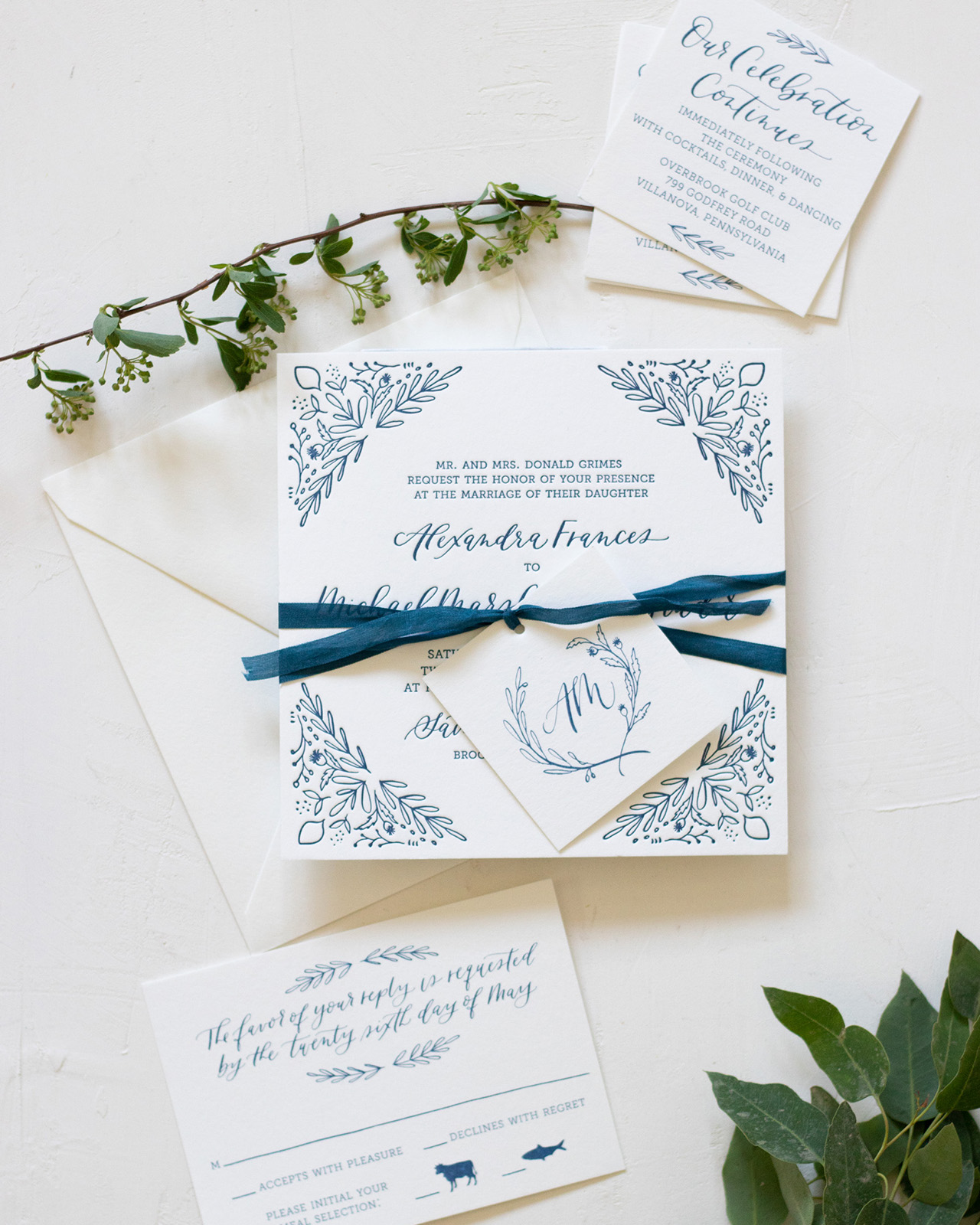
Ahhhh…. navy and white is such a beautiful and classic combination. Add in some modern botanical illustrations from one of our talented Designer Rolodex members, Kim of Bright Room Studio, and you’ve got some seriously gorgeous navy and white illustrated floral wedding invitations! I love that Kim and the bride and groom decided to letterpress print the entire suite in a single color – navy blue – which just completely elevates Kim’s beautiful illustrations and lettering. So pretty!
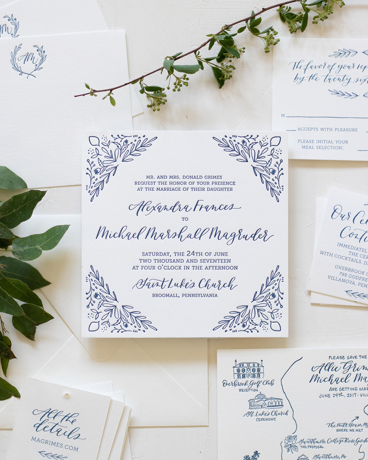

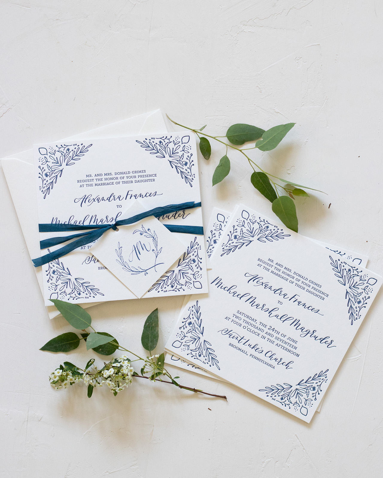
From Kim: Working with Allie and Michael on their invitations was so much fun. I knew it was going to be a great project when I received a design brief written by the groom! He put so much thought and time in to sharing their story, aesthetic and things that were important to them (including their favorite cocktails and guilty pleasures!) that it made the creative process so much fun and made their invitations incredibly personal and special for them.
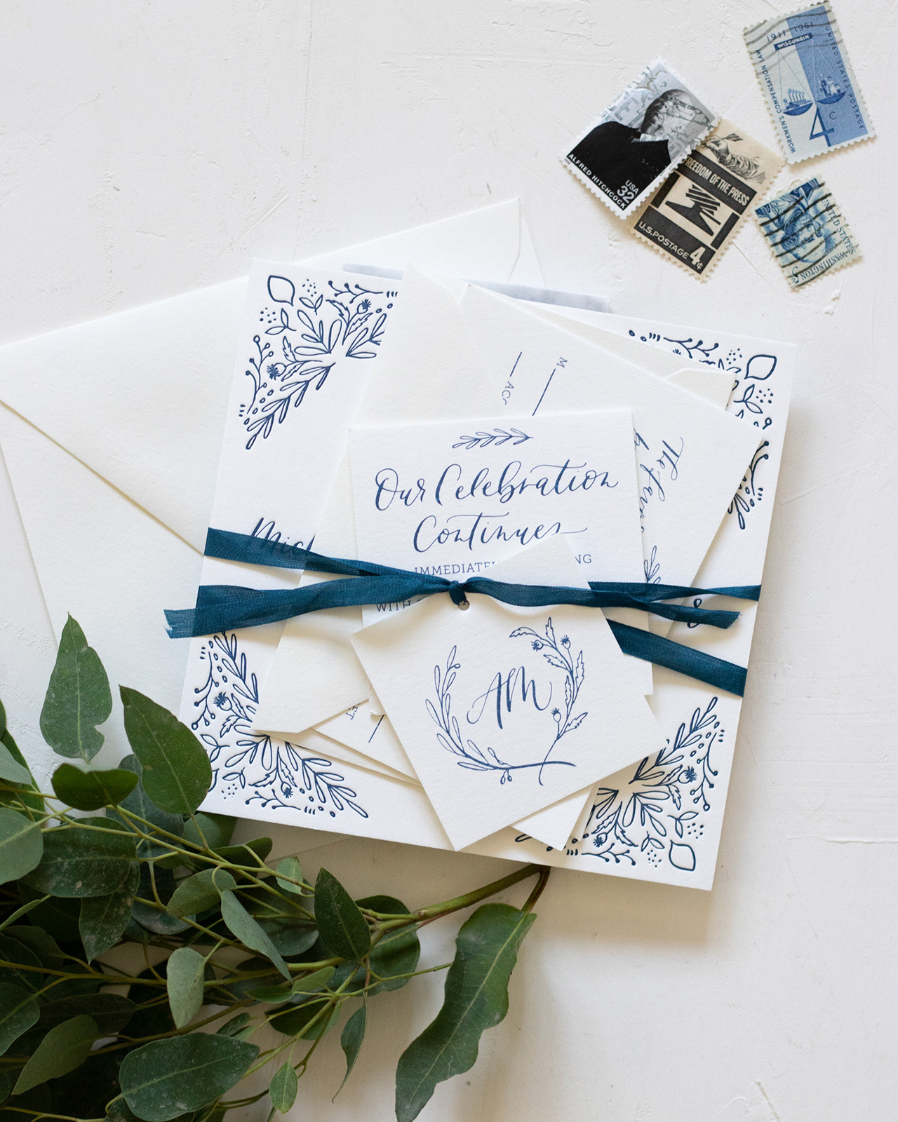
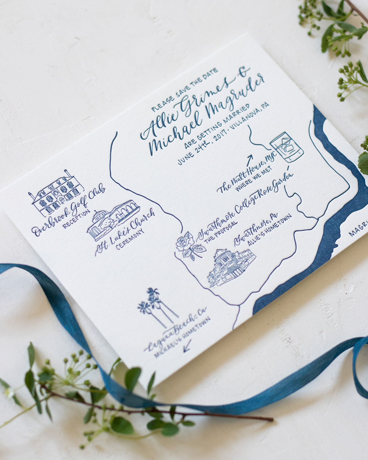
We started with the cute map save the date. I love creating maps, especially when I get to incorporate illustrations of the architecture and buildings, combined with places that are meaningful to them. They met “the old fashioned way” – at a bar! – so we definitely wanted to incorporate that cute detail, along with the wedding venues. We did the map in a gorgeous blue, which became a design theme for the rest of the suite.
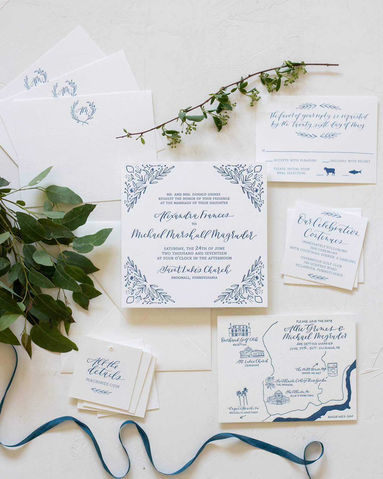
For the invitation, we wanted to keep it sophisticated but still personal. We chose symbols to represent their heritage: an olive branch for her Greek background and a thistle for his Scottish roots. I illustrated each branch and used it throughout the invitation through patterns, graphic details and the monogram. We letterpress printed the invitation to really make the leaf details pop.
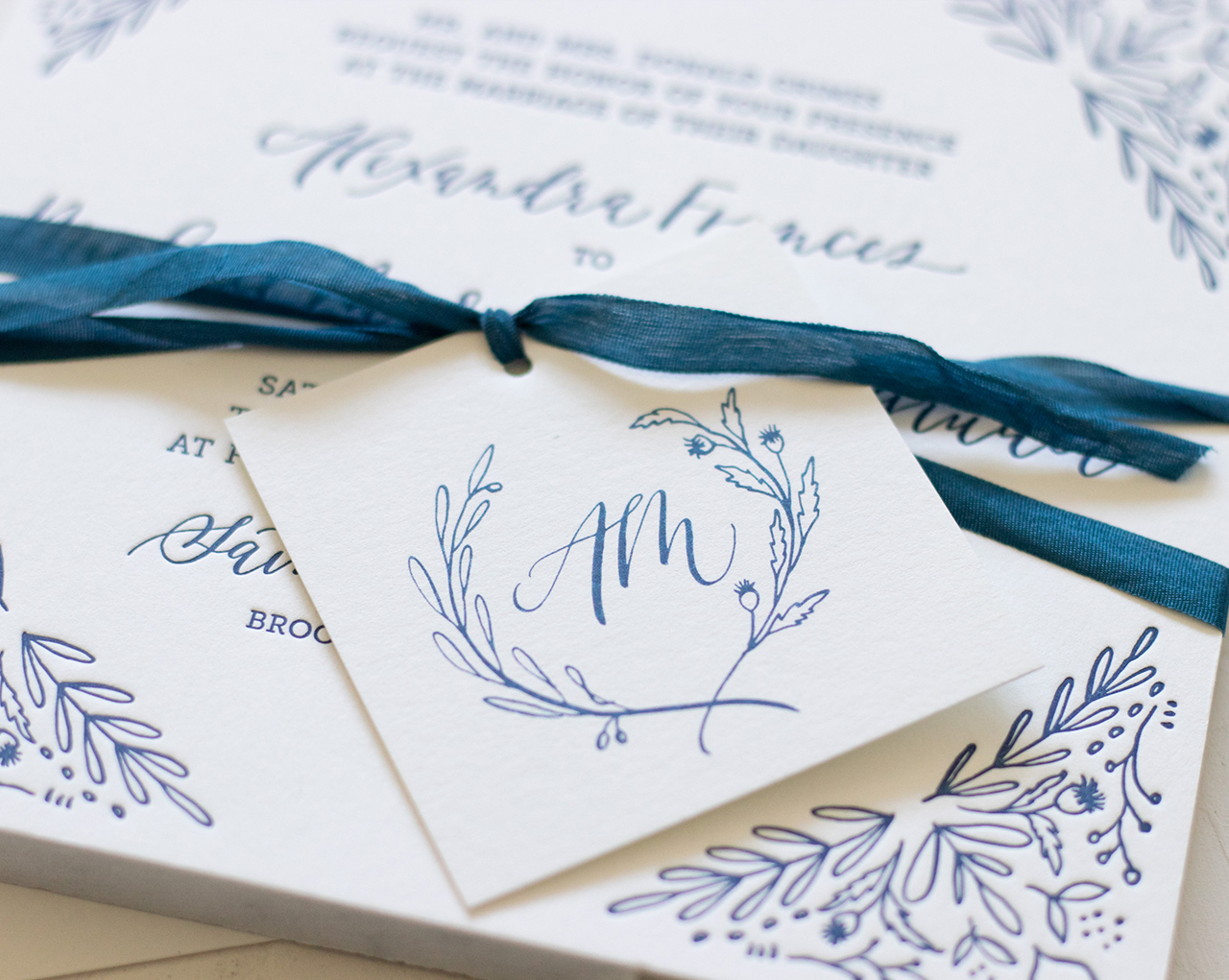
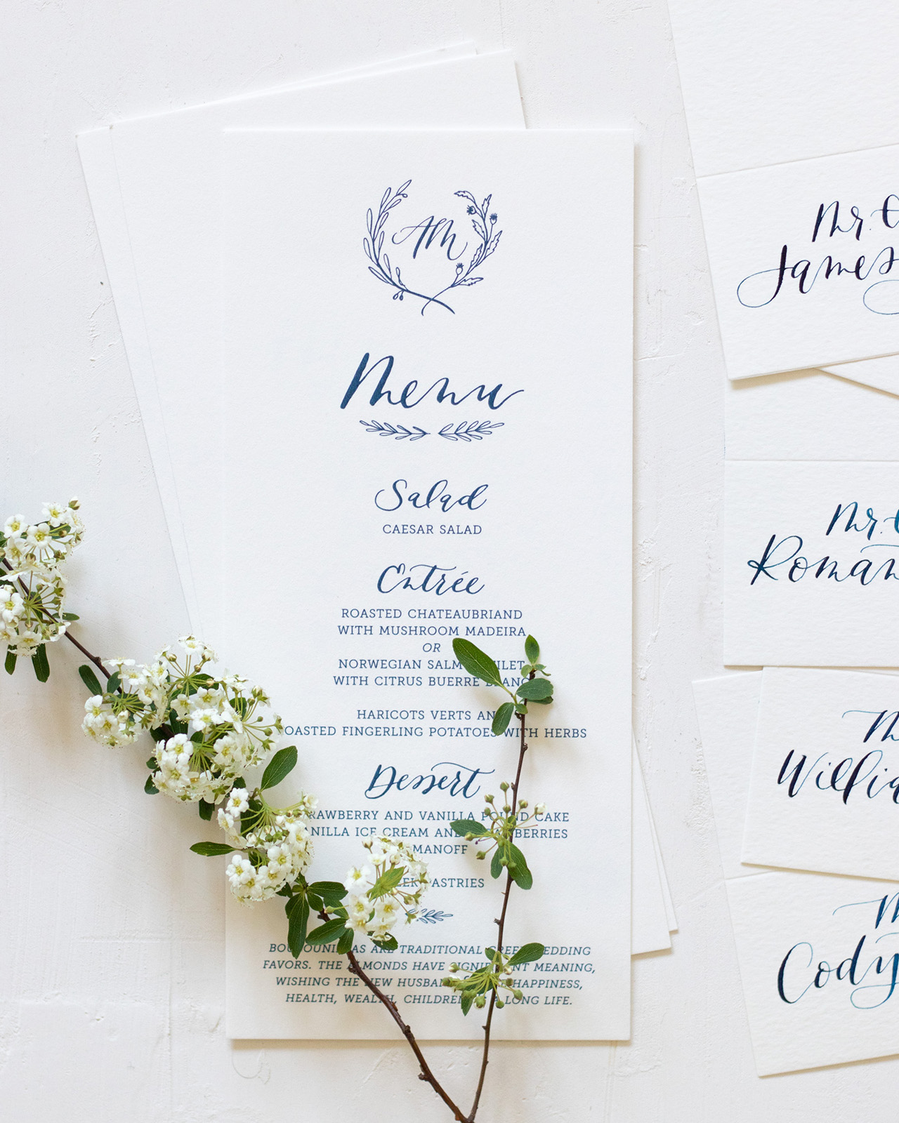
The monogram tag is such a great example of what you can do in the design process. I showed them one design with this leaf pattern and one with the monogram and they couldn’t decide, so we found a way to incorporate both ideas throughout the suite. The monogram was also a perfect detail to use in other elements on their wedding day, such as the sweet notecards, menu and program.
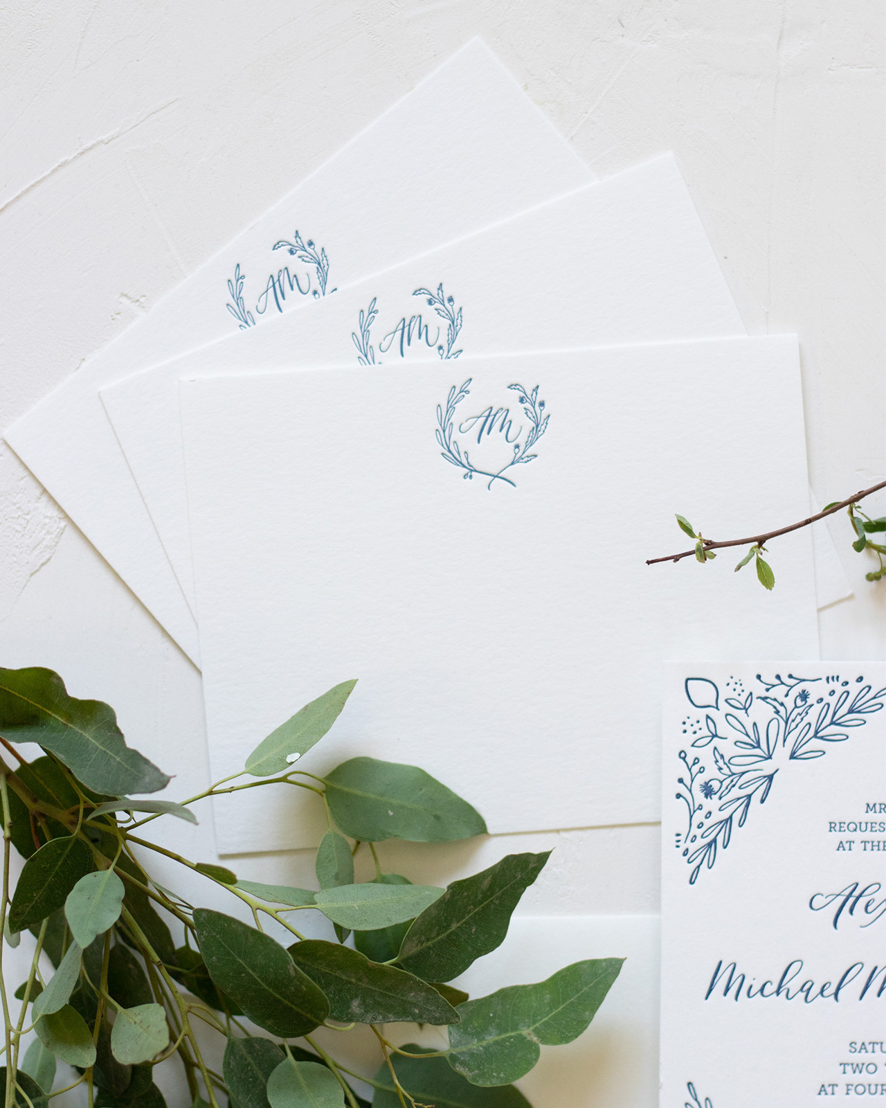
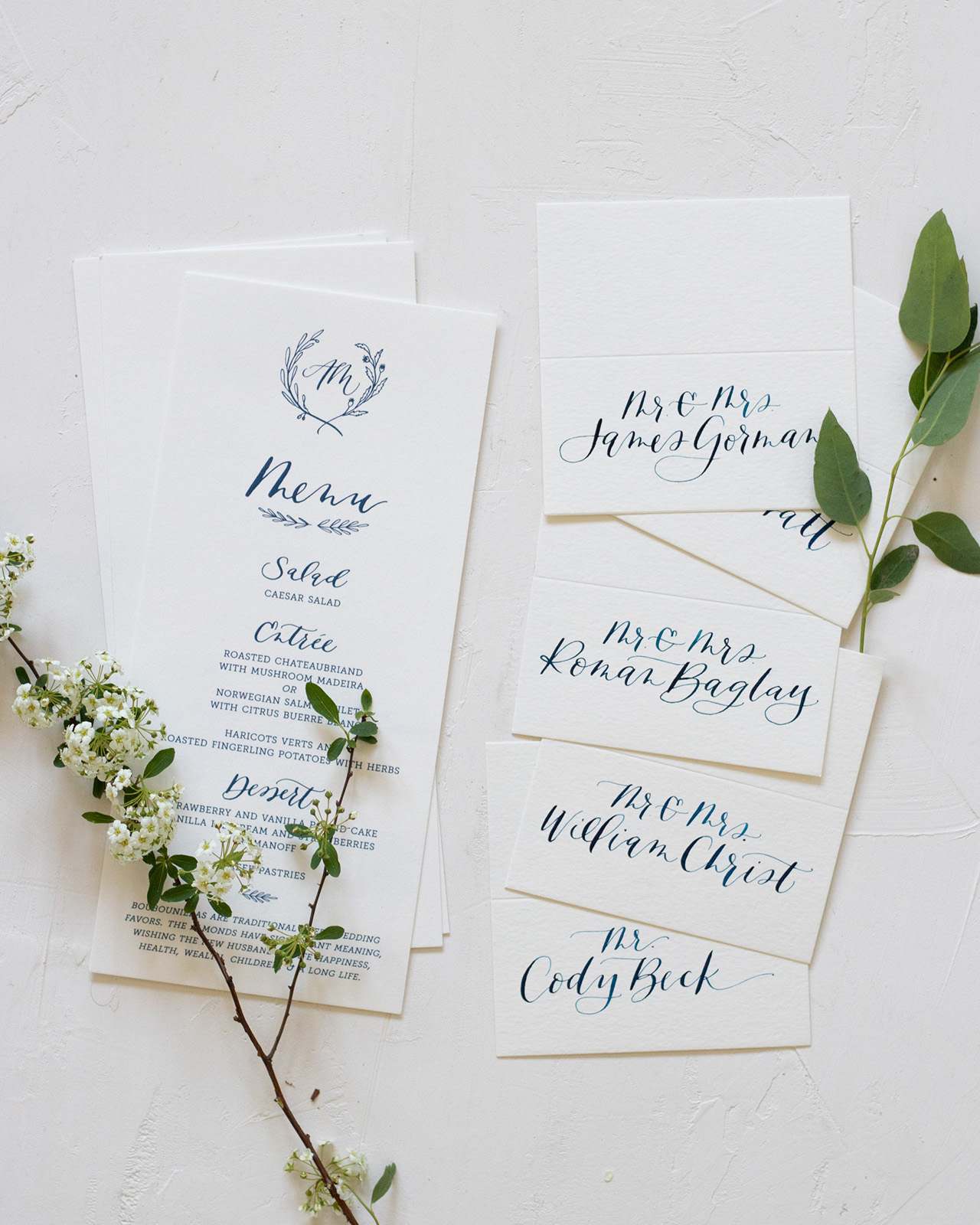
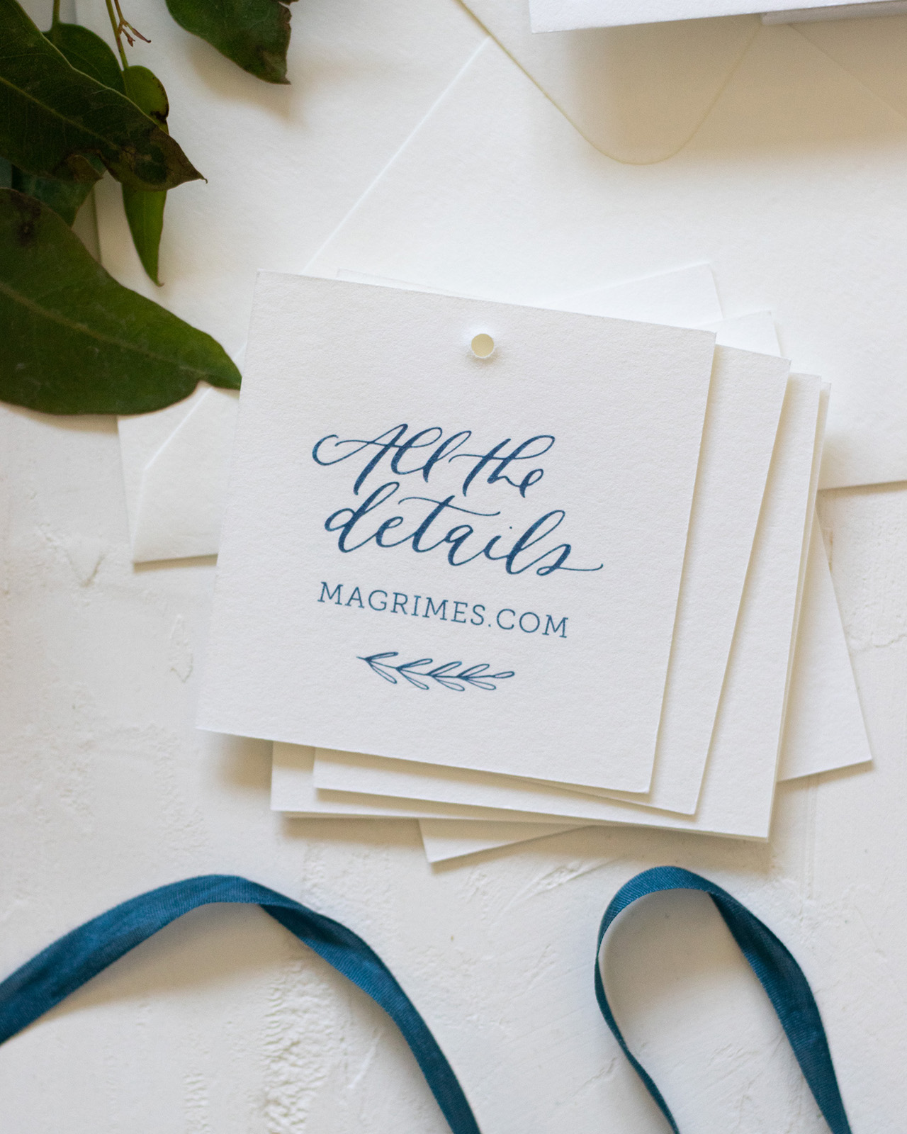
We continued the monochromatic palette through everything, which kept the design cohesive and sophisticated. The little branch details and modern calligraphy style tied the smaller pieces together. What resulted was a lovely invitation that felt personal to them and gave their wedding a beautiful look throughout.
Thanks Kim!
Design: Bright Room Studio
Printing: Mercurio Brothers Printing
Bright Room Studio is a member of the Designer Rolodex – you can see more of Kim’s beautiful work right here or visit the real inviÂtaÂtions gallery for more wedding invitation ideas!
Photo Credits: Bright Room Studio

Beautiful