Hello friends! I’m super excited to dive into the work of calligrapher Emily Asher of Emily Rose Ink today. It’s summertime, and we’re right in the peak season of being outdoors, where you want pretty things around you that feel fresh and organic, and even maybe a little romantic. That pretty much wraps up Emily’s style of calligraphy. So let’s jump in with a whole dose of lettering work that I think you’ll love. – Jen
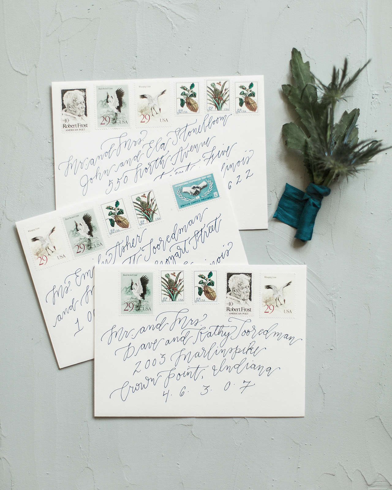
Photo Credit: Lea Emerson Photography
Of her inspiration, Emily shares, “I’ve found that I gravitate towards a style that feels romantic and organic but refined, a little imperfect without being too messy. I want my invitations to convey the formality deserving of a wedding without feeling stuffy or too traditional.”
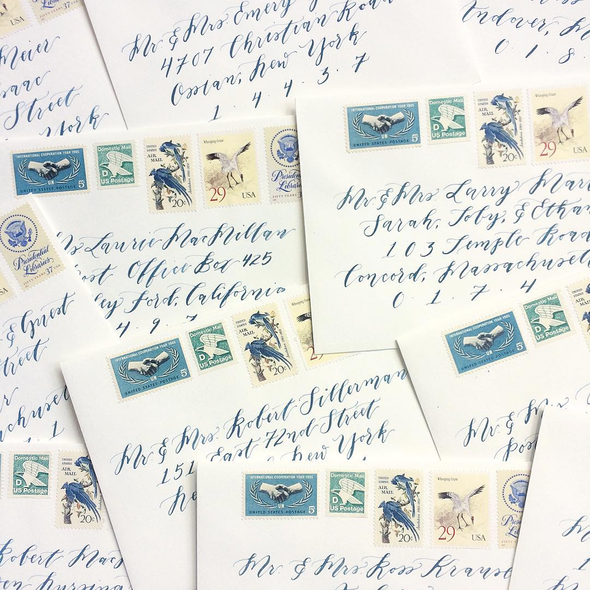
Emily likes to use vintage stamps with her wedding projects. “It’s fun for me to choose stamps that correspond to the couple’s geographical location, their history, or their interests, and they dress up an envelope in a way that makes each guest feel like they are opening a beautifully decorated gift when they receive their invitation.”
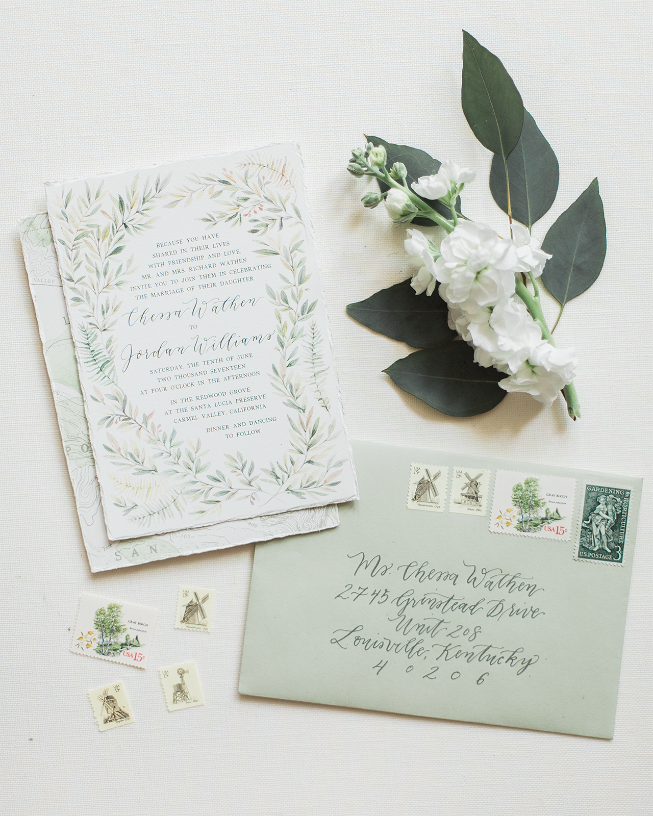

Photos: Leah Emerson Photography
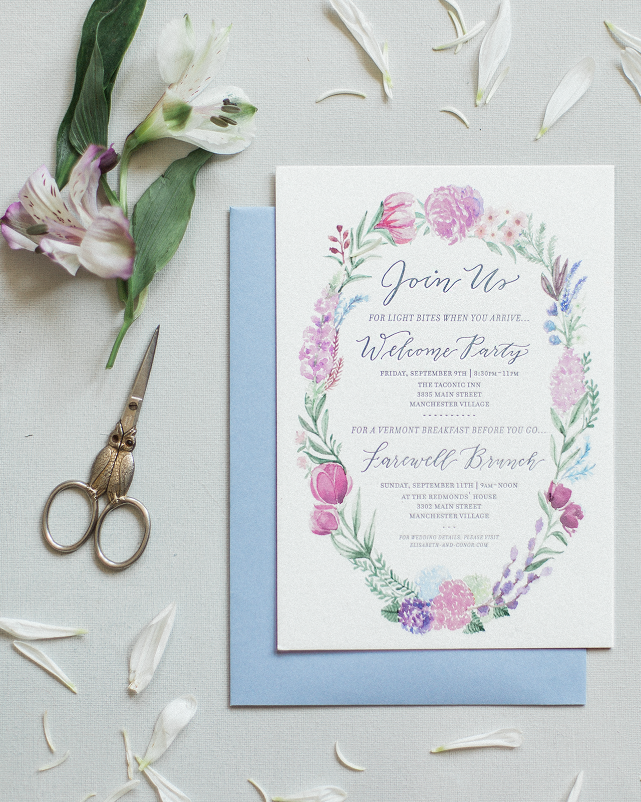
“I am definitely inspired by nature and often my invitations have a sense of place – whether it’s a venue illustration or a floral border inspired by the local colors and varieties of flowers that will be used in their wedding,” shares Emily. This is one invitation for a welcome party that I’d want to frame afterwards!
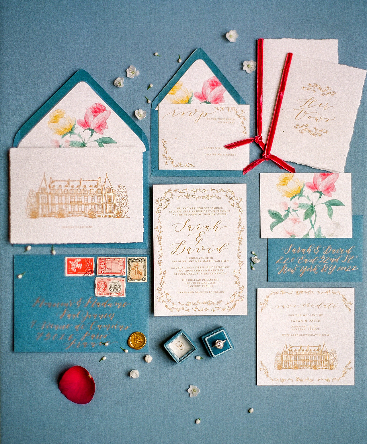
Photo: Tim Tab Photography
I love this color palette for an invitation suite. That’s such a pretty blue and I love how it pairs with the reds.
“Lately I’ve been doing a lot of venue illustrations – both detailed architectural line drawings and watercolor scenes inspired by the natural beauty of the venue — and I love giving guests a preview of the wedding in this way,” says Emily. “The invitations also then serve as mementos for the couple, pieces of art that they can cherish forever.”

Photo Credit: Lea Emerson Photography
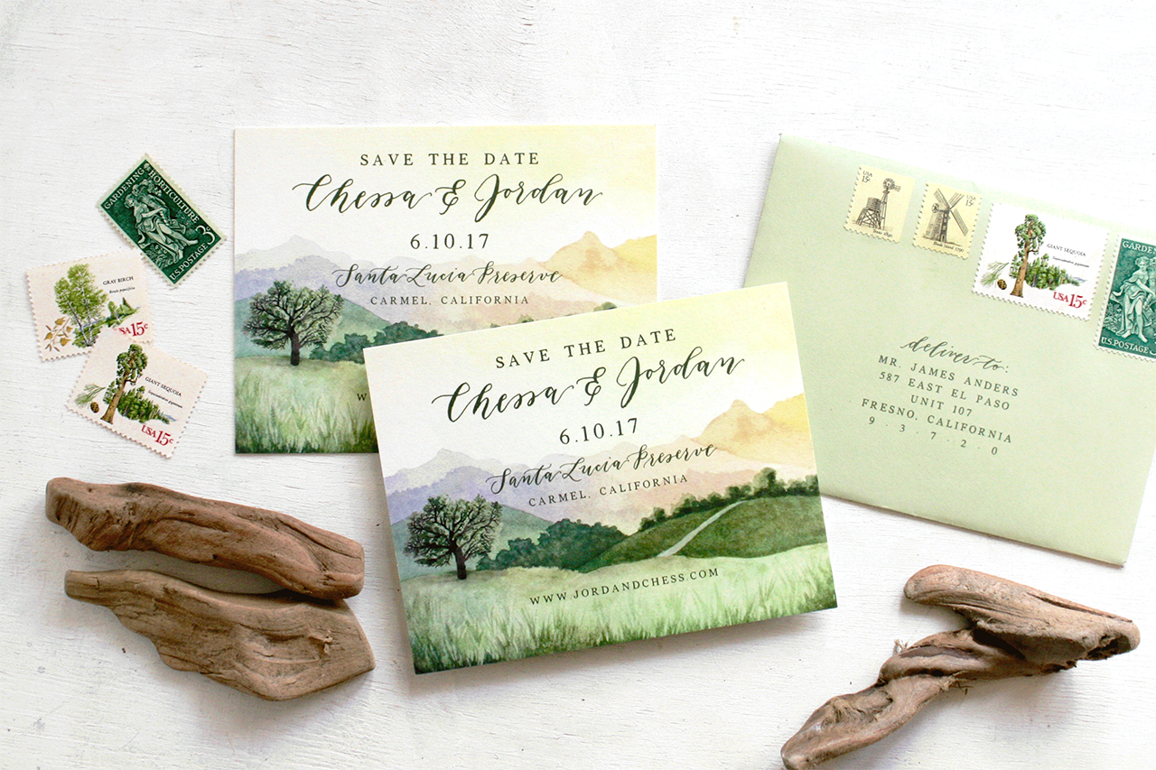
Check out these Save the Dates by Emily! Talk about a keeper — the California landscape looks so cool on those cards.
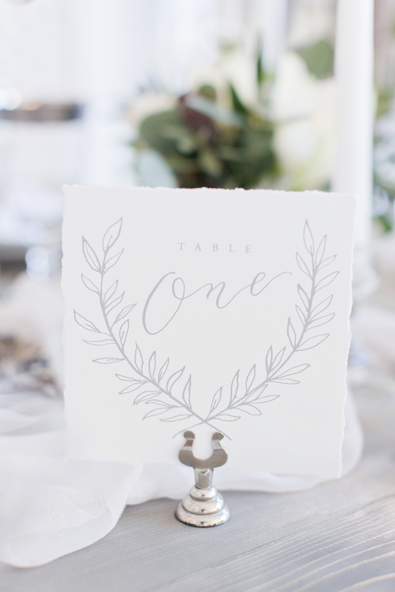
Photo: Maria Harte Photography
Here’s an example of when subtle is so perfect. The soft gray tones of the lettering and vine illustration on this table card makes the design feel more modern.
Thanks so much to Emily of Emily Rose Ink for sharing a peek of her work. See you soon, friends!
Emily Rose Ink is a member of the Oh So Beautiful Paper Designer Rolodex – you can see more of her work right here!

Thanks so much for sharing! <3