These illustrated wildflower wedding invitations make me sad to see summer go! Michelle of Honey Paper designed this whimsical watercolor wedding invitation suite along with the bride’s mother, drawing inspiration from the mountains of Sun Valley, Idaho. What a special gift for the bride!
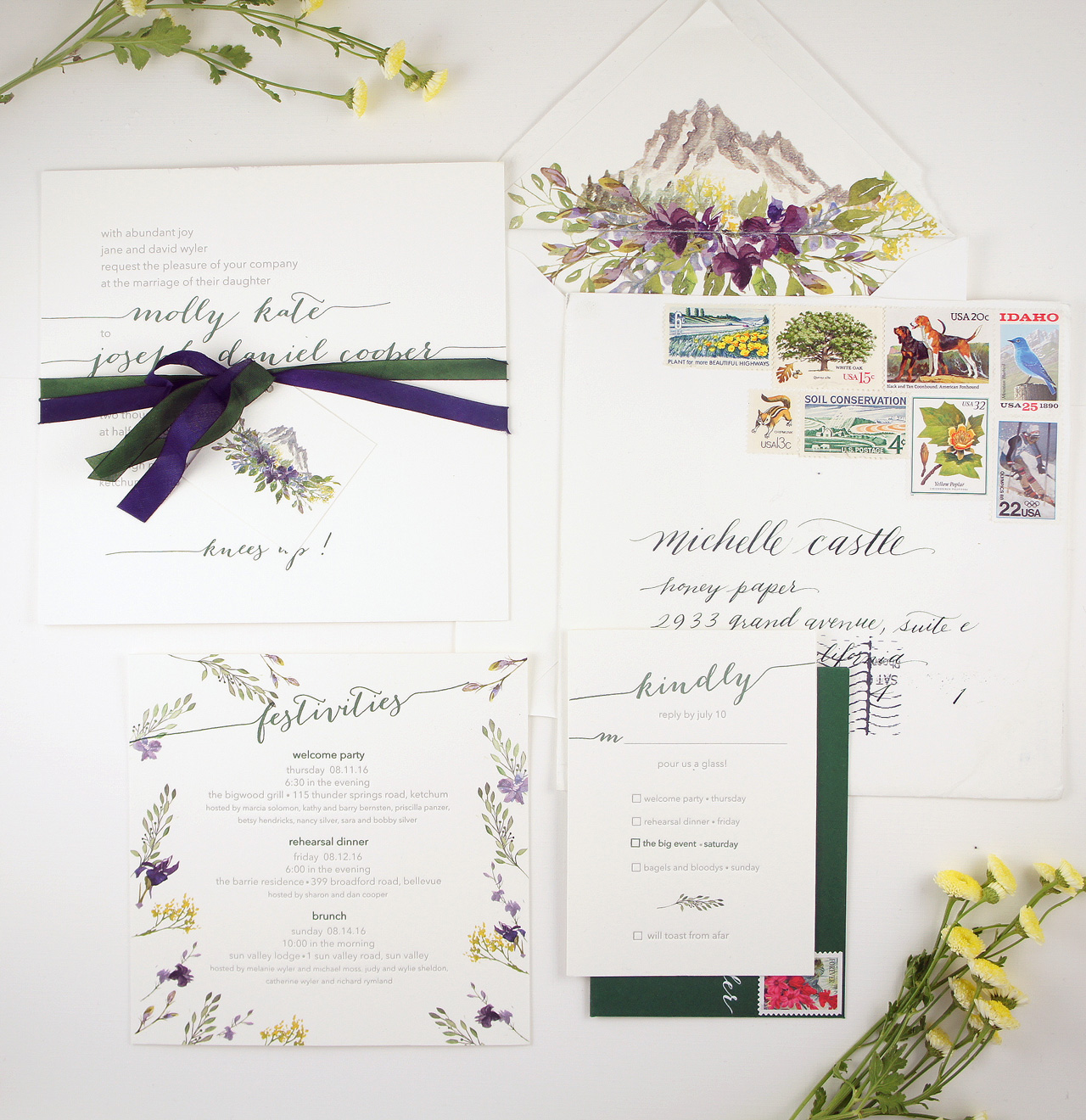
From Michelle: It was so much fun working with the bride’s mother on this invitation suite. She wanted to do something special and unique for her daughter. We worked on creating an invitation that was inspired by the elegant wedding venue, which was surrounded by all the gorgeous, natural beauty of Sun Valley, Idaho. The color palette was forest green, lavender, various shades of plum and a touch of mustard yellow, reflecting the mustard seed plant in the area.
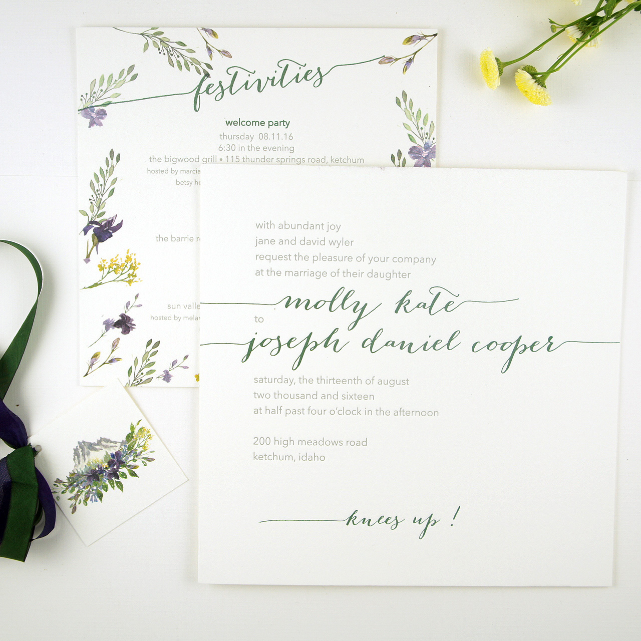
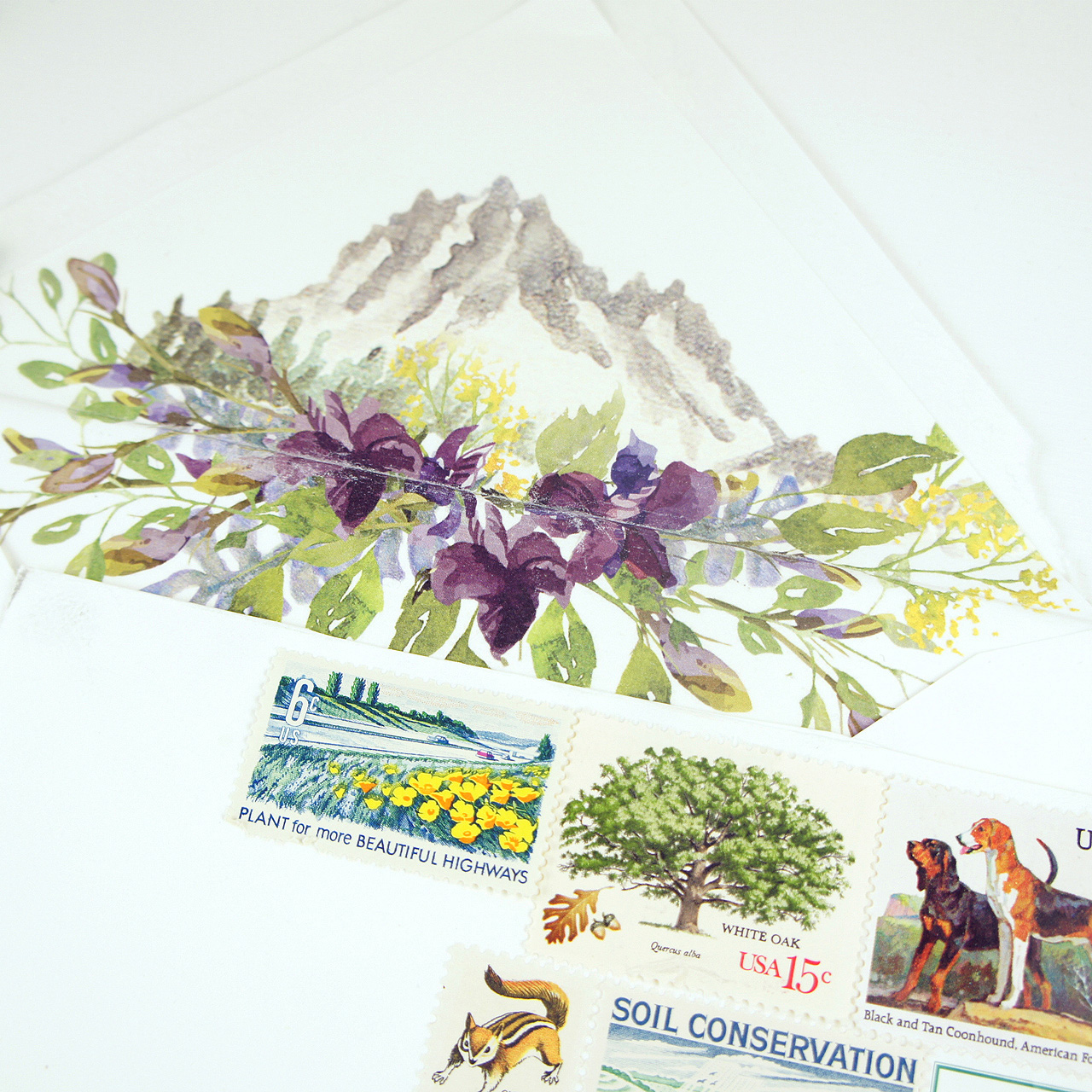
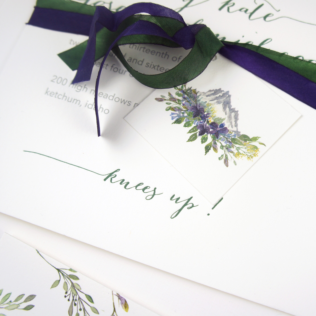
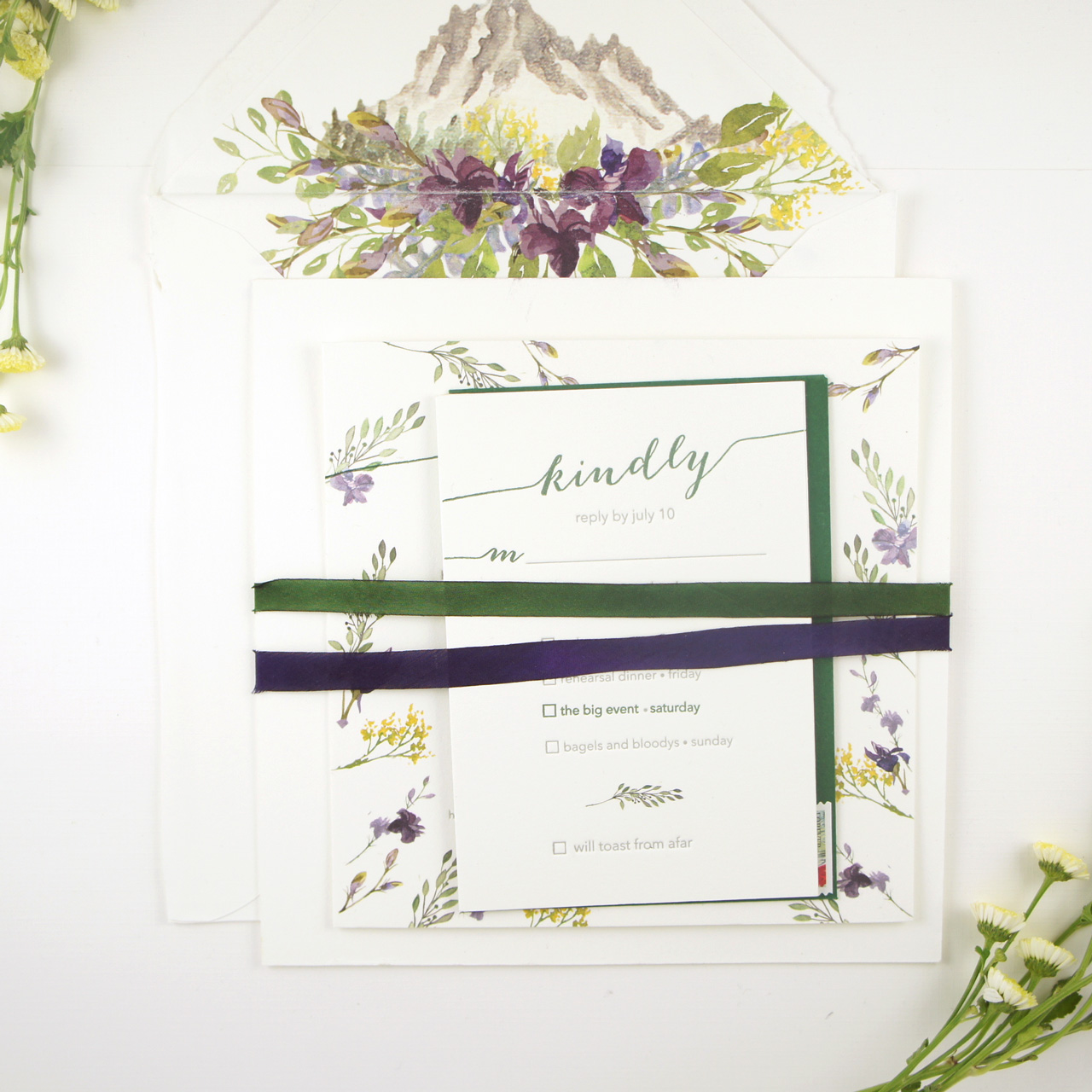
The clients were originally attracted to my watercolors, so we knew we had to incorporate those, but the bride’s mother wanted to make sure it was also elegant with a bit of whimsy in the wording. I started by creating a watercolor illustration of the iconic Sawtooth Mountains that lie north of Sun Valley and are the recreation destination for many visitors in the area. The watercolor mountain is painted with a variety of wildflowers in their surroundings. That image was used for a stunning envelope liner and on a small tag attached to ribbon that tied the invitation suite together.
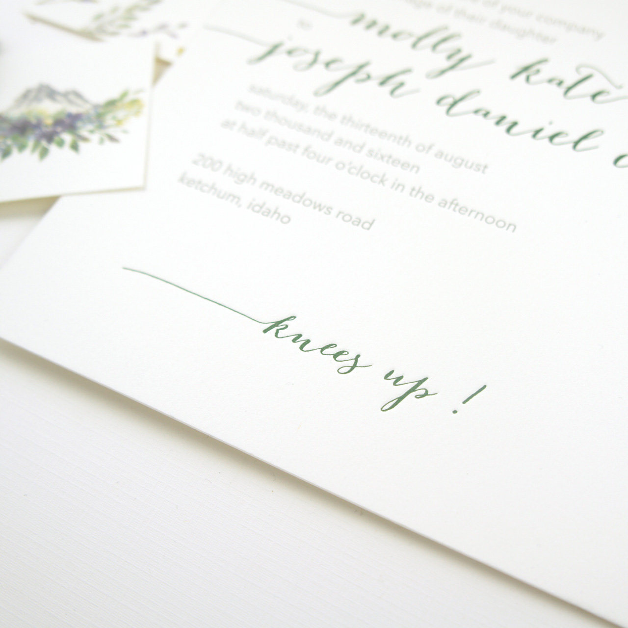
Both the invitation and reply card were kept simple to remain elegant and let the watercolors stand out. We had the most fun with the wording, which they definitely wanted to be a bit unexpected for the recipients, but not deviate too much from tradition. “Knees Up†was used instead of the traditional “Reception to follow†and was taken from the song “Knees Up Mother Brown†from the early 1900s. The expression “knees up” came to mean a party or a dance.
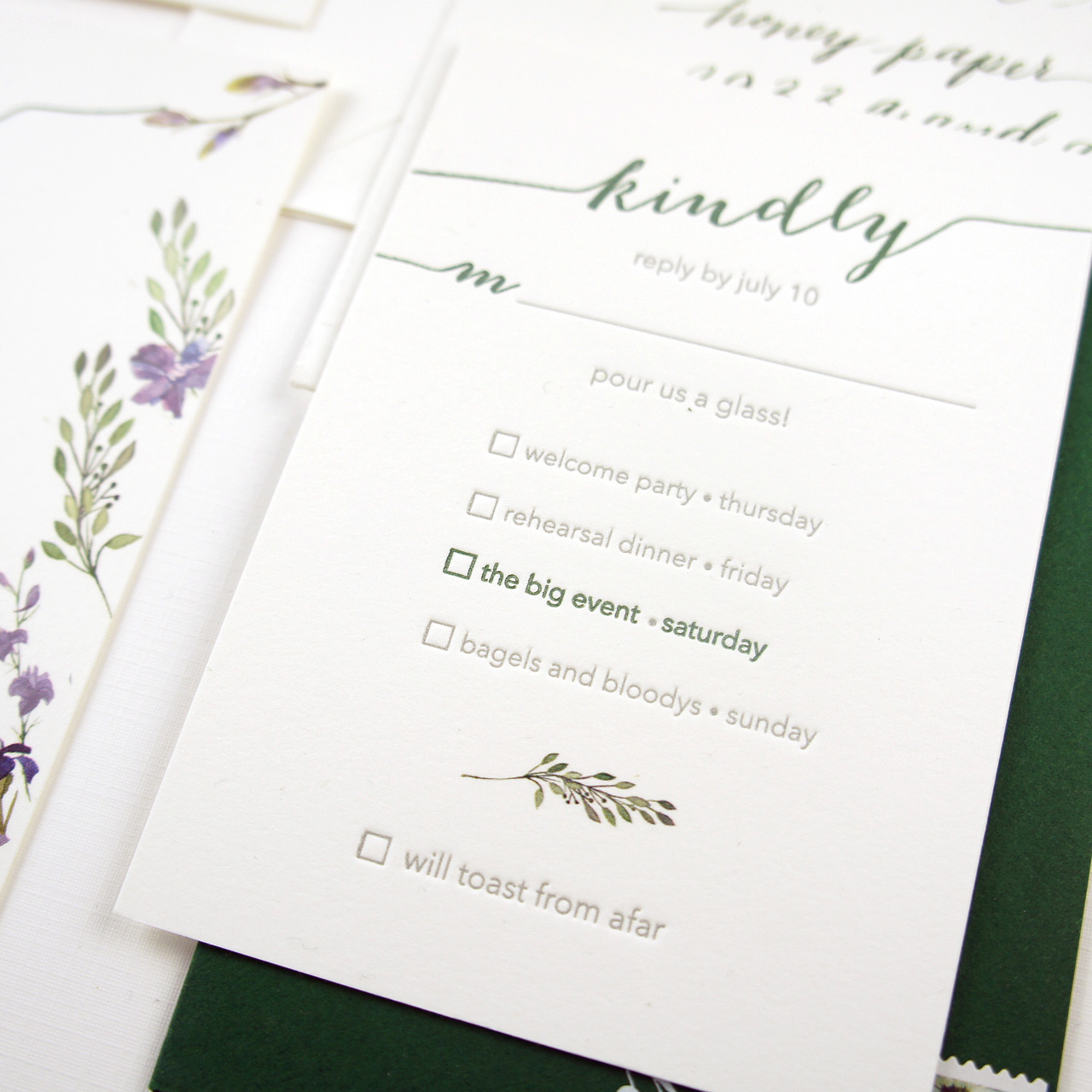
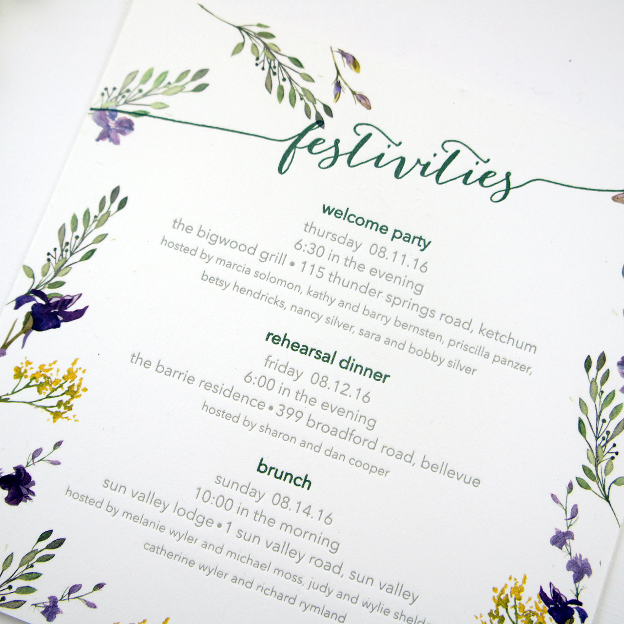
To make the invitation suite extra special, the clients inserted an event card that was bordered with all the different wildflowers. This was placed on the flip side of the invitation and was a visual treat when the invitee turned the invitation over. This was all tied together with two ribbons and the custom tag.
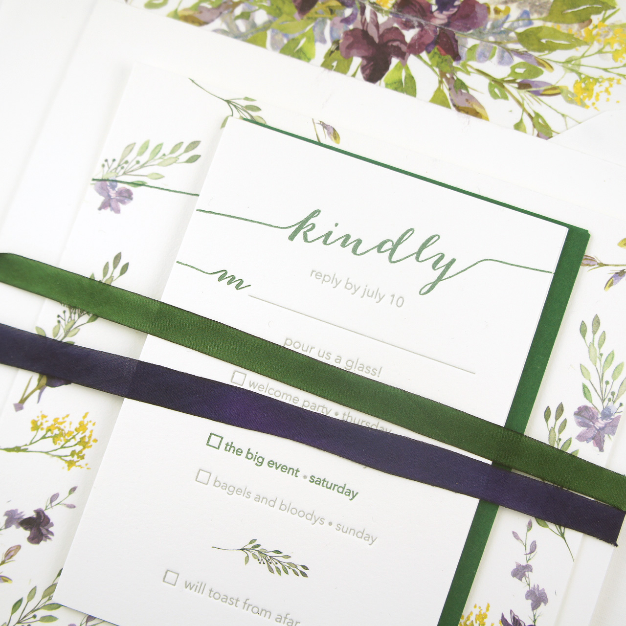
Printed on Crane Lettra Fluorescent White 220# and 110# paper. The watercolor illustrations were digitally printed and paired with two color letterpress printing for the invitation text.
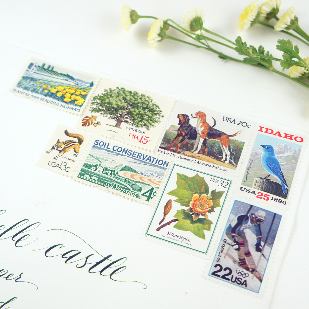
The envelopes were addressed with green calligraphy to match the inside ink color and then paired with vintage stamps – many with an Idaho theme!
Thanks Michelle!
Design: Honey Paper
Printing: The Paper Place
Calligraphy: Penagraphics
Check out the Designer Rolodex for more talÂented wedÂding inviÂtaÂtion designÂers and the real inviÂtaÂtions gallery for more wedding invitation ideas!
Photo Credits: Michelle Castle

What a joy to se my work and passion featured. Thank you!
AMAZING!!! Love these designs!
http://www.crimsonletters.com
Wow, the invitations look stunning! I love the style and design of it, so different and unique, and at the same time elegant and fun. Thank you for sharing!