Whenever I look at a wedding invitation, I always look for that one special detail that stands out from everything else. Sometimes it’s hand lettering or calligraphy. Sometimes it’s the carefully chosen vintage stamps. In the case of these gorgeous aquamarine watercolor and letterpress wedding invitations from Shana of Iris and Marie Letterpress, it’s the beautiful and ethereal hand painted details that Shana added to each invitation. So perfect for an oceanside wedding!
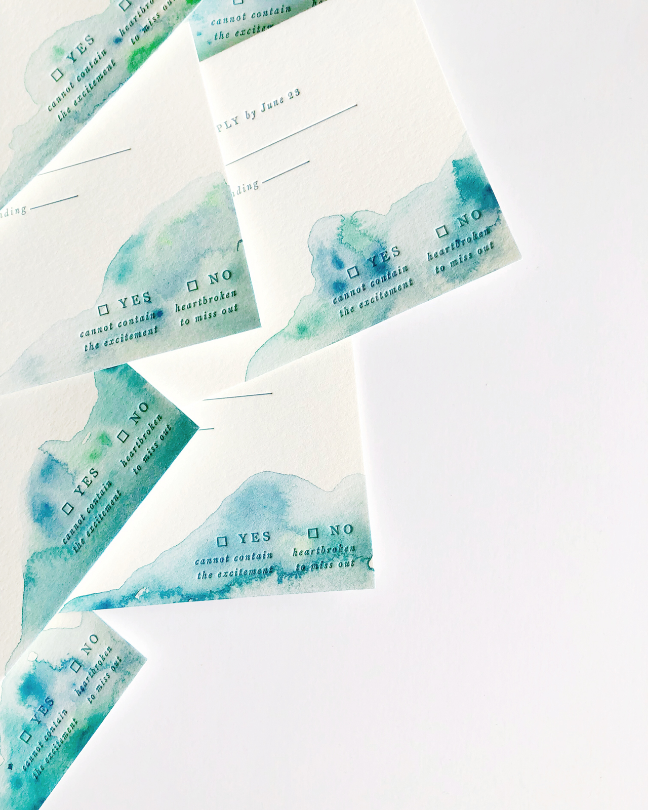
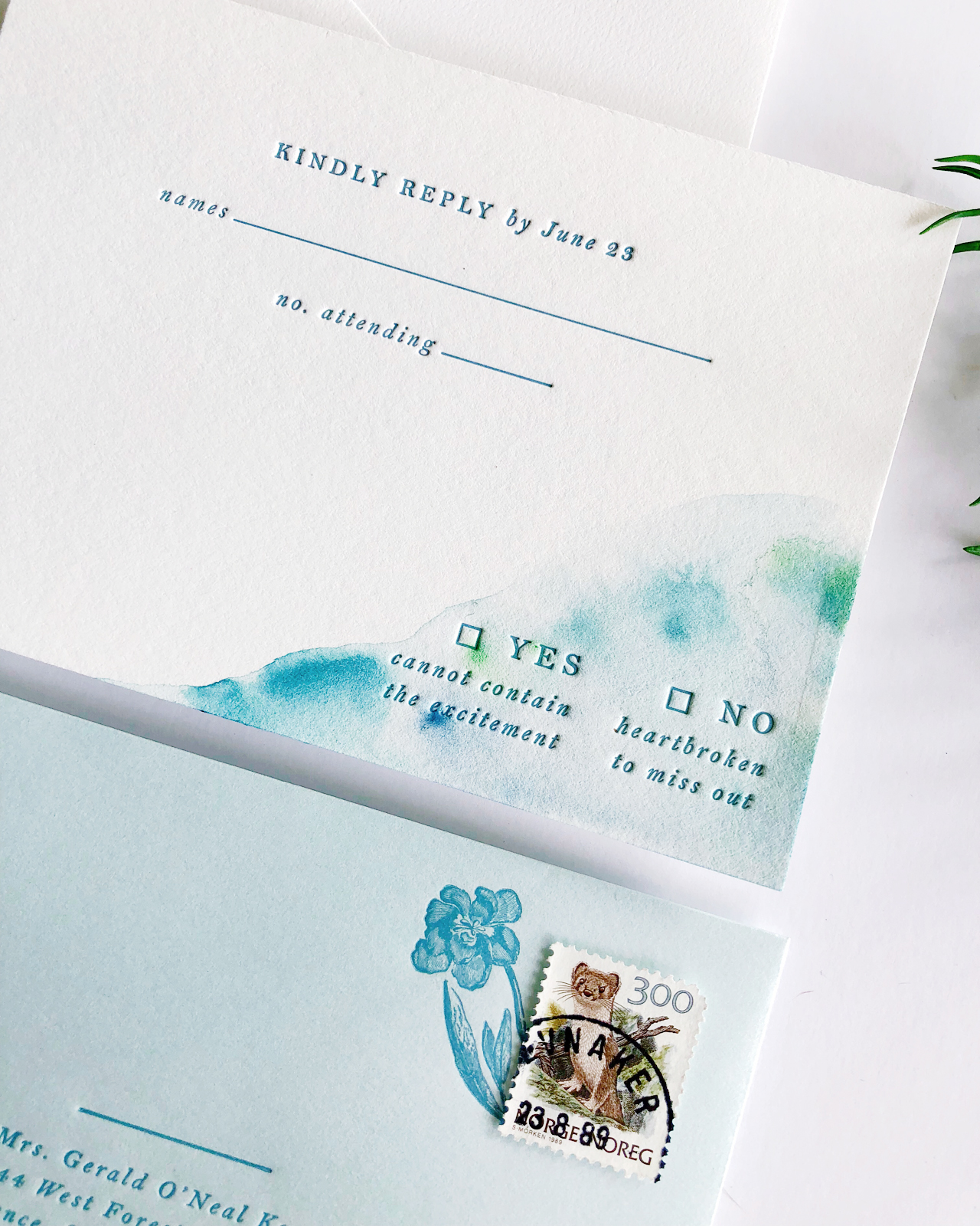
From Shana: Abbey’s July wedding in Florence, South Carolina was hot, but these cool ocean blues and greens gave her guests a breath of fresh air before the big day. Each invitation and reply card was hand painted with acrylic paint using a special water technique. The design was letterpress printed on a 1920s Chandler & Price letterpress using Crane Lettra cotton paper for the invitation and Cards & Pockets Aquamarine envelopes for the reply envelopes. Three colors were used throughout the suite: medium dusty teal, dark dusty teal & grey-green.

The reply card and envelope featured the darker teal of the suite, where as the invitation and outer envelope featured the medium dusty teal that Abbey picked out. The dusty teal used matched her bridesmaids’ dresses perfectly! To go along with her chill vibe, the grey-green was used on the text of the invitation to compliment the blues going on everywhere else.
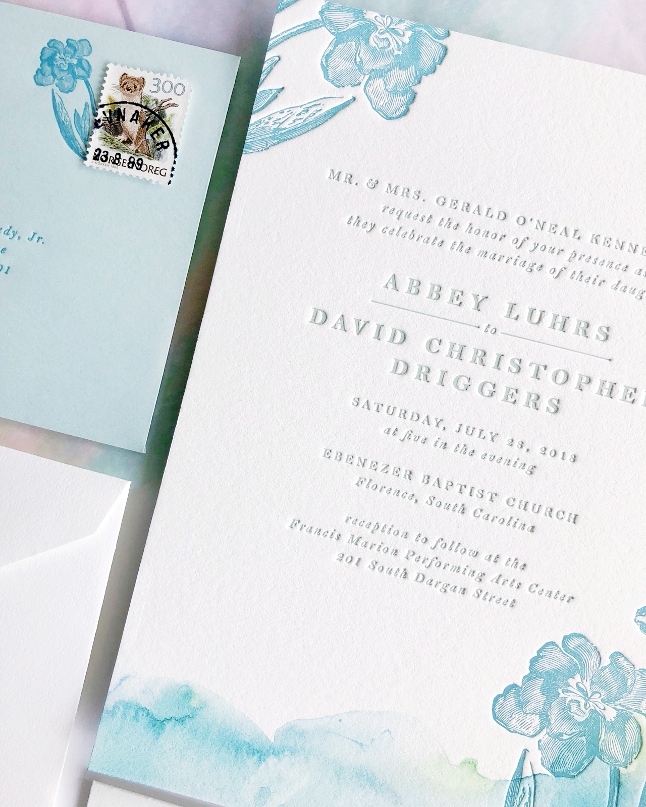
At the bottom of each invitation is the hazy water painting created uniquely for each invitation with subtle hints of a bright green. The grey-green ink really helped pull those bright greens out & made the invitation colors flow together. The really cool thing about hand painting each piece of paper is that each guest gets a different suite which in turn makes each invitation feel like its own art piece.
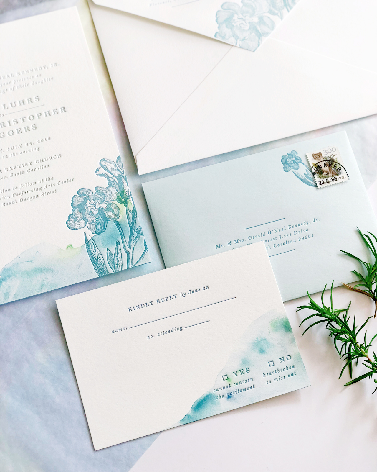
Abbey definitely was excited to see each suite come together and see how every invitation was different than the next. She also wanted to add a floral element, but didn’t want them to overpower the hand painted details. So we printed floral illustrations on top of the painted piece to add extra texture.
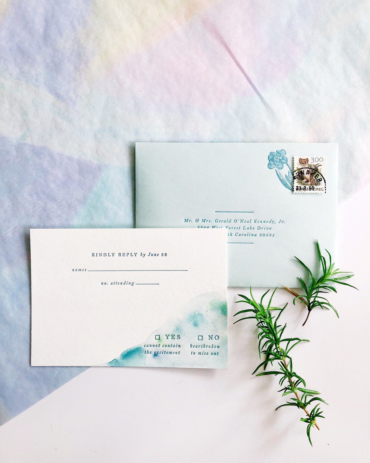
Can you spot the other little floral element peeking out from the stamp? Instead of having a plain corner of her reply envelope where a stamp would go, we opted to have a cute little flower coming out of the stamp for some extra personality. Flowers were also added to the outer envelopes by being printed to bleed off the envelope flap to give guests a little insight to what is inside.
There are so many fun elements going on in this one suite that you might think that this wedding definitely does not have a “relaxed” vibe. Heck yes it does! Don’t the blue-greens make you want to sit by the ocean? If I were to give this wedding a new theme it would be: relaxed by the ocean with a flower in one hand and sea glass in the other.

Thanks Shana!
Design and printing: Iris and Marie Letterpress
Envelopes: Cards & Pockets
Looking for more wedding invitation inspiration? Visit our wedding invitations archive for more custom wedding invitation ideas!
