Modern yet classic and geometric yet organic, this wedding invitation suite is full of the very best juxtapositions. Michael Musser of Anticipate Invitations drew inspiration from one of nature’s most beautiful elements when creating these striking navy and gold foil agate-inspired wedding invitations. How beautiful is that gold foil border formed by the agate lines against that gorgeous dark blue paper?!
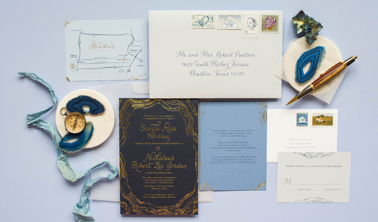
From Michael: Sharla and Nick approached me with their own jumping off point ideas for their wedding stationery design, and I knew they were on to something that could be taken to another level with some carefully well thought-out details.
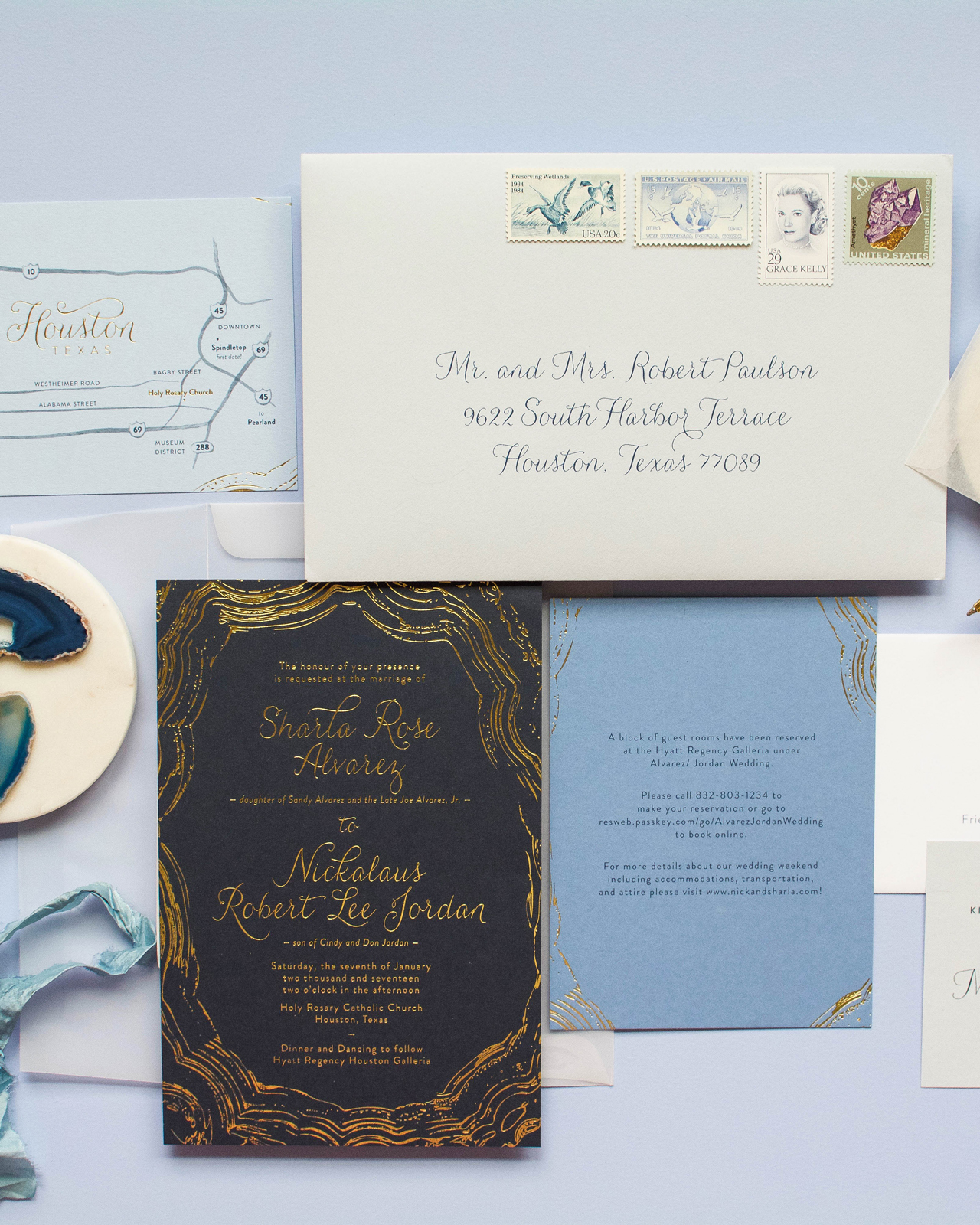
Sharla wanted to bring in something modern and abstract, yet also keep the feeling classic and traditional. She also wanted to use the blue hues and metallic golds she would repeat through her other wedding design elements. After some initial designs that were more geometric in nature, we landed on the more organic, yet graphic lines, of an agate slice. It allowed for the invitation to be fully classic and fully modern at the same time. To lean classic, we kept everything in metallic gold foil and printed on Colorplan paper’s dramatic Imperial Blue. The lines of the stone were pulled from a scan of an actual agate slice, and then edited and filled in as necessary to perfectly frame the invitation’s wording.
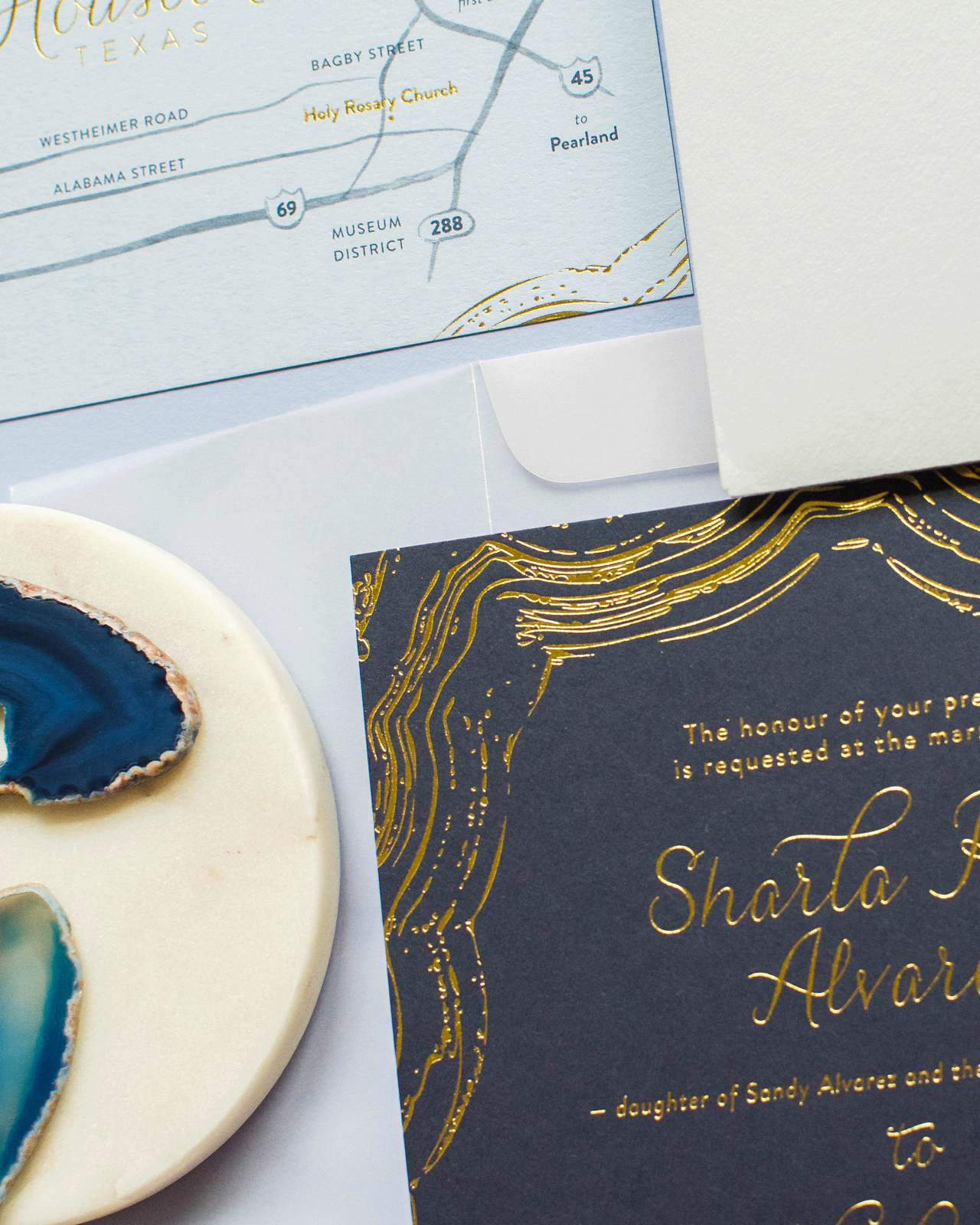
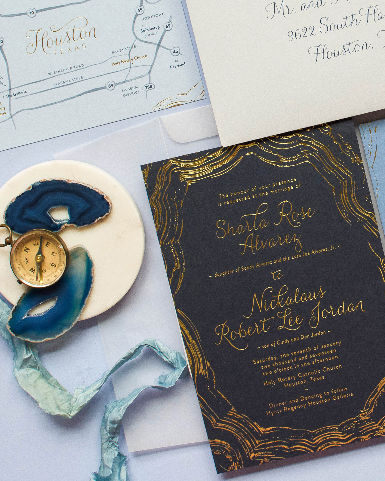
To further mimic the stone, we used graduated shades of blue paper from Colorplan for the remaining details cards, so that when stacked, it would create a beautiful ombré effect. To visually tie the pieces together, the agate lines of the invitation were repeated on all the corners of the smaller cards. When stacked, they formed the complete agate design, but perfectly hid the invitation’s wording.
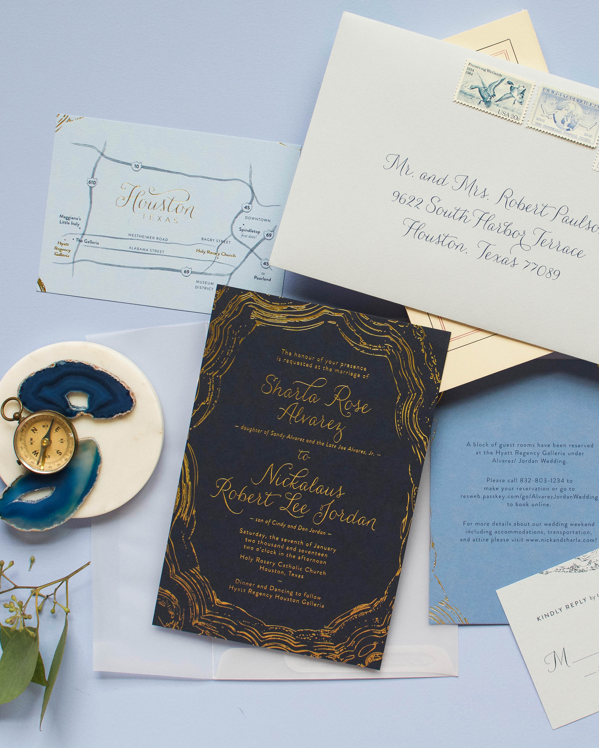
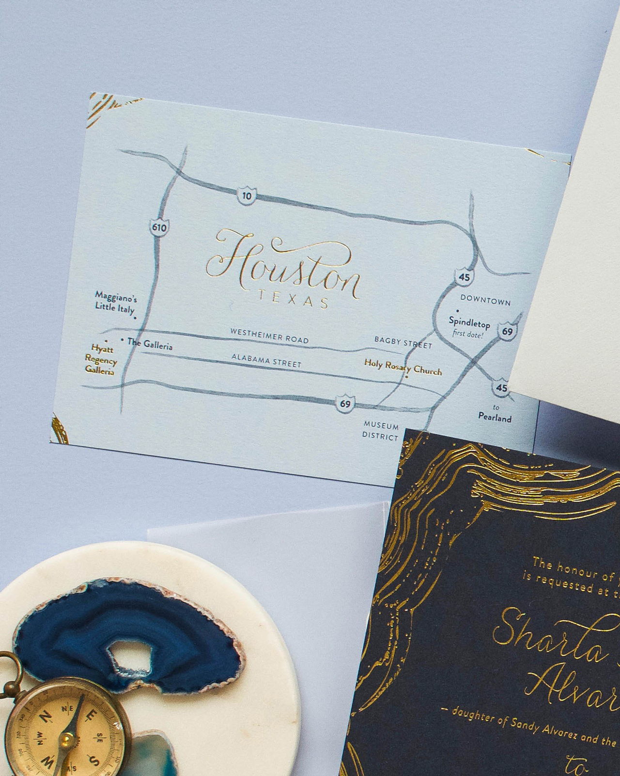
The secondary cards included accommodations, a modern map card that mixed simple watercolor lines and gold foil, and the reply card with envelope.
The cards were tied together with gold string in a random and layered fashion while framing the monogram that was printed on the back of the top details card.
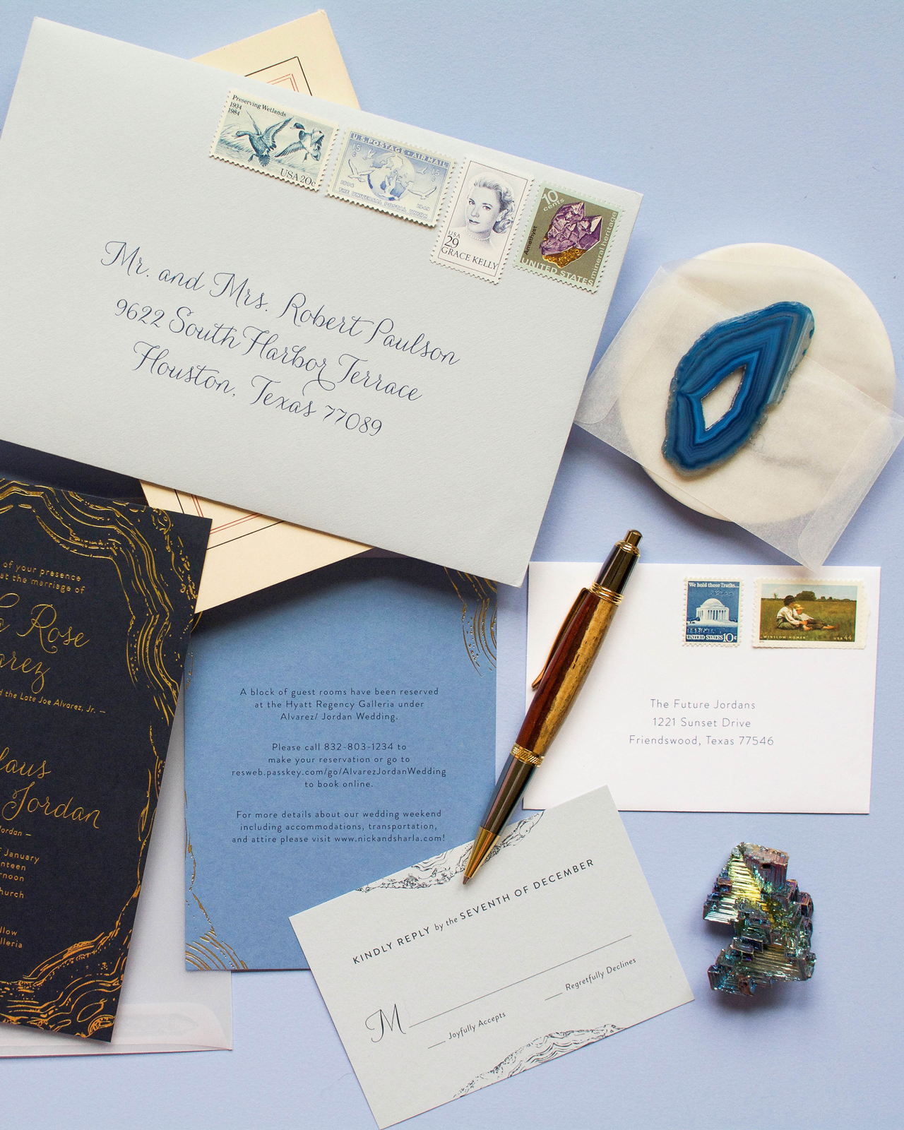
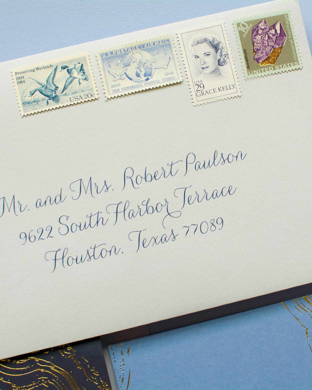
The suite was slipped into a clear vellum envelope, which was then inserted into a light blue outer envelope and lined with metallic gold paper. The envelope’s finishing touch was the set of four vintage postage stamps, that highlighted the blue tones and the geodes.
Thanks, Michael!
Design: Anticipate Invitations
Printing: Hodgins Engraving
Paper: Colorplan Papers
Planning: Two Be Wed
Check out the Designer Rolodex for more talÂented wedÂding inviÂtaÂtion designÂers and the real inviÂtaÂtions gallery for more wedding invitation ideas!
Photo Credits: Very Robin & Co.

Stunning! What is the calligraphy font used on the envelopes?