We loved sharing these minimalist black and white invitations from Grace of Grace Niu, and today we’re over the moon to share her personal wedding invitations with all of you! Grace clearly prefers a softer, more minimal design aesthetic – all of which definitely comes through in her own understated green calligraphy and fern wedding invitations. Hand painted greenery, delicate calligraphy and soft brush lettering, and the tiniest dose of gold ink. So pretty!
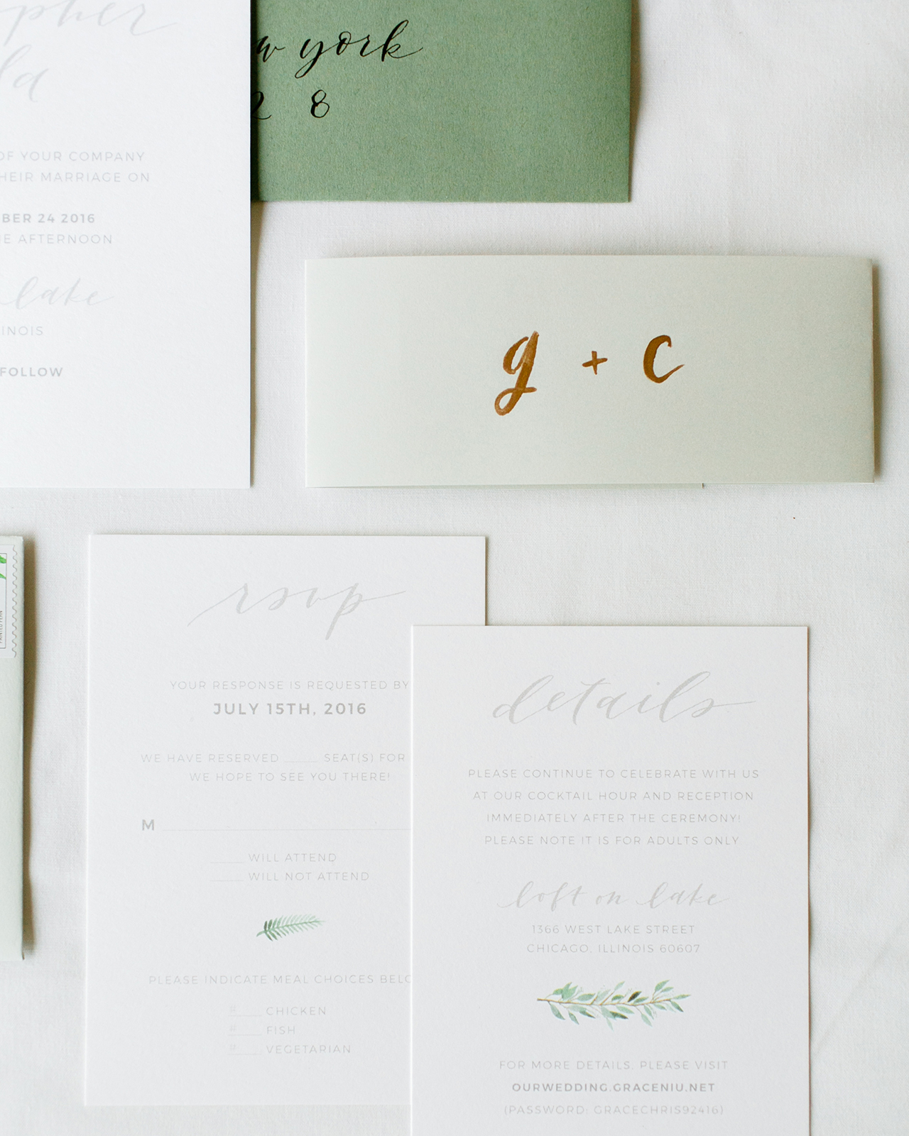
From Grace: Being a graphic designer and invitation designer, I obviously knew I would be designing my own wedding invitations when it came time. I had never given the invitation much thought before getting engaged, but it made it so much easier once I established my mood board and vision for the wedding in general.
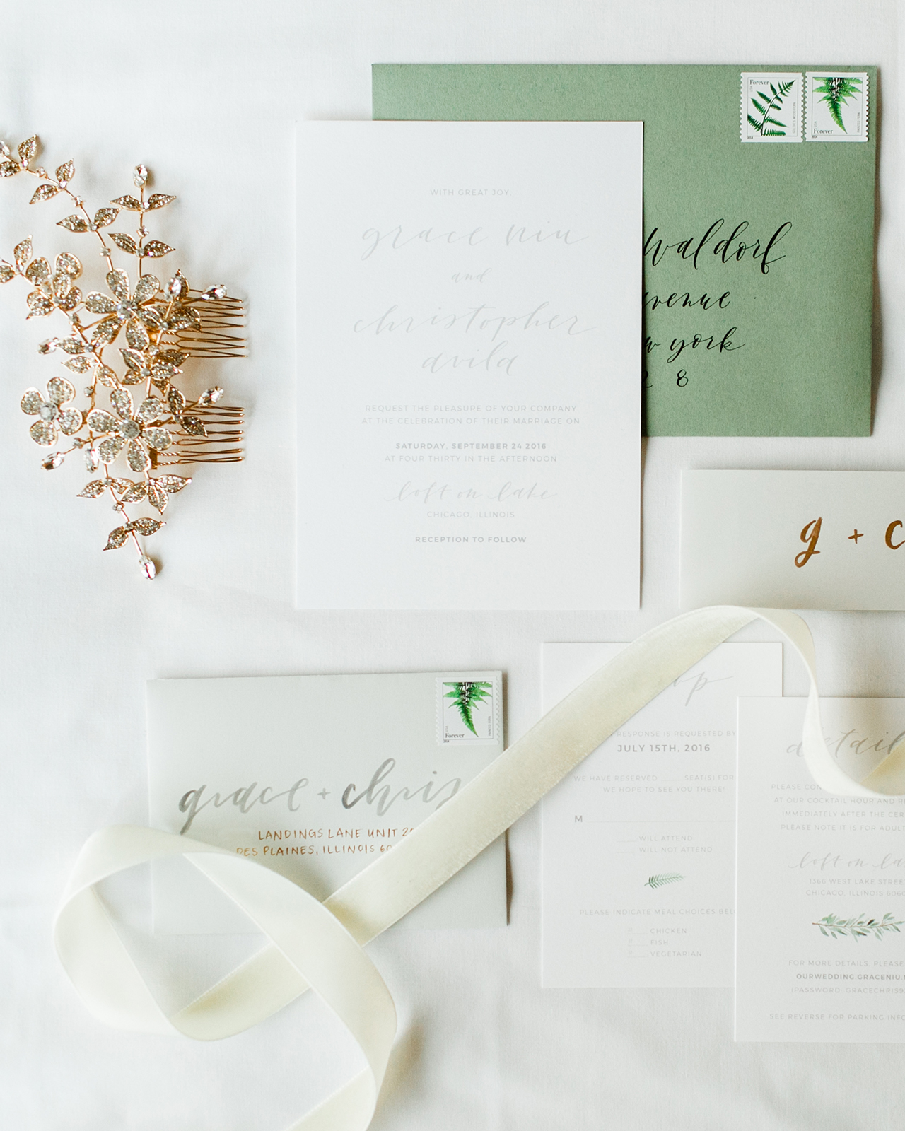
A lot of graphic designers say that sometimes the hardest person to design for is yourself, but luckily I wasn’t too hard on myself and didn’t try to second guess myself too much. After looking at my Pinterest board, I curated a few select images and designed a mood board to serve as the aesthetic vision for the whole wedding. It was a modern organic feel, full of greenery, lots of white and light gray, and gold accents.
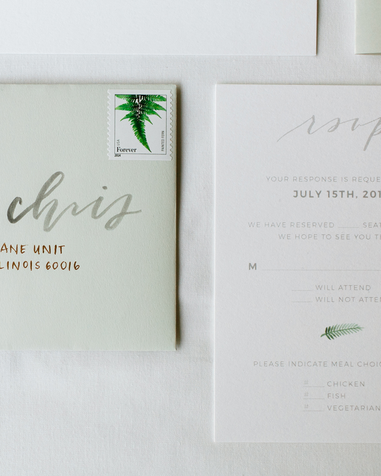
When it came time to design the invitations, I went for a minimalist design on the main invitation, keeping the color of the lettering and type to a very light gray. I wanted it to be beautiful, quiet and elegant. On the reply card, I added a small hand-painted fern to serve as a color accent, but otherwise kept everything else the same light gray. For the details card, I did something similar and used a hand-painted eucalyptus stem to break up the blocks of text a bit and to add a little color.
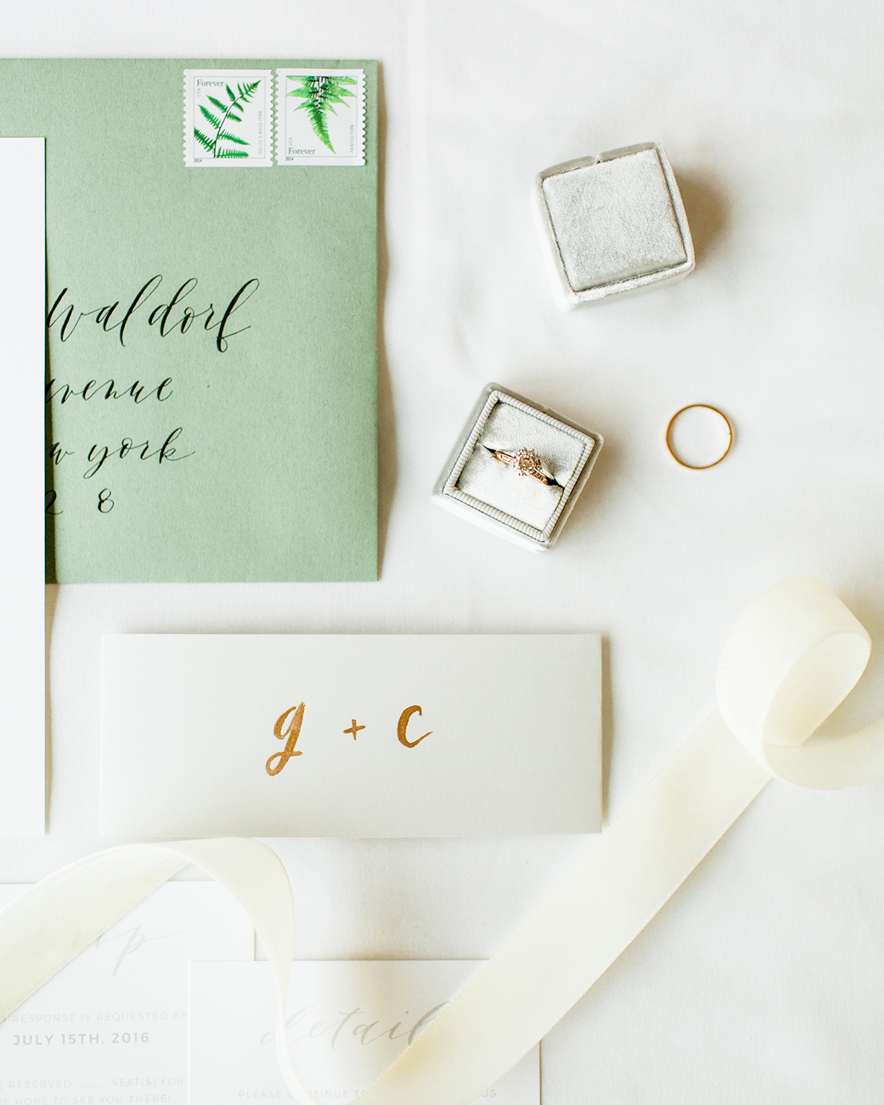
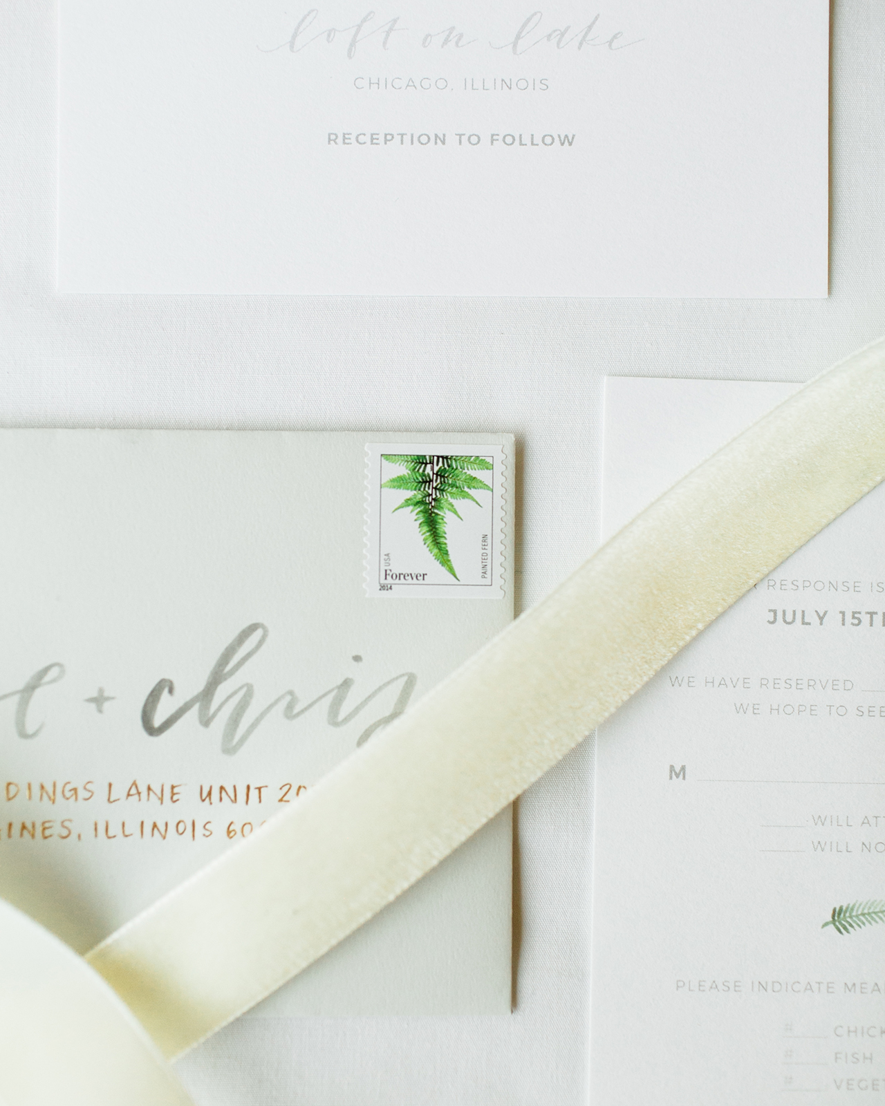
I completed the suite by choosing a light gray paper for the belly bands, and hand-painted our initials in gold ink on every belly band. I used the same light gray for the reply envelopes, which were individually hand-lettered with our first names and reply address. For the main envelope, I chose a sage envelope to coordinate with the hand-painted greenery elements, and calligraphed each one in black ink. To finish off the suite and tie everything together, I found the most perfect fern stamps to use on our envelopes. Looking back on these, I’m so glad to have had the chance to design these invitations for myself and to show our guests what I love doing.
Thanks Grace!
Design & Calligraphy: Grace Niu
Printer: Geographics Inc.
Gray paper and envelopes: Neenah Paper
Green envelopes: Carnival by Mohawk
Paper: Mohawk SuperFine Eggshell
Check out the Designer Rolodex for more talÂented wedÂding inviÂtaÂtion designÂers and the real inviÂtaÂtions gallery for more wedding invitation ideas!
Photo Credits: Erika DenHoed of Mayden Photography

Yay!! Thanks so much again, Nole!